|
| Group |
Round |
C/R |
Comment |
Date |
Image |
| 52 |
Aug 17 |
Comment |
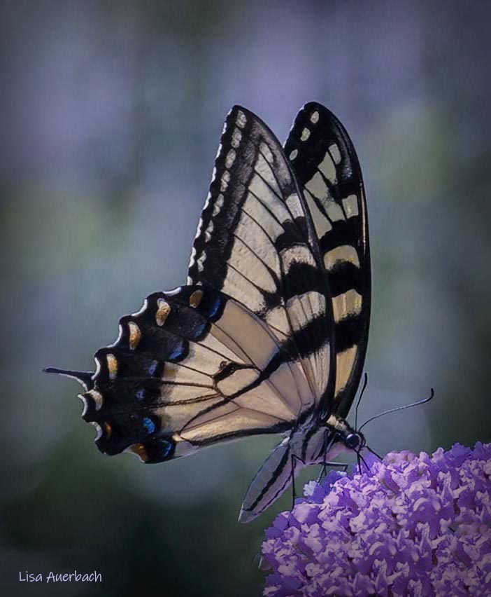
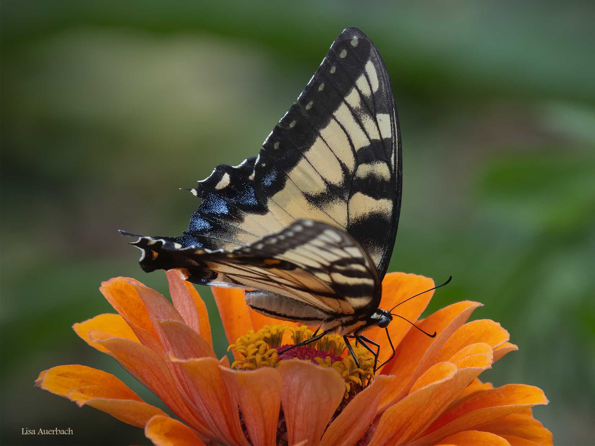
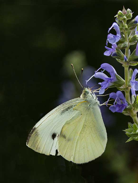
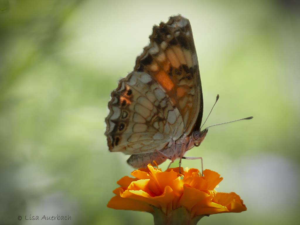
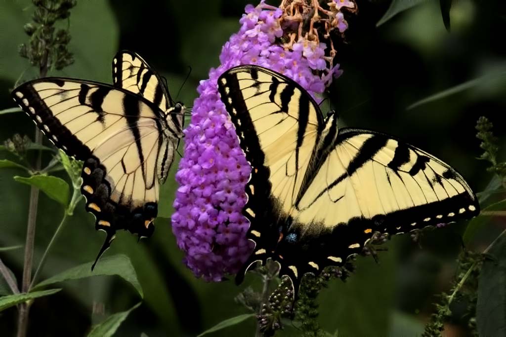
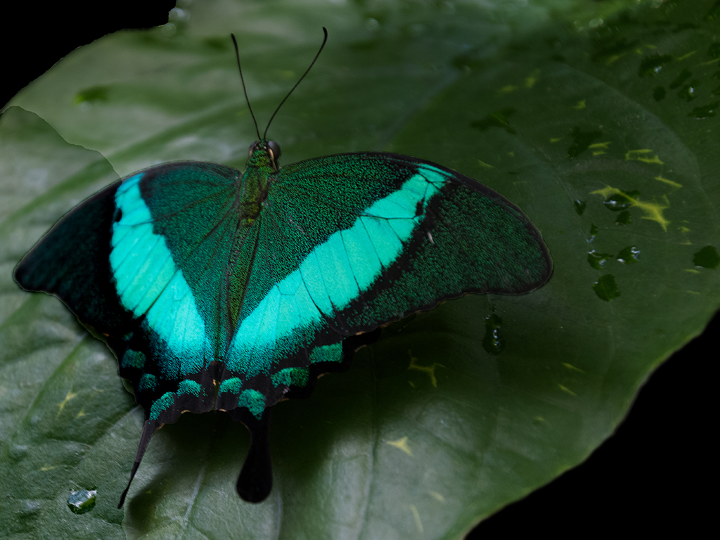
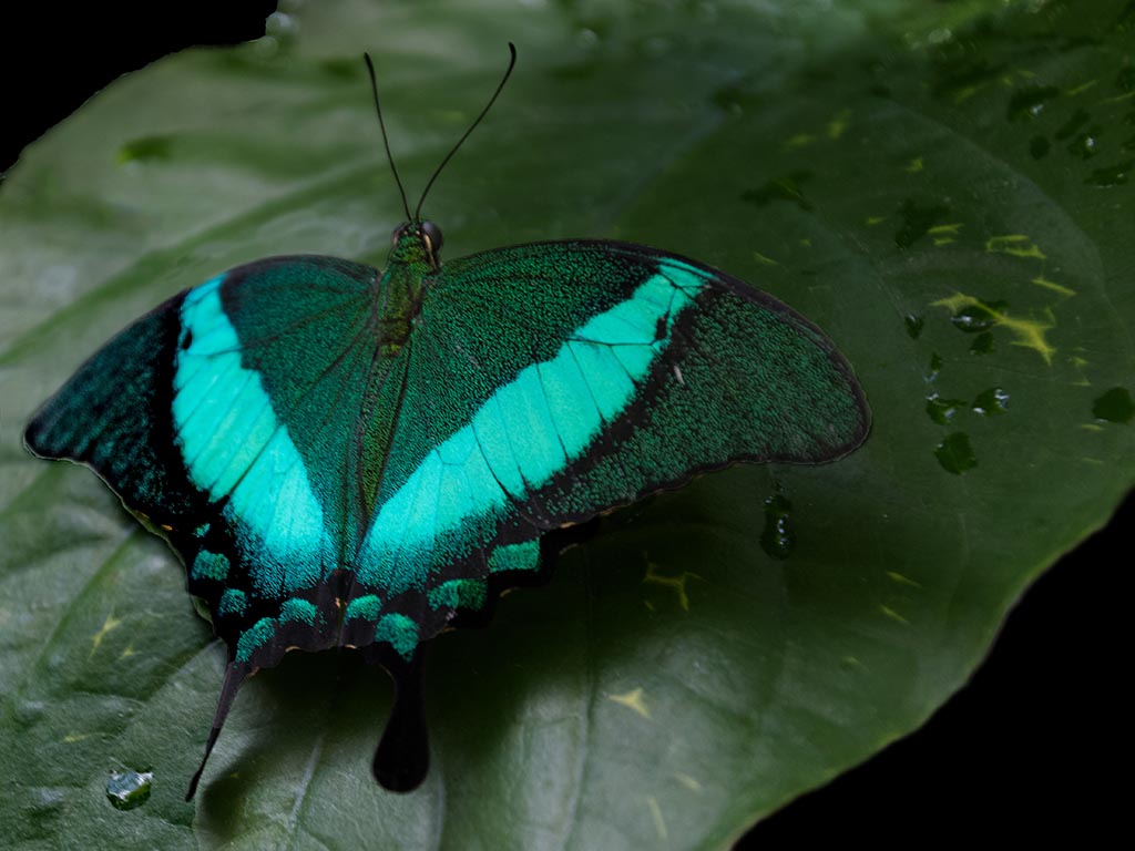
OK, here is Butterfly Take 2. I did try raising the shadows for the left wing and added a bit more structure to it. I also cloned that wing a bit along the edge. Finally I cloned and used the healing brush for the line across the leaf. |
Aug 19th |
 |
| 52 |
Aug 17 |
Comment |
Yes, I use the PS clone tool. What I don't understand is "using the clone tool on darken". I know how to clone but is there a special part of the clone tool for darkening? |
Aug 19th |
| 52 |
Aug 17 |
Reply |
I'm not sure what you mean by using "darken" on the clone tool. It is simply a tool. When I click on it, no choices appear; only the tool which I then use to clone.
What am I misunderstanding? |
Aug 19th |
| 52 |
Aug 17 |
Comment |
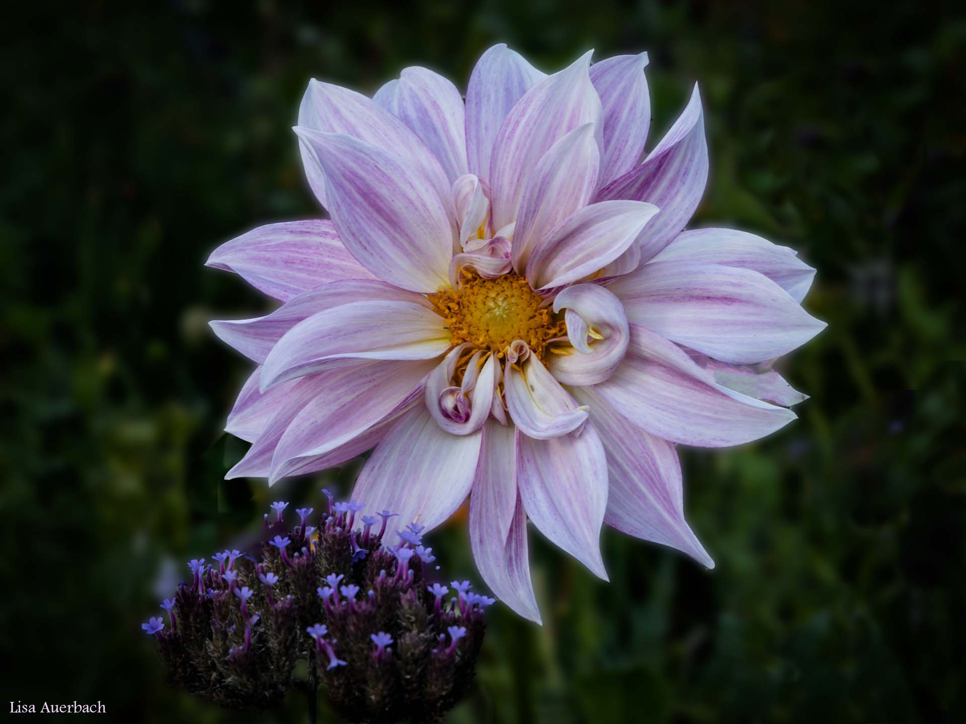
I like both the mono and the one with color. Good shots, both. |
Aug 19th |
| 52 |
Aug 17 |
Comment |
Good suggestions on the wings. I'll play around with it.
Thank you. |
Aug 9th |
| 52 |
Aug 17 |
Comment |
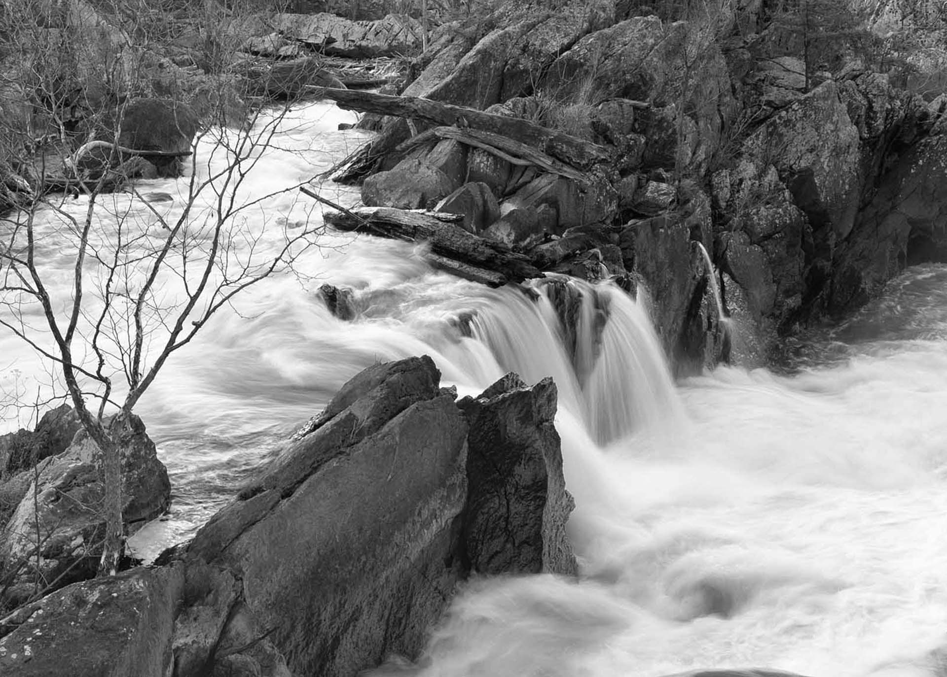
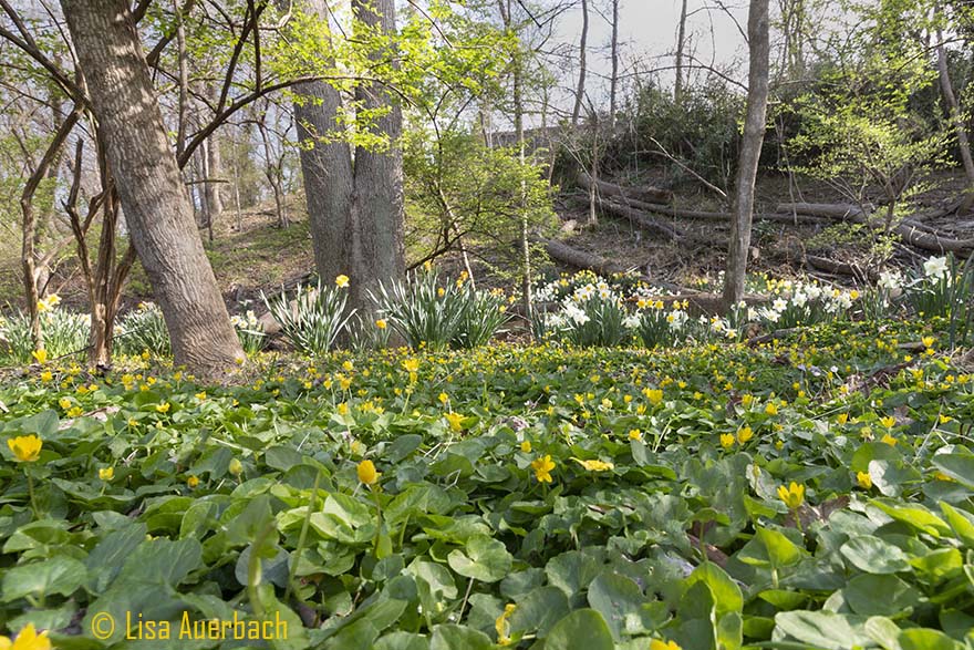
Well done. I would like to see the monochrome. I think you have caught the texture of the slope quite well. A bit of contrast would accentuate the curves; however this is a good image as is. |
Aug 8th |
| 52 |
Aug 17 |
Comment |
I like your suggestion of submitting the original as it shows such a difference.
I do like your composition and clarity of shot with catch light in the eye. I am torn between the amount of yellow added to the second image. For me there is only a tad too much. That is quite a subjective idea because I am partial to green more than yellow. |
Aug 8th |
| 52 |
Aug 17 |
Comment |
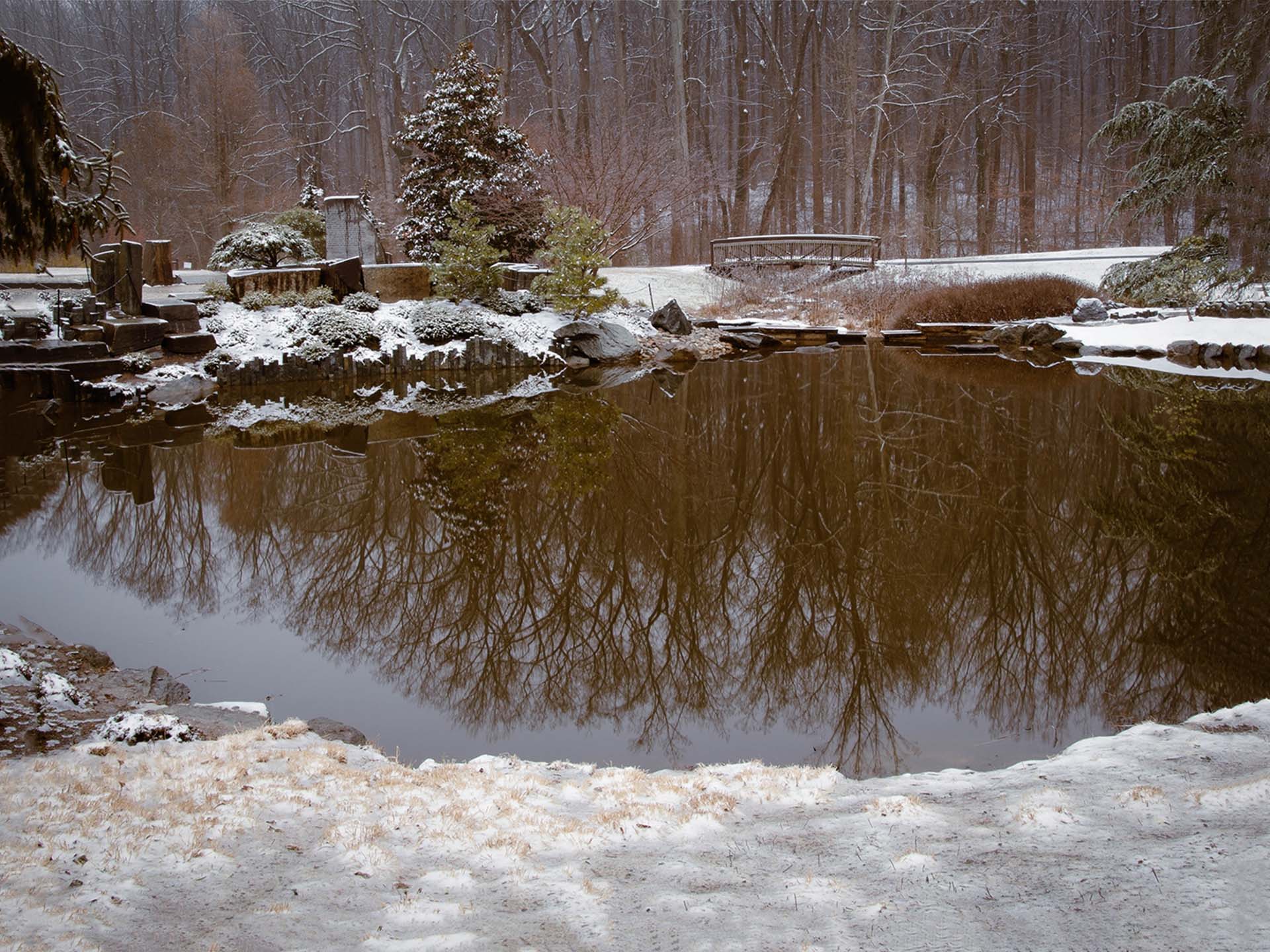
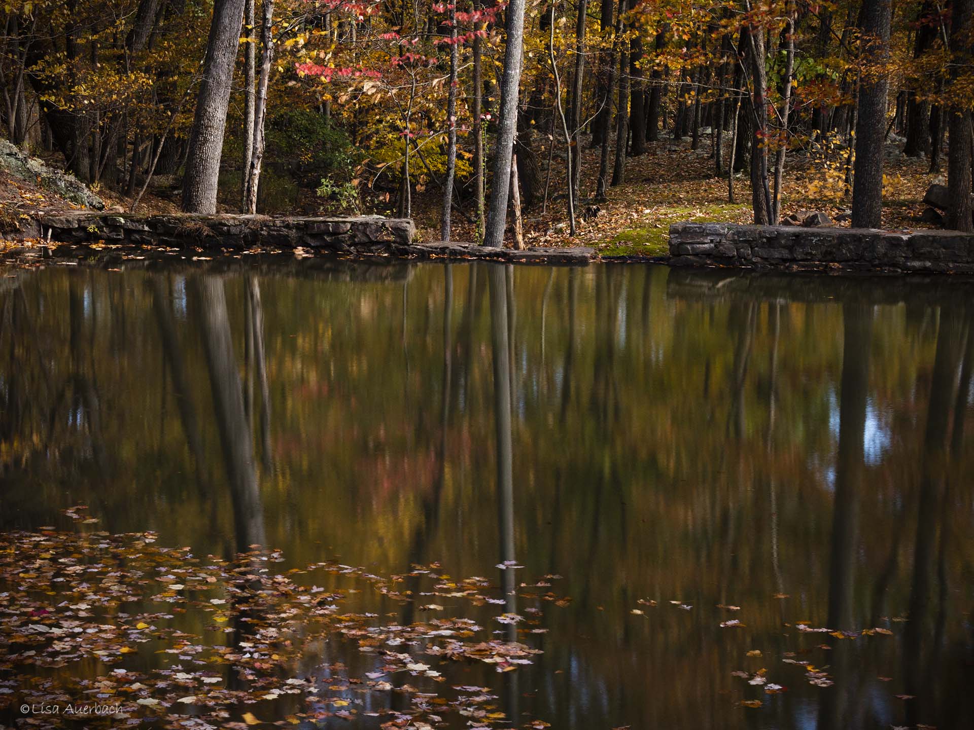
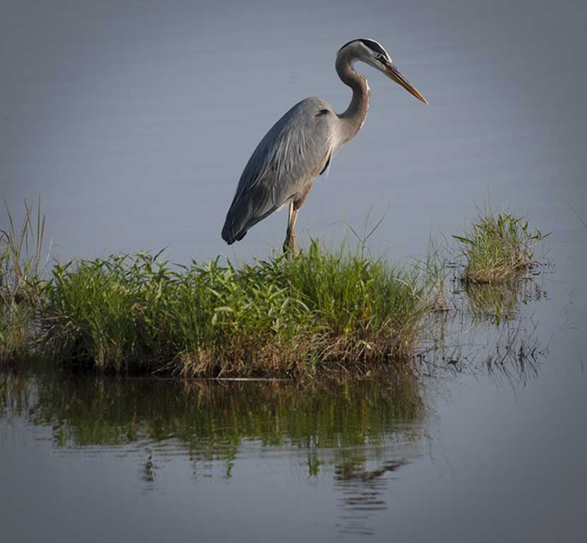
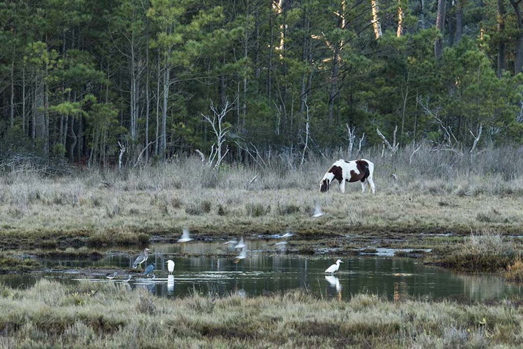
My eye first went to the vegetation and then I noticed the eagle. There is too much competition at the top of the image to make this work. I think that a bit more color in the bottom would make the reflection stand out.
If you are trying to compensate for too much foliage I wonder what would happen if you made the vignette backwards: white at top and contrast at the bottom?
|
Aug 8th |
| 52 |
Aug 17 |
Comment |
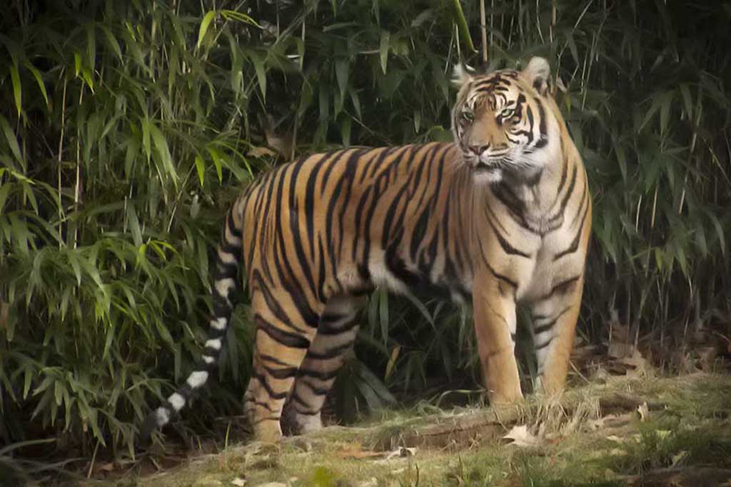
You manipulated background highlights quite well so the focus is on the beautiful tiger. I like its eyes which have been well shot. The fur is crisp.
The one thing I notice is the feet have been cut off. It would have been nice to get them in the shot. |
Aug 8th |
| 52 |
Aug 17 |
Comment |
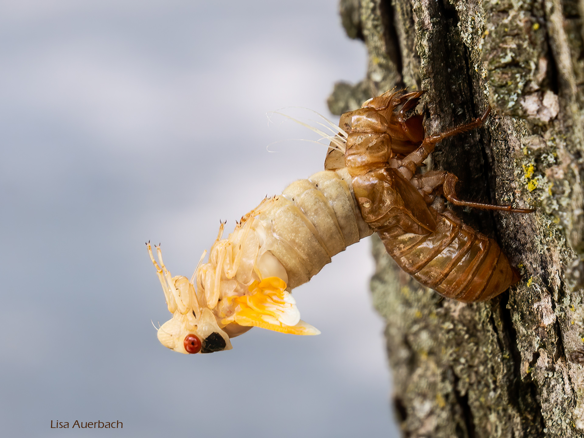
I like what you showed us. The moth blends well with its surroundings. In my opinion the contrast should be greater only in the moth. When I compare the original and the processed I think somewhere in the middle would be right for contrast. On something like this, hand held cameras are not as precise as tripod mounted. In workshops I have been told that a tripod should be used for any shutter speed slower than 1/60. I think you might have needed to hand hold thus might have used a higher ISO/faster shutter speed. |
Aug 8th |
| 52 |
Aug 17 |
Comment |
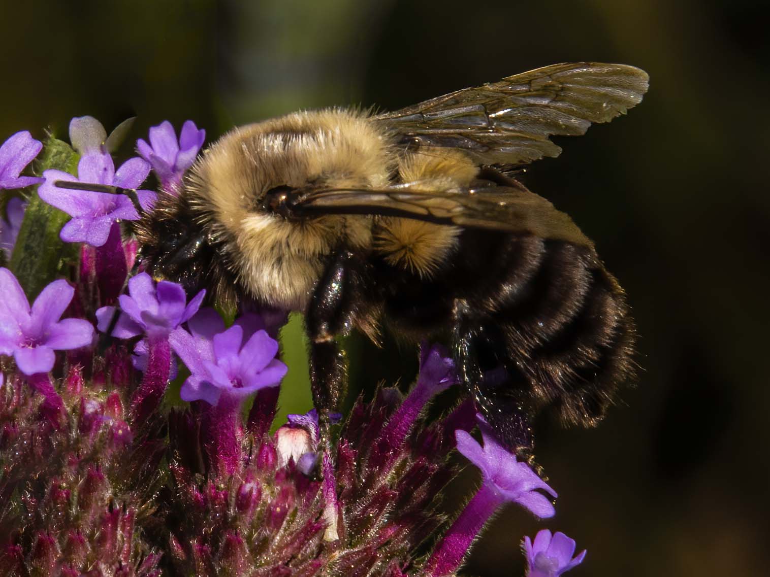
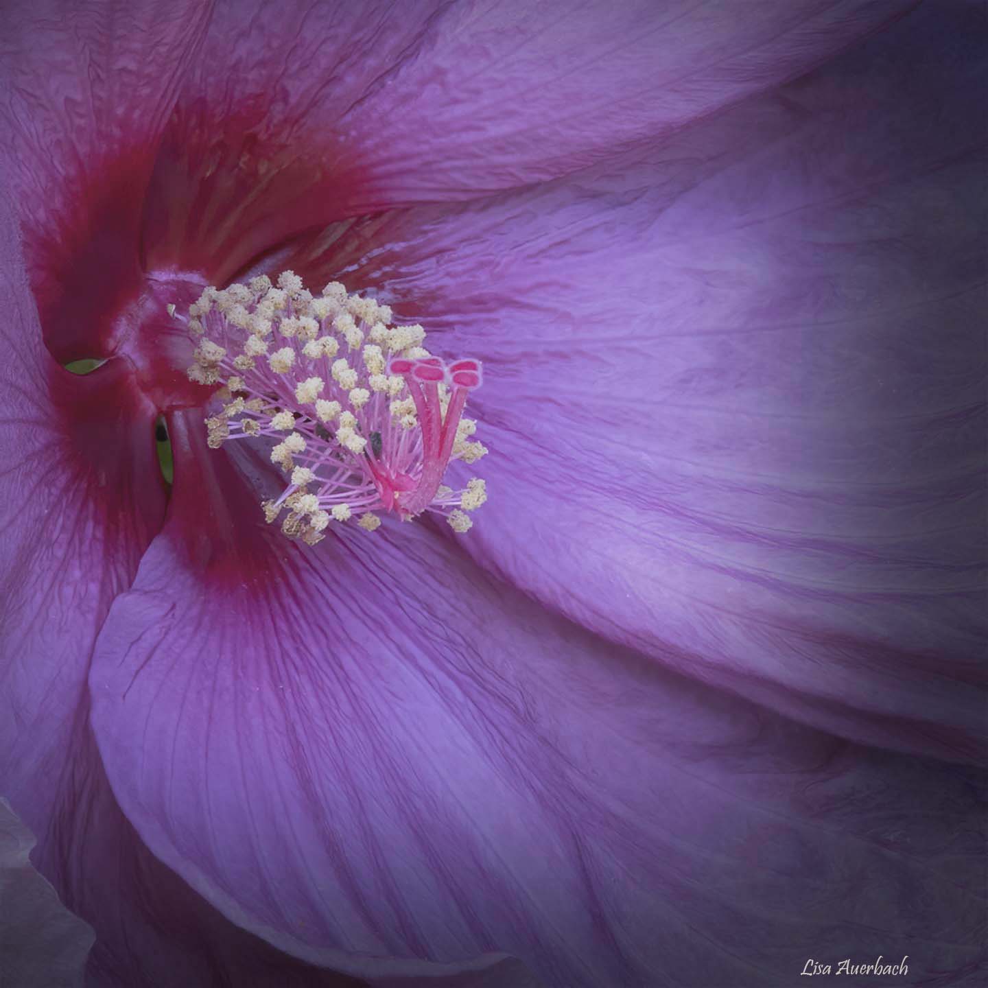
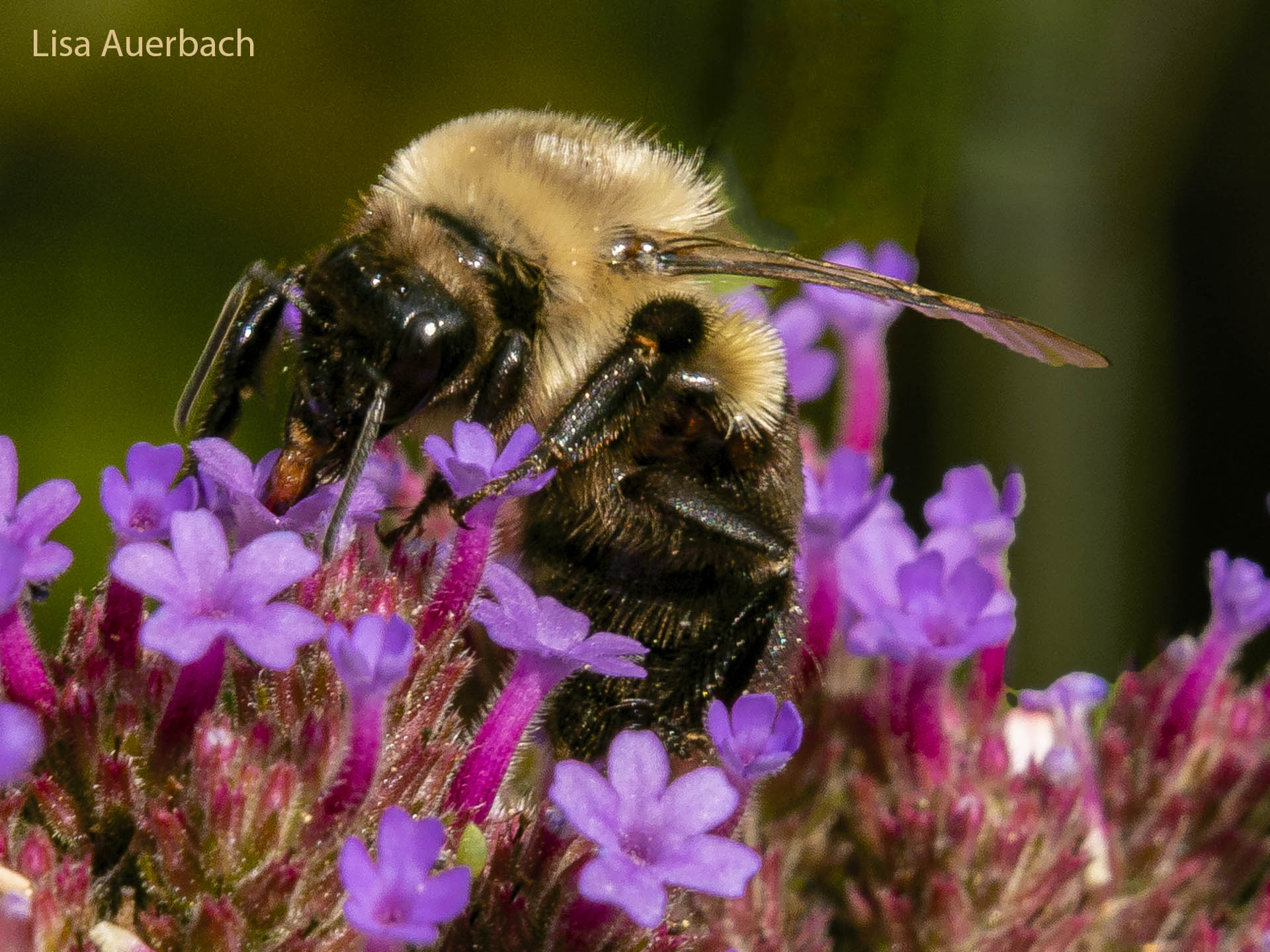
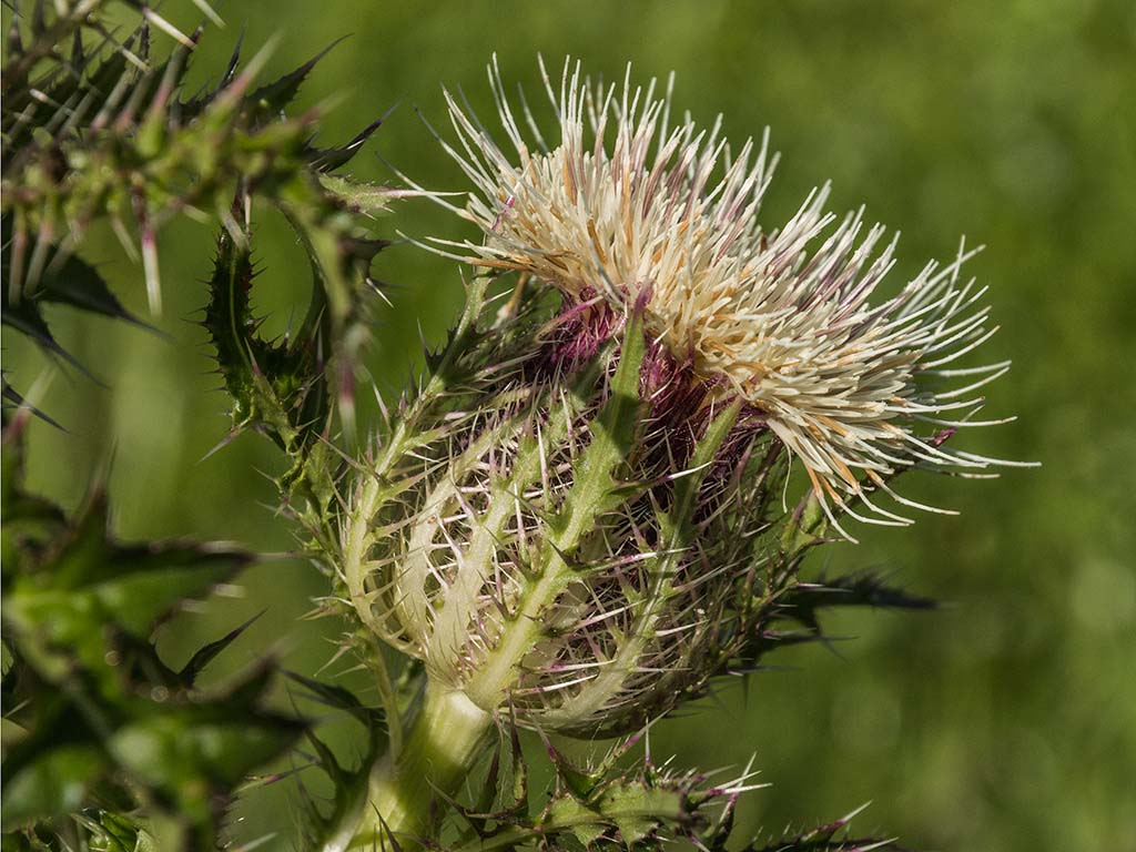
I like this badger, and how grand that you finally found him. The blurred light flowers on the left are distracting. I cropped making this a vertical image and cut out the blurred flowers. That still put the badger's eye on a thirds point. The background purple flowers show in a pretty diagonal adding to the shot. |
Aug 8th |
10 comments - 1 reply for Group 52
|
10 comments - 1 reply Total
|