|
| Group |
Round |
C/R |
Comment |
Date |
Image |
| 52 |
Apr 17 |
Comment |
I like the contrast. Actually I like all three ideas from you, Mike, and me. This is an image with a few possibilities whose score will depend on the mood of a judge on a given night.
However, I'll work on it more and see what I like. These ideas are what make this group fun and provoking, I do think.
|
Apr 11th |
| 52 |
Apr 17 |
Reply |
I like this image. When I first looked at it I tried to crop similarly but found the noise too visible. You did a good job of cleaning up the noise. The duck is more pronounced in this presentation. |
Apr 10th |
| 52 |
Apr 17 |
Comment |
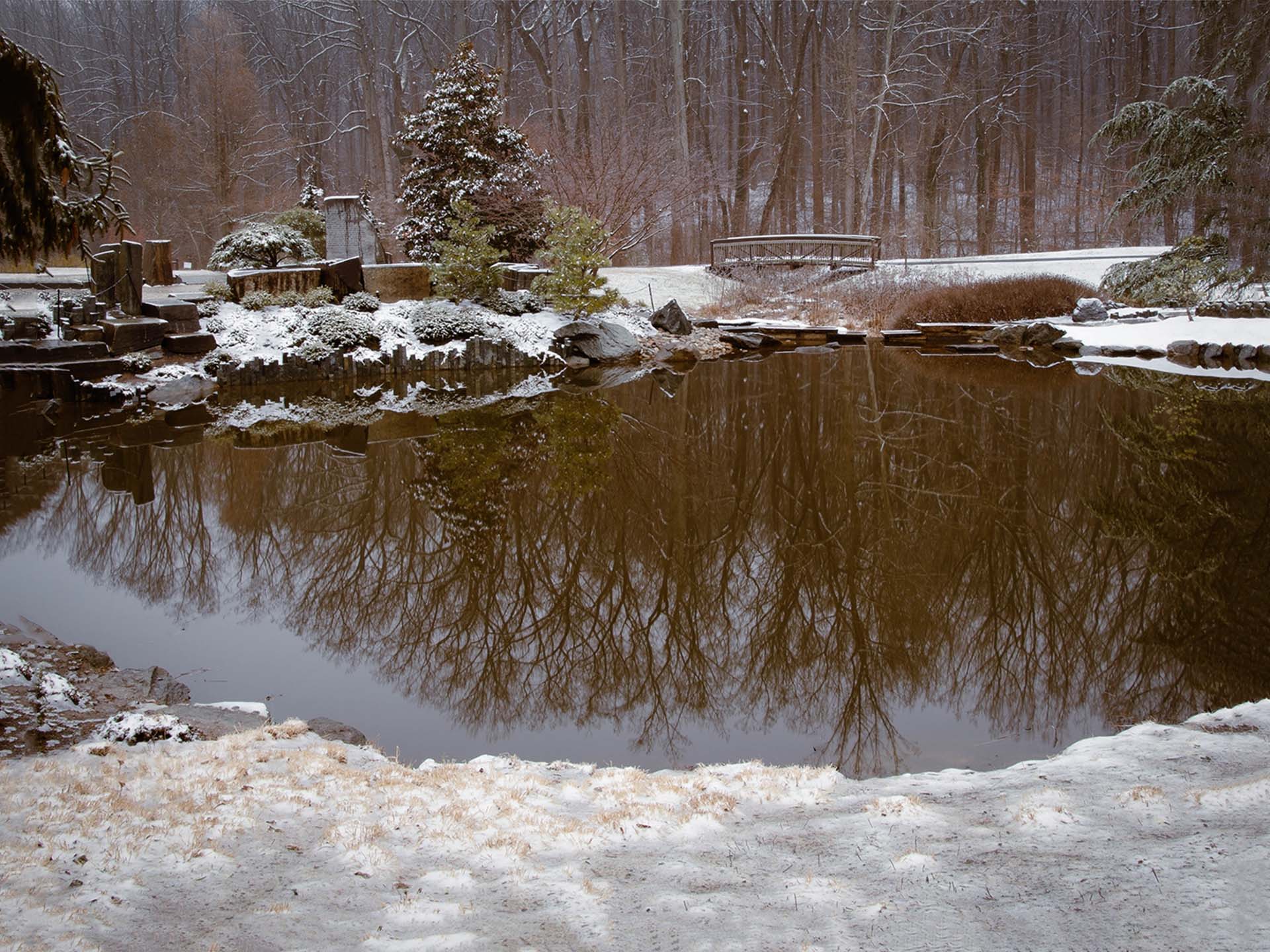
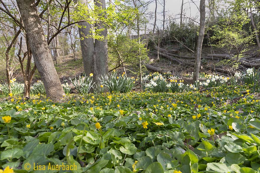
I like the edit although the left side is a bit too bright white for my taste. Taken down a bit would work well. I like the crop and the addition of foreground.
Thank you for your suggestions. I'll rework my image. |
Apr 9th |
| 52 |
Apr 17 |
Comment |
Hmm. Please post so I can see what you did. |
Apr 9th |
| 52 |
Apr 17 |
Comment |
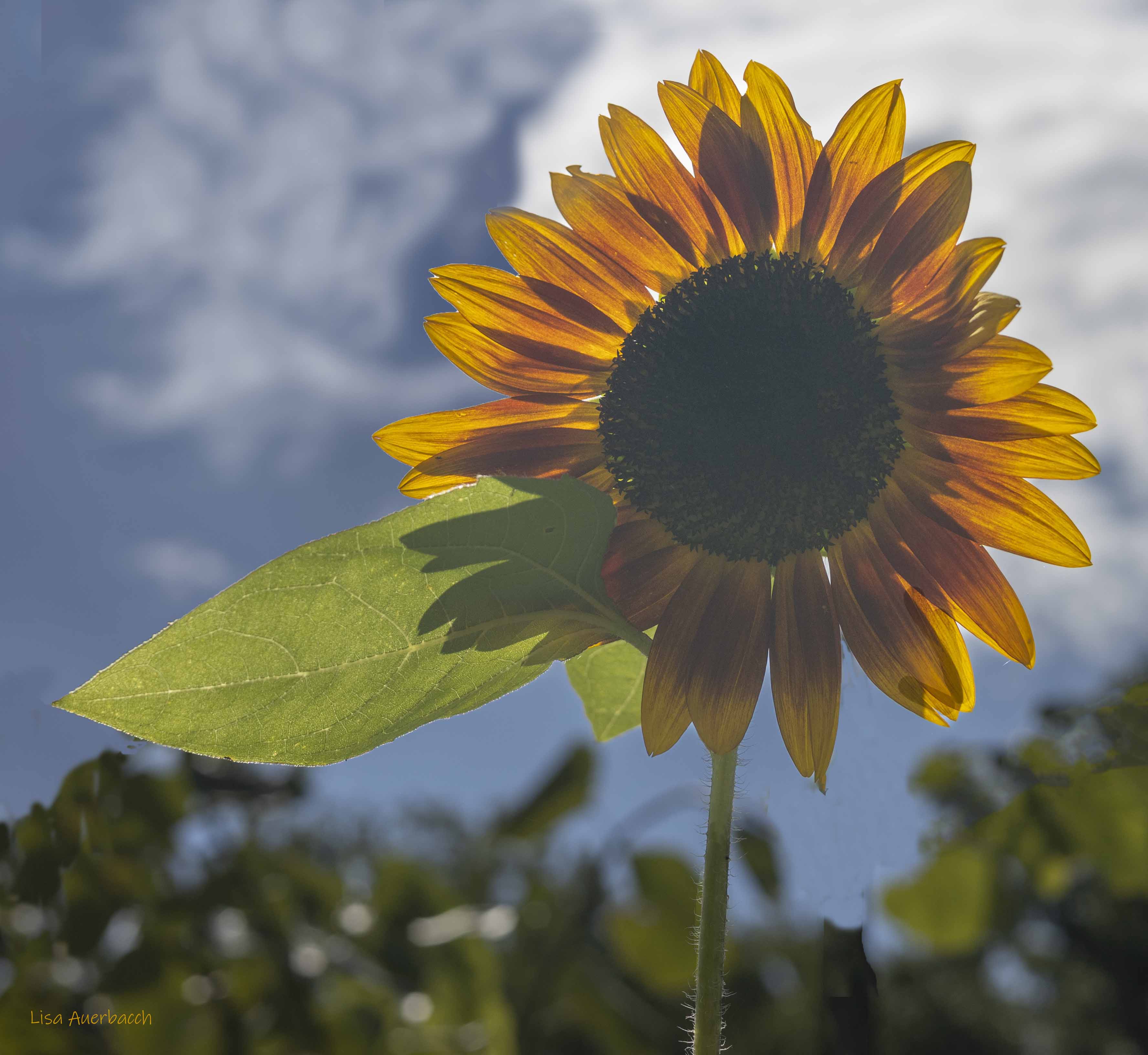
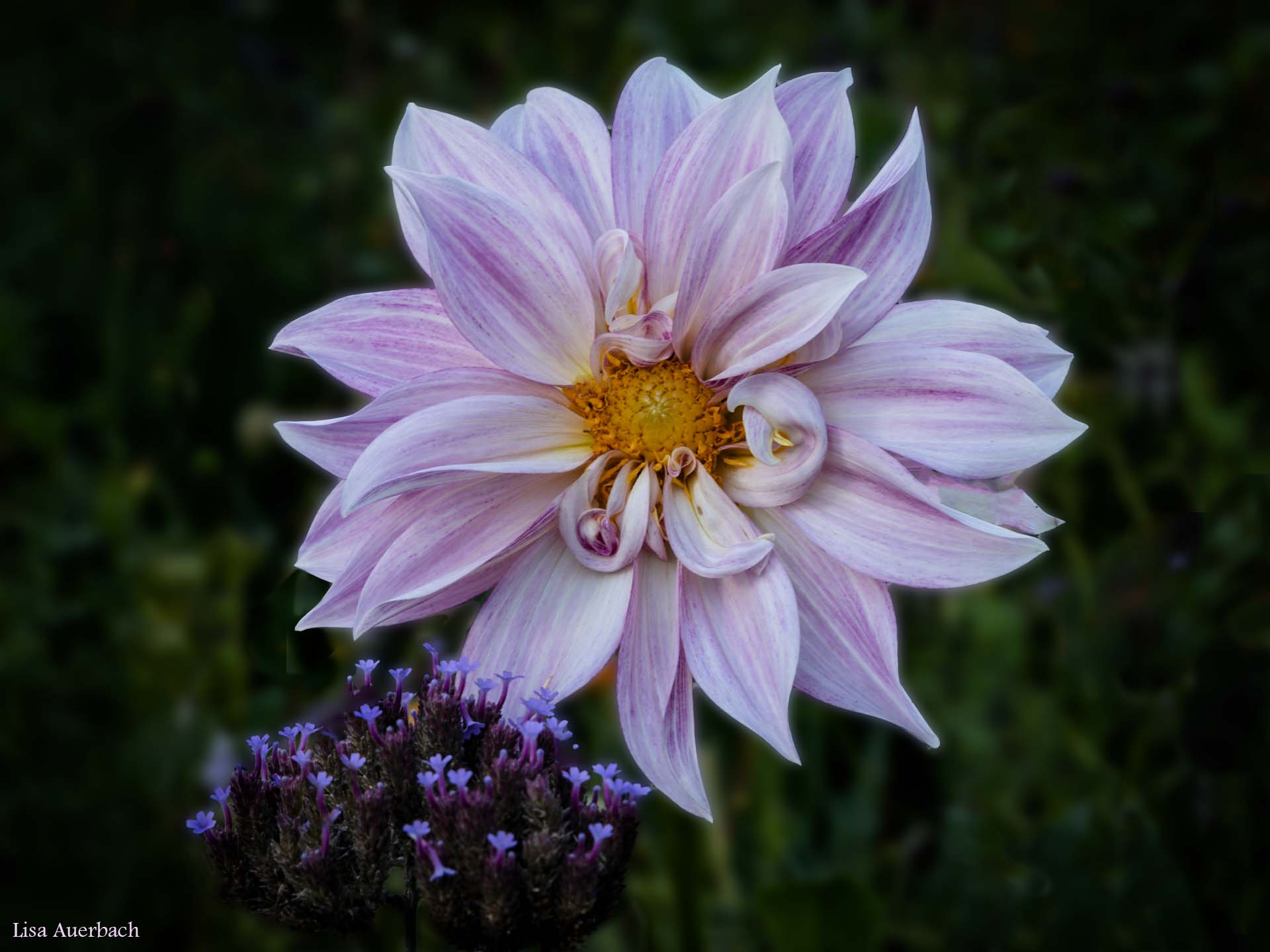
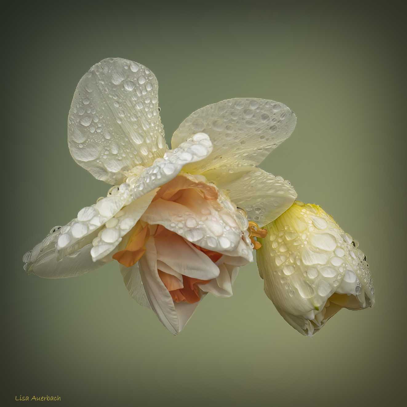
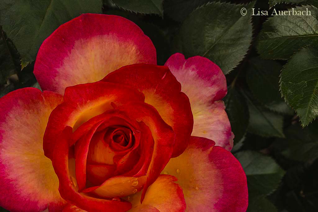
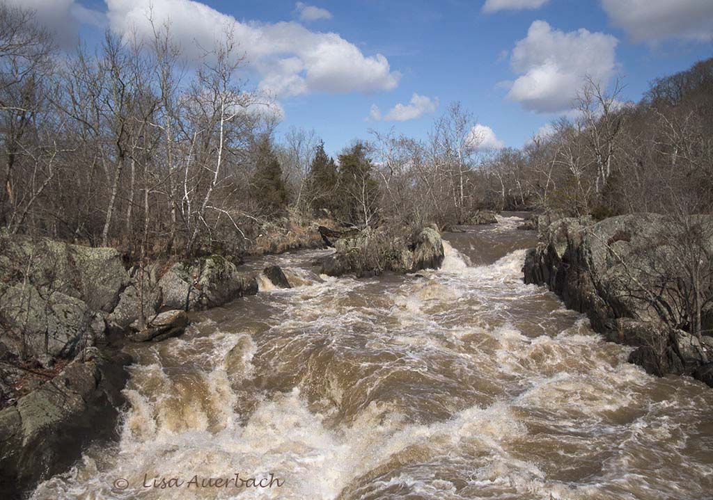
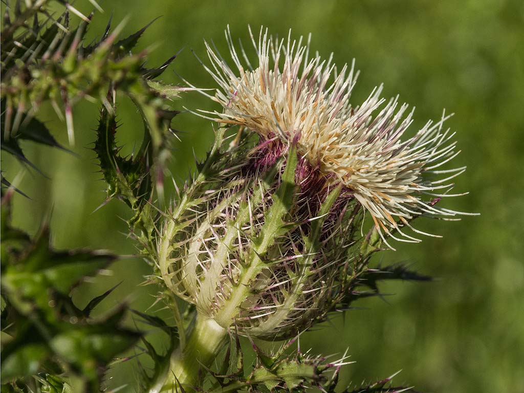
The diagonals of the background mirror the diagonals of the tulip which add good interest.You have many leading lines which do their job well. Water drops always please me, and the one on bottom right is splendid. I wonder if decreasing highlights just a very small amount would give more texture to the whites of the petals. |
Apr 9th |
| 52 |
Apr 17 |
Comment |
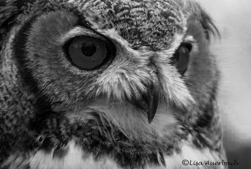
Your image does have an oriental feel to it. The background colors and the wisps of leaves add to the feeling. There is good catch light in the eyes. Mike, your images are usually crisper. In my opinion, the leaves on the end are too soft, and the bird’s feathers are too hot. Might your aperture have been a bit too wide for the leaves or the ISO too high for the feathers? |
Apr 9th |
| 52 |
Apr 17 |
Comment |
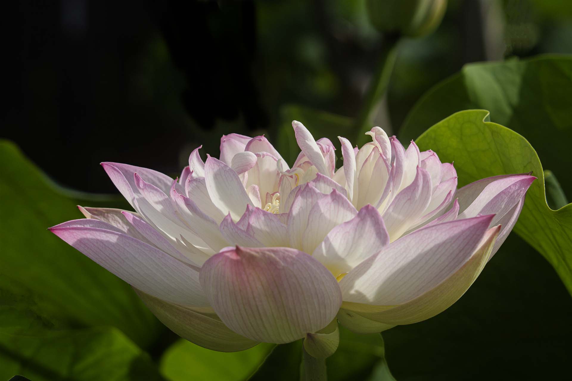
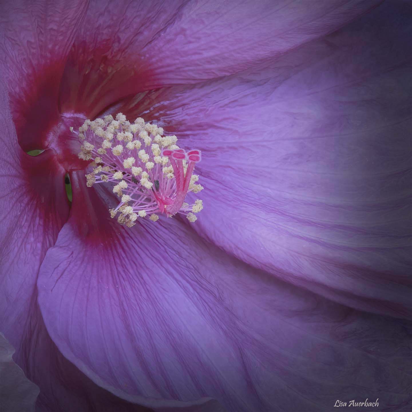
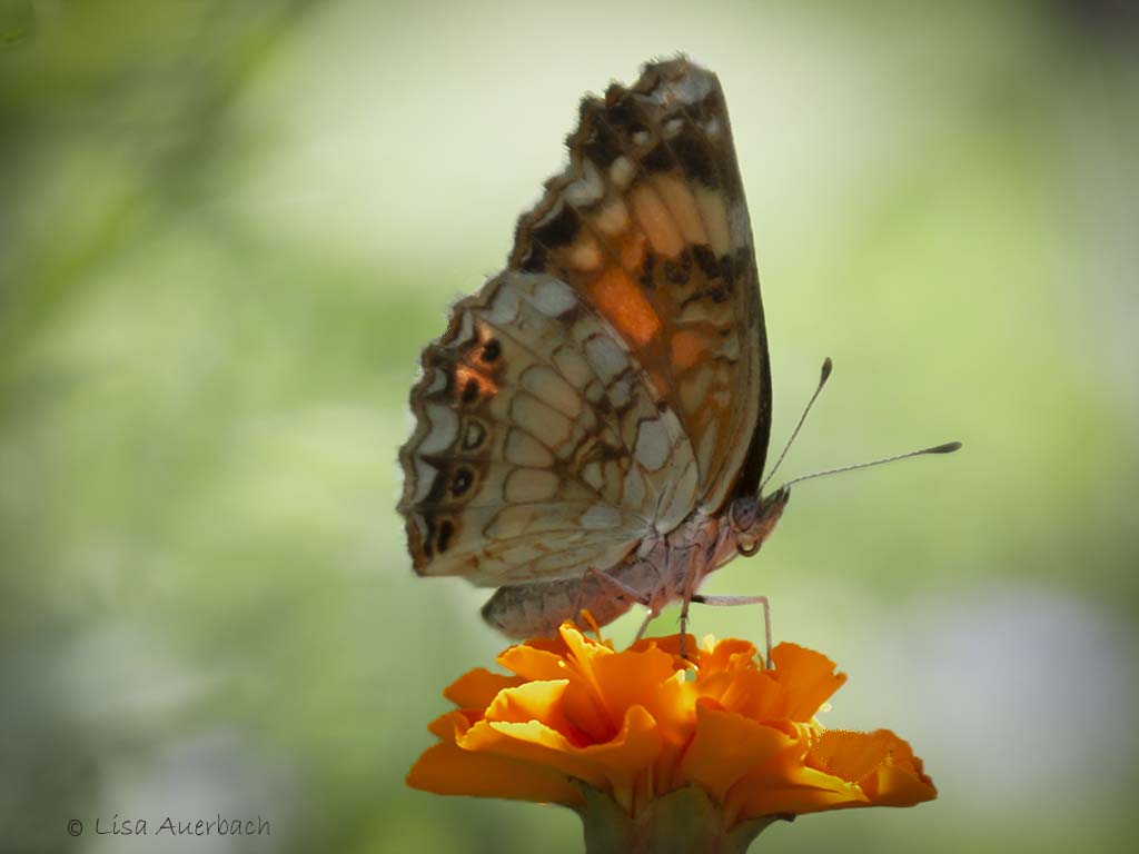
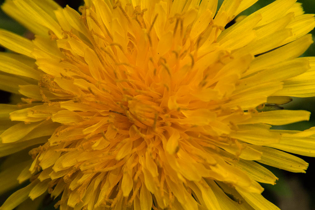
The unusual colors drew me in immediately. I like the textures of your image. My eye travels around the parts. Your background is nicely toned down but the stalk behind the flower holds enough interest that it should be shown. My only suggestion would be to take highlights down. Your picture is a little bright. Otherwise well done. |
Apr 9th |
| 52 |
Apr 17 |
Comment |
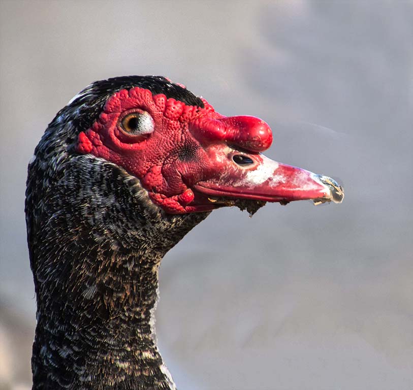
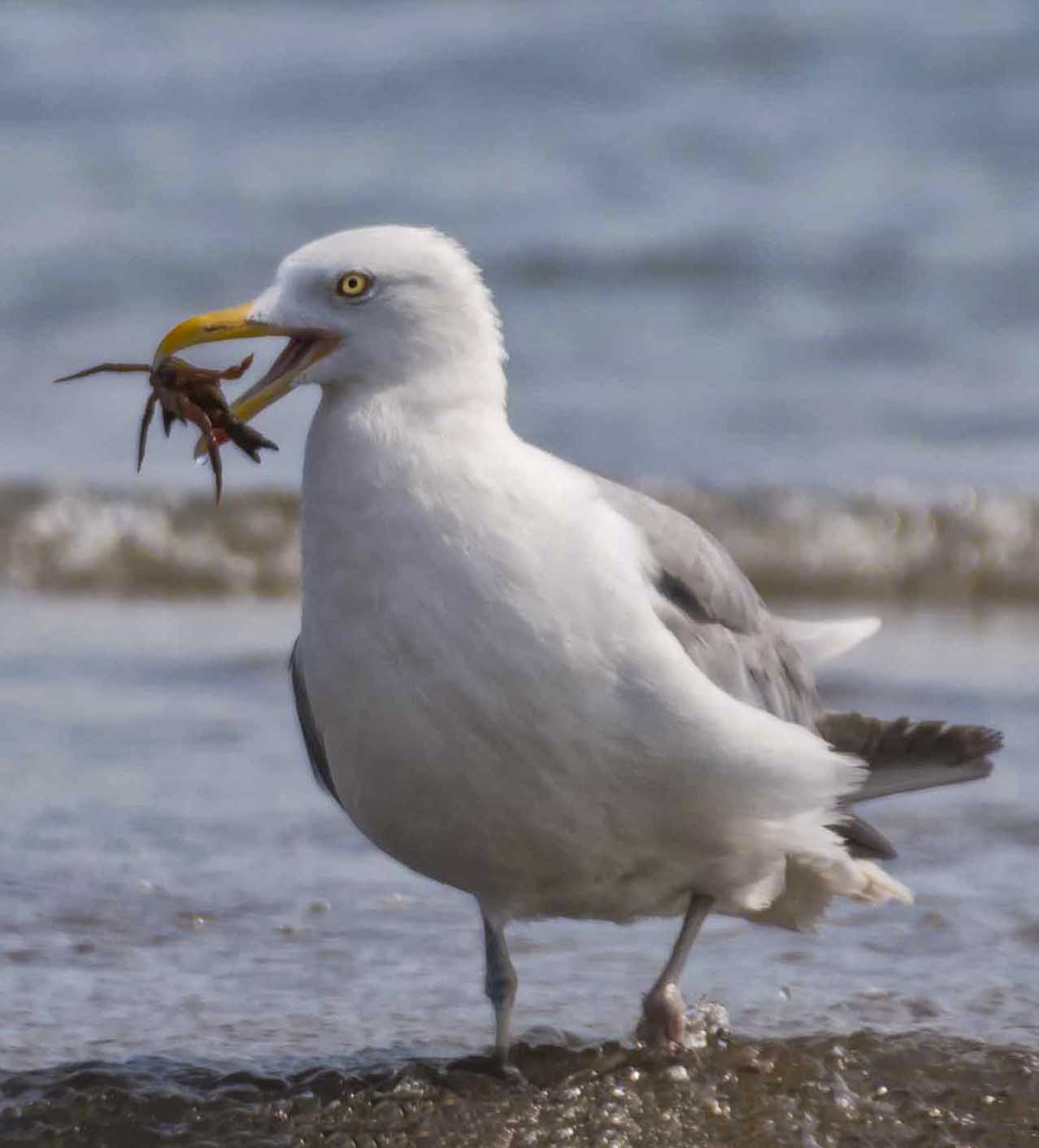
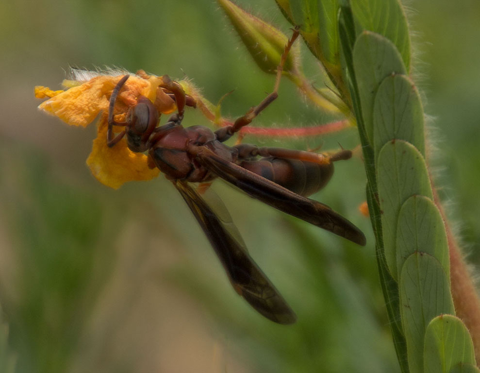
What you have is clear and sharp. The eye is great; colors as well. I am curious why you cropped as you did. I’d like to see more of the bird especially since your feathers have good texture and color. |
Apr 9th |
| 52 |
Apr 17 |
Comment |
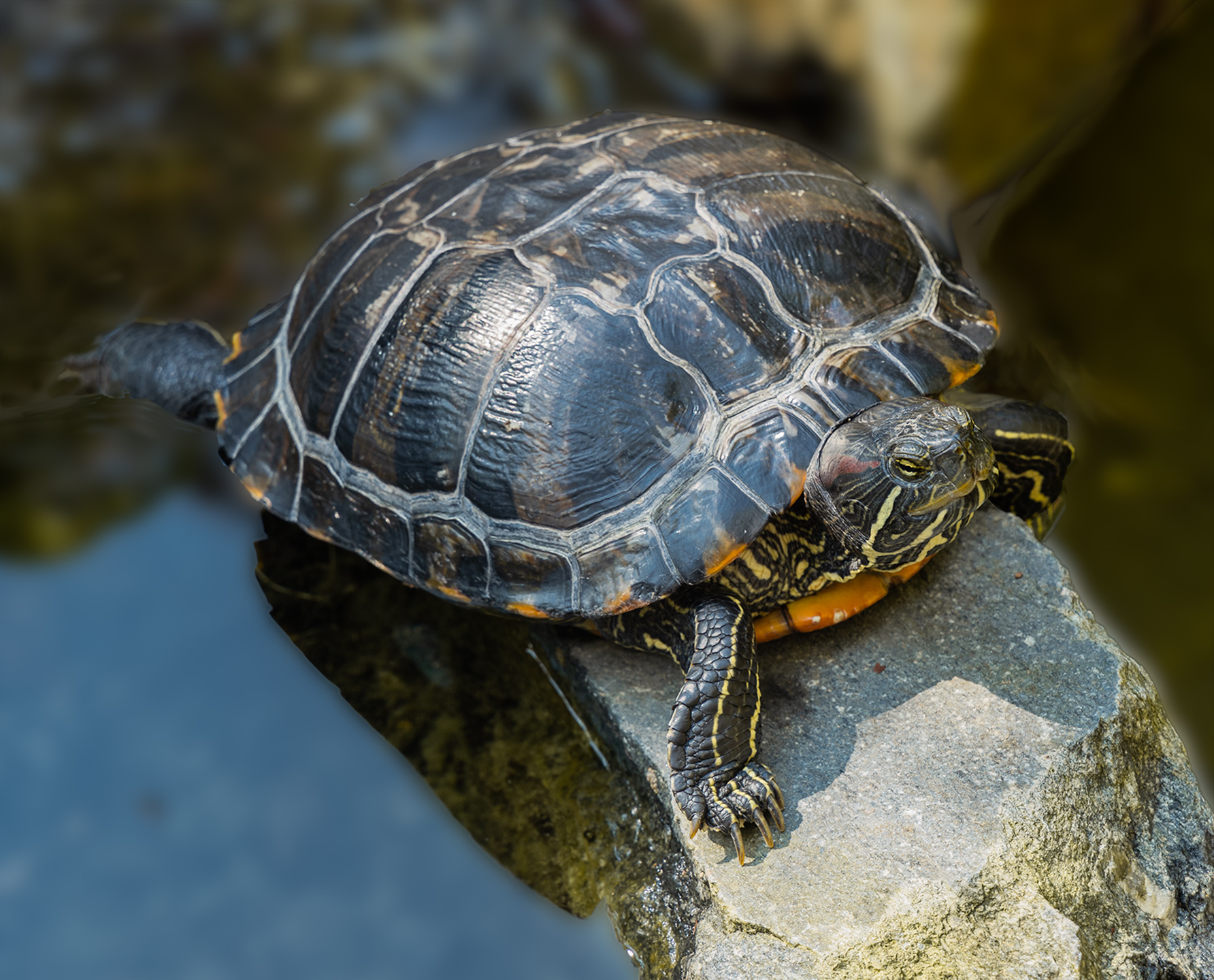
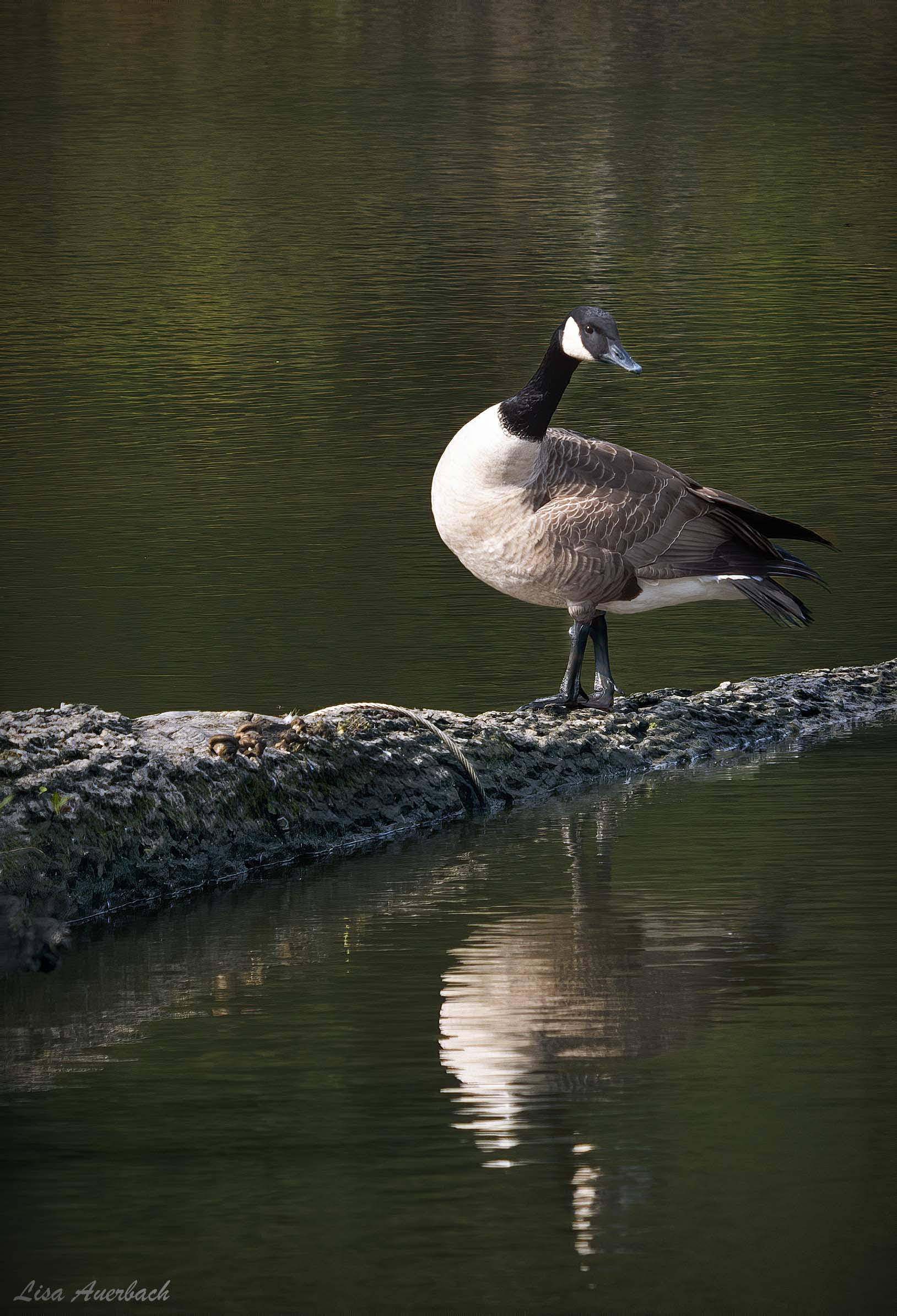
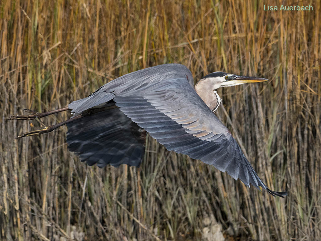
A great bird on a bad hair day. I like those top feathers splayed in different directions. The colors are really good, and the eye has been caught well. I like the calm water and gentle waves. Since I am on the same learning curve as you are with regards to birds, I’m anxious to read what the bird specialists have to suggest. |
Apr 9th |
| 52 |
Apr 17 |
Comment |
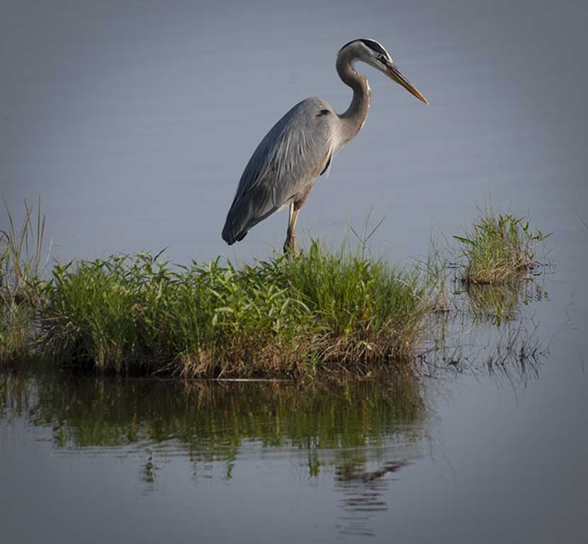
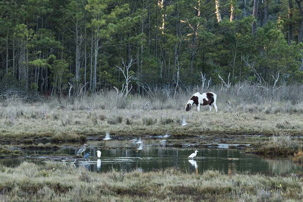
That the crane is walking gives the image a story. It seems to be looking toward where it is stepping. You have good color and catch light in the crane’s eyes. Your colors are true to nature. In my opinion adding a bit more contrast sets the crane apart from its background as well as sharpens that already good eye a bit more. |
Apr 9th |
9 comments - 1 reply for Group 52
|
9 comments - 1 reply Total
|