|
| Group |
Round |
C/R |
Comment |
Date |
Image |
| 41 |
Jan 25 |
Comment |
This is a powerful "less is more" image supported by the fact that we read from left to right. Portraits of strong personalities show the person on the right side of the canvas facing left. As westerners "read" the portrait, their gaze is stopped by the portrait on the right side of the canvas facing left reinforcing the strength of the person in the portrait. That's what you have accomplished here with minimal fanfare. The viewer's gaze peruses where your daughters are going before their interest comes to the girls' entry into the scene on the right at which point the viewer follows their progress toward the window. Quite subtle. Nice work. |
Jan 8th |
1 comment - 0 replies for Group 41
|
| 54 |
Jan 25 |
Comment |
The sharpness of the tower, the beautiful sky framing everything, and Juliet securely leaning over the balcony all combine to make a compelling composite. I think Juliet's hair is a bit of a problem. Peggy's attempt improves it somewhat, but the hair in both images looks like it is being held together with some sort of hair gel: there are no loose ends. Since the hair is a major piece of this image, I feel it should look more like hair. Everything is top notch. |
Jan 13th |
| 54 |
Jan 25 |
Comment |
Your imagination is matched by your technical skills in this composite. The shadow on the left side of the original presents a problem, but you solved it beautifully. Using the mirror image technique works equally well with the building in the background and with the sky. The angel's shadow gives the angel 3-dimensionality, and putting the cracks in the stairs adds a Greek myth aspect to the overall scene. One almost feels sorry for the fallen angel's losing its head, a delightful imaginary touch. Very nice work. |
Jan 11th |
| 54 |
Jan 25 |
Reply |
Thank you for your feedback. Your observation about the stairs is the one sticking point I had about the image. I was really torn between the original color and the one I finally chose. I felt the final color offered more separation from the arch in the foreground. |
Jan 8th |
| 54 |
Jan 25 |
Comment |
This is a terrific blending job. The individual parts merge together seamlessly to produce palpable energy. Using only 2 colors is the glue that helps hold all of the pieces together, and the bright spots are placed judiciously in the image to draw the viewer's vision around the canvas. Nice work. |
Jan 6th |
| 54 |
Jan 25 |
Reply |
I hope what is beyond death is as comforting as your image. I find "Ad Astra" a bit harsh. |
Jan 6th |
| 54 |
Jan 25 |
Reply |
Thank you for your observations. You read my mind as you did in November. |
Jan 6th |
| 54 |
Jan 25 |
Reply |
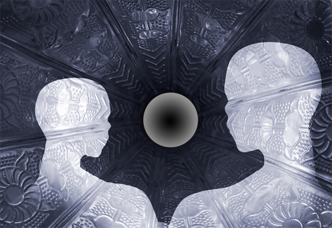
Kirsti, The simplicity and direct approach of the black & white image focuses the viewer on the "ghosts" in their environment. The sharp tones in the color version focus attention away from the mannequins and, as you say, are too restless. The gramophone is a terrific background on which to place your transparent "ghosts." There are alternatives to Brad's Milky Way. I placed a Radial Gradient in the center of the gramophone to see what it would look like. There are many options with Gradients, and this one is not the best, but it's a solution to explore. You have a good composite here. |
Jan 2nd |
 |
| 54 |
Jan 25 |
Comment |
Even if the title did not suggest a dream, the image certainly does. The confluence of your variety of colors is a pastel wonderland and brings a smile to the viewer's face. The impact of these colors mutes the impact of so much white in the image. I wonder if the "dream" would work as well without the "snow." We haven't had a major snowstorm in the northeast U.S. yet, but I'll think of this pastel wonderland when I'm carefully walking in the snow to my car. |
Jan 1st |
| 54 |
Jan 25 |
Comment |
Black and white works well in this image because there are strong, distracting colors in Originals 1 and 2. The rugged wall over which the water falls adds strength to the bottom 60% of the image. The man at the top of the waterfall is a stronger image than the people at the bottom of the waterfall, and I believe is the only person necessary here as the people at the bottom are too small to add anything. Your fascination with water continues to result in enjoyable images. |
Jan 1st |
5 comments - 4 replies for Group 54
|
6 comments - 4 replies Total
|


