|
| Group |
Round |
C/R |
Comment |
Date |
Image |
| 54 |
Jun 24 |
Reply |
Thank you for your comments. I try to stay away from reality as much as I can. We seem to be on the same page. |
Jun 23rd |
| 54 |
Jun 24 |
Comment |
What usually happens in this group is if one is late to make comments, all of the observations have been covered. Personally, I usually don't look to create stories in my composites or look for stories in others. I generally try to create emotion, such as disequilibrium, in the viewer. You have done that here. It doesn't matter if the woman has been kidnapped and left there or came to the waterfall to commit suicide, the emotional reaction of the viewer takes precedent. Thank you for the Photoshop tips. I'm always looking to learn more. |
Jun 14th |
| 54 |
Jun 24 |
Comment |
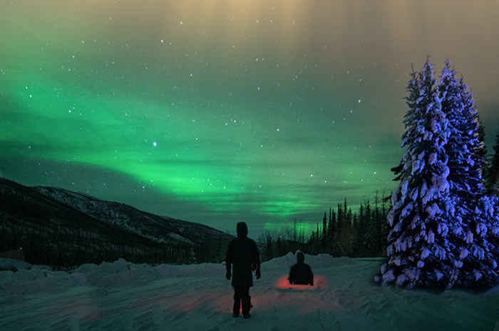
Obviously, there's a lot of food for thought, here. I think the bumper sticker philosophy for this composite is "If it ain't broke . . . ." The colors are masterfully blended as usual and fit the scene perfectly. The snow covering throughout the image, including on the trees, communicates COLD very well. In spite of the bumper sticker adage, there are a couple of (rough) changes I took the liberty of making. I straightened the trees and moved the red hole so a figure could emerge from it. I went for the mysterious by adding the second figure. The basic original composite works well as a backdrop for future musings. |
Jun 14th |
 |
| 54 |
Jun 24 |
Comment |
The original image is such a beautiful photo that it's hard to alter it without taking away from that beauty. I believe that K.I.S.S. is a corollary to "Less is More." I feel the window is too strong. I envision your original image framed on the bottom by the snow on the window and only an additional gentle light snowfall throughout the rest of the image. That would keep it simple and create a loving winter scene. Your original is certainly a base to build on. |
Jun 9th |
| 54 |
Jun 24 |
Reply |
Thank you for your observations and for introducing me to a new word. I did include the subject's shadow on the ground at first, but it broke the symmetry of the line of umbrellas (brollies) and their shadows. As this is an image of whimsy, I chose symmetry over reality. |
Jun 9th |
| 54 |
Jun 24 |
Reply |
We all need a bit of whimsy at one time or another. I'm happy you enjoyed this touch of whimsy. |
Jun 6th |
| 54 |
Jun 24 |
Comment |
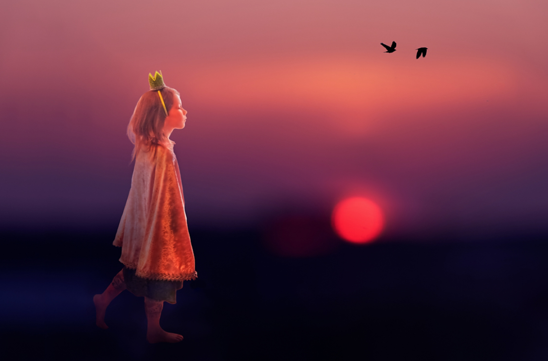
What a provocative image. Everyone who sees this will see something different. The colors are terrific because (1) they are a bit other-worldly, and (2) they seem to support the princess as if she is floating. There is a theory of thirds in creating images that says that the focal point should be at one-third of the "canvas." I'm not shy about breaking rules, but in this case, you have placed the princess at what seems like the one-third point, and it's quite powerful. As I am a "less is more" disciple, I would make 2 changes. The scepter seems to be in an awkward position even though she is sleepwalking. I am also distracted by so many birds. The 2 main birds are strong enough to make the point. I've taken the liberty to attach an image with those changes. Provocative images are especially stimulating. |
Jun 5th |
 |
| 54 |
Jun 24 |
Reply |
Thank you for your observations. We're on the same page. I used the woman in a different composite years ago which required her to walk down floating pieces of a chess board. I like your yellow better. |
Jun 5th |
4 comments - 4 replies for Group 54
|
4 comments - 4 replies Total
|