|
| Group |
Round |
C/R |
Comment |
Date |
Image |
| 54 |
Dec 23 |
Reply |
Please see my reply to Maria. |
Dec 15th |
| 54 |
Dec 23 |
Reply |
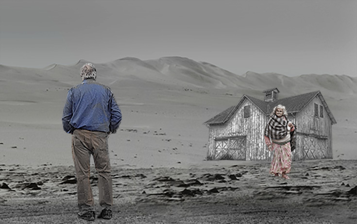
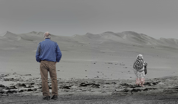
Here's another version based on your and Kirsti's feedback. As per your suggestion, I made the woman less sharp, but I may have gone a bit too far. As per Kirsti's suggestion, I removed the house. In response to both of your comments, I moved the man to the left and cropped the whole image because the house is gone. The image is no longer so crowded, but I left the barn for context. I feel the image has potential based on the 3 observations I've received so far. I'm always grateful for thoughtful feedback such as I've received so far. |
Dec 15th |
 |
| 54 |
Dec 23 |
Reply |
I'm sure the reaction will be positive. |
Dec 11th |
| 54 |
Dec 23 |
Reply |
I was hoping that the buildings would provide some context for the reunion, i.e., a son returning home to his mother and the home he left after a terrible argument. With no context, I feel it's just two strangers crossing paths. |
Dec 11th |
 |
| 54 |
Dec 23 |
Comment |
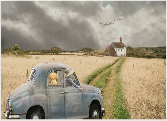
You have combined all of your elements masterfully. The placement of the car draws the viewer into the image because it's on the beginning of the road to the church. The birds help the viewer focus on the end of the car ride, and the driveway connect the two. The soft colors say "look at me" very gently. My camera club's judges have trained me to look for opportunities to crop so I have done that to your wonderful image. I've also reduced the white frame to what Photoshop calls a stroke (Edit > Stroke). This is a warm, welcoming image. Nice work. |
Dec 11th |
 |
| 54 |
Dec 23 |
Comment |
It's a shame Leonardo didn't know your daughter. Your blending skills, which are numerous, did the trick in placing your daughter's face on the original. I prefer the background in the original, but I might be picky about that. The hand with the painted nails is classic! Send a copy to the Louvre. |
Dec 11th |
| 54 |
Dec 23 |
Comment |
Light painting is a fun, frustrating endeavor. I only see fun here which I hope is what you are after. You did the hard work so the viewer can complete that work with his/her imagination. The colors on the black background work quite well. The only improvement I can think of is to put a white border around the composite to separate it from the black background that is not a part of the image. In Photoshop, Edit > Stroke will do the trick. |
Dec 11th |
| 54 |
Dec 23 |
Comment |
I find the original image such a wonderful photo it's hard to imagine adding anything to it. My first thought was to move the beak to the outside of the wing, but you beat me to it. The little boy in the movie "Sixth Sense" saw dead people. I see faces in your gems, which is distracting. I wish I could be more positive about an image you worked so hard on, but I like the original image so much I can't help but think "if it ain't broke, don't fix it." |
Dec 11th |
| 54 |
Dec 23 |
Comment |
This is a very creative composite. The woman works very well as the flower and the green arms complement the stem to complete the flower image. I do have a couple of suggestions. Judges who critique my camera club competitions often say take a "walk" around your image to find places that could be improved. Here's what I found on my "walk." The head(s) of the flower look pasted onto the stem because there's a definite border where the heads rest. Since they are on a separate layer, you can use a Layer Mask to soften the place where the heads meet the hand, eliminating the cut-and-paste look. 3 of the 4 arms are slanted as a flower might be slanted, but the 4th arm is straight and looks detached. These are easy fixes for an image definitely worth fixing. |
Dec 11th |
5 comments - 4 replies for Group 54
|
5 comments - 4 replies Total
|