|
| Group |
Round |
C/R |
Comment |
Date |
Image |
| 41 |
Nov 23 |
Reply |
Thank you so much for taking the time to explain all of your steps. I can't wait to try them. |
Nov 7th |
| 41 |
Nov 23 |
Comment |
I visit your work often, and I commented on your April image partly because that image seems to use the same technique. You have a similar look in your August entry as well. I am so taken with that tone mapped quality of this image, that I had to write and ask how you achieved that look. It really draws the viewer into your scene. Please share your technique. |
Nov 2nd |
1 comment - 1 reply for Group 41
|
| 54 |
Nov 23 |
Reply |
Thank you for your positive feedback. |
Nov 18th |
| 54 |
Nov 23 |
Reply |
Is it too much of a cliche to have the surfer coming out of the pitcher? |
Nov 14th |
| 54 |
Nov 23 |
Reply |
Thank you for taking the time to provide so much feedback. I looked at the ceiling and saw that on my computer that it is not too bright. If I cropped the ceiling, I would come dangerously close to the hanging light. The people who judge competitions for my camera club emphasize "cropping" ad nauseum. I always wrestle with the idea of cropping and how much a part adds to the overall image, especially in landscapes. It is probably an age-old discussion, and we'll just have to learn from it as we go. |
Nov 8th |
| 54 |
Nov 23 |
Reply |
Have fun! |
Nov 8th |
| 54 |
Nov 23 |
Reply |
I'll look for it today. |
Nov 7th |
| 54 |
Nov 23 |
Reply |
Thank you! |
Nov 6th |
| 54 |
Nov 23 |
Reply |
There is not a common preset because each image requires different treatment. I call my method my "witch's brew." I start by sharpening the image before using a complicated sequence in Adobe Camera Raw to make adjustments. Once I've accepted ACR's adjustments, I apply Nik Software's Color Efex Pro 5's "Detail Extractor," "Tonal Contrast," and "Pro Contrast" in that order. I once wrote down my Witch's Brew. I'll see if I can find it and email it to you if you like. |
Nov 5th |
| 54 |
Nov 23 |
Comment |
This is a very good shot of a surfer even if he is added. I, too, have had an image of a surfer hanging around, but I haven't felt motivated to revisit as you can see below. I feel from your "About the Image" comments that you realize that the bust does not belong here. The cloud above the surfer is such an eye-catching cloud that perhaps you can have the surfer surfing out of the cloud in its present position over the crashing waves. The right 40% of this image really draws the attention of anyone looking at it. The mantra of the judges who judge my camera club's competitions is "crop!" You certainly have an image with great potential. |
Nov 5th |
 |
| 54 |
Nov 23 |
Comment |
Your image certainly embodies the Halloween spirit and communicates the enjoyment you experienced putting this together. Compared to your previous 4 or 5 composites, though, this is a bit too commercial. I've always felt that creating an artistic Halloween image is very difficult because we are inundated with so many such images every year over an extended period of time. I try to stay away from Halloween composites. As a high school English teacher, I always cringed internally whenever a student said he/she really liked the essay he/she was handing in. It almost always meant they were not objective about their writing. This is why we all joined this group--to get an objective opinion rather than relying on our emotionally involved opinion. Revisit your recent entries, compare them to this image, and I feel you'll see the difference. |
Nov 5th |
| 54 |
Nov 23 |
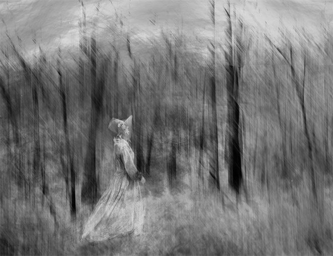
Comment |
Thank you for sharing your technique in such detail. Robert Frost was attracted to the woods because they were "dark and deep," but he couldn't stay. I grew up in a neighborhood surrounded by woods, and I DID have time to walk into those "dark and deep" forests. Your technique is masterful, and you seem to have accomplished what you set out to, but as you can see from my rendition of your image, I see woods differently. Just a personal reaction coming from a different point of view. |
Nov 5th |
 |
| 54 |
Nov 23 |
Comment |
This is very reminiscent of your October entry though your husband is not a ghost. I like the fact that you're exploring an idea. Good things come from exploration. October's composite does not require an explanation, though you offer a little background that does not impact the image. Here, however, you tell the viewer what he/she should be seeing. That's the job of the image. This could be a picture of me the day I went to take pictures of birds at a wildlife preserve and forgot to return the flash drive from my computer to my camera. Keep exploring and let your final image tell the story. Your images do tell good stories. |
Nov 2nd |
| 54 |
Nov 23 |
Comment |
The stairs make a good place for these boys to skateboard, and the boy in the middle of the stairs works very well. His balance is good for where he is, and he does not look cut-and-pasted. Judges who comment on the photos at my camera club competitions always caution us to "walk" around the photo with our eyes after we think we have a final product. The following comments are the result of my "walk." The boy lying on the floor is too small. Compare him to the boy in the blue shirt. The boy in the blue shirt has a good skate-boarder pose, but it looks like he came down the stairs backwards. Is that possible? Look under the raised arm of the boy in the blue shirt. There's a woman in the background that might be distracting as the focus should be on the skate-boarders. You have a good idea, here, with the stairs, but you have to take that "walk" the judges always talk about. |
Nov 2nd |
5 comments - 7 replies for Group 54
|
6 comments - 8 replies Total
|


