|
| Group |
Round |
C/R |
Comment |
Date |
Image |
| 54 |
Jul 22 |
Reply |
I agree. This is an image that should be revisited. Even if you can't make this image match the image you have in your mind, working on it will be very informative. Good luck. |
Jul 28th |
| 54 |
Jul 22 |
Reply |
I'm glad you like the image. The title of the composite is "Escape," which in my mind applies to the man and the balloon. |
Jul 14th |
| 54 |
Jul 22 |
Reply |
I respect your taste and your opinion, but minimalist was my goal. To the man in blue, this IS a real box. This image is a nightmare, hopefully more disturbing than an image with a "real" box and magic tricks. Thank you for your thoughtful feedback. Thoughtful feedback is why we're all here. |
Jul 12th |
| 54 |
Jul 22 |
Reply |
What would this image look like if the leaves were more defined, and the spirit had less opacity? She, not the leaves, is the spirit. When I want more definition in my leaves, I use the Hue/Saturation Adjustment Layer and reduce the impact of yellow. This is certainly an image worth refining. |
Jul 10th |
| 54 |
Jul 22 |
Reply |
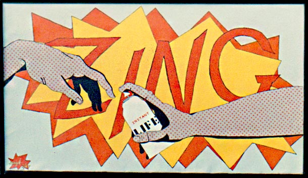
Fifty-five years ago in the spring of my senior year in college, I painted the attached "Instant Life" in the style of the, then, popular Pop Art. I was an English major with a minor in art history. Original 1 uses a spray can perhaps to steer the men along a particular path in their journey. Spray cans are such a strong symbol of the instant moment they can be labeled anything. Original 2 seems pretty tame, but Original 3 is, for me, the most impactful as it lurches out of the ground. It might be more impactful if the hand were directly in front of the men as it would be more sudden. |
Jul 6th |
 |
| 54 |
Jul 22 |
Comment |
Kirsti, I see what you're trying to do, but unfortunately it looks like an over-exposed image. Over-exposing has its place if one is trying to communicate the heat of a desert, but you have leafy green leaves here. Please look at Steve Estill's work in Group 34 this month. I feel you will find his composite informative. We're all in this together, and we're lucky to have a such vast source of photographers to learn from. |
Jul 5th |
| 54 |
Jul 22 |
Comment |
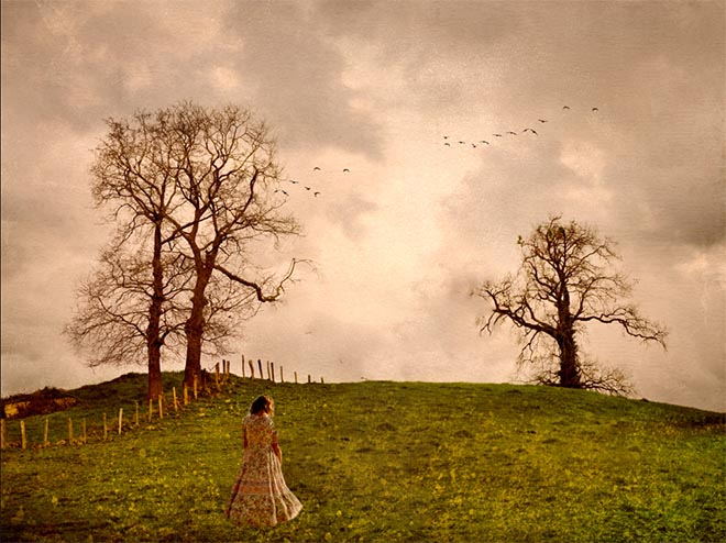
There are a lot of aspects that work very well in this composite. The sepia tone ties everything together nicely, and, together with the posture of the woman, a strong emotion is clearly communicated. The gray sky and the birds are icing on the cake. Personally, I do not like anthropomorphism which is illustrated here by the trees reaching out to each other. Their reach creates another problem for me. With the branches on either side of the woman, the image is too balanced for the emotion being illustrated. An off-center figure would add to the disequilibrium so much of your work conveys. I've attached a hastily rendered idea of what I'm aiming at. |
Jul 5th |
 |
| 54 |
Jul 22 |
Comment |
Brad, as a retired high school English teacher, I highly recommend Robert Frost's poem "The Road not Taken" as your guide to looking at your composite with an informed eye. The poem popped into my head as soon as I saw your image. Life's choices are sometimes not as easy as the choice between color and B & W, but Frost offers a poet's perspective. |
Jul 5th |
3 comments - 5 replies for Group 54
|
3 comments - 5 replies Total
|