|
| Group |
Round |
C/R |
Comment |
Date |
Image |
| 34 |
Nov 21 |
Comment |
I must agree with those who feel that Original 2 is the preferred image. One gets more of a sense of the fun you seem to want to communicate in Original 2. It is less busy than the final image and the green stands out nicely. Original 2 looks like a good illustration for an Irish folk tale. |
Nov 29th |
| 34 |
Nov 21 |
Comment |
Great looking horse! a caveat: no judge who comes to my camera club gives high points for animal photographs in which the back of the animal is dominant. |
Nov 18th |
| 34 |
Nov 21 |
Comment |
The steps you have taken here to create this image make it look tone mapped. For me, that's a big plus. This is your 2nd successful pine-needle-on-a-car composite. Not only is the front windshield broken, but the back window is broken as well, but the lights on top of the cab are intact. You made a nice car choice for this image. The pine needles are wonderful. I was born and raised in South Carolina not far from what is now Old Car City, and the pine needles are quite reminiscent of the forest of pine trees that dominated my neighborhood. And lots of people had an old car parked alongside their driveway. All of your work was worth it! Have you ever thought of having this frog's legs for dinner. Quite a meal! Thanks for a trip down memory lane. |
Nov 18th |
| 34 |
Nov 21 |
Comment |
I have to start off by disagreeing with Fran. Photography IS art. It is not a second class genre. I will also agree with Fran. This image is art. Personally I love paintings or photographs with pencil drawing incorporated into them. Picasso frequently drew lines and/or sketches on his paintings. Her dress is exquisite. I suggest you call Vogue magazine. In addition, the background ties it all together nicely. Nice work! I'm just wondering what the #metoo movement would think about the blindfold over the woman's face. |
Nov 18th |
| 34 |
Nov 21 |
Comment |
I believe I said once before that you are a matchless matchstick sculptor. You've done a wonderful job merging your engine into your image. The impressionistic treatment works very well. Perhaps you could darken everything around the engine so that emerges from a dark environment. There will probably be lots of suggestions for a composite that has so much potential. |
Nov 18th |
| 34 |
Nov 21 |
Reply |
Thanks for your feedback. I've fallen in love with tone mapping because of what it does to the musician's eyes, etc. The trick for an artist is to turn his/her personal taste into a taste that everyone can relate to. It's a challenge that keeps artists going . . . if they want to eat. |
Nov 9th |
| 34 |
Nov 21 |
Reply |
I'm happy for you that you had a nice Goth weekend and that you got to play with your plug-ins. Grunge suits her well. |
Nov 8th |
5 comments - 2 replies for Group 34
|
| 54 |
Nov 21 |
Reply |
See my reply to Brad below. |
Nov 14th |
| 54 |
Nov 21 |
Reply |
I used the Clone Stamp Tool on the enter line as you suggested, and I also took out the "lights" at the top of the image that Maria found distracting. I like the image better without Maria's "lights," but I have to think about remodeling a centuries old building. Thanks for taking the time to point out that line. As I said to Maria, that's why we're in these groups: to see what others see. |
Nov 14th |
 |
| 54 |
Nov 21 |
Reply |
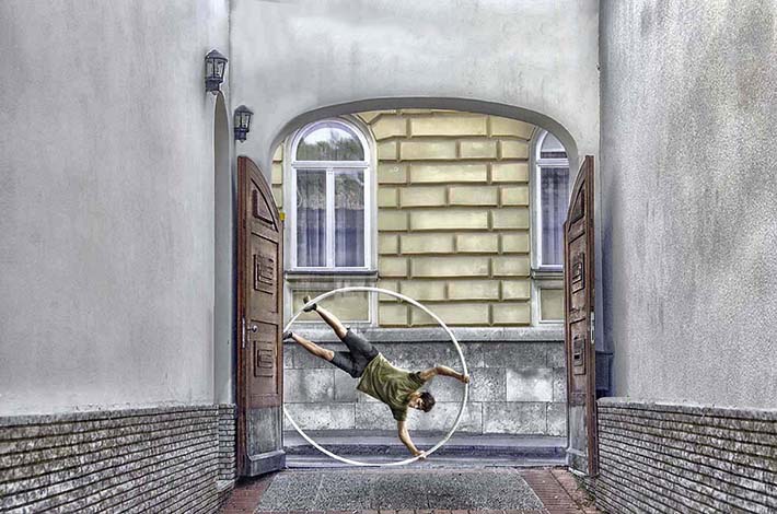
Cutting out the human and the hoop is half the fun. :) Thank you for your feedback. |
Nov 13th |
| 54 |
Nov 21 |
Reply |
As I said in "About the Image(s)" above, I tried to use a third original but everything I tried detracted from the final image. Three images does make it a challenge, but, for me, the greater challenge is to produce a composite that is a work of art. I do not want to spoil a work of art with an addition that is forced into a scene. |
Nov 12th |
| 54 |
Nov 21 |
Comment |
All of the parts fit together to create a peaceful, idyllic scene. The dog, the shed, the rusty truck, and the tree are placed in a way that balances everything. The viewer can tell that you really enjoyed putting the pieces of this puzzle together. Everything works so well! |
Nov 12th |
| 54 |
Nov 21 |
Comment |
This looks like some of my dreams or like an updated version of the myth of Sisyphus! The digitized drawing works very well with the clouds and with your travelling companion. The mix of color with black and white heightens the dream-like quality and the disequilibrium. If you're not careful I might have to refer to you as a surrealist. That's a good thing. |
Nov 12th |
| 54 |
Nov 21 |
Comment |
Welcome to Group 54, Peter. You have combined three images to expand the cliché that the whole is more than equal to the sum of its parts. You have created an image that makes the viewer want to take that walkway all the way to the church. It's quite inviting. |
Nov 12th |
| 54 |
Nov 21 |
Comment |
This is a wonderful shot without the textured layer and the text. I agree with the above comments that this could be a bit lighter and cropped as Peggy suggests. Surrealist painter Rene Magritte is famous for the text he includes in his painting of a pipe. Other than that image, I'm not a big fan of texts in paintings/photographs. It's just my pet peeve. |
Nov 12th |
| 54 |
Nov 21 |
Comment |
What a clever idea to actually have Mother Nature paint the pumpkins orange. It looks like a mid-day shot, and you've handled a difficult exposure very well. Mother Nature's arm is the only drawback to this image. It needs to look more like an arm. Definitely an image worth working on. Nice job. |
Nov 12th |
| 54 |
Nov 21 |
Comment |
This is a joyous celebration of fall in New England! The young man is perfect for this image, and you've incorporated the leaves in such a way as to emphasize his joy. It's a shame that fall is so brief. |
Nov 12th |
| 54 |
Nov 21 |
Reply |
Thank you for your clarification. Your English is fine. My wife and I have visited Australia twice, and we had a hard time understanding the Aussie accent. :) I looked at the pre-cropped original of the wall you're referring to and saw that what looks like lights is actually sunlight shinning on the scallopped edge of a tile roof. I never really saw that as a distraction probably because I was focused on the main part of the image. This is why these groups exist. It enables us to see what others see. |
Nov 12th |
| 54 |
Nov 21 |
Reply |
Thank you for taking the time for such detailed feedback. If I understand your "but" correctly, your suggested crop would remove the top of the arch and some of the windows seen through the arch. Perhaps a better solution for your "but" would be to use the Content-Aware tool to remove the small lights. Personally, I like the arch and the small lights. They add charm to otherwise bare walls--which I rendered bare using the Content-Aware tool in removing other small annoyances. |
Nov 11th |
| 54 |
Nov 21 |
Reply |
Thank you for your feedback. |
Nov 10th |
6 comments - 7 replies for Group 54
|
11 comments - 9 replies Total
|


