|
| Group |
Round |
C/R |
Comment |
Date |
Image |
| 34 |
Aug 21 |
Reply |
As a former English teacher, Macbeth's statement of what life is--"a walking shadow . . ."--still reverberates. Shakespeare would have loved Escher AND Dali! Google Michael Cheval, a current surrealist painter. Illusions are his stock and trade. Thank you for your feedback. I guess I have to rethink the sun. I hope I'm not too late with this reply. I haven't checked the group responses in a while. |
Aug 31st |
| 34 |
Aug 21 |
Reply |
Your summer home sounds wonderful. Actually, different people in Turkey told me lion while others told me tiger. I guess "big cat" fits the bill. (I never read the "Chronicles" or saw the movie.) |
Aug 14th |
| 34 |
Aug 21 |
Reply |
Stephen, your comments are always welcome because they reflect what James Whistler said, "An artist is not paid for his labor but for his vision." Most of the comments in the 2 groups that I belong to address my "labor" rather than my "vision." As I stated in my "About the Image" section above,
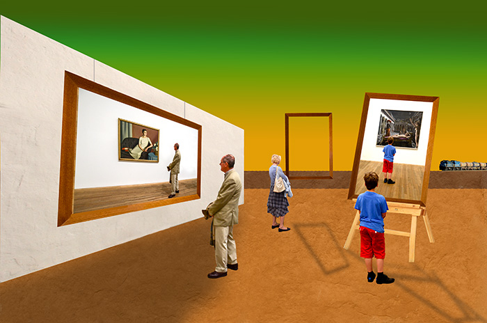
there was much discussion in my art history classes about life imitating art and art imitating life. Life imitated art in a big way Thursday night. The New York Yankees played the Chicago White Sox in a stadium built next to the still-existent set of the movie "Field of Dreams." The players entered the stadium by emerging out of the corn field into the outfield just as the players did in the movie. I would love to add different poses of the onlookers in my composite, but at the time I did not think to take pictures from different angles. The boy is looking at a painting by Paul Delvaux one of my favorite Surrealist painters who, like Magritte, is from Belgium. I don't know the artist of the other painting. Ben Shahn, another of my favorite artists, painted commentary about social movements which, before social media, influenced people into action. Art imitating life imitating art. I looked at your bio and saw that your wife is Turkish. When my wife and I traveled in Turkey, several Turkish people told me that Kaplan is a Turkish name and that it means "lion." My wife's background is Egyptian, Syrian, and French , and I always wanted to be exotic, too, so I declared myself exotic after our trip to Turkey. |
Aug 14th |
| 34 |
Aug 21 |
Reply |
Thank you for your feedback.
|
Aug 13th |
| 34 |
Aug 21 |
Reply |
Thank you for your feedback.
|
Aug 13th |
| 34 |
Aug 21 |
Reply |
If my comments are poetic, it's because this image is poetic. |
Aug 9th |
| 34 |
Aug 21 |
Reply |
By all means don't be sorry. The absence of a point of focus is intentional and was designed to engender disequilibrium. In July's PSA JOURNAL there's an article titled "Breaking the Rules." I have expressed in Digital Dialogue on occasion that art is about breaking rules--Picasso, Dali, Pollack, Magritte, etc. I'm certainly not in their ball park, but I will ignore "the rule of thirds," etc. if it suits my purpose. Dialogue and feedback are the currency of these DD groups, and I appreciate yours. |
Aug 9th |
| 34 |
Aug 21 |
Reply |
Feedback that informs is what matters, and I respect the time you dedicate to writing feedback that informs. |
Aug 9th |
| 34 |
Aug 21 |
Reply |
I actually like your treatment better. Jan's has too many artifacts. |
Aug 9th |
| 34 |
Aug 21 |
Reply |
You are my shadow guru. My goal is to get all of the shadows right on the first try. I felt that with an open landscape I needed a sun to create those pesky shadows. It's curious that you and Gwen felt the sun should not be there, but neither of you object to a green & orange sky. Steven Jobs is famous for saying that "simplicity is the ultimate sophistication." For him, even not having the sun would not have fit his category of sophistication, but I appreciate your linking a different version of my composite to the word. I've attached a pre-shadow draft from which I removed the sun. It is more peaceful to the eye, but I wanted disequilibrium. |
Aug 8th |
 |
| 34 |
Aug 21 |
Comment |
I, too, take pictures that are "for future use." I have several raindrop shots that I have been unable to make work in a composite. You have succeeded better than I have because your treatment of the colors works so well, but I feel this is not finished. Perhaps if motion blur could make the raindrops seem to move that would help. |
Aug 6th |
| 34 |
Aug 21 |
Comment |
WOW! You have created the epitome of "delicate." No one can look at this and NOT see the fragility of a flower. The colors and translucence of the flowers is contrasted softly by the green and sharp edges of the leaves, and the white background is the only background that could emphasize the subtlety of this image. This clearly illustrates one of Steven Jobs' most famous quotes: 'Simplicity is the ultimate sophistication.' The amount of work you put in was worth every second! |
Aug 6th |
| 34 |
Aug 21 |
Comment |
The original photo gives you a lot of details to work with, and you have emphasized them and softened them at the same time. This creates a soft landing for the eye. The purple in the flower rests comfortably on the green background. I didn't notice the stem until I read your description, but your image is so comfortable to look at I feel the stem doesn't really matter. |
Aug 6th |
| 34 |
Aug 21 |
Comment |
The colors are engaging and eye catching, and the variety of colors and shapes is dazzling. The color green forms a canvas for the rest of the colors. It's certainly the antithesis of goth! The only suggestion I have is to make this garden one that the eye (or person) can wander through. Even though the purple flowers are different sizes to suggest depth, to me this composite exists on a single plane. (As an aside, the names of the flowers make it difficult for me to follow the description of you workflow.) |
Aug 6th |
| 34 |
Aug 21 |
Comment |
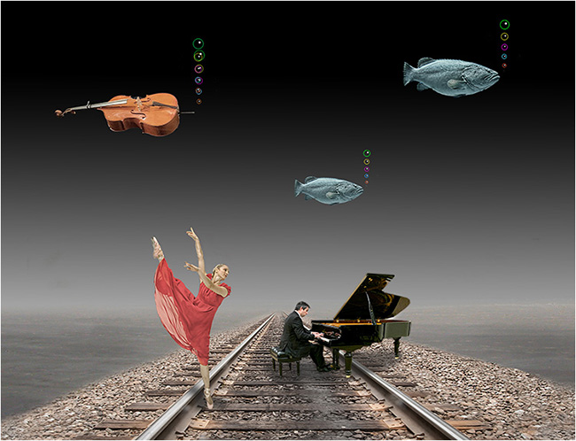
One of the best aspects of being a part of PSA's Digital Dialogue is seeing the variation in styles of similar objects and scenes. The composite I submitted in April, 2021 in my other group (attached) displays fish and breathing bubbles in my style, quite different from the Handman style, and the good news is that both can be appreciated. Whereas I sometimes use railroad tracks to draw a viewer in or allow a way out, you seem to like having roads, rocks, and other devices leading the viewer into your images. The rocks work well here. You also have a variety of treatments of buildings throughout your work that come right out of your unconscious. When your unconscious mind meets your technical/software mind, good things happen. |
Aug 5th |
 |
| 34 |
Aug 21 |
Reply |
Thank you for taking the time to re-read the Guidelines. I understand what you are saying about the sun, but when I look at a work of art, I look at everything, not just what my eye is initially drawn to. From your added comments, you looked away from the sun to see other aspects of the composite for which I am grateful. |
Aug 2nd |
| 34 |
Aug 21 |
Reply |
Gwen, I notice that you frequently write only 1 line of comments about my composites. If this one is, as you say, "a wonderfully thought out and executed piece of work" I feel elaboration is in order for me to learn from what you see. After all, the goal of the PSA Study Groups is for us to learn from others in the group. May I suggest that you refer to the "Guidelines" link at the top of the page which will take you to the "Digital Dialogue Guidelines." Scroll down and you will find suggestions in the "What to Say Comments" section. In this way you can be helpful to the contributing photographers and inform them about the specifics of what is good and what needs improvement. Your thoughts are valuable, but you seem hesitant to elaborate beyond a few words. |
Aug 2nd |
5 comments - 12 replies for Group 34
|
| 54 |
Aug 21 |
Reply |
Thank you for reading the title and for your insightful comments. I looked at your April 2021 image and thought it was quite good. Cell phones are distracting us all, and the mood of your image communicates the down side of our being so distracted. On the flip side, in this crazy world, healthy distractions are needed. |
Aug 10th |
| 54 |
Aug 21 |
Reply |
I did not mean for my comment to be dismissive. I could have expressed myself better. |
Aug 8th |
| 54 |
Aug 21 |
Reply |
We can agree to disagree. I do not use other people's art as a main component in my composites because I feel that other people's art is "the easy way out" and saps my creative juices. Like I said, we can agree to disagree. |
Aug 8th |
| 54 |
Aug 21 |
Reply |
I re-sized the two front figures over and over again and couldn't decide on a correct size. I often don't follow the "point of interest" rule, preferring instead to have the viewer's eye walk through my image. There's an informative article on breaking rules in the July 2021 issue of PSA Journal. It's worth a look. |
Aug 8th |
| 54 |
Aug 21 |
Reply |
I appreciate your candor. Perhaps I did not express myself clearly enough. I am a member of 2 PSA digital dialogue groups so I can learn how I can improve my photography. Too often, people tell me that my composites are "interesting" or that they love them. Neither of these descriptions inform me as to what it is that they liked. I was a high school English teacher. Imagine if I graded essays by telling students their work was "cute," "interesting," or that I loved their essays. What would they have learned? I try to elaborate in my feedback hoping that the group member will learn something. As I said in my comments above, I really like Tom's work. He's a very good photographer and would love to pick his brain. As he is a relatively new group member, I felt that his reading the guidelines would focus him so all could learn from him. I approach formatting my feedback here as I did as an English teacher--the feedback is meant to inform and hopefully focus the writer/photographer on what is good and on how to improve what needs improving. Thank you for raising your concerns. As I often say here, the purpose of these groups is dialogue and discussion. |
Aug 7th |
| 54 |
Aug 21 |
Comment |
I saw this on your website liked it again. Under the "less is more" guideline, please leave the interpretation of the image to the viewer. Isn't the purpose of art to make the viewer think. Otherwise, it's decoration. |
Aug 6th |
| 54 |
Aug 21 |
Comment |
Antonio Gaudi, the architect of the church in Barcelona that looks like sand castle drippings is also famous for the following quote: "There are no straight lines in nature." You have well crafted colors but the edges of the images you imported are too sharp. For example, look at the sharp edge between your beautiful sky and the ground. In addition to feathering there is a blur too (like a brush) that I sometimes use on edges. Keep it up. If it were easy, everyone could do it. |
Aug 6th |
| 54 |
Aug 21 |
Comment |
Less is more here because the sky and the water interact/clash without interruption. This image is REALLY stormy. I think I would be more frightened for the people in the boat if they, too, were in B & W. It would be more "film noir-esque" if there is such a word. You've certainly stirred up a lot of emotion in any viewer. |
Aug 6th |
| 54 |
Aug 21 |
Reply |
Kathy, I enjoy a lot of your work, but I'm afraid that without your explanation and the stack of originals, I wouldn't know what is happening here. I may be wrong, but I thought that the parts of the composite had to be our original photographs rather than downloads from the internet. With your history of creative images, I know you've got more up your sleeve. |
Aug 6th |
| 54 |
Aug 21 |
Comment |
THIS is an eye! Everything works to make it look like an eye: the "hair" around the eye; the fish's eye is so organic; the bright areas of the eye suggest cornea; the deep crevice toward the right of the frame; and of course, the shape of the eye. You've managed all of the parts very well to make a wonderful composite. |
Aug 6th |
| 54 |
Aug 21 |
Reply |
Tom, I visited your 500px website and very much enjoyed my stroll through your galleries. You are an accomplished photographer, and I see that I can learn a lot from you--which is the goal of the PSA Study Groups. As an accomplished photographer, you are, of course, aware of the effort that goes into creating a finished product, and you are also aware that words like "cute" and "interesting" are inadequate to the task of informing the person you intend to inform. May I suggest you click the "Guidelines" link at the top of the page and scroll down to the "What to Say in Comments section." This may guide you in how to improve the skills of the people in our group. I look forward to viewing your work and to reading your observations about my work. |
Aug 2nd |
| 54 |
Aug 21 |
Comment |
Kathy, unless I read your description wrong, I think you submitted one of your steps rather than the completed composite. |
Aug 1st |
5 comments - 7 replies for Group 54
|
| 99 |
Aug 21 |
Comment |
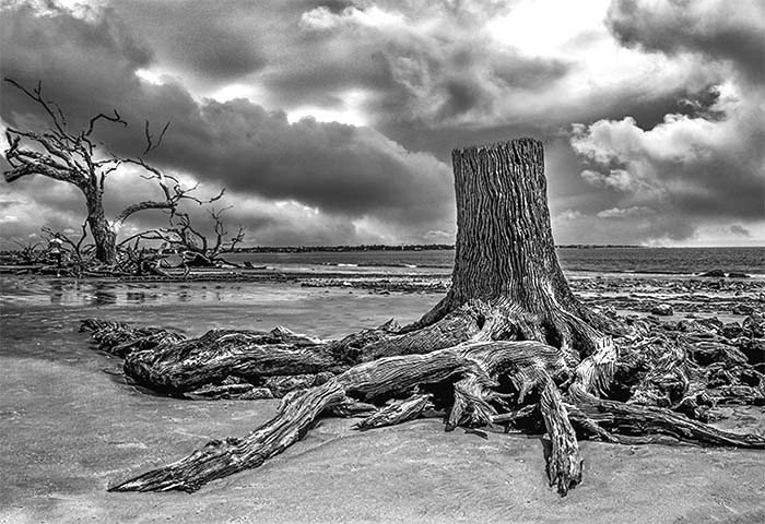
This tree stump is certainly worthy of being photographed. I've taken the liberty of editing your photograph a bit. I cropped the whole image, placing the stump off center to balance the dead tree in the background. Then I cloned out the cloud just above the stump so the stump didn't look like a chimney with smoke coming out. Then I used the Levels Adjustment layer to brighten up the image. Your image is a find shot, but I believe it's worth a second look. |
Aug 1st |
 |
1 comment - 0 replies for Group 99
|
11 comments - 19 replies Total
|


