|
| Group |
Round |
C/R |
Comment |
Date |
Image |
| 34 |
Mar 21 |
Reply |
Thank you for taking the time to illustrate your point of view. Imagine being on this road at night with the only light coming from the cabin at the bend of the road. My image is probably not dark enough. :) |
Mar 15th |
| 34 |
Mar 21 |
Reply |
Thank you for taking the time for your reply. I did notice that you credited the photographer in your "About the Images." I have on occasion used a statue or painting in a Digital Dialogue composite, but I try to avoid it. Topaz Labs is a PS plug-in that turns one's photos into "art" that looks like Van Gogh, Degas, Monet, etc. It also has other art styles that are not attributable to famous artists. I played around with it for a while, but lost interest because it looked too manipulated for my taste. My camera club on occasion hires, for competitions, a judge who awards merit based on his (mostly men) personal preference. A recent judge, upon viewing photos, would first say he liked it, then would point out all of the numerous mistakes the photographer made, and finally award the photo the highest score. His personal preference trumped photographic standards. I enjoy agreeing to disagree with you as it justifies the existence of the PSA study groups and helps me grow as an "artist." |
Mar 15th |
| 34 |
Mar 21 |
Comment |
The colors are bright and cheerful and the diagonal created by the trumpet and the bee is very strong. Here's the however: I find the Topaz-look of the background flowers detracts from the overall effect of the image. This is probably personal because I OD'd on Topaz recently and try to avoid it at all costs. This image is just in time for spring. |
Mar 13th |
| 34 |
Mar 21 |
Comment |
Wonderful setting and very effective lighting. Your image has a variety of shades of green which enhance the image. Nice work. |
Mar 13th |
| 34 |
Mar 21 |
Comment |
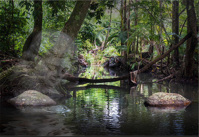
You have taken a picture of a place I wish were around the corner from me. I would go there as often as possible. Perhaps I would even meet mother nature. I grew up in a rural area in the southern U.S. and now live in NJ in a suburb of NYC. I miss the places pictured here. I hear the voices of the judges who judge my camera club's competitions: "The eye is attracted to the bright spots in the image." I tried to darken the bright spots here and also removed the leaves in the upper right hand corner--also a distraction. I left the rock beneath Mother Nature bright to attract the eye to her. This is a wonderful setting, well worth your taking a second look. |
Mar 13th |
 |
| 34 |
Mar 21 |
Comment |
This is a wonderful combination of images that work well together to create a fantasy. (Refer back to my fantasy/reality comments for your June 2020 composite.) There are a couple of aspects of this image that, for me, detract from the overall image. When I discovered Topaz Labs filters, I used them to distraction. I've come to find that images that have a Topaz Labs "look" are distracting. The second nit is your used of another person's photograph. When I took photography classes at the New School in NYC, the instructors drummed into our heads that taking a picture of someone else's art is not a creative moment on our part but a creative moment on the part of the artist whose work we photographed. Your final image reflects your own tremendous creativity, but I prefer your images that use your personal "witch's brew." |
Mar 13th |
| 34 |
Mar 21 |
Comment |
Steve and Jan have made a lot of constructive comments. There's little left for me to say except that I agree with Jan that "this image has good bones." By all means, save it for a rainy day. |
Mar 12th |
| 34 |
Mar 21 |
Reply |
I'm happy this composite makes you feel uncomfortable. How much of the art in the Tate Modern would you put on your wall? Most of what I create is not meant for the walls of homes. I envisioned the traveler turning because he heard a noise. I placed the monk so he would not be in the sight line of the traveler and thus there would be no conversation. I'm glad you find this interesting. |
Mar 11th |
| 34 |
Mar 21 |
Reply |
I'm happy you enjoyed the foreboding. :) |
Mar 6th |
5 comments - 4 replies for Group 34
|
| 43 |
Mar 21 |
Comment |
Lane, I was born and raised in South Carolina and now live in Wanaque, New Jersey. Your photo evokes memories of my SC years. Houses like this were common, but I was not a photographer then. The trees and bushes here could not protect this house from the plague, and the sky serves to enhance the image of an abandoned house. The color of your image completes the sad tale of the demise of not just a house but a home. Everything works. |
Mar 4th |
1 comment - 0 replies for Group 43
|
| 54 |
Mar 21 |
Comment |
Your images would be the perfect book cover of a book about the leaf people of Venus. Everything is blended so seamlessly that one forgets this is a composite. Keeping the shadow of the stem and the leaf adds 3-dimensionality to your image. The colors are great in the original, and the desaturation works quite well also. This composite is a treat. |
Mar 13th |
| 54 |
Mar 21 |
Comment |
Well done! You have a variety of elements that mix together very well. There are so many shadows around the bird that he doesn't really need to add another one. In addition to the halos, the sun shinning at the top of the image attracts the eye away from the majority of the image. Darkening that light would keep the eye on the more important elements. Nice work. |
Mar 13th |
| 54 |
Mar 21 |
Comment |
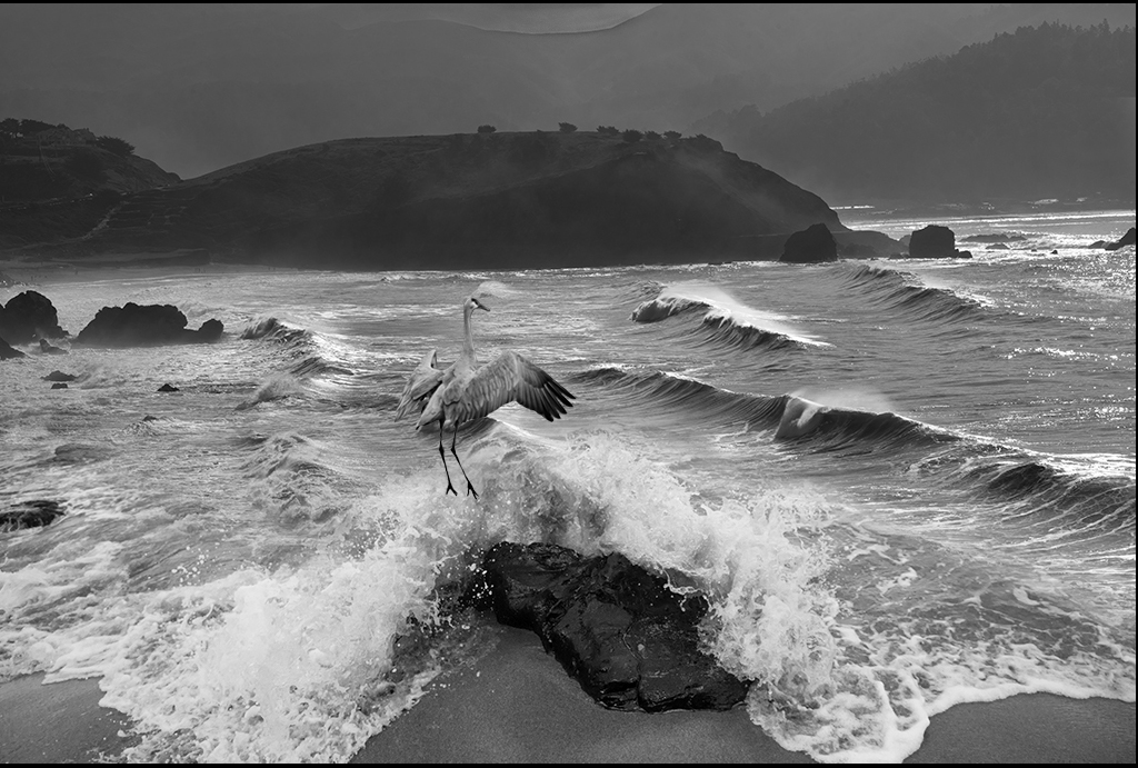
You do wonders with waves. This image is a good example of how powerful B & W photography can be. You have details in the highlights AND the shadows. Ansel Adams would be proud. Instead of cropping the top and cutting off the eye's view of distance, darken the light part that people want to crop. I tried to illustrate what I mean below. I'm not sure the bird adds anything. I hear the waves when I look at this image and hardly see the bird. |
Mar 13th |
 |
| 54 |
Mar 21 |
Reply |
I was afraid the pretty women would dominate too much if they were more real. I did experiment with a few levels of their transparency, but this level is the one I chose. |
Mar 6th |
| 54 |
Mar 21 |
Reply |
I did wrestle with the cauldron's transparency, but since all other figures were transparent to some degree, I finally decided to do the same with it. As for the skull, I had the voices of camera club judges in my head: "Don't put a bright object near the edge of an image." In addition to being a "less is more" advocate, I also believe "rules are made to be broken," but the voices won in this case. |
Mar 6th |
| 54 |
Mar 21 |
Reply |
Sounds like a good idea. The gradient tool isn't my strong suit. This will give me a chance to practice. |
Mar 4th |
| 54 |
Mar 21 |
Comment |
Neil, Maybe we can introduce your mimes to my witches. I discovered the hard way that, when I can, I must take the same picture from different angles, especially when I was working on a mirror image. You have chosen the correct 4 images for this composite quite successfully. Your lighting leads the viewer's eye toward the back of the image irresistibly, and you've handled the shadows in a way that makes your mimes perfect matches for my witches. |
Mar 4th |
| 54 |
Mar 21 |
Comment |
Now you have more figures to add to your colorful quilt. Isn't Liquify a useful filter. |
Mar 3rd |
| 54 |
Mar 21 |
Comment |
Cute kid! Love the green and blue together. |
Mar 3rd |
6 comments - 3 replies for Group 54
|
12 comments - 7 replies Total
|


