|
| Group |
Round |
C/R |
Comment |
Date |
Image |
| 34 |
Feb 21 |
Comment |
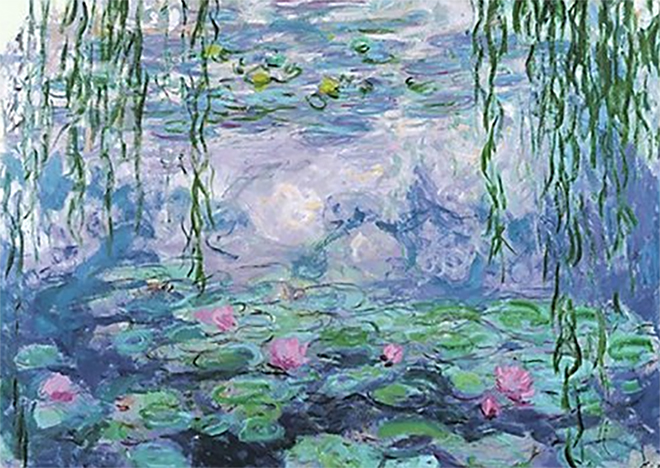
Sometimes you have to break the rules. Your Layered Field does not have a strong focal point, but neither does Claude Monet's "Water Lilies" that I've attached. In fact he breaks another rule by putting "distracting" images at the edge of the frame as you point out I have done in my February entry. Don't change a thing. Monet would be proud. |
Feb 24th |
 |
| 34 |
Feb 21 |
Comment |
This is another successful On1 + Oil Paint image. The shoveled up snow completes the whole scene, and the scarf says this is all whimsy. However, when people read a book, listen to music, or look at art, they interpret that art based on their own experiences. On good weather days, I go to a local wildlife preserve called The Celery Farm. It seems that every Canadian goose on the east coast makes an overnight visit there at one time or another. I go so frequently that I occasionally see an "orphan" goose that has not flown away with a flock. It's for this reason that the flock of geese add a touch of sadness for me for the lone goose. |
Feb 15th |
| 34 |
Feb 21 |
Reply |
In my "About the Image" description, I mentioned that my goal "was to create a dream-like image." My fault for not stating the idea of a dream more clearly in the title. |
Feb 13th |
| 34 |
Feb 21 |
Reply |
I think the clarity of Taylor's image is closer to what one sees in the sheep, but I'd still use the Hue/Saturation Adjustment Layer to make her skin color closer to skin tone. I like Jan's suggestion of Taylor adding the flowers to the sheep. This give a reason for the flowers to be there. |
Feb 11th |
| 34 |
Feb 21 |
Comment |
Let me speak for the birds. They are an inspired crown for the woman who is the central image. In addition the blending of the net and her face helps to unify the whole image. The eyes at the bottom of the net peering at the viewer are effective in their subtlety. Two suggestions if I may: (1) remove the masks from the net. They are too cliché for an image with so much nuance and (2) use the skull in the lower right hand corner in the masks' place but keep them behind the net. Nice work. |
Feb 11th |
| 34 |
Feb 21 |
Comment |
As an Art History minor in college (a century ago), Fra Angelico's "The Annunciation" was always on of my favorites. Pardon my direct approach, but perhaps this is why I don't get the connection between the daisies and "The Annunciation" other than everything is leaning and the daisies/gazanias are the color of the angel's robe. I commend you for pursuing the study of art. I feel that my lifelong interest in art has helped my photographer's eye as well as my creative approach. The study of art will help advance your skill as a photographer and as a Photoshop user. Keep it up. |
Feb 11th |
| 34 |
Feb 21 |
Comment |
There's a well kept secret of a Little Red Lighthouse on the Manhattan side of the George Washington Bridge directly under the bridge. My wife and I took our 7 year-old grandchild on the long walk to see the lighthouse but were disappointed that we could not enter. I asked my grandson to pose as if he were looking down from the top of the lighthouse, and with the help of Photoshop I placed him at the top. He was delighted. Photoshop CAN make dreams come true. Your image is a delightful memory of a special time with your grandchild. Not many people have their portrait taken with sheep. I have a couple of suggestions, if I may, that will help make Taylor look less pasted. As her image is much sharper than the sheep, try a touch of Gaussian blur on her. Then use the Hue/Saturation Adjustment Layer on her face (select red) and reduce her blush. I feel the image would look less pasted if the flowers were not on the sheep. They divert attention and increase the pasted look. This image will always be a fond memory for you. |
Feb 11th |
5 comments - 2 replies for Group 34
|
| 54 |
Feb 21 |
Reply |
Thank you for visiting and for your kind words. |
Feb 19th |
| 54 |
Feb 21 |
Reply |
Aavo replied above. I'm Alan. |
Feb 17th |
| 54 |
Feb 21 |
Comment |
I agree with Marilyn. This would make a great cover for a children's book. I use Transform/Warp a lot when I create shadows. I just looked at your website. You have some nice work there. |
Feb 17th |
| 54 |
Feb 21 |
Comment |
Terrific job of blending. I truly believe that the woman has been cursed by wood nymphs to spend eternity as part of this log. Personally, I would dial back the green and the yellow using the Hue/Saturation Adjustment Layer. I would also take out the birds. For me, they are a distraction. Nice work. Keep revisiting it to see things fresh. It's a keeper. |
Feb 9th |
| 54 |
Feb 21 |
Comment |
Great seascape! I can HEAR the ocean! The only suggestions I have for this dynamic image are to make the bird a little less sharp. It's much sharper than the sea. The second suggestion is to get rid of the lens flare. It detracts from your wonderful sun. |
Feb 9th |
| 54 |
Feb 21 |
Comment |
Welcome to group 54, Neil. So this is how Hindu gods cut their hair. Brad's comments basically mirror what I was thinking. I look forward to more of your creative ideas. |
Feb 9th |
| 54 |
Feb 21 |
Comment |
I agree with Marilyn but with 2 caveats. If I may be direct, my personal feeling is that we should leave politics out of our monthly submissions. The second caveat is that the overwhelming majority of the work we submit should be original rather than cutting and pasting others' photographs. It's hard to take original photos when we're locked down for a year, but this is an opportunity to scour some of those folders that are clogging our computers with tons of photographs. |
Feb 9th |
5 comments - 2 replies for Group 54
|
10 comments - 4 replies Total
|


