|
| Group |
Round |
C/R |
Comment |
Date |
Image |
| 34 |
Jan 21 |
Reply |
Thank you for your feedback. I think my comments to Jan and Georgiane address your concerns. |
Jan 27th |
| 34 |
Jan 21 |
Reply |
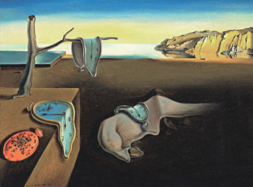
I'm happy that you were bothered by my composite. What you may be feeling is the disequilibrium I try to instill in my surrealistic images. I used the B & W Adjustment layer to create the tonality to put the focus on the Jacks. Thank you for taking the time to adjust my image to illustrate your point of view. "Persistence of Memory" by S. Dali is perhaps the most recognized surrealistic painting of the Surrealism Movement. It doesn't tell a story and generates palpable disequilibrium. I aim for these attributes when I create surrealistic images. |
Jan 25th |
 |
| 34 |
Jan 21 |
Reply |
Thank you for your comments. As far as the walls and pavers are concerned, since there are faded colors and gray tones throughout, I felt that the sharpness added that bit of disequilibrium I look for as I strive for surrealism. |
Jan 11th |
| 34 |
Jan 21 |
Reply |
It's a shame they're not submarines. |
Jan 9th |
| 34 |
Jan 21 |
Reply |
In the dimension (as Rod Serling called it) of imagination, anything is possible--including mobile Jacks-in-the-Box. |
Jan 9th |
| 34 |
Jan 21 |
Comment |
The idea of marbles floating down a river raises the question of whether or not marbles float. If they don't, this is a wonderful fantasy. I agree with what Fran says about the movement in the water and possibly blurring some of the marbles. I'm a bit confused why the water is realistic in Original 1 but has changed in the final image. Realism in a fantasy is always good. Also, if marbles do, indeed, float, some would be more submerged than others as they are moved by the water. I feel that Fran's and my suggestions are testimony to the enormous potential of this composite. I do hope you will "play with it again later." |
Jan 4th |
| 34 |
Jan 21 |
Comment |
As Fran and Kerstin have indicated, this is a 'texture" image, and you have done a wonderful job of bringing out that texture. As the original still life has so much contrast, it's amazing that you saw the final image the way you did. Nice image! |
Jan 4th |
| 34 |
Jan 21 |
Comment |
What an interesting subject for a photograph! You have a lot of competing textures here that might benefit from a softer "brush." The ram, I feel, would also benefit from less contrast. I think this ram is a subject worth revisiting with a little less intensity in mind. |
Jan 4th |
| 34 |
Jan 21 |
Comment |
You are very skilled at turning a realistic country scene into a re-imagined country scene. They are all quite delightful. I look forward to your applying that skill to a different setting. |
Jan 4th |
| 34 |
Jan 21 |
Comment |
Free expression in art is just as important as free speech in everyday life. Quentin Tarantino has his niche, but I prefer the subtlety, nuance, and suggestion of Rene Magritte. |
Jan 4th |
| 34 |
Jan 21 |
Comment |
The mailboxes are stylized very well especially since the originals are real, tough mailboxes. I was so taken with them that I didn't notice the proportion of the bird. The sun has the delightful look of yellow powdered sugar, and the colors throughout are blended with a soft touch. I took the liberty of re-sizing the image to illustrate how I see it. I did a bad job as I don't have your delicate touch, but I think you can see I feel there's too much middle. Now I sound like a camera club judge. In any case, an artist using pastels couldn't have done a better job. |
Jan 4th |
 |
6 comments - 5 replies for Group 34
|
| 54 |
Jan 21 |
Reply |
I feel it has a Twilight Zone feel because the "enemy" is unseen. If I add color to the trees on the left, someone will say the color on the edge is distracting. That's what makes these groups so enjoyable. |
Jan 14th |
| 54 |
Jan 21 |
Reply |
I did the same when I first got Topaz. I use Adjust more than any other now because it tone maps. I should actually revisit it because it IS a powerful plug-in. |
Jan 14th |
| 54 |
Jan 21 |
Reply |
That's some photo! I mistook it for ones taken by professional astronomers. I didn't know Sigma lenses were that good. Unfortunately, it was cloudy in New Jersey when the conjunction occurred. I have a 200-400 Nikon zoom with a 1.5 extender. I was hoping to get a crack at it. You're lucky it was clear out west. |
Jan 14th |
| 54 |
Jan 21 |
Comment |
I'm sure your grandson enjoyed counting these frogs. Did he find the big frog a little menacing? It could easily be used in another composite as a menacing figure. You did a wonderful job of transferring the frogs into the larger composite, but I agree with Aavo. A little shadow goes a long way to eliminate floating. I know because I often forget necessary shadows. The composition also adds to this image. Nice work. |
Jan 14th |
| 54 |
Jan 21 |
Comment |
Did you take advantage of the mud bath when you were in Colombia? Your mud ghouls are perfect for the setting in which you have placed them. Having them coming out of the caves adds to the realism. Surgically removing their arms is, indeed, ghoulish. Nice image. |
Jan 14th |
| 54 |
Jan 21 |
Comment |
Everything has been blended beautifully and realistically. The silhouette of the trees makes the sunset all the more believable. The moon, though a little too big here, works quite well. The only problem I have is that you seem to have used a published photograph of the conjunction of Saturn and Jupiter. Your blended sunset would be beautiful without it. |
Jan 14th |
| 54 |
Jan 21 |
Comment |
Pardon my candor, but I am not in favor of using filters, such as Topaz, in the main body of an image. In my mind it's a shortcut, especially for someone as creative as you. |
Jan 14th |
| 54 |
Jan 21 |
Reply |
I though about taking him out, but I wasn't sure so I left him in. |
Jan 11th |
4 comments - 4 replies for Group 54
|
10 comments - 9 replies Total
|


