|
| Group |
Round |
C/R |
Comment |
Date |
Image |
| 34 |
Aug 20 |
Reply |
I value your feedback even when I disagree with you. If I know the judge, I choose my entries for my camera club competition based on who the judge is. In photography, there is a rule of thirds. If I place a subject properly at the 1/3 spot according to the rule of thirds, judges often say the image should be cropped. Art is about breaking rules: the Impressionists broke the rules, Picasso broke the rules, etc. In any case, I see what you're saying in your example, but we'll have to agree to disagree. I like the whole arch. Thank you for taking the time to crop my image and show me what you meant. Your feedback is always appreciated. |
Aug 9th |
| 34 |
Aug 20 |
Reply |
She was not near the castle. She was in more of a downtown area. I compared the two images, and I believe we took pictures of the same woman! |
Aug 8th |
| 34 |
Aug 20 |
Reply |
I, too, wonder what will happen next. |
Aug 8th |
| 34 |
Aug 20 |
Reply |
Thank you for your kind words. I didn't think the bricks at the top of the image was so bright. The man has white highlights in his hair and the woman's arm is also white. In addition, the threshold of the entry is brighter and lower than the bricks. I do not take offense at your observation; I'm just confused as there are areas in the composite that are brighter than the bricks. |
Aug 8th |
| 34 |
Aug 20 |
Comment |
When I grow up, I want to be able to blend images as well as you have here. Everything works: the buildings, the wet streets, the lights, the man with the umbrella, and, of course, the blending. This is quite a successful endeavor. |
Aug 4th |
| 34 |
Aug 20 |
Comment |
This is a warm, comforting image. Your use of the newspaper texture is perfect, here, to add nostalgia and to make Albert look like a doll from an antique store. I'm wondering why the bookstore owner added an Einstein doll to a display with a book titled "Afterlife." |
Aug 4th |
| 34 |
Aug 20 |
Comment |
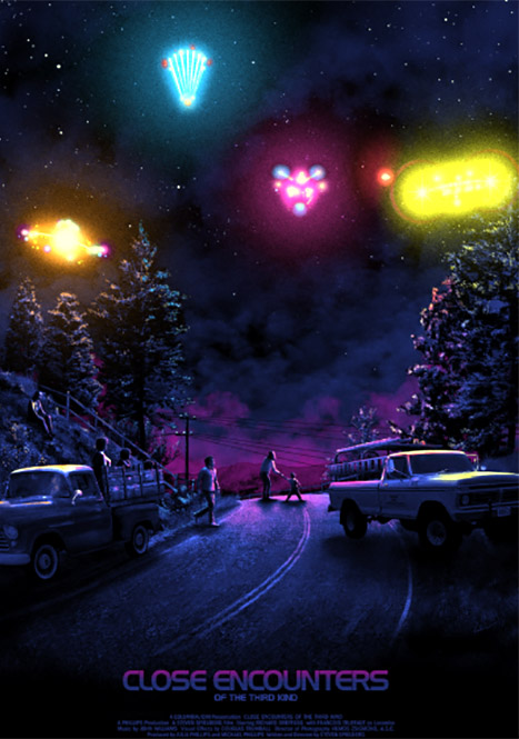
I can't help seeing a scene from Spielberg's "Close Encounters" (see below) in which people are on a highway seeing the UFO's for the first time. Your composite ranks right up there with Spielberg's image. And technology has improved to the point where you can include a GPS where Spielberg could not have imagined it. The way things are going, the distance on your highway sign might have read "light years." |
Aug 4th |
 |
| 34 |
Aug 20 |
Comment |
Very well constructed. A detailed composite such as this takes time and tenacity. The outcome is well worth the effort. I hate to say "however," but I feel the plant that obscures the bridge obscures a wonderful addition to this composite. Personally, I love old bridges and feel it deserves more exposure. |
Aug 4th |
| 34 |
Aug 20 |
Comment |
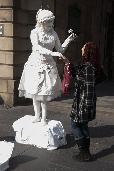
In 2011, my wife and I took a repositioning cruise from Copenhagen to Fort Lauderdale. We stopped in Edinburgh where I took the photo below. As far as your treatment of the Edinburgh street performer is concerned, the composite is quite ghostly and well constructed, but I agree with Steve, there needs to be more contrast to help make the ghost stand out as a ghost. You've chosen wonderful pieces for this composite, and it's worth revisiting. |
Aug 4th |
 |
| 34 |
Aug 20 |
Reply |
Thank you, Steve, for your kind words. |
Aug 2nd |
5 comments - 5 replies for Group 34
|
| 54 |
Aug 20 |
Reply |
I see what you are saying about the woman on the right, and I think I agree with you. I was so fascinated with discovering an optical illusion that I didn't look at the composite more deeply. But I'll bet money that if I eliminated the woman on the right some camera club judge would want me to crop the image. |
Aug 17th |
| 54 |
Aug 20 |
Comment |
The high contrast works. PSA members have access to PSA webinar recordings. There was a webinar I "attended" in May, I believe, conducted by a photographer who extolled the virtues high contrast images. I tried to find it for you, but the PSA webinar recording page is down. I feel that moving the lizard down closer to its corner and moving the crow up closer to its corner would give a strong diagonal and add some teeth to this composite. |
Aug 9th |
| 54 |
Aug 20 |
Comment |
The door in this image is both a positive and a negative. The positive is that there is a door leading to another gallery. The negative is that the door is not tall enough to be a door, and it obscures some of the paintings. Also, the angle of the top of the door needs adjusting. The perspective of the paintings in the second gallery certainly adds depth to the image. This is worth revisiting. |
Aug 9th |
| 54 |
Aug 20 |
Comment |
The flame coming out of a turbo-butterfly makes perfect sense, but it might be more "realistic" if it were placed behind the butterfly like a jet trail. I feel the b-fly is too small for the flower, but I like the idea of a surreal butterfly illuminating a forest. |
Aug 9th |
| 54 |
Aug 20 |
Comment |
I echo what Brad and Aavo say about the composite. The idea of a cute little girl emerging from a plant is one worth revisiting. |
Aug 9th |
| 54 |
Aug 20 |
Comment |
This is a complete image/ The building seen through the window adds a lot of depth, the shadow bending down the steps suggests realism, and the details on the walls and ceiling in the room are icing on the cake. I would prefer that the woman in the cape is not smiling. |
Aug 9th |
| 54 |
Aug 20 |
Reply |
I have to be more careful about my shadows! I leave off too many. Thanks. |
Aug 9th |
5 comments - 2 replies for Group 54
|
10 comments - 7 replies Total
|


