|
| Group |
Round |
C/R |
Comment |
Date |
Image |
| 20 |
May 20 |
Comment |
Just browsing images, and your image caught my eye because I love to take pictures of iguanas and your process would certainly make good scales for an iguana. Thanks for your lovely image. |
May 3rd |
1 comment - 0 replies for Group 20
|
| 34 |
May 20 |
Reply |
Thank you for your feedback. The amphitheater may make an appearance in the future. I'm working on it. |
May 22nd |
| 34 |
May 20 |
Reply |
Thank you. |
May 18th |
| 34 |
May 20 |
Reply |
Thank you for your observations. My art history background introduced me to the Golden Rectangle and perhaps embedded it into my psyche. It appears in architecture as far back as the hay day of the Greeks. In any case you're right, I do prefer more standard dimensions along the lines of the Golden Rectangle. I kept the wall of the amphitheater (after removing the seats that surrounded the stage) because I wanted to add depth by having the wall cover part of the woman. I felt it starts the eye's journey from foreground to background. There's an image incubating now that includes the whole amphitheater including walls at the entrance. We'll see how it goes. |
May 10th |
| 34 |
May 20 |
Reply |
I think I was not clear in my feedback. I was not saying that one should not get inspiration from other artists. I get inspiration from looking at surrealist painters' and photographers' works of art, but I do not copy some of the wonderful ideas I see. That can be very frustrating. I wanted to suggest that you use the inspiration to make the image your own. Thanks to you and Steve for helping me (I hope) clarify what I meant. |
May 6th |
| 34 |
May 20 |
Comment |
The hill, house, sky, and birds catch one's attention at first sight, but the image of the child walking with his/her hands out for balance is absolutely precious and is the anchor of this composite. This is very peaceful and contemplative. Are you familiar with Andrew Wyeth's painting "Christina's World?" If not, take a look. I tried to post it here, but somebody changed the way to upload, and it wouldn't work. |
May 3rd |
| 34 |
May 20 |
Comment |
I admire your tenacity. For me, your image is halfway between a portrait and a sketch. It needs to have more of a direction. There a few tutorials online that teach how to transform a photograph into a sketch. I'm sure you learned a lot with all the avenues you explored, and you'll be able to put those things to use in the future especially with your determination.
|
May 3rd |
| 34 |
May 20 |
Comment |
My first glimpse of your image brought to mind The Great Wave of Kanagawa. That is both a blessing and a curse. In the photography courses I took and from the judges in my camera club competitions, we were always admonished NOT to photograph other people's art. Their art can't be our image. You certainly have done a nice job recreating the wave, but the key word is recreate. I'm not trying to be harsh, here. I'm offering feedback that might help lead you to your goal of "creative inspirations."
|
May 3rd |
| 34 |
May 20 |
Comment |
The minute I looked at this wonderful image I thought that B&W was the wrong tone for a picture with a dragon. Then I saw Original 3, and I was convinced. I agree with Larry that the dragon has to be the star of the show. The sunset and its reflection on the water would make the B&W knight and dragon stand out quite well. Or the reverse. MAybe even give color to the dragon's "breath." In any case this is certainly an image worth playing with. (My wife and I were in Rovinj a couple of years ago. What a lovely town! I got some nice photos, but no sunset.) |
May 3rd |
| 34 |
May 20 |
Comment |
Your image is as soft as a flower. You did a wonderful job getting rid of the background. I agree with Denise that the lighting is exquisite, the tones are lovely, and the composition is good. This is an image for the mid to go to for a rest. |
May 3rd |
| 34 |
May 20 |
Comment |
The lighting, the shacks, the path to the shacks, and the guard (who is quite sharp) work together beautifully to make a riveting image. In addition, your work with Colour Balance is icing on the cake. I agree with Denisse about the boat so I took the liberty of using Gausian blur to put it more towards the background but the process to upload seems to have changed and it didn't come out. I enjoy looking at this image! |
May 3rd |
6 comments - 4 replies for Group 34
|
| 40 |
May 20 |
Comment |
Camera club judges seem to be cut from the same cloth. Judges in my camera club in the U.S. do not seem to like anything too creative. As to what I would change: Place the original image in a layer underneath this one in Photoshop, and use a layer mask to reveal all of the people. Then reveal a colorful sign or two. Don't overdo it. The rest will remain a sketch-like image. It may be too surreal for camera club judges, but it may also turn out quite nice. |
May 3rd |
1 comment - 0 replies for Group 40
|
| 54 |
May 20 |
Comment |
I agree with Peggy about the black and white working well in the fog. I also agree with Brad about the tonal range. At a time when computers and robots are becoming more human, this composite may be look into the future. |
May 13th |
| 54 |
May 20 |
Comment |
The people mesmerized by the ghost riders standing on the edge of a fog bank is certainly an invitation to a story. If, as Brad suggests, you move the ghost riders up and to the right while at the same time moving the woman in the foreground to her left you would create a nice diagonal in your image. |
May 13th |
| 54 |
May 20 |
Comment |
Your method definitely works! However, the method I found in a Photoshop magazine is 3 steps and 2 layers. It's not as blended as your method (which I will try with fewer layers), but you might like the look. Welcome to Group 54. |
May 13th |
| 54 |
May 20 |
Comment |
The tiger is G-R-R-R-E-A-T! It blends in perfectly, adds a tough of humor and a touch of seriousness, and even makes the "flower" come alive. Artists see what others only catch a glimpse of. You saw a flower where none existed. Way to go! Like Brad, I thought of Magritte when I saw this image. He's one of my favorite surrealists. I knew where all of his paintings were in the MoMA until they remodeled it. I know the method that Kathy used to embed the city inside the model. I'll scan it and email it to you and Kathy. The method was published in a 2005 edition of Photoshop User." I kept those pages and have had fun with the technique over the years. |
May 12th |
| 54 |
May 20 |
Comment |
Kathy, Even though it's only May 11, most of the positive observations have already been offered. I agree that this image uses blend modes well, is intimidating, and uses color, perspective, and proportion to create a visual treat. I'm afraid I've plagiarized Peggy and Brad, but they seem to have summed it up very well. I know the steps that imbedded the background inside the model. I have used the process before. I'll scan the steps and email them to you and Peggy. I, too, look forward to seeing more of your work. |
May 12th |
| 54 |
May 20 |
Reply |
I am referring to the birds you added. If you have to meet the 3 image quota, simply add the pelican farthest to the right. That way my eyes can continue to wander through your image. I'm not screaming "Less is more" because I don't always take my own advice. But I am whispering "Less is more" in your ear. |
May 10th |
| 54 |
May 20 |
Reply |
Stephen, I replied to your feedback earlier, but it seems to have disappeared. Thank you for visiting and offering feedback. There is a subtle shadow for the sphere on the wall. The darker, longer shadows of the columns are intentional to create a little disequilibrium in the viewer. It seems to have worked. The columns are located the remains of the Temple of Zeus in Athens, Greece. |
May 10th |
| 54 |
May 20 |
Comment |
I'm not sure what you mean by art like this is so personal to you unless you are referring to the Christian/Muslim religious content. Both my November and my June 2018 entries contain religious content--Jewish and Druid. Religious content IS personal, and that's why I use it. It evokes an emotional response. As far as what I would like you to comment on just look at the feedback to this image: "clever," compelling," "interesting," "otherworldly," and "personal." I have mentioned before you joined Group 54 that I have an art history background leaning toward surrealism. Surrealism is my goal; that's why the shadows of the columns are darker than the other shadows. The total of the comments above seem to reflect the surrealistic nature of my image. I can't dictate what you should say. Please just look at my images as art and respond as if you were talking to a friend while walking in a museum (I should be so lucky). |
May 10th |
| 54 |
May 20 |
Reply |
I agree about the sphere, but the tutorial I followed couldn't bend the columns any more. I got frustrated and included the sphere as it is. Perhaps a poor choice, but I saved it as a PSD as well as JPEG, so I can always come back to it. |
May 10th |
| 54 |
May 20 |
Comment |
This is a visual feast. The clouds and the waves draw the viewer into the image and give him/her a place to meander. I agree with Peggy about keeping your children away from the stylizing. The B & W here keeps the viewer from being distracted by color. Because I enjoyed letting my eyes wander throughout your image, I found the birds distracting. I wonder if "Less is more" works well here. |
May 8th |
| 54 |
May 20 |
Reply |
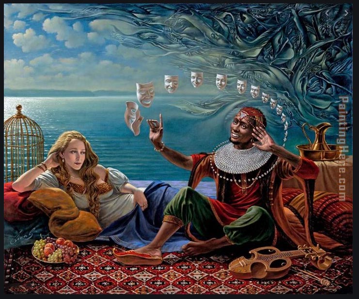
Peggy, your feedback is very interesting. On the one hand you say that you like that everything points to the sphere, but on the other hand you say that the sphere should be more visual. Both of my parents pursued art as a hobby and both enjoyed surrealism. As a result, I have been exposed to surrealism since childhood. There is no one style of surrealism, but one has to peruse not just glimpse a surrealistic image. My April image was the least complex image I have submitted. Most have required a more careful viewing. If one allows oneself to be distracted by the brightest spot of an image, then the rest of the image is seen only at a glance. I hope the contemporary surrealism artist, Michael Chaval, illustrates my point. Your feedback requires me to self examine which is why feedback of the PID groups is so valuable. Thank you. |
May 8th |
 |
7 comments - 4 replies for Group 54
|
15 comments - 8 replies Total
|


