|
| Group |
Round |
C/R |
Comment |
Date |
Image |
| 34 |
Oct 19 |
Reply |
Thank you for your feedback. In my camera club, we are told frequently by the judges of our competitions that the eye is attracted by the brightest spot in the photo/painting. It's how Rembrandt made his living. The man reading is the bright spot in my original. I feel Steve's lights would draw the eye away from the man. As far as my witch's brew is concerned, it is a step by step process that must be evaluated and adjusted as you go. Sometimes in a final step (but no always), in the list of layers, I put the result of the brew on top of the original and use a blend mode or simply play with the opacity of the brew's outcome to achieve a desired result. Sometimes it works beautifully, and sometimes it doesn't. PID participants don't get to see the one that end up on the cutting room floor. :) |
Oct 11th |
| 34 |
Oct 19 |
Comment |
This reminds me fondly of the sci-fi movies of the 1950's. I agree with you that a sphere would fit nicely here, but Original 3 is such a good shot that viewers will accept the free form shape as fitting quite well. I recently wanted a sphere and used Google to find a website that showed me how in a few steps. I don't remember the site, but Google has a good memory. (My sphere might make an appearance in the near future.) |
Oct 9th |
| 34 |
Oct 19 |
Reply |
Thank you for taking an interest in tweaking a composite you have such a positive reaction to. |
Oct 8th |
| 34 |
Oct 19 |
Reply |
Thank you for taking time to further explain your workflow. |
Oct 8th |
| 34 |
Oct 19 |
Reply |
I admire your tenacity. |
Oct 8th |
| 34 |
Oct 19 |
Reply |
Here's the rub: once you turn on the light you have to consider shadows. |
Oct 8th |
| 34 |
Oct 19 |
Comment |
Masterful, as usual. I agree with Georgianne about the puffy sleeves. Is it On1 that gives your images that magical realism/HDR final "glow" that I like so much? That look serves your images well. |
Oct 7th |
| 34 |
Oct 19 |
Comment |
The final image makes a nice abstract, but I'm wondering if that final image could have been achieved without 11 steps. Ctrl-U in PS will give you an uncomplicated Hue/Saturation dialogue from which you can manipulate individual colors. Hue/Saturation adjustment layer will give you the same thin, only more complicated. You can also do the same thing in Adobe Camera Raw. I'm always trying to reduce the steps in my workflow, especially since I work with composites so often. |
Oct 7th |
| 34 |
Oct 19 |
Comment |
Quite a nice image--especially the hair. The sky helps make this composite a true Halloween image. Though the zombies (?) are terrific, I feel you were more focused on the teeth than on the old church and tombstones. Like Georgianne, I would have liked to have seen more of the church. For me, it would have enhanced this very good image even more. |
Oct 7th |
| 34 |
Oct 19 |
Reply |
There is a scene in Roman Polanski's "Rosemary's Baby" in which the audience sees the villainess sitting on the bed talking on the phone. But Polanski films her through an open door which allows the audience to see only her partially obscured left side. That scene is a powerful scene in that it rivets the audience's attention making them want to see more. As far as unwritten or written rules are concerned, the most famous artists are those who create "new symbol systems" by believing that there are no rules in art. Rembrandt did this by using light to look into the soul of his subjects. (My bio doesn't mention it, but a century ago I minored in Art History in college. Sometimes that background creeps out.) |
Oct 6th |
| 34 |
Oct 19 |
Reply |
Thank you for your encouraging feedback. My entry in Group 54 in April explored the idea of putting a figure on the edge. You might be interested in seeing it. It's also basically monochrome. |
Oct 3rd |
4 comments - 7 replies for Group 34
|
| 54 |
Oct 19 |
Reply |
Thank you for your feedback. The Digital Dialogue feedback that we get is often fascinating and always helpful. Aavo does not like the face in the sky, yet Brad suggests that the clouds come out of its head as if the clouds were brains. Food for thought from both suggestions. There was very little manipulation of the mannequins other than taking 3 photos from three sides. |
Oct 28th |
| 54 |
Oct 19 |
Reply |
Just a short plane ride away! |
Oct 8th |
| 54 |
Oct 19 |
Reply |
Thank you for your kind words. Do I understand you to say you live in Charleston? I was born & raised in SC, and this summer I finally visited Charleston. |
Oct 8th |
| 54 |
Oct 19 |
Comment |
The blending in this composite works very well to communicate a Halloween-esque image. The colors belie the traditional Halloween colors, but I think that works well also. Personally, I would prefer a blended face on the body and a more transparent raven to add more of a dream-like quality. Nice work. |
Oct 7th |
| 54 |
Oct 19 |
Comment |
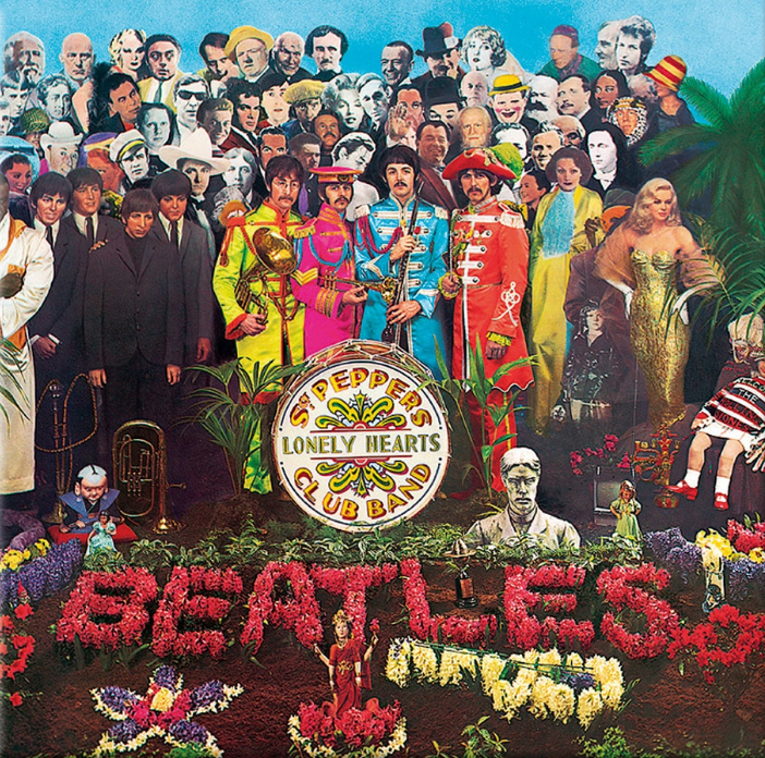
This composite is reminiscent of the "Sgt. Pepper's Lonely Hearts Club Band" album cover. Perhaps the woman on the lower right is screaming, "Paul is dead!" For my taste, the final product is too dark. Dark does not equal scary. I agree with Brad that the edges of the woman's image are too sharp--as are the edges of the masks/ghosts. Original 1 is such a good capture that is should form the central focus of your composite as is. |
Oct 7th |
 |
| 54 |
Oct 19 |
Comment |
Originals 1, 2, and 3 are all realistic images that you have blended together to make a composite that has a dream-like aura to it and defies rational analysis. The colors of the whole image, the movement of the waves, and the flight of the birds are all relaxing and a little playful. It makes the dreamer not want to wake up. |
Oct 7th |
| 54 |
Oct 19 |
Reply |
There were times when I wanted an open sky and times when I wanted the face in the sky. Without the face, I felt the clouds were too strong. I didn't think at the time to add a different sky. That's why feedback is so important. Thank you for yours. |
Oct 6th |
| 54 |
Oct 19 |
Reply |
I am a big fan of surrealism and try to emulate the disequilibrium that surrealist painters are so good at. One of Salvador Dali's most famous paintings, "The Persistence of Memory" is long on disequilibrium and short on telling a story. Judging from your feedback, this composite has created a sense of disequilibrium for you. :) |
Oct 3rd |
3 comments - 5 replies for Group 54
|
7 comments - 12 replies Total
|


