|
| Group |
Round |
C/R |
Comment |
Date |
Image |
| 34 |
Sep 19 |
Reply |
I visited your website and enjoyed the stroll through your creative mind. If the purpose of art is to provide the opportunity for others to see the world as the artist sees it, hence changing the perspective of the non-artist, you certainly have done this. (As far as libations go, wine is the strongest alcoholic beverage I drink.) |
Sep 24th |
| 34 |
Sep 19 |
Comment |
I'm glad your workflow was easier than the explanation. I agree with Georgiana's take and her subsequent revision, probably easier to do than to explain as well. Spider placement is crucial and catches the eye of the goth quite well. Nice composite. I'm guessing you were being modest. This was just as difficult to put together as to explain. |
Sep 22nd |
| 34 |
Sep 19 |
Comment |
Forget the iPad apps. What's your favorite libation? Looks like you had a good time. Like Georgianne, I like the flower the best, though Original 2 peeks my curiosity. |
Sep 22nd |
| 34 |
Sep 19 |
Comment |
Photos are nicely rendered and beautifully framed. A nice gift, indeed. |
Sep 21st |
| 34 |
Sep 19 |
Reply |
Please see my comments in my reply to Jan (you and Georgianne). |
Sep 16th |
| 34 |
Sep 19 |
Reply |
Please see my comments in my reply to Jan (Steve, and you). |
Sep 16th |
| 34 |
Sep 19 |
Reply |
Jan, Steve, Georgianne: Thank you all for you comments. I've taken your advice, though along different routes, and I feel the final product has been improved. Steve, I did not add stars, because as a retired English teacher, I found that literature equates stars with hope. To be brief, I used PS patch tool and content-aware, the HDR program, Aurora, and then back in PS I placed the revised version (which came out too light) on the original and reduced the opacity of the revised version.
|
Sep 16th |
 |
| 34 |
Sep 19 |
Comment |
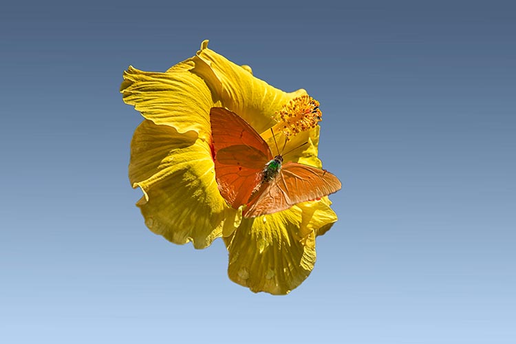
Thank you for your workflow. It's always beneficial to get into the mind of another photographer. As I have said on occasion, I'm a proponent of K.I.S.S. I extracted the flower and butterfly and changed the hue of the butterfly to give it some separation from the flower. I feel the background detracts from your lovely shot of the flower and butterfly. I chose the blue background (1) because it's simple and (2) I have it in my background folder. |
Sep 12th |
 |
| 34 |
Sep 19 |
Reply |
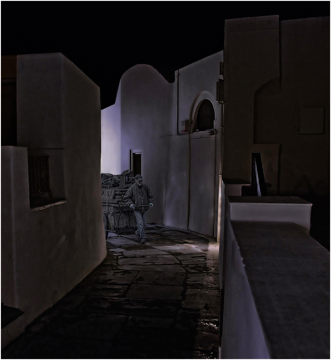
Steve, thank you for taking time to edit my composite. The light lines come from lights seen and unseen. The buildings were not cut out and added to a night sky. The man and his cart were the only things added to the scene. I always forget to add a stroke, even in my camera club competitions. I think the synapse for that necessity has eroded. |
Sep 10th |
4 comments - 5 replies for Group 34
|
| 54 |
Sep 19 |
Comment |
I agree with Brad. This is an example of if-it-ain't-broke-don't-fix-it. Original 2 is such an eye catching photo that improving it is a Herculean task. |
Sep 25th |
| 54 |
Sep 19 |
Reply |
Half a century ago when I was an undergraduate in college, one of my philosophy classes raised the point that nothing was something. I feel the same way about skies. |
Sep 25th |
| 54 |
Sep 19 |
Comment |
I'm very drawn to the forests in you composite, but for me, there are too many distractions taking my eye away from a virtual walk in these wonderful woods. There is a nature preserve a half hour away from my house, and I spend hours there walking through the woods with my camera. Often there are deer who allow me to accompany them on their walk. It's difficult to capture that on "film," but that's what I try to do. It's very personal, but I don't make composites of the woods shots I take. Perhaps that influences my take on your composite. |
Sep 24th |
| 54 |
Sep 19 |
Comment |
The background is a palette of textures that make the whole image. I feel the fall colors draw the eye away from these marvelous rocks, and the spider really has very little impact. You have a wonderful rough draft to save for a rainy day. |
Sep 24th |
| 54 |
Sep 19 |
Comment |
I agree with brad. Your image is somewhere between fantasy and reality. To answer your question to Brad, "Let there be light." Think of putting the woman and the tree in the Garden of Eden surrounded by desert with some sort of mystical light highlighting the "tree of knowledge of good and evil." Perhaps devil/angel type images that appear on cartoon characters' shoulders as they try to make a choice. Eve certainly looks tentative when she reaches for the apple. |
Sep 22nd |
| 54 |
Sep 19 |
Reply |
I didn't spend hours on the spokes, but it was a labor of love. Also, I spent several hours on the desert in Namibia a few years ago and there was no wind at all, hence no dust. Timing is everything. |
Sep 16th |
| 54 |
Sep 19 |
Reply |
Thank you for your feedback. I didn't add shadows because of the cloud cover. Instead, I covered parts of the wheels, the horse's feet, and the "blue" man's shoes with dirt. The feet of the man in the distance are partially obscured by the desert. I thought that would suffice. It probably isn't showing well on the monitor. |
Sep 10th |
4 comments - 3 replies for Group 54
|
8 comments - 8 replies Total
|