|
| Group |
Round |
C/R |
Comment |
Date |
Image |
| 1 |
Mar 19 |
Comment |
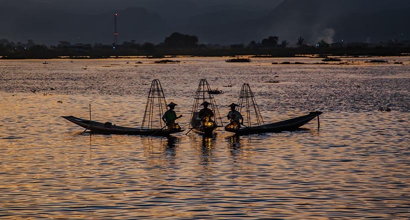
Your three fishermen easily capture the eye of the observer in a dramatic setting. It took patience to wait for them to arrange themselves in such a wonderful pose. I've taken the liberty of cropping your photo as a suggestion as to how to attract the viewer's eye even more. The sunset draws the eye from the center, as does too much water around the fishermen. My camera club stresses cropping out parts of the picture that distract the viewer. You have an artistic picture inside your original. |
Mar 1st |
 |
1 comment - 0 replies for Group 1
|
| 34 |
Mar 19 |
Reply |
I have enjoyed and learned from our dialogue. Perhaps you can teach me one last thing. I do like your Steampunk composites (I believe there was another one). You mention adding an overlay. Can you tell me how one does this? |
Mar 22nd |
| 34 |
Mar 19 |
Reply |
Thank you for taking the time to provide feedback and an image. First of all, your point about the boy is well taken. I went back to the original and flipped the boy horizontally, and he faces Christ at a better angle. Second, I had hoped the boatman could be seen as rowing toward Christ accompanied by his surrealistic reflection. Third, I don't feel a vignette nor an undercoating of texture adds cohesiveness or solidifies a theme. We'll have to agree to disagree on that point. Finally the light emanating from the hole in the ground is "the Light of the world." I've seen Salvador Dali's "Persistence of Memory" dozens of times as it is the Museum of Modern Art in NYC, and I still don't understand what the drooping watches have to do with memory or why the closed pocket watch is covered with ants or what ants have to do with memory. I frequently look online at current surrealistic artists Nguyen Dinh Dang and Michael Cheval just to enjoy their imaginative works while not always "getting it." I know I'm not in any of their leagues, but I still call upon the muses to keep my imagination fresh and look forward to feedback such as yours to help me see my composites as others see them. |
Mar 20th |
| 34 |
Mar 19 |
Reply |
Candy, Thank you for your feedback. You raise 2 points that I wish to clarify. Just as beauty is in the eye of the beholder, so is the image of Christ. I'm Jewish. Neither Lent nor Easter influence this composite. My goal is to create surrealistic works, hence the boat's reflection in the sand, not in water. The meaning is up to the viewer. The title of the composite is "The Light" because I like the song "Light of the World" in the play "Godspsel", and Google tells me that in John 8:12 Jesus says, "I am the light of the world." The boy being captivated by an image of Christ as the light of the world, for me, is not disjointed. I appreciate your feedback/dialogue, and I hope you understand that my creative thoughts here were secular. |
Mar 16th |
| 34 |
Mar 19 |
Reply |
Thank you for your comments. As far as straight lines are concerned, I have more success with the PS method I use than other straight line methods. I feel I have more control. Two philosophies I try to follow when creating my composites are "Less Is More" and "Keep It Simple Stupid." That's why there's no motion blur or wave ripples. In addition, if I supply too many detail, I feel I would lose the surrealistic effect I'm aiming for. |
Mar 10th |
| 34 |
Mar 19 |
Reply |
I hope you don't mind if I answer your questions after a few others have made comments. I'm glad you like Original 2. It has been successful in a couple of photo competitions. |
Mar 10th |
| 34 |
Mar 19 |
Comment |
I feel this comes under the category of "if it ain't broke, don't fix it." I feel Original 2 is easiest on the eye of all of the images and could probably blend well with Original 3 if you want to "fix it." I wonder if the "heavy application of Dynamic Contrast and Dark Glow filters" is what I find over the top. I know the title is "The Daily Grind" and this is reminiscent of my teaching days, but it just doesn't work for me as a photograph. But I do feel that I'm going to be late for class. |
Mar 7th |
| 34 |
Mar 19 |
Comment |
I just can't imagine why someone from Green Bay would want to go to Patagonia in the dead Wisconsin's winter in exchange for Argentina's summer. Enjoy. Your image makes a beautifully muted abstract design. The colors are well matched, but its's a bit too busy for my taste. |
Mar 7th |
| 34 |
Mar 19 |
Comment |
Georgianne, you have used your available tools well, but I feel the original version makes a better image than the one that tries to tell a story. Freud said "sometimes a good cigar is just a good cigar" [and not a sexual symbol]. Sometimes a good nature shot needs no alteration. |
Mar 7th |
| 34 |
Mar 19 |
Comment |
Your entry is reminiscent of Edward Curtis, a photographer of the old west who printed in sepia tones. What did we do before Nik Software. You have used it well. And don't you just love PS's liquify. You have put the tools available to us to good use. |
Mar 7th |
| 34 |
Mar 19 |
Comment |
Your three faces blend seamlessly with the waves and are the reward for all of the steps you took to make the composite a thing of beauty. Your description is a mini-tutorial on how to use plug-ins and PS tools that can manipulate color. You handled smart object, opacity, flattening layers, duplicating layers very well. This is an excellent sample of the reward one gets when one makaes full use of the tools available. |
Mar 7th |
5 comments - 5 replies for Group 34
|
| 54 |
Mar 19 |
Comment |
I see this differently from others. For me, it is a good idea that slightly missed the mark. You have created a fascinating mystery, but I see areas that need looking after. The building and its door look as if they were treated with a Photoshop plug-in and have lost their character as a result. I agree with Peggy that the boy is too bright, but I disagree with her about the branches. I prefer seeing the building without that filter. One last suggestion. The dog looks cut-and-pasted. He occupies such a central position, he needs to look more natural. This is certainly an image worth working on. |
Mar 6th |
| 54 |
Mar 19 |
Comment |
I agree with Betty's observation concerning the vagueness of the mother ship and with Brad's suggestion about adding a starburst. |
Mar 6th |
| 54 |
Mar 19 |
Comment |
I'm not a fan of Topaz Glow, but you have used it to perfection! Your masking in the face at low opacity is a technique that I will store in my memory bank. It works beautifully here. I've taken the liberty to crop out the bird. I feel it is superfluous here. The focus is your wonderful angel. The building to the angel's left helps create scale. |
Mar 6th |
 |
| 54 |
Mar 19 |
Reply |
Brad, As an art history minor in college (a century ago), I took part in a lot of discussions trying to define what art is. For me, there are no rules in art unless one is painting by numbers. I joined the Digital Dialogue so I could see what others see that I missed. Most of my composites go through several incarnations, so I'm often too close to them. I appreciate all feedback that I get and grow as an artist as a result. |
Mar 6th |
| 54 |
Mar 19 |
Comment |
I agree with the above. If you trim a little off of our right (the man's left) you will be more in keeping with the rule of thirds without harming this wonderful image. |
Mar 5th |
| 54 |
Mar 19 |
Reply |
Aavo, Your solution would be more in keeping with the man's hat which shows the sun more overhead. I'll be mindful of this in future iterations. Thank you. |
Mar 5th |
| 54 |
Mar 19 |
Reply |
Thank you for your feedback. Please see my response to Betty about other shadows. As for the intensity of the man's shadow, I agree. It could be toned down just a touch. |
Mar 4th |
| 54 |
Mar 19 |
Reply |
Peggy, Thank you for your observations. I guess moving the man is a reflection of the judges who come to my camera club's competitions. They do not like people, animals, objects that are moving toward an edge of the photo to be too close to the edge. They generally want the subject to have room to move. The same applies to birds too high in the frame. This may be why I feel your man is too close to the edge. |
Mar 3rd |
| 54 |
Mar 19 |
Reply |
Betty, Thank you for your feedback. I wrestled with the idea of placing some sort of tree shadow, but I felt it would either fall on the man or would distract from the man as it would be too close. |
Mar 3rd |
4 comments - 5 replies for Group 54
|
10 comments - 10 replies Total
|


