|
| Group |
Round |
C/R |
Comment |
Date |
Image |
| 18 |
Feb 19 |
Comment |
I think "hot lips" is more appropriate than "Paddlers." When I first saw your composite I thought you meant to create a face. Aside from the lips, I see two eyes, a nose, and a chin. Sometimes the unconscious sees what the conscious mind doesn't see. Conscious or unconscious, this is an intriguing composite. |
Feb 4th |
1 comment - 0 replies for Group 18
|
| 34 |
Feb 19 |
Reply |
Thank you for your feedback. Magritte has always been one of my favorites. Check out Michael Cheval and Nguyen Dinah Dang for very imaginative surrealistic thinking. |
Feb 24th |
| 34 |
Feb 19 |
Reply |
Thank you for your feedback. On my copy, the ballerinas are transparent, and the door frame is visible through them. Perhaps I was a bit too subtle in my treatment of the transparency. |
Feb 23rd |
| 34 |
Feb 19 |
Reply |
Thank you for your feedback, Candy. I wanted the ballerinas to be transparent. The door frame is seen through the ballerinas in the same way the dark sky is seen through the last of the ballerinas in line. I appreciate your photographer's eye observing so closely. |
Feb 16th |
| 34 |
Feb 19 |
Reply |
I like your lighter eyes better than my darker eyes. Good luck in the exhibition. |
Feb 9th |
| 34 |
Feb 19 |
Comment |
I had not heard of Steampunk until I visited Group 34 in November 2018 and saw your "Steampunk Femme." One doesn't have to know about Steampunk to enjoy the treatment of these clock parts. Thanks for sharing the path you take to get the effect on the clock. I delve into HDR to experiment with tone mapping in order to achieve a slight other worldly look. Your finish on the clock has a eye-catching tone mapped effect. Blurring the parts in the background helps tie it all together. |
Feb 9th |
| 34 |
Feb 19 |
Comment |
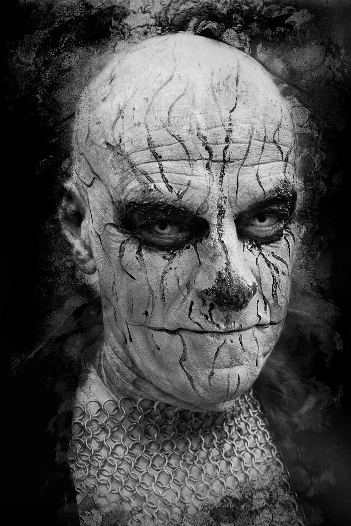
Steve, Thank you for your workflow description. That coupled with Denise's and Jan's feedback are a composite tutorial. Little for me to add except that I would prefer your Goth guy darker as a whole and in B & W which I have taken the liberty of attaching. Goth was very popular in the high school where I taught, and I don't remember any outfits other than black. |
Feb 9th |
 |
| 34 |
Feb 19 |
Comment |
Denise, you have created a lighter-than-air ballerina. Everything you've done has contributed to her pixie image. I wonder if providing some sort of "ground" that she could be hovering above would contribute to her airiness or if you should just leave it to the viewers' imagination. I agree with Steve's suggestion of a white stroke around the edges. |
Feb 9th |
| 34 |
Feb 19 |
Comment |
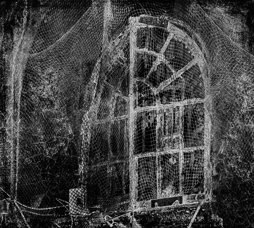
Knowing that this is a penitentiary window the net is appropriate and adds a measure of insane asylum. I agree that Steve's Gothic bride adds a bit of a story line, but I prefer this image in B & W. I took the liberty of changing it using a B & W adjustment layer in PS. |
Feb 9th |
 |
| 34 |
Feb 19 |
Comment |
Thank you for the detailed explanation of your workflow--the term I see when I work tutorials online. The colors really stand out and immediately catch the attention of anyone looking at the photo. This reminds me of the posters that were popular when I was in college during the previous century. |
Feb 9th |
| 34 |
Feb 19 |
Comment |
As a retired high school English teacher, I'm required by law to quote Shakespeare. One of my favorite quotes from Macbeth is, "It's a joyful trouble." You clearly had fun putting together this composite. I often use my grandchildren for my composites, and they've become willing participants. I can only echo what Steve said above about the technical aspect of this composite. It does, indeed, put a smile on one's face. |
Feb 9th |
| 34 |
Feb 19 |
Reply |
So do I! |
Feb 9th |
| 34 |
Feb 19 |
Reply |
I truly appreciate the feedback that my composite has generated. My goal is to learn from engaging in dialogue about the photos in the group. I'm struck by your phrase "artistically intentional," and I agree. Not all artistically intentional efforts achieve their intended effect. That's what feedback is for. As far as the pen tool is concerned, I am currently using it to eliminate the background that can be seen in the rusted frame of a wrecked ship. I remove a section at a time and come back later as it can be tedious, but I hope to incorporate the hull in a future composite. |
Feb 8th |
| 34 |
Feb 19 |
Reply |
I agree with the danger of a "pasted on" look, but I don't feel that applies here. In any case, your feedback is welcomed and instructive. |
Feb 7th |
| 34 |
Feb 19 |
Reply |
Steve, thank you for your feedback regarding the shadows. My thinking was that in surrealistic pictures, light and shadow are also surrealistic. I just wanted the shadows here to represent floating of their respective sources. As for the absence of shadows of the ballerinas and the door frame, again I felt that shadows and no shadows in the same image would suggest Rod Serling's "middle ground between light and shadow." I did splash some dirt on the base of the door frame to try to give it dimension, but it's way too subtle. Thank you for this opportunity to dialogue. It increases the potential for learning. |
Feb 6th |
| 34 |
Feb 19 |
Reply |
Thank you, Barbara. I look forward to the challenge of being in 2 distinguished groups. |
Feb 1st |
6 comments - 9 replies for Group 34
|
| 54 |
Feb 19 |
Reply |
Here's the revision. Thanks again. |
Feb 11th |
 |
| 54 |
Feb 19 |
Reply |
I'll try your suggestion. I never saw how muted the middle face is. Thank you for your observation. |
Feb 10th |
| 54 |
Feb 19 |
Comment |
Brad, you are the master of haze, fog, and mist. I agree with Betty. Could you move the beautiful shot of the rocks in Original 2 so that (1) the man is casting his net toward the rocks and (2) the rocks emerge from the mist? I see a good image here, but I feel the placement of the parts doesn't allow it to come through. |
Feb 9th |
| 54 |
Feb 19 |
Comment |
Wonderful colors. There's a green grocer near me that displays about 5 different brightly colored bell peppers. Every time I go in I want to set up lights and choose the most colorful peppers and take some still life shots. The colors alone would make the shot. I feel that way here. The bust is distracting. Were there enough colorful squashes in the barrow to make that your shot? |
Feb 9th |
| 54 |
Feb 19 |
Comment |
Great use of a beautiful museum's outer wall. Where this is a good depiction of action, it still seems like the figures have been cut and pasted. Shadows as suggested above would help, as would, I believe, making the farthest part of skateboard rink go out of focus. Nice action composite. |
Feb 9th |
| 54 |
Feb 19 |
Comment |
The plaintive look on the face of the bust in Original 1 is worth focusing on. Placing the bust in the weeds in front of the No Trespassing sign emphasizes that look. However, the jewel placed in the bust's eyes serves to lessen that wonderful plaintive look you chose to put front and center. I feel that reducing the size of the bust, placing it in the lower right hand corner so that it creates a stronger diagonal with the sign, and keeping the path through the weeds as seen in Original 2 would serve to highlight that plaintive look. |
Feb 9th |
| 54 |
Feb 19 |
Reply |
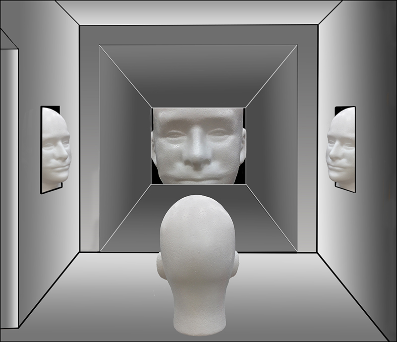
Brad, thank you for your feedback. de Chirico is one of my favorite surrealist painters. The blank faces are certainly de Chirico-esque, but the absence of his long, sharp, dark shadows in my composite doesn't reflect him. In any case, mentioning de Chirico and me in the same breath is certainly a tremendous compliment. |
Feb 6th |
4 comments - 3 replies for Group 54
|
11 comments - 12 replies Total
|


