|
| Group |
Round |
C/R |
Comment |
Date |
Image |
| 48 |
Sep 18 |
Comment |
Margaret - by "too dark" I don't mean the man at all. I mean the engine itself.. of course that is dark, its a black thing! I have no problem with that at all... I just think the entire image could be brightened up a slight bit - like what Bev did in her example. Other than that... I think this is an excellent image! Both in composition and subject matter, not to mention the sharpness of it. I truly love this image. My comments were geared toward the overall image itself. Bev's rendition makes the area above the wheels a bit brighter - The area just in front of the worker. That is what I mean with the image being a bit "too dark". I guess there is a better way to describe what I am thinking, but that was the best I could think of when I wrote the comment. |
Sep 17th |
| 48 |
Sep 18 |
Reply |
Thank you, Neil... to be honest, I didn't see that noise! See? I learn from every comment. MANY thanks! |
Sep 17th |
| 48 |
Sep 18 |
Comment |
I LOVE this image. It tells a story that no one could capture as well. I love the way you blurred out the background as it made the image much stronger. I would do nothing to improve on this image at all... after all, there is no improvement to perfection! :) |
Sep 17th |
| 48 |
Sep 18 |
Comment |
I agree with the posts above... I think this is a wonderful photo in terms of subject matter and sharpness... my only issue is that it is a bit too dark. If you really wanted to play around with it, you could brighten/lighten up the entire image a bit and put a focal "spotlight" on the man to make him stand out just a bit more. Not sure if I made myself clear, but I do like the image very much, just that it is too dark |
Sep 17th |
| 48 |
Sep 18 |
Reply |
MANY thanks, Richard! |
Sep 4th |
| 48 |
Sep 18 |
Reply |
Bev, looks great and I do like it this way, but in this case, I was looking for a softer image. |
Sep 4th |
| 48 |
Sep 18 |
Reply |
Not to worry, Sean... I learn from every opinion. :) |
Sep 4th |
| 48 |
Sep 18 |
Comment |
I love the black and white... and the addition of birds is never a deterrent to an image! Love them... Sometimes a color image just NEEDS to be converted to black and white. Good job here... The sun is well placed. I think it would look funny put elsewhere. Now, I am being VERY VERY picky - but how would it look if you added just a bit of a sun reflection on the water? Not a lot, just a little bit - like I said... being very picky - other than that, I would do NOTHING else to it... LOVE the image just as it is. |
Sep 4th |
| 48 |
Sep 18 |
Reply |
Thanks for the information! I don't mow the lawn... that is husband's job! I like the way it looks though... and I will pass the info along to him.. :) |
Sep 4th |
| 48 |
Sep 18 |
Reply |
Just my humble opinion... glad you like it! |
Sep 4th |
| 48 |
Sep 18 |
Reply |
LOVE it, Bev... This image is even stronger.. nothing left to do here! |
Sep 4th |
| 48 |
Sep 18 |
Reply |
Have a wonderful trip! Please travel safely |
Sep 4th |
| 48 |
Sep 18 |
Comment |
This image is very interesting, LOVE the way the lawn mover made stripes of the grass! The baseline draws the eye into the photo, but I would try to make the very light dirt at the upper left of the baseline the same color as the rest of it. I find that to be the slightest bit distracting. All in all, this is a great image. |
Sep 2nd |
| 48 |
Sep 18 |
Comment |
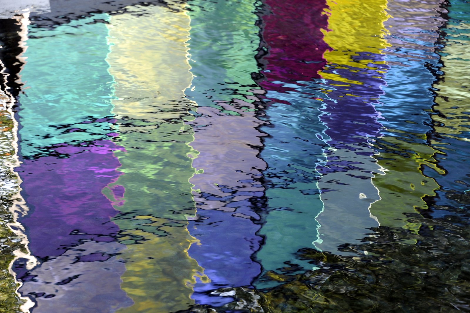
Bev, this image is FANTASTIC! I love the reflections. With the exception of the removal of the little tuft of tree over the left side of the bridge, I would do nothing further to the image. It is not a big thing but if someone were to be very picky, they may find that little tuft of tree top to be a bit distracting. |
Sep 2nd |
6 comments - 8 replies for Group 48
|
6 comments - 8 replies Total
|