|
| Group |
Round |
C/R |
Comment |
Date |
Image |
| 48 |
Jan 17 |
Reply |
Agree!!! |
Jan 20th |
| 48 |
Jan 17 |
Comment |
Oh Bev... I would appreciate that very much! Please post the instructions.... :) |
Jan 20th |
| 48 |
Jan 17 |
Reply |
Neil... THIS is a terrific shot!!!! |
Jan 17th |
| 48 |
Jan 17 |
Reply |
MUCH better!!! but now the mountains look too orange to me. Nancy, the subject matter is terrific... I love this image, but if you could work with the color somehow....
|
Jan 17th |
| 48 |
Jan 17 |
Reply |
Neil, you are right... that is distracting! Thank you for pointing that out! I was so buys looking at the bird, the bottom strip never occurred to me. |
Jan 17th |
| 48 |
Jan 17 |
Reply |
Margaret.... I meant to brighten up the whole image...not lighten up the black man. lol |
Jan 15th |
| 48 |
Jan 17 |
Reply |
I think this works much better... :) |
Jan 15th |
| 48 |
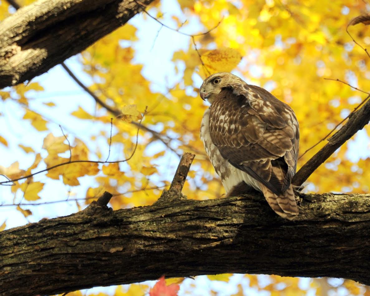
Jan 17 |
Reply |
Margaret... yes, I had a very long lens! I was on the ground and he was way up in the tree. It was an extremely sunny day... I will try to tone it down, but when I did the first time, this is what I got... maybe recropping will help... Good suggestion....
|
Jan 15th |
| 48 |
Jan 17 |
Comment |
Neil.. I like this image, but it is sized a bit too small for this venue. It is cropped well, but I find it a bit too dark. Can you brighten it just a bit? All in all... great image! |
Jan 14th |
| 48 |
Jan 17 |
Comment |
Nancy... I think this image is a very nice vista.. but I think it is a bit too "blue". it is clear, composition is terrific, but the greens are a bit too blue. If you could reduce that a bit, I think it would be a stronger image. I loved Alaska... this image is very inviting... Great shot |
Jan 14th |
| 48 |
Jan 17 |
Comment |
I agree with Ahmed's crop. I would, however, leave the entire leaf shadow intact on the lower left. Otherwise GREAT SHOT!!! I found the metal you describe as identifying it as a car to be somewhat distracting. I like the crop but wonder if you could just brighten it a little bit - the right side looks a bit too dark. |
Jan 14th |
| 48 |
Jan 17 |
Comment |
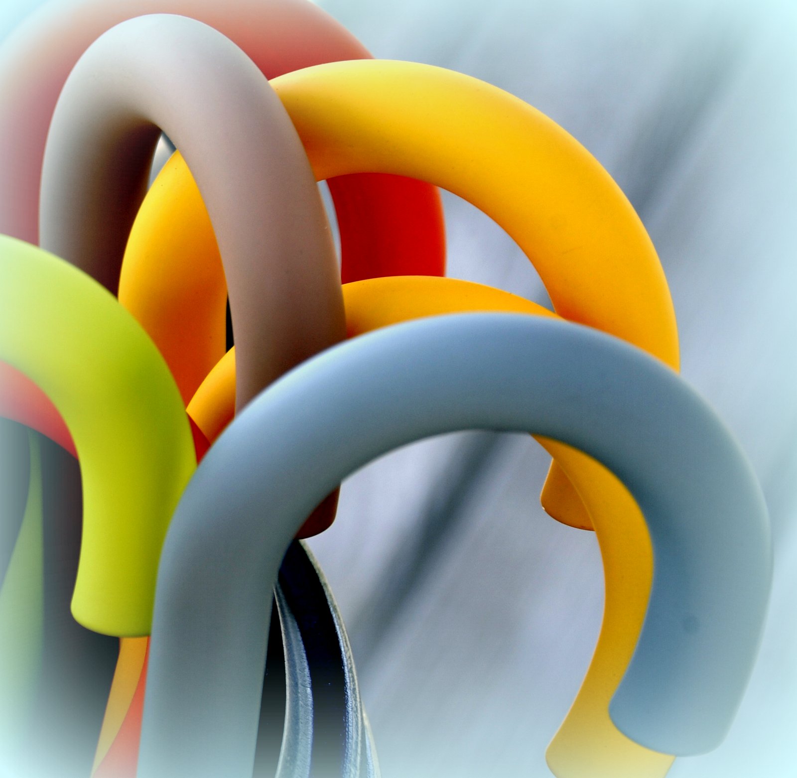
Ahmed... I LOVE abstract! I love this image and wonder if the image would be stronger if you cropped out the upper right corner (which is out of focus just a bit) just to the broom handle with the blue ties and cropped it to just under the first bunch of brooms on the upper left to just under them where the dark begins. So it would be the upper left quarter of the image. What do you think? |
Jan 14th |
| 48 |
Jan 17 |
Comment |
Bev... everything on this image is spot on with regard to composition and clarity. I agree with the shadows in the eyes. Can you brighten them a bit? Otherwise, terrific portrait!
h |
Jan 14th |
6 comments - 7 replies for Group 48
|
6 comments - 7 replies Total
|