|
| Group |
Round |
C/R |
Comment |
Date |
Image |
| 50 |
Aug 18 |
Comment |
Thanks all. |
Aug 5th |
| 50 |
Aug 18 |
Comment |
Think you got it. |
Aug 5th |
| 50 |
Aug 18 |
Reply |
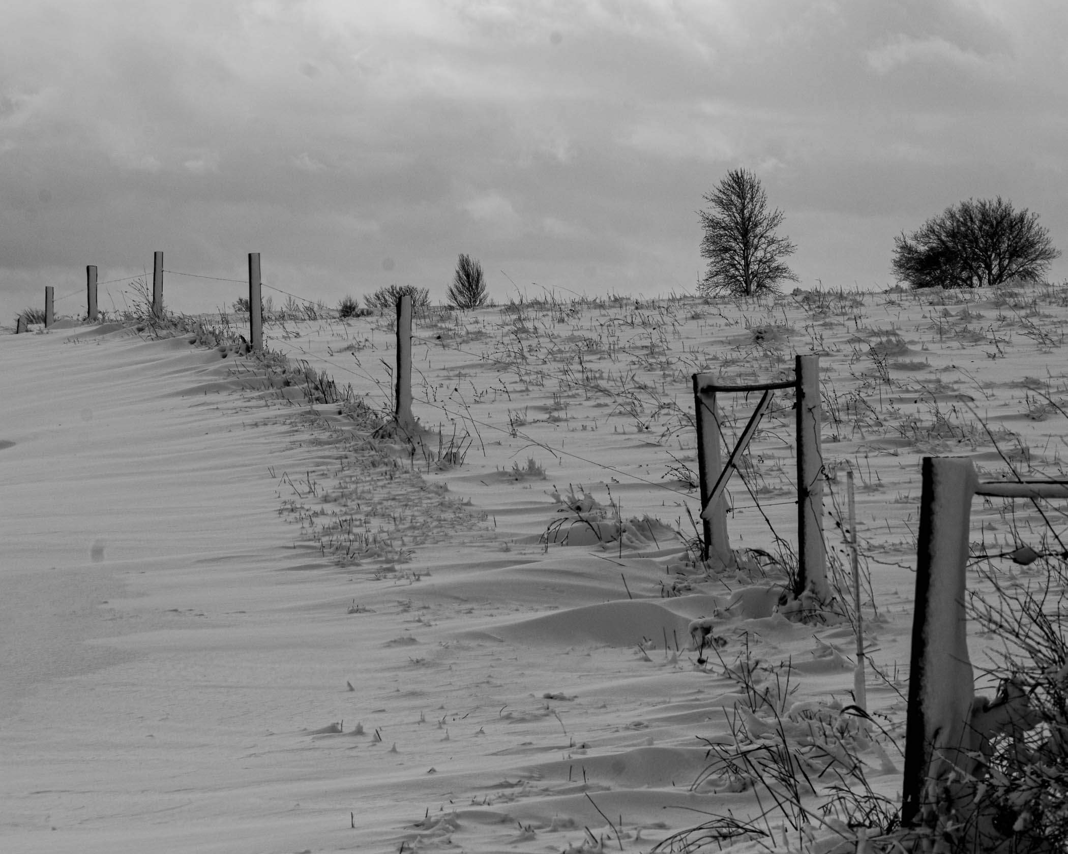
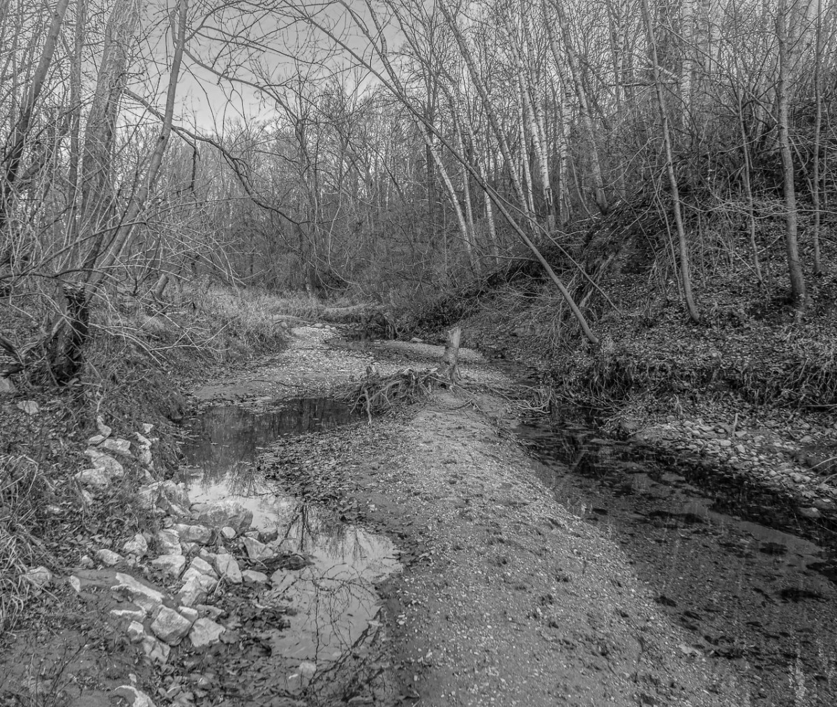
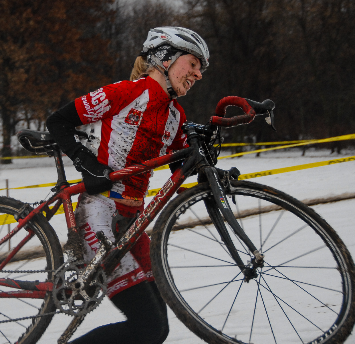
On my screen I don't see a lot of detail. The hills both sides of road are just "shadow". The slope to the right has detail/texture and the foreground has detail/texture in the trees.
|
Aug 3rd |
| 50 |
Aug 18 |
Comment |
Oh, the crop half way into the rumble strip. |
Aug 3rd |
| 50 |
Aug 18 |
Comment |
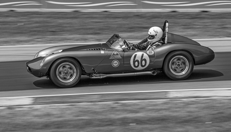
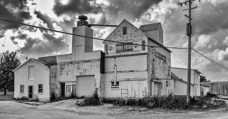
Another vote for David's crop. I also like Gordon's gaussian blur to every thing but the car to neutralize the bold Kohler signs which are not in good shape. I think the blur will make both color and mono interesting. Now if you also have that Topaz filter that makes the prime subject jump from the page comic book style, you have a "creative" third option but consider more right side cropping then. |
Aug 3rd |
| 50 |
Aug 18 |
Comment |
The old flip trick works well and improve image (as do the other comments. Great shot. |
Aug 3rd |
| 50 |
Aug 18 |
Comment |
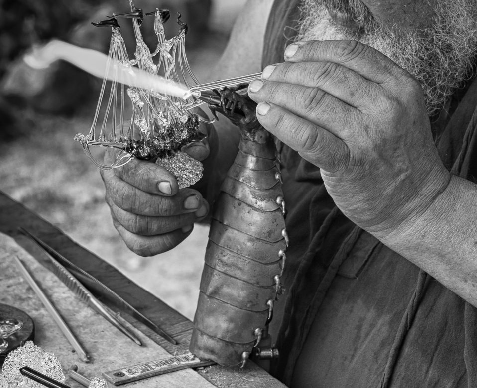
Thanks all. Single wire will go and need to tone down upper left corner which draws your eye. |
Aug 3rd |
| 50 |
Aug 18 |
Comment |
|
Aug 3rd |
| 50 |
Aug 18 |
Comment |
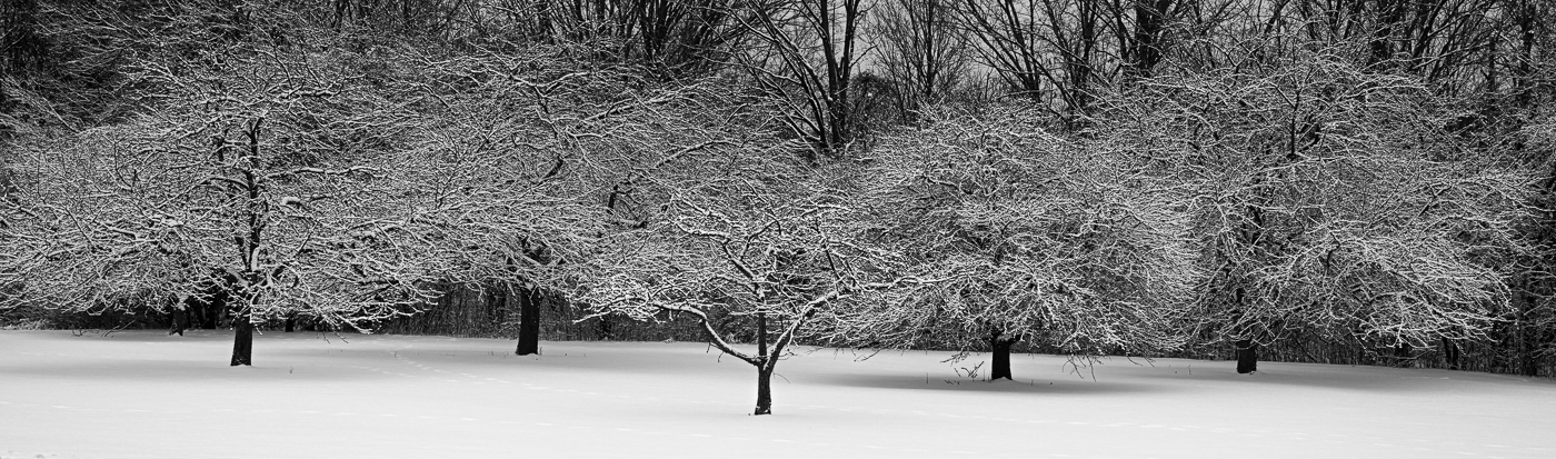
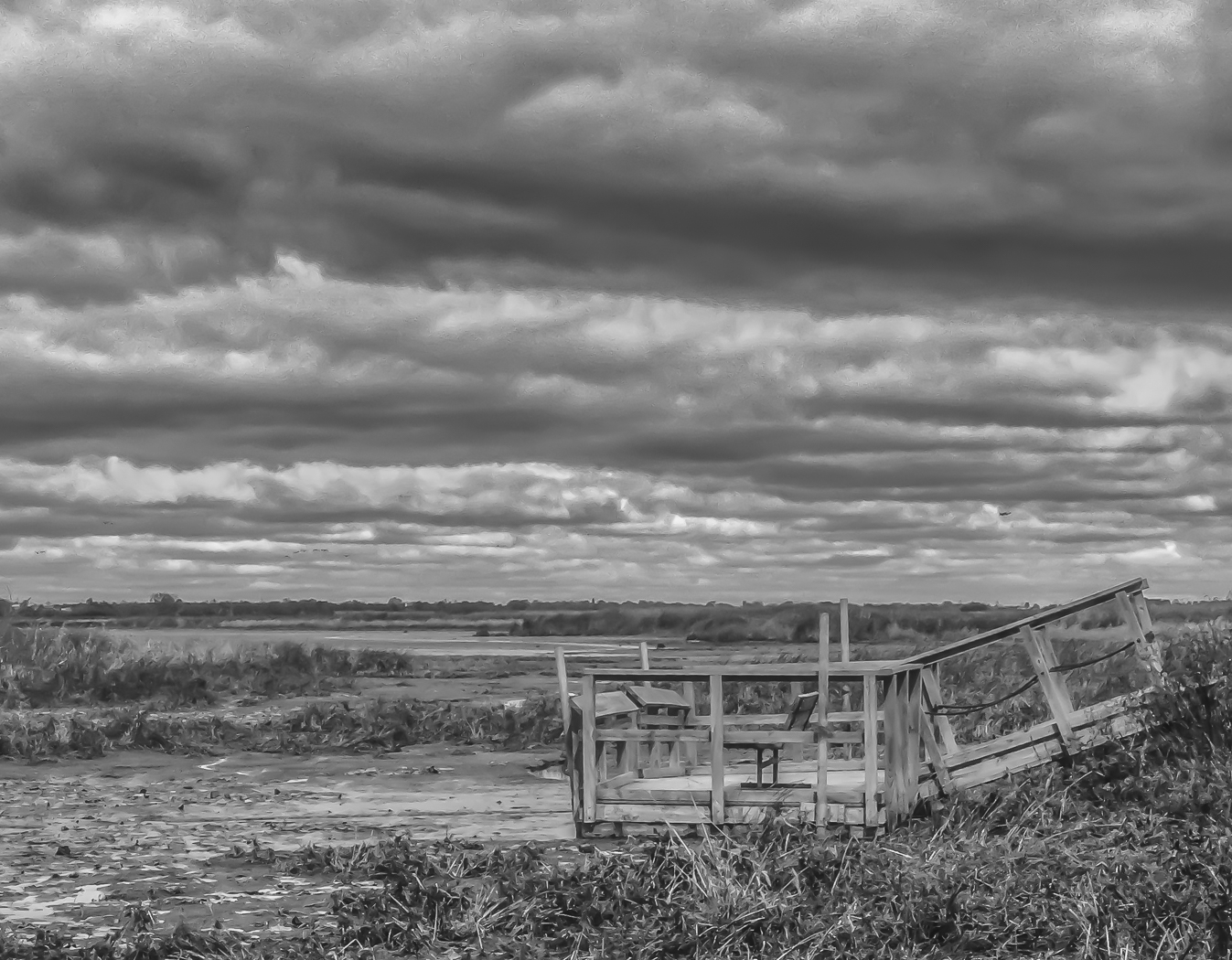
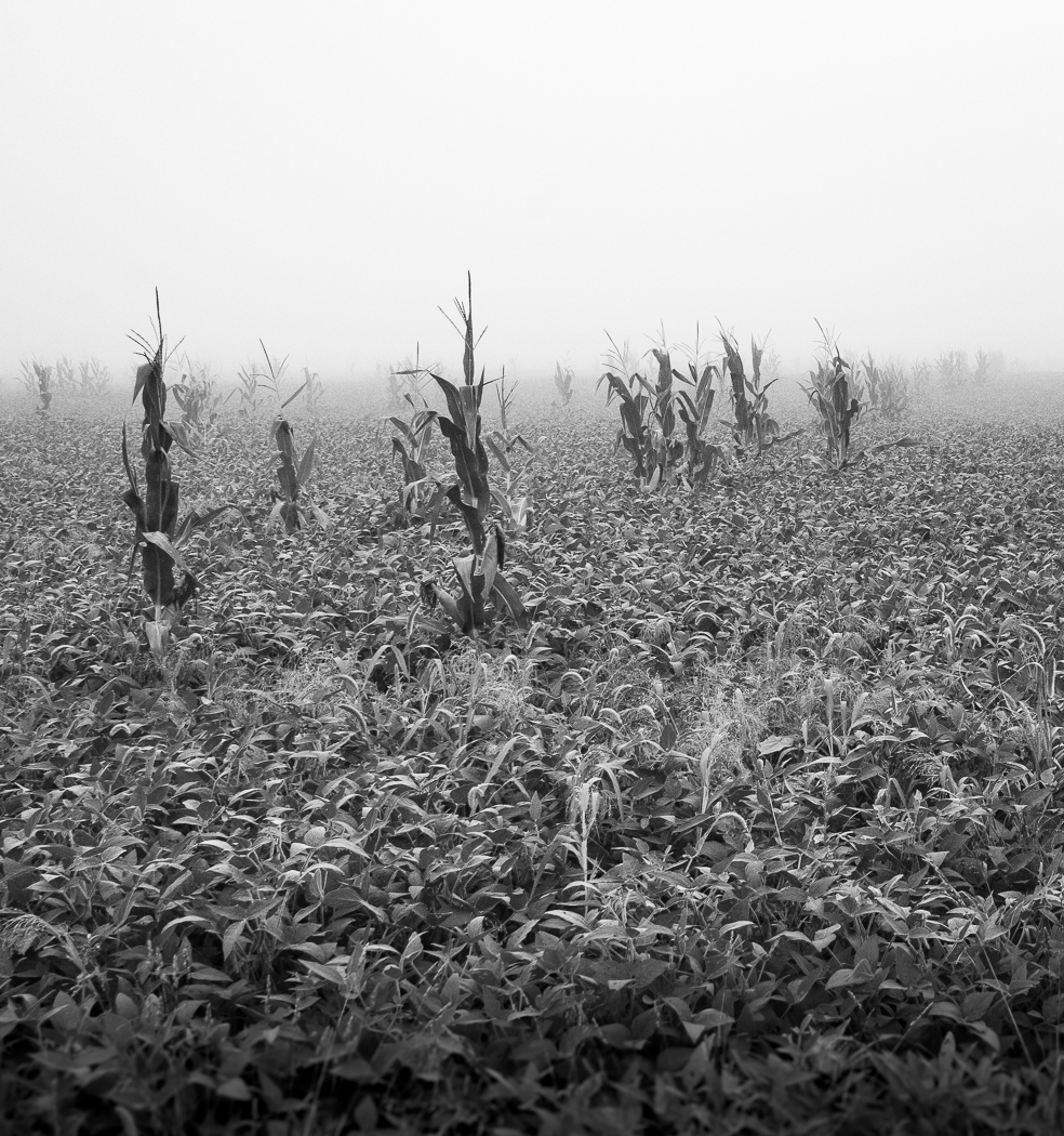
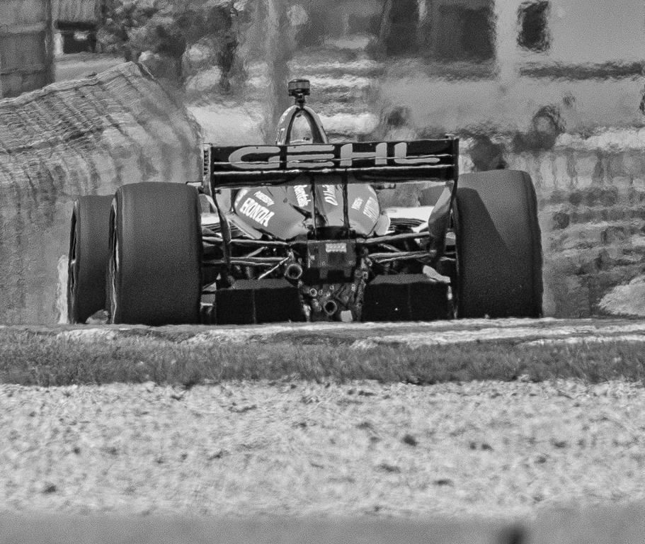
First I agree with B & W vs color.Now as to the version, this photo reminds me of the Ansel Adams sand dune I have (cheap calender copy) on my wall. The AA photo has less dark areas and more detail which is what I was looking for. The winding road Orig 2/Jeff/David is needed. Guess I'm still bothered by the "detail" element. |
Aug 3rd |
| 50 |
Aug 18 |
Comment |
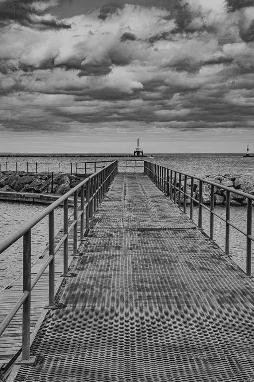
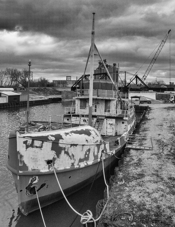
Agree on the buoys and sky crop Jeff executed. I really like reflections like you captured.
Not sure what Jeff did but the image seems sharper. One thing that was bothering me is the brights windows (in bldg not in reflection) made image blurred to me. |
Aug 3rd |
| 50 |
Aug 18 |
Comment |
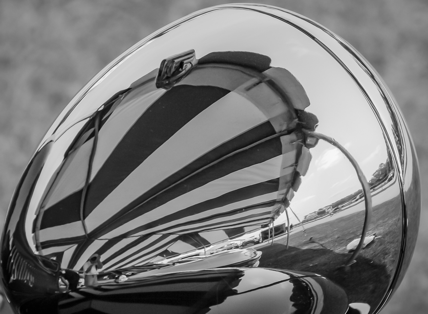
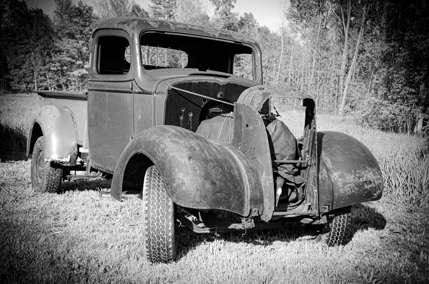
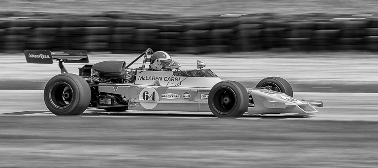
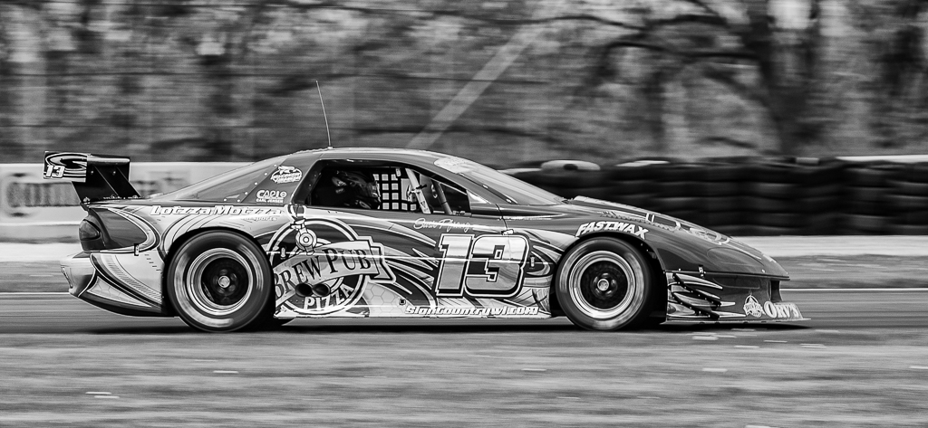
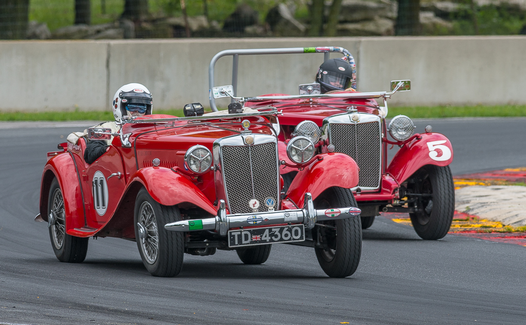
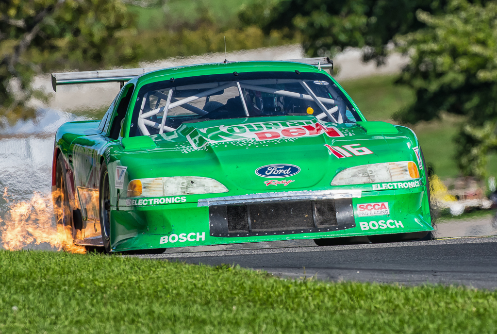
I like the version David/Jeff has, darker and cropped so the full headlight rim shows. Helps the grille pop.
Another version could be cropping to the grill only.
Color vs mono - I like both if cropped like David/Jeff show. I'd also clone out the tar joint and blur everything in lower right and left that isn't the car. For the selected blur areas, I think you are in PS. |
Aug 3rd |
10 comments - 1 reply for Group 50
|
| 59 |
Aug 18 |
Comment |
Also the WI State Membership Director is a professional rodeo photographer in WI area rodeo district. Jeff Klug or Gerry Emmerich or the WI PSA newsletter website (Focus) could give you an email if you want another opinion. And I believe Joe has taken a rodeo or two.
|
Aug 16th |
| 59 |
Aug 18 |
Comment |
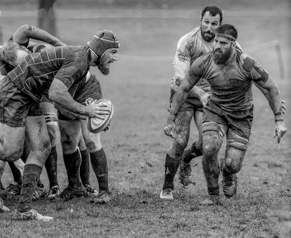
Great shot Bruce. Like the faces of the rider and other viewers. I think the only editing you can do if you want to enter in PJ is cropping. Hazards of what looks like a smaller local rodeo. Keep in mind if you also enter in PIDC or M you can edit the background as you like, opasity etc. I also agree with you that the rider's horse is very important in telling the rodeo story. Another option would be to crop the two guys left and right letting the picture show audience interest.
I suspect success if entered in competition would be the knowledge and interests of the judges. You might want to try one of the India contests. Regardless, I would bet the guy bull-dogging would like a copy. |
Aug 16th |
| 59 |
Aug 18 |
Comment |
A second WOW and sorry I missed last month.
No suggestions. Cropped nicely to focus on people's faces and action while showing the environment. Odd number of people (two guys hanging on for dear life and the third standing and guiding the raft through the falls). Room to go to the right. Close to the rocks for danger.
Should be accepts easily and maybe a medal/HM unless you enter in a contest where judges see this regularly or several one time shots. |
Aug 6th |
| 59 |
Aug 18 |
Comment |
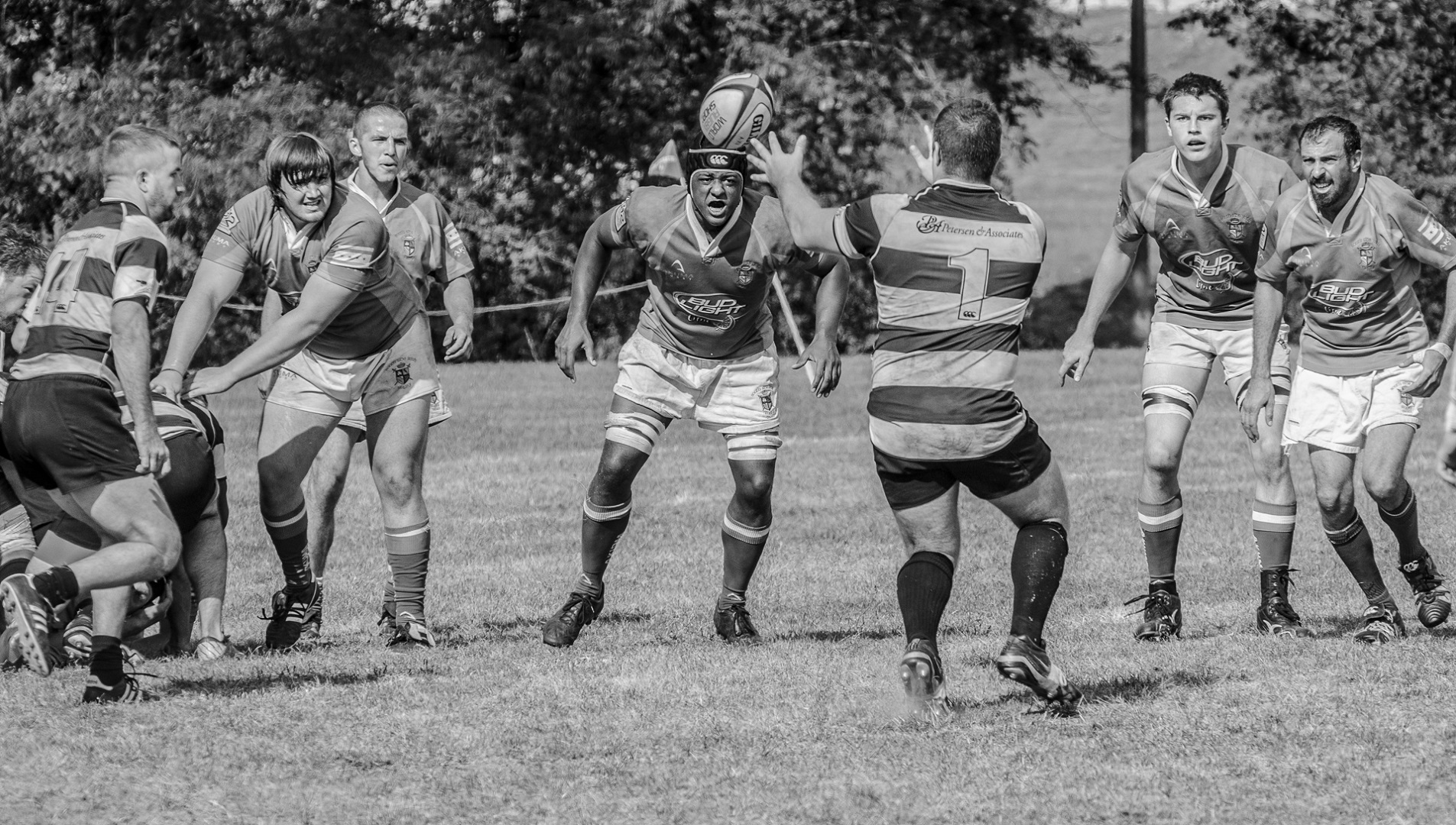
I haven't done polo in a long time but the background is always a problem. Couple of things:
-Eight legs great
-Downplay some of background by cloning out the ballons on upper right and pink wrap on left?
-Maybe a little cropping on right and left?
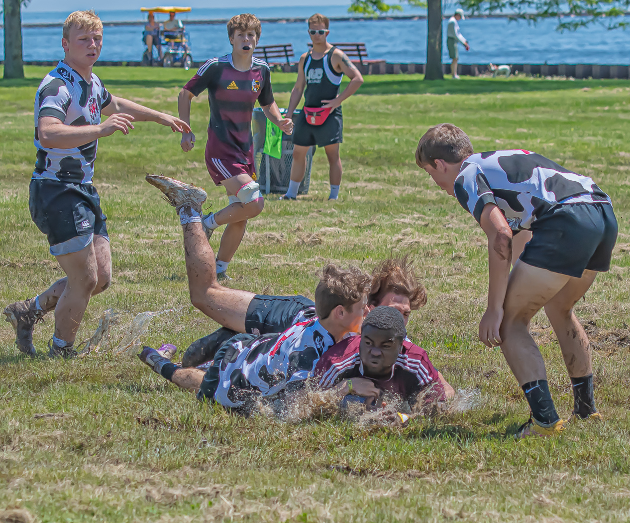
-Also I miss the ball |
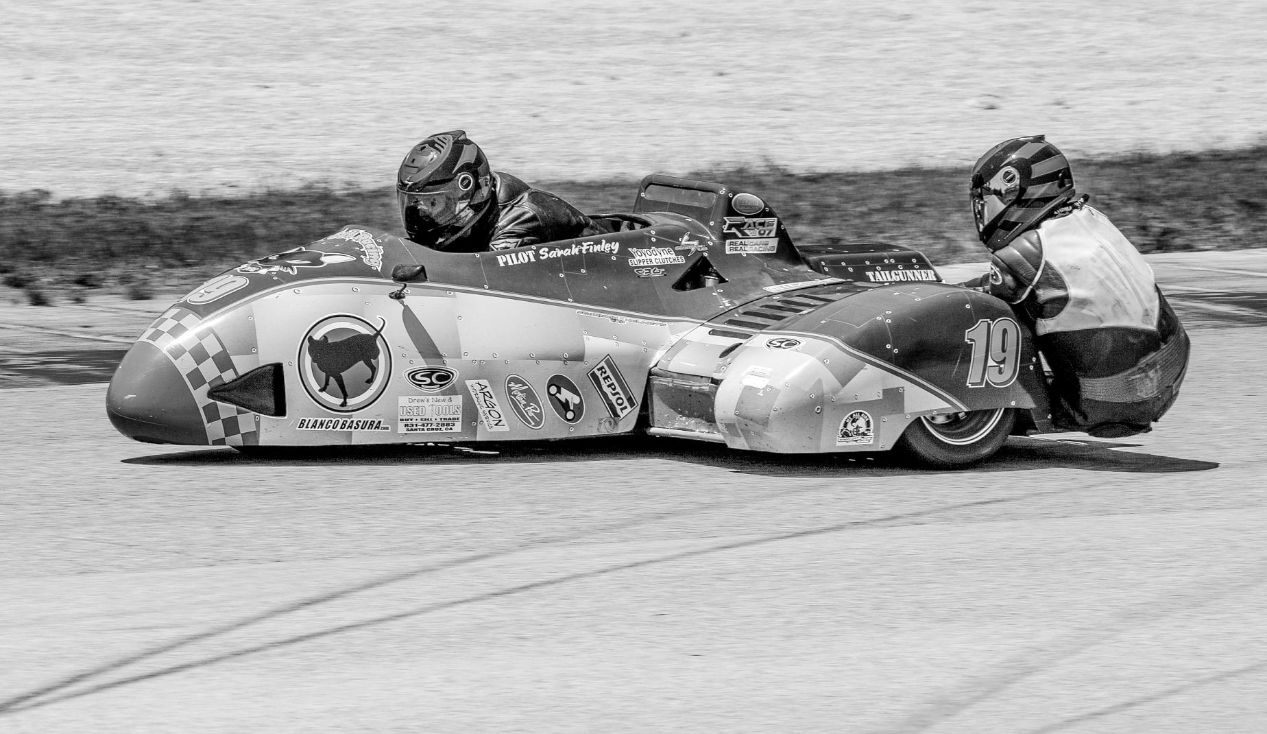
Aug 3rd |
| 59 |
Aug 18 |
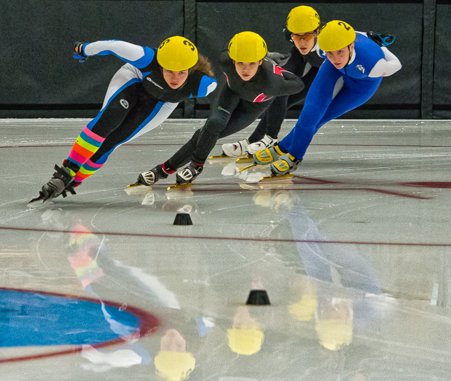
Comment |
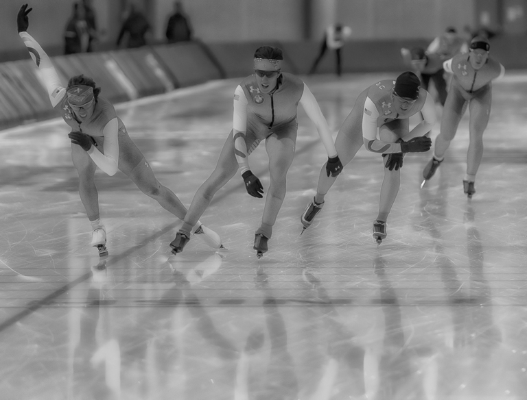
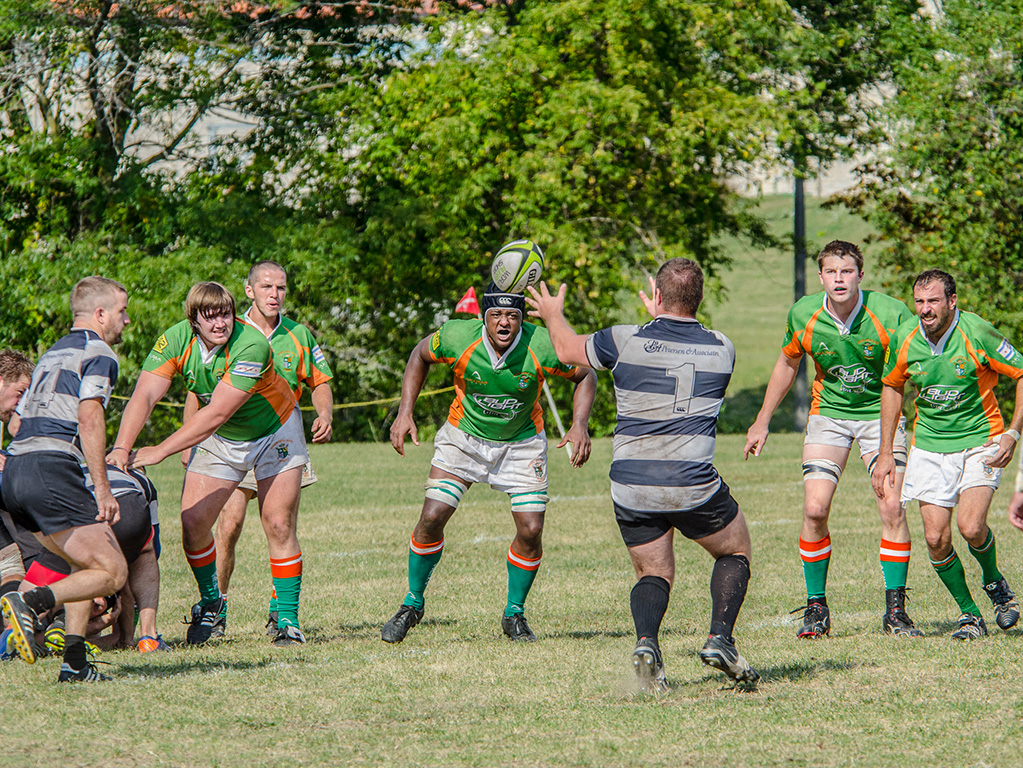
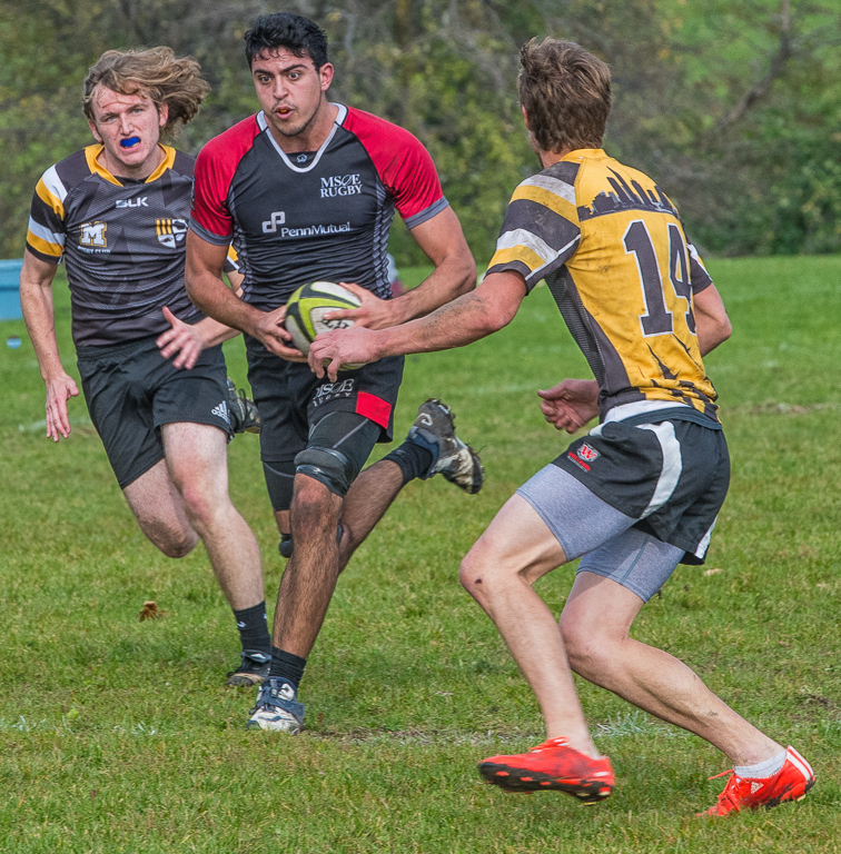
I like it Joe. One of the better volleyball shots with not too much cropping and 18 focused on the ball. Only negative may be lack of bright colors. Have you thought of trying mono? |
Aug 3rd |
5 comments - 0 replies for Group 59
|
15 comments - 1 reply Total
|