|
| Group |
Round |
C/R |
Comment |
Date |
Image |
| 52 |
Mar 26 |
Comment |
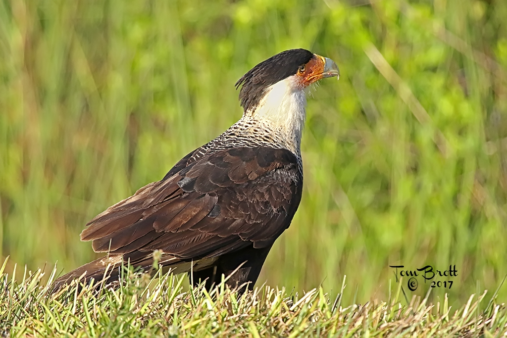
I feel that Sharon's suggestion of rotating the image a bit for cropping purposes is a good one. The branch under the wing does not bother me but, I also feel it adds nothing to the image. The Cara-Caras are sharp and clear and the main focal points has a clear background. Cropped or not it is still a beautiful image. |
Mar 17th |
| 52 |
Mar 26 |
Comment |
I like the crop you have used to make this image. For me I think the image is a little too high key and I would like to see a more natural green color behind the grackle. If you are going to keep as now shown I might suggest removing or dodging out the iron window covering in the upper right of the image. I think the suggestion of lightening the head, feet and tail to bring out more detail is excellent. |
Mar 17th |
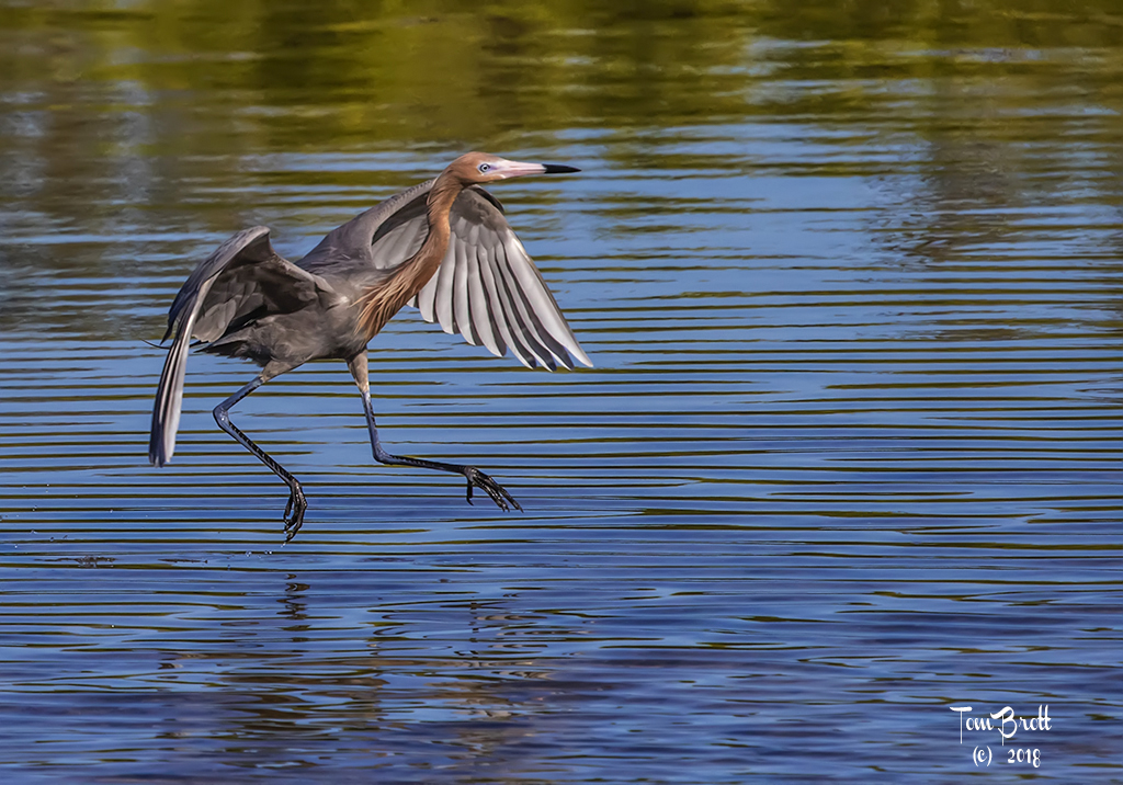
| 52 |
Mar 26 |
Comment |
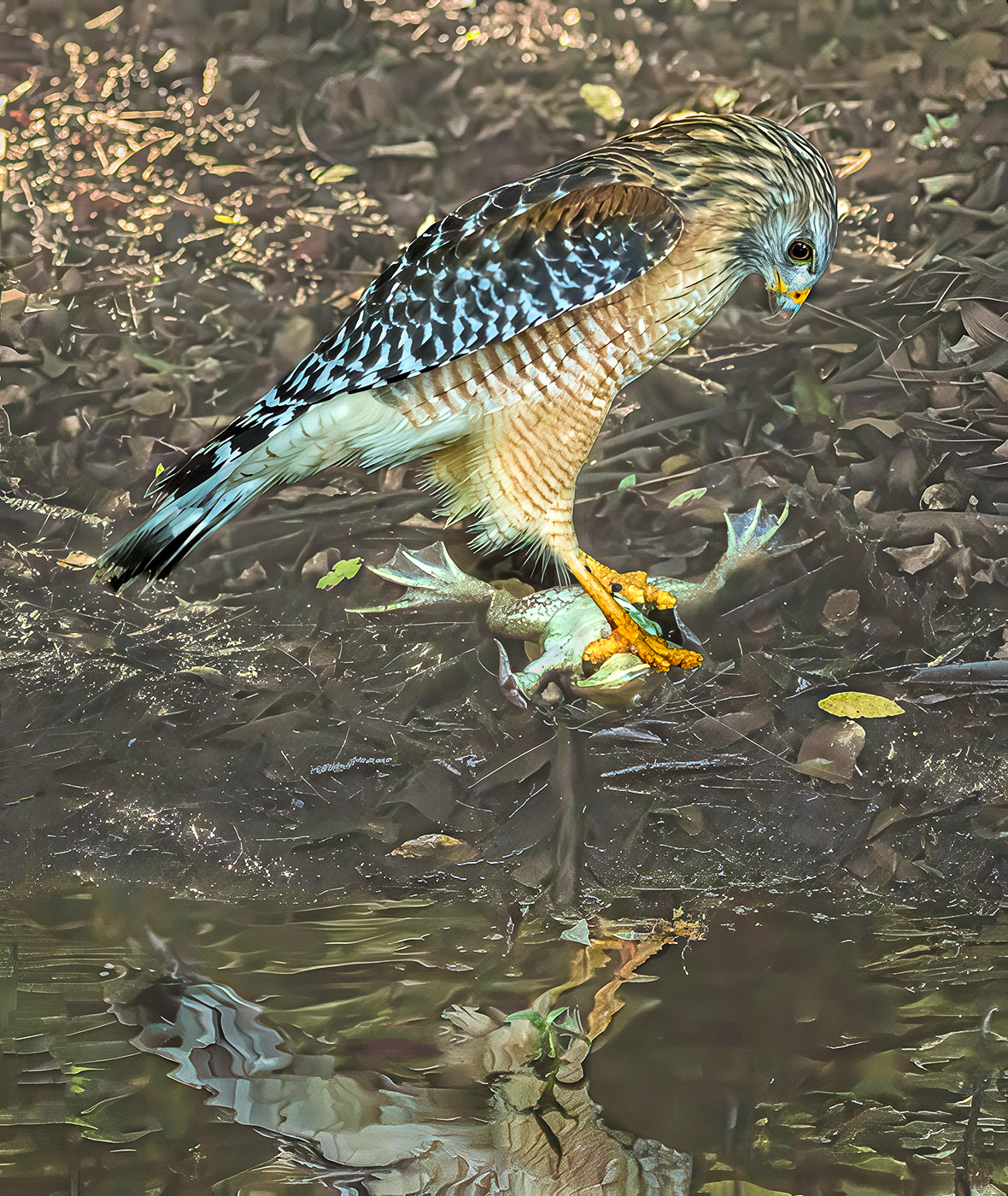
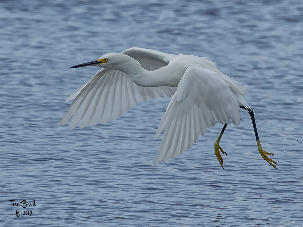
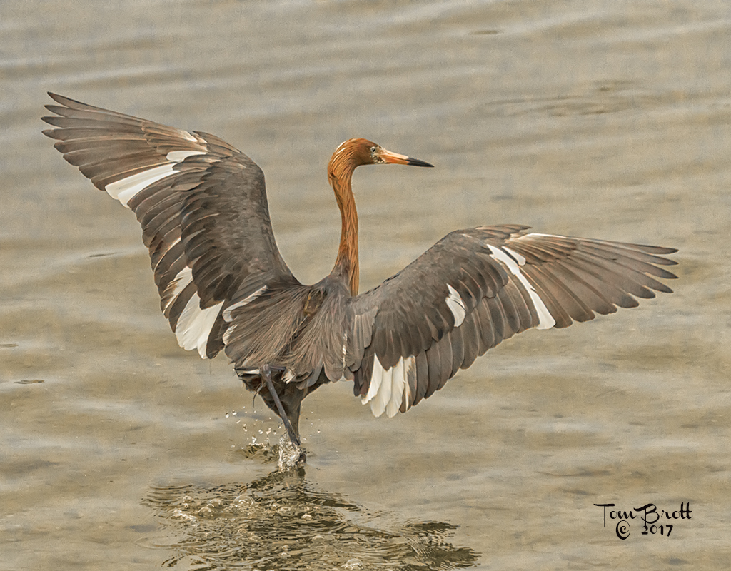
I like the foot splashing marks left in the water by the bird taking off. i fee the same as the other comments in lightening the brown color to bring out more detail. In Photoshop I just tried going to image - adjustments - shadows/highlights and the browns of the bird appear lighter adding a little more definition. |
Mar 17th |
| 52 |
Mar 26 |
Comment |
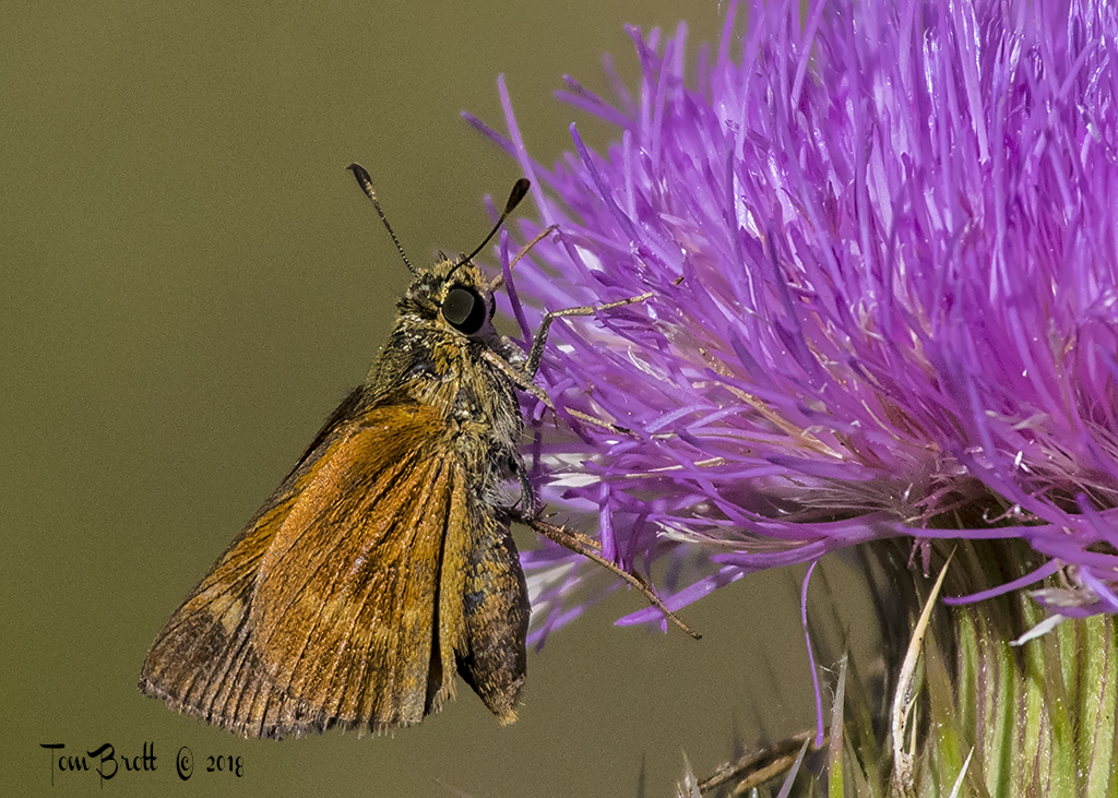
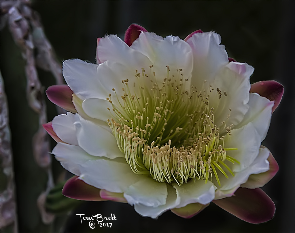
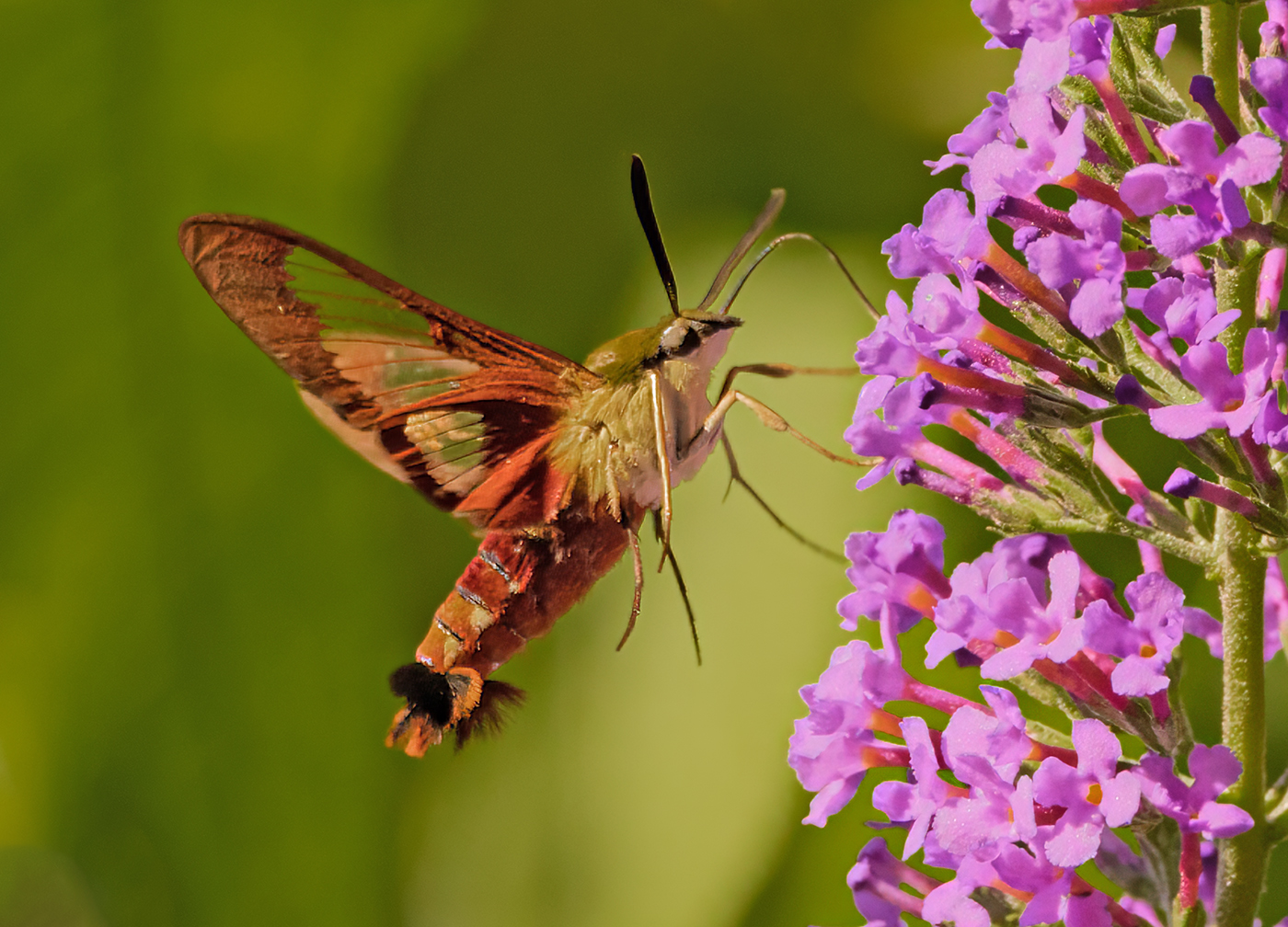
I like the stop action of the wings as well. The hummingbird is sharp and clear enhancing the image. I think Sharon is correct with the cropping suggestion of the long stem thistle. When my eye travels upward on the stems it tends to jump over to the right most stem as the upper portion of the left thistle stem appears to be very close to the same color as the background. I also feel that the thistle flower the hummingbird is feeding on is a little too purple in luminosity. I always have trouble finding the proper formula to correct the purple of thistle plants to look natural. |
Mar 17th |
| 52 |
Mar 26 |
Comment |
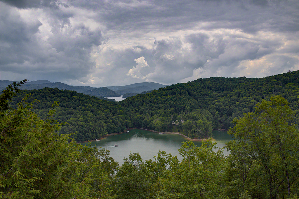
I also like this image with the sloping mountains into the river valley and snow capped mountains in the background. I feel that the lava rocks in the foreground are a little too much and Sharon's suggestion of cropping up a bit could help the image. The dehaze slider would help clarify the mountains and/or using one of the options in the levels adjustment. From your description it sounds like it was fun getting to this vantage point as well. |
Mar 17th |
| 52 |
Mar 26 |
Comment |
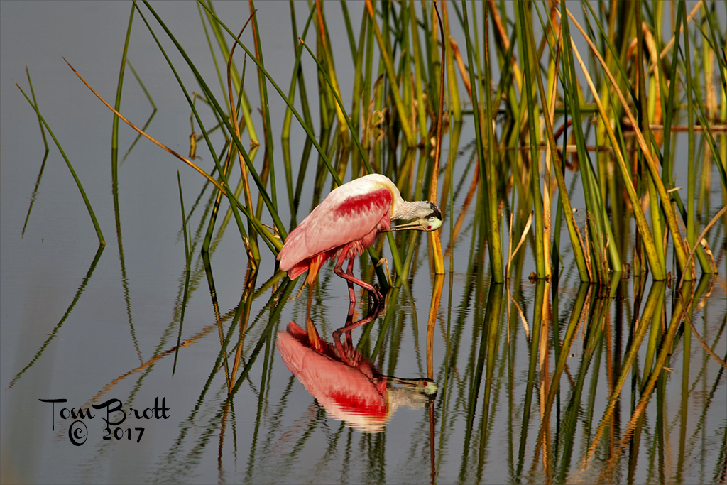
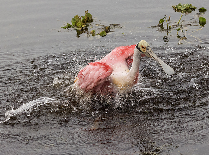
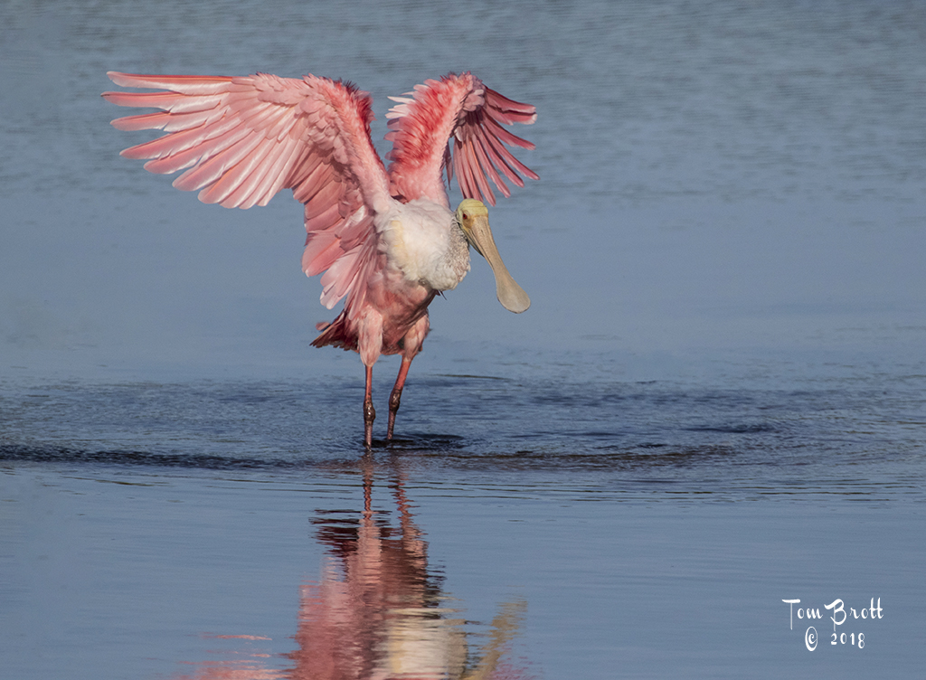
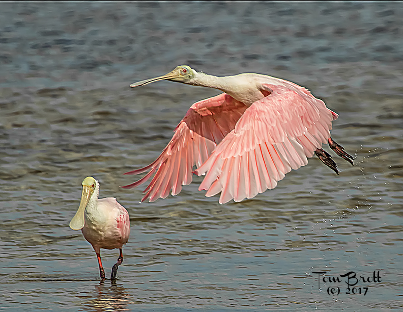
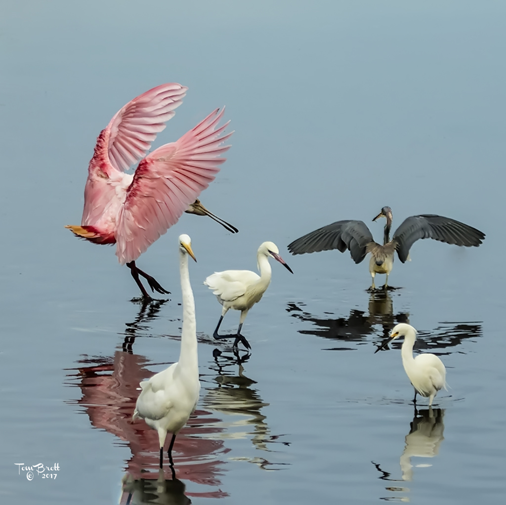
I like your second rendition better. My concern would be the use of the image. If for personal pleasure by all means remove that piece of palm string under the adult's butt. If for nature competition then it has to stay. I did notice in your revised image with the darkened background that piece of palm string was removed. For me the landscape version works much better. Camera settings look good for that cloudy day. Colors look natural and not oversaturated as so many people have a tendency to do on spoonbills. |
Mar 14th |
| 52 |
Mar 26 |
Comment |
I like to try and keep as close to the PSA Nature image rules as possible. The vegetation was a concern and that is why I was asking the group about it. As for the brilliance of the spoonbill I believe it was a lighting problem as it was a very overcast day and any more saturation of the spoonbill made it appear oversaturated especially in the darker pinks.. |
Mar 14th |
7 comments - 0 replies for Group 52
|
7 comments - 0 replies Total
|