|
| Group |
Round |
C/R |
Comment |
Date |
Image |
| 49 |
Apr 20 |
Comment |
I think the cropped version works well. the only other thing I could suggest is to remove two distractions.Center two flowers on the top has a small piece of grass growing (remove it) and of the two flowers on the upper right the one on the left also has a spike growing out of it. |
Apr 17th |
| 49 |
Apr 20 |
Comment |
Great perspective. I like it a lot. The cropped version does seem to work better than the original. I was wondering if the sky should be toned down a bit as it looks un-natural to me. |
Apr 17th |
| 49 |
Apr 20 |
Comment |
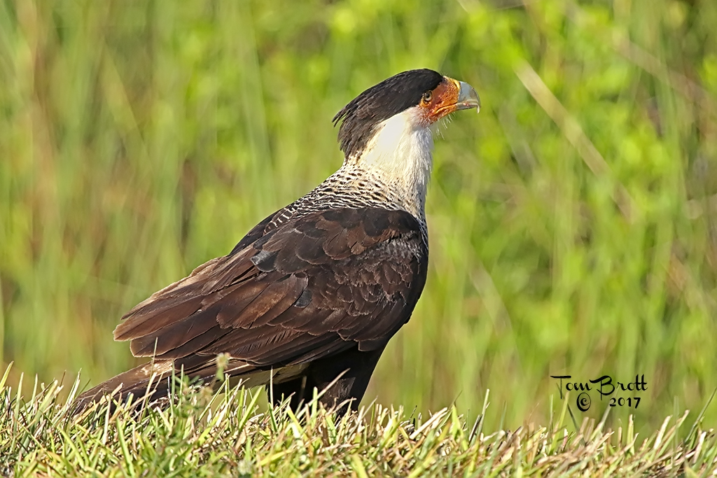
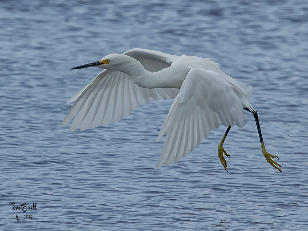
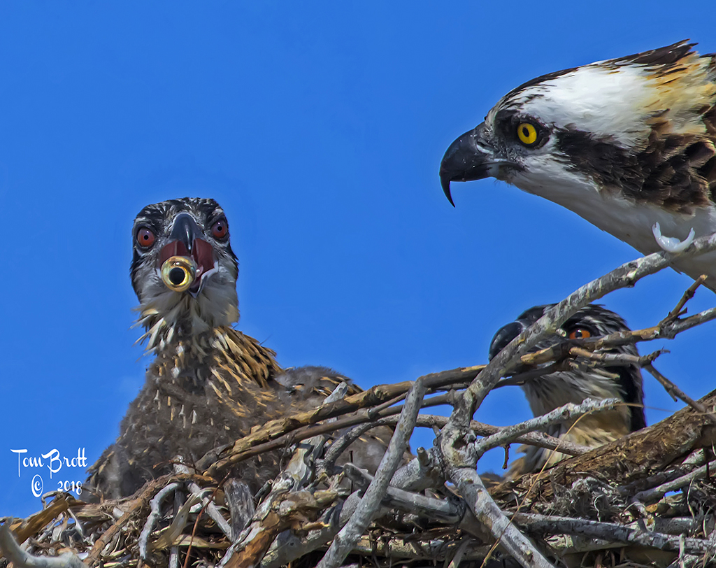
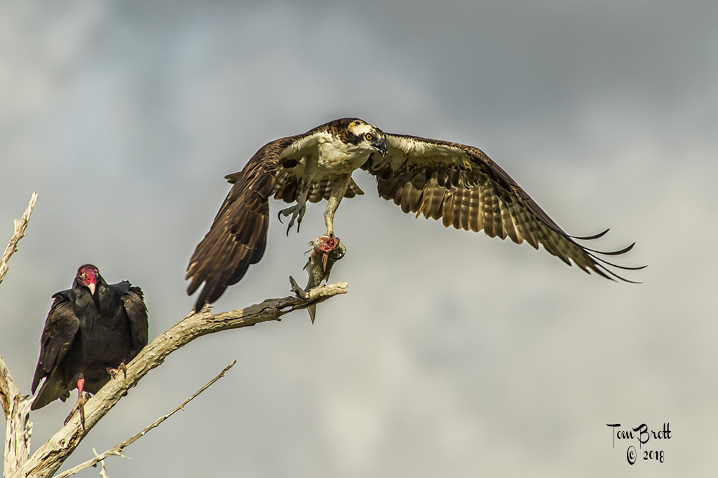
What a fantastic image.
I have to agree that maybe the eagle and see need a little separation. I'm not sure the suggested cropping is the best way though. I played a bit and reduces the luminescence of the blue in the sea, reduced shadows a bit and adjusted some mid-tones. |
Apr 17th |
 |
| 49 |
Apr 20 |
Comment |
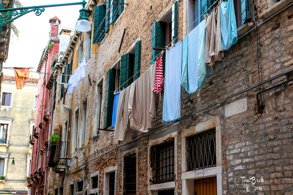
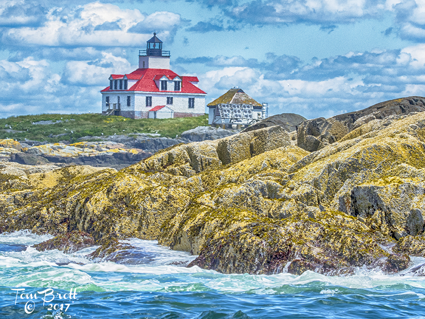
Interesting subject and image. The last house on the right is leaning to the left and as Stephen showed needs to be straightened. |
Apr 17th |
| 49 |
Apr 20 |
Comment |
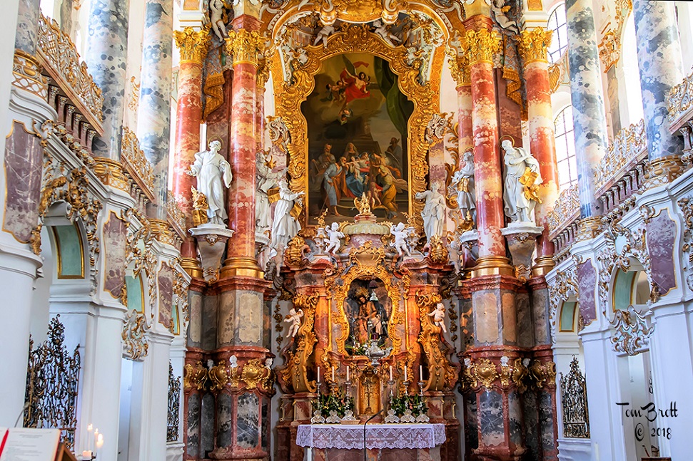
Like this image a lot. I don't care for the suggested crop because you loose one of those beautiful ceiling panels. I played with some of the mid-tones a bit and also played with the yellow luminescence and saturation as I felt the yellow glow especially lower left area was a bit too bright. |
Apr 17th |
 |
| 49 |
Apr 20 |
Comment |
Love the concept and capture. I think Fred is right on with his crop. My nit pic would be in the upper right portion there are 2 places that have started to deteriorate and you might want to work on them a bit with cloning or a healing brush. |
Apr 17th |
6 comments - 0 replies for Group 49
|
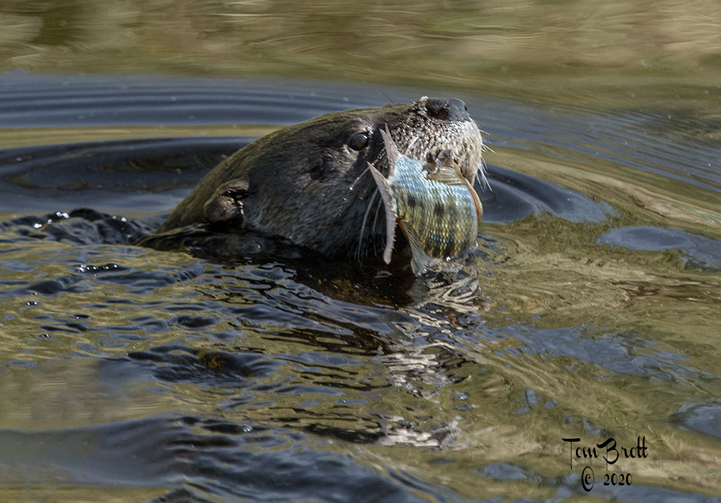
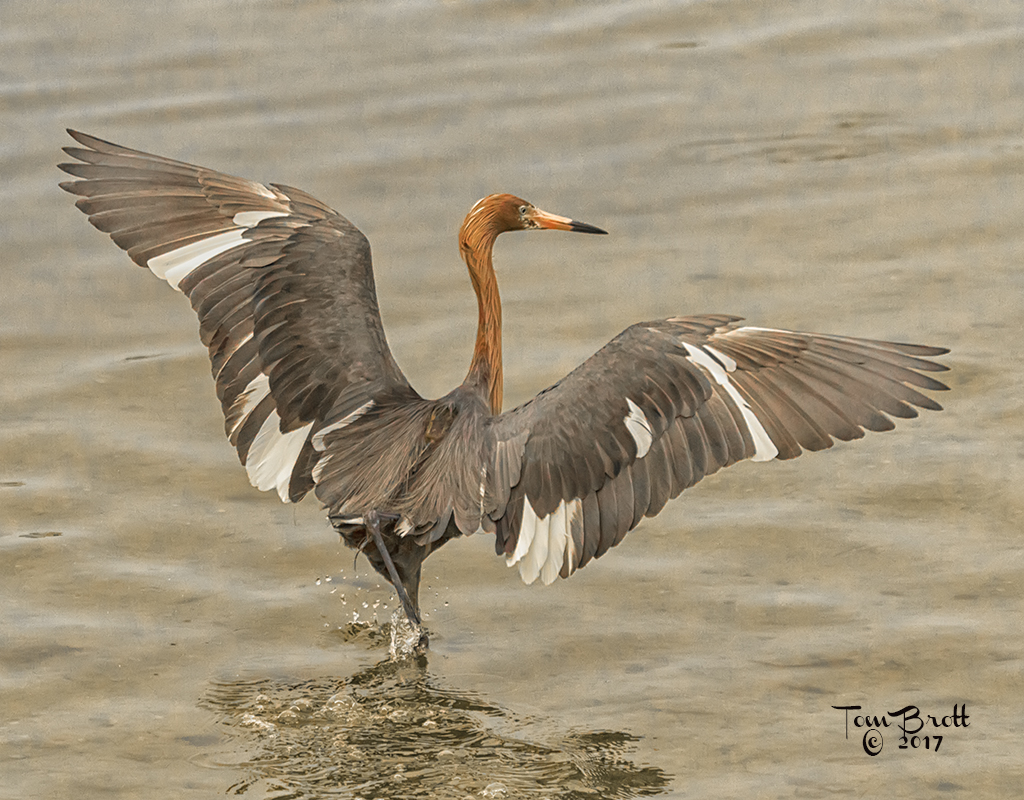
| 52 |
Apr 20 |
Comment |
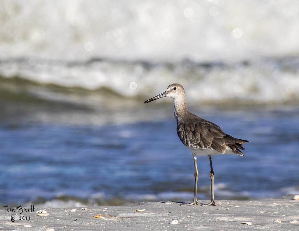
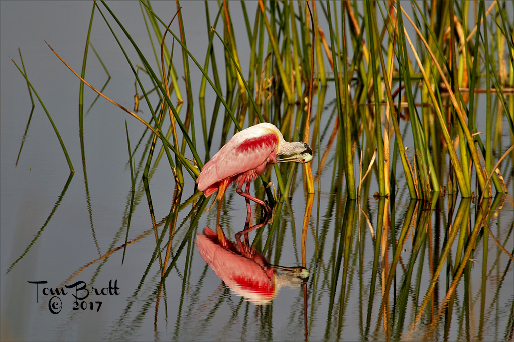
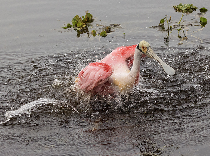
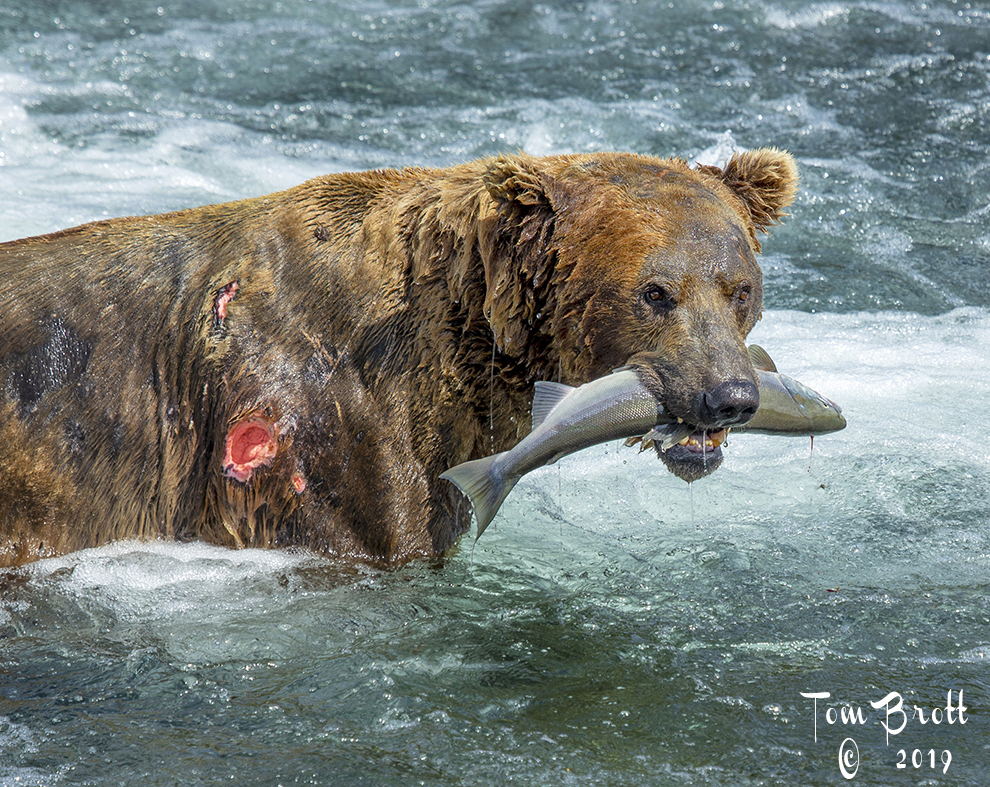
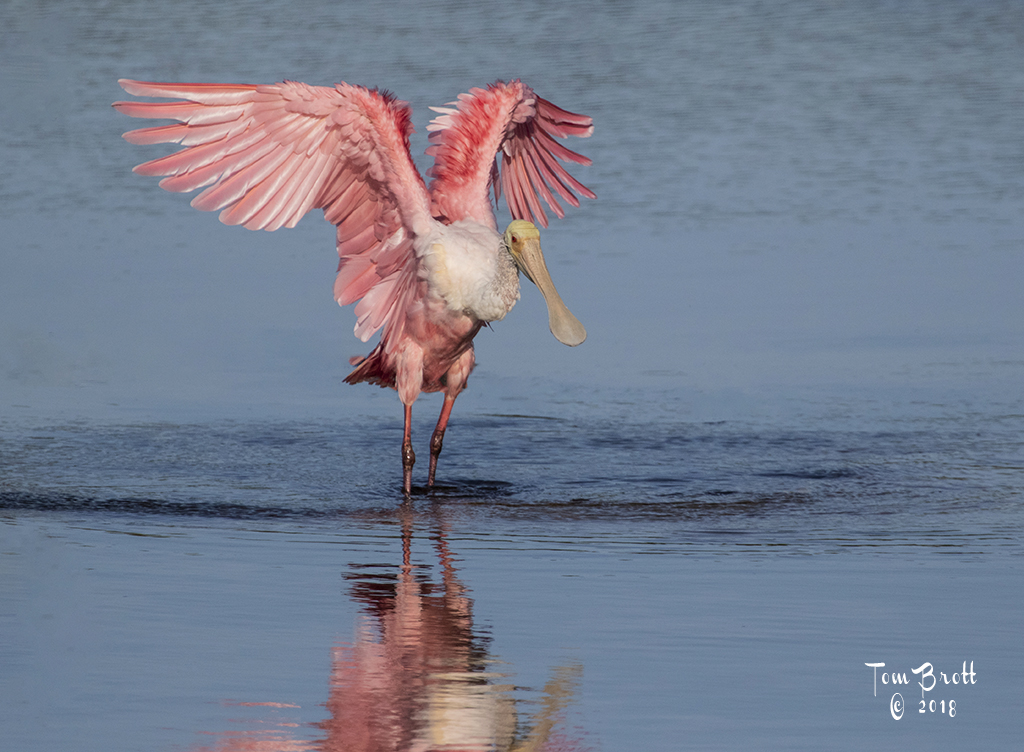
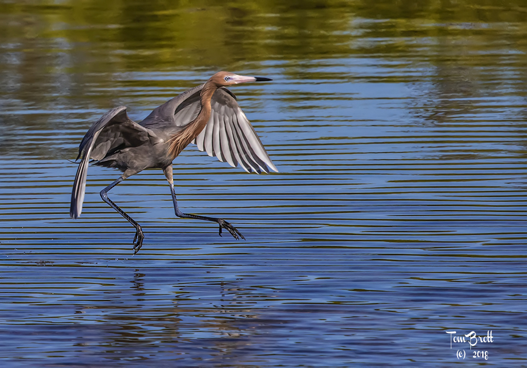
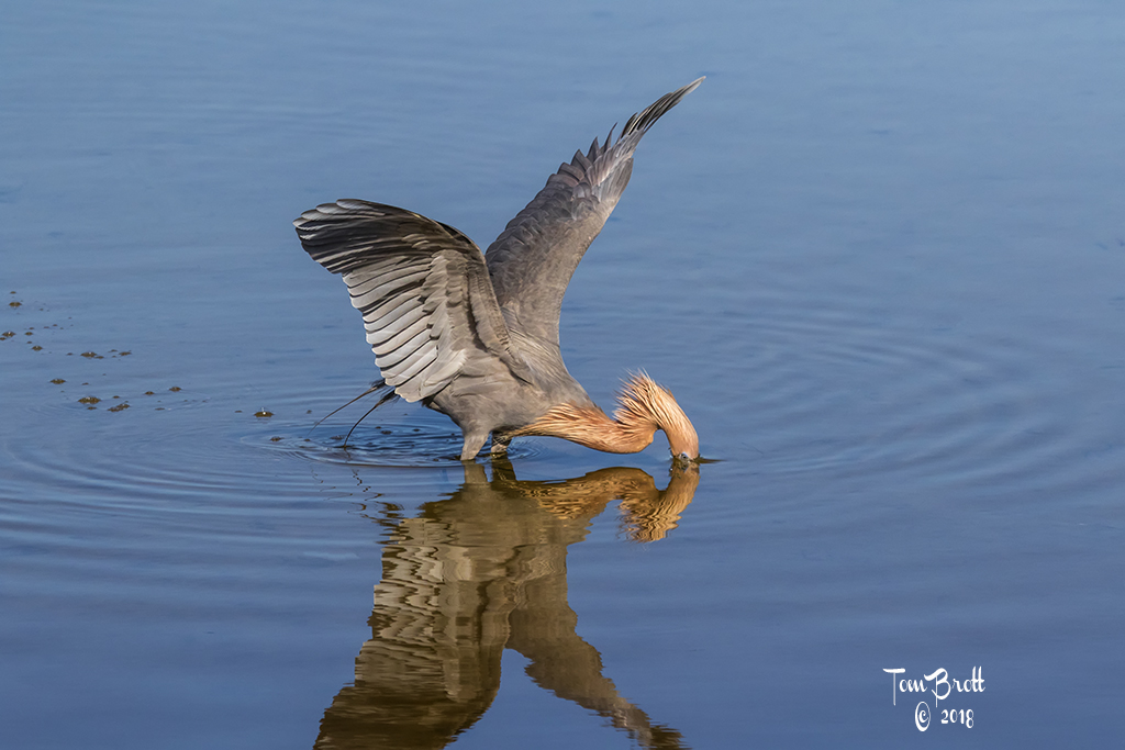
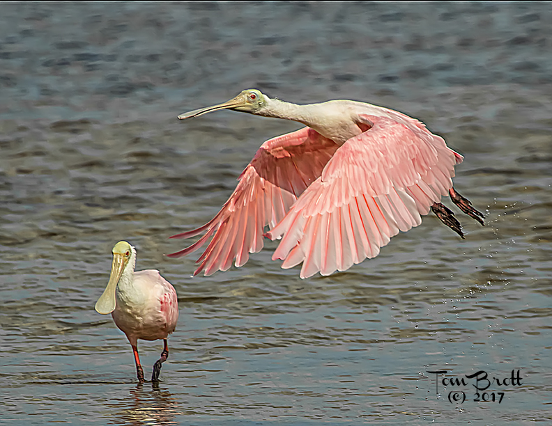
I am split between the coloring of the original and the presented one. The body and heavier feathered areas of the wing look more natural in the original. But the coloring enhanced in the presented version looks artificial on the body and heavier feathered areas of the wing. I can see why you tried to enhance it to bring color to the single layer of feathers on both wings in the original (very light to white).
The gold color of the background water (presented version) I think distracts and competes with the spoonbill's color as compared to the original water color. To my way of thinking the blurred wing tips do indicate motion but so does the landing spoonbill so I think the wing tips should be sharper and crisper. Only my opinion. |
Apr 17th |
| 52 |
Apr 20 |
Comment |
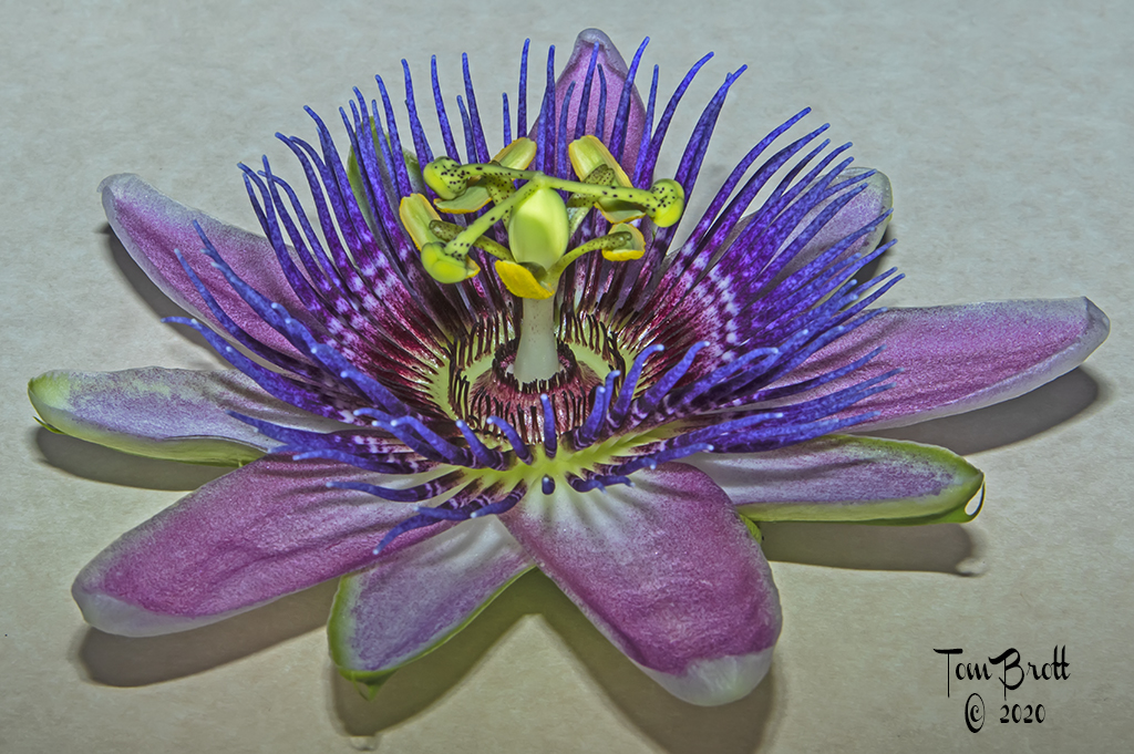
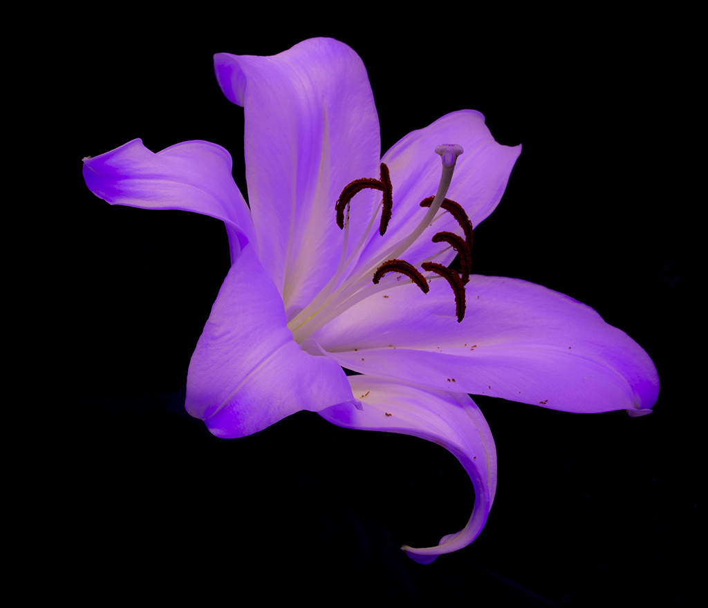
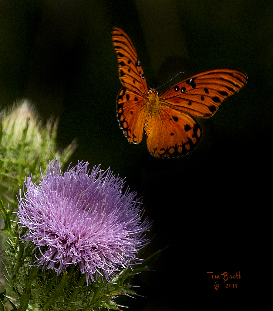
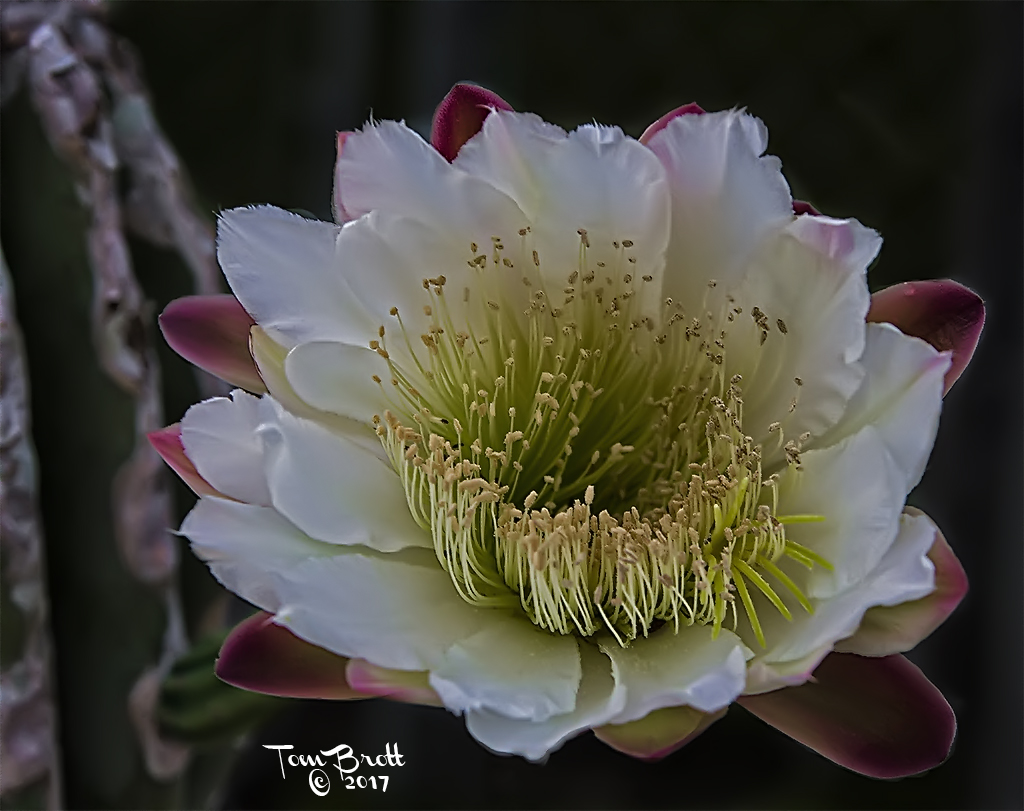
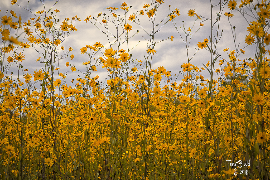
I can't offer much to the discussion of this image that hasn't already been stated as helpful suggestions. I agree with the much tighter crop and the darkening of the background area. As Pamela said "the focus is the middle of the flower with the stamen and the three petals" and that is a good general rule in situations like this. |
Apr 17th |
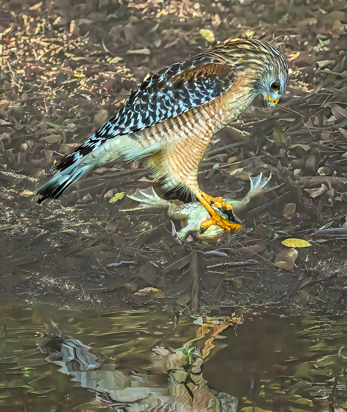
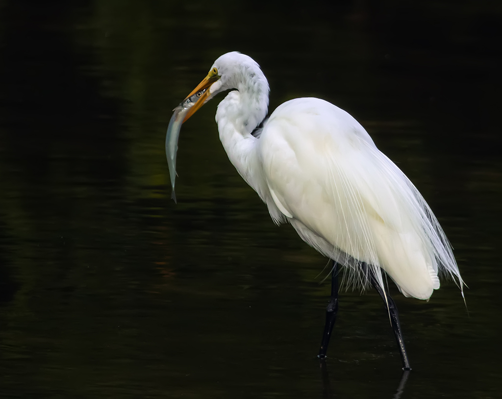
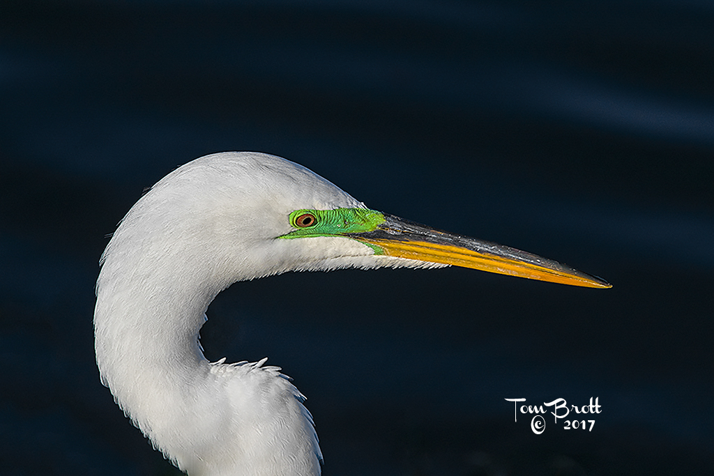
| 52 |
Apr 20 |
Comment |
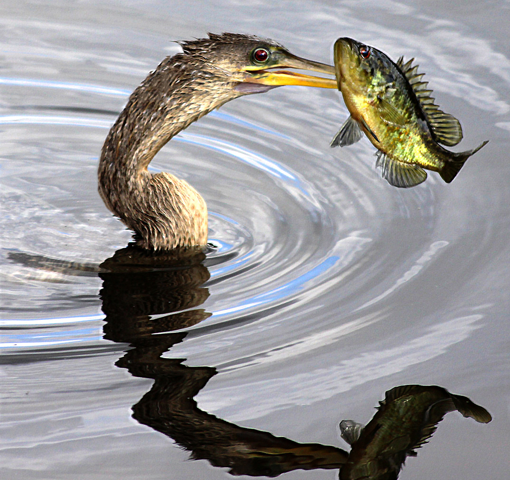
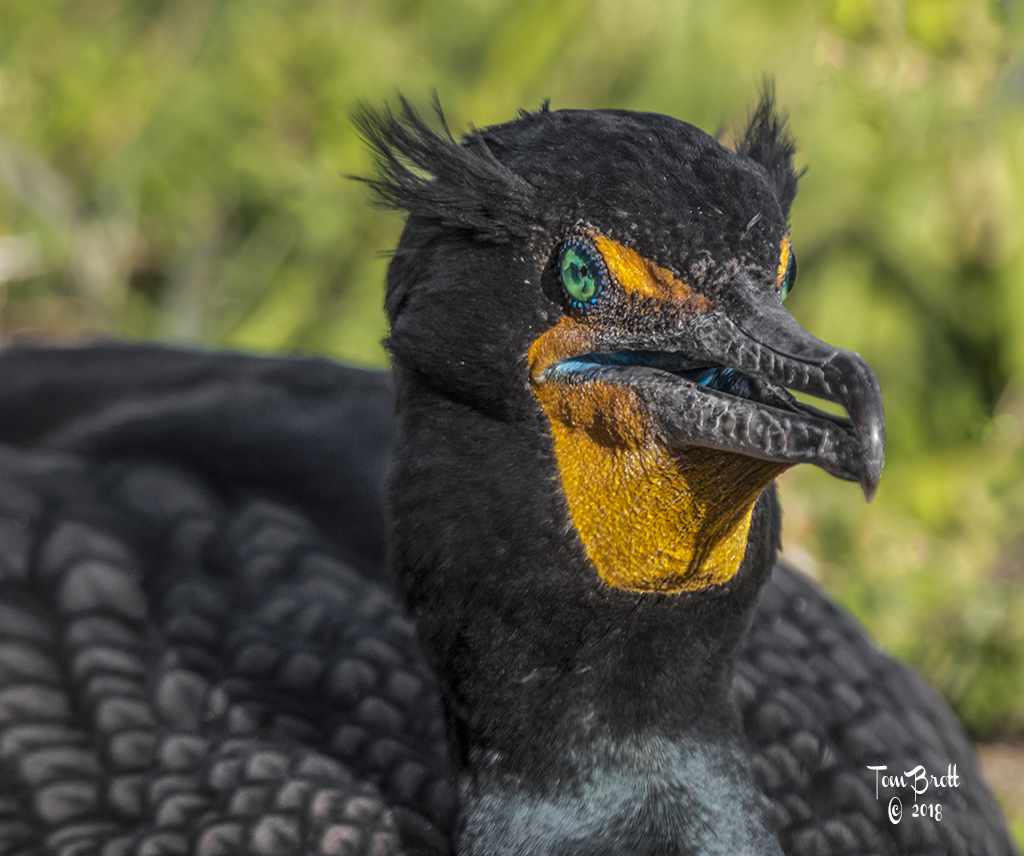
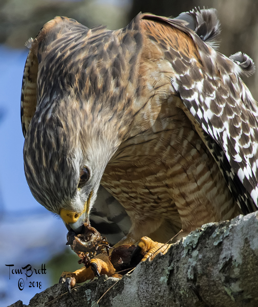
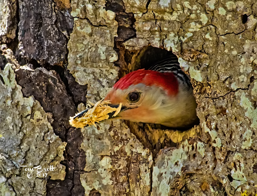
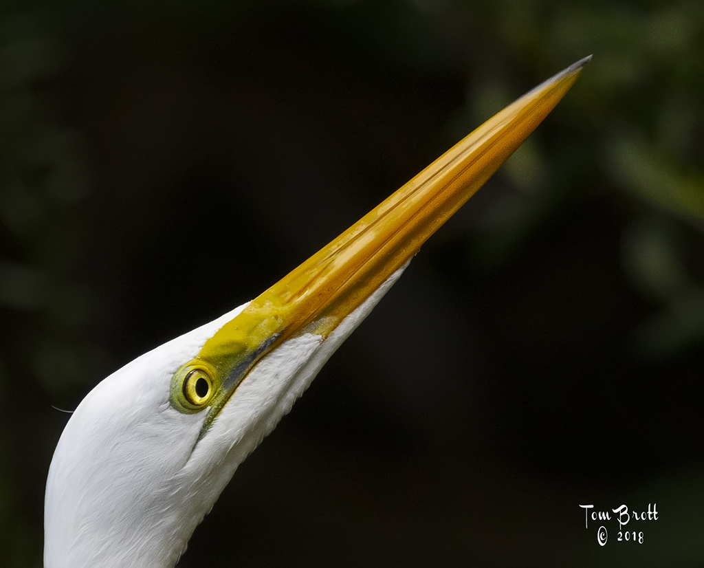
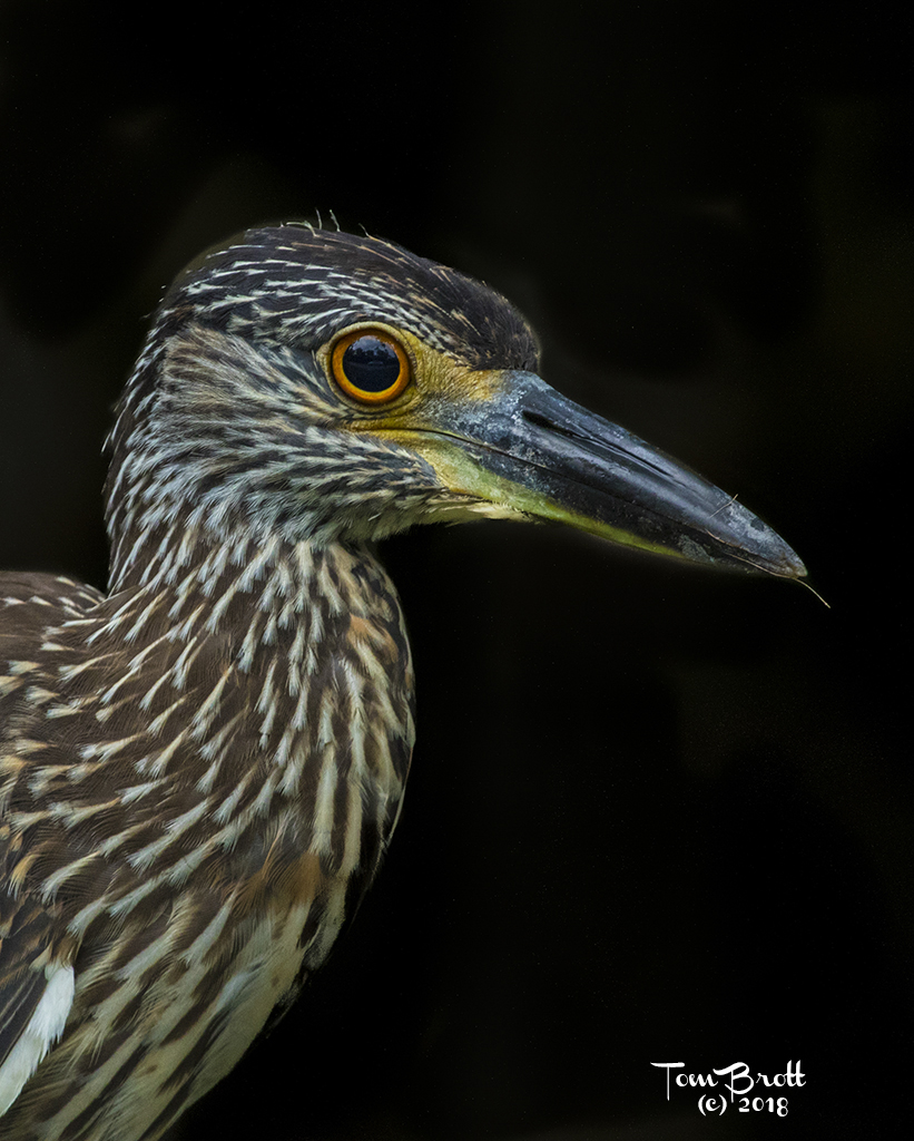
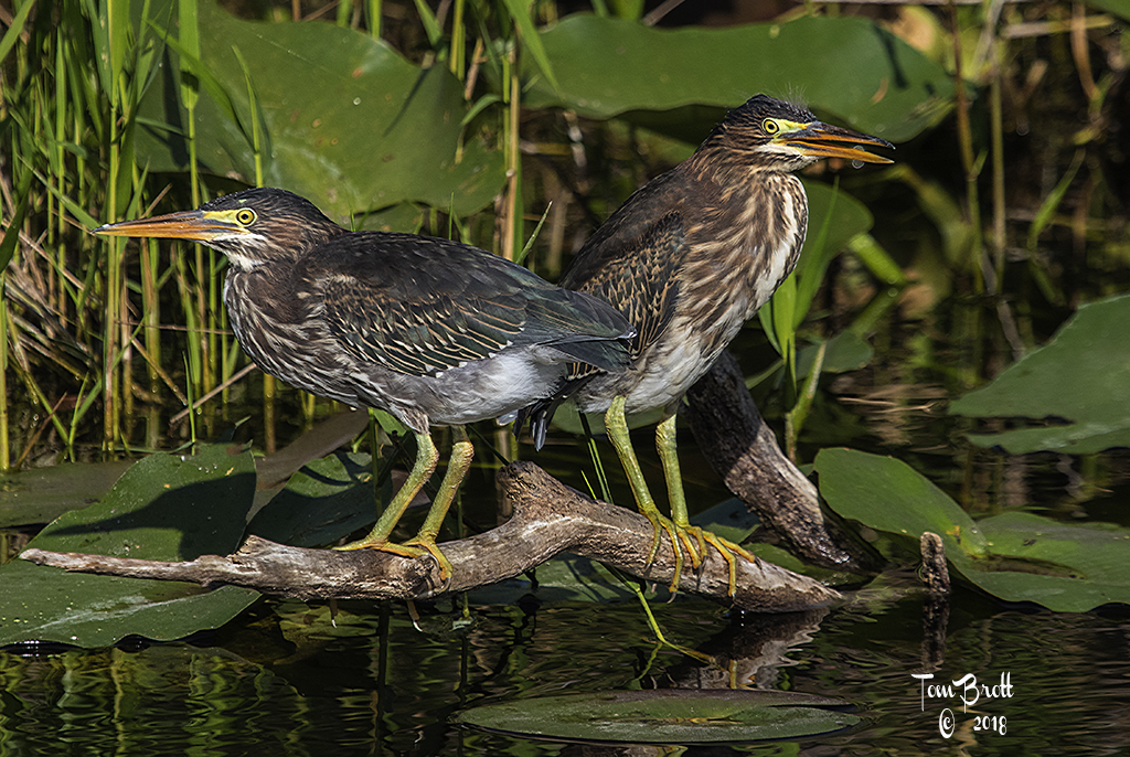
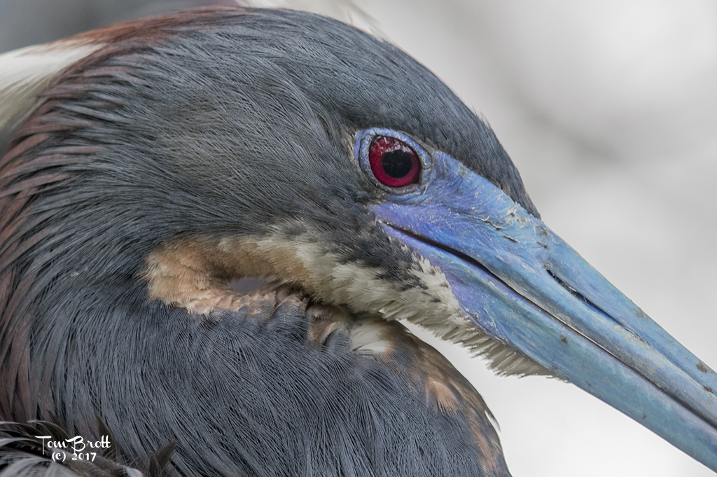
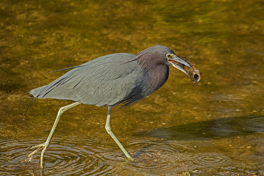
Love this image. The sharpness of the eye and head - crisp wings and back. I agree I might try to lighten the legs to add detail. My other observation is on the lower edge of the lower wing there are 2 yellowish splotches that I find a little distracting. Do you have any idea what they might be? |
Apr 16th |
| 52 |
Apr 20 |
Comment |
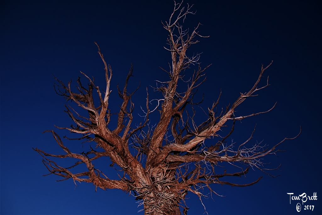
Nice texture in the tree and major branches. I have to agree with that with all the finer branches it appears as too much clutter to me. I love the ground coloring and the flowers that grab the eye. I was wondering about cropping from the right side - two options could be available as I see it. Crop into the first downward branch. OR Crop into the second large fallen downward branch. I think this version cuts out a grey between the evergreens - it gets rid a a lot of cluttered small branches but keeps the massive size of the tree and its majestic look and beautiful greenery and flowers of the ground. |
Apr 16th |
| 52 |
Apr 20 |
Comment |
I have to agree with all the others on the colors, tonality, clarity and crispness of the image. The color harmony is excellent and the image pops. I can make no suggestions on improvement either. |
Apr 16th |
| 52 |
Apr 20 |
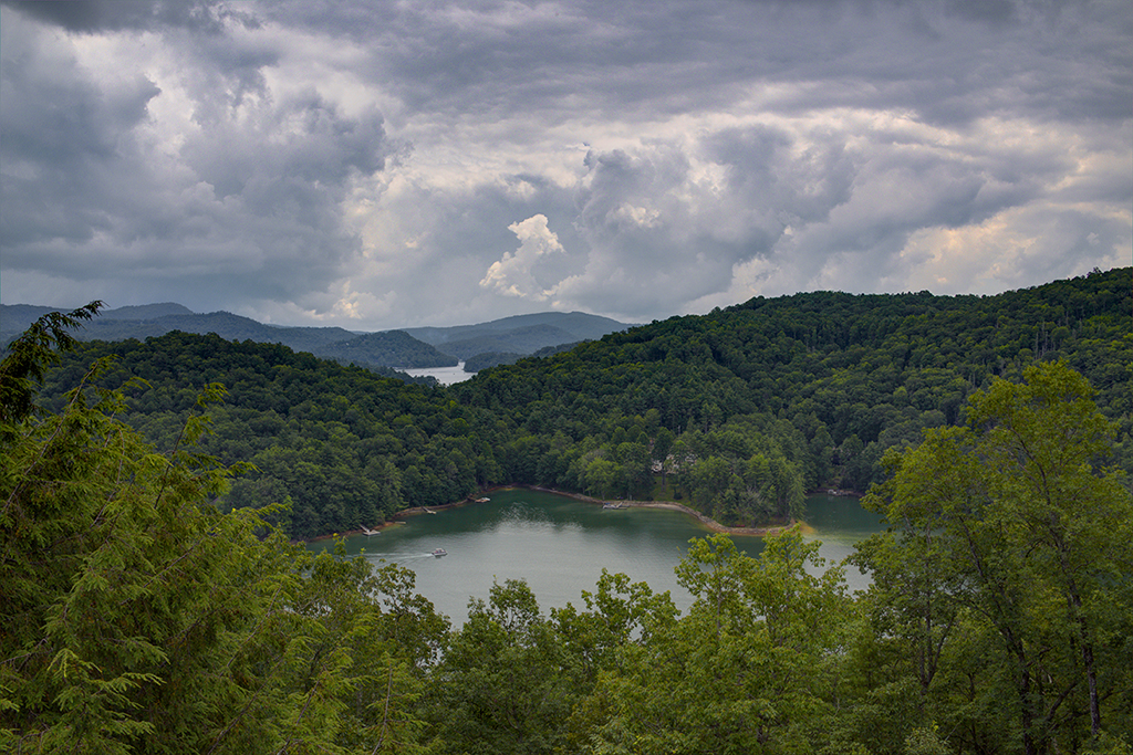
Comment |
I have to agree with all the others on the wonderful colors, tones and depth of field etc. I tried flipping the image horizontally and then the green (to me) does not become that much of a distraction or seem too bright because my eyes go left to right looking at the image and by catching the water flow first the green did not distract me. See what you think? |
Apr 16th |
| 52 |
Apr 20 |
Reply |
Original image attached. As you know me by now I love close ups and detail.As you can also see a very heavy crop.
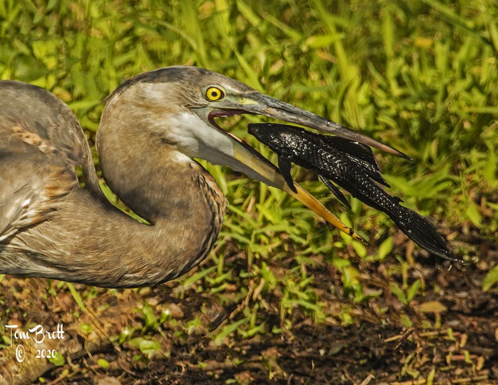
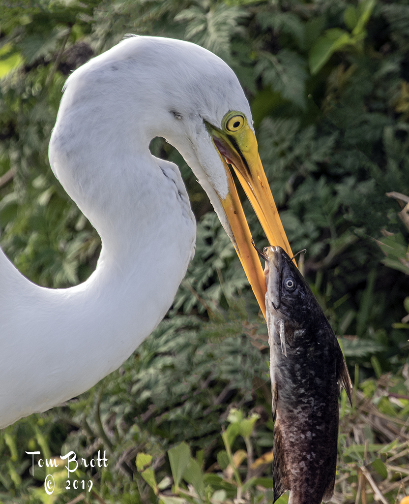
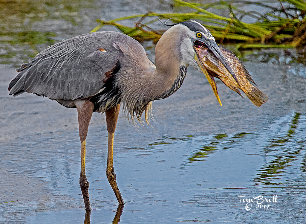
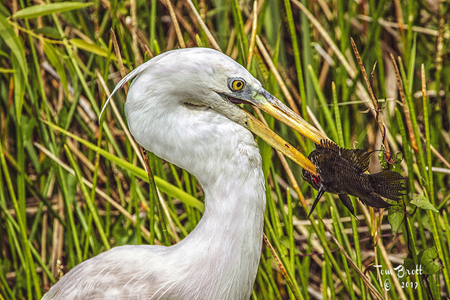
As an aside on this image I tried to enter it into competition for the Florida Council of Camera Clubs and it was rejected in the documentary and color categories and they told me this belonged in CREATIVE. (There is no nature division only Color, Creative, Mono and Documentary). I am waiting for the judging to finish in mid April and then contact the head judge and find out the reasons for their decision (It also happened to one of my wife's images of a Great Blue swallowing an armored catfish). |
Apr 7th |
 |
6 comments - 1 reply for Group 52
|
12 comments - 1 reply Total
|