|
| Group |
Round |
C/R |
Comment |
Date |
Image |
| 49 |
Feb 20 |
Comment |
I forgot to mention that I removed the two poles in the center right |
Feb 11th |
| 49 |
Feb 20 |
Comment |
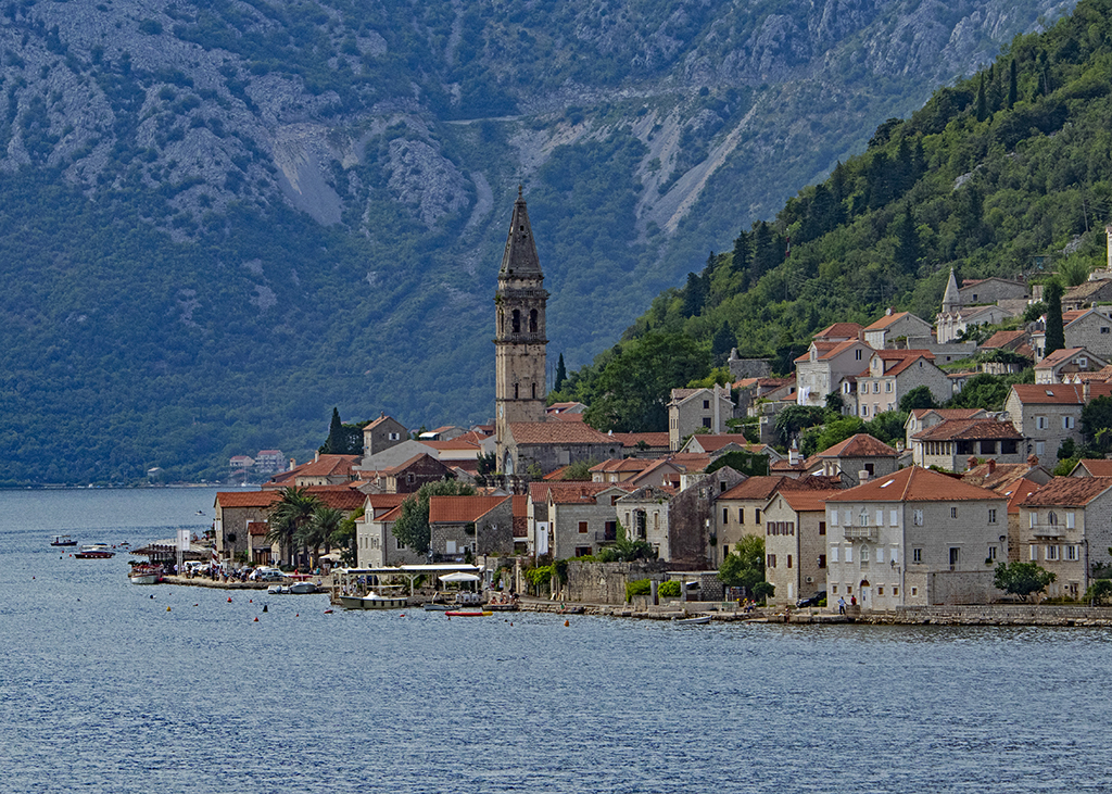
Love the texture ans color of the rolling hills. House stands out well. To me the area of concern is the background / upper 1/3 of the image. I think it is a little washed out and needs to pop more adding to the flavor of the scene. I did a quick edit - darkening the background in RAW and used levels to highlight the mid-tones there. I also de-saturated magenta that started to appear in the upper areas.
Your thoughts? |
Feb 11th |
 |
| 49 |
Feb 20 |
Comment |
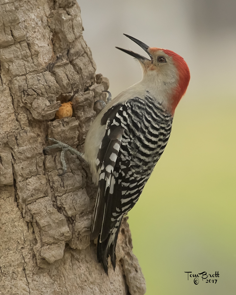
I like the B&W a lot. Good tones and clarity. Nit pics - under the window sill (I love the texture of the old sill and the bottom frame of the window with the old peeling paint) the shadow could be lessened and the bottom three pains of glass are a little distracting with the reflection. |
Feb 11th |
| 49 |
Feb 20 |
Comment |
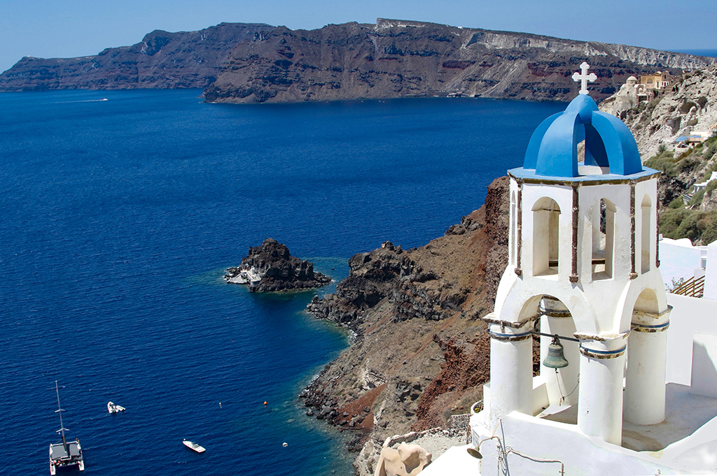
I like your thinking on this. I am a little concerned on the connecting line of shore. I think there are areas that don't meld together correctly - I tried the smudge tool about 15% to give the center line more of a reflection look (???). I also felt it was a bit grainy and used Imagenomics to help correct this. |
Feb 11th |
 |
| 49 |
Feb 20 |
Comment |
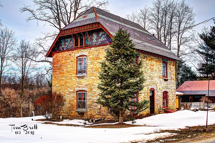
I think playing with this image could make it a good one. I felt it was too dark so I reduced the shadows and brought up the mid tone levels. I felt there was a slight blur to the details so I went to filters - sharpen - shake reduction to help make it sharper. Your thoughts? |
Feb 11th |
 |
| 49 |
Feb 20 |
Comment |
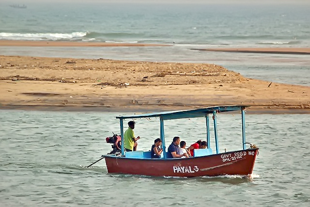
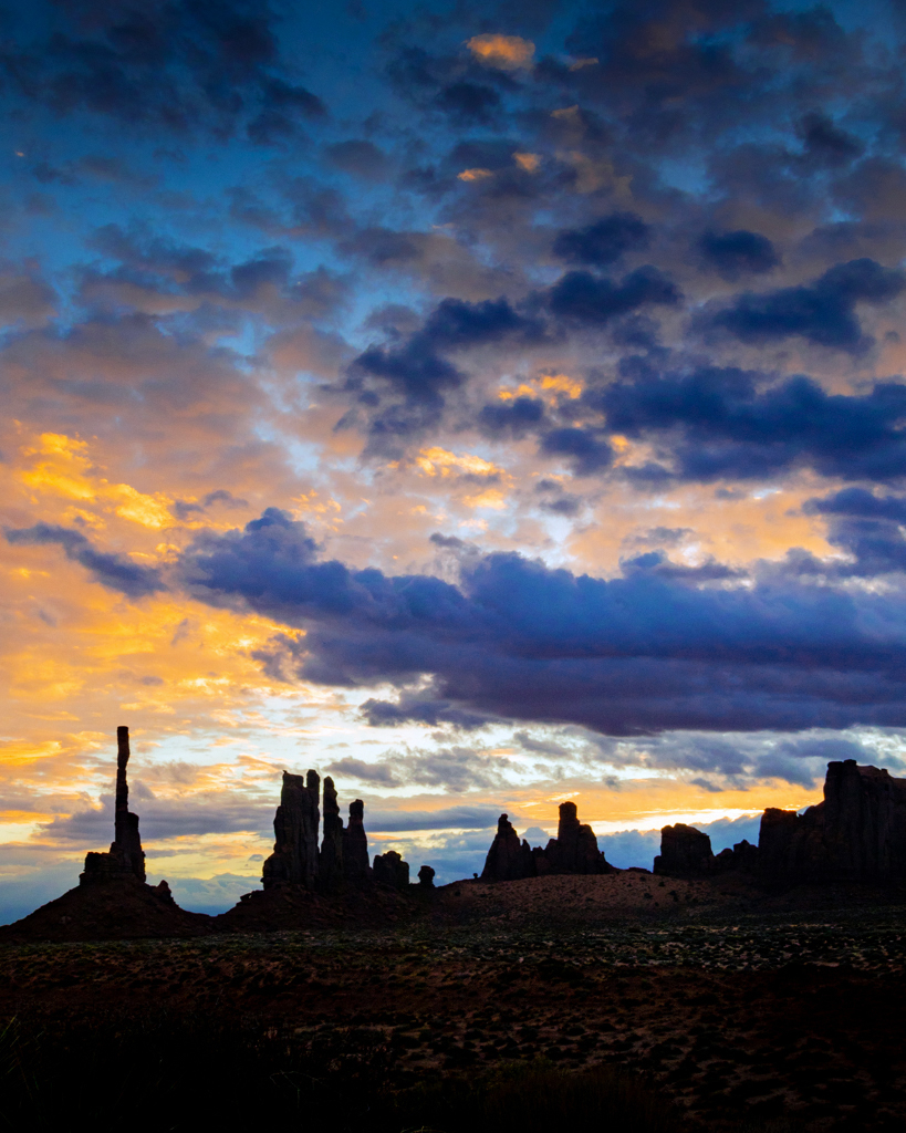
I like this image. To my eye I thought the foreground could use a little lightening as the center shows a hint of detail in the ground. I lightened it a bit and darkened the monuments to add to the silhouette scenario. I might have darkened the lower clouds a bit too much though. You need to play. Your thoughts? I think you have to open the image to fulls screen to see my changes. |
Feb 11th |
 |
6 comments - 0 replies for Group 49
|
| 52 |
Feb 20 |
Reply |
SEVERAL years ago.
Auto Correct
|
Feb 18th |
| 52 |
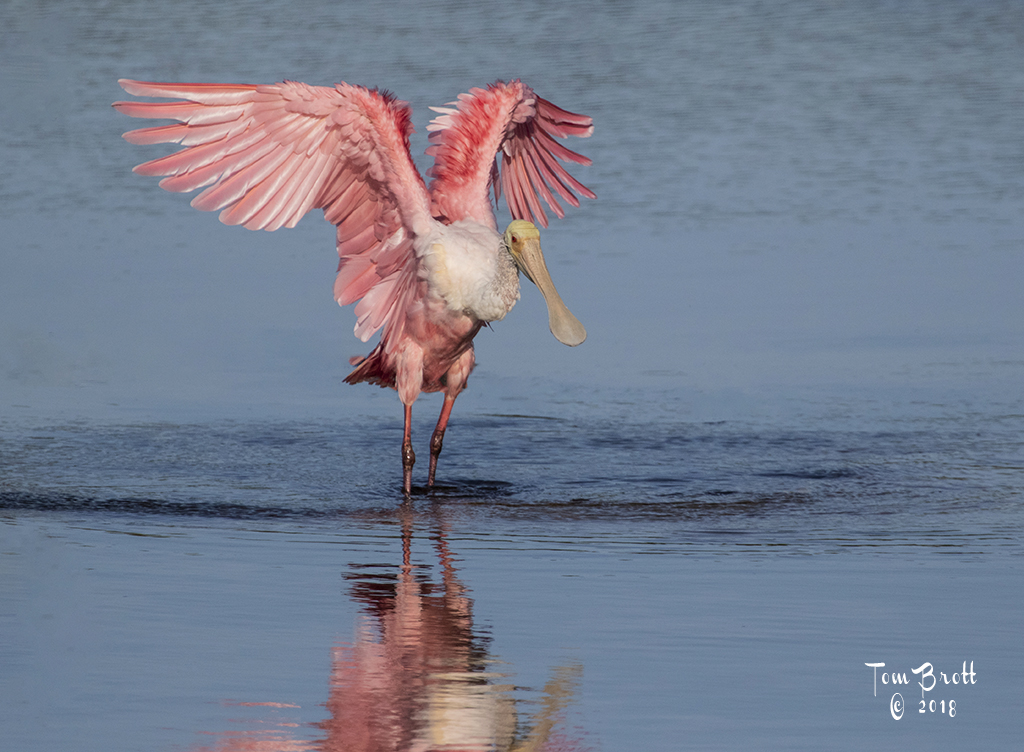
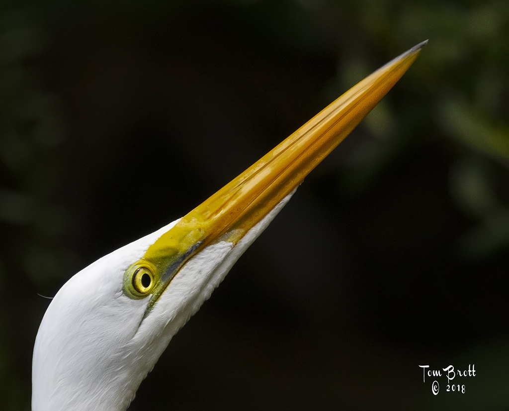
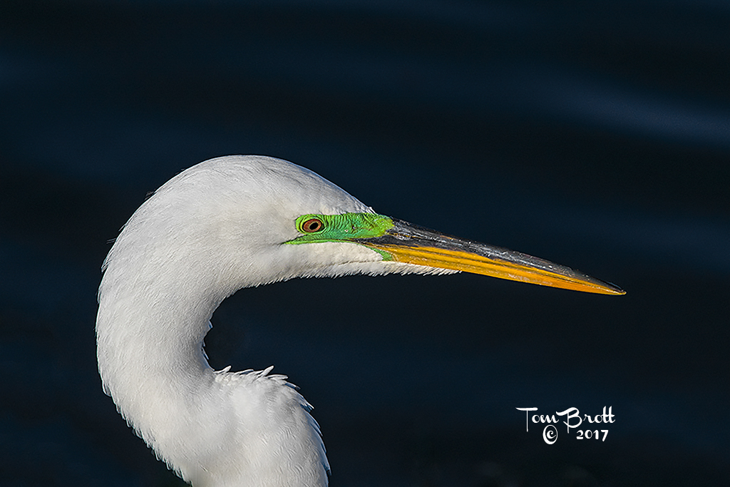
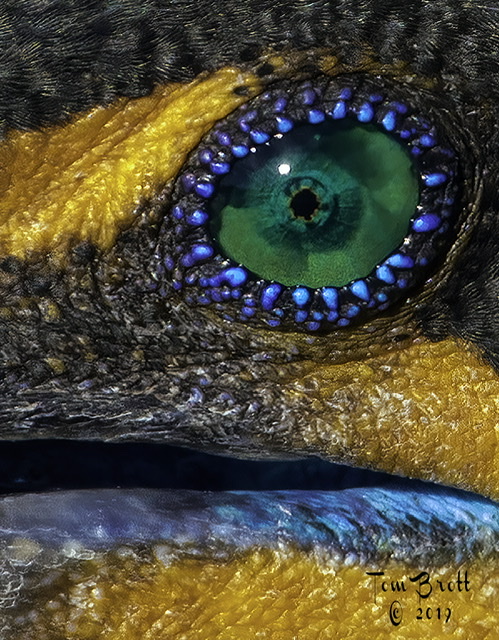
Feb 20 |
Reply |
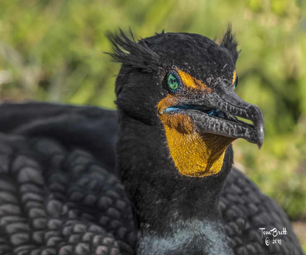
This is from a post I did Senegal years ago to the group. Head shot of a cormorant in breeding colors. I took the eye only and blew it up to a 20 x 30. Check out the detail. |
Feb 18th |
 |
| 52 |
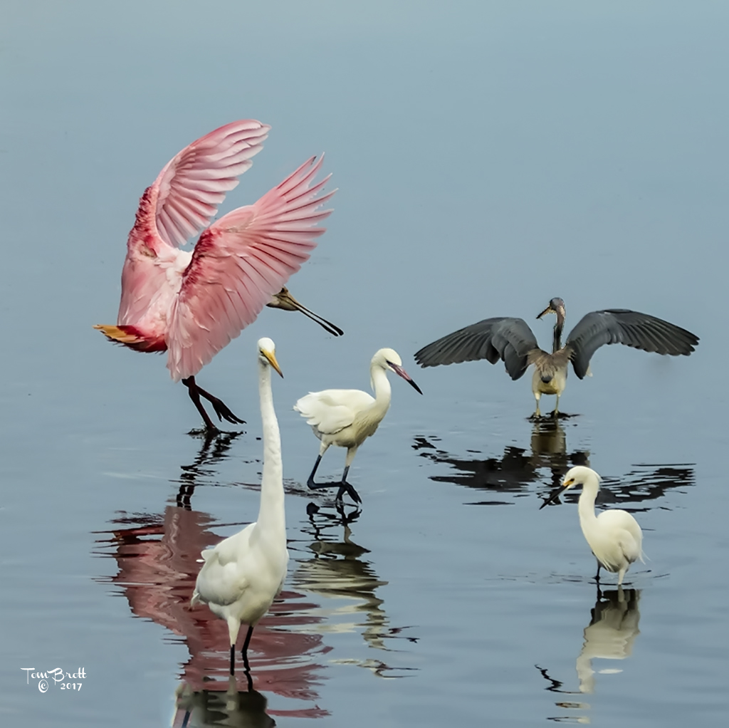
Feb 20 |
Comment |
Unique as others have said. The pink tones and the silhouettes work well together. Although this is not my taste of style it works and presents well. A very different creative image. |
Feb 18th |
| 52 |
Feb 20 |
Comment |
A very interesting image. I would have to agree with those that say the crop is a little too tight. Possibly the same size that is on the top should be extended on the sides. To my eye I like the colors depth and more of a pop in the original as well as the definition in the snow. (I like definition in what I look at and the presented version is a little too washed out for my taste).
That being said I agree with Sharon that with a little work this could be a great image. |
Feb 18th |
| 52 |
Feb 20 |
Comment |
I think this crop works well as there is great detail in the bird and the water. I have purchased Topaz AI Megapixel a program that enhances the size of the image and does it pretty well - I have taken images from the camera that are my standard size of 18.5" x 12" 300 dpi and blown them up to 42" x 27" 300 dpi without any loss in quality. It might be something worth looking into for situations like this. |
Feb 18th |
| 52 |
Feb 20 |
Reply |
It is all subjective as in judging. Just an idea an my taste. And with tat white stuff on the ground I would be out of there quickly as well. That is why I live in South Florida. |
Feb 17th |
| 52 |
Feb 20 |
Comment |
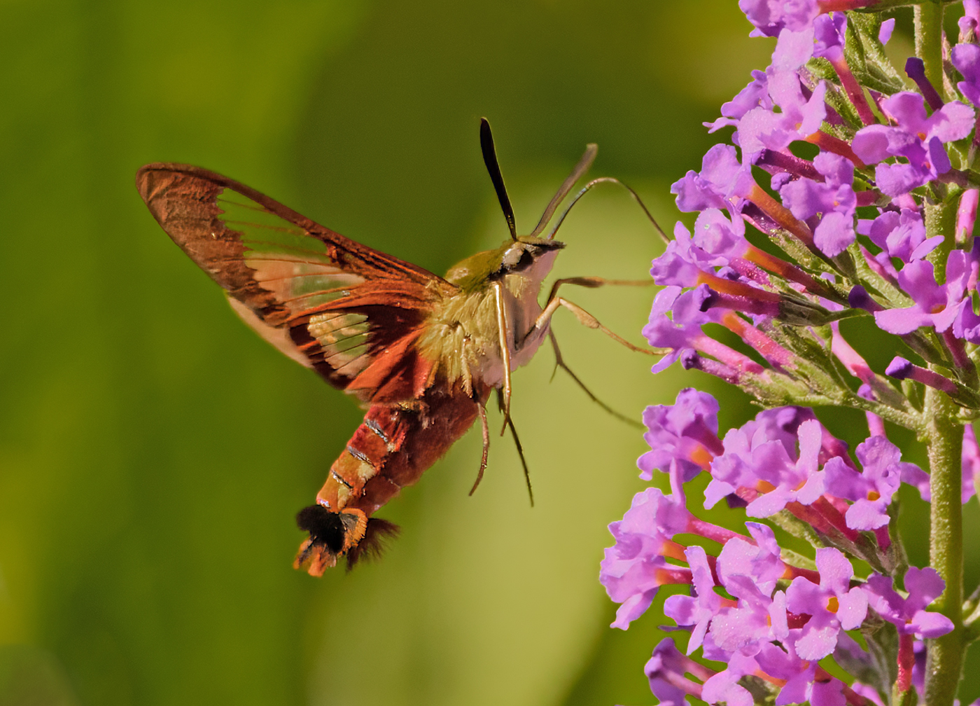
Lisa, first a correction - this is a yellow swallow tail butterfly and not a monarch. The out of focus front wing does not bother me as others have mentioned. I think in your post processing you lost some of the brilliant colors of the butterfly itself and flower that pop better in the original. You did a great job of subduing the background. I love the sharpness of the flower and body of the butterfly (a thought would be to reduce the shadows on the body a little). |
Feb 17th |
| 52 |
Feb 20 |
Comment |
This is a beautiful winter scene that you have captured well.
I just have a thought about your treatment on the water's flow. To me if you are try to present a beautiful cold winter scene I think that the water rushing over the rocks instead of the velvet look would make a better presentation. I feel for this situation would create a more natural image. There is absolutely nothing wrong with the image as presented but those were my initial thoughts when viewing and was wondering if you tired a few exposures without the ND filters? |
Feb 17th |
| 52 |
Feb 20 |
Comment |
Great shot as usual. Along with the others I have to agree there should be more room in the front of the swan (this from a tight portrait person). The detail in the swan and feathers are wonderful and natural. On Mike's comment of the yellow I believe that is a natural occurrence of tinting the feathers from feeding in non pristine waters. I do have an area for concern though. In the top portion of the presented image there are white flecks / noise that are not in the original. Probably something in post processing and should be easy to fix. |
Feb 17th |
6 comments - 3 replies for Group 52
|
12 comments - 3 replies Total
|