|
| Group |
Round |
C/R |
Comment |
Date |
Image |
| 49 |
Jan 20 |
Comment |
Your intent on the image is wonderful. The lady bug with the aphid is clear and colorful. I tried several things like blowing up the ladybug but nothing worked to make it look good. The back ground as the others have suggested is an eyesore. I not sure anything could help remedy this. I tried enlarging it several times making it 300dpi and that didn't work. Cropping different ways and rotating different degree of angles all proved fruitless. |
Jan 23rd |
| 49 |
Jan 20 |
Comment |
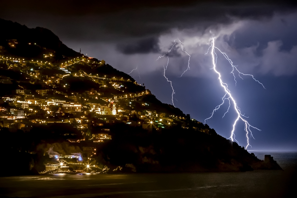
Freed this is a nice shot. It might be just a matter of taste but i find the lights on the hill side a little to yellow. I went to Photoshop, Adjustments, Hue/Saturation, Yellow and used the bottom slider to the left to remove some of the yellow. In the Original it does no look as yellow as presented. |
Jan 23rd |
 |
| 49 |
Jan 20 |
Comment |
Nice image. Great colors, tonality and clarity. Definitely a keeper. I can't suggest anything to improve this image.
As for the lenses. My new go to lens is the Canon 28-300 when I'm not out birding. I find it is very useful with the zoom ranges. |
Jan 23rd |
| 49 |
Jan 20 |
Comment |
My thoughts were the colors were a little flat. I went into Photoshop adjustments and used levels to add more pop. Also cropped a bit off the top as suggested by Graham. |
Jan 23rd |
 |
4 comments - 0 replies for Group 49
|
| 52 |
Jan 20 |
Reply |
I did it in Photoshop 2020 - that is all I use |
Jan 23rd |
| 52 |
Jan 20 |
Comment |
Mike,
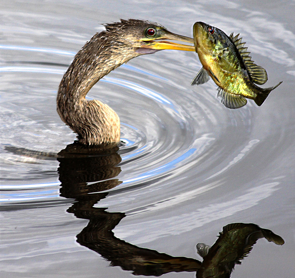
Another great image. My only concern is that your processing has washed out the bird a bit too much. I like the pop in the original of the bird but the processed water in the processed image. It really looks like you had some fantastic trips in the last couple of months. |
Jan 23rd |
| 52 |
Jan 20 |
Comment |
I think the others have pretty much covered how to enhance this image. One of the first checks I do when taking an image is BACKGROUND. Are their distracting factors behind the image? The two birds that were chosen were great with detail and color but the handling of removals and finished background is not pleasing to the image.(Yours leave shadows of other birds and also the texture of the road/pebbles is a mixture of blur and well defined detail but they are not on the same planes and mixed. |
Jan 23rd |
| 52 |
Jan 20 |
Comment |
Nice image that definitely gives the feeling of cold and starkness of late fall or early winter. Even though the clouds and smaller birches play an important part of the image as presented I feel it is a little too bland on the right side. Your vertical image of the tall birch is much more pleasing to my eye. Both have good color and definition. |
Jan 23rd |
| 52 |
Jan 20 |
Comment |
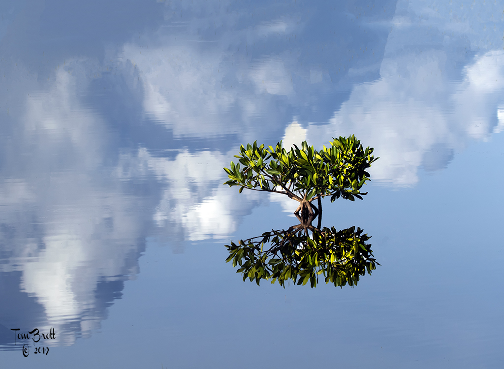
Nice fall image with good colors and reflections. I too will have to vote for the vertical format. For me an area that catches my eye and concern and I don't know how to suggest correcting it is the center tree. The tree itself has great definition and texture and color in it but the reflection does not and look to me like there is a flag pole in the water. (Is it too straight or no lower branches to let me know it is a tree)?? This is just my take and initial impression as everything else is done well. |
Jan 23rd |
| 52 |
Jan 20 |
Comment |
Welcome. What a wonderful image. I have to agree with the rest that the background is a touch too bright and the suggested fixes. To my eye there are 3 areas of concern with the snake. The area right behind the head, where the body goes into the bill and the lower curve portion of the body. My recollection of garter snakes the top of the body was a darker grey and black (I know there are different color variations). But I feel the single row of scales that are light grey to white areas should be a bit darker to really finish off the snake. It does look like a directional thing that may be a reaction or reflection of the sun.
The concentration of the Great Blue and the expression of the snake are super. Great clarity, color and detail of the main subjects. |
Jan 23rd |
| 52 |
Jan 20 |
Comment |
I like this image a lot. I have two areas of concern. First is the bright spot that everyone has mentioned and the second is the area of the lower right where the rocks go back and leave a black void without much detail. I don't know a lot of the the techniques that you usually use and explain but I think some of the more simple solutions are overlooked. I first went to raw to remove some of the shadows in the void area. Then went to levels and options with the dark & light button - ok - then on the Imput slider moved the center slider to the right to 70 and the Output slider on the right moved it to 207. This all added some darker contrast and did darken the light spot a bit. Back to raw and used the brush to tone down the bright spot even more. |
Jan 23rd |
 |
6 comments - 1 reply for Group 52
|
10 comments - 1 reply Total
|