|
| Group |
Round |
C/R |
Comment |
Date |
Image |
| 49 |
Nov 19 |
Reply |
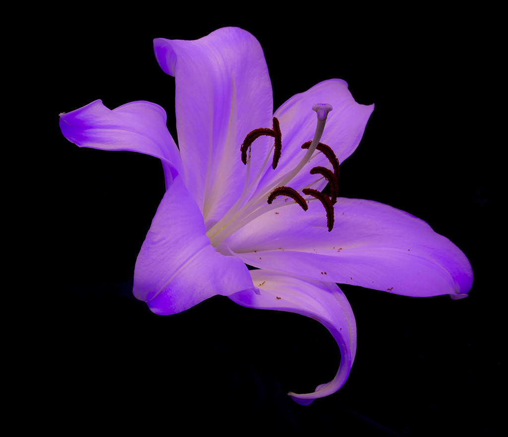
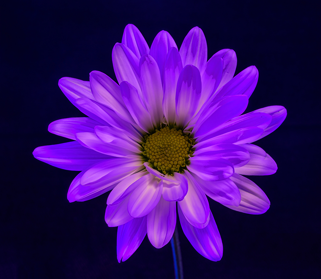
I should also mention that the original white one was taken under normal light conditions and the one for comments was taken under the Black Light set up. |
Nov 18th |
| 49 |
Nov 19 |
Reply |
Alan - I saw some Images on the computer that were done under black light conditions. I am still playing around quite a bit and this was a first try. I used a black backdrop with 3 black light lighting sets. 2 on the sides and one overhead. I did find out that the exposure time had a tendency to change color of the whites. Shorter time 1 second gave out a beautiful pink/purple hue to the lily. I also played with daisies. Same results - 1 second was pink/purple, 2 seconds was a combination of pink/purple start to see some blues and 4 seconds changed the white colors to a blue with yellow center turning to a green color. Attached is a daisy at about 2 seconds. |
Nov 18th |
 |
| 49 |
Nov 19 |
Comment |
I also wish the image was larger to see more of the detail. I like the handling of the water against the black rocks. The red crabs add a nice color to the image. |
Nov 18th |
| 49 |
Nov 19 |
Comment |
Nice image and post processing. I like the peaceful setting with the greens and reds melding together nicely. In the extreme foreground there are a couple of hot leaves and I was wondering why you didn't move a step to the left to eliminate the background tree that is at a slight angle and looks like it is growing out of the larger tree. |
Nov 18th |
| 49 |
Nov 19 |
Comment |
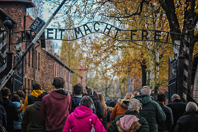
Wonderful story. I found that the image was a little soft especially in the overhead sign. I went to filters - sharpen - shake reduction and ran the program which seemed in my opinion to help. Then went to adjustments - levels - options - dark and light button. Your thoughts. |
Nov 18th |
 |
| 49 |
Nov 19 |
Comment |
Like the image a lot. I have to agree with Alan on the noise. I used Imagenomics soft ware to remove the slight noise and then reduced the shadows slightly and upped the mid-tone colors a bit. Your thoughts? |
Nov 18th |
 |
| 49 |
Nov 19 |
Comment |
Very nice image. Great definition in the horses face with the slight smile and the majority of the eye showing and all being crisp. I like the randomness of the mane partially covering the eye. You also managed the background and sky well. |
Nov 18th |
5 comments - 2 replies for Group 49
|
| 52 |
Nov 19 |
Comment |
I like this image as well. My first inclinations in viewing was that the right side of the canyon was a bit over processed and / or saturated. I also feel the back canyon wall on the left is too bright for the rest of the image and needs to be toned down a bit. With your processing of the reflection pool, to my eye has become, a bit too yellow and lost some of the definition of the original image. I do like the subtle reds of the iron color running up to the reflection pool giving more definition to the grey colored rocks. |
Nov 18th |
| 52 |
Nov 19 |
Comment |
I like the focus on the center of the leaves and how as the eye moves outward the focus fades. I think that as the leaves are so prevalent throughout that I might crop in on the left side to the main leaf there as the area being cropped is too out of focus and does not fit with the rest of the shapely image. |
Nov 18th |
| 52 |
Nov 19 |
Comment |
This is a very stark image to me. I just like color.
I do like how you were able to capture the various peaks, valleys and hill areas by the defining tree lines and shadows. There is a lot of great definition in an image that has a main focus on whites. |
Nov 18th |
| 52 |
Nov 19 |
Comment |
Peaceful and serene. The reflection of the trees on the still waters is great. I have to agree that maybe a little more pop in the trees would add to the image. As for the cropping of the grass out I am torn. My feeling is to crop a little ways up on the grass about equal to where it meets the water in the right side still leaving some grass but not overbearing. |
Nov 18th |
| 52 |
Nov 19 |
Comment |
A very pleasing scene. I have to agree with the shadows of the right bank and the brightness of the left bank. I do like how Mike did remedy the image presenting a more balanced light. It didn't bother me initially but I can see Sharon's point about the foreground rocks creating a barrier. |
Nov 18th |
| 52 |
Nov 19 |
Comment |
Not being an expert in landscapes I am also confused by the comments of the center and the over saturation. I am not seeing that at all. I really like this image - the colors, shapes of the tufas and the background mountains.What has caught my eye the several time viewing this image is the wisp of cloud about 1/3 of the way from the left. It is just darker than the others and distracting to me. I believe however it is a product of HDR processing though it is visible in the original as well. |
Nov 18th |
6 comments - 0 replies for Group 52
|
11 comments - 2 replies Total
|