|
| Group |
Round |
C/R |
Comment |
Date |
Image |
| 49 |
Sep 19 |
Reply |
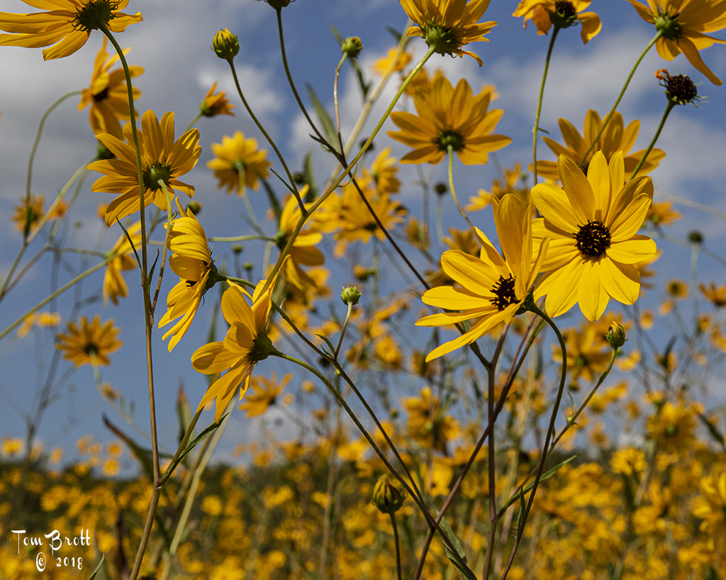
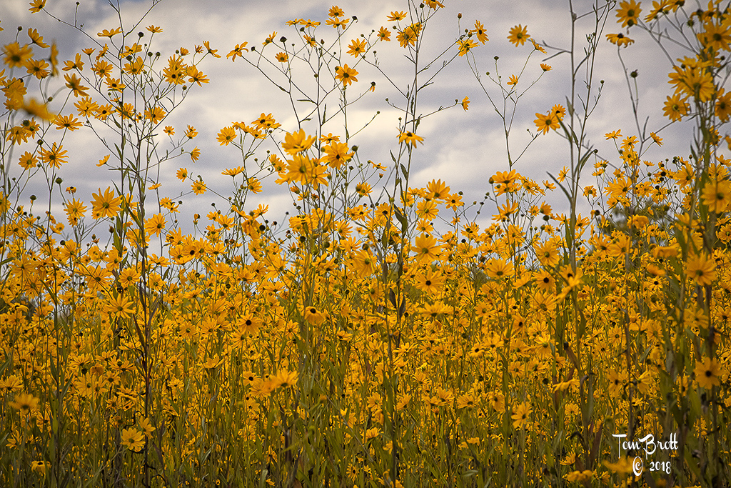
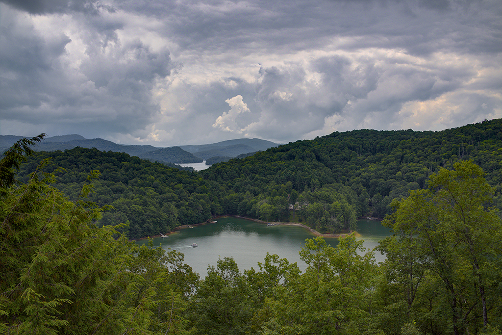
I think my goal was to show the vast fields of yellow with the flowers and showing the different heights that they grew in. I had during this outing also photographed many individual flowers. |
Sep 18th |
 |
| 49 |
Sep 19 |
Comment |
Like this image a lot. My first reaction in seeing this was the lack of the cobble stone roads that lead to the Colosseum. Then looking at the original I think you made a smart decision to not include the cobble stones. Nice details of the building itself and colors. Being an HDR did you use the ghosting tool to try and bring the people in more focus?
Still is a wonderful image. |
Sep 18th |
| 49 |
Sep 19 |
Comment |
Nicer bright background colors make the people in the image pop. There is a very distracting grey box - center far left that should be cropped out. I think a much tighter crop would help immensely - just above the arcade lights and focus on the people. You can see the reflection in their glasses of the Cyclone. |
Sep 18th |
| 49 |
Sep 19 |
Comment |
I have to agree with Alan's comment about the cropping in on each side. I also believe that maybe darkening the sky might a little more might give a little more definition to the pole dancer. |
Sep 18th |
| 49 |
Sep 19 |
Comment |
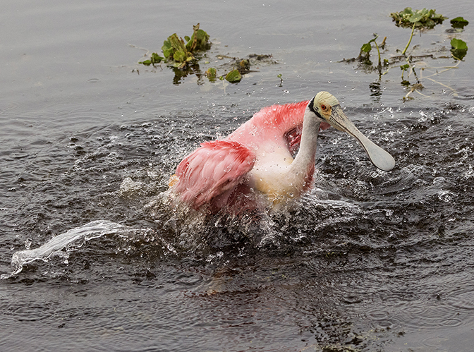
In addition to what Alan said I can see by shadows that the image was taken with the sun directly overhead. I feel you have lost a lot of detail and contrast in the feet and lower shell closest to the viewer. |
Sep 18th |
| 49 |
Sep 19 |
Comment |
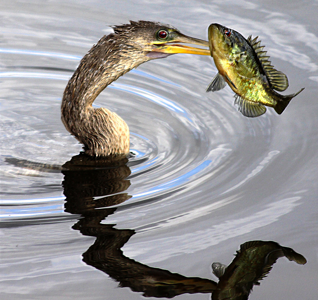
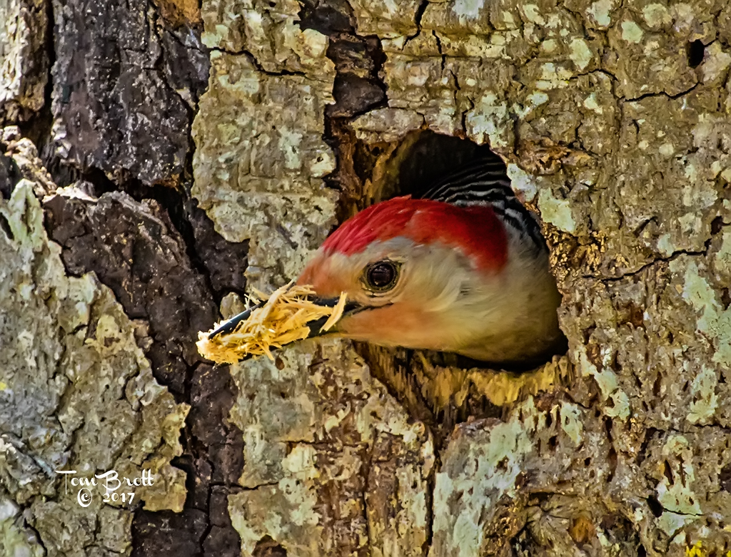
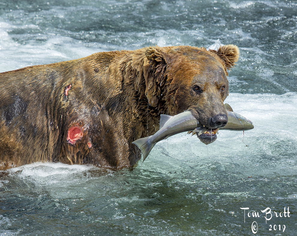
I have not been to Lake Clarke NP but have been to Katmai NP and it is very exciting capturing the bears in action. My first reaction is that the raised paws are blocking the faces. You have great detail and great action between the bears and the splashing of the water. If you were shooting in the burst mode a frame before or after this shot might give a better view of the faces. It does look like a couple of sub-adults playing. Good job. |
Sep 18th |
| 49 |
Sep 19 |
Comment |
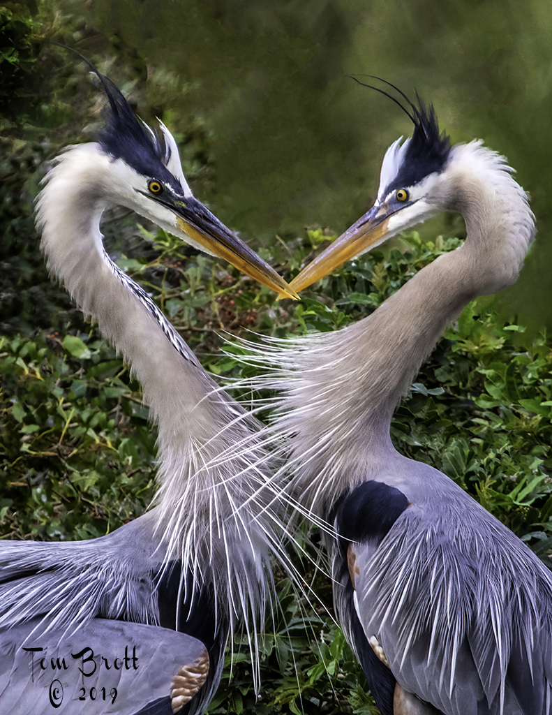
Wonderful image and you met your goals. B&W was a great choice and removing the distractions done to perfection. |
Sep 18th |
6 comments - 1 reply for Group 49
|
| 52 |
Sep 19 |
Comment |
Another wonderful image. I know you were trying for the soft light of sunrise in your edition but for me I like the original that still gives you a sunrise feeling and also has a little more pop which my eye prefers. |
Sep 18th |
| 52 |
Sep 19 |
Comment |
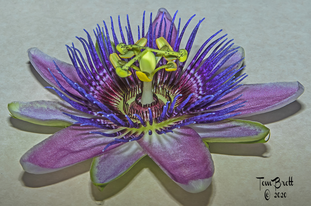
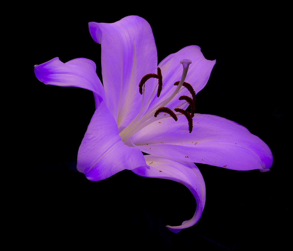
Nice image. I like your crop better and would have to agree with John that maybe a little more space on the top would help the image but then you would have to deal with another stem in back of the flower. Overall I believe you did a wonderful job. |
Sep 18th |
| 52 |
Sep 19 |
Comment |
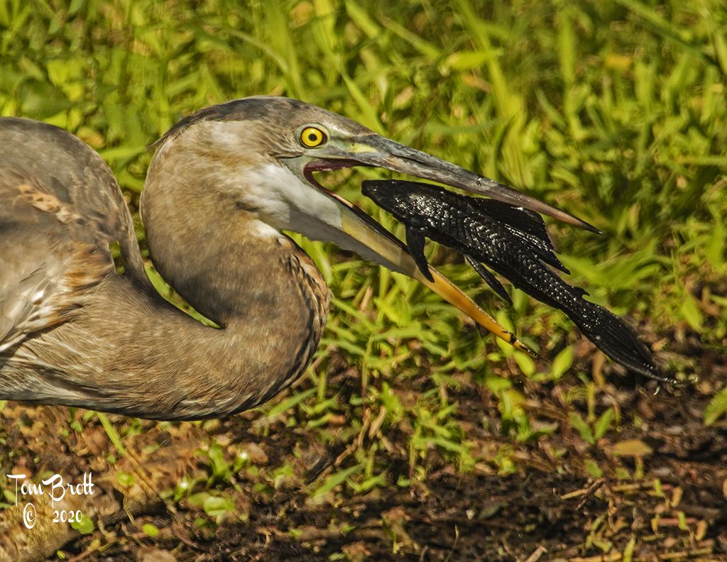
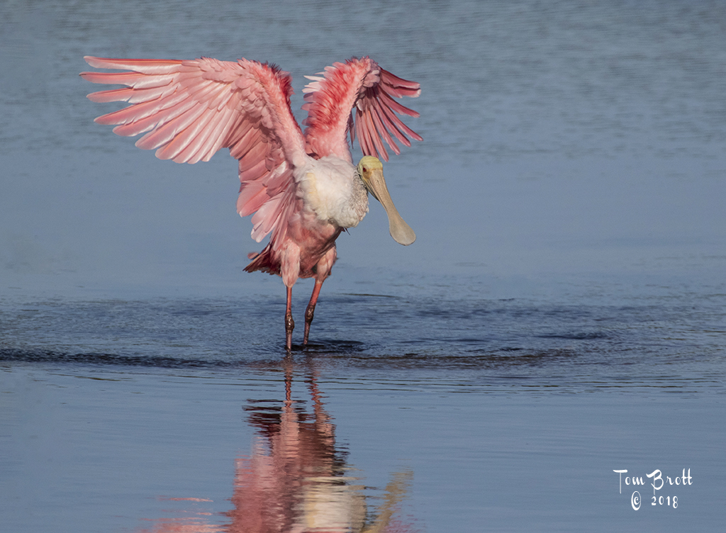
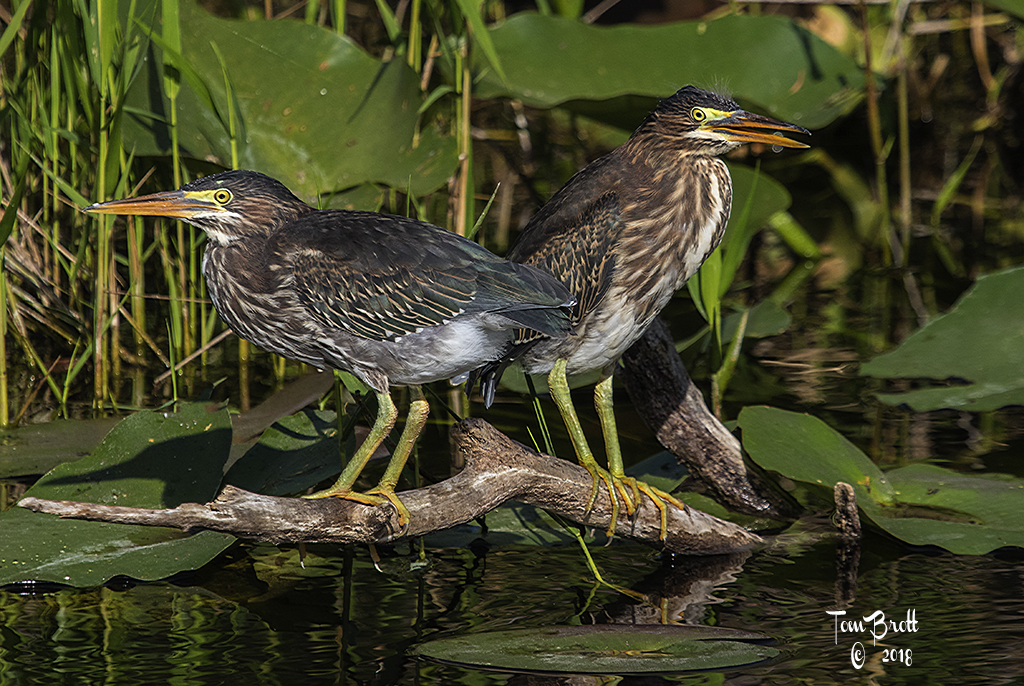
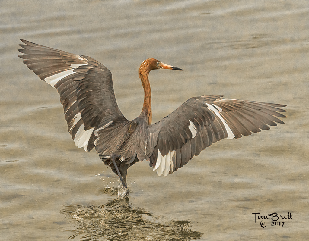
Great shot as well as the other images you posted in this series. I was wondering if you would post one of the series.
I think my only suggestion would be to fix the bright white area on the back of the head as Mike suggested. Other than that it is a super image. |
Sep 18th |
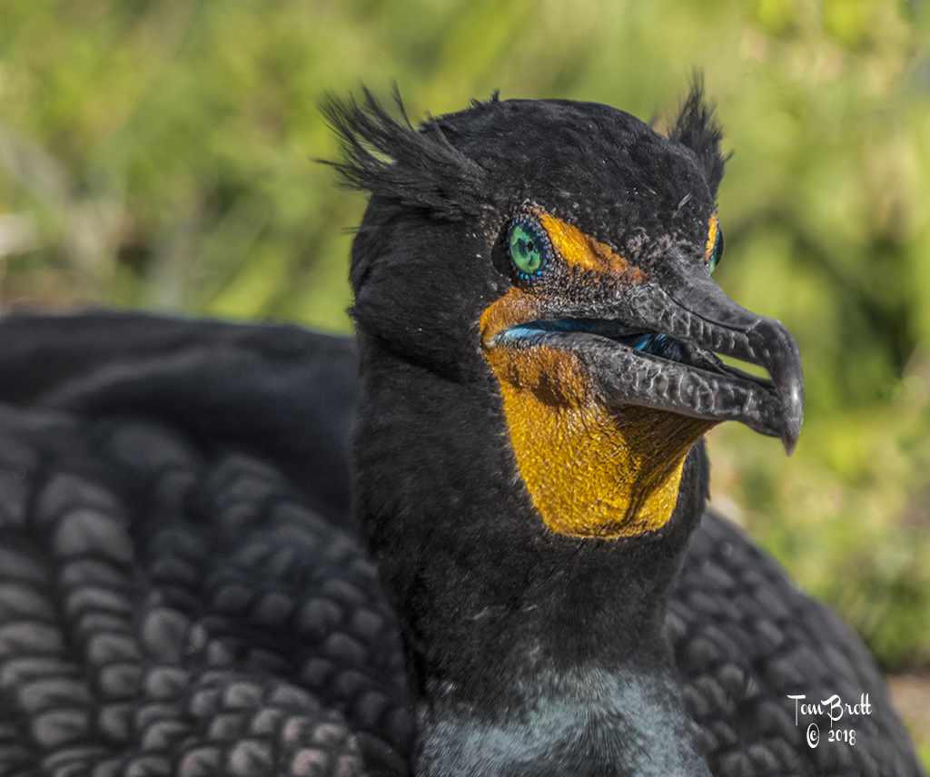
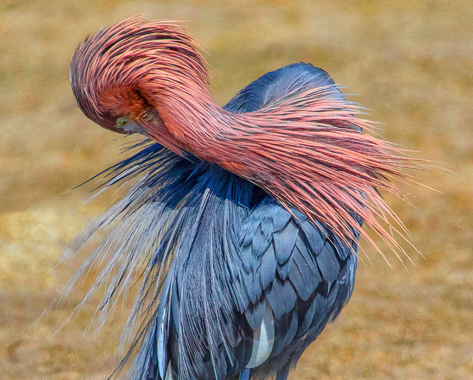
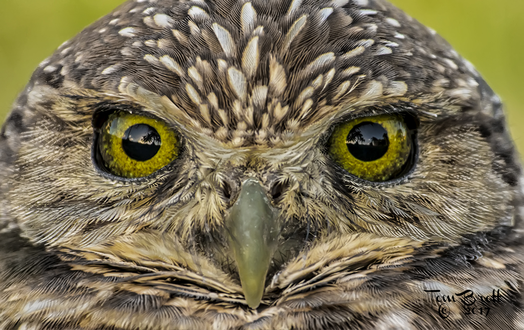
| 52 |
Sep 19 |
Comment |
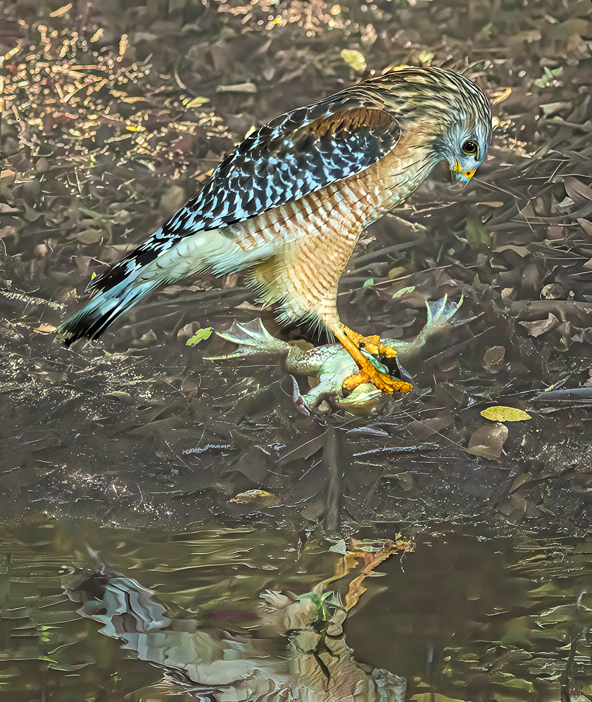
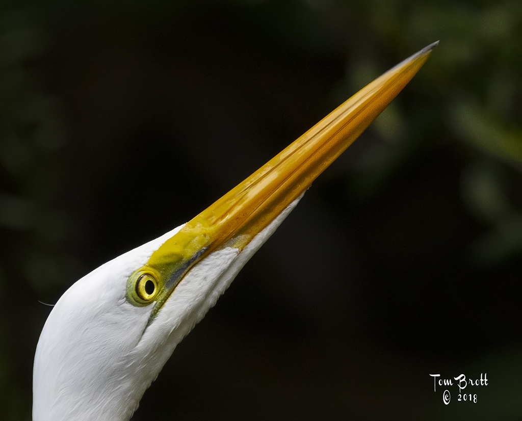
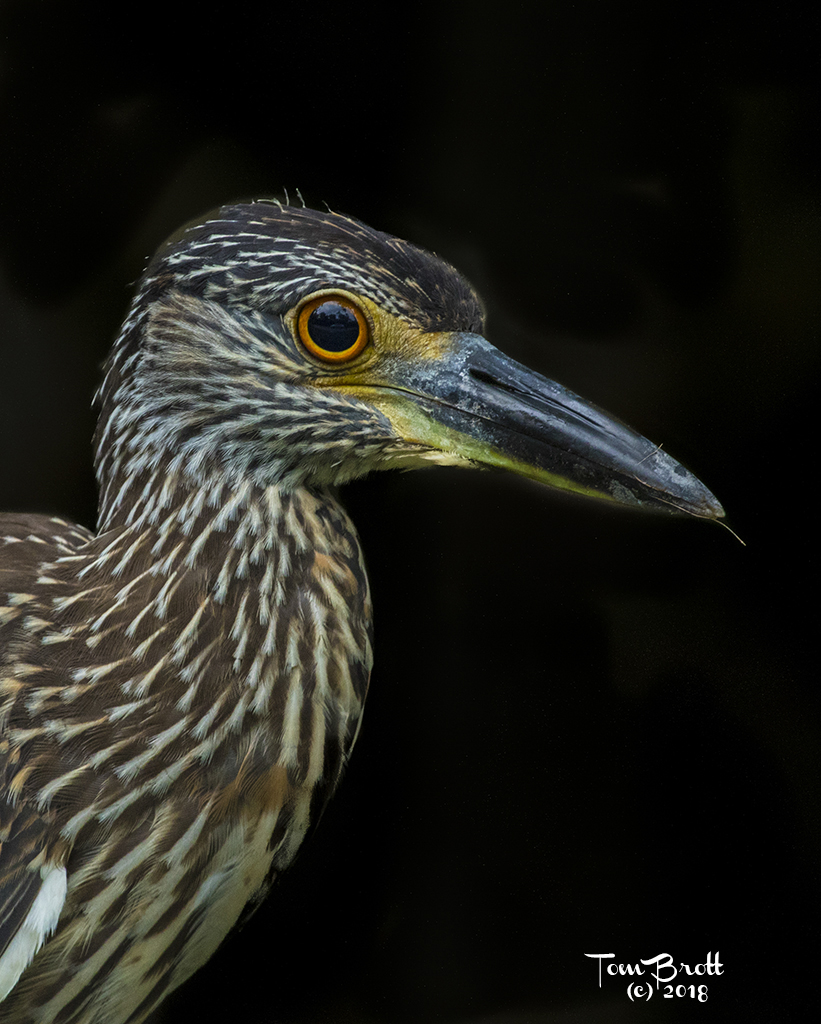
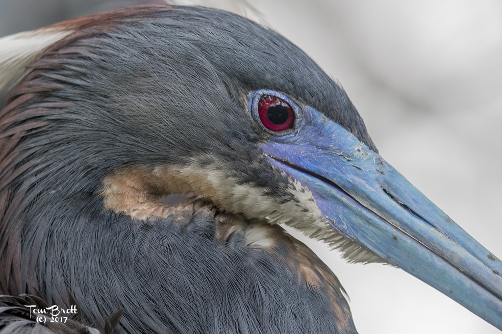
I love the colors and detail in the head and throat. I would have to agree with the others on darkening the background a bit to clear up some of the distractions. I also noted that there is a ghost area (for lack of a better word) right above the nose area that looks overly grainy and whiter than the rest. I am not sure of the cause or how to remedy this. |
Sep 18th |
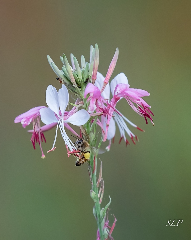
| 52 |
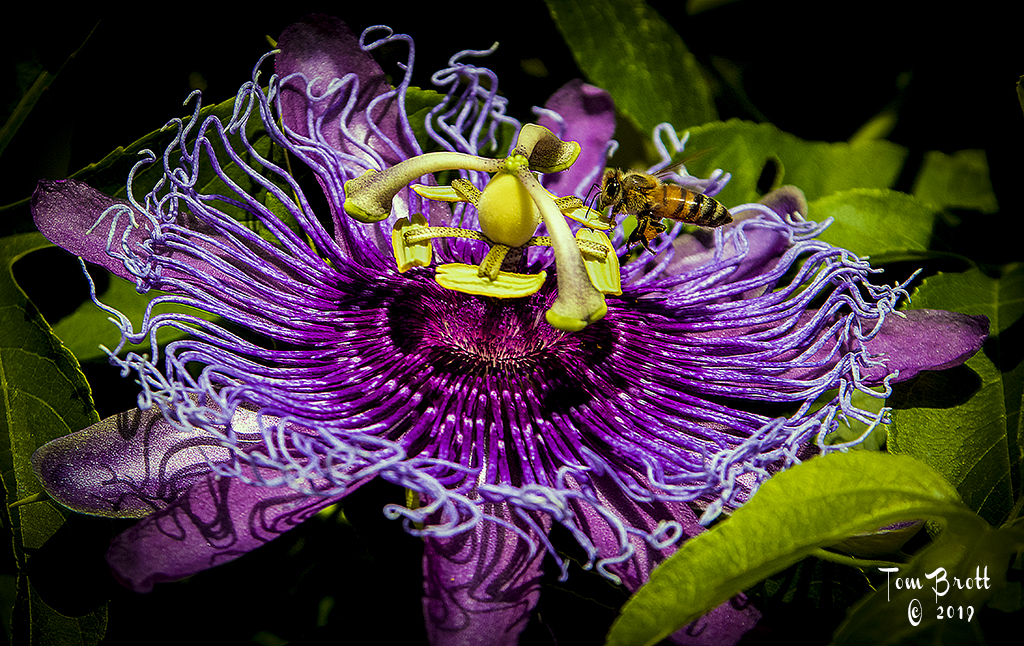
Sep 19 |
Comment |
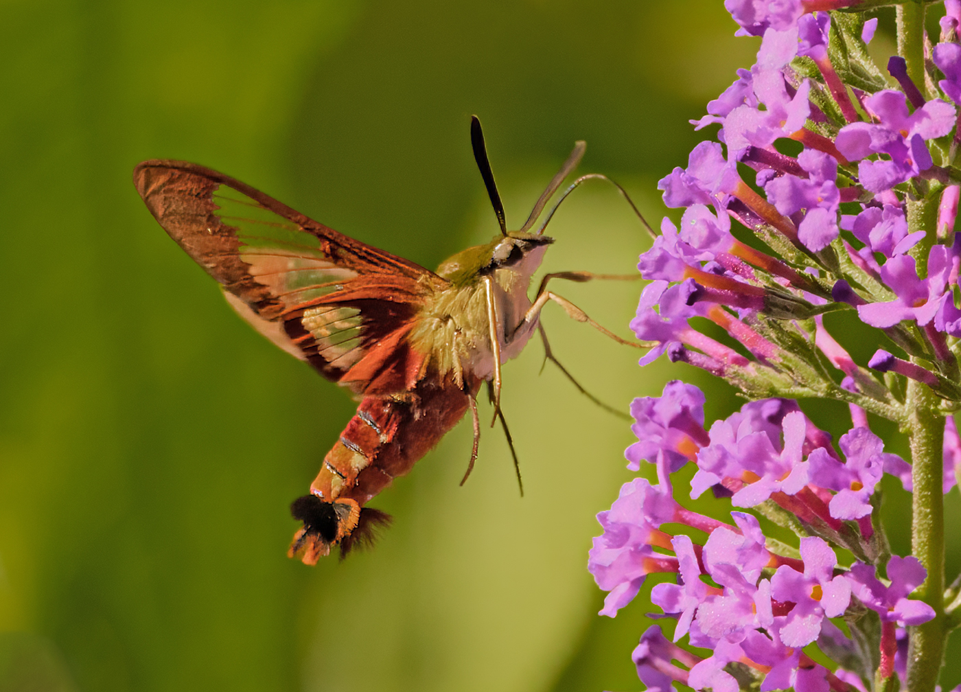
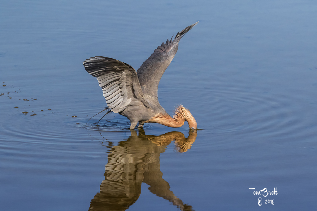
I like the image as presented. The colors of the flowers and plant are right on but for my taste I would like a little more pop to the color of the bee. I don't know if this would be allowed in Nature but a program Called "Imagenomic" can help reduce the graininess of the background. I like using it on higher ISO images to keep the background smooth. |
Sep 18th |
 |
| 52 |
Sep 19 |
Comment |
I like it. Thanks for the suggestions. |
Sep 3rd |
6 comments - 0 replies for Group 52
|
12 comments - 1 reply Total
|