|
| Group |
Round |
C/R |
Comment |
Date |
Image |
| 49 |
May 19 |
Comment |
I think Alan's suggestions are right on. Those two distractions were too eye catching in the image. |
May 28th |
| 49 |
May 19 |
Comment |
Wonderful action image. Definitely getting some air under him. Good clarity and sharpness with the colors popping. Small nit pic - power line (?) about 1/3 the way up from the bottom left side should disappear. |
May 28th |
| 49 |
May 19 |
Comment |
Very beautiful portrait. Well done. Anette pops, her eyes sparkle and the grey fabric add a beautiful contrast. I have two small areas of concern that create a distraction for me. 1 - lower left side there appears to be a red colored something trying to pop out - maybe darken that a touch. 2 - lower right side it looks like an arm trying to come out with that hint of red as well in the image - again a think a little darkening would take care of that. |
May 28th |
| 49 |
May 19 |
Comment |
I agree with the other two but went about it a little different. I first used the healing brush to remove several distractions. Then I used levels to adjust the colors - thinking that Dick's version looks too saturated and giving the colors more definition. Finally I cropped a little differently. |
May 28th |
 |
| 49 |
May 19 |
Comment |
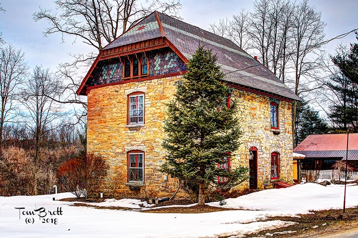
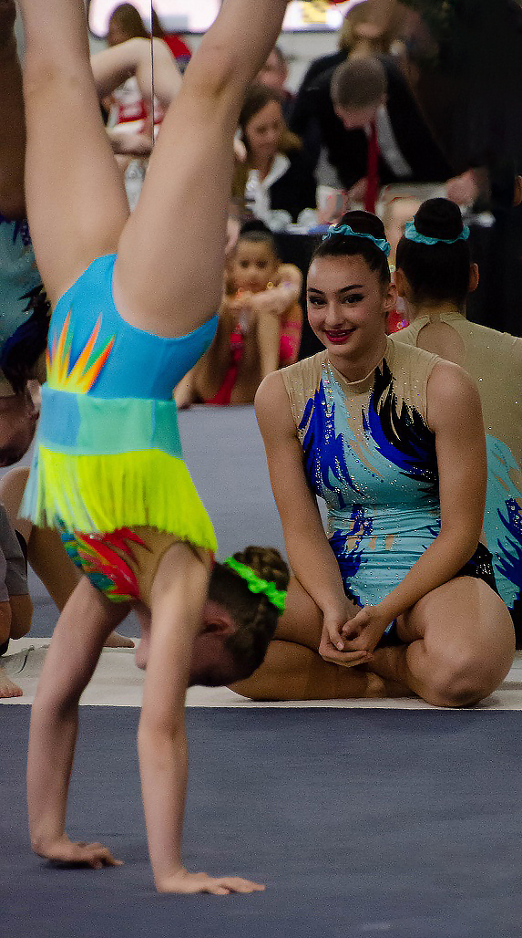
I go along with what Alan said with the wider lens opening. My other thought was to remove the girl on the right totally setting up a different crop. That seems to highlight your daughter better but it also puts an emphasis on the girl sitting on the floor. |
May 28th |
 |
5 comments - 0 replies for Group 49
|
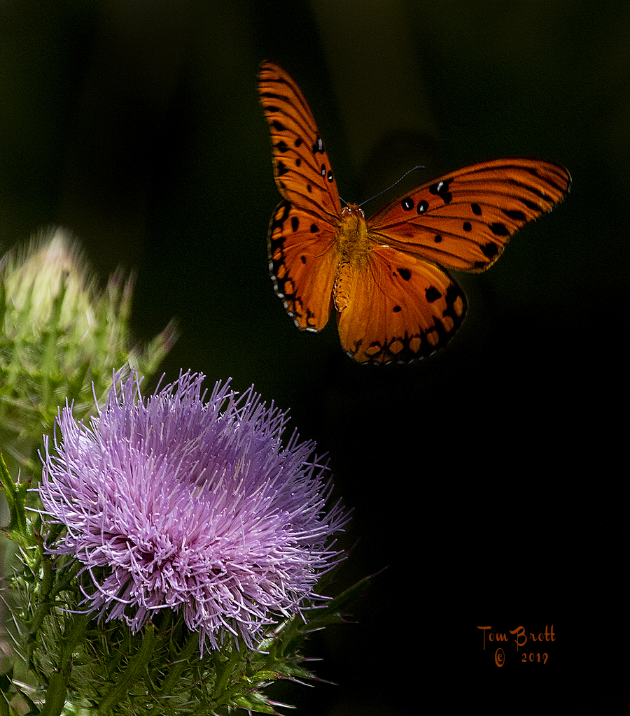
| 52 |
May 19 |
Comment |
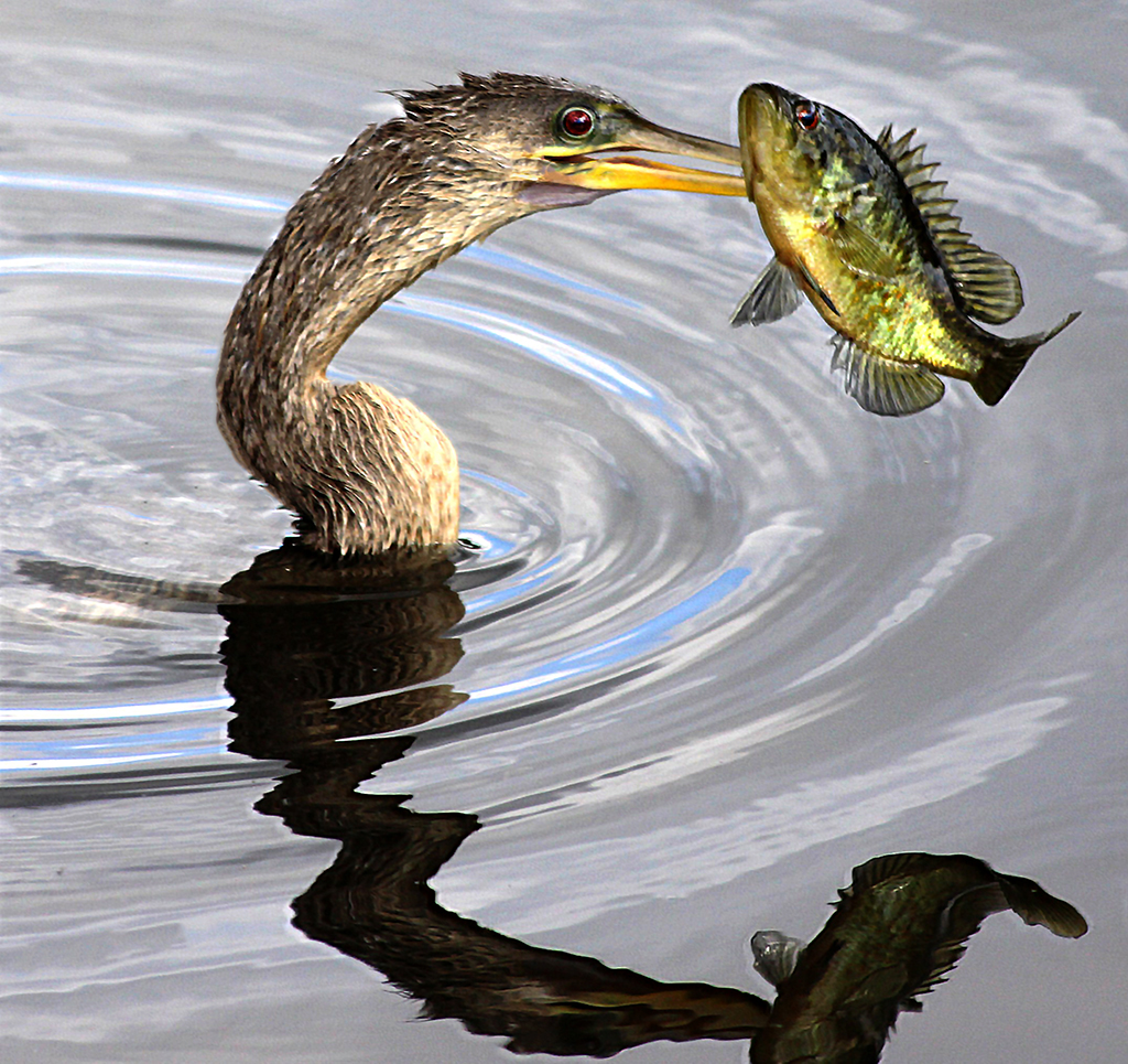
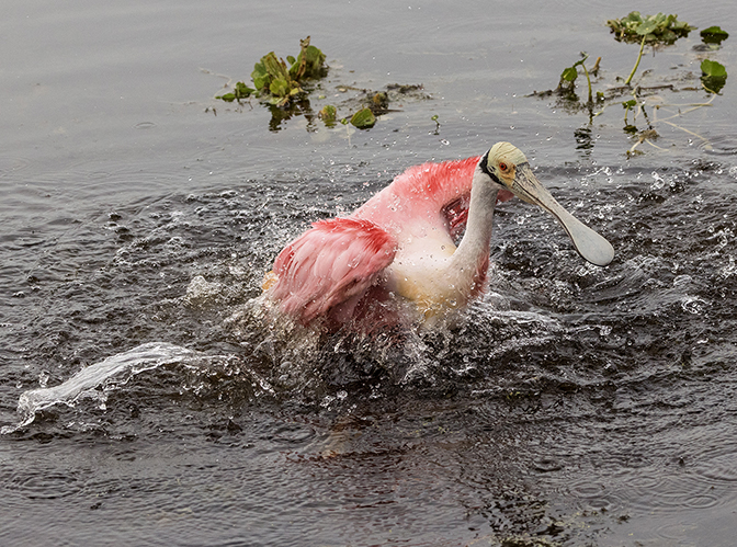
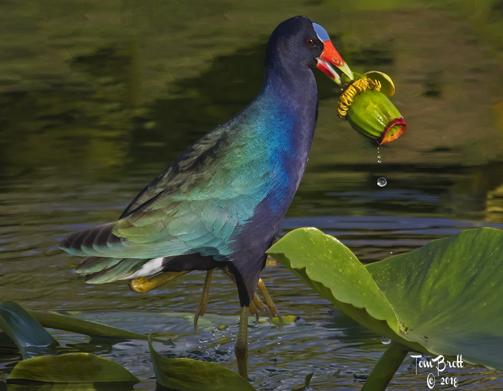
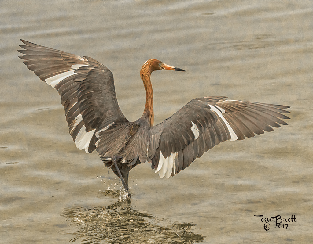
Wonderful image. Great clarity and action. In this instance the reflection has almost greater in detail than the actual bird in flight. The reflection of the back wing seems off to some because of the shooting angle. You might want to totally flip the image to make some people happy (I have done that before when the reflection has shown more detail than the image and no one knew the difference). My nit pic is the darker area the reflection is flying toward - bottom far left. A little eye soar for me.
Overall another great image. |
May 21st |
| 52 |
May 19 |
Comment |
I like the diagonal branches in the upper portion leading into the hint of spring colors/flowers. The trunks of the trees anchored into the ground appear to form a pathway leading into fresh spring greens of the grass making one want to follow the pathway to freshness and spring. Nice image. |
May 21st |
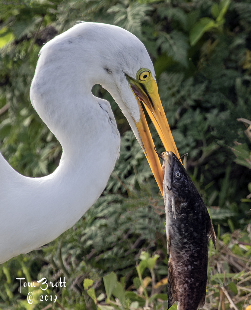
| 52 |
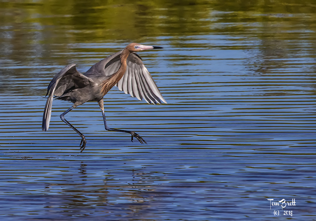
May 19 |
Comment |
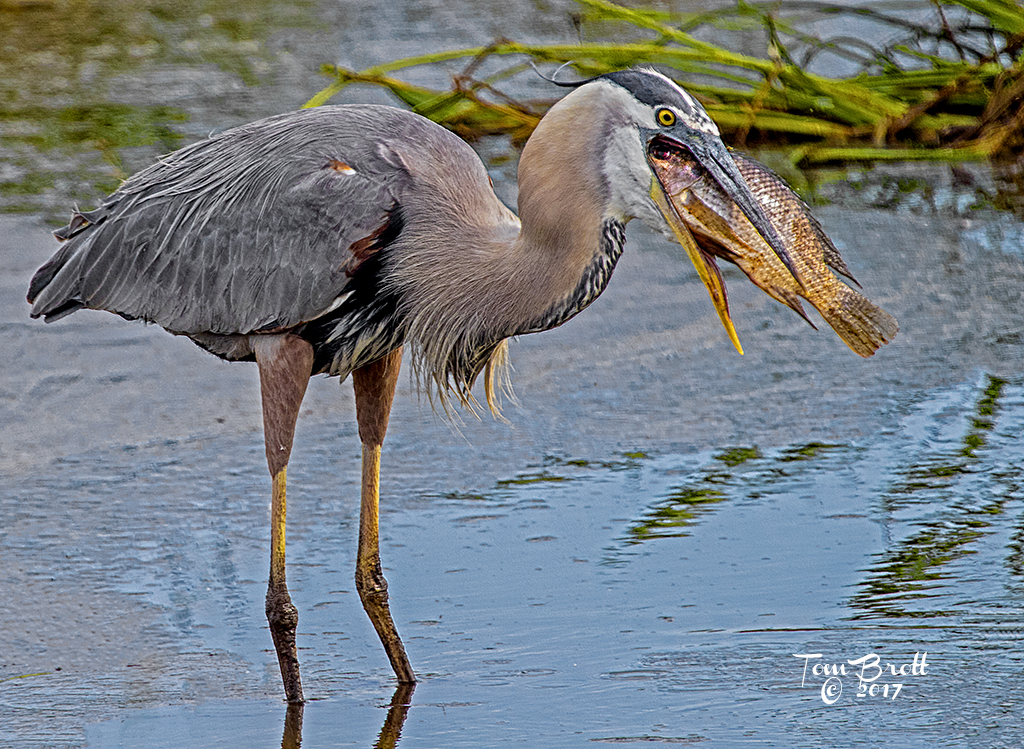
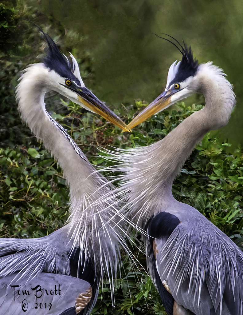
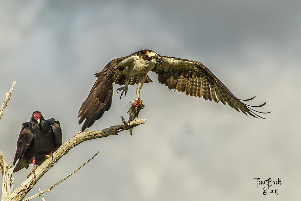
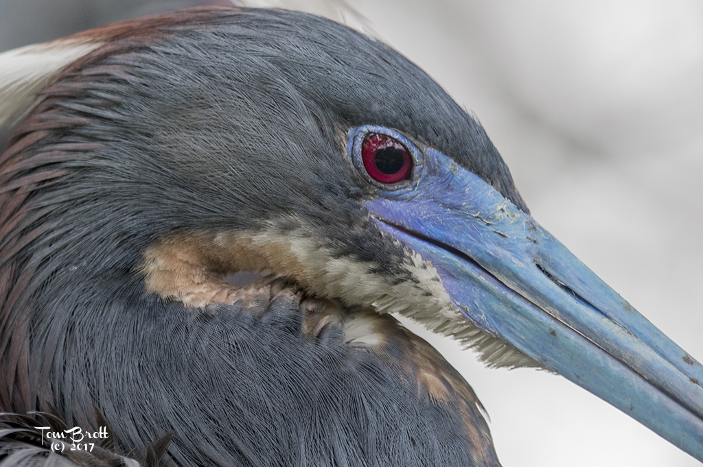
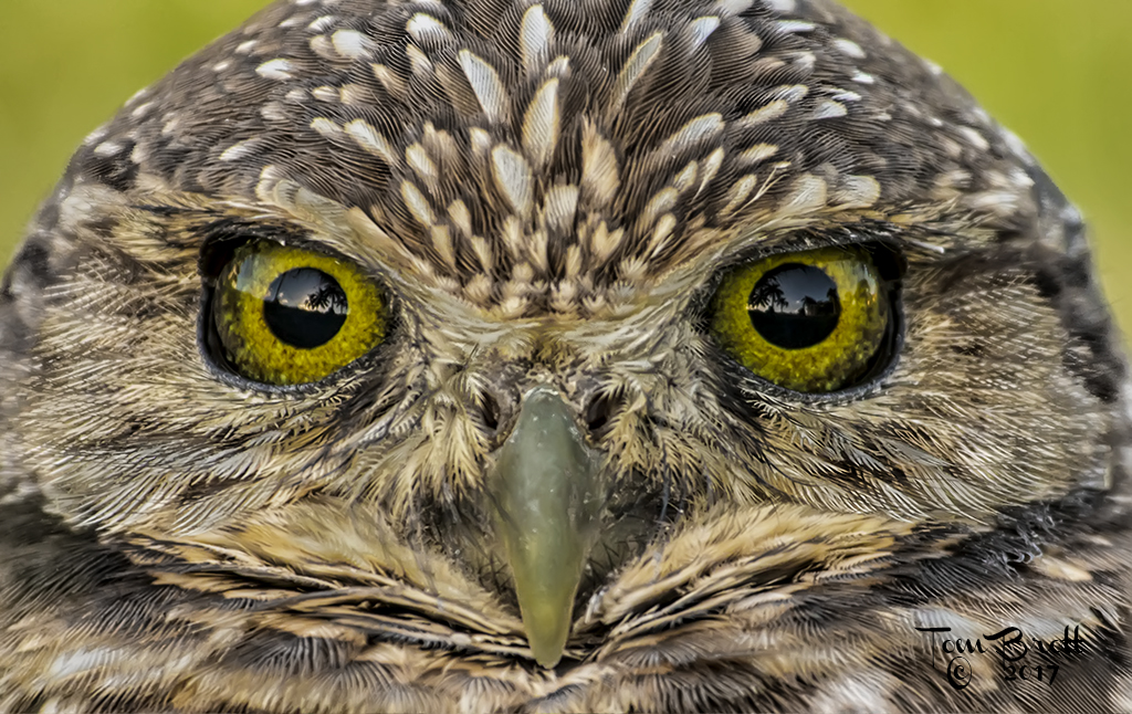
Great capture and action image. To my eye and as presented on my monitor I have to agree with Mike. I think some of the blues in the outer up stretched wing look a little unnatural. I have never seen a great Blue with the lore as aqua/turquoise looking and there appears to be a little too much in red on the upper portion of the bill for me. But what I have learned from Cornell Labs that a lot of the coloring in these areas depend on location of the bird and the diets they consume. I guess my color comments are from the deep south of Florida. All is sharp and very clear and the flying water droplets help suggest a fast action. |
May 21st |
| 52 |
May 19 |
Comment |
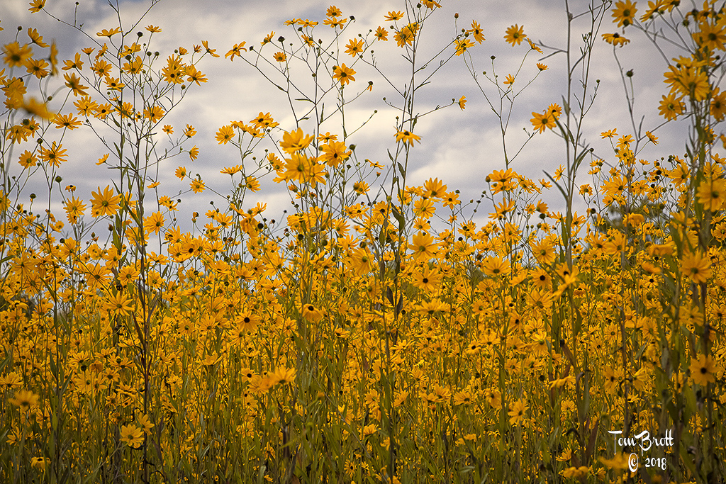
I like this whites and yellows of the two main stems and the over all background. I think the real eye soar for me is that one end leaf(?) pointing to the right in the center of the frame. To my eye it looks like there might have been a small breeze that makes it look double exposed. I feel it should disappear. I do like the way the rest of the background looks and the diagonal row of leaves seem to set the rest of the image in place leading to the white and yellow flowers. |
May 21st |
| 52 |
May 19 |
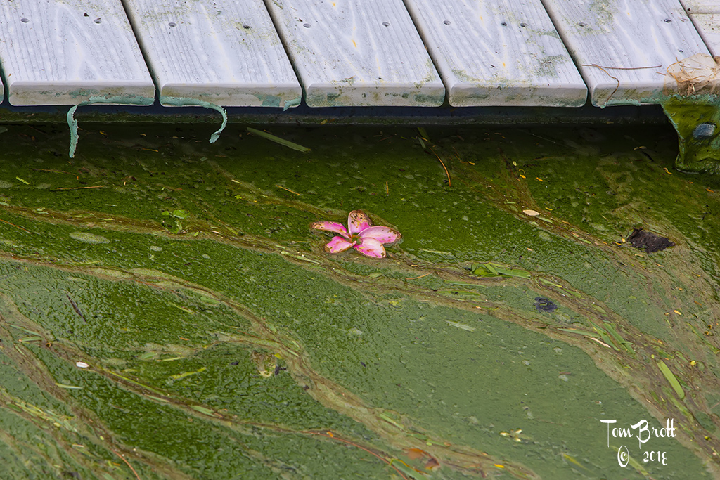
Comment |
Like the presented version with the way you removed the tulip in the bottom left and the muting of the leaves in the lower portion. My eye would prefer a little more pop in the flower colors as in the original but I guess that would rid the image of the DREAMY feeling as Sharon said. |
May 21st |
| 52 |
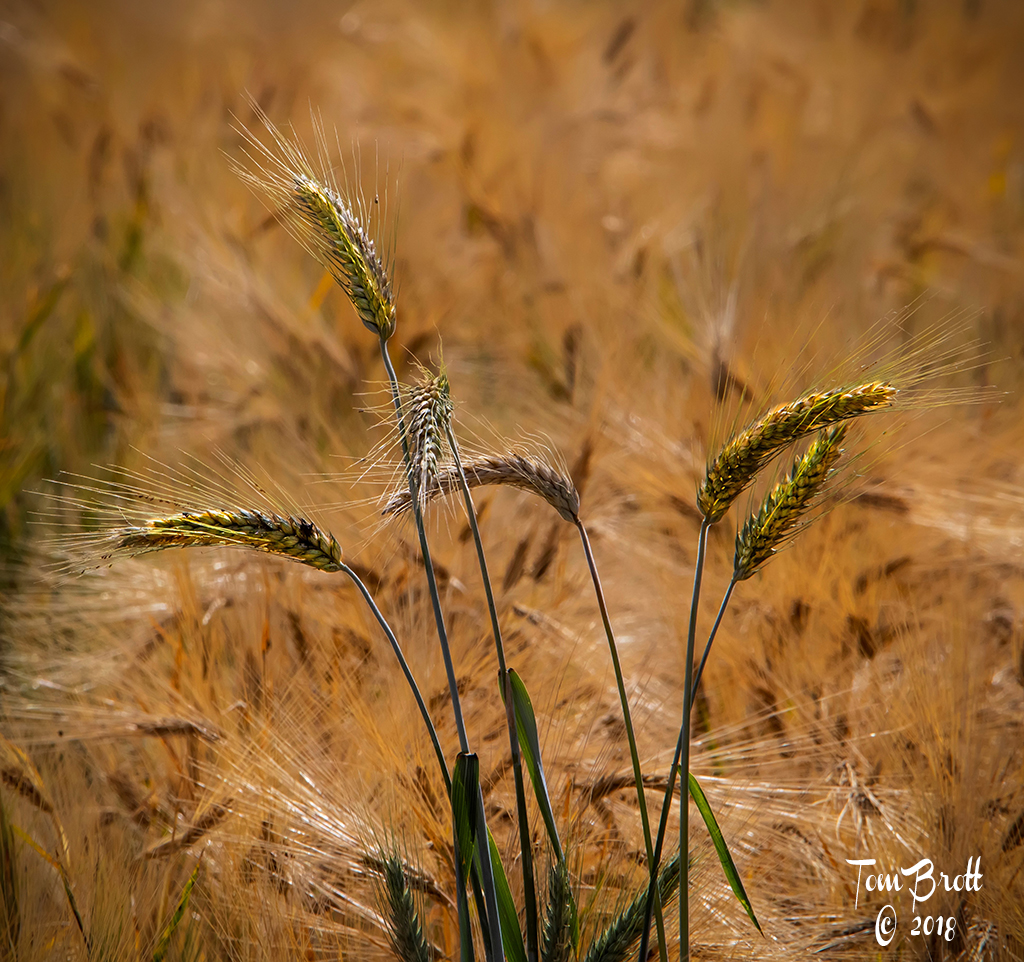
May 19 |
Comment |
Wonderful image. Perfect colors and cropping to make the image really stand out. The only very small nit pic to MY eye is I think the background should be a touch lighter. Some of the darker areas seem to be competing with the veining of the leaves. Love the background idea and have seen it used in several classes I have taken. It means PLAN AHEAD though and that is something most of us do not do. |
May 21st |
6 comments - 0 replies for Group 52
|
11 comments - 0 replies Total
|