|
| Group |
Round |
C/R |
Comment |
Date |
Image |
| 49 |
Mar 19 |
Reply |
Normally I would have done that but it was a tricky back lit situation and I was trying to keep the back areas from blowing out. You can see the sunlight on the back of the head and neck. |
Mar 30th |
| 49 |
Mar 19 |
Comment |
Alan is right about the eyes. I went back into camera raw and lessened some of the shadows under the chin area and that also made the eye area a little clearer. If you are not using this as a nature competition shot then you could add an overlay over the eyes to brighten them and also add the catch light. |
Mar 20th |
 |
| 49 |
Mar 19 |
Comment |
Alan, to my eye at least it was a touch flat. I used levels to add a little pop (may be took dark now)and cropped a little right left and bottom to get rid of items and space not needed. Just my thoughts. |
Mar 20th |
 |
| 49 |
Mar 19 |
Comment |
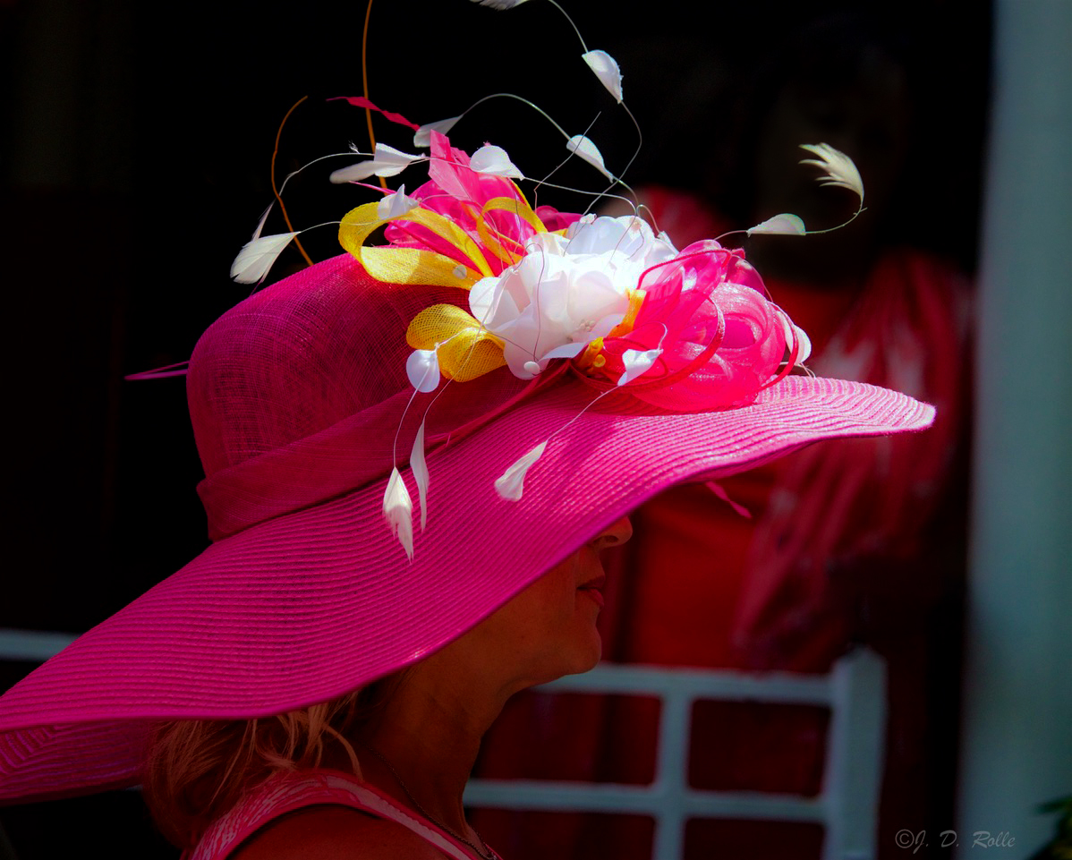
I have to agree with Alan About the background in crowds. I darkened the face area, used the lasso tool to remove the arm and purse and the touch of blue on the center left, used the healing brush on several areas and the cloning tool. By also adding highlights I was able to give the white flower on the hat some more detail. Your thoughts? |
Mar 20th |
 |
| 49 |
Mar 19 |
Comment |
Nice image. Great lighting and I go along with Alan that a little should be cropped off the left or at least use the lasso tool to remove the (I believe) ship on the horizon. |
Mar 20th |
| 49 |
Mar 19 |
Comment |
I think the process you used creates a wonderful image. I love the softness and crop. My only suggestion would to have used a faster shutter speed as the hand in the foreground is not clear and shows motion. |
Mar 20th |
5 comments - 1 reply for Group 49
|
| 52 |
Mar 19 |
Reply |
It is a new program as a stand alone or as a filter preset. Right now it is also $20.00 off original cost. Not sure if I wanted it so I got a trial version for 30 days to play around with and to see what it can do. |
Mar 20th |
| 52 |
Mar 19 |
Reply |
A lot sharper and better. |
Mar 20th |
| 52 |
Mar 19 |
Comment |
A Emerald Toucanet. I have to agree with the others that the branch in the center is distracting but one often has to take what one is given in nature photography. I feel the colors are a little flat and could benefit from levels or curves.
Will get a chance to try my hand at the rare birds of Costa Rica next month. Can't wait. |
Mar 20th |
| 52 |
Mar 19 |
Comment |
Mike,
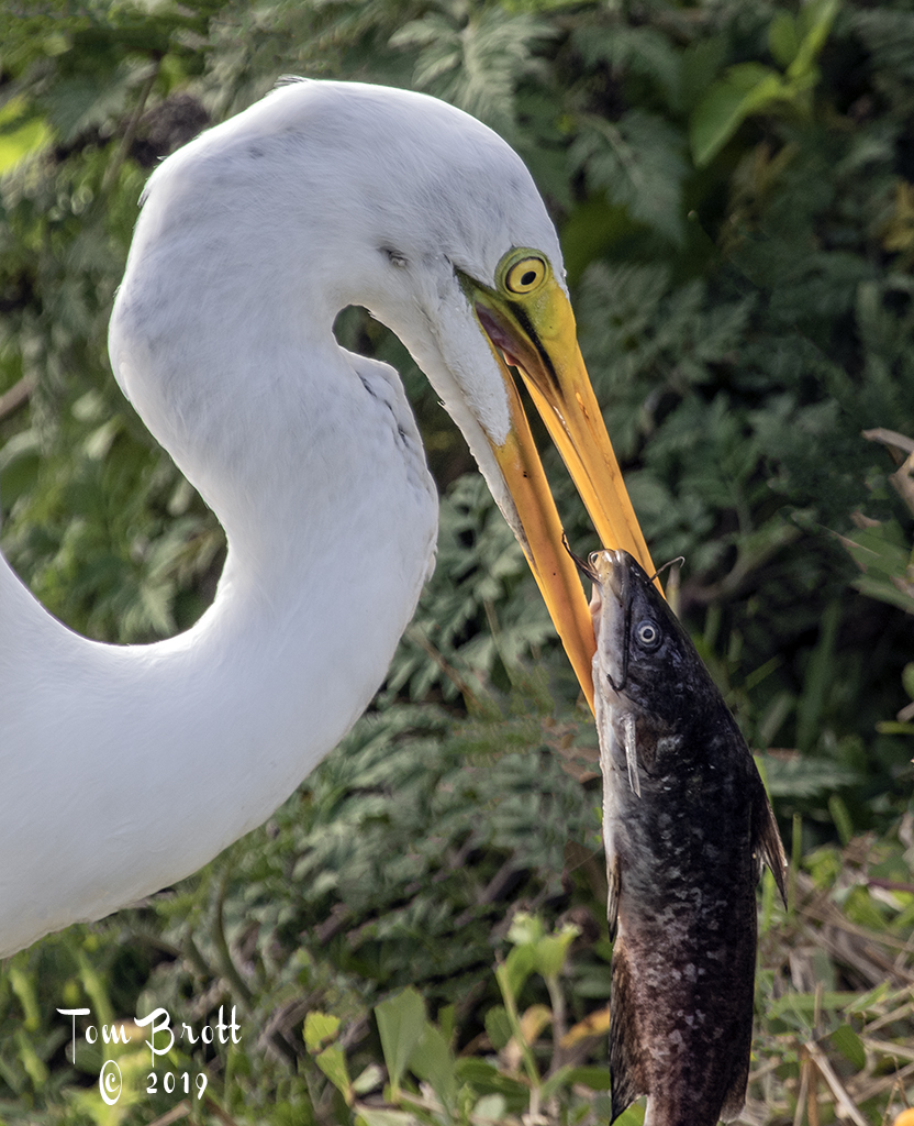
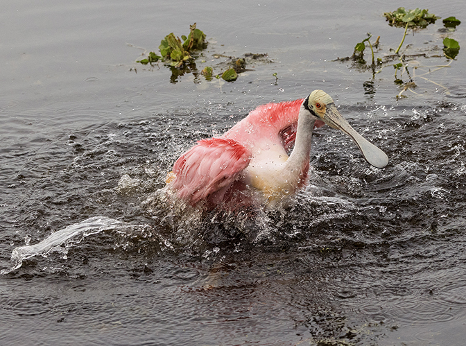
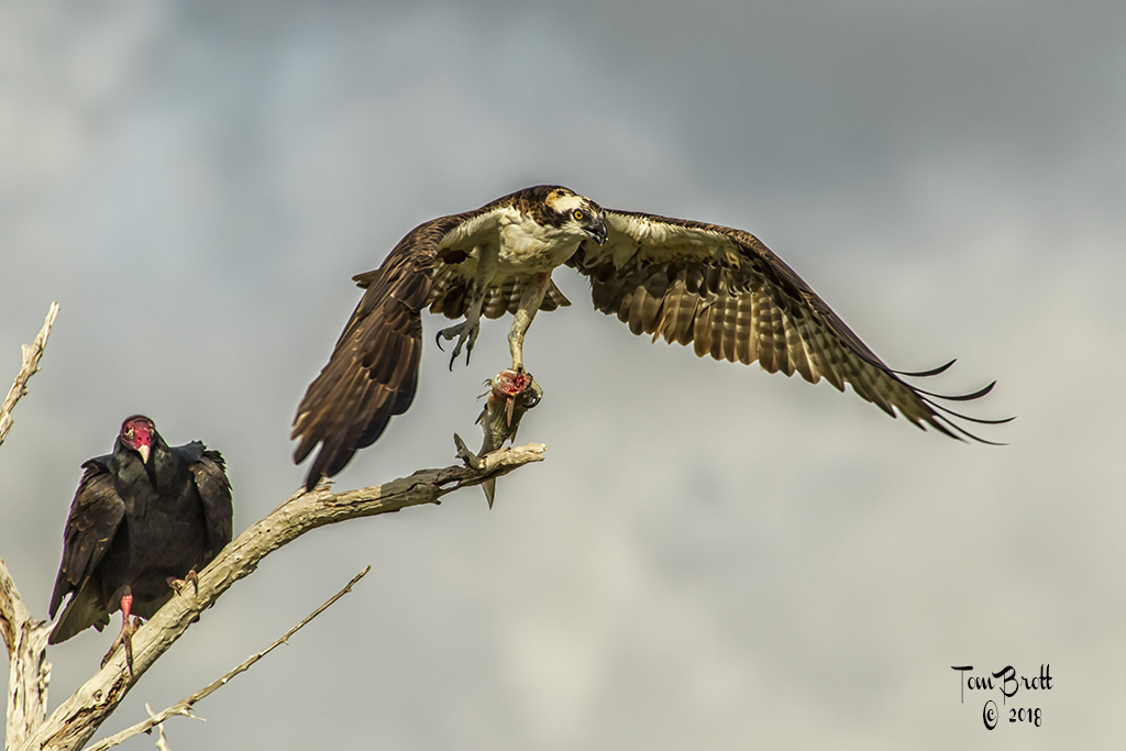
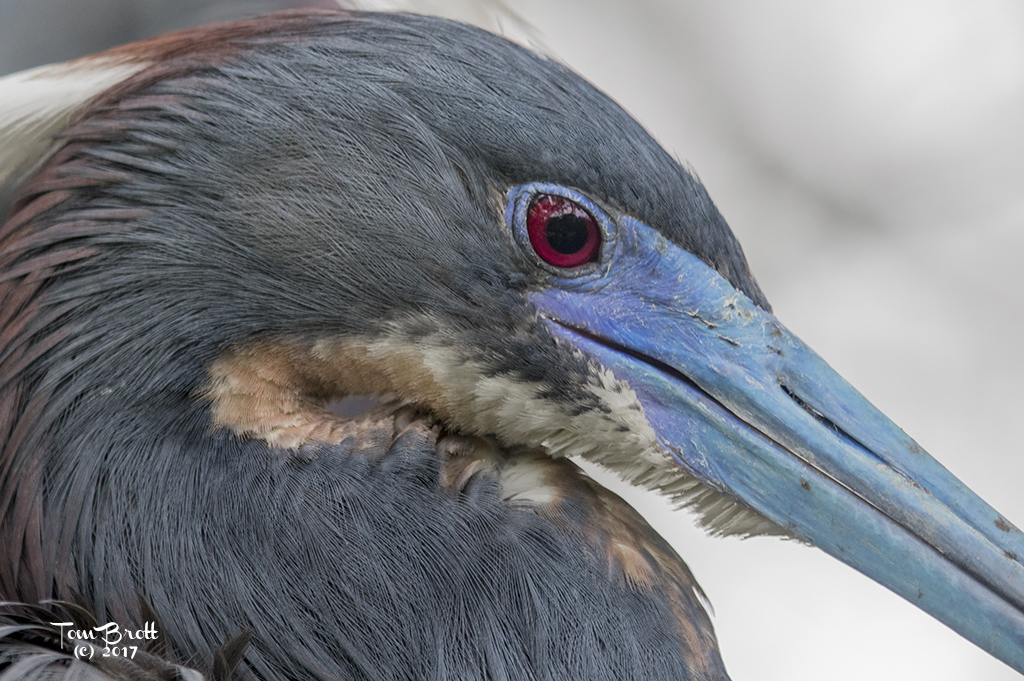
Your image is right on. Great capture of flight and wing position. The darker background doesn't bother me at all. One nit pic comment. Knowing these birds as well as I do living here in south Florida I feel the bluish out line of the mating eye and the reddish center of the eye could use a little more pop. Other than that another super fine capture. |
Mar 20th |
| 52 |
Mar 19 |
Comment |
Judith,
You know that I am not the artsy type of person. I have been trial testing Topaz's new program Sharpen (it also works with helping to focus to certain extents) so I ran your image through the program. I (personally) find the Sharpened version much more pleasing but think it keeps you artsy aspect to the image. Your thoughts. |
Mar 20th |
 |
| 52 |
Mar 19 |
Comment |
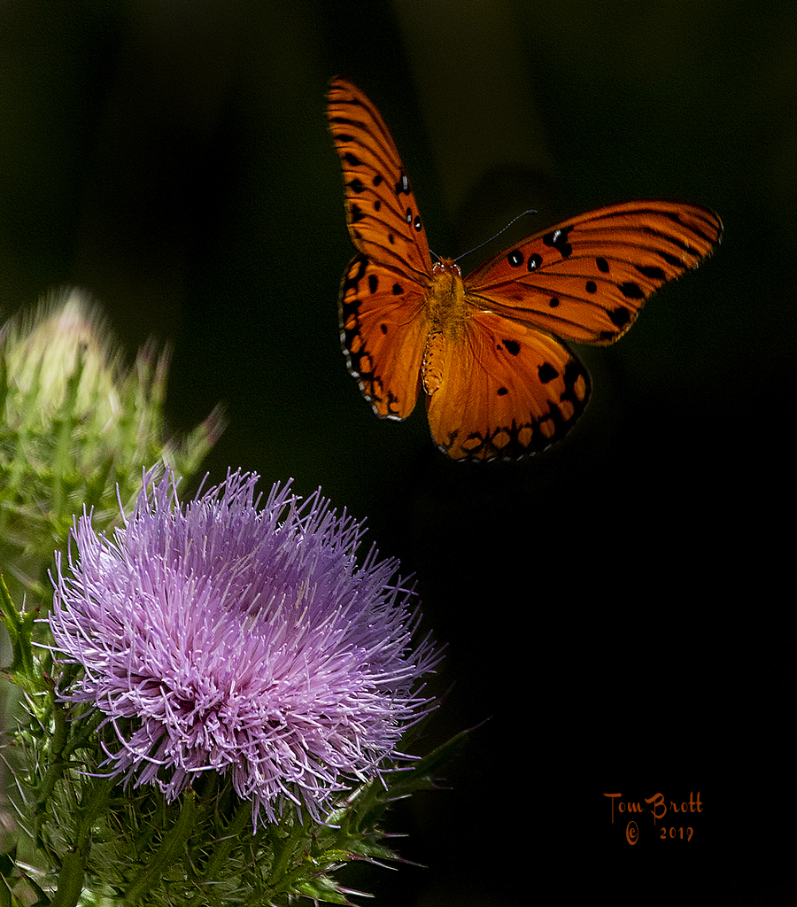
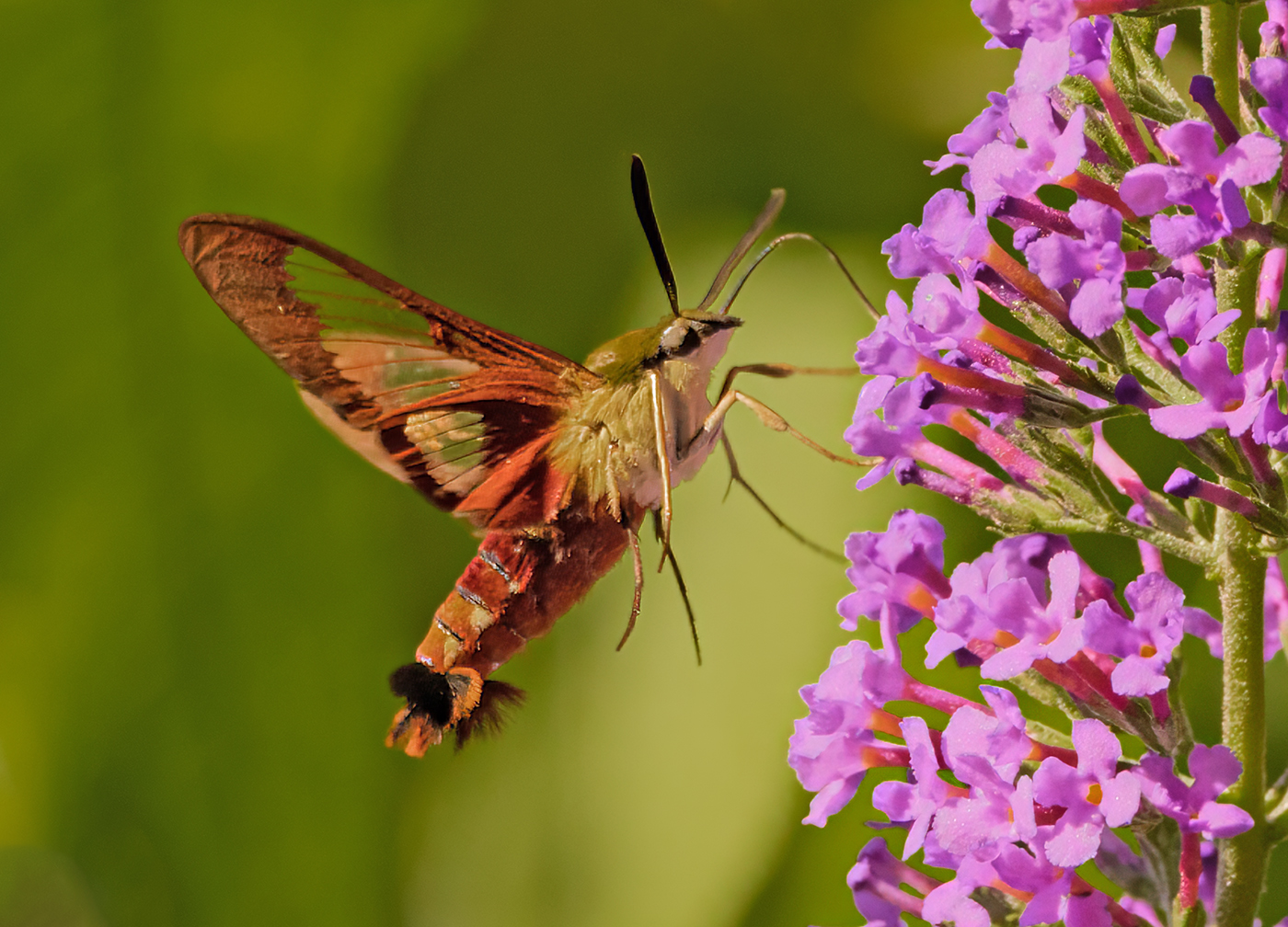
Nice image. Great colors, tonality, and overall sharpness. The orange, black and green of the image work well and are very pleasing to the eye. I do have a concern though and wonder if it is my monitor as none of the others have mentioned it. Around the monarch and especially the antennae, legs and top of the wings there appears to be blotchy imperfections in the green areas but it is fine and you need to look close. I am thinking it has something to do with processing as I have encountered it as well on some finer lined images in the past.
As for the two branches on the bottom I feel they are needed for balance. |
Mar 20th |
| 52 |
Mar 19 |
Comment |
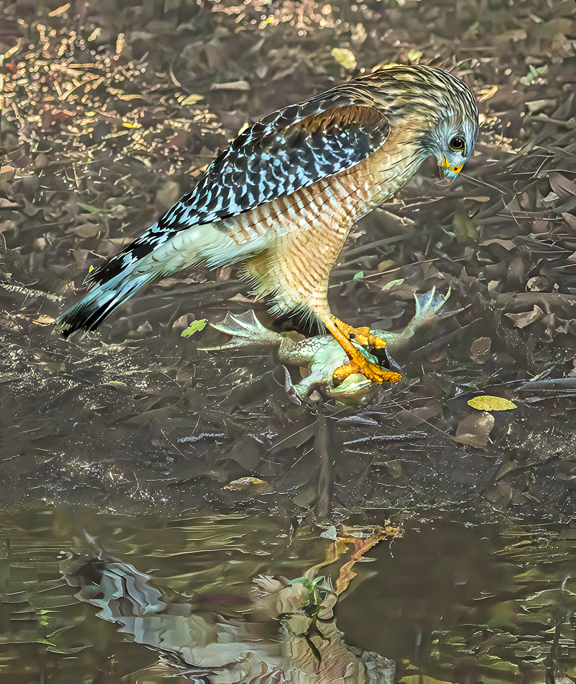
A very pretty orchid and good capture. I like Mike's suggestions and newer rendition of the plant. Spots gone, brighter whites and colors that appear to pop more. The background definitely needs to be darker and in your second cropped version using the triangle crop lines you lost some of the flower. With a little work this can be a beautiful image to be very proud of.
I see you got the signature problem worked out. Yeah! |
Mar 20th |
| 52 |
Mar 19 |
Comment |
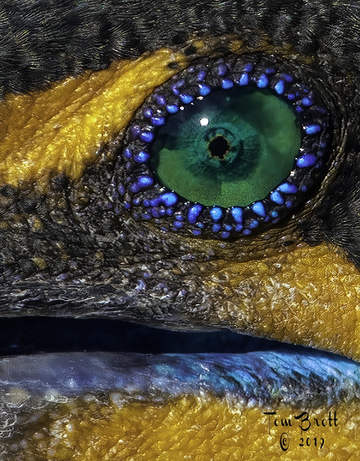
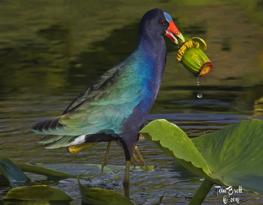
Like the image very much. The colors, sharpness and crispness are amazing. I have to side with John and his view as an Audubon type painting (rather than nature) but used in an artistic way I guess it fits perfectly. I have one minute concern. The purple and lavender feathers on the wing appear to have some noise or something that makes it look like lint present. Maybe it is just my monitor - I hope it is. |
Mar 20th |
6 comments - 2 replies for Group 52
|
11 comments - 3 replies Total
|