|
| Group |
Round |
C/R |
Comment |
Date |
Image |
| 49 |
Jan 19 |
Comment |
My thoughts are that you are correct in that the image is too busy especially in the foreground. I cropped to just below where the building reflections are - removed the tower on the left and increased levels a bit. There really are several nice layers in this image. |
Jan 20th |
 |
| 49 |
Jan 19 |
Comment |
Like the image and the details. My only suggestion would be to lighten the tree in the background roof to help the skulls standout better. It is very hard to figure out what they are in the B&W version. Lots of great detail in the rest of the image. |
Jan 20th |
| 49 |
Jan 19 |
Comment |
Very obvious that the image was shot through a fence. This can be seen especially in the bottom 1/3 of the image. I don't know the circumstances but the closer you can get to the fence the less obvious the fencing becomes in the image. I think by adjusting levels, using ColorEfex 4 to enhance the details and then cropping tighter would help this image. |
Jan 20th |
 |
| 49 |
Jan 19 |
Comment |
I like the image as presented or the suggested crop. I feel that if you could slightly darken the back window it would show the cracked window and add to the feeling of old and distressed. I also like how one can see the rain starting to run down the front fenders. |
Jan 20th |
4 comments - 0 replies for Group 49
|
| 52 |
Jan 19 |
Comment |
I love the find and the nest - very unique. I was just trying to figure out how to make the nest more prominent. I know you thought of every angle before shooting. |
Jan 20th |
| 52 |
Jan 19 |
Comment |
Mike, I think this is a great image and story. I am torn, remove the lower penguin (as suggested by Sharon) creates a better image for me but then you loose the story. Either way this is wonderful. |
Jan 20th |
| 52 |
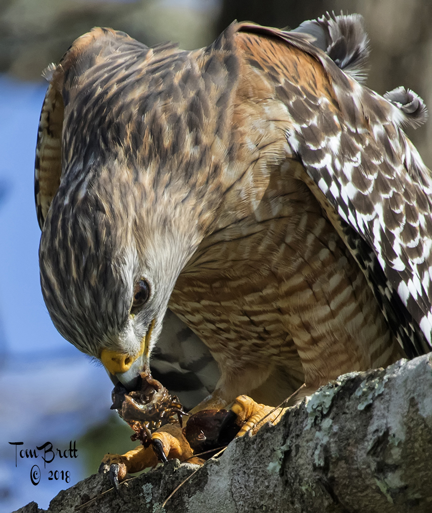
Jan 19 |
Comment |
Great detail in this Hawk. I think you chose the right settings. I think I have to agree with Sharon concerning the curved branch in the lower background and that it should be removed. I also think sharpening the eye a bit and increasing the levels would add more pop to this image. |
Jan 20th |
| 52 |
Jan 19 |
Comment |
I feel the way it is presented the blue in the bottom portion are unnatural and that the background is way to busy making it hard to find the subject of the nest. Not knowing the environment or circumstances of this image I think it might have been enhanced by shooting from a lower angle. |
Jan 20th |
| 52 |
Jan 19 |
Comment |
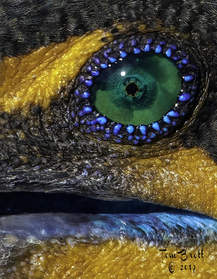
Nice sharp, clear and detailed image. I think the others have hit on the minor corrections or concerns with this image. However I am not sure that the area around the eye is a nictitating membrane, upon a closer look, I think they are bubbles or foam from the eye and it looks like it is over the eye lid on the right side. |
Jan 20th |
| 52 |
Jan 19 |
Comment |
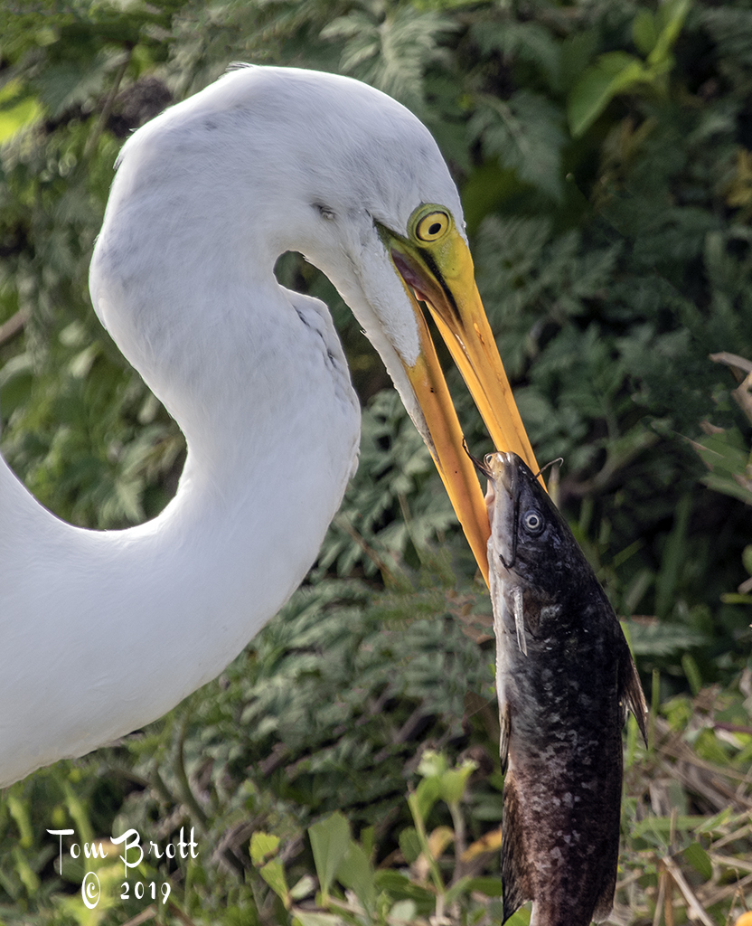
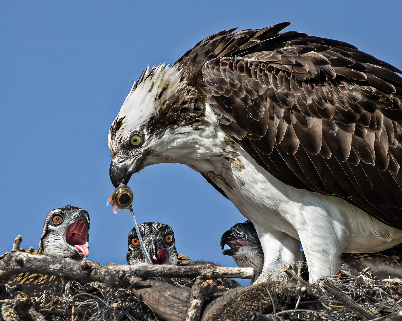
Nice image. Love the coloration of the eye and how you handled the polarization and the ND filter. I think the bottom could be a touch lighter showing the environment and I am a little distracted that the end of the fish's tail is not there. |
Jan 20th |
| 52 |
Jan 19 |
Comment |
Very interesting image as presented. First I think I agree with Carol in that the image was processed with a little too much red in the rocks (just a personal taste). I do like your original concept with the log pointing the way to the arches and with the vegetation gives one a sense of the size of the ahead arches and that feeling is not there with Mike's crop. I have photographed the twin arches many times and at many angles and have always likes the openings in the arches - one looking like Africa and the other looking like South America.
I also like the glow that emanates from the cavity on the right. |
Jan 20th |
7 comments - 0 replies for Group 52
|
11 comments - 0 replies Total
|