|
| Group |
Round |
C/R |
Comment |
Date |
Image |
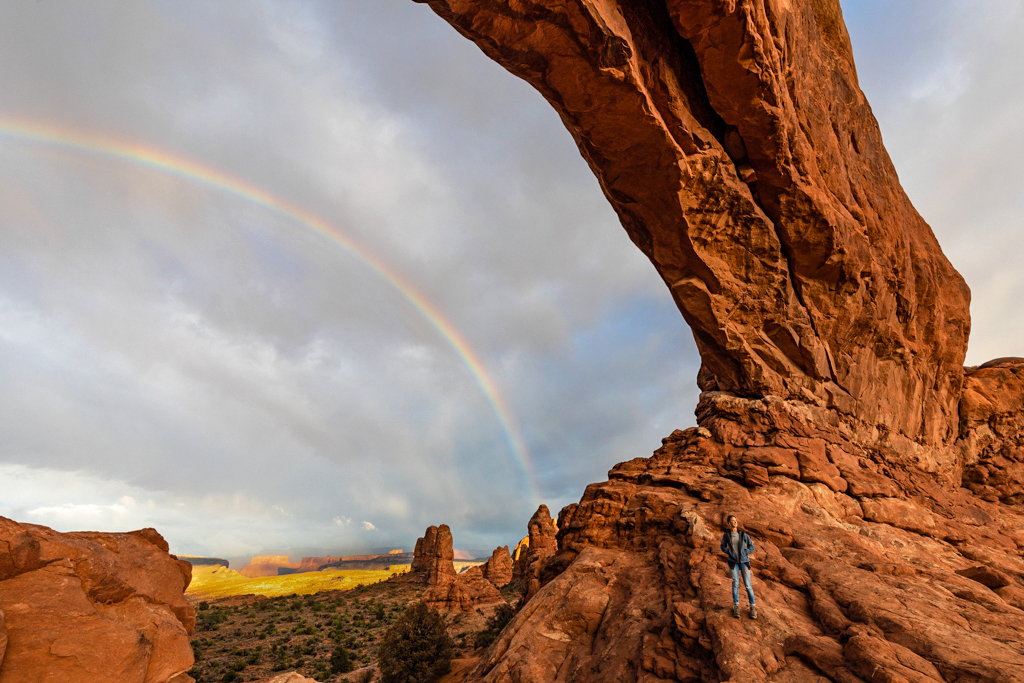
| 49 |
Nov 18 |
Comment |
Fred, I like this image. The person there adds scale as Graham says. I might consider lessening the shadows in the arch. Also adjusting the mid-tone colors to give a little more pop and enhancing the gold area in the background under the arch. |
Nov 23rd |
 |
| 49 |
Nov 18 |
Comment |
Nice capture. I think you are right on with your settings and I like your cropped version better. I know this image can not be replicated because of the snow but maybe a suggestion for next time. I think is you had shot a bit lower so the green leaves on the left did not obscure as much of the falls would have in my estimation made a great picture better. |
Nov 23rd |
| 49 |
Nov 18 |
Comment |
Nice humanitarian story. The shadows behind the two are distracting to me. Perhaps a nor straight shot would have been better or even bouncing the flash to make the shadows less harsh. |
Nov 23rd |
| 49 |
Nov 18 |
Comment |
Such a wonderful image. Clear and bright and definitely showing the city. A nit pic though. The building in the center left has a blue halo around the light at the top of the building, the same with the building in the right center with the diagonal slope and finally the far right night sky.
I think playing with the blue and cyan sliders in hue / saturation you can lighten the halo effects. |
Nov 23rd |
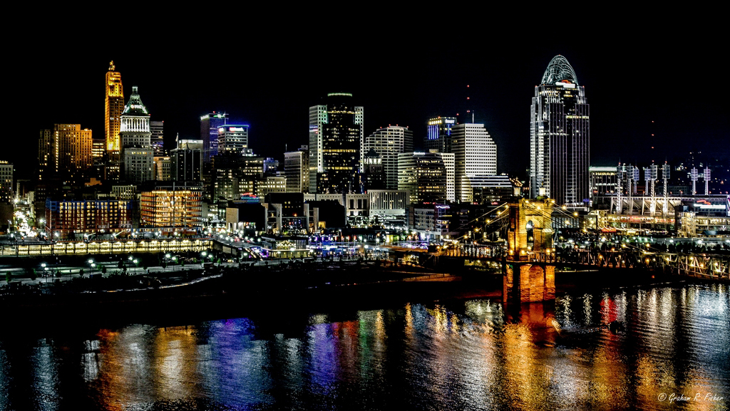 |
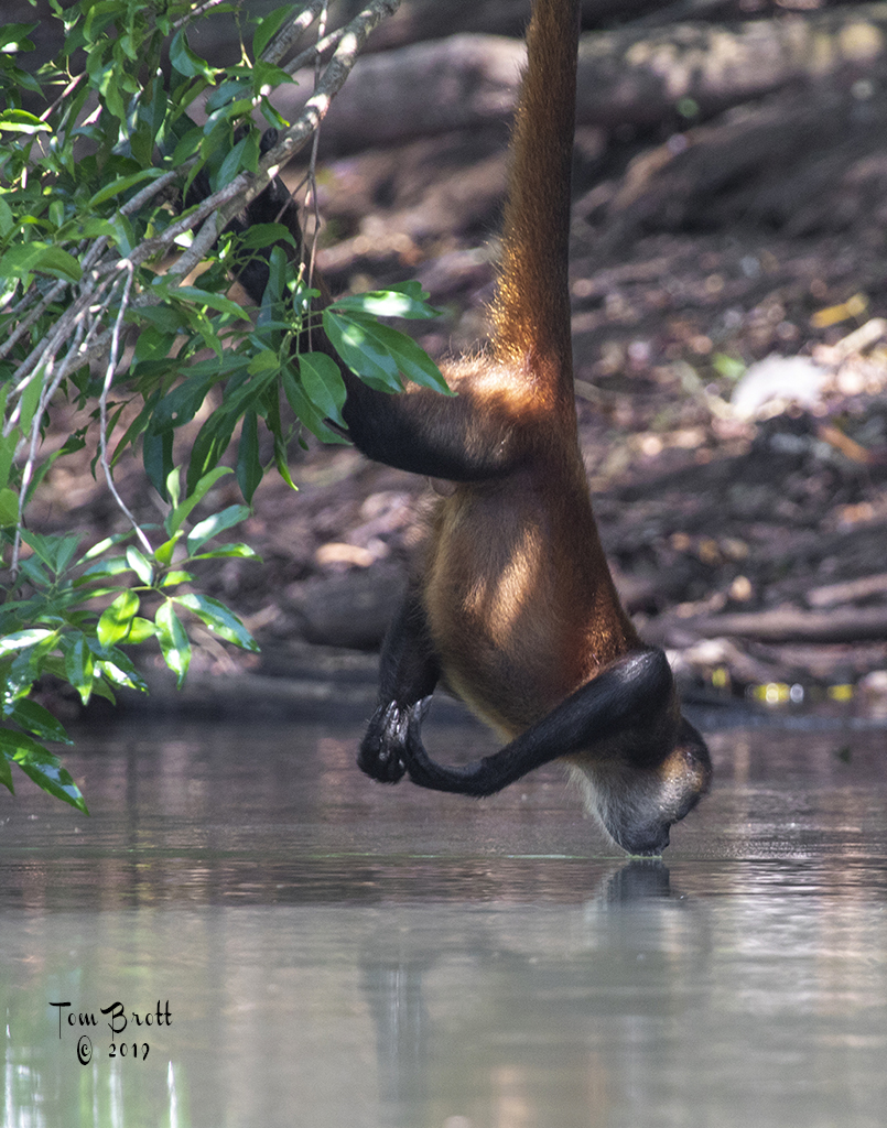
| 49 |
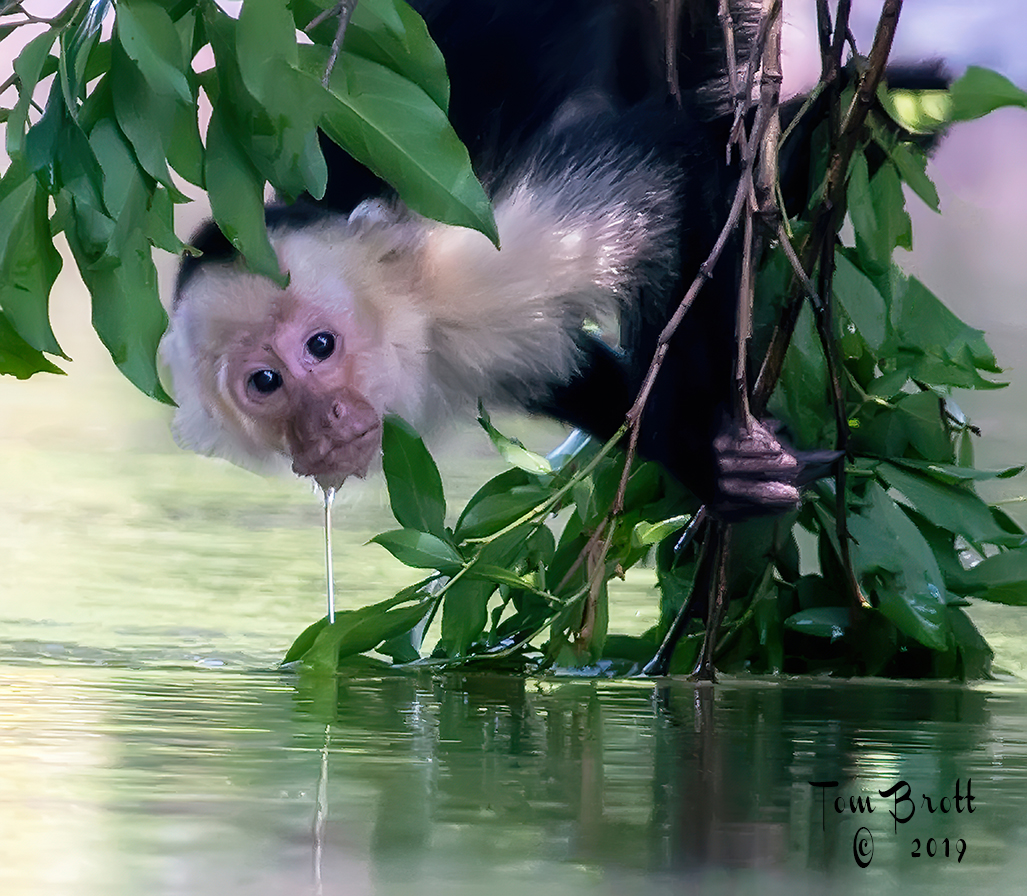
Nov 18 |
Comment |
Nice silhouette image. I think one has to look closely at the image (without reading your description) to figure out what you are seeing. I think a closer crop concentrating on the monkey might be the answer. |
Nov 23rd |
| 49 |
Nov 18 |
Reply |
Much better |
Nov 11th |
| 49 |
Nov 18 |
Comment |
Fred, This image is very very small. Can you make it larger and repost? It is really hard to see the details and when I try to enlarge it looks very blurry and fuzzy. |
Nov 10th |
6 comments - 1 reply for Group 49
|
| 52 |
Nov 18 |
Comment |
What an image! I like what you have done in your post processing. The diagonal of the pier, the strength of the lightning bolt and even the magenta streak in the water all add drama creating quite an impact. Great catch. |
Nov 23rd |
| 52 |
Nov 18 |
Comment |
I think the monochrome is nice showing great detail and contrast but I had to really study the image to figure out what I was viewing. I think your color version gives the viewer a better idea they are viewing a fungi. You also have the same detail and contrast in that image. If using the color version I would reduce the shadow in the bark of the tree in the upper right corner of the image. |
Nov 23rd |
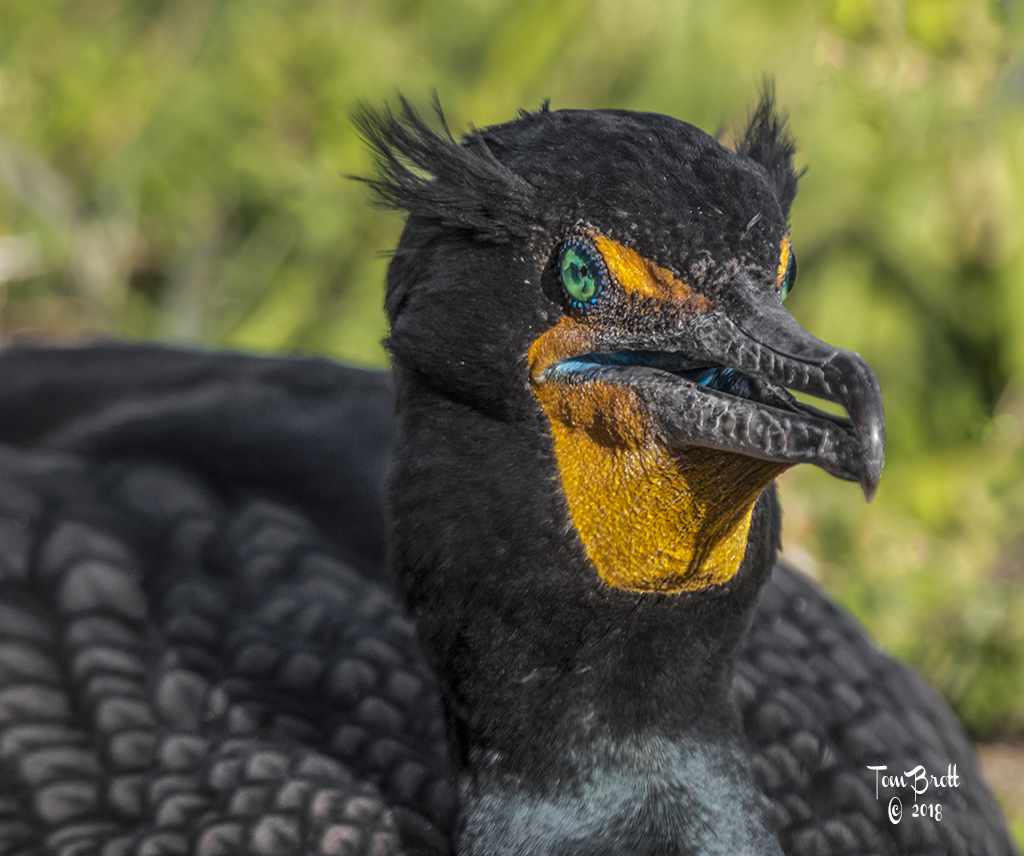
| 52 |
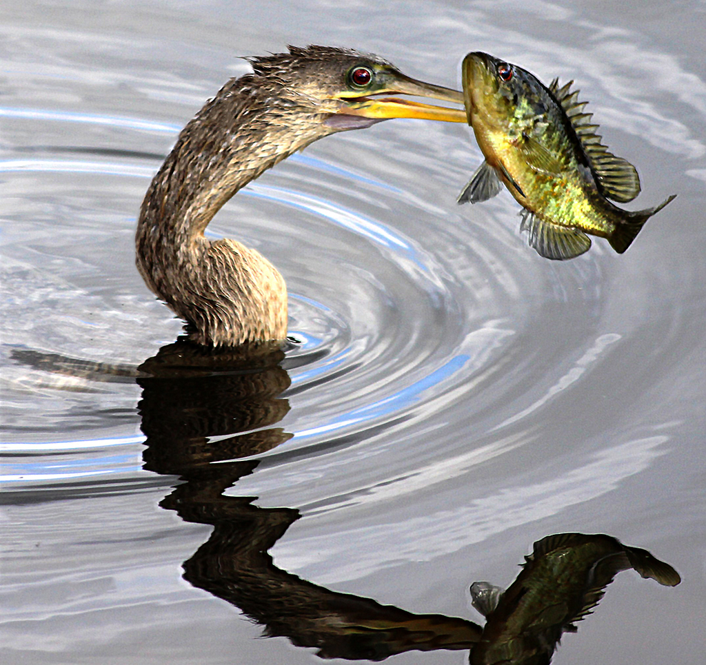
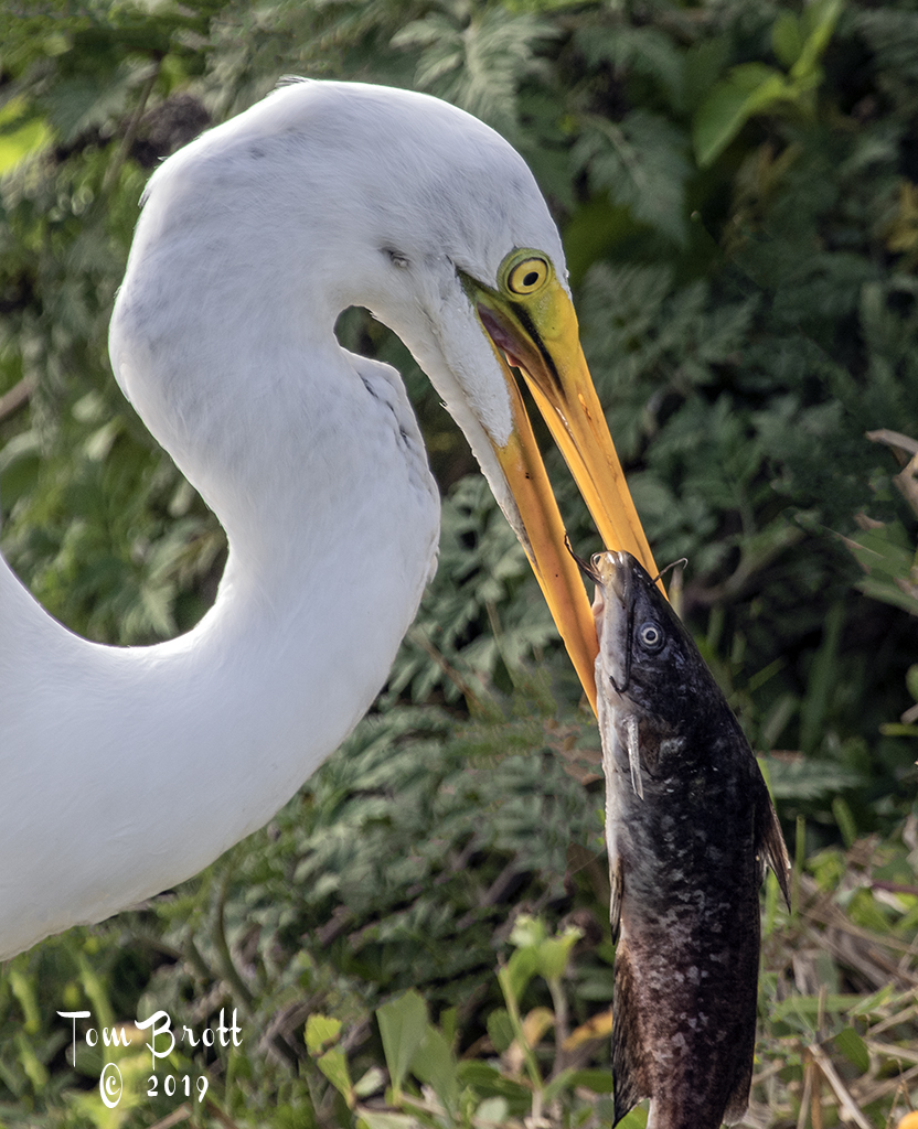
Nov 18 |
Comment |
I like the expression on the cormorant as it looks like it is saying "GOOD MORNING WORLD". In the original the sky did appear to be over saturated but in your second version you have corrected it nicely. The broken branch was not an eye sore to me but again your revision I think has enhanced the image. |
Nov 23rd |
| 52 |
Nov 18 |
Comment |
A wonderful image. My initial thought was it was a touch flat and I think Sharon hit on the right combinations of adjustments. I also thought there might be a little to much sky and bare trees on the top but Mike's suggested crop does remedy the situation. The colors are beautiful and set up a very tranquil scene. |
Nov 23rd |
| 52 |
Nov 18 |
Comment |
Carol, Love this image and would love to go there.
I feel that the lower right corner is too bright and lacked definition. I played by taking it back to camera raw filter in PS. I used the selection brush selecting the bright sand area - then - Exp slider to left -1.25, highlights left -.56 and tint to right +30. Then adjusted the midtone levels to right about .92 and used the filter Imagenomics for noise reduction. I also notice on the left side about 1/4 way down a spot. I had to reduce your image size to get it to repost. Your thoughts. |
Nov 3rd |
 |
| 52 |
Nov 18 |
Comment |
Sharon, I was looking at the images posted thus far. I love this and think it is competition worthy. My initial thoughts was that it was a touch flat. I went into levels and moved the midtone slider to the right from a 1.0 to a .86 - might be a touch to far. Your thoughts. We sometimes over look this adjustment. |
Nov 3rd |
 |
6 comments - 0 replies for Group 52
|
12 comments - 1 reply Total
|