|
| Group |
Round |
C/R |
Comment |
Date |
Image |
| 49 |
Apr 18 |
Reply |
Alex,
I tried processing the image in a manor similar to what you did. But my preference for this image was to give it the old dull antique look. It is just a matter of preference to likes and the eye. |
Apr 20th |
| 49 |
Apr 18 |
Comment |
The second image is much better. I would have to agree with Alex that you need to experiment with the motion. You can also consider panning the subject and create a still subject with a blurred background giving the observer a sense of motion. |
Apr 20th |
| 49 |
Apr 18 |
Comment |
I like this image a lot. Graham made a good suggestion on the radio tower in the background. I think I might consider cropping a little of the right side just to the right of the trees and also from the top with some of the clouds. You have a lot of nice detail and convey the wide opens spaces of the prairie. Well done. |
Apr 20th |
| 49 |
Apr 18 |
Comment |
I think Graham hit the nail on the head with this image. Also the comment that Alex made with the cell phone is also a valid point. |
Apr 20th |
| 49 |
Apr 18 |
Comment |
An interesting scene. Good colors and tonality. I think there is a little bit too much space on the right. I might suggest cropping to just the right of the sign post as to me it creates too much negative space. I also think with the crop it help create a better diagonal with the fence. |
Apr 20th |
| 49 |
Apr 18 |
Comment |
Like the image and congratulations on the HM. I think you nailed it just the way it is. The boots do need to be there. Well done and no suggestions. |
Apr 20th |
5 comments - 1 reply for Group 49
|
| 52 |
Apr 18 |
Comment |
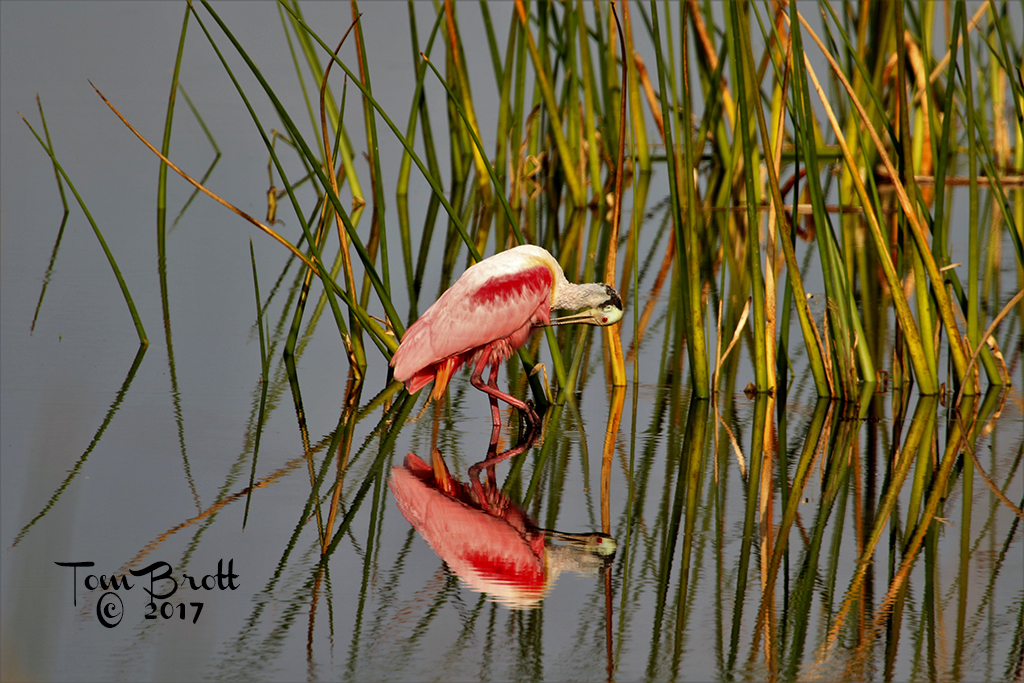
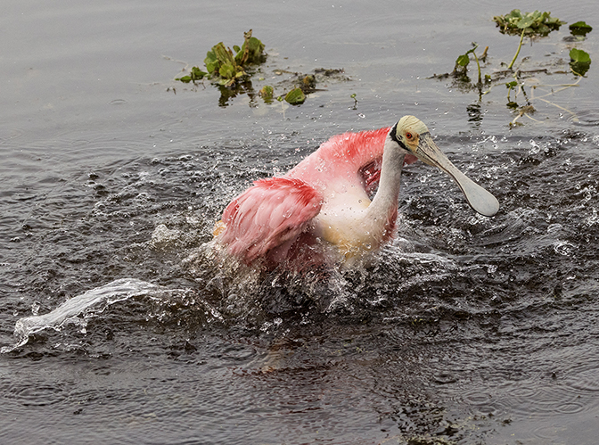
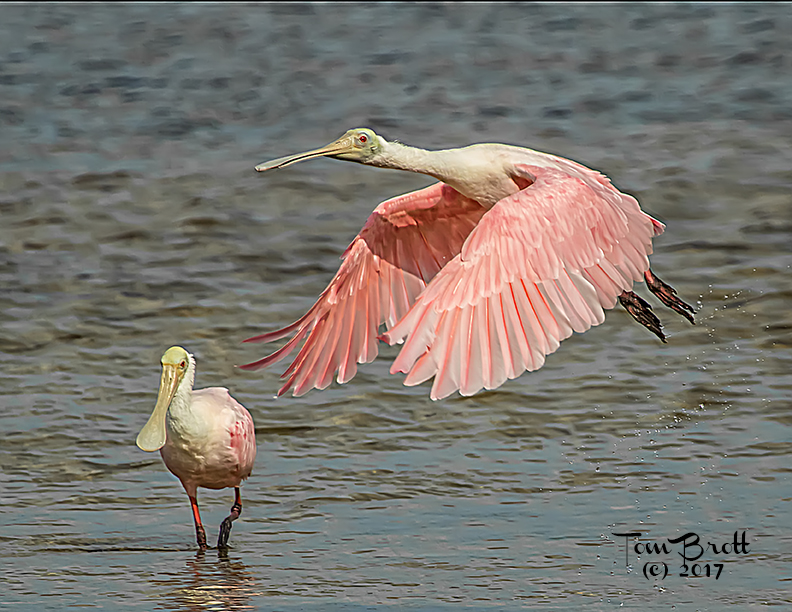
Well done and a beautiful job editing. I see so many spoonbills that are oversatured in the pink areas and you have nailed the pink in all its natural tones. You brought out the detail of the vegetation well and the feathers are sharp and clear. I wouldn't change a thing. |
Apr 20th |
| 52 |
Apr 18 |
Comment |
Nice Image. I would have to agree with the others that a little sharpening of some of the yellow/orange colors might help. I am torn about the leaf in the lower portion of the image being a little too green and maybe needs to be toned down or darked small amount. I really like the detail in the bright yellow tip of the flower. |
Apr 20th |
| 52 |
Apr 18 |
Comment |
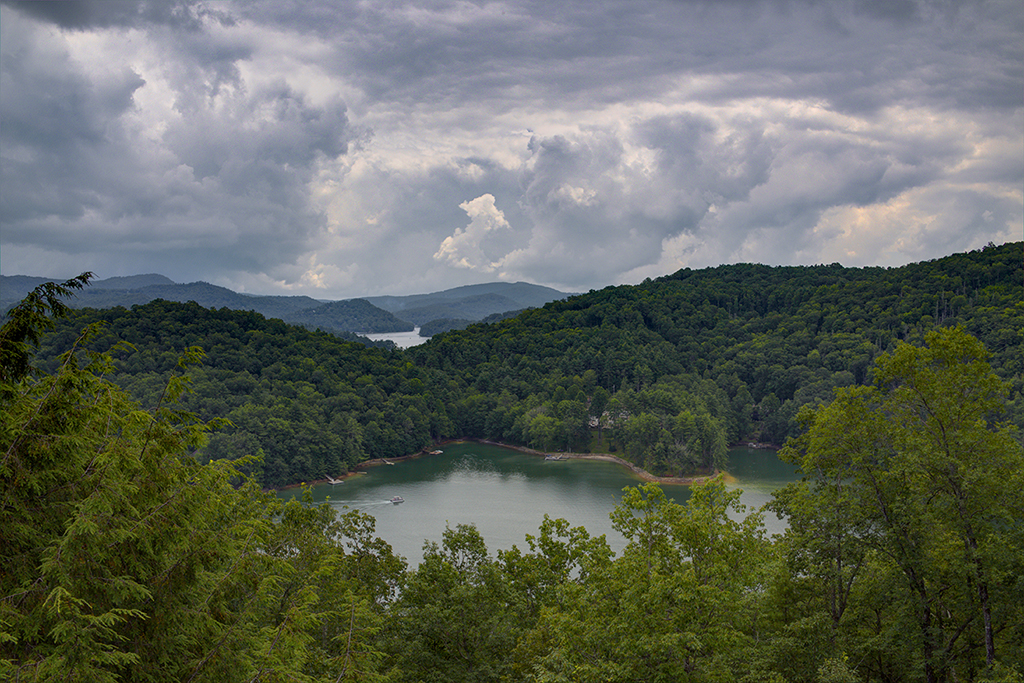
Like the different variations of the green forest that are throughout the image. The placement of the river / road are perfect and there is just enough sky and distant mountains showing in the upper portion of the image. Well done. |
Apr 20th |
| 52 |
Apr 18 |
Comment |
Nice water flow action shot. Looks like you are right out there in the middle of the river taking the shot. I think the idea of lessening the shadows on the rocks on the right would add to the image. I like the blue sky and the starkness of the vegetation around the river letting one know it is the winter / early spring time of year. |
Apr 20th |
| 52 |
Apr 18 |
Comment |
Like the colors of the bird and iguana. The shrubbery adds a nice contrast with the greens. The first thing that caught my on on my monitor and checked it out on the iPhone as well is the two white dots above the birds head on the left. They can be cropped out easily. Other than that I wouldn't change a thing. |
Apr 20th |
| 52 |
Apr 18 |
Comment |
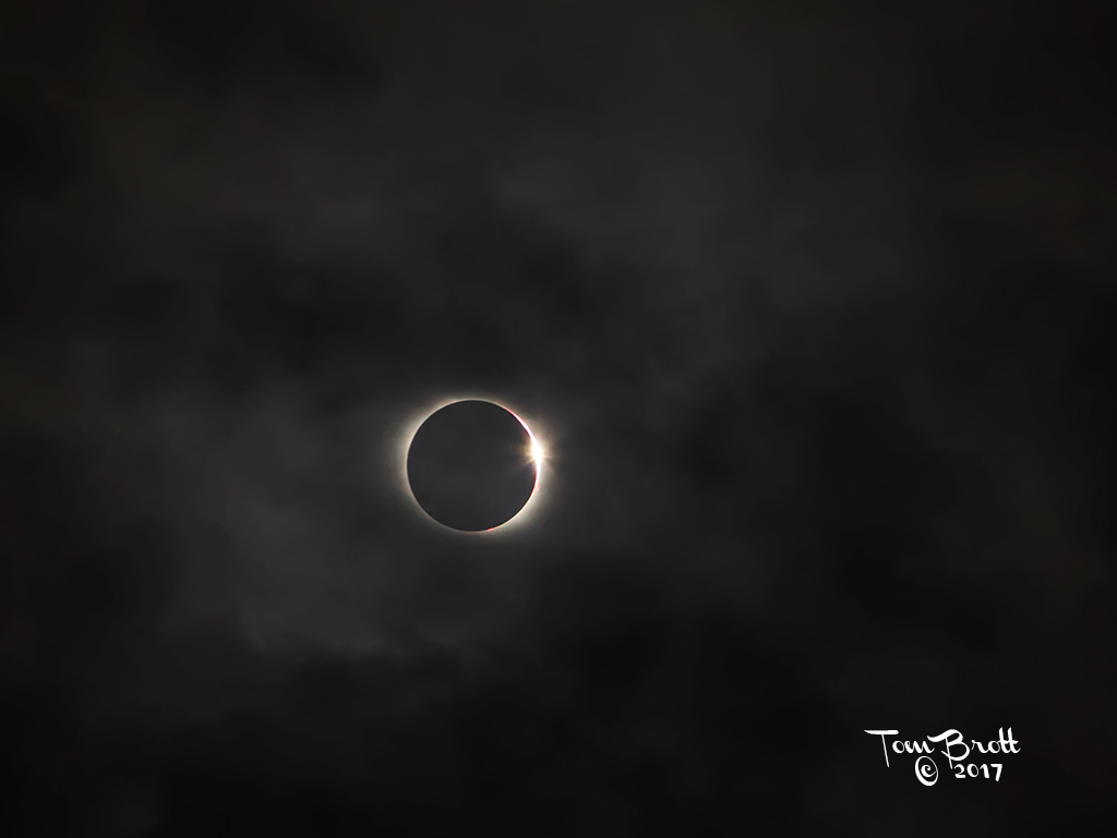
Wonderful image. It all fits together nicely. Love the colors and serenity feeling. Two very minor thoughts. Your horizon line on my monitor has a distinct reddish color line. I am guessing this is from wave action and the ND filter. Second is for my preferred taste. The branch on the far left meets the horizon perfectly. I would like a little separation either above or below the horizon line. It is something well worth hanging and to be proud of. |
Apr 20th |
6 comments - 0 replies for Group 52
|
11 comments - 1 reply Total
|