|
| Group |
Round |
C/R |
Comment |
Date |
Image |
| 49 |
Mar 18 |
Reply |
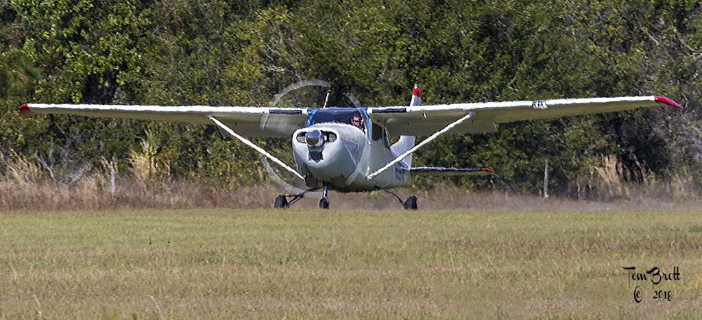
Thanks. Shooting at higher F stops and having a little space between your subject and background help give blurred backgrounds. This image was shot at a little upward angle to help add more separation. |
Mar 18th |
| 49 |
Mar 18 |
Reply |
Thanks. Shooting at higher F stops and having a little space between your subject and background help give blurred backgrounds. This image was shot at a little upward angle to help add more separation. |
Mar 18th |
| 49 |
Mar 18 |
Comment |
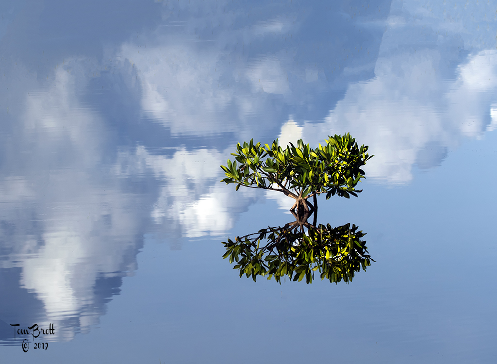
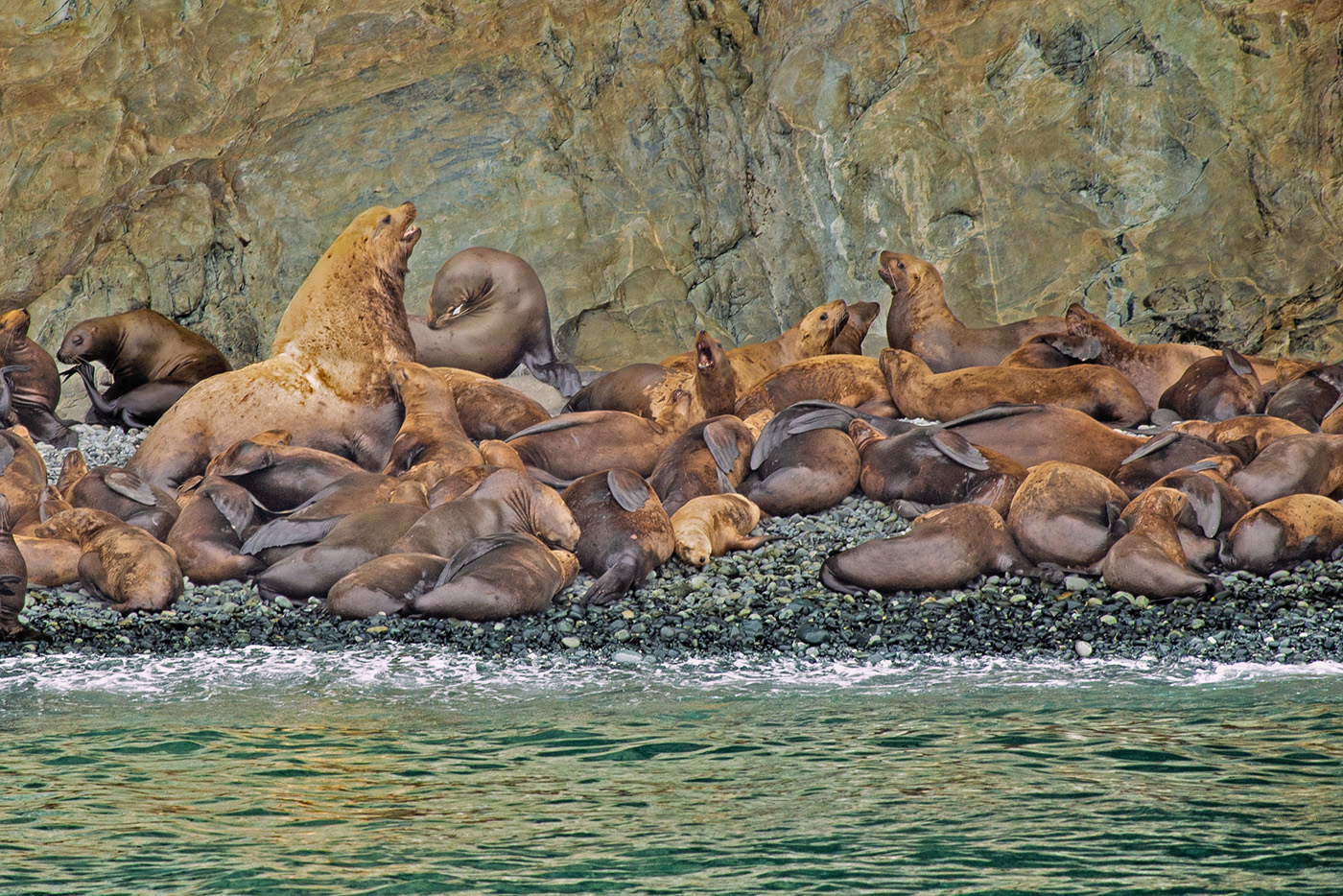
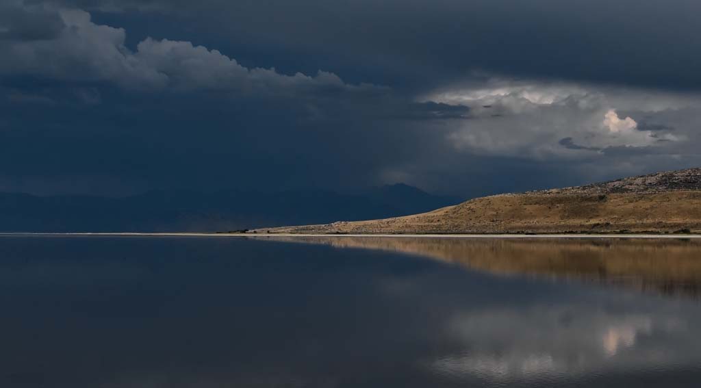
I also just noticed on you image there is a series of black dots in the water just below the land mass on the left side. There is another on the right side. Because of the distance they may be birds but the don't show that way. |
Mar 18th |
| 49 |
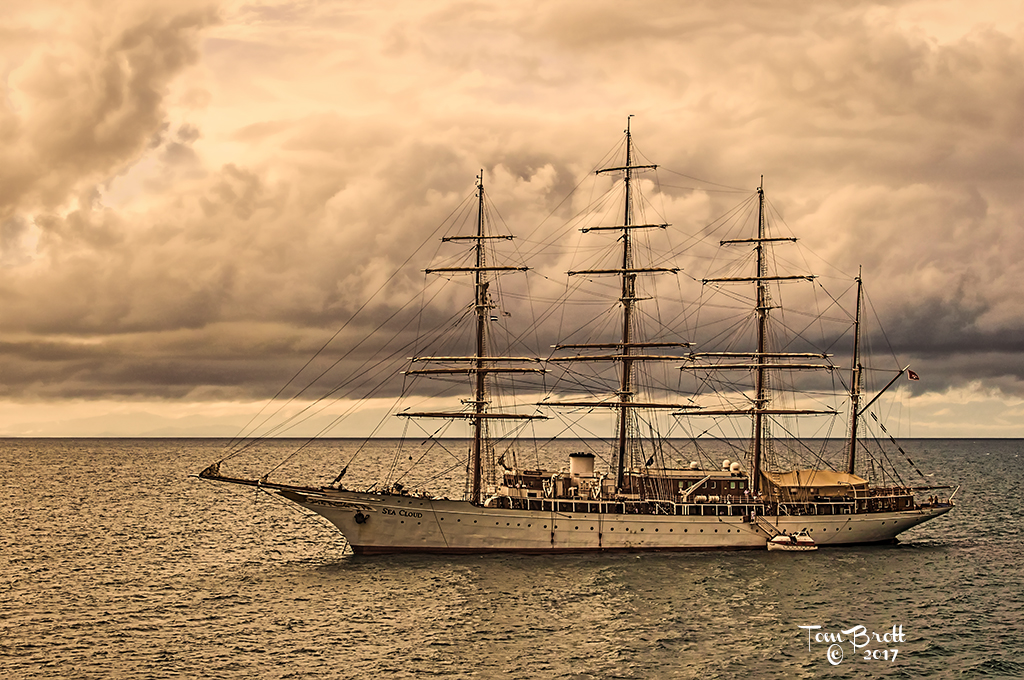
Mar 18 |
Comment |
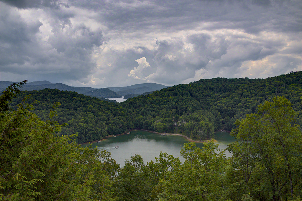
I am not one for perfect middle horizons. So I cropped a little off the bottom. You can see in the image that there is definitely some weather going on in the background so I emphasized some of the mid level tones to bring out details in the clouds and also de-saturated the blues to make irt a more dramatic sky. Then reduced the sky noise. |
Mar 18th |
 |
| 49 |
Mar 18 |
Comment |
B&W is a good choice. You have definitely displayed "COLD". We in the south do not have access to images like this. Good contrast and I like the motion of the snow flakes falling adding to the COLD. The front of the sled is a touch out of focus (I am assuming depth of field) but I think that almost indicated motion on the sled. Well done and please keep your cold up there. |
Mar 18th |
| 49 |
Mar 18 |
Comment |
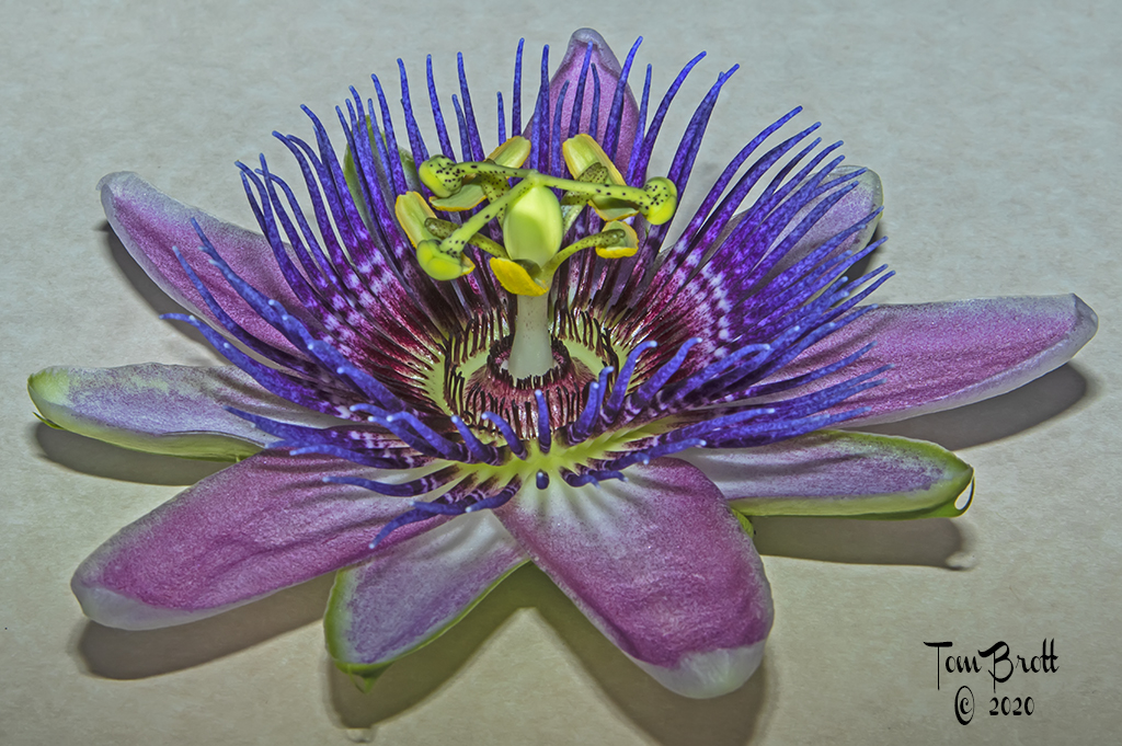
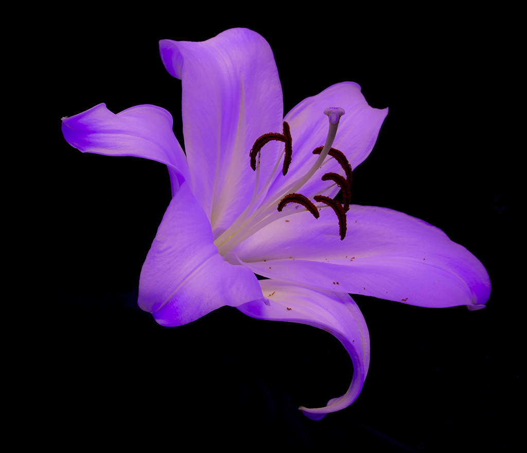
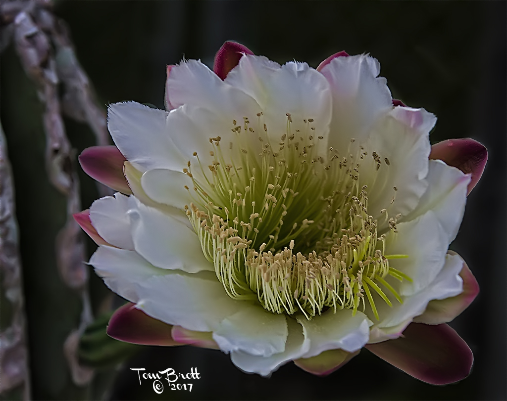
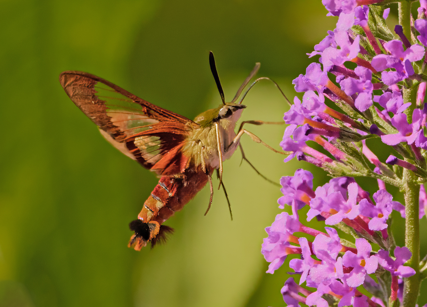
I also find this image of the flower VERY soft. The white streak in the background is very distracting. |
Mar 18th |
| 49 |
Mar 18 |
Comment |
The colors are good and the lighting is good on this image. My first reaction was the "Where's Waldo" reaction to this image. But I like your placement of Andy as he is not in the center. I I did put it in a competition I think it would be best in the Photo Journalism category. |
Mar 18th |
| 49 |
Mar 18 |
Comment |
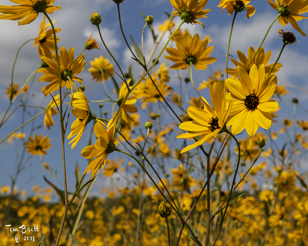
I think that with the day as you described that B&W was a good choice. The cropping suggestions is good. I am just wondering that if you slowed down your shutter speed quite a bit to show the grasses blowing and the wave action moving if it might have given this image a more dramatic impression. |
Mar 18th |
6 comments - 2 replies for Group 49
|
| 52 |
Mar 18 |
Comment |
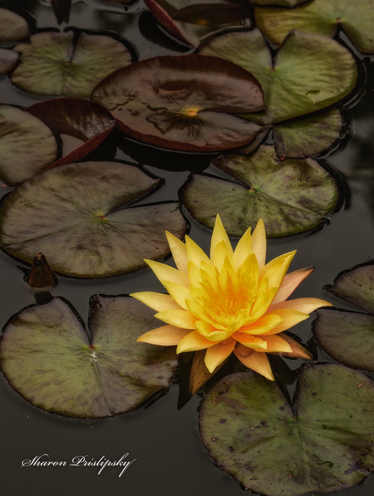
Like the image. For my taste I think the yellows of the lily are a touch too bright hiding some of the wonderful details of the flower. I used the simple levels tool that so many people forget about (that includes me too until a PSA judge suggested using it on several images that were presented to him). I adjusted the mid-tones a bit and de-saturated some of the yellow in hues/saturation. |
Mar 18th |
 |
| 52 |
Mar 18 |
Comment |
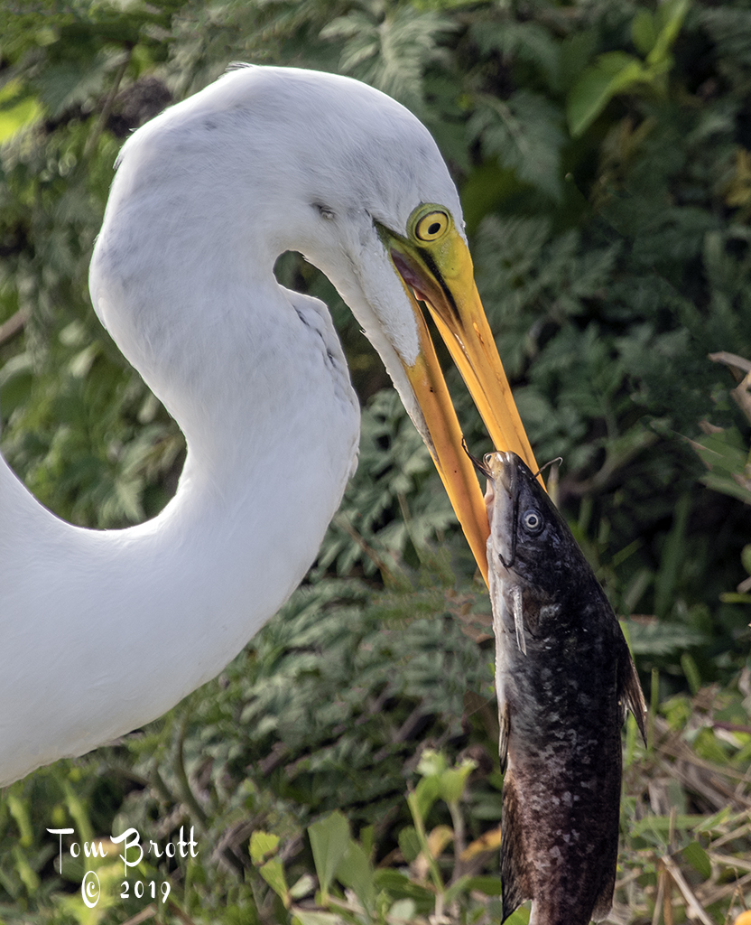
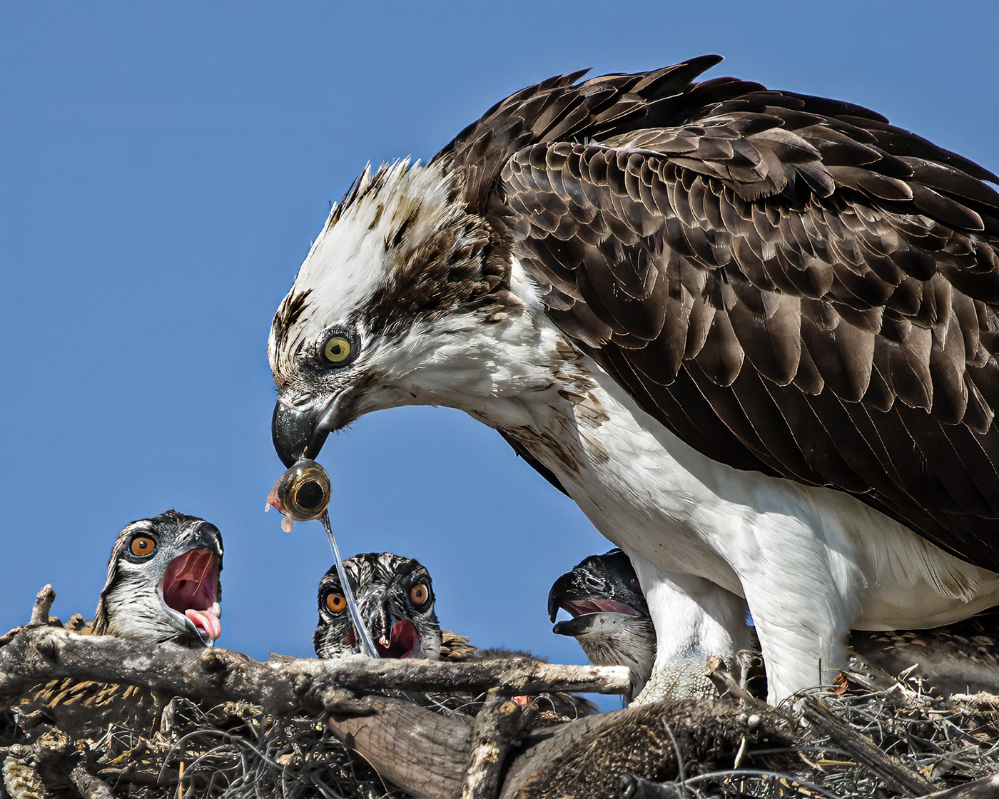
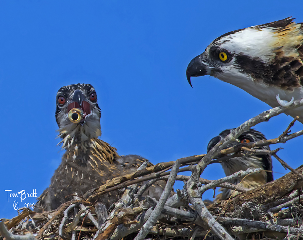
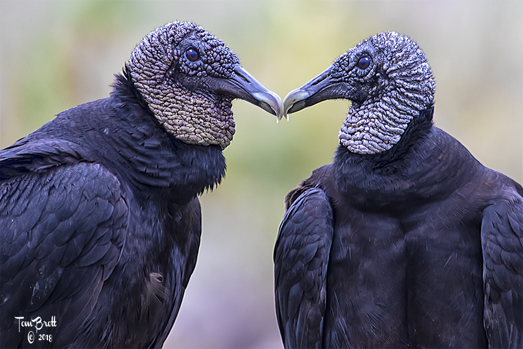
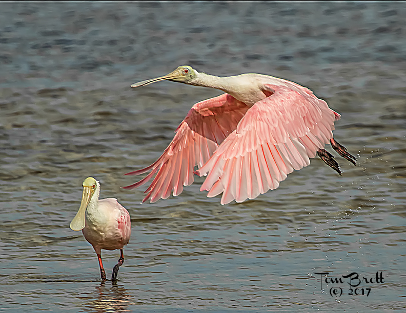
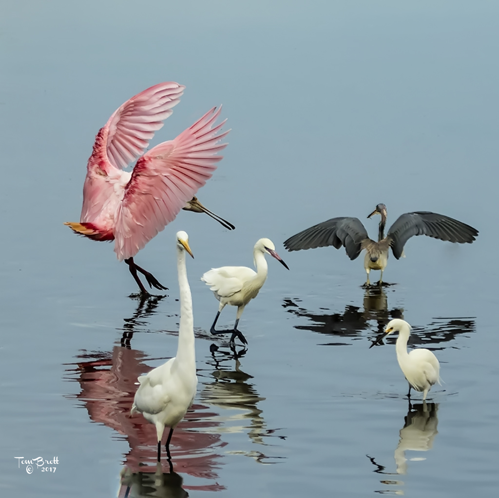
White Birds - The hardest birds to capture. There always seems to be an area where the light hits directly and you loose details in the feathers as in the chest area of the adult bird. You did well in bringing out most of that detail in your processing. I have to agree that there might be too much nest with very prominent twigs/branches that could be cropped up a bit. Also I do find those small twigs that cover the babies beaks a bit distracting. There is always one or two twigs in every nest that always interfere with the babies and there is not much you can do about it. I realize that is part of nature if that is how you are presenting the image. |
Mar 18th |
| 52 |
Mar 18 |
Comment |
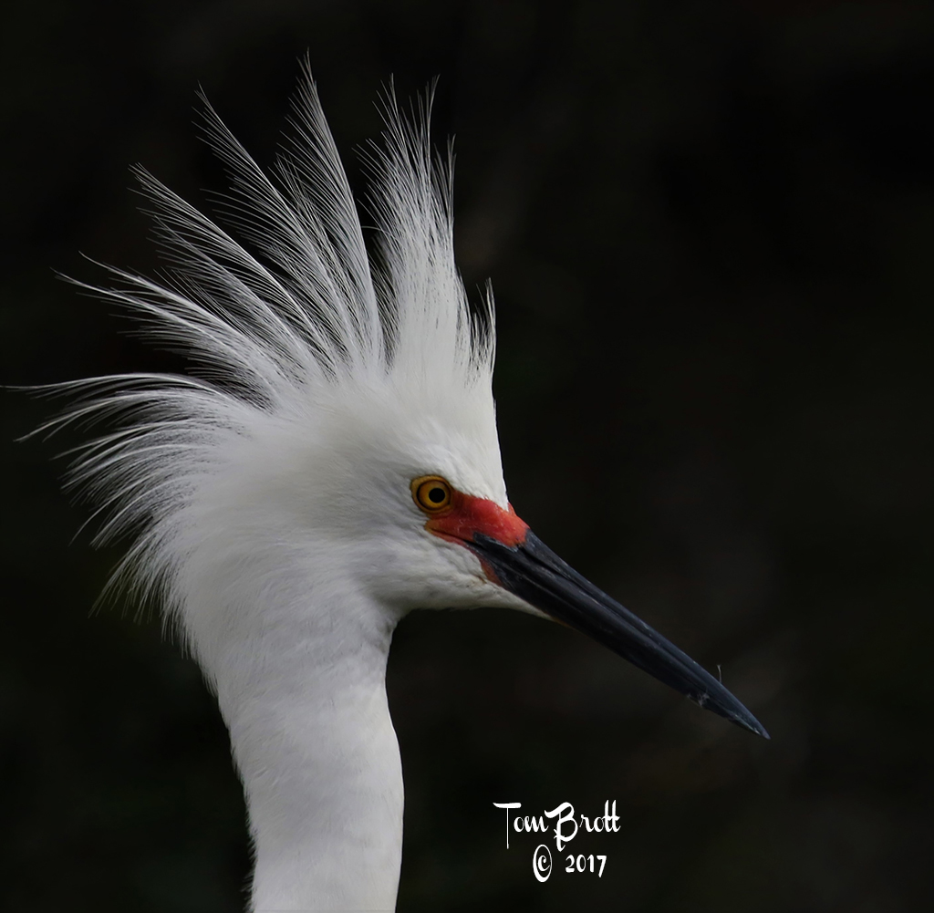
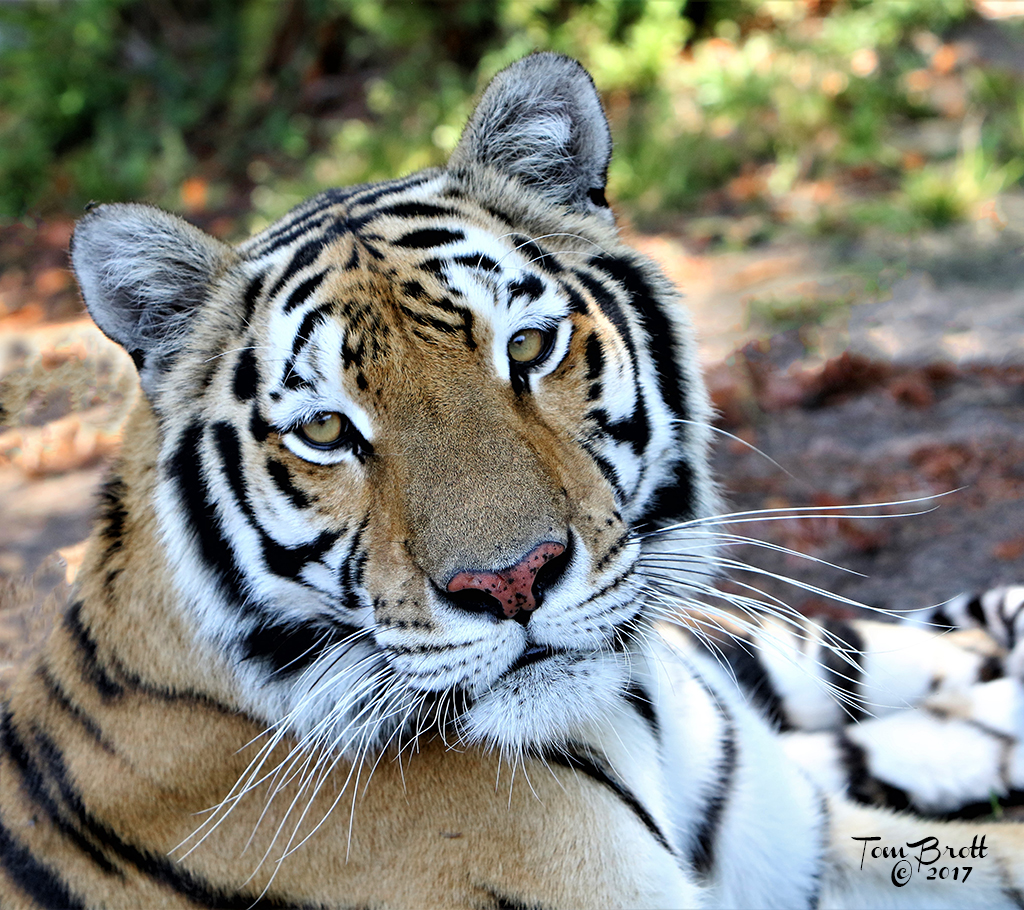
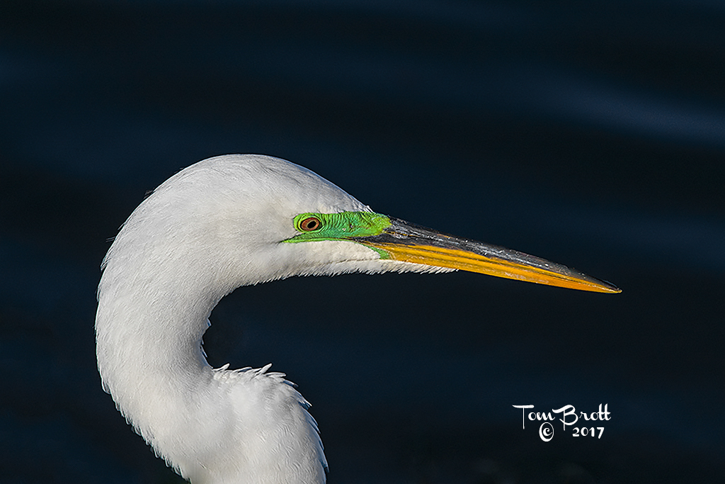
This is a great portrait image. I have to agree with the others in the softness in the eyes. Sharpening and possibly some more contrast might help. Also as some of the others have mentioned the right side of the image - especially back-ground and some lower places on the bird seem pixelated on my monitor. I cropped it a little more in the right side to remove the pixelated areas and adjusted the mid-tone levels a bit. |
Mar 18th |
 |
| 52 |
Mar 18 |
Comment |
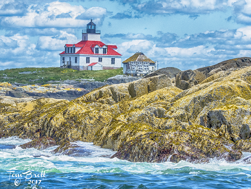
I believe the original image is a much better one. I have to agree that some of the colors look a bit over-saturated. The sky does not bother me as that is where your light source is and by the shadows on the foreground rock you can see that it is lower in the sky. The framing and leading lines are good creating an interest and flow. |
Mar 18th |
| 52 |
Mar 18 |
Comment |
Wonderful. Great colors in the leaves, the frost on the leaves and the water droplets all blend together well and create a very pleasing image. Not sure about the crop that the others have suggested. |
Mar 18th |
| 52 |
Mar 18 |
Comment |
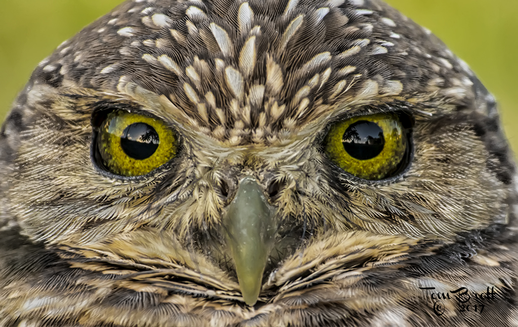
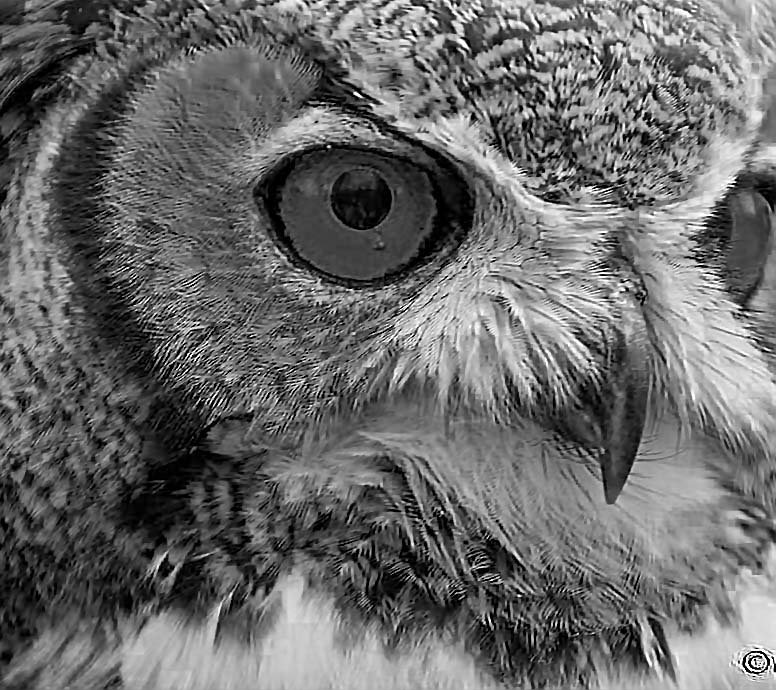
Fantastic. Great image and I love the owl position. There is just a subtle difference in the whites that makes it all stand out perfectly. Snow, owl and background all have well defined shades of white for that high impact. Don't change a thing. |
Mar 18th |
6 comments - 0 replies for Group 52
|
12 comments - 2 replies Total
|