|
| Group |
Round |
C/R |
Comment |
Date |
Image |
| 49 |
Aug 17 |
Comment |
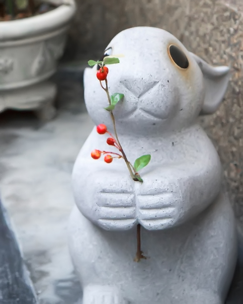
The only other comment I can make is that shooting at ISO 1000 with a lighter subject has created some noise. I use Imagenomics as a tool and used that software to remove the weaker noise to the left of the rabbit and the background pot. I also increased the saturation on the berries a bit. |
Aug 23rd |
 |
| 49 |
Aug 17 |
Comment |
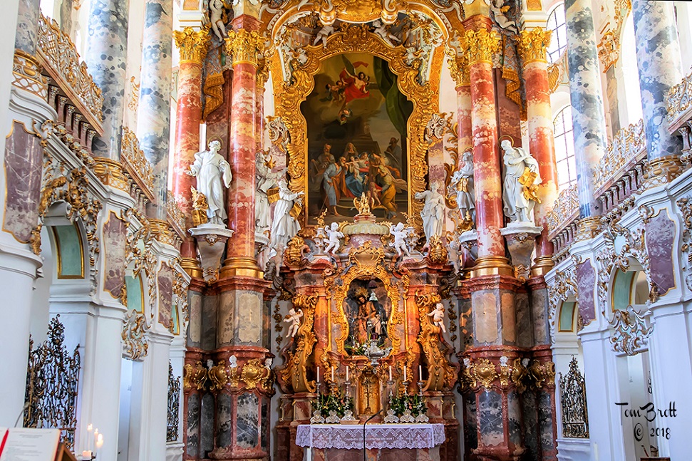
My wife and I have had a lot of discussions on this image. First SHE is NOT a fan of any HRD images. I understand what you did and why you did things for this image. I'm not sure how to correct some of our concerns. This is just our taste in images. The center isle has produced shadows from the pews that are to us a distraction. The reflection of the window in the center of the alter is a distraction. The center pews and books on the left side look too artificial while those on the right side of the right double pews look very natural in the color of the wood and books. The shadow of the crucifix attached to the back left wall is too dark and expansive and you lost the clarity of the cross itself (it sort of blends together). You have captured the colors of the windows well as you said was a concern of yours.
I am wondering if you remove the darkest image and make it a three shot image if it would take care of some of the concerns we have ??? Gook luck with the competition as we think you are on the right tract going outside the metro areas to some of the neighboring towns. |
Aug 23rd |
| 49 |
Aug 17 |
Reply |
Alex, I believe I made the normal adjustments in Photoshop and when i was satisfied I first used Color Efex Pro 4 - Landscape - Polarization and made the adjustments that i thought looked best. I then took that image and used Topaz - Adjust 5 - HDR Collection - Light Pop Smooth. |
Aug 23rd |
2 comments - 1 reply for Group 49
|
| 52 |
Aug 17 |
Reply |
The grass in front of the face are only a couple of single blades and that is just part of nature. Especially if you were caught by surprise as you mentioned. The real back set of flowers do not look natural. |
Aug 23rd |
| 52 |
Aug 17 |
Reply |
The reason I chose the crop I did was that I felt the hind legs and tail were a little to soft and I did not want them to distract from the head shot. |
Aug 23rd |
| 52 |
Aug 17 |
Comment |
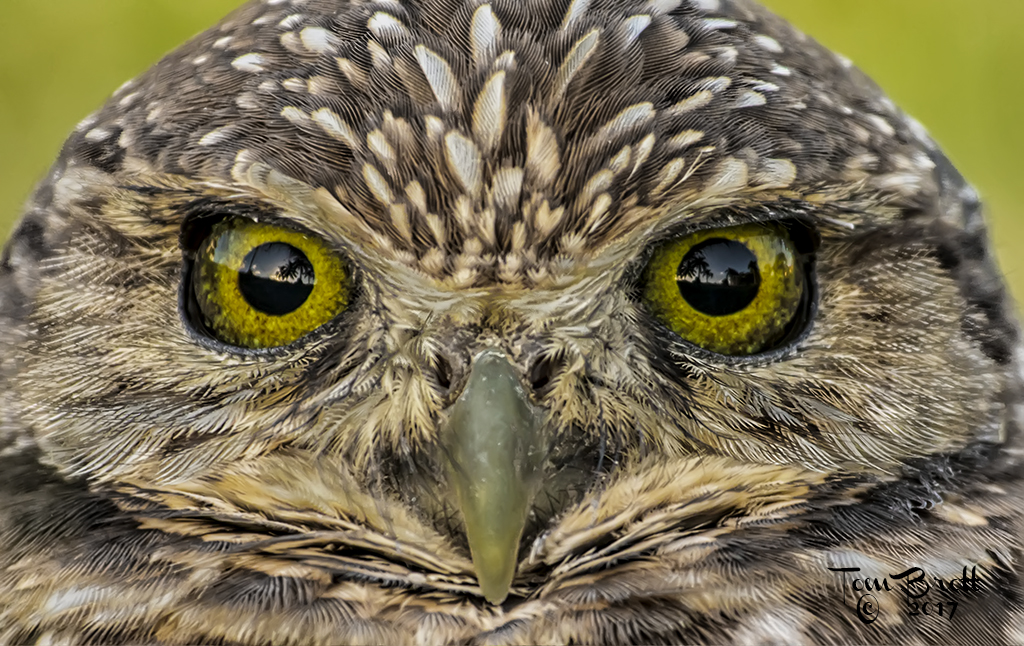
Nice capture and nicer fix. The face and eyes are right on. I still have a little problem with the flowers in the very back. They appear a little strange blur looking on my monitor and have a white halo around them. Perhaps cropping down a little more to just below your name and above where the three flower tops form a straight line. |
Aug 23rd |
| 52 |
Aug 17 |
Comment |
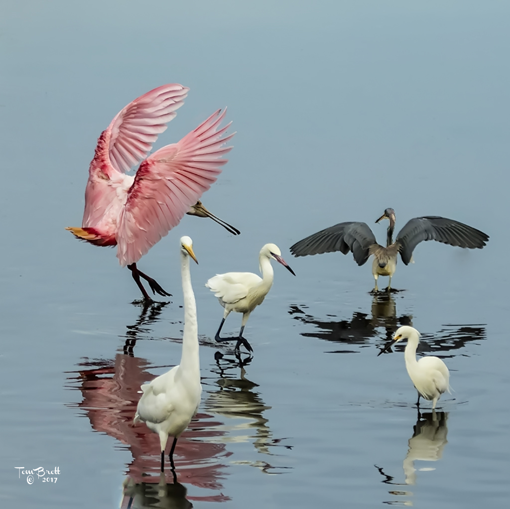
What a wonderful find and capture. I think I would have had the camera a little farther away using more of my lens magnification power. I have found that often allows a better use of the light present so you could increase shutter speed and the f stop. The outer edger of the wing appear a little soft and a different F stop could have helped to correct that. I agree with John that the original is more natural oriented and the wing colors appear to pop a little better. Nice shot and great find. |
Aug 23rd |
| 52 |
Aug 17 |
Comment |
Wonderful capture of the slot canyon. Great natural colors and tonality. One of the truer shots of the canyon I have viewed. You captured the light and shadows perfectly with plenty of shading contrast to show the different layers of erosion through the years.
I think the B&W is excellent as well and believe the aluminum with satin finish print really makes this image pop. |
Aug 23rd |
| 52 |
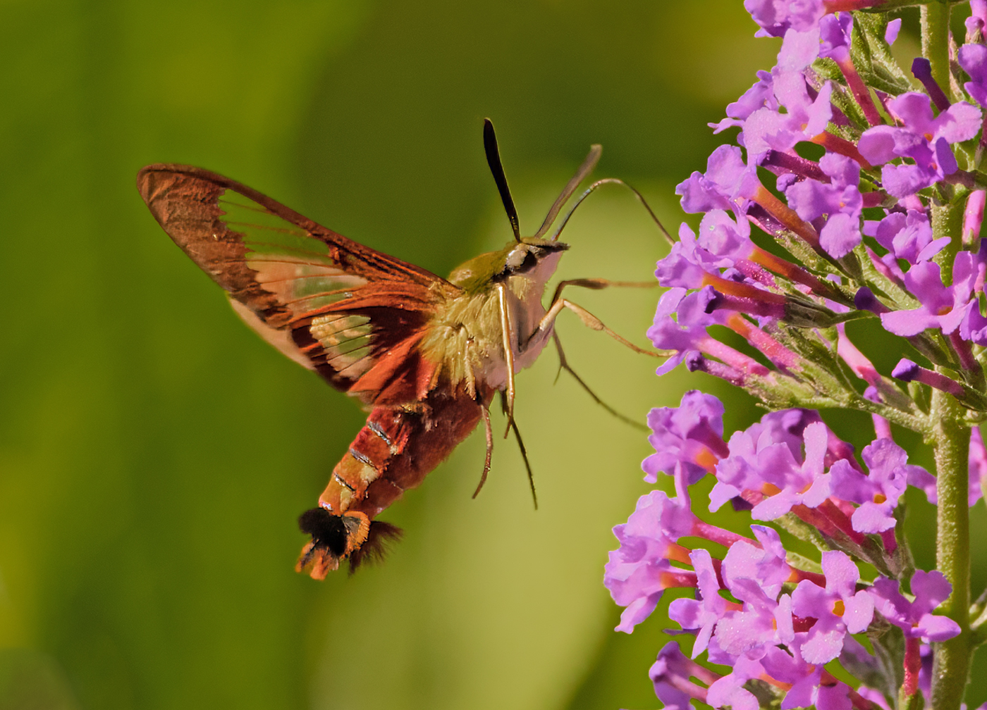
Aug 17 |
Comment |
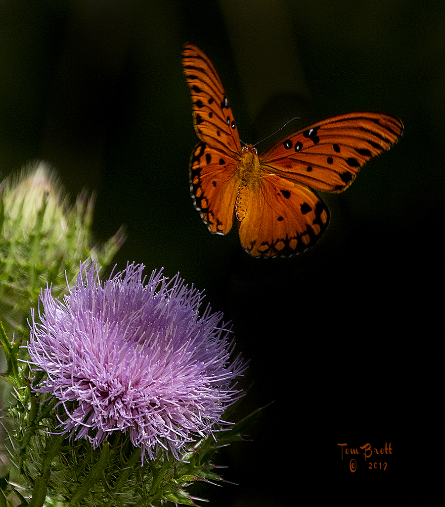
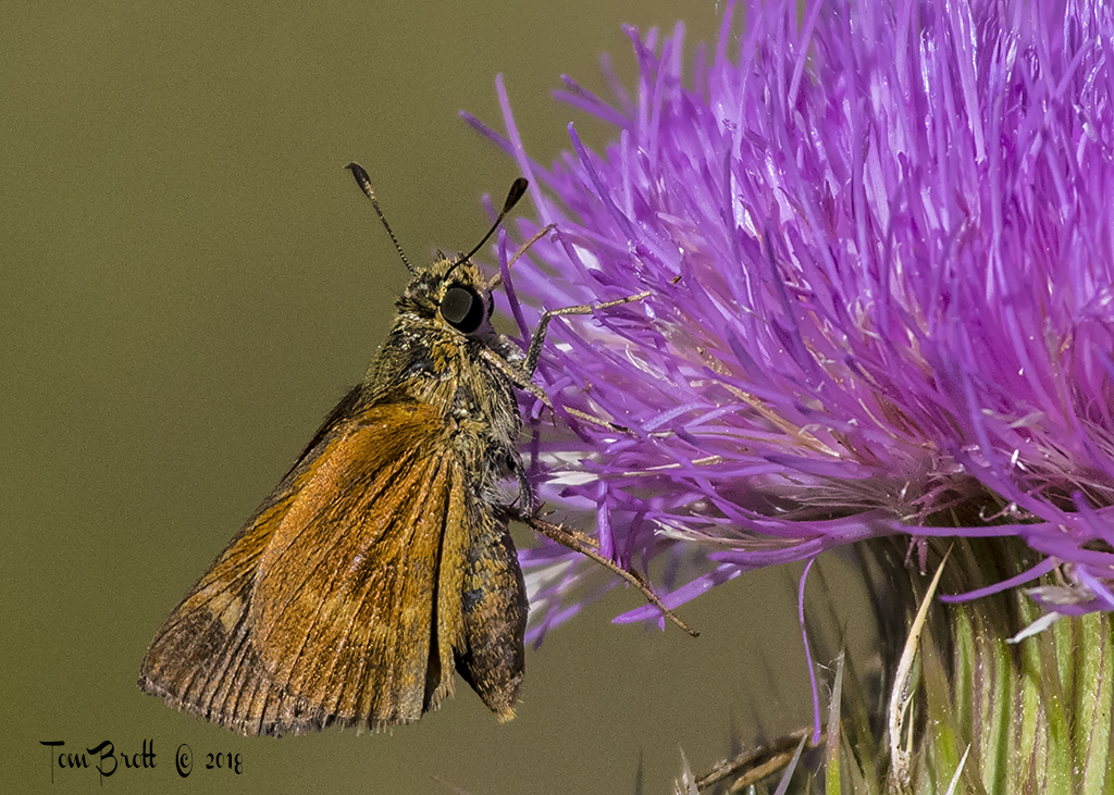
Love the butterfly. The colors are magnificent. I know how hard it is to get a shot like this at the spur of the moment and the problems of inside shooting. I think I would have tried to preset some of my settings before attempting to shoot inside. By raising the ISO you could have raised the F stop to get a better depth of field (evident on the left side of the wing and some of the head area). I think the left wing in all versions still leave room for better clarity. |
Aug 23rd |
| 52 |
Aug 17 |
Comment |
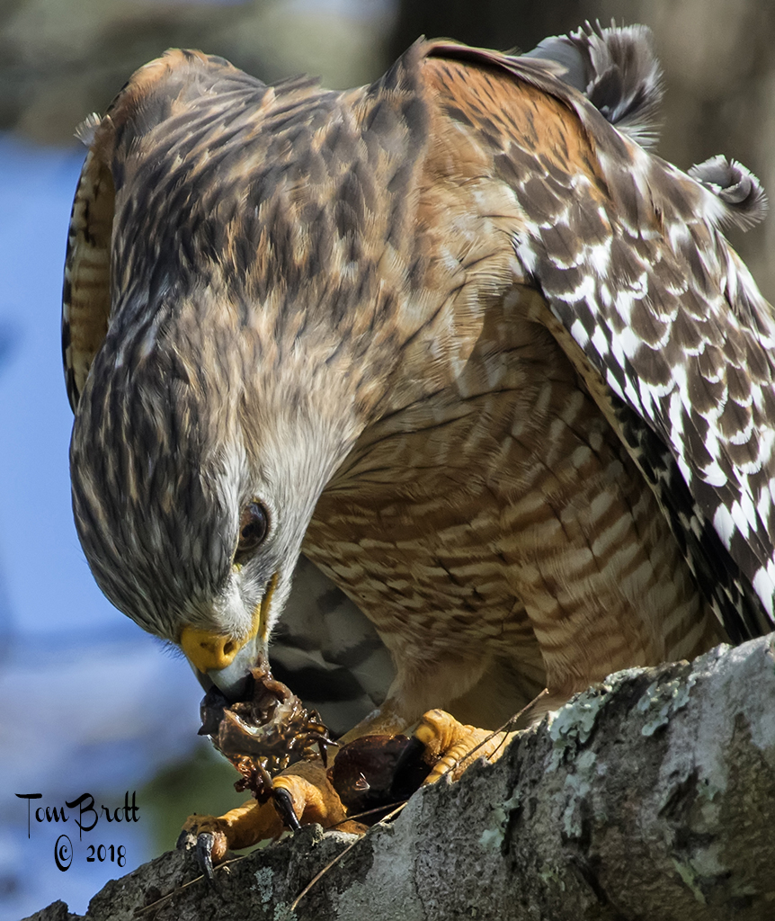
Either way this is a powerful image. I have to agree that the white does not add but distracts from the view of the image. The tighter crop that Mike suggested without the other bird in the background to me better shows the shear power and majesty this bird deserves. My eye was also drawn to the left side of the left foot. There is a white reflection of light there that is also distracting. This is as you said is a hard image to present with the eagle flying directly at you but I think you have done it well with the angle you had. |
Aug 23rd |
| 52 |
Aug 17 |
Comment |
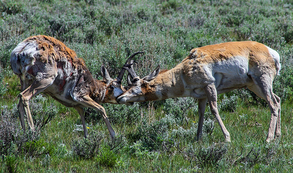
Wonderful. Love the leaping over the fields and the total clarity of the fawn. The hair on the spots are feathered on the right side of each spot to giving the fawn a real appearance of moving. Back ground with color and blur are great and the frontal flowers truly add to the image. In your original I feel the catch eye is a little better. Maybe Mike is correct but I like your finished version. Well done. |
Aug 23rd |
6 comments - 2 replies for Group 52
|
8 comments - 3 replies Total
|