|
| Group |
Round |
C/R |
Comment |
Date |
Image |
| 41 |
Apr 20 |
Reply |
Thank you Henry! I definitely enjoy a variety of subjects. We have been trying to view this stay at home as safe at home -- and then melded that feeling into our "Artist in Residence" period |
Apr 25th |
| 41 |
Apr 20 |
Comment |
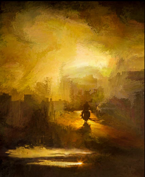
I love the scene and the painterly feel! The Colors and brush strokes are great.
perhaps crop some off the bottom so your rider is more in a "power point" |
Apr 25th |
 |
| 41 |
Apr 20 |
Comment |
I love mirrored images and this makes a great heart shape, which works well with the pink.
What program are you using for masking subjects out? Topaz remask? |
Apr 25th |
| 41 |
Apr 20 |
Comment |
very neat. I would love to see the original, how lucky to find ladybugs and all those flowers! I want to live near a neighbor like that!
The polar distorts is fun, and combining that with twirl (how did you also back in after the twirl???)
The liquify gives it a painterly feel. |
Apr 25th |
| 41 |
Apr 20 |
Comment |
I like the scene a lot1
The Topaz simplify makes it pop even more, but I cannot really see the brush strokes. With this type of a detailed scene, even with simplify the painting with brushstrokes must have taken you hours and hours! wow.
|
Apr 25th |
| 41 |
Apr 20 |
Comment |
This is very creative! The end result is powerful. I agree, poster, book cover, etc. Good composite and layers.
It certainly is on the news and on our minds, so it makes sense that the virus would get into our creativity too. I have a whole pandemic series that I have been working on these past few weeks |
Apr 25th |
| 41 |
Apr 20 |
Comment |
I like the egret flying in, like it is surprised and hopeful about the lack of people and decreased pollution.
The BW works well. The grain fits the covid mood, but I personally am not fond of grain and seems like fog instead of grain would give a similar feel, perhaps even making the juxtaposition of the beach and bridge and wildlife and peacefulness of the BIRD despite our unease. |
Apr 25th |
6 comments - 1 reply for Group 41
|
| 44 |
Apr 20 |
Comment |
I love the color, but BW did cross my mind since the tree is just wonderful with tones and texture |
Apr 25th |
| 44 |
Apr 20 |
Comment |
I love the tree in the foreground! The texture and the way it walks you through the scene. Perfect choice of f4 for a sense of place with the emphasis still being on the tree. |
Apr 25th |
| 44 |
Apr 20 |
Reply |
I lie this crop with removing some from the bottom and emphasizing the arches and ceiling |
Apr 25th |
| 44 |
Apr 20 |
Comment |
wow, great use of the strengths of five different programs to achieve this! What a great capture and edit! |
Apr 25th |
| 44 |
Apr 20 |
Comment |
Thank you Rick for the NECCC comments. We did work really hard to get this amazing lineup for the 75th-anniversary of the NECCC photography conference. We have managed to keep the entire lineup the same for 2021, so, just like the Olympics, the 75th is postponed to 2021. www.NECCCphotoconference.org It is a great three day immersion into photography. |
Apr 25th |
| 44 |
Apr 20 |
Comment |
I also felt isolation from looking at it, reading that other people interpreted it as quarantine was interesting. The one lady looks like a ghost, like those wedding photos where they add a not 100% layer of a loved one into a wedding or similar event.
I have been taking lots of photos, viewing this as our "artist in Residence" period, but I have been doing creative and macro and light painting photography and no HDR while safe at home. I did do some lightbox HDR, so hopefully have something next for May, otherwise I know tat I have a ton of unedited images on the hard drive. |
Apr 25th |
| 44 |
Apr 20 |
Comment |
I love the composition. You did a good job correcting the distortion. The windows on the left, and their reflections have a blue color cast, perhaps warm them up to match the scene.
I do like the tones here, but Max's version does have more pop. |
Apr 25th |
| 44 |
Apr 20 |
Reply |
I see the greys now, but interestingly did not when I edited it. I also notice the cooler highlight colors, so I warmed them up |
Apr 20th |
 |
| 44 |
Apr 20 |
Reply |
here is more symmetrical, but I think that I like a little more on the right |
Apr 20th |
 |
| 44 |
Apr 20 |
Reply |
The light on the highlights was from large floor to ceiling windows, it was a cold overcast but bright day |
Apr 20th |
6 comments - 4 replies for Group 44
|
| 91 |
Apr 20 |
Comment |
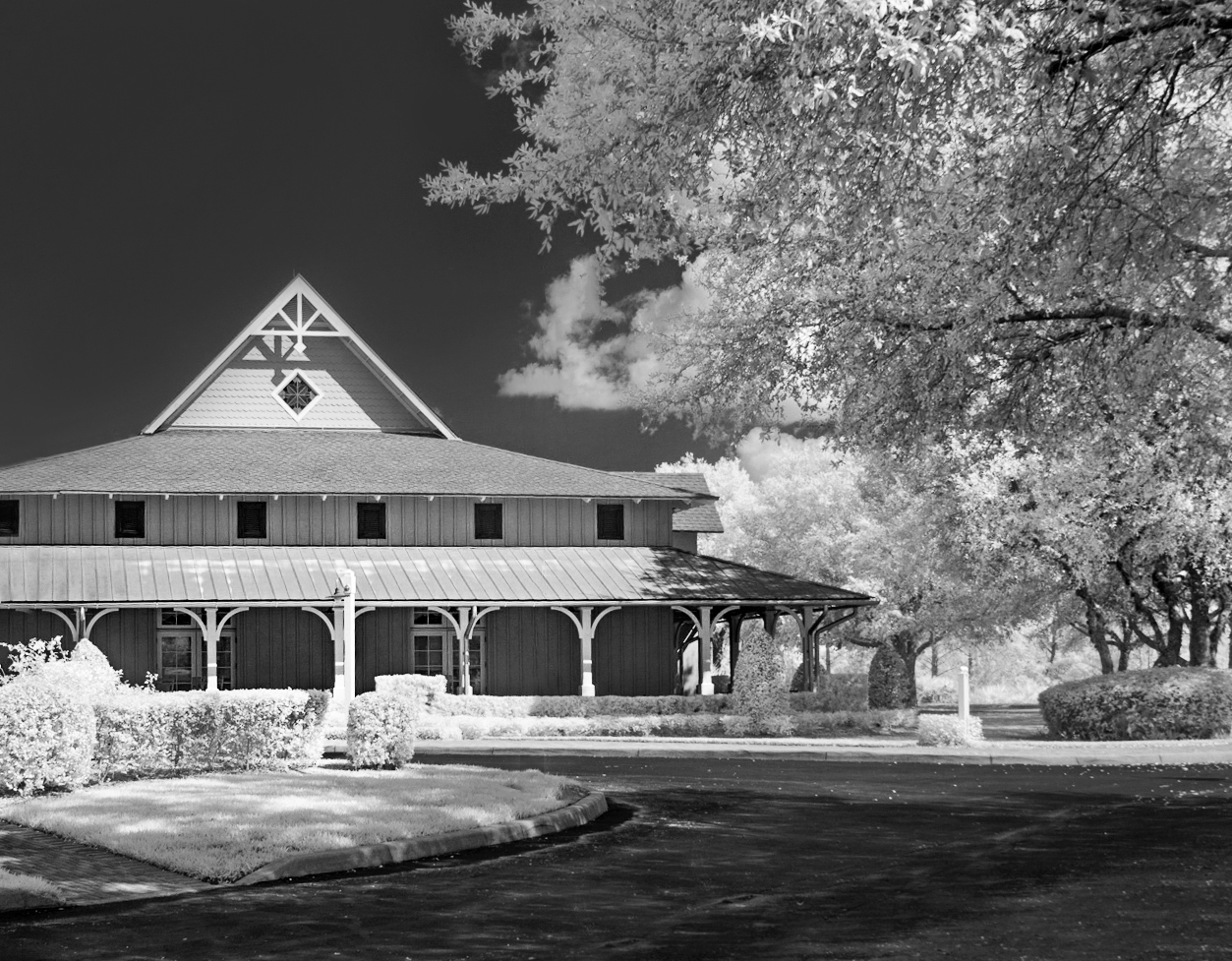
I love the supercolor as much as the edited version. I often leave the image in supercolor and the Lifepixel website has lots of stunning supercolor examples.
I like your edit, the red could be toned down in luminance slightly and a could of the flowers on the top and bottom cloned out.
Thank you for the detailed explanation, we all want to learn and your information helps! |
Apr 25th |
| 91 |
Apr 20 |
Reply |
Hi Judy, I like your edit, removing some of the distractions, thanks for taking the time to show us! |
Apr 25th |
| 91 |
Apr 20 |
Reply |
Yes, I see some simple cloning that could be done to simplify the image. I like the face and it seemed such a dominant subject in the midst of all the nature, but I see that simplifying and removing some in post would help
|
Apr 25th |
| 91 |
Apr 20 |
Reply |
find faces all over the place. This one was an old weathered hood with the hood open and you see the release teeth |
Apr 25th |
| 91 |
Apr 20 |
Reply |
Chan, good observation. I think the tint comes from both the wavelength used and the white balance and editing used. |
Apr 25th |
| 91 |
Apr 20 |
Comment |
Nice conversion!
I love the tones, the blues and yellows and tans work very nicely. The composition is pleasing walking you through the scene.
I wish that there was a tad more road on the right, but can see why you cropped it that way. |
Apr 25th |
| 91 |
Apr 20 |
Reply |
I like your BW edit -- there is a crispness that makes the image pop
The distortion correction in Adobe Camera RAW, amazing what it can do
I like the lamp-post itself, it is quaint and I like the curves and tones, but the placement seems off so I decided to try content aware fill (I did it in three parts, clouds, sky, house (the house removals was miraculous). |
Apr 20th |
 |
| 91 |
Apr 20 |
Reply |
I like your crop Judy, it gives us room to roam around.
|
Apr 20th |
| 91 |
Apr 20 |
Reply |
I agree with Chan, the rock on the far side is bright.
One trick is to turn the image, temporarily, upside down and notice any hot spots -- it makes the image abstract and hot spots are more noticeable |
Apr 20th |
| 91 |
Apr 20 |
Reply |
Judy, I like your darker moodier edit of this! What did you do? |
Apr 20th |
| 91 |
Apr 20 |
Comment |
I love the tones!
Did you envision it in yellows/browns/sepia when you photographed it? |
Apr 20th |
3 comments - 8 replies for Group 91
|
15 comments - 13 replies Total
|