|
| Group |
Round |
C/R |
Comment |
Date |
Image |
| 41 |
Dec 19 |
Comment |
how wonderful is this! Fun! I especially love the dog having its own pillar.
One thing that I try to do at the end of a composite is to add a color blend mode at a lower opacity to tie everything together, it helps with the different lighting/cutouts/colors |
Dec 28th |
| 41 |
Dec 19 |
Comment |
wow, powerful! You should submit this to Adobe stock!
The only thing I can suggest for improvement is that our eyes are drawn to the brightest part, which in this case is her nect, perhaps tone that down just a tad and brighten her face just a tad.
Well done! |
Dec 28th |
| 41 |
Dec 19 |
Reply |
I really like this version |
Dec 28th |
| 41 |
Dec 19 |
Reply |
Thank you for the details. It is always fun to explore and play around in PS "Well, this isn't what I started out to do" -- fun! |
Dec 28th |
| 41 |
Dec 19 |
Comment |
I like this, especially how you handled #3.
I see some white haloing in #3
and I like the idea suggested above about clone or content aware scale to add more stem for #1 |
Dec 26th |
| 41 |
Dec 19 |
Comment |
Quite a complex and detailed composite! I like how you included what inspired you to create it too.
for my taste, the man is too orangy and does not feel as connected to the scene. |
Dec 26th |
| 41 |
Dec 19 |
Comment |
I love the color harmony with the blues and greens and orange fire!
The added monkey tells a story, but I do I prefer the second version because he seems more fearful and cautious of the fire than in the first version. |
Dec 26th |
| 41 |
Dec 19 |
Reply |
I like this suggestion.
I agree "I prefer the second version (#3) because he seems more fearful and cautious of the fire than in the first version." |
Dec 26th |
| 41 |
Dec 19 |
Comment |
I would love details about how you created this. |
Dec 10th |
6 comments - 3 replies for Group 41
|
| 44 |
Dec 19 |
Reply |
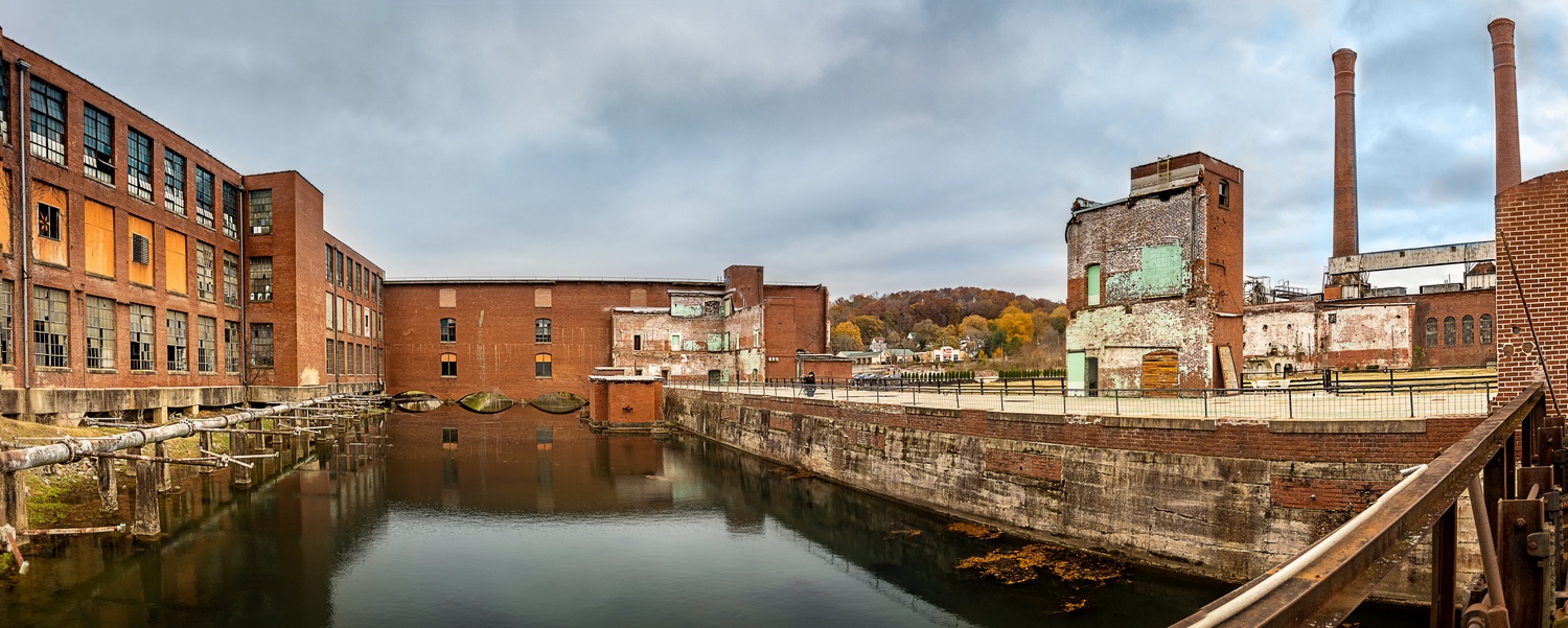
Thanks Mahmoud. After reading the above comment, and then yours, I challenged myself to remove the pipe...
I used content aware fill (and a little cloning) |
Dec 29th |
 |
| 44 |
Dec 19 |
Reply |
Thanks. After reading your comments I went in and cloned on a new layer set to darken to remove the halo in the sky.
I also tried to fixed the bow in the center building.
I also content aware filled and a little cloning and removed the pipe |
Dec 29th |
 |
| 44 |
Dec 19 |
Comment |
I love the fog in this scene, cool! The composition and blending are well done.
One suggestion is what Max said, tone down the bright parts just a tad. |
Dec 29th |
| 44 |
Dec 19 |
Comment |
I love how the fountain is the center of interest, adds a different look to the building. The water and the shutter speed for the water adds a lot of interest.
This would actually be a great place for a stitched HDR. Five exposures moving camera (vertical mount) left and then middle and then right and merge the HDRs and then merge the resulting three images using stitch (or in PS HDR panorama merge in one step for a dng file). |
Dec 29th |
| 44 |
Dec 19 |
Comment |
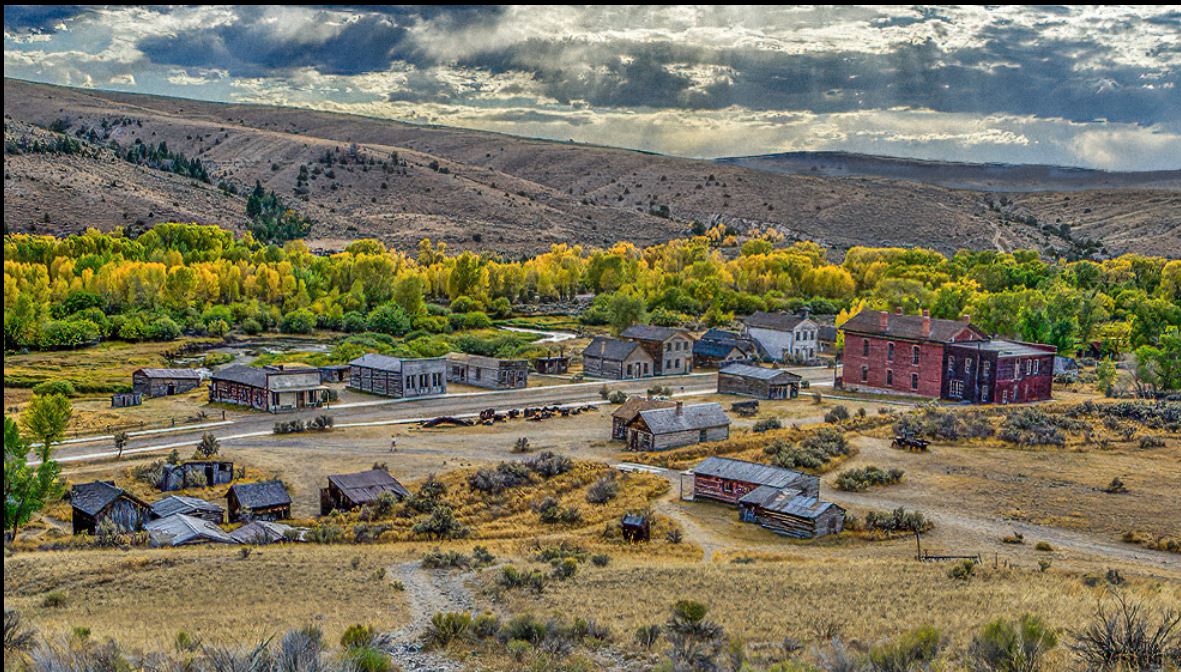
I love the scene. Wondeful location, it looks like an awesome trip. The tone mapping looks natural.
I would darken the peninsula area and lighten the building, as you want the viewer's eyes to go to the top and they tend to go to the brightest part. One trick is to turn the image upside down before you are "finished" with it and see what is the brightest part and make sure that it the part you want the viewer to focus on the most.
There are some artifacts in the lower left, a line in the water and a brighter spot.. Perhaps due to "TouchRetouch" ?? |
Dec 29th |
 |
| 44 |
Dec 19 |
Comment |
Good description, like the leading lines! I have not have known what the cool leading lines were unless I read your description. I wish that we could see the turntable.
I would like a lot more contrast.
I am curious, what was the original histogram? It seems a little flat/lacking dynamic range, so just curious as to why the HDR approach was chosen (I was not there, dso just inquiring) |
Dec 28th |
| 44 |
Dec 19 |
Comment |
I love the time of day and composition. The toning and blending are well done. Makes me want to go there!
perhaps darken the 'fence' on the left side, the top especially is a little bright
Happy New Year! |
Dec 28th |
5 comments - 2 replies for Group 44
|
| 91 |
Dec 19 |
Reply |
I agree about the touching stems, great job showing what you were thinking (and later explaining it) -- thanks!! |
Dec 26th |
| 91 |
Dec 19 |
Reply |
Thank you for the explanation, this has been a good example of how adding details to the capture, editing, and suggestions really makes the PSA DD groups awesome! |
Dec 26th |
| 91 |
Dec 19 |
Reply |
yes "The last thing I would try is to clone out the small rectangular sign."
content aware fill would work well here |
Dec 26th |
| 91 |
Dec 19 |
Comment |
I really like the placement of the statue -- places on the right looking to the left -- it gives the statue and the viewer a lot of space between the statue and the left edge of the frame.
perhaps crop off some of the bottom |
Dec 26th |
| 91 |
Dec 19 |
Comment |
I like the leading line -- and it carries me all the way to the tree, and then the tree prevents me from going out of the composition, nice!
The trees are a little bit "hot" for me, seems like there is lost detail. |
Dec 26th |
| 91 |
Dec 19 |
Reply |
I agree about using dehaze liberally. Zoom into 100% and watch how dehaze can disrupt pixels.
Matt Kloskowski has a good short tutorial on dehaze https://mattk.com/dehaze-the-good-bad-and-the-ugly/ |
Dec 26th |
| 91 |
Dec 19 |
Reply |
I like your version with the black line removed. |
Dec 26th |
| 91 |
Dec 19 |
Reply |
Here it is with some Topaz lens effect... |
Dec 26th |
 |
| 91 |
Dec 19 |
Reply |
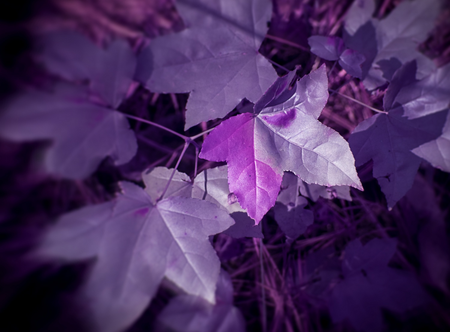
"I am not a fan of real heavy use of vignetting to darken the edges but it works well for this composition."
I agree in general, it does not often work, unless it does :-)
In this case the business of the scene permisses the vignette. |
Dec 26th |
| 91 |
Dec 19 |
Reply |
Thanks! I agree with avoiding bright centers in general, but it was indeed that bi-color leaf that stopped me in my tracks and called for me to take the IR camera out.
I will go into Topaz lens effects and see what I can do as far as blurring the background, good suggestion. |
Dec 26th |
| 91 |
Dec 19 |
Reply |
I agree, your edit improves the composition and keeps our eye focused on the place where the viewer's eye should stay. |
Dec 26th |
| 91 |
Dec 19 |
Comment |
great sky! I love the clouds
The colors of all those blues juxtapose well against the yellow/oranges of the cliff.
The bright area did catch my eye in a distracting way. so I would crop off the bottom. One thing I try to do before "finishing" a photo is to turn it upside down -- that way it becomes abstract for an instance and you can see what is the brightest parts of the image, and discern if that is where you want the viewers eye to go... |
Dec 26th |
3 comments - 9 replies for Group 91
|
14 comments - 14 replies Total
|