|
| Group |
Round |
C/R |
Comment |
Date |
Image |
| 41 |
Nov 19 |
Reply |
I DO like it in the original! But in the composite, it draws my eye there, rather than making me see the image more cerebrally and think about the head in the clouds above the bikers. |
Nov 19th |
| 41 |
Nov 19 |
Reply |
That is why I love these DD groups, we see what we want to see, feedback helps us improve. I tend to flip my photo upside down before "finishing it" so that it becomes more abstract and I can see hot spots and outliers easier. |
Nov 19th |
| 41 |
Nov 19 |
Comment |
very cool! The red lit tress as lava fie is wonderful!
I like how you included an iphone portion as well, we always have our cell phone with us so why not incorporate more from those images.
The water ripples are a good addition, really ties it all.
I like all of the critters in the foreground. The only area I think is a tad cluttered is the very left with all of the plants.
As fas as improving, reduce not a lot - it really flows (pun intended)
-- the opacity of the jellyfish on the right, seems like it would be more transparaent in "reality" LOL
-- the white urchin thingy in the left top seems too bright to me, the viewers eyes are drawn to the brightest thing. I like it there -- I just don't think that it should be the enter of interest. Also seems like it would have a little red color cast from all of the fire and volcano
-- |
Nov 18th |
| 41 |
Nov 19 |
Comment |
I like composites, and what a great way to show off so many doors!
I would love to hear about the details of how many layers -- how many images - how did you merge the photos?
I like how you placed the yellow/green man's head. The orange dominates, so it seems like placing it in a powerpoint would make it pop more, rather than so centered. |
Nov 18th |
| 41 |
Nov 19 |
Comment |
I love the colors -- the green against the red works very well!
"I played with the PS Liquify filter to make it curvaceous"
I love this part! How fun to make it dance...
I would remove the red from the top right. |
Nov 18th |
| 41 |
Nov 19 |
Comment |
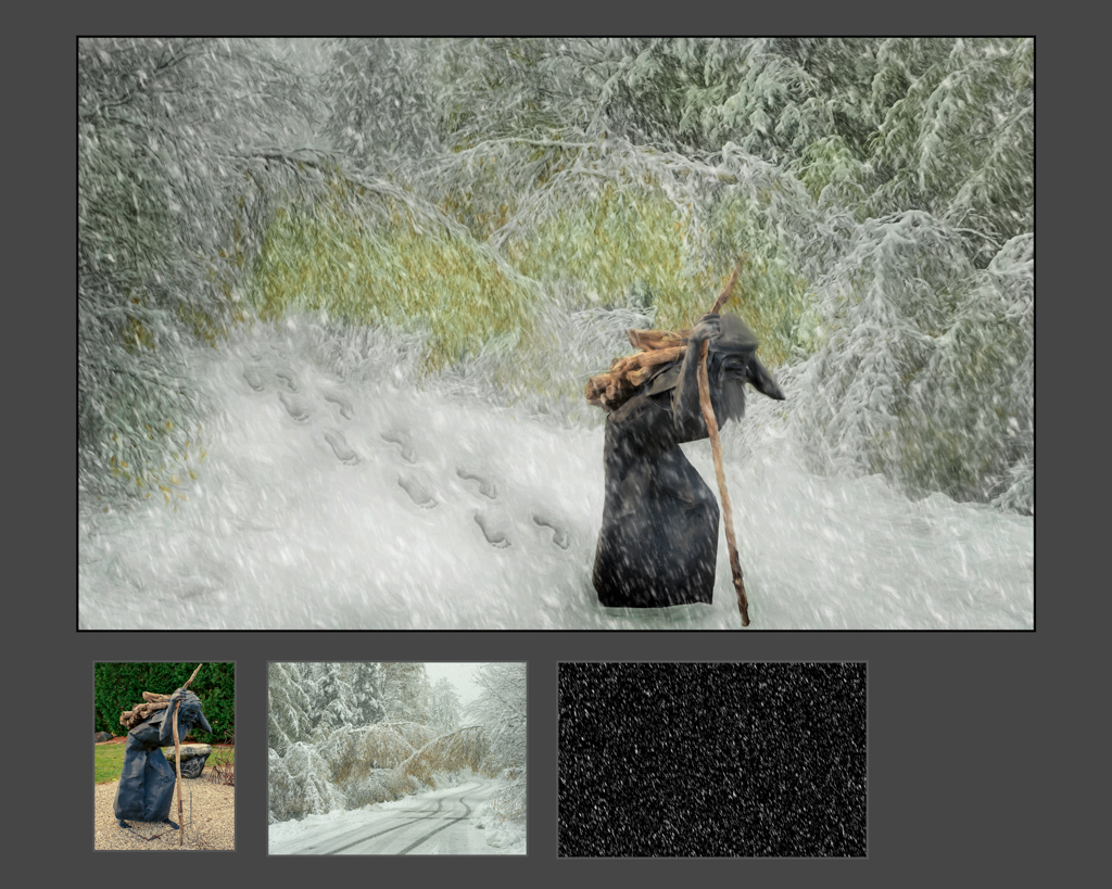
I love this creativity! wow!!!!
To start with a pumpkin and add all this, how creative! The orange color against the winter scene is a wonderful contrast.
It is wonderful as is, perhaps a few tweaks...
--the mouse closest to us seems floating, perhaps some snow on the bottom of his foot or bury his foot in the snow?
--mask just a tad of the snow away from her face
--the branches and trees on the far right seem to indicate that their path is blocked, perhaps flip the woods so that they have room to run out of the frame
--puppet warp (or liquify) her arm, the general rule for body parts is to bend it. |
Nov 18th |
| 41 |
Nov 19 |
Comment |
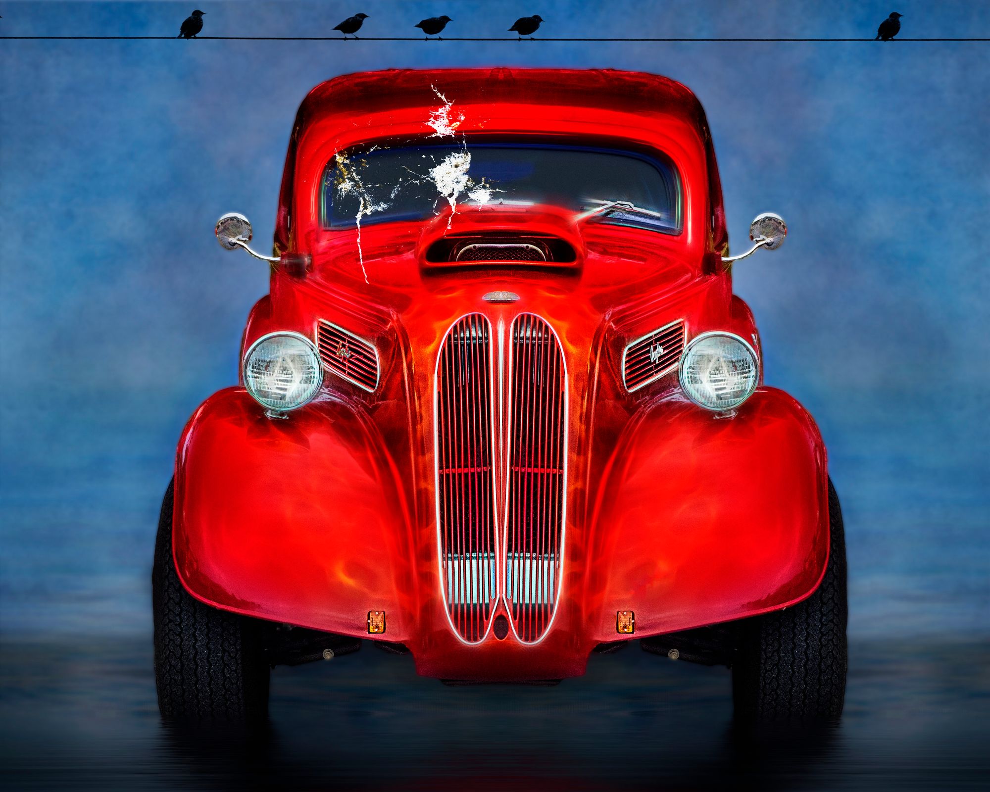
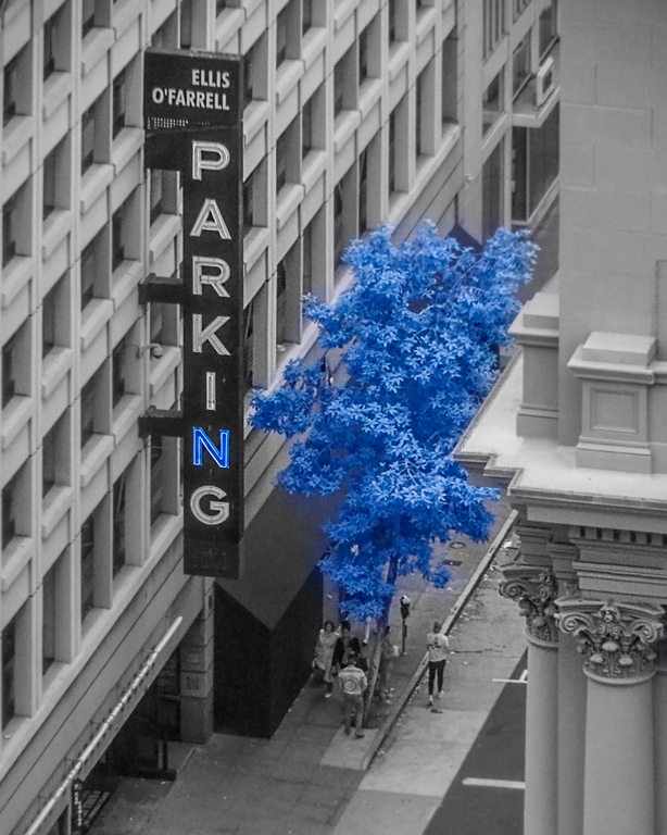
I like the addition of the clouds to bikes. The head is cool as it is looming and watching over the bikers. I am not sure about the sunburst, as it is by far the brightest thing int he image and my eye goes there, rather than to the message of the head over the bikes.
The blend seems less refined than some of your other images. The trees on the left could be blended out. |
Nov 18th |
5 comments - 2 replies for Group 41
|
| 44 |
Nov 19 |
Comment |
weird, I was typing about vertoramas and what shows up on my FB feed is a good article about them...
https://themindcircle.com/vertical-panoramic-churches/?fbclid=IwAR2jawMBOXKr6Unh9Qi97vz7xbL9-PGhtMNIB1Ck40-8SLd7Fs1qlZ0YiqY |
Nov 27th |
| 44 |
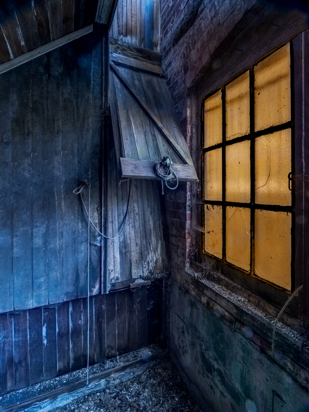
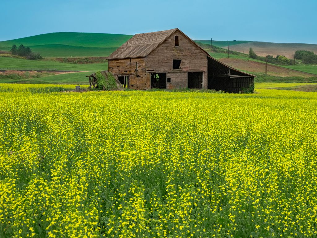
Nov 19 |
Comment |
I love old barns,!
I would add some more contrast will bring out the details
The more modern blue rope does not fit well with the older barn, so try to remove using content aware fill. |
Nov 27th |
| 44 |
Nov 19 |
Comment |
The wide angle, season, fall colors, composition, shadows, and time of day all work -- wow!
There is fringing along the top of the gate, try replace color or selective color to remove it. |
Nov 27th |
| 44 |
Nov 19 |
Comment |
I like the almost symmetry of the image, but with the two different women. The subject keeps the viewer interested.
The image is a tad tight for me, for verticals like this where I know that I will have to apply perspective I try to shoot wider than my end composition to give room for distortion correction.
Try to straighten the sides
Try cropping out the top window to improve composition.
Desaturate the pink flowers and the blue sky
use a blend more layer and even out the blue windows.
perhaps even try monochrome or sepia |
Nov 27th |
| 44 |
Nov 19 |
Comment |
The strong vertical is well done! The color and strong lines give the image impact. The blending is well done.
Yes, think vertical for panorama and horizontal for vertoramas.
Multiple level stitched images are fun too! |
Nov 27th |
| 44 |
Nov 19 |
Comment |
I like the brach going across the "Tom Branch Falls" ;-)
I like the composition. The colors and tone-mapping look natural, perhaps darken the top some, |
Nov 27th |
| 44 |
Nov 19 |
Comment |
I love the scene! The colors pop and the low angle with the birds in the front add impact. I love the clouds and the color saturation. Perhaps a tad more contrast in the furthest wave and right stacks.
I see a face in the leftmost stack. |
Nov 18th |
7 comments - 0 replies for Group 44
|
| 91 |
Nov 19 |
Reply |
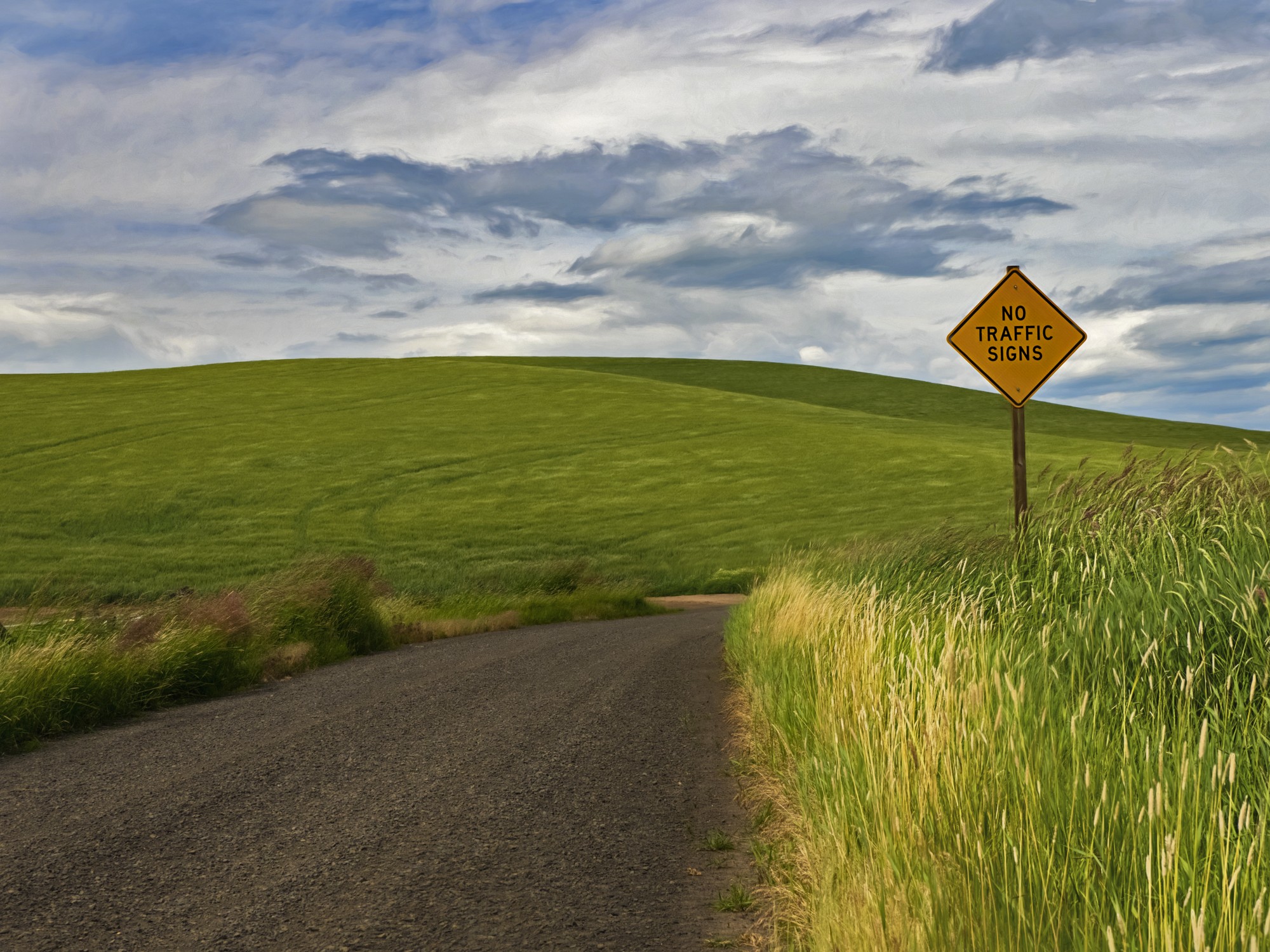
Yes, I was conscious of the peak not breaking the horizon. I took this image and then also images from both sides, but this composition held the roofline inside the hills.
The fields are always moving out there, so that line of wheat must have been moving for the blur. |
Nov 18th |
| 91 |
Nov 19 |
Comment |
I like the chrome look. The placement of the lamp post in the third powerline works well. The colors pop!
I might have been tempted to crop a tad off the bottom black and darken the bright white diagonal that runs thru the image |
Nov 18th |
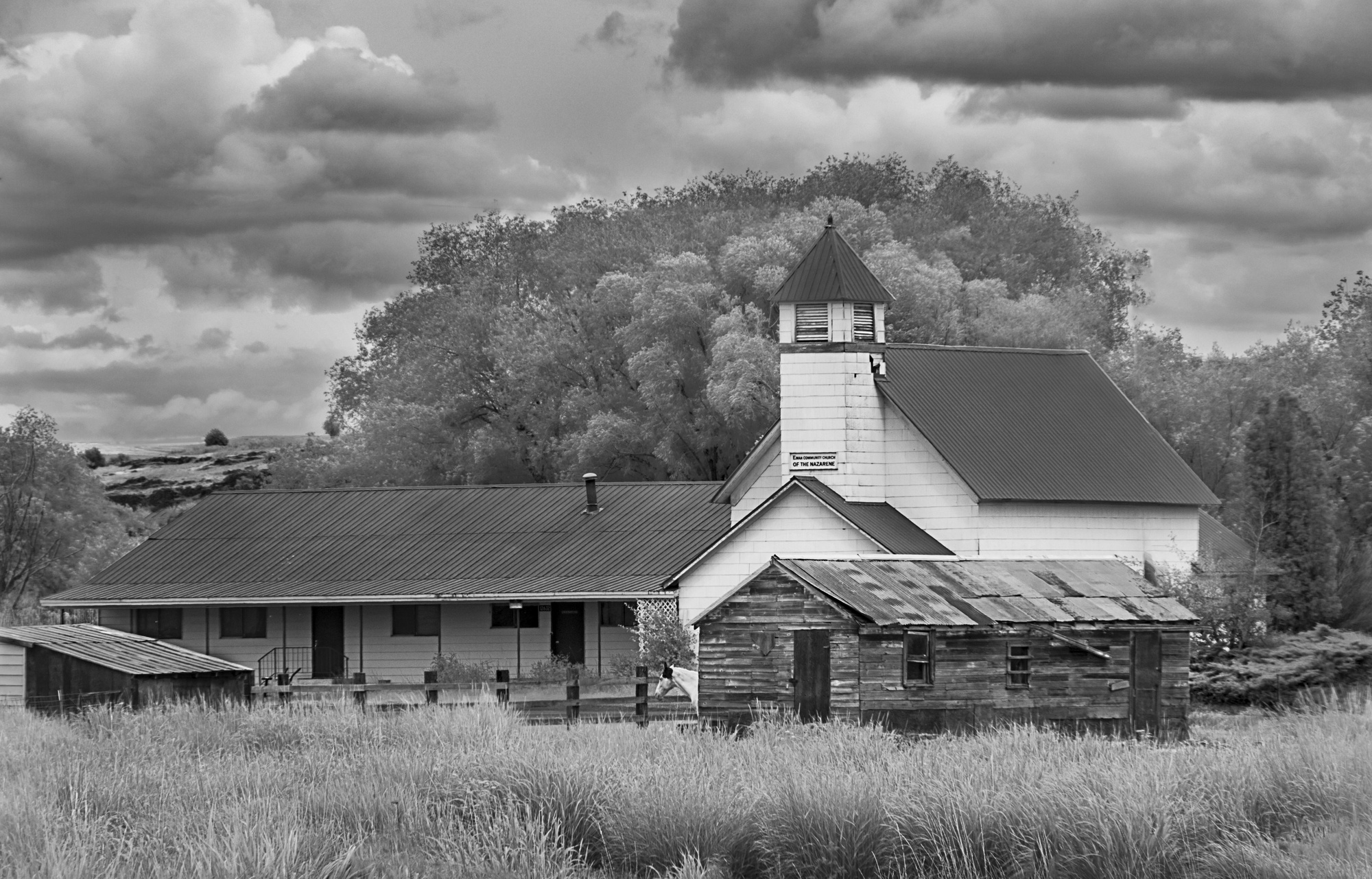
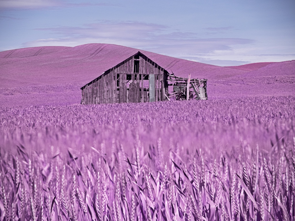
| 91 |
Nov 19 |
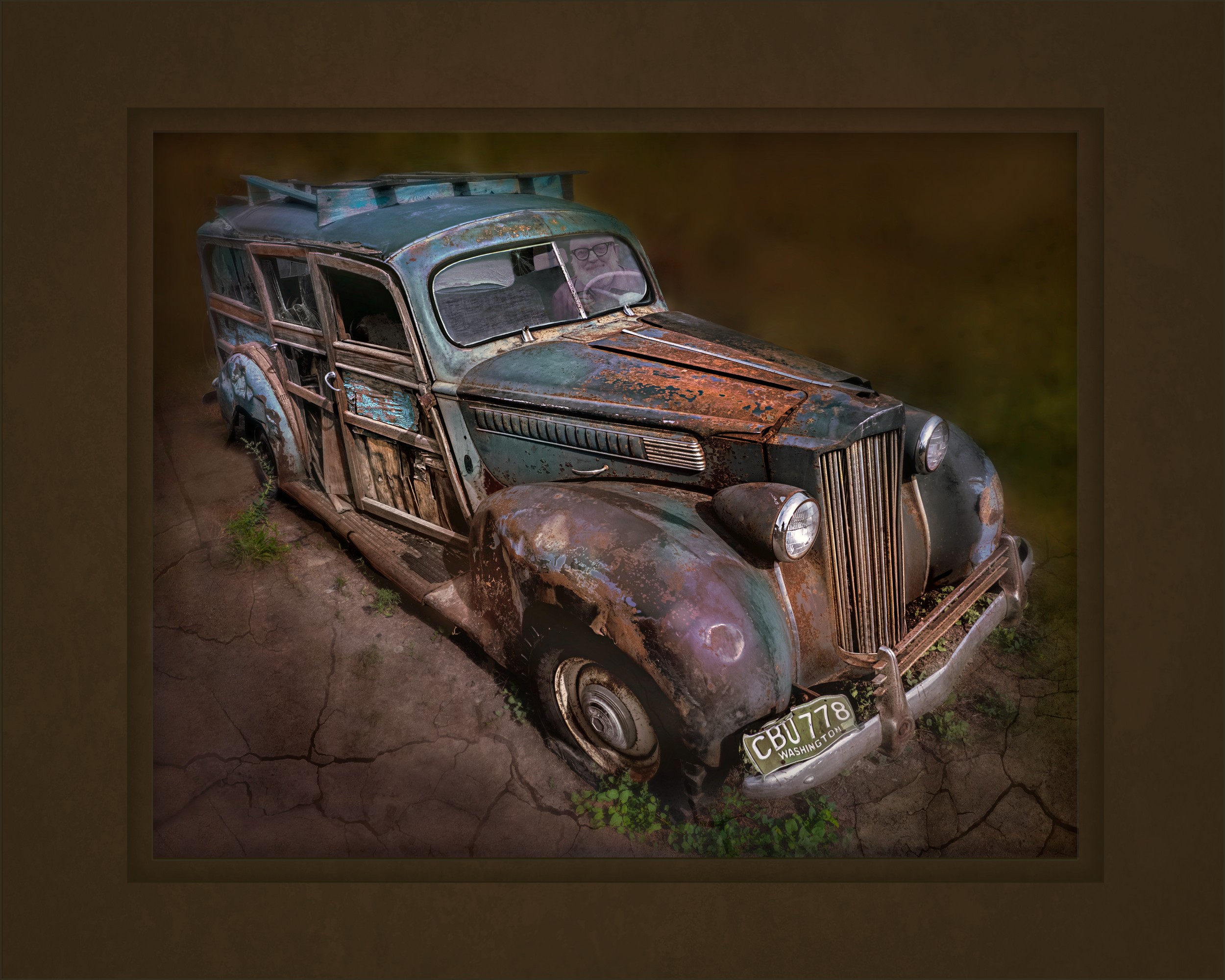
Comment |
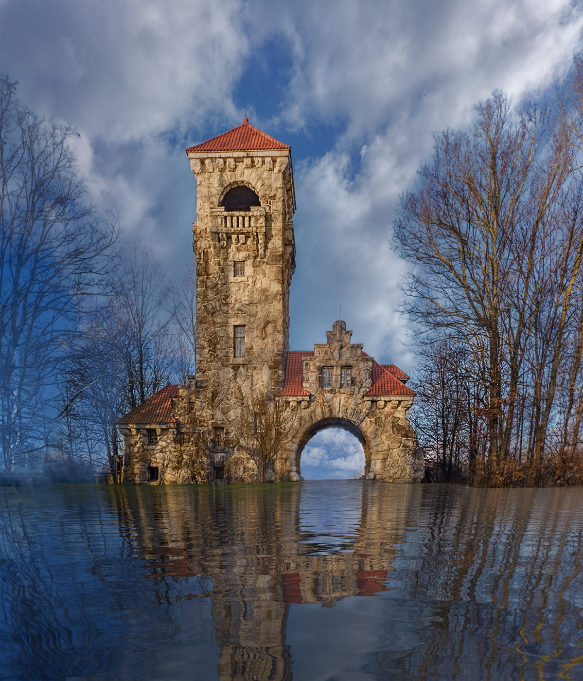
I love abandoned houses! The dark sky is a good indicator of IR.
I like how you cropped the image to include less foreground. To my eyes the horizon seems falling to the right, perhaps try to straighten it. The tree shadow in the bottom almost acts like a vignette. The tree dominates, and it grows out of the frame on the top and right, seems like the tree becomes the main subject, rather than the house.
|
Nov 18th |
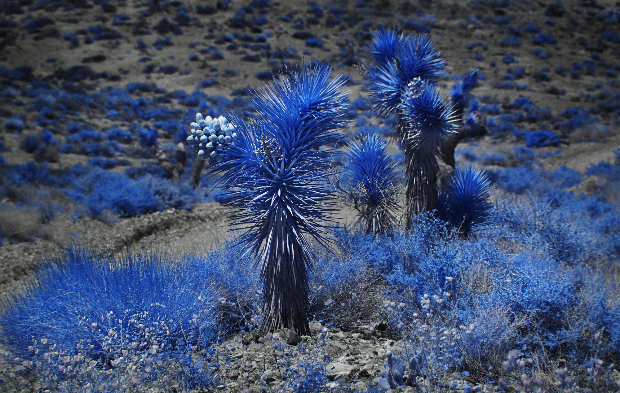
| 91 |
Nov 19 |
Comment |
Jim, I love the yellow trees here, it is a very good demonstration of what IR can do1 The juxtaposition of the trees against the sky works well.
I like the camera angle and composition as it feels as if you are part of the river.
The only constructive criticism I can give is that I feel that the water at the bottom of the image is too dark -- perhaps crop off the bottom underneath the rocks |
Nov 5th |
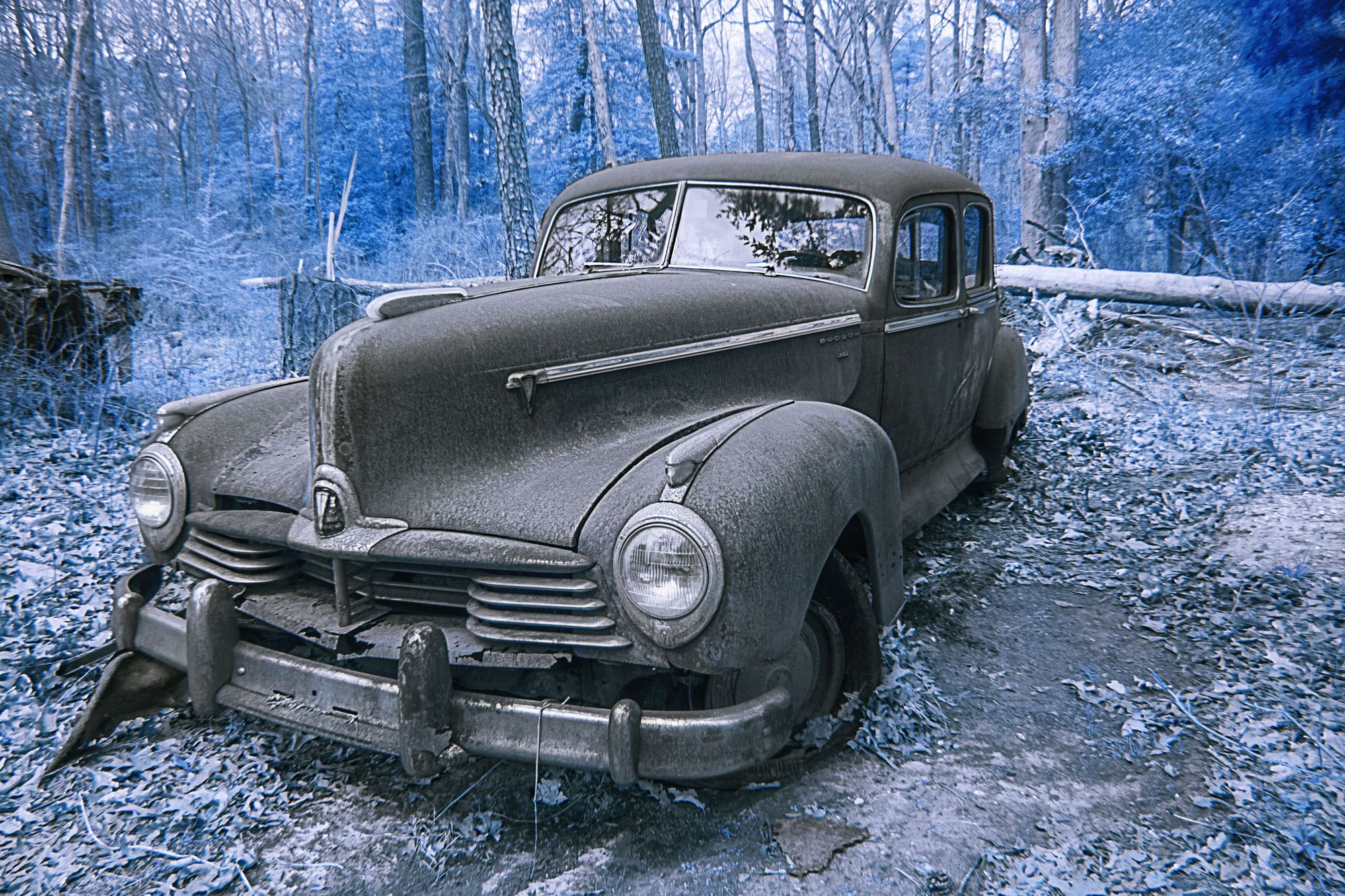
| 91 |
Nov 19 |
Comment |
thank you for a thorough description of what you did in camera and in post-processing. Information like this really helps us all learn!! More is better as we try to master IR photography -- thank you Jim! |
Nov 5th |
| 91 |
Nov 19 |
Comment |
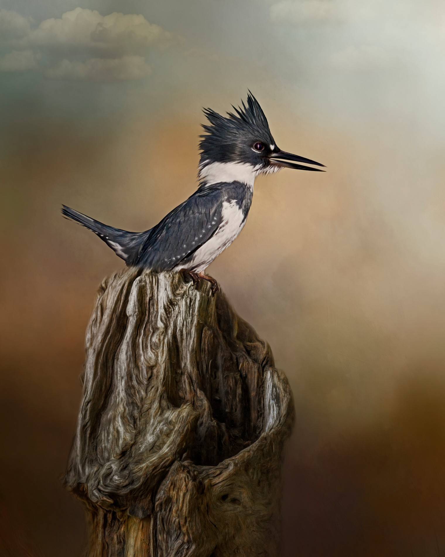
I love the fence leading the viewer's eyes in the foreground and the dominant tree and the dark sky.
It would be interesting in this case to see a visible image taken at the same time and B&W Profile 05 chosen for conversion to B&W. |
Nov 5th |
5 comments - 1 reply for Group 91
|
17 comments - 3 replies Total
|