|
| Group |
Round |
C/R |
Comment |
Date |
Image |
| 41 |
Aug 19 |
Reply |
Henry, you are correct, presentation would help here. I sometimes forget since viewing on my monitor is does not have the same issue. |
Aug 18th |
| 41 |
Aug 19 |
Comment |
I love the idea! And I have been doing multiples like this in camera lately (my camera ghosts the overlay so I can position the moon, etc. exactly where I want it in-camera as an overlay)
I love the sun added to the scene, it fits well. I am a little confused by the grunginess of the elephant, but that is personal taste.
good use of two strong elements to make a story. |
Aug 14th |
| 41 |
Aug 19 |
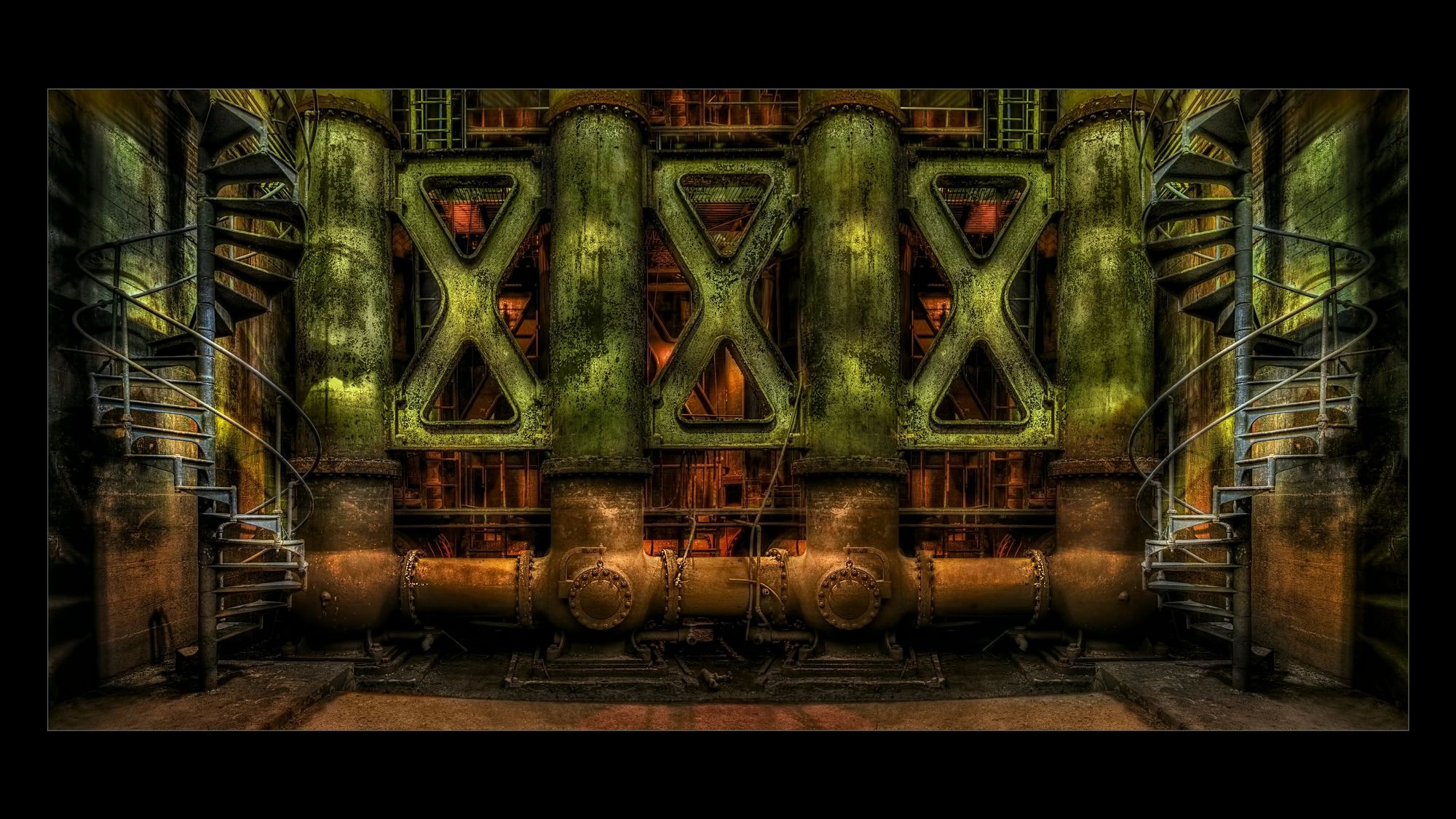
Comment |
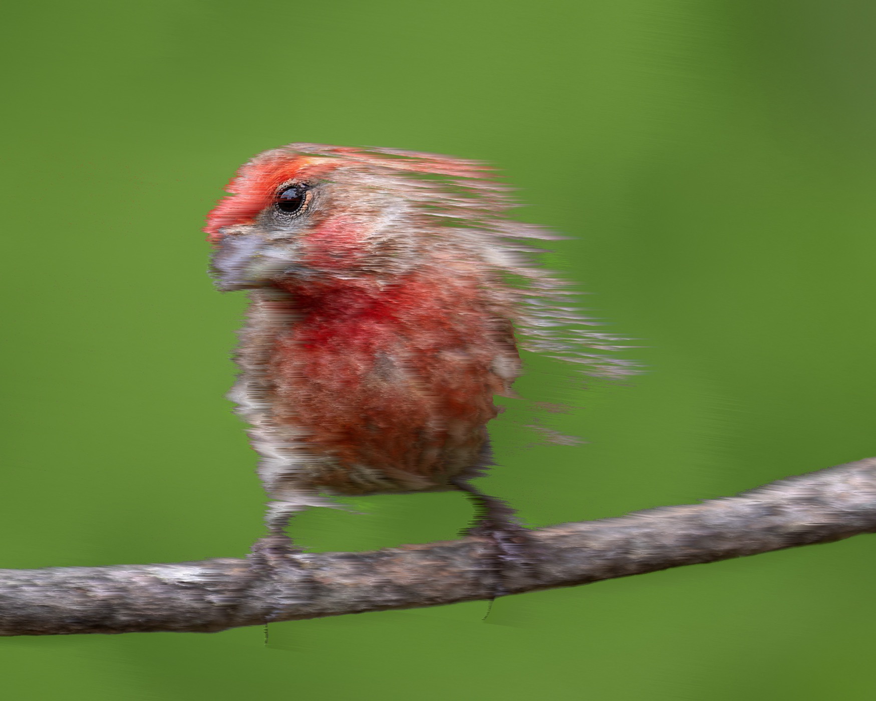
I love the colors and graphic appeal and how the Topaz simplified a complex scene but left it so interesting.
The sky is the only thing that you might paly with, everything else is so smooth, and the sky has so much texture, I want to stay on the bikes, but the sky pulls me away. Well done! |
Aug 14th |
| 41 |
Aug 19 |
Comment |
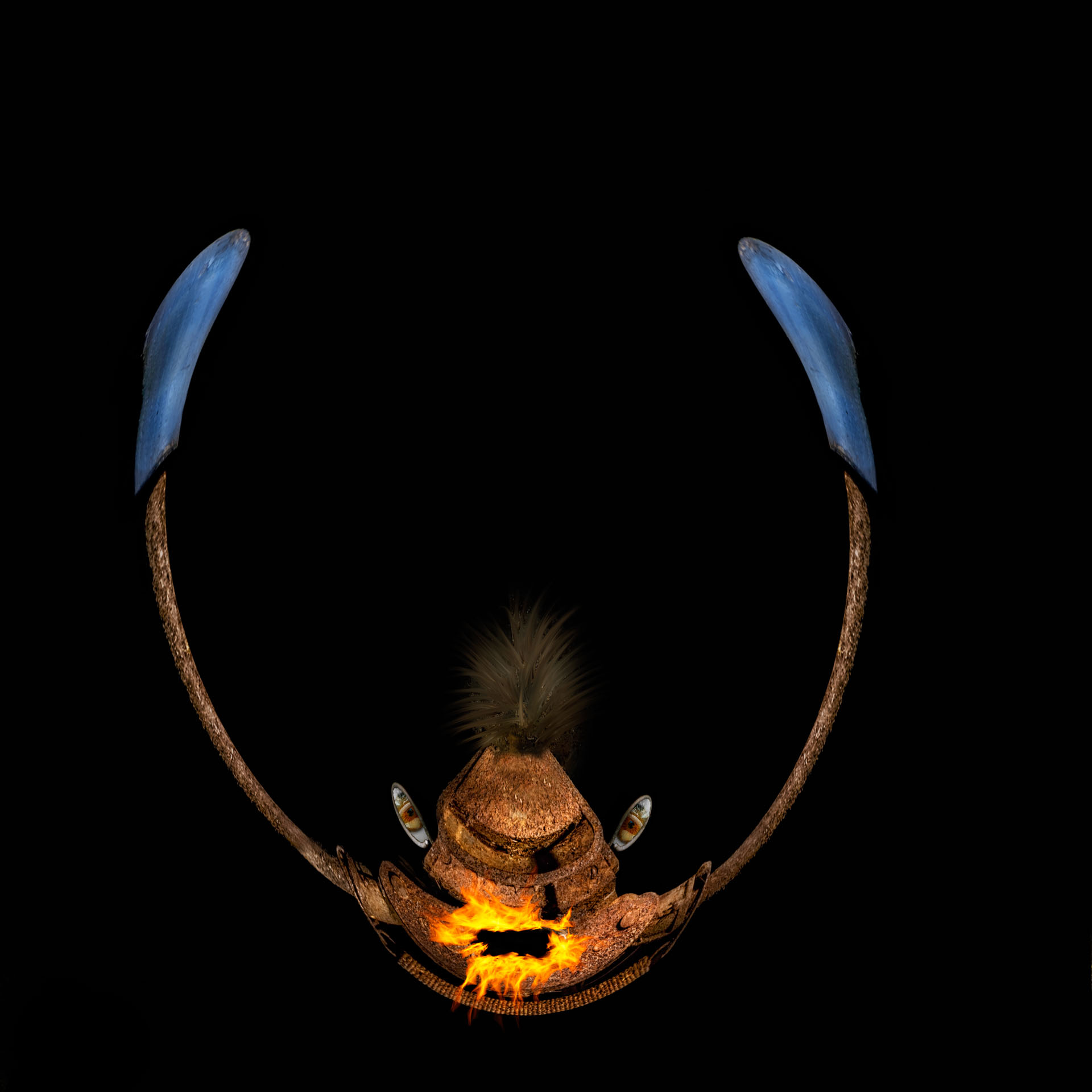
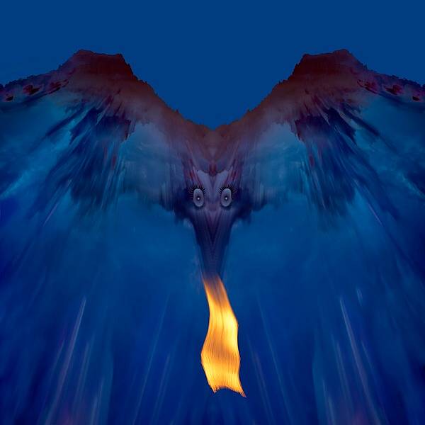
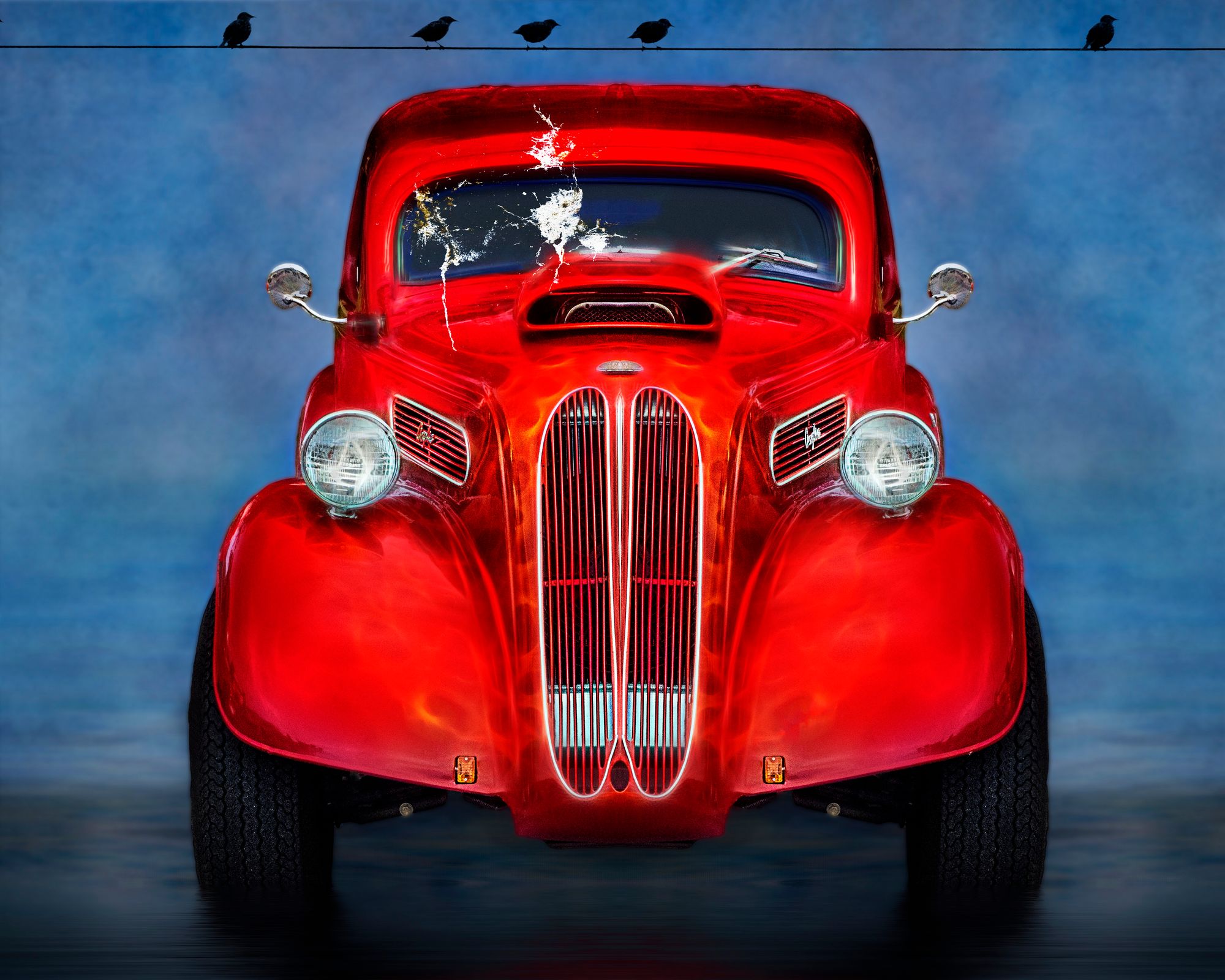
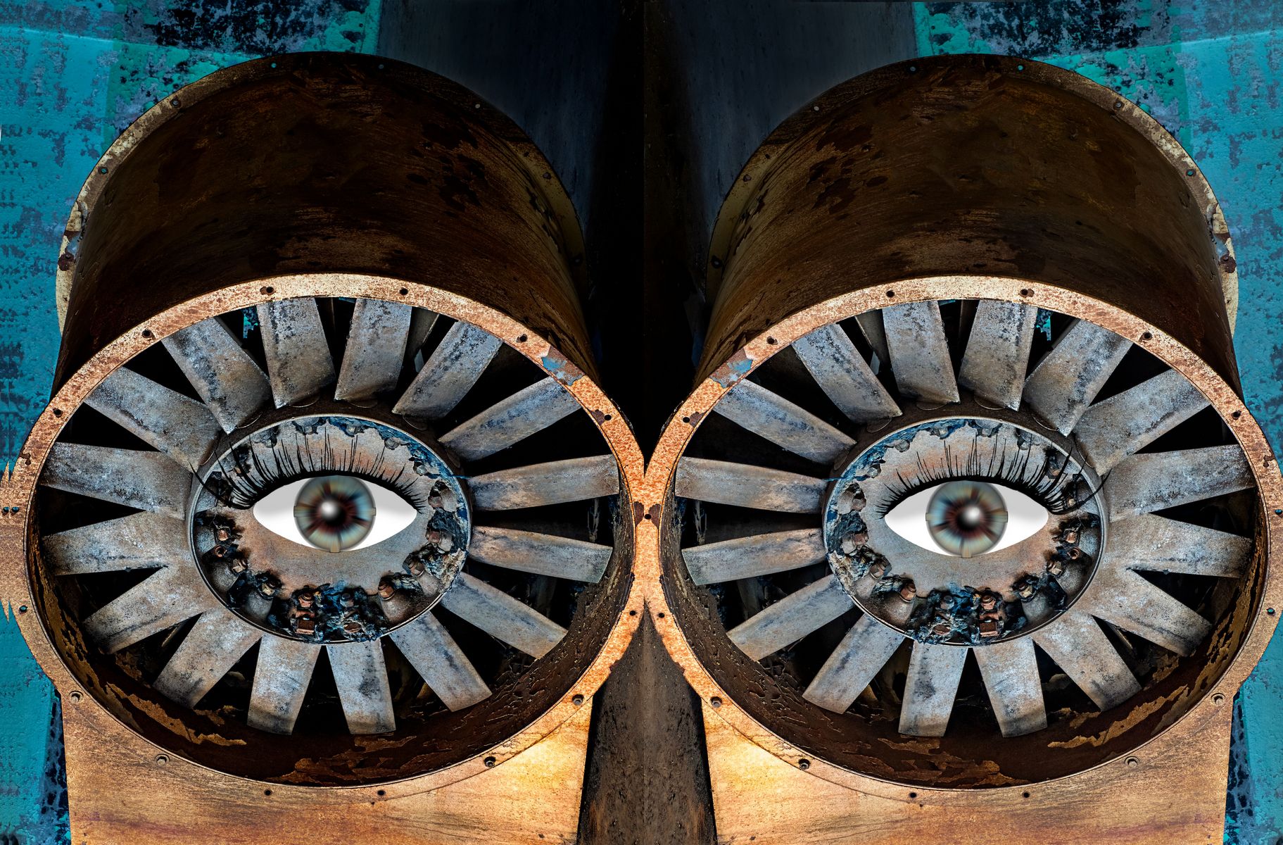
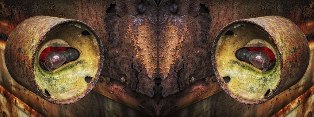
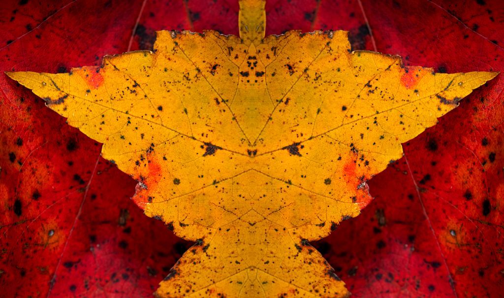
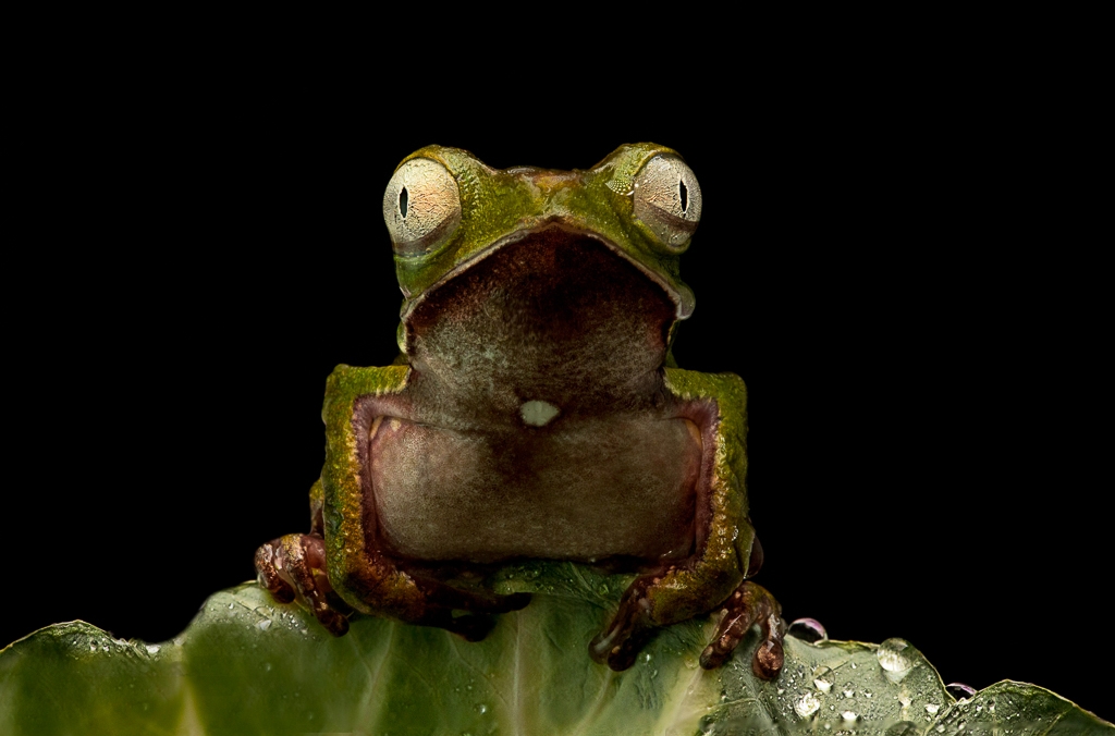
I like the BW effect. The center line leads you right to the eyes!
The bats add to the image.
Perhaps darken the left side (or mirror the right to the left) to make the left side darker so you are sort of forced to stare right down the center into the eye. |
Aug 14th |
| 41 |
Aug 19 |
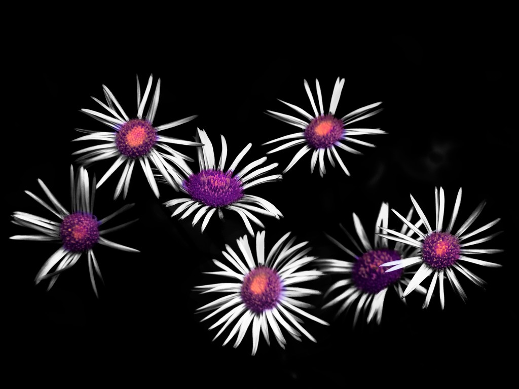
Comment |
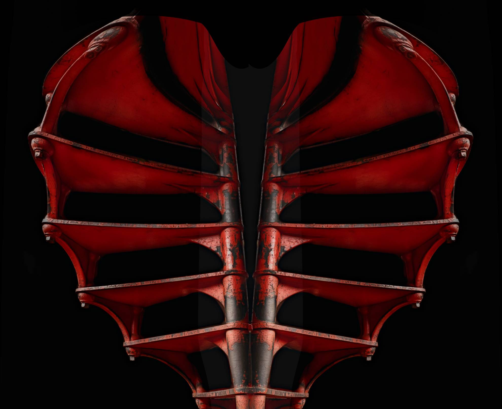
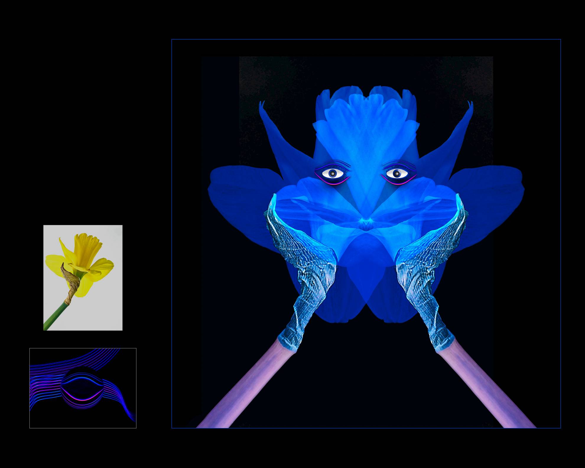
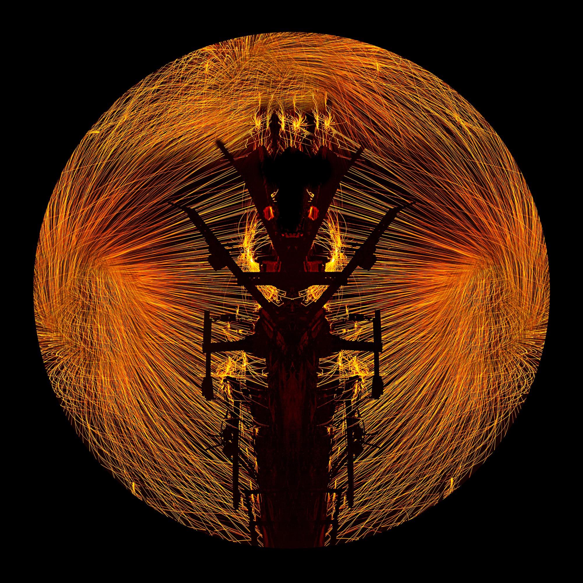
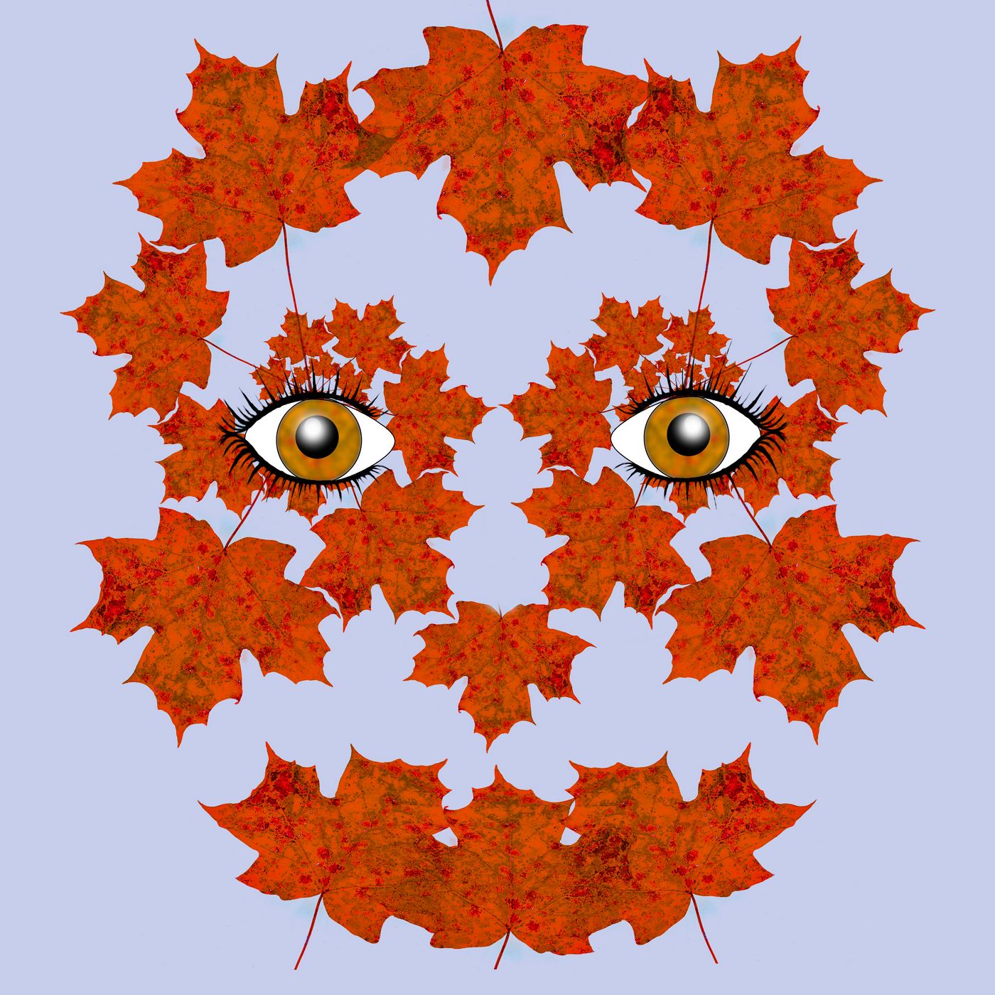
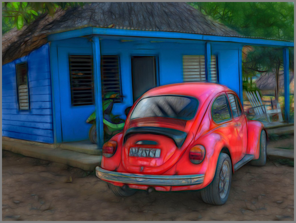
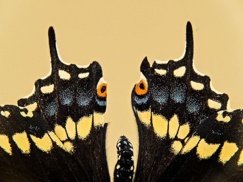
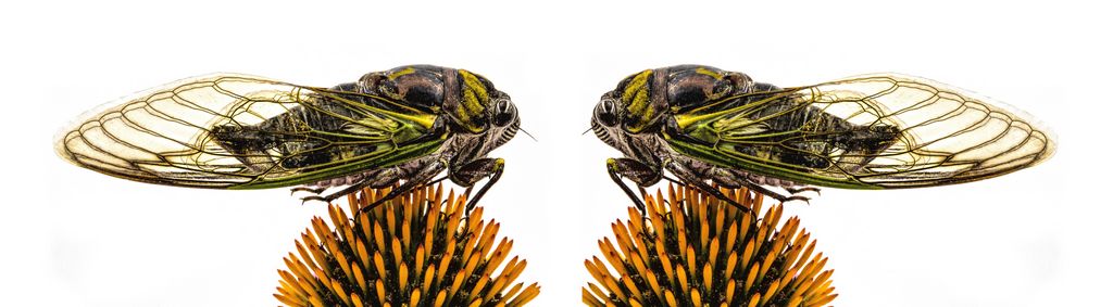
I love this!
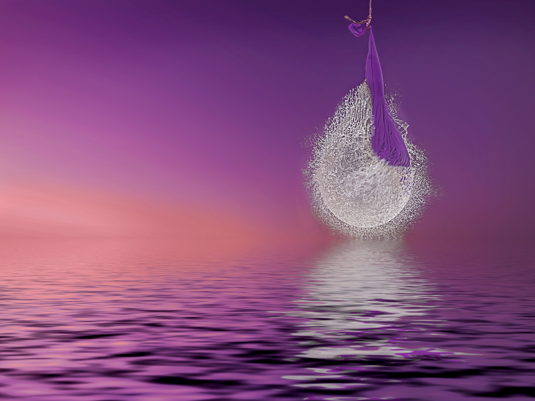
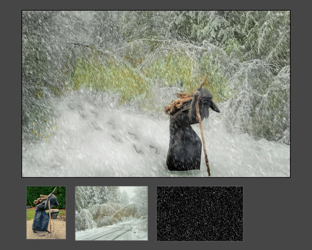
The heart is perfect, glad that you have joined the world of pareidolia!
I love the addition of the beetle.
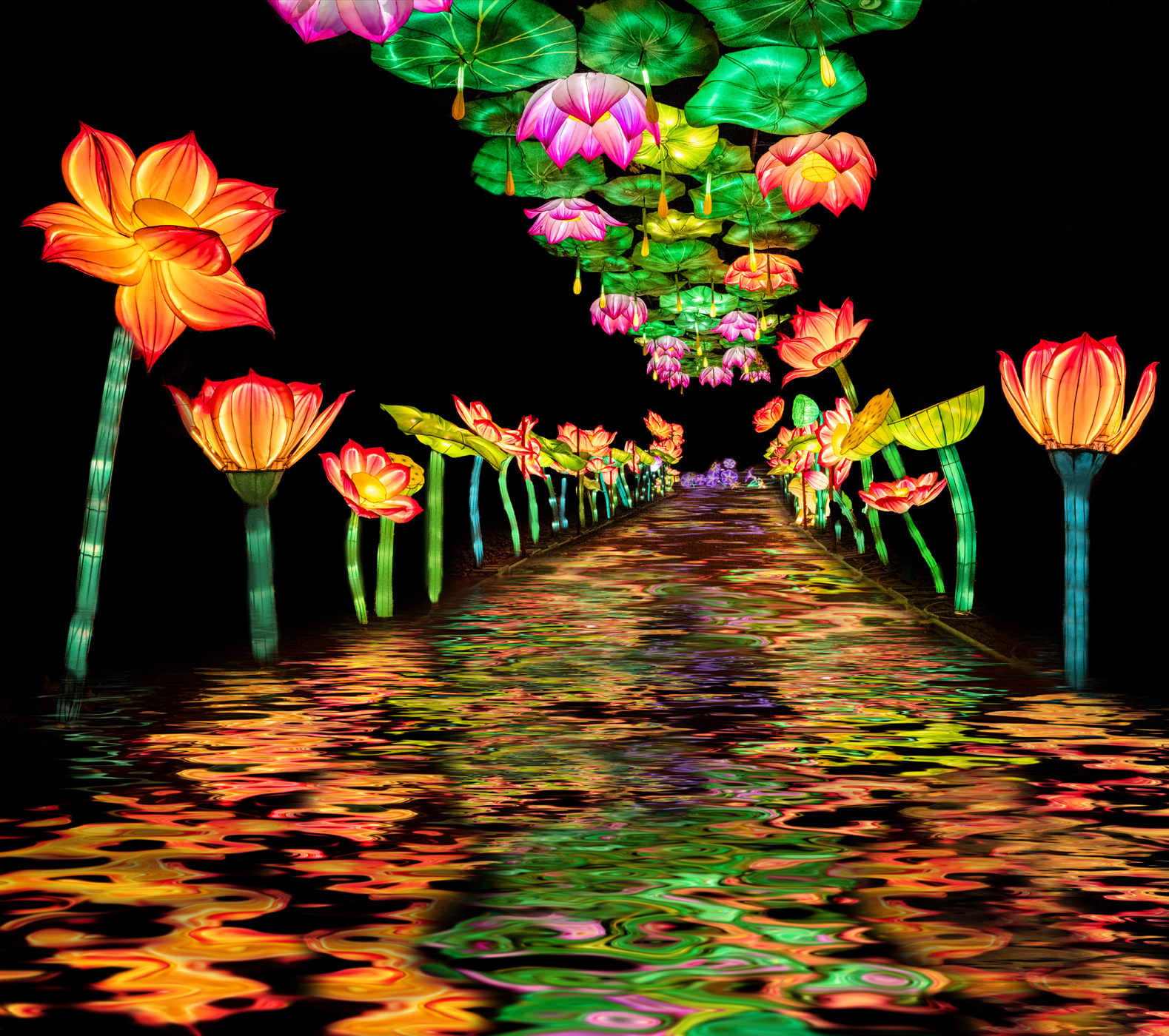
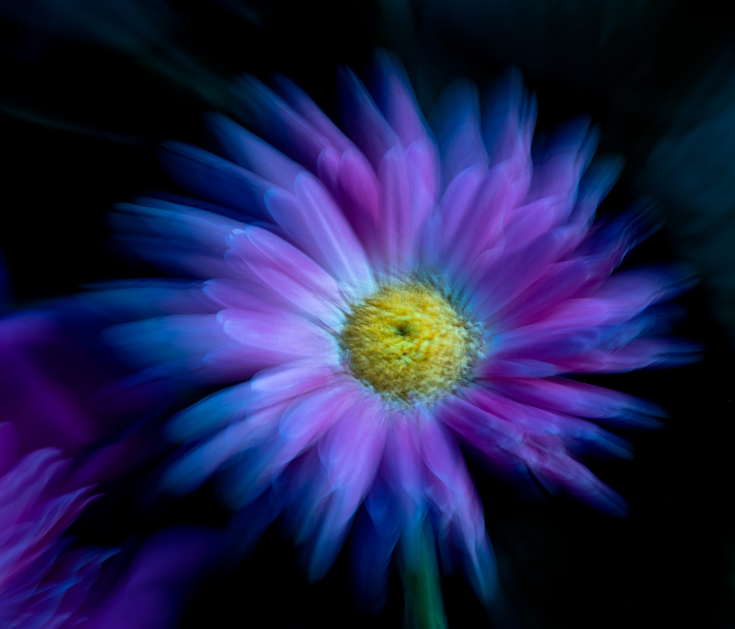
The only thing I can suggest, that perhaps would improve, would be to (1) to fill in the black gap in the green in the middle bottom and (2) change the red in the background to green to allow just the beetle to be in red. |
Aug 14th |
4 comments - 1 reply for Group 41
|
| 44 |
Aug 19 |
Comment |
I like the angle and where you shot the image from. The oranges of the windows complement the sky nicely.The white river draws your eye right through the scene to the dam and then to the sky
The image seems a tad dark, contrasty and perhaps oversharpened. |
Aug 18th |
| 44 |
Aug 19 |
Comment |
Seems like a good image for an article or story. The sign was placed intentionally into the composition. Can you get close to the fence to get closer?
For more pop, a different time of day?
I like the blend but would try increasing the contrast a tad.
There is a bright spot on the fence/truck that could be toned down...
|
Aug 18th |
| 44 |
Aug 19 |
Comment |
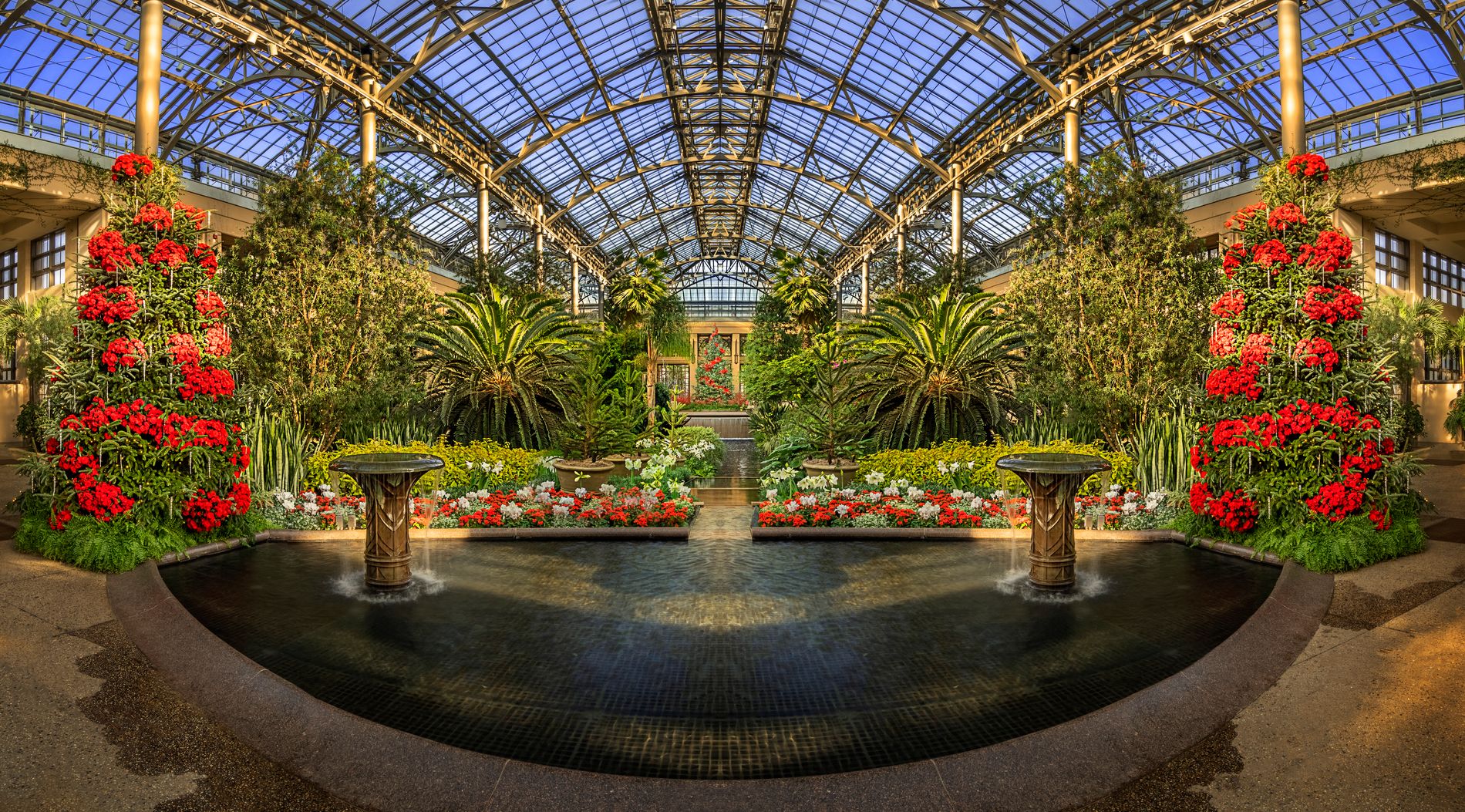
Love the gold and blues inside.
Blended quite well which can be hard inside places like this.
The red could be darkened and de-saturated a bit.
I did not notice the side vertical until mentioned, but corrected is better |
Aug 18th |
| 44 |
Aug 19 |
Comment |
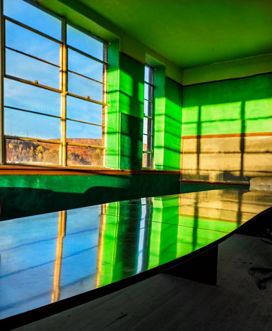
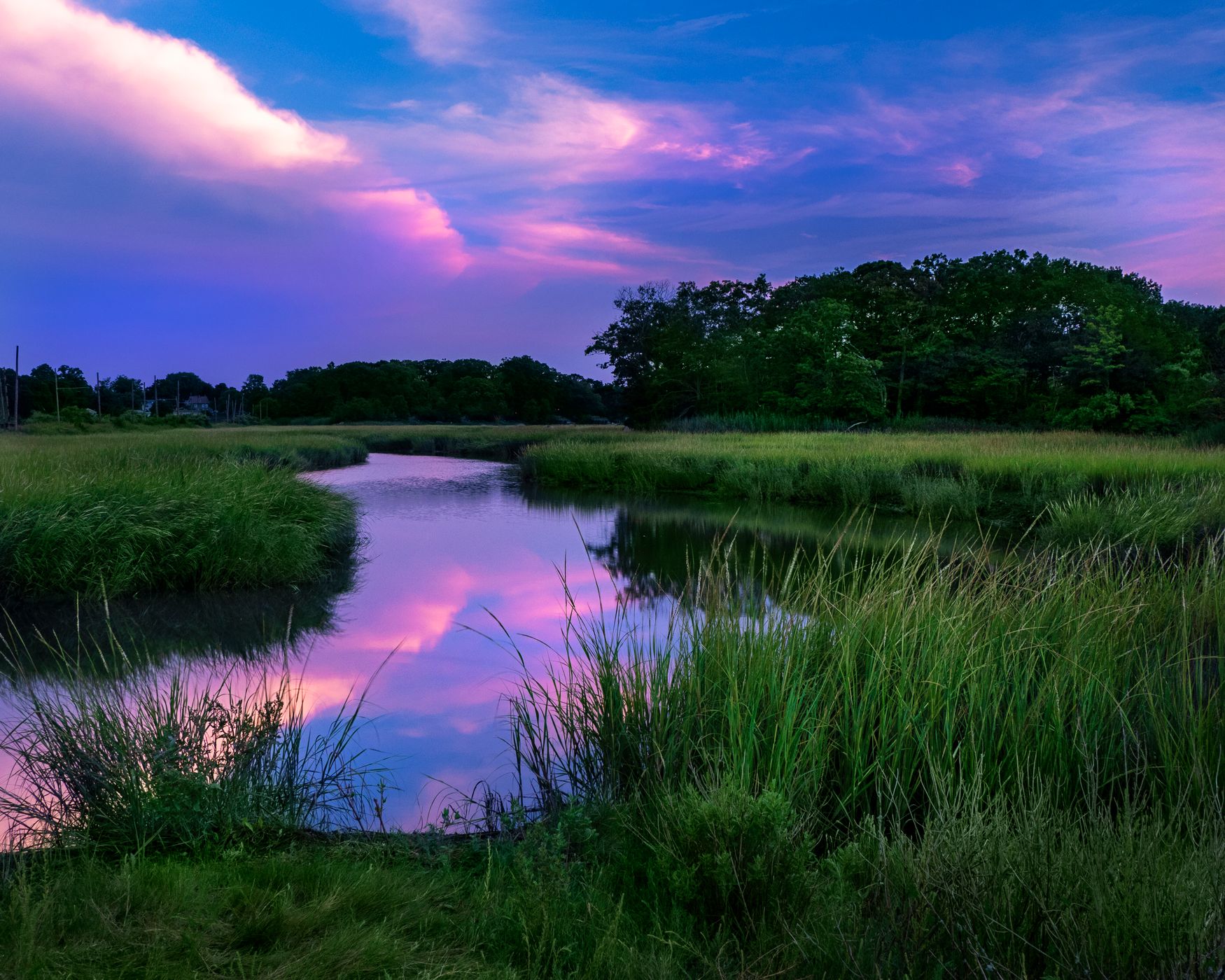
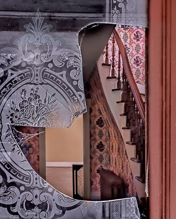
Beautiful. I like the scene, the tones, the reflection and ripple.
The blend looks natural, even in the weeds, just the top of the left tree looks darker.
perhaps tone down (burn0 the weeds just a tad since I want them to complement not competee with the building and reflection |
Aug 18th |
| 44 |
Aug 19 |
Comment |
I like the rocks and the framing. I love the warm tones of the rocks against the great sky and the blue no clouds is perfect here.
You might clone out the portion of the dog |
Aug 18th |
| 44 |
Aug 19 |
Reply |
I like the not straight on because you see the angle of the logs on the right, just burn in the lower right and that window sill line on the right |
Aug 18th |
| 44 |
Aug 19 |
Reply |
I agree, those areas could/should be burned in more |
Aug 18th |
| 44 |
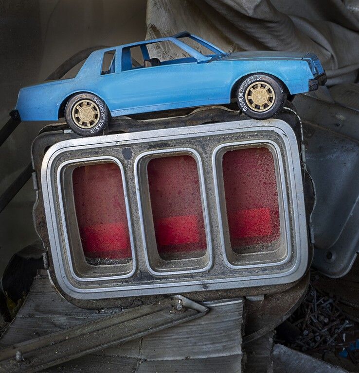
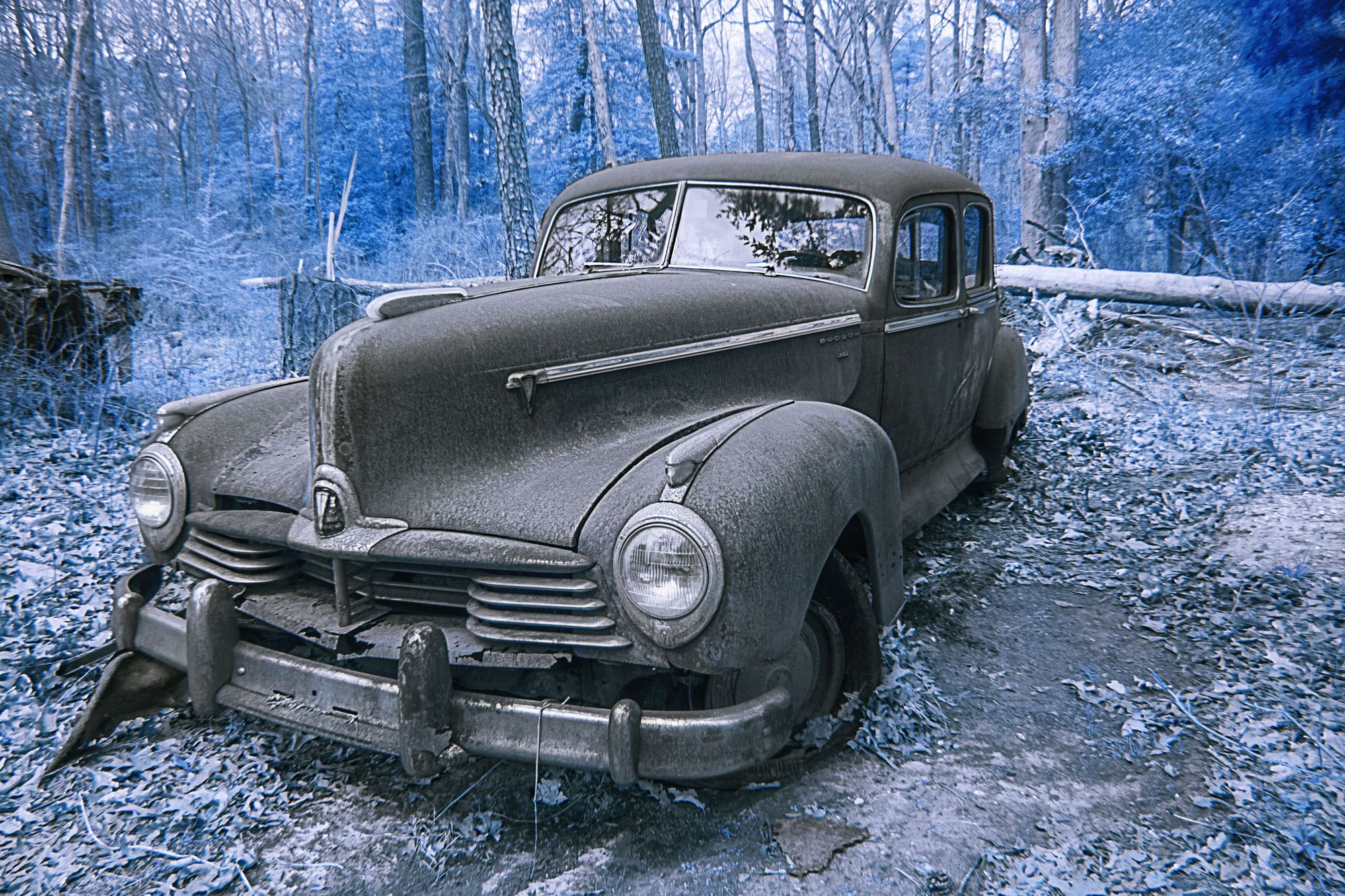
Aug 19 |
Reply |
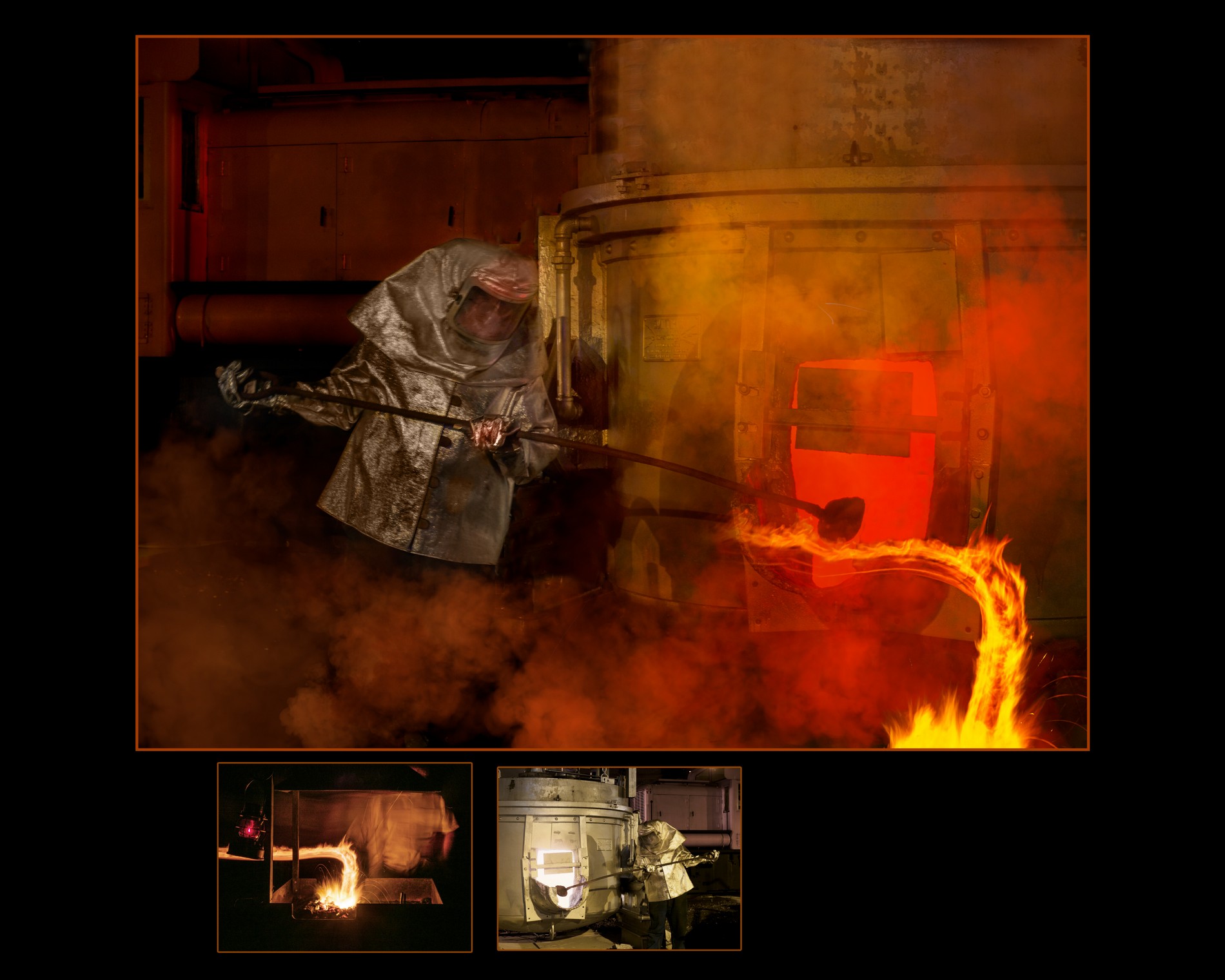
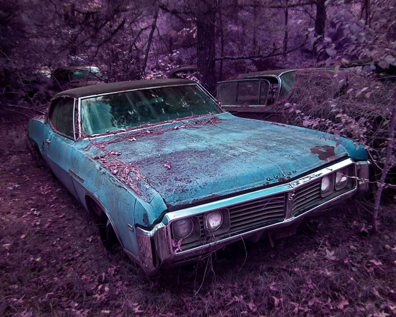
Yes, I loved the DUST
and the red of the brake light was graphic for me with the blue car and white/silver items
this one was a toy car...
hundreds of real cars, but this was a toy car, not a crash :-)
|
Aug 18th |
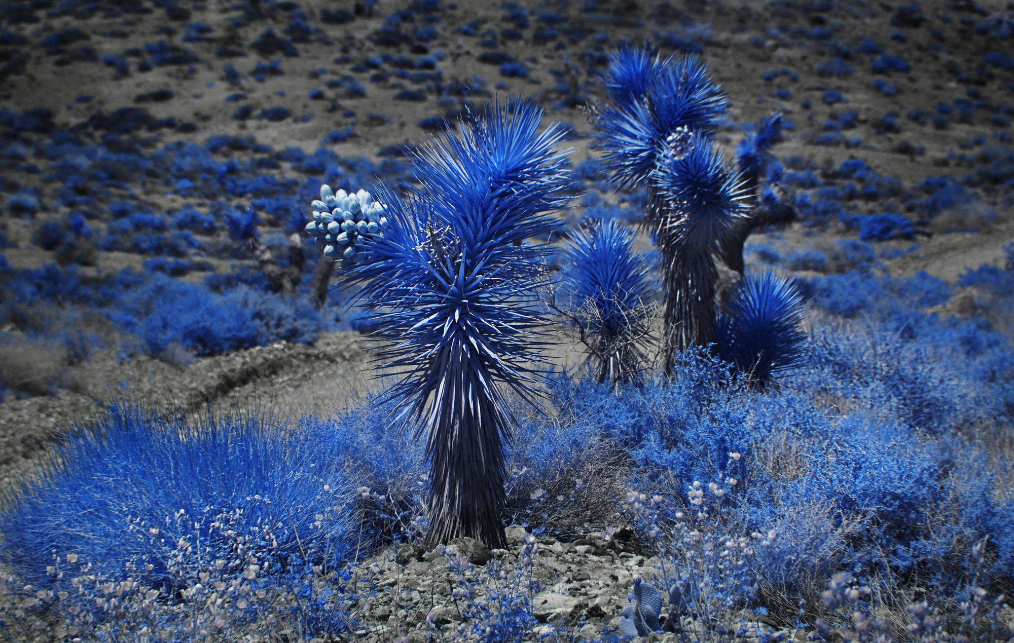
| 44 |
Aug 19 |
Reply |
No, I did not remove the color, it was just monochromatic except for the red white (silver) and blue. There is blue near the nails, and some creams and blues in the background. |
Aug 18th |
| 44 |
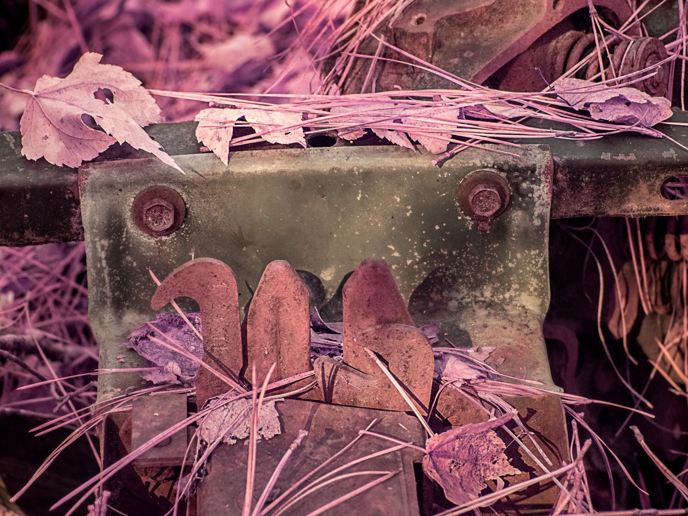
Aug 19 |
Reply |
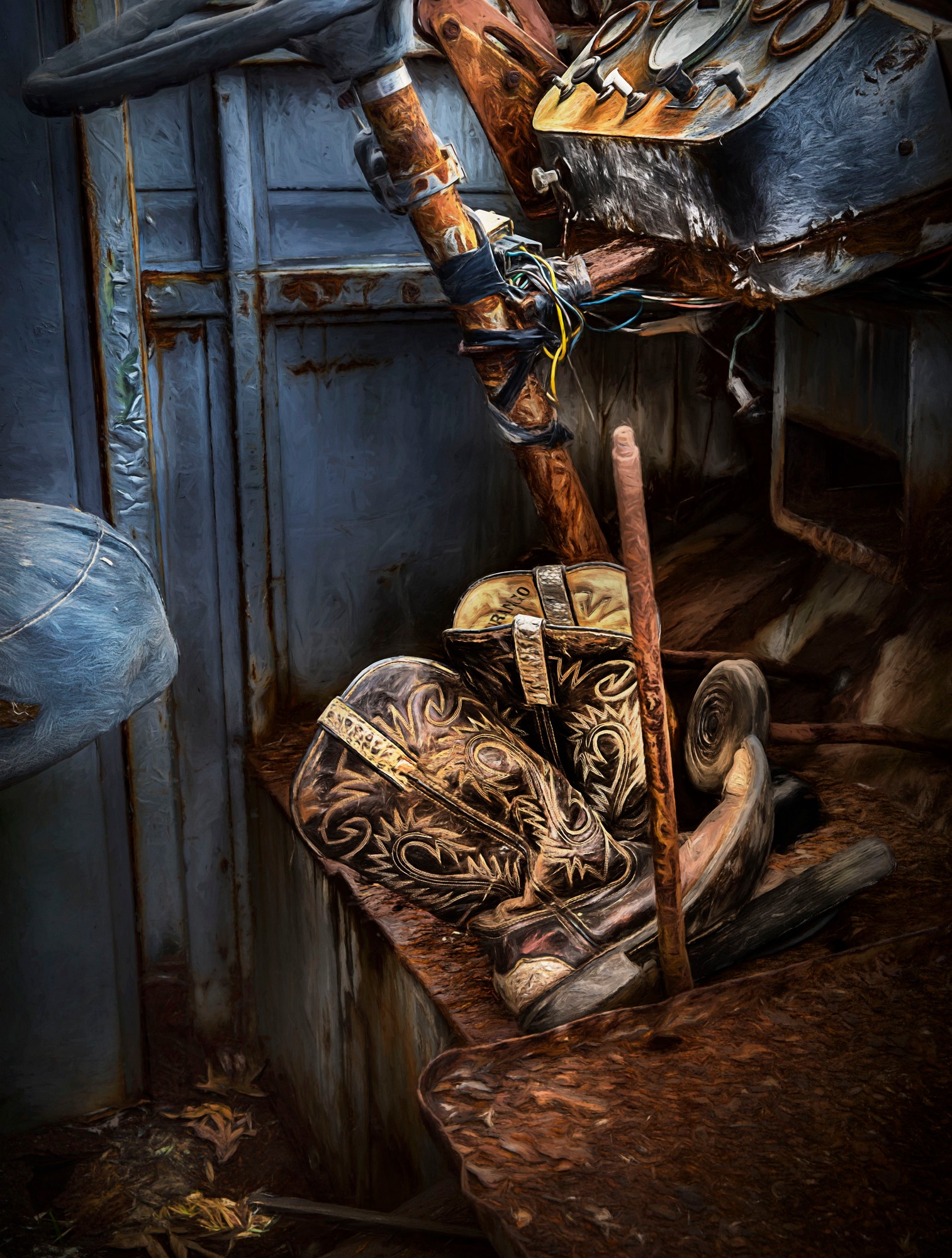
Brad, The place is chock full of photo ops! You never know what will be there next!
Tom and I are leading a workshop to Old Car City (and an abandoned denim factory and a train museum) in November. We will shoot during the day at OCC twice -- and light paint one evening. I could stay a month there and not run out of compositions and images to take. |
Aug 18th |
| 44 |
Aug 19 |
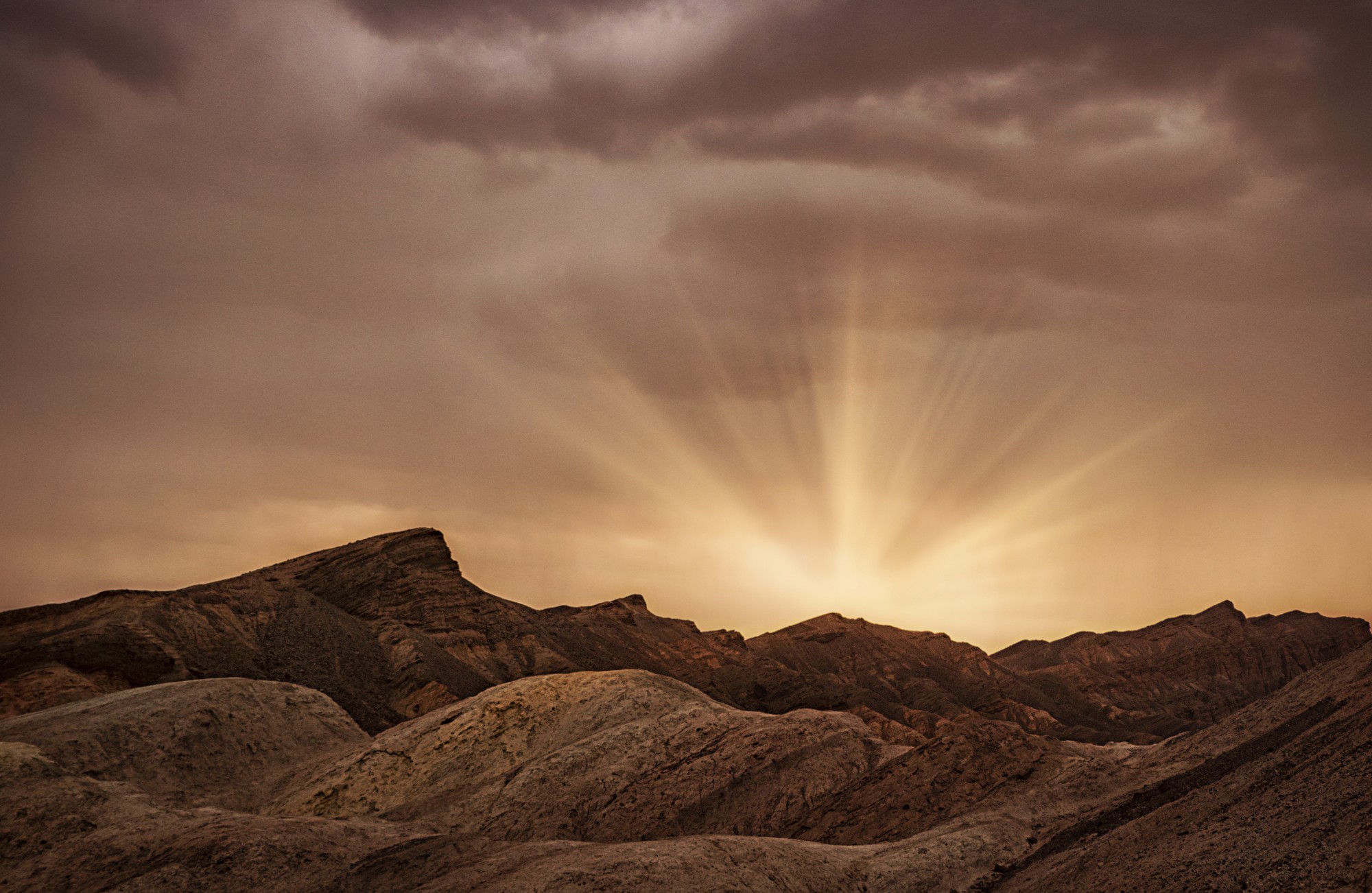
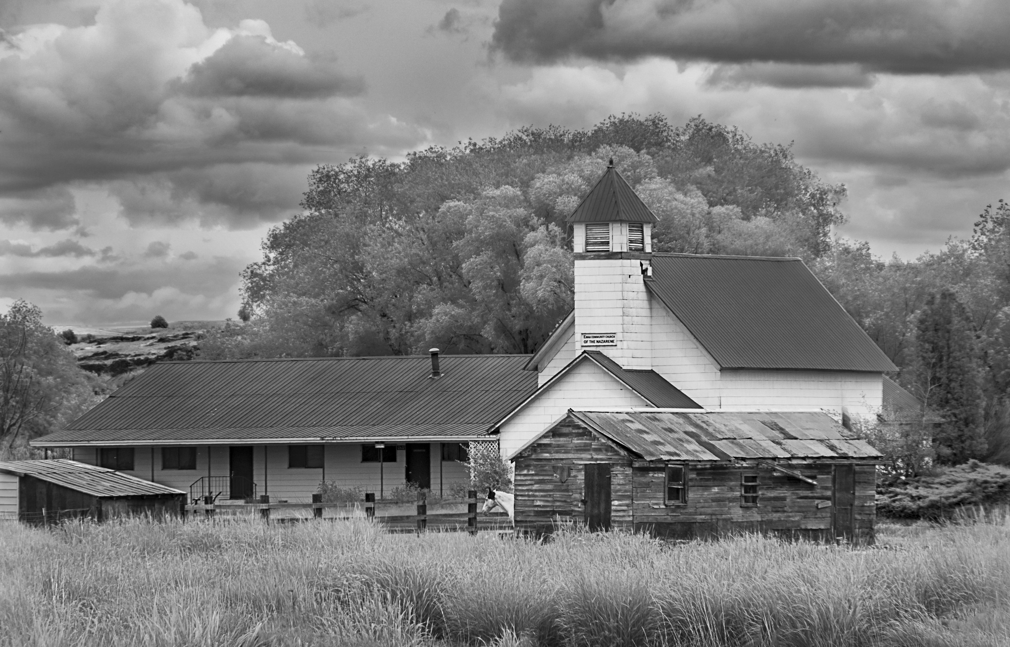
Comment |
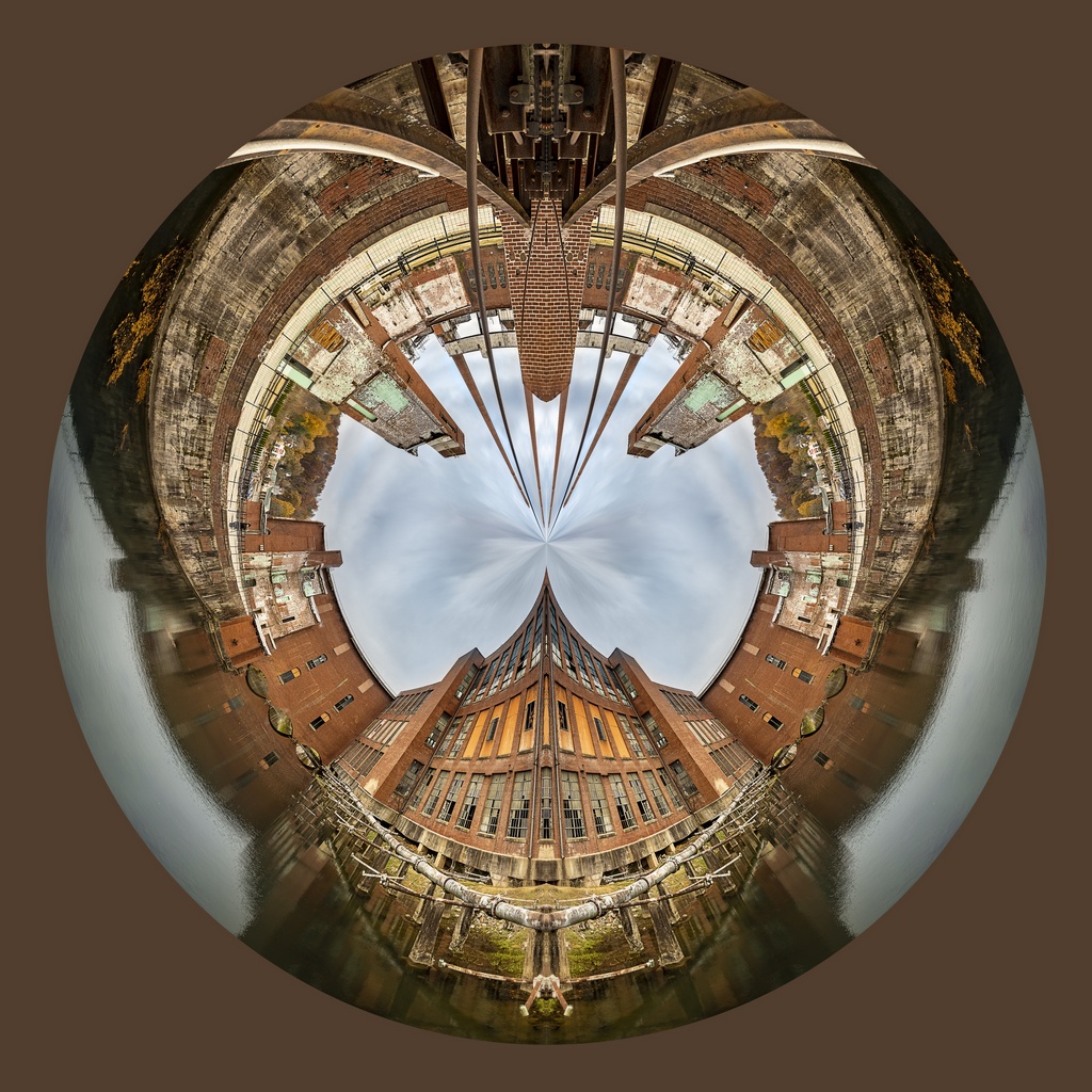
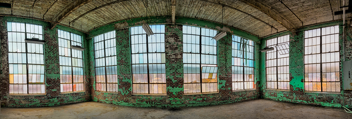
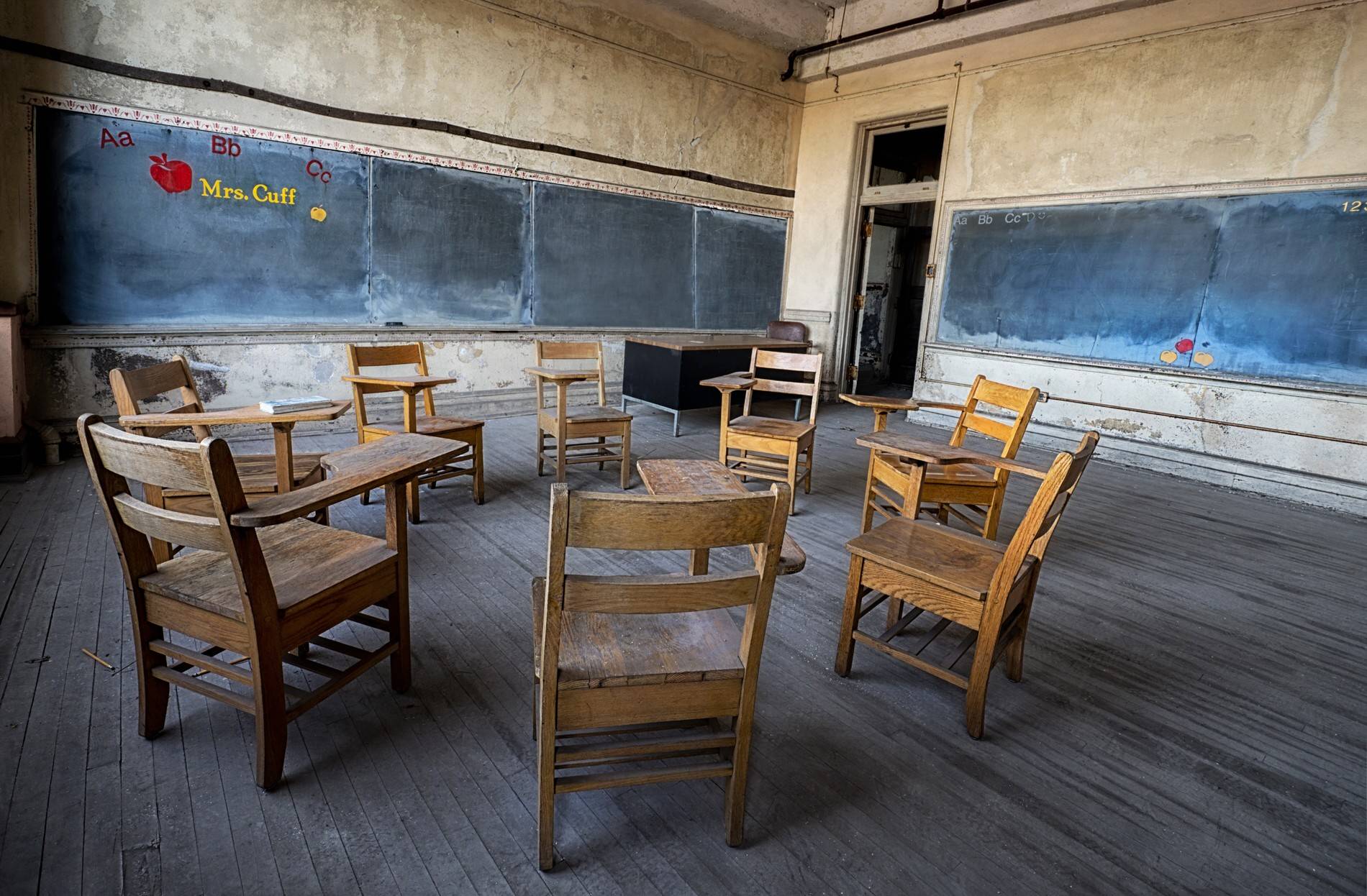
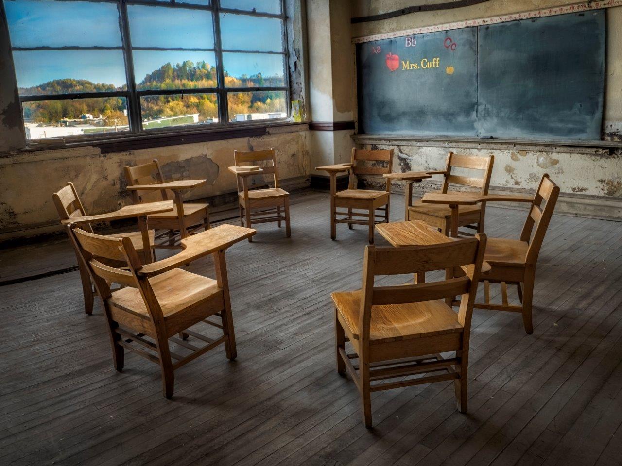
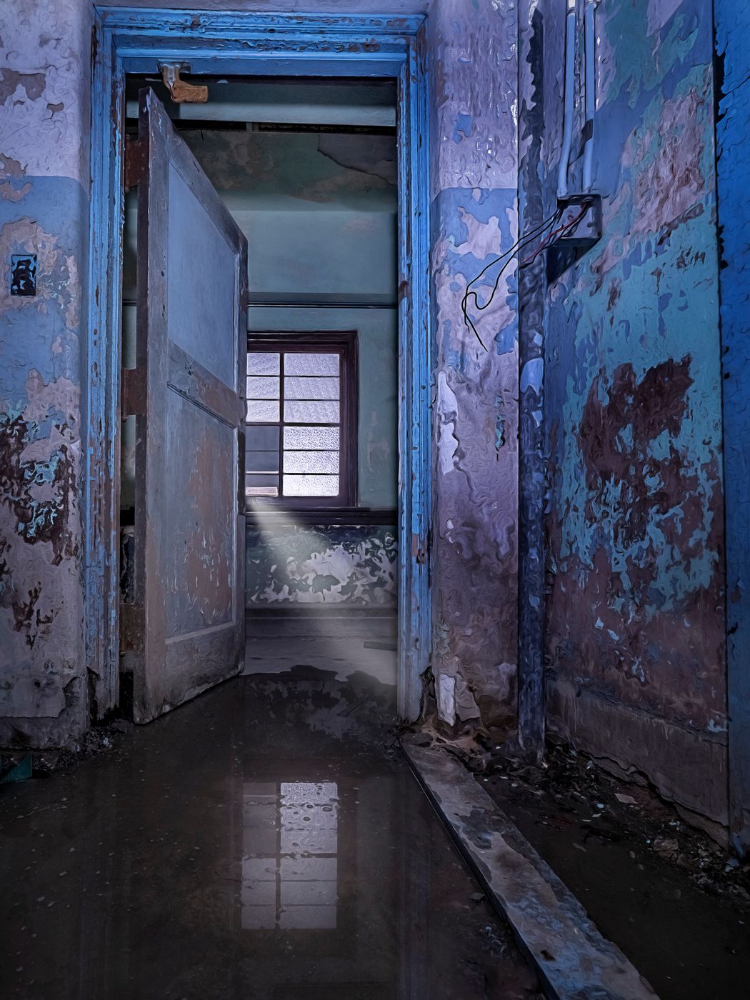
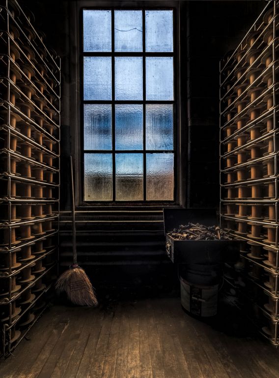
The tone mapping is stellar here! The mountains look realistic and the tones inside are well done. The cross adds to the scene.
The camera is not quite square to the window. I would also crop out the red cushion/rug n the lower right as well as the vertical in the upper right. |
Aug 14th |
6 comments - 5 replies for Group 44
|
| 63 |
Aug 19 |
Comment |
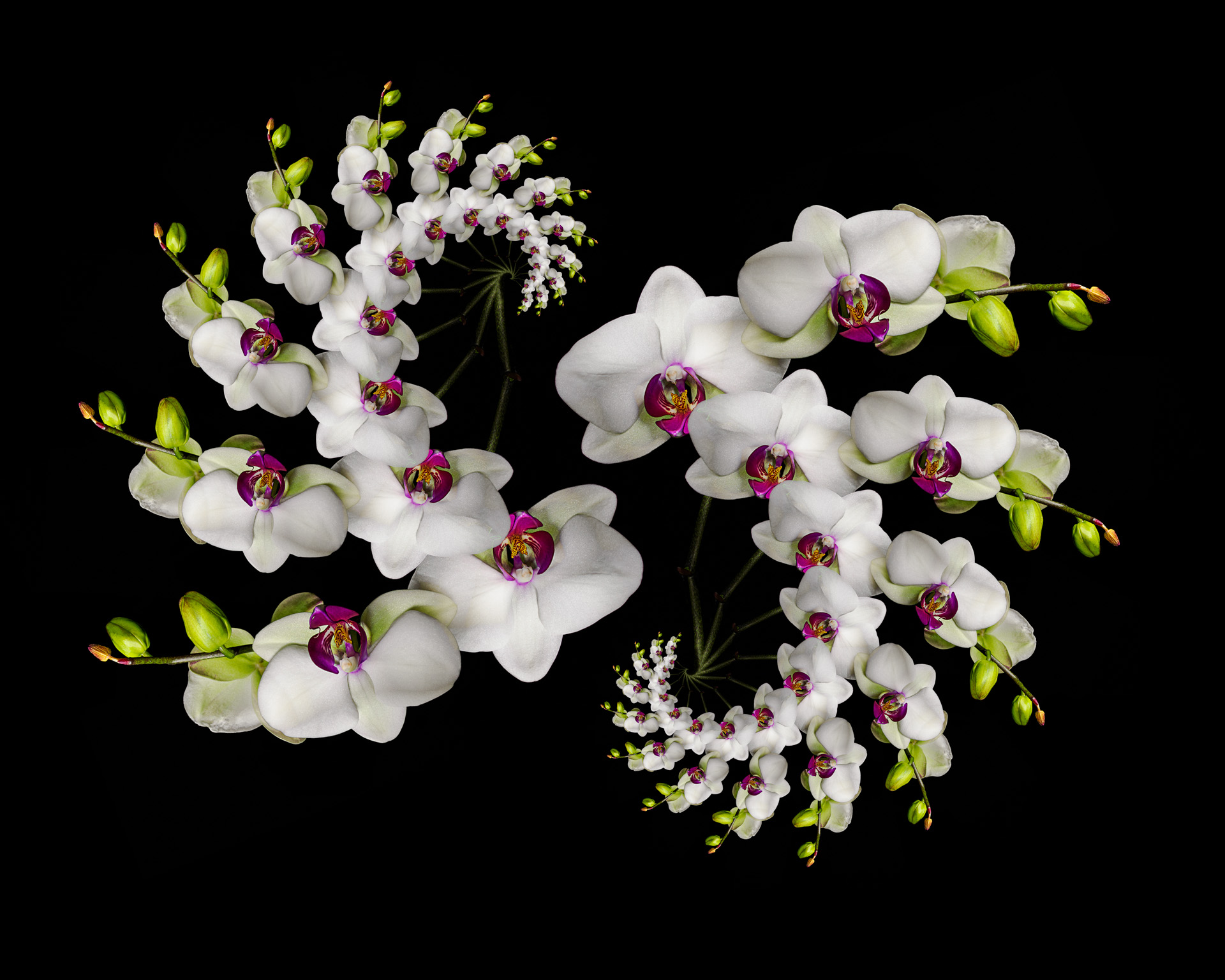
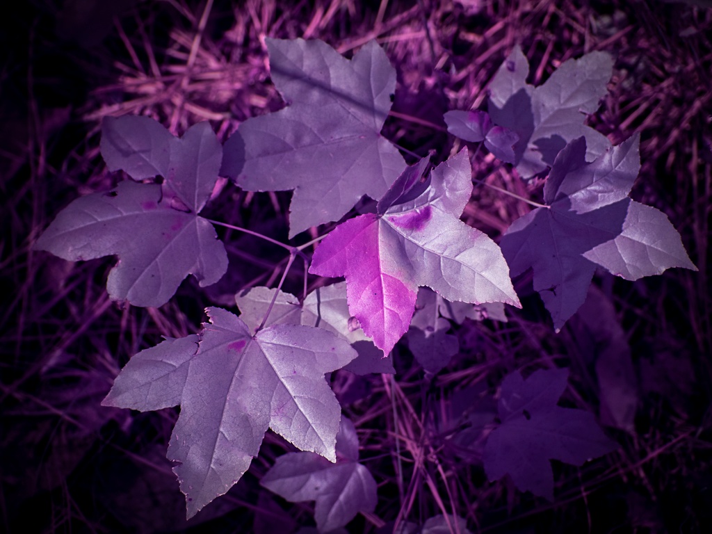
missing my macro group, had to check in. Love the yellow and purple! The bottom 2/3 holds my interest, you might crop more off the top.
regarding the PS conversation
I use a brush quite often to lessen or remove distractions
two new layers, one opacity set to 20% and the other the blend mode changed to color. I then paint on each layer to paint over areas that are too bright, too distracting or have other colros... |
Aug 18th |
1 comment - 0 replies for Group 63
|
| 79 |
Aug 19 |
Comment |
visiting from another group
just love this!!
some blurs are just awesome!
The bokeh adds, but perhaps tone down the bright ones so that we can really have some whimsy time with the butterfly |
Aug 18th |
1 comment - 0 replies for Group 79
|
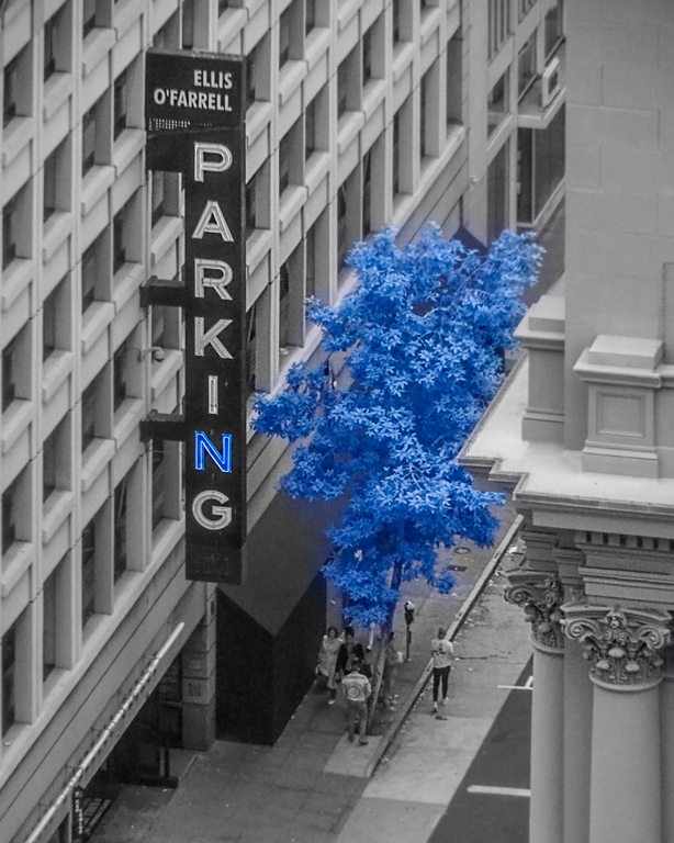
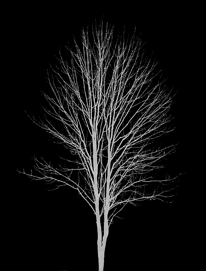
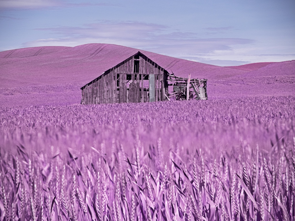
| 91 |
Aug 19 |
Comment |
I love the leading line! It draws you right thru the frame to the gazebo. And the negative space with the sky and the vertical composition help to make this a strong image.
Thanks for details like this "converted Nikon D90 (@665nM)"! We are all here to learn and that helps!
How did you select your WB in camera?
What did you use to swap channels? |
Aug 18th |
| 91 |
Aug 19 |
Reply |
Thank you for providing the SOOC versions. Everyone let's try to submit the SOOC each month, if you have n intermediate send that too, and of course the final version
Thanks! |
Aug 18th |
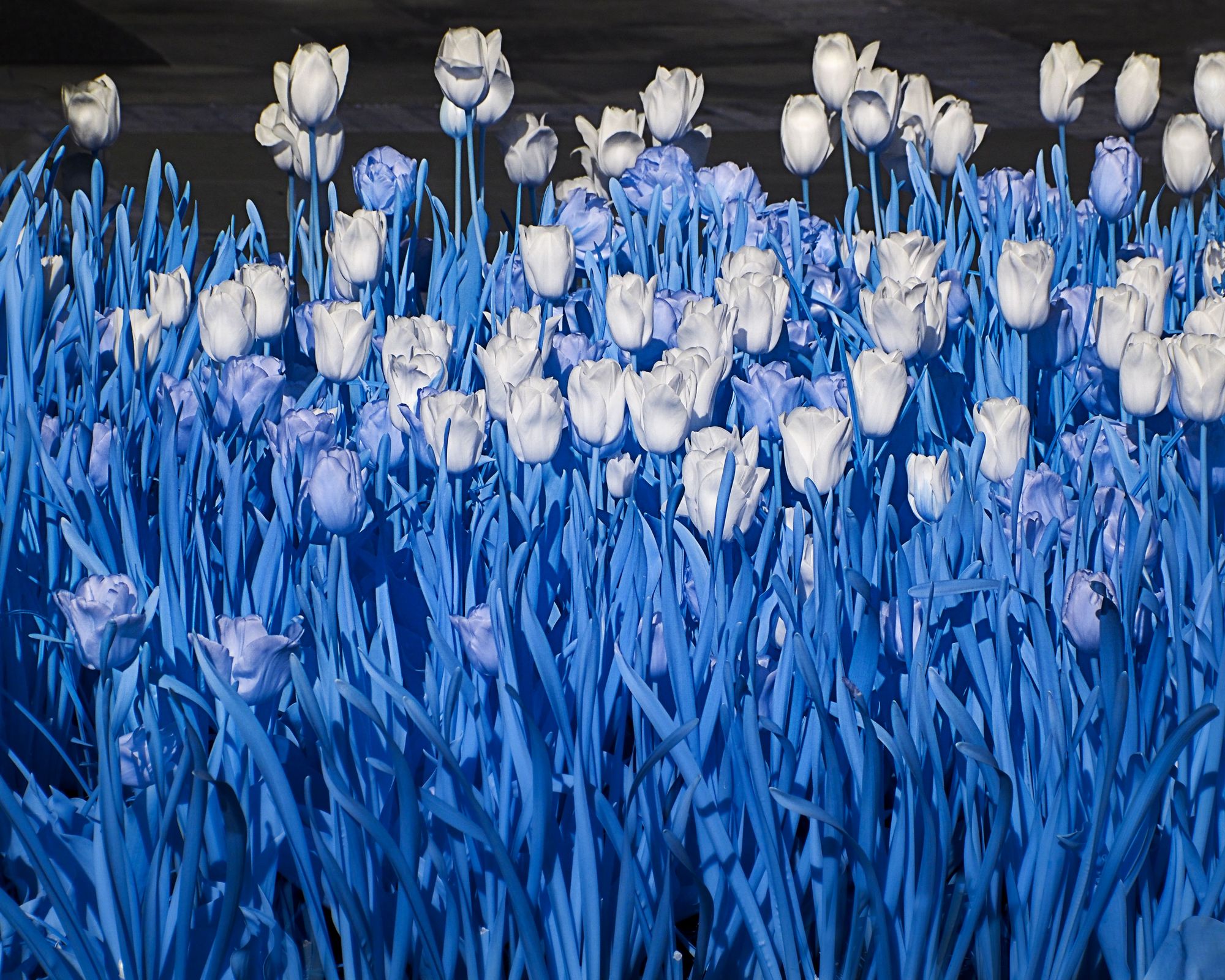
| 91 |
Aug 19 |
Comment |
I like the scene!
Did you try any distortion correction to straighten the vericals in LR?
I like the explanation. I actually love the orig 2 version
but can see the trees in the final version enticed you to show off the IR trees.
There is some haloing and chromatic aberration in the tree-sky areas, especially the upper left.
|
Aug 18th |
| 91 |
Aug 19 |
Comment |
Thanks for all the details Judy! Everyone, the more details about the image, IR, conversion, post-processing that you can give the more that we will all learn!
Judy I also love the supercolor 590 from LifePixell, my favorite!
"Then I send image to PS for channel swapping- I'm not at all familiar with PS but am able to apply the channel swap actions""
FYI, what Judy is referring to here...LifePixel provides actions for channel swapping! |
Aug 18th |
| 91 |
Aug 19 |
Comment |
"My camera is a converted Sony mirrorless. "
Jim, tell us more, who converted it and to what?
There are so many types of conversions.
Mine was converted by LifePixel https://tinyurl.com/Lifepixel-IR.
I did a full spectrum conversion so that I can put a visible filter back on if I wanted to bring the IR as a backup camera. I then use one of these two filters, either of which I can also convert to BW.
Filter Band:Hyper Color Infrared (470nm)
Filter Band:Super Color Infrared (590nm)
https://tinyurl.com/Lifepixel-IR and then go to start here and filter choices
see more https://www.youtube.com/watch?v=ZvVZLGg0LC8 (does not have some of the newer filter choices but is a good video) |
Aug 18th |
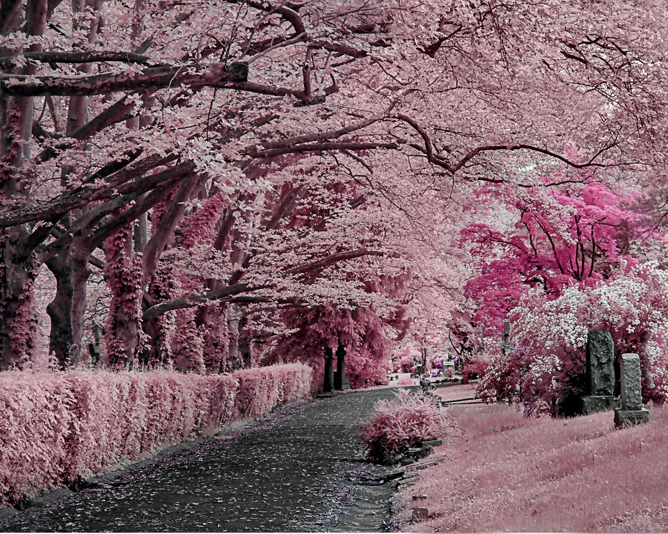
| 91 |
Aug 19 |
Comment |
I love the leading lines!
Mark, thank you for the needed distortion correction.
I am curious as to how people are converting the SOOC images to processed images, seems like desaturating and plugins are popular. |
Aug 18th |
| 91 |
Aug 19 |
Reply |
Thank you Judy for making comments about infrared radiation from the sun and time of day and chlorophyll.
In addition to the capture, the processing, we want to all learn as much about IR as possible, and everyone giving tips like this will help all of us -- and any visitors that we get. Thanks! |
Aug 18th |
5 comments - 2 replies for Group 91
|
17 comments - 8 replies Total
|