|
| Group |
Round |
C/R |
Comment |
Date |
Image |
| 41 |
Nov 18 |
Comment |
great concept! Made me laugh!
The background we well added
the ironing board and dog were lit well and added together very well. The er and the eyes are done very well!
the dogs tail looks like it is between its legs, I would either clone that out or take another image with its tail up and composite it in.
You need a little shadow on the dog, perhaps the ironing board to match the window shadow of the background.
personally I do not like the cigarette, it made me cringe to see the dog smoking, even more so than the person, but that is a personal social issue... |
Nov 9th |
| 41 |
Nov 18 |
Comment |
the colors pop and the two images have good color harmony to blend together.
I love the way that your treatment affected the red tree (and all of original 1)
The flowers in #2 to me at least, seems like they should be more in the sky, there is empty space there and they could compliment the red leaves
The vase is quite large and distracting, can you shrink it, either with transform or pinch or liquify. |
Nov 9th |
| 41 |
Nov 18 |
Comment |
An intersting set of images to blend. The moon on the sky looks good. And the balloons look well composited.
I would either add more foreground or elminiate it, the foreground is the weakest portion. |
Nov 9th |
| 41 |
Nov 18 |
Comment |
good choice of subjects and they are composited well together
I would add a color blend mode on top of all of it to tie the colors together. |
Nov 9th |
| 41 |
Nov 18 |
Comment |
I like the horse and the mane and the texture on the body -- the creativity is cool.
I wish that the background was a tad darker -- it looks too bright to me and detracts from the horse. |
Nov 9th |
5 comments - 0 replies for Group 41
|
| 44 |
Nov 18 |
Comment |
love the colors and tones and rainbow! great for handled and thank you for the info about the quirks in the new version. I love the play of light and the way that photo reads. |
Nov 30th |
| 44 |
Nov 18 |
Comment |
love the composition and clouds
the tone mapping is well done
I would crop some off of the bottom, leaving top of the rock |
Nov 9th |
| 44 |
Nov 18 |
Comment |
love the rainbow -- how cool to capture it!
I would play with the foreground -- it is noisy and the colors look too neony.
Also try a soft light blend mode to pop the rainbow... |
Nov 9th |
| 44 |
Nov 18 |
Comment |
I love stair images, and this one is well done! Hard to do handheld and with this ISO.
The window light with the three lights adds to the image.
Have you tried Topaz denoise
-- does a good job and does not remove too much detail.
or the new Topaz A.I.Clear for noise removal |
Nov 9th |
4 comments - 0 replies for Group 44
|
| 63 |
Nov 18 |
Comment |
The composition and colors are strong and the yellow directs your eye to read it in a strong impactful way.
like the selective focus.
also a good example that even at f32 macro subjects are not sharp thru and thru which is why people focus stack (not needed here) -- demonstrates focal length and magnification relate to image depth of field |
Nov 30th |
| 63 |
Nov 18 |
Reply |
worth going back for - great image!
My monitor is calibrated for subtle shades of grey, many people lose the last 10% towards black. A tip for making sure that you don't have "holidays" is to put a temp levels layer and make it lighter and these just pop out, then delete the layer as it is only a visualization tool |
Nov 30th |
| 63 |
Nov 18 |
Reply |
weird, it added a photo from another month -- this is the one that shows the cloning issues, sorry. The image is worth going back to and fix those or selecting the background and blur average |
Nov 30th |
 |
| 63 |
Nov 18 |
Comment |
I love the vertical and the placement of the flower and center. the s add interest. The colors are good and the lighting is impactful. It is cropped a little too tight on the left side and there is one petal (left middle) that has a bright spot that I would tone down. Wonderful! |
Nov 30th |
| 63 |
Nov 18 |
Comment |
wow!
love this with selective colors
water drops add a lot
well done!
darken the background and watch for smudges |
Nov 9th |
 |
| 63 |
Nov 18 |
Comment |
you can get rid of the artifacts by selecting the background and doing a blur average
or perhaps cloning
or painting with blue |
Nov 9th |
 |
| 63 |
Nov 18 |
Comment |
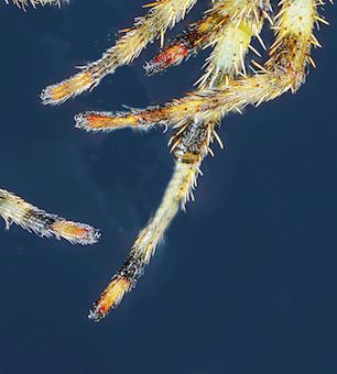
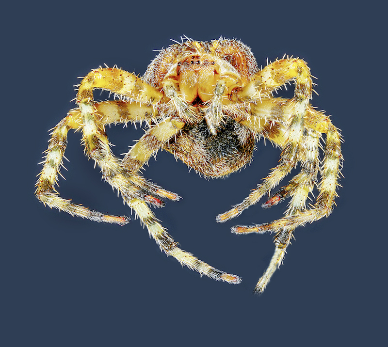
cool creepy spider!
Stacking was done VERY well! wow!
There are some cloning artifacts left behind
|
Nov 9th |
 |
| 63 |
Nov 18 |
Comment |
The body is well handled and the eye and proboscis are very sharp - love the detail.
The background is soft and works well.
The angle seems off to me, perhaps rotate it
and I wish that the antennae were sharp, perhaps take a second photo focused on the antennae and mask them in |
Nov 9th |
6 comments - 2 replies for Group 63
|
15 comments - 2 replies Total
|