|
| Group |
Round |
C/R |
Comment |
Date |
Image |
| 9 |
Jun 18 |
Reply |
|
Jun 21st |
 |
| 9 |
Jun 18 |
Comment |
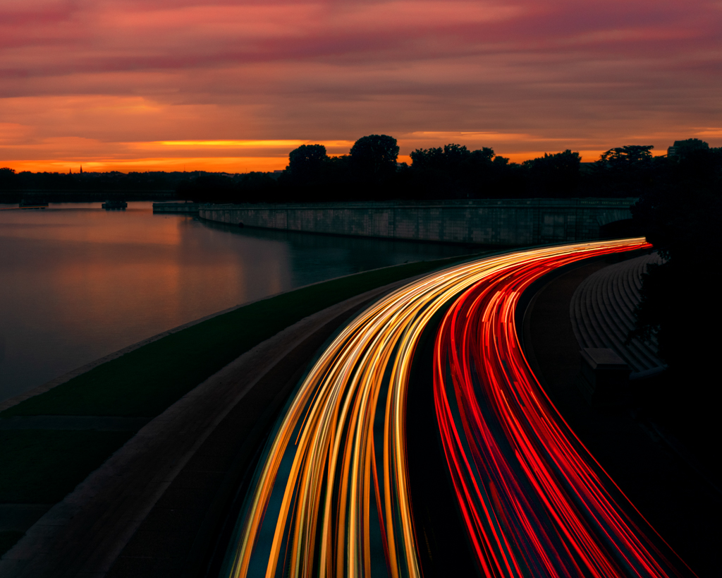
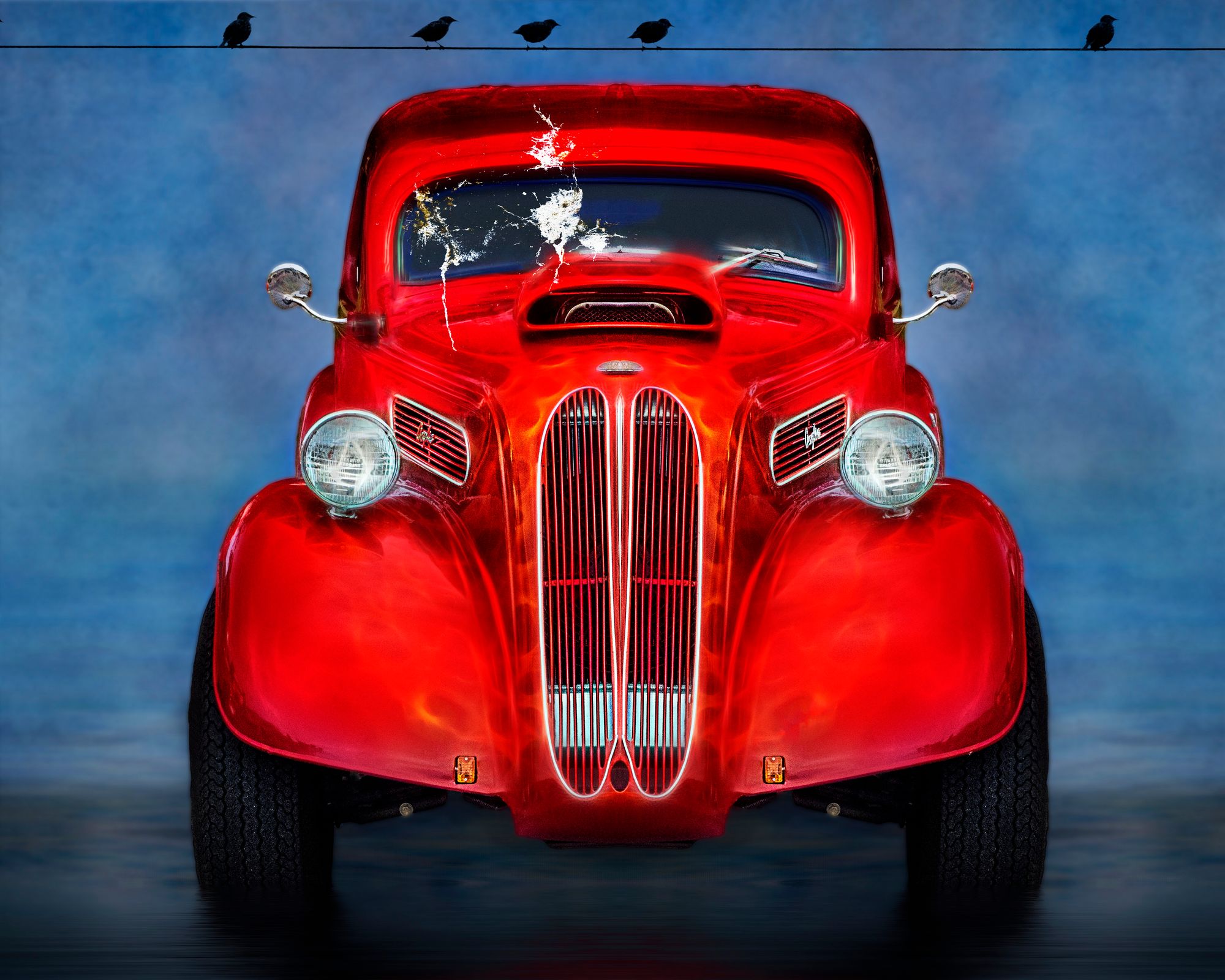
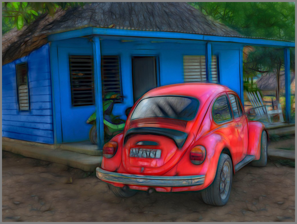
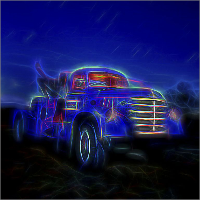
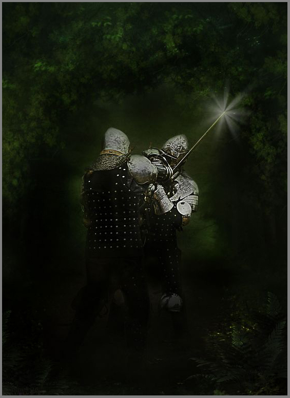
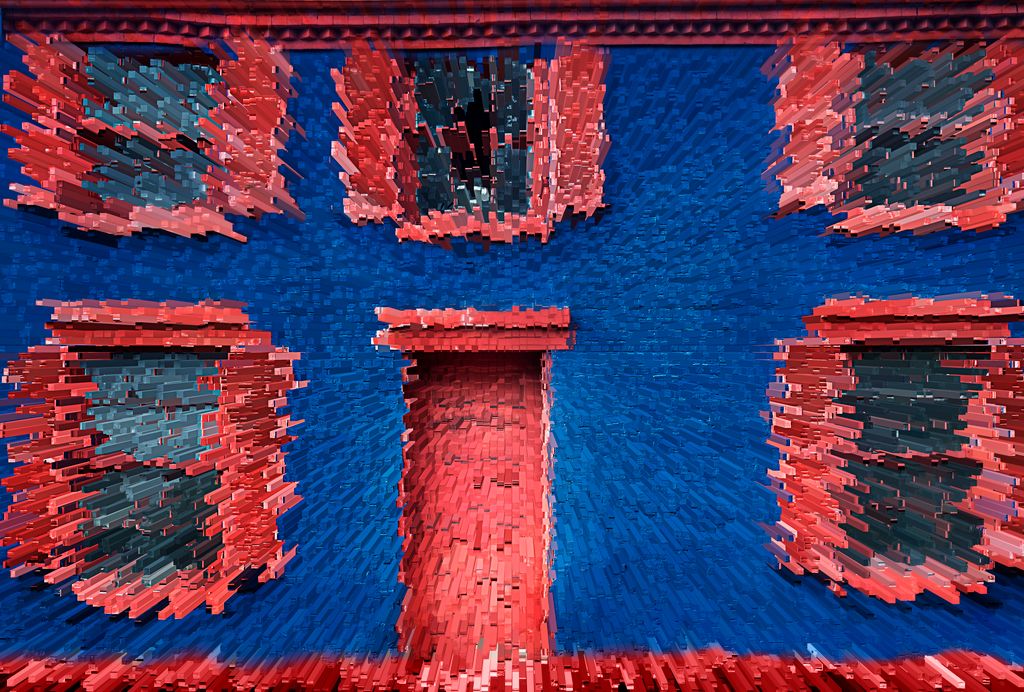
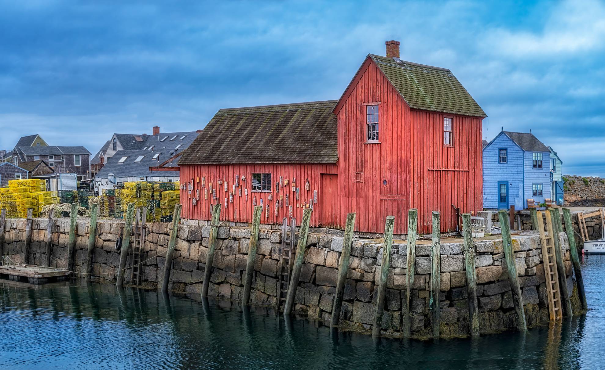
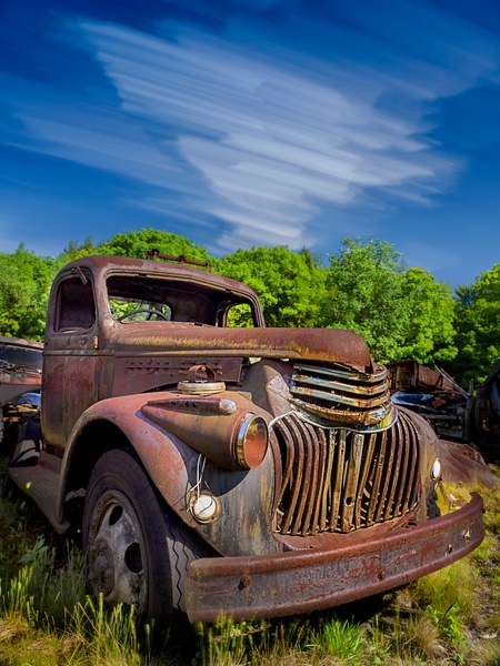
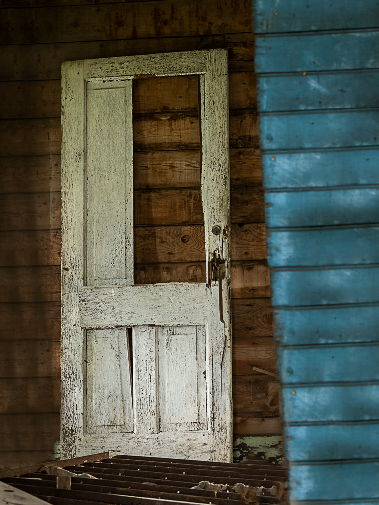
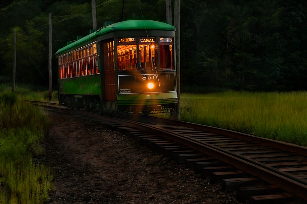
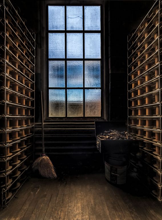
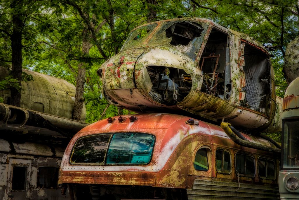
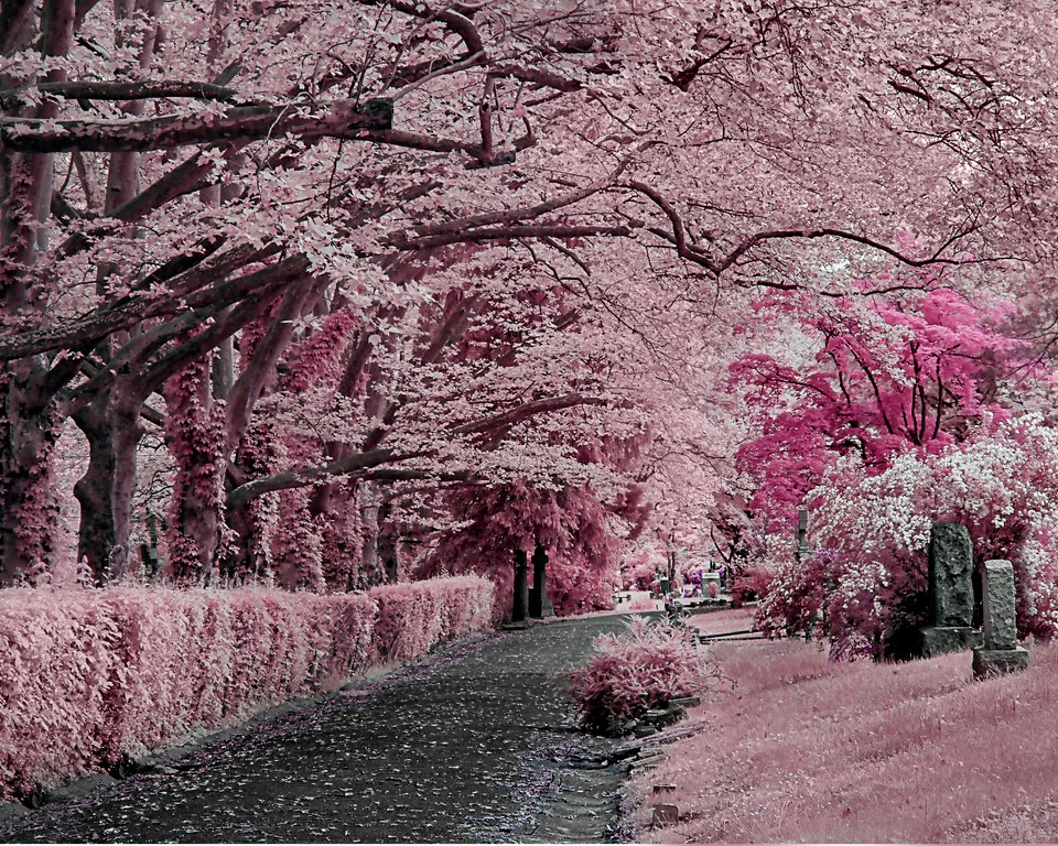
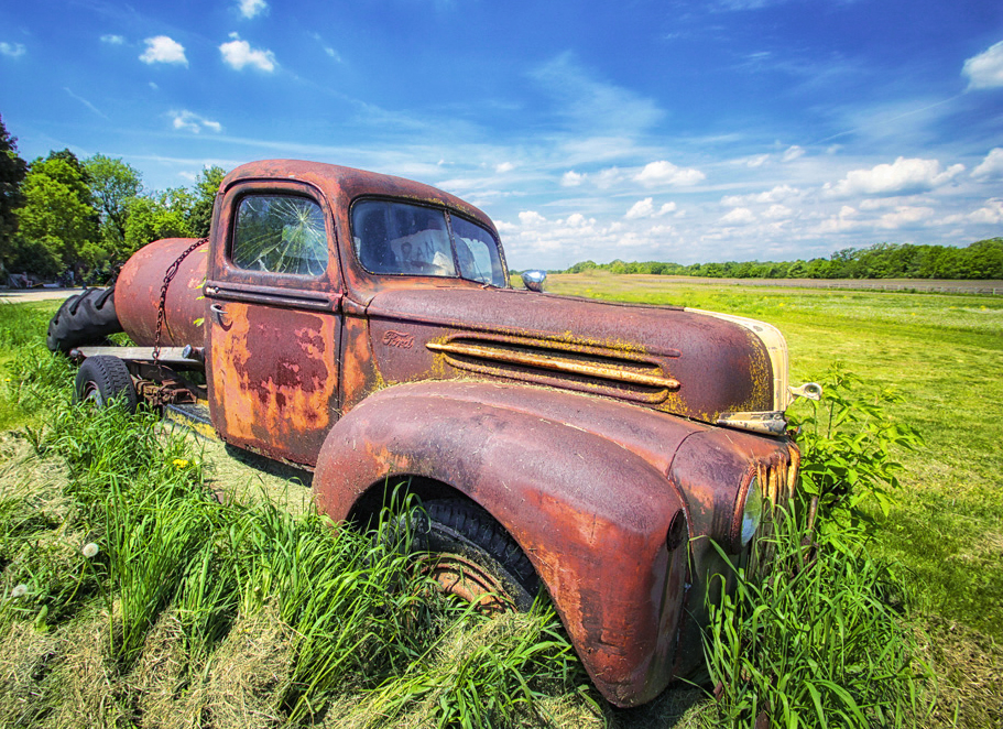
visiting from group 63, you mentioned this cool old truck in 63
I love old trucks! nice find good capture and great day to be there! You chose a great lens and got close to the truck! Sweet!
It seemed like it needed a polarizer to make the red pop and prevent the glare -- and some dehaze in ACR. I added some dehaze and a touch of contrast
then topaz glow auto shine
then Nik
polarize
and glamour glow
lastly cropped to remove the distraction and make the composition stronger removing the truck from the center
|
Jun 21st |
1 comment - 1 reply for Group 9
|
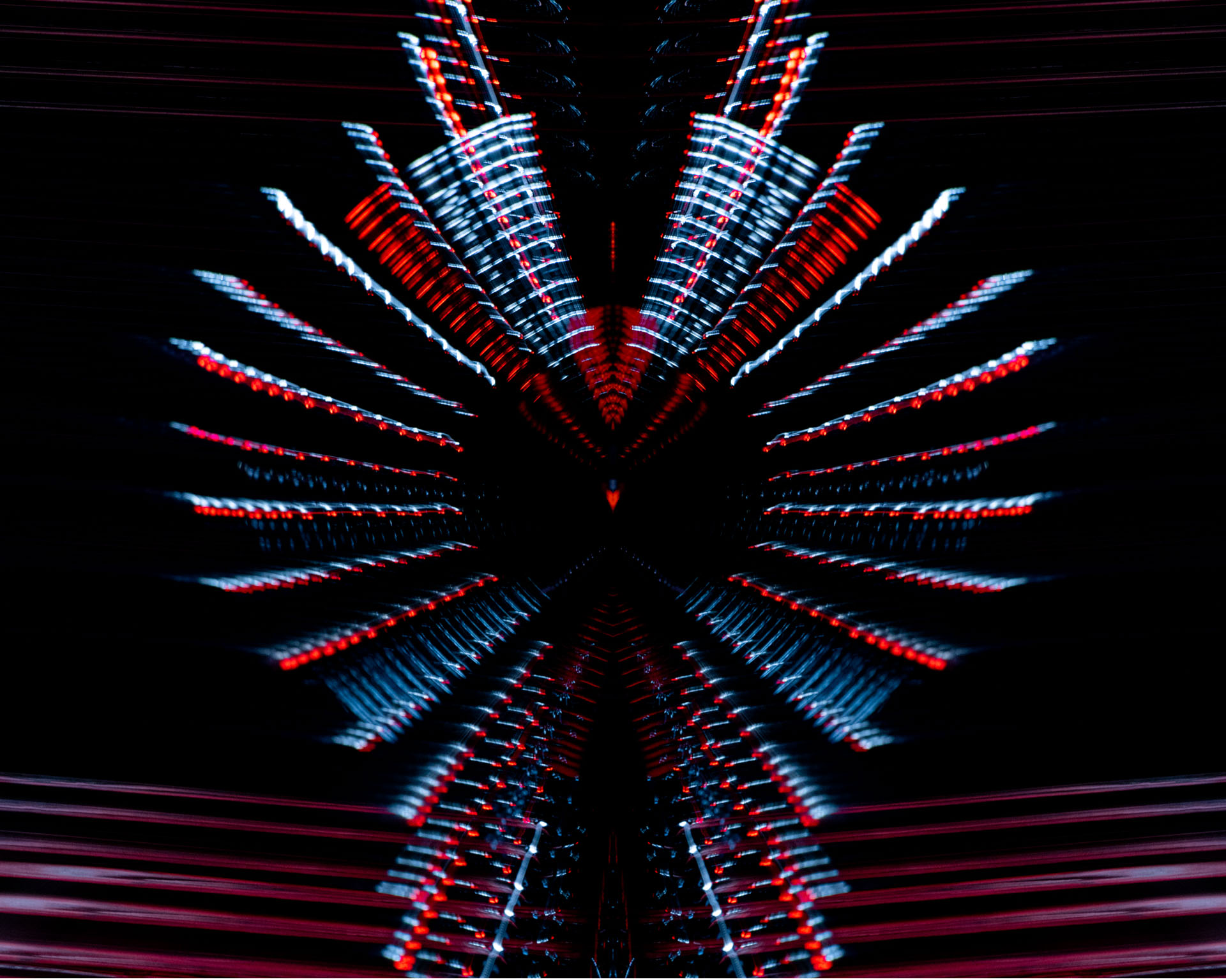
| 41 |
Jun 18 |
Comment |
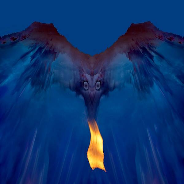
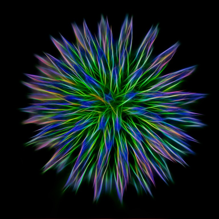
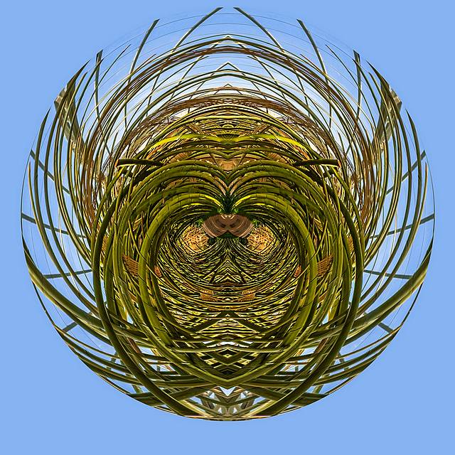
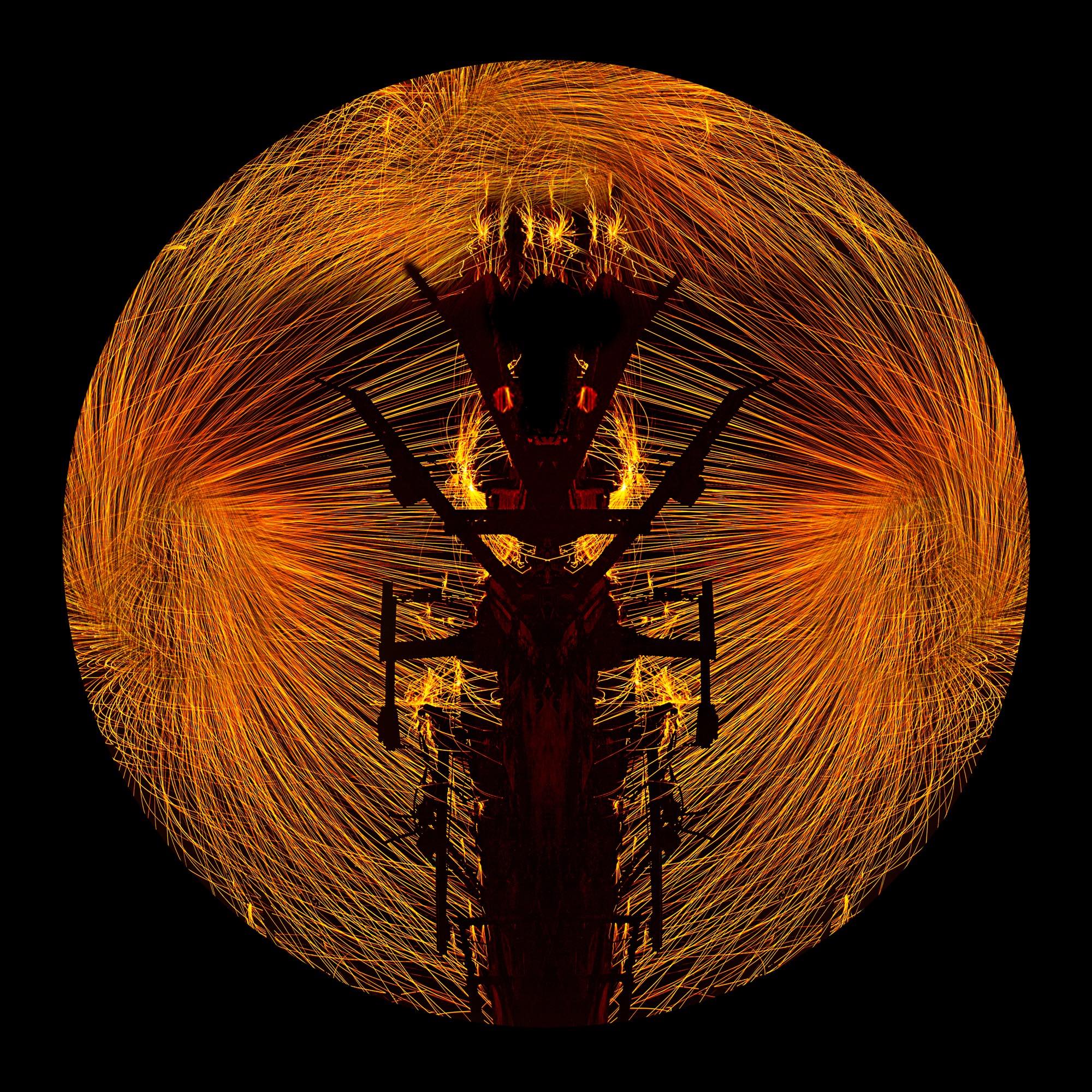
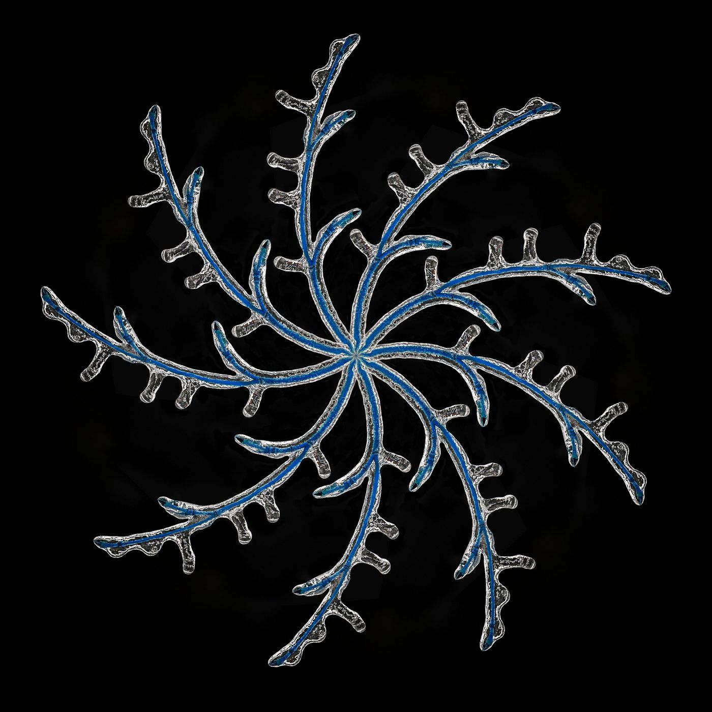
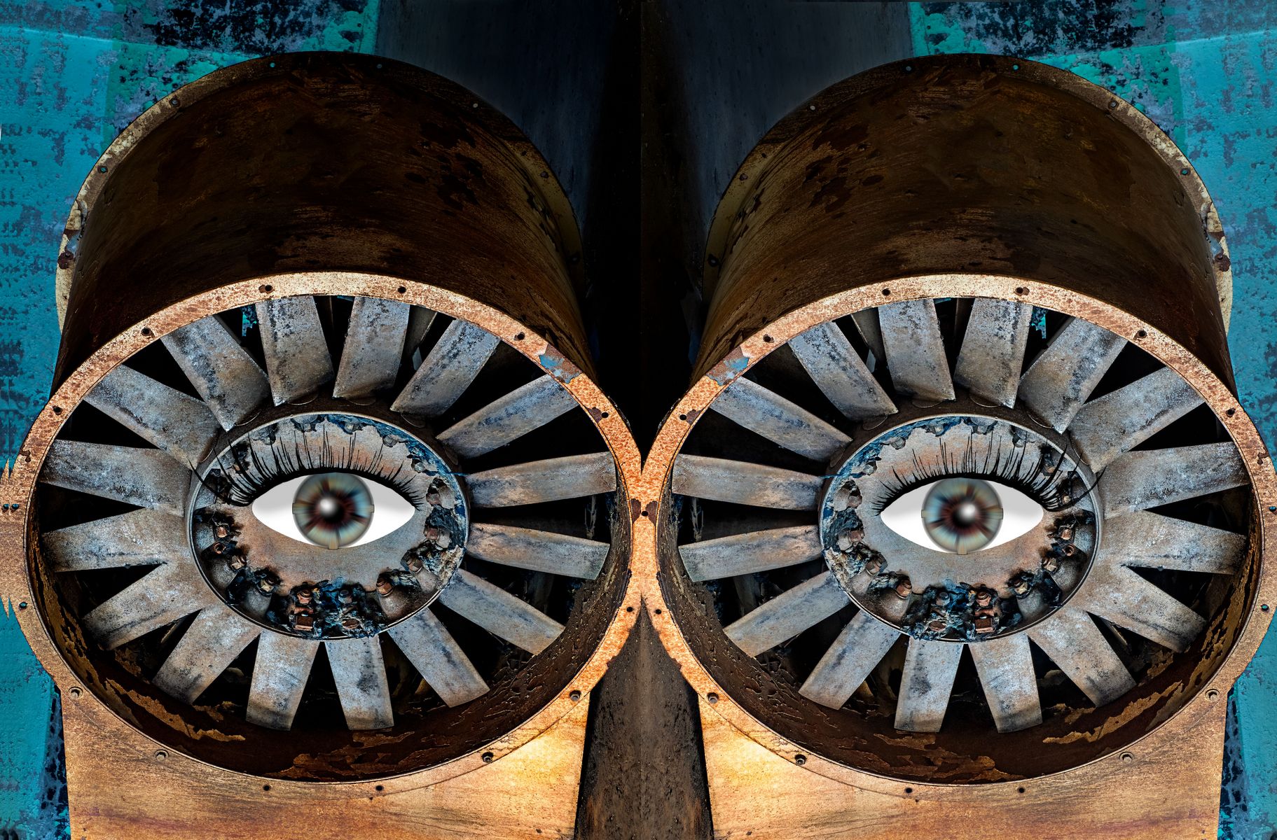
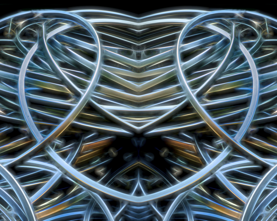
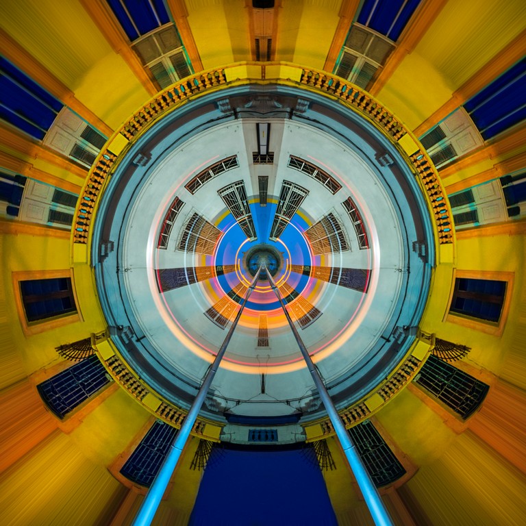
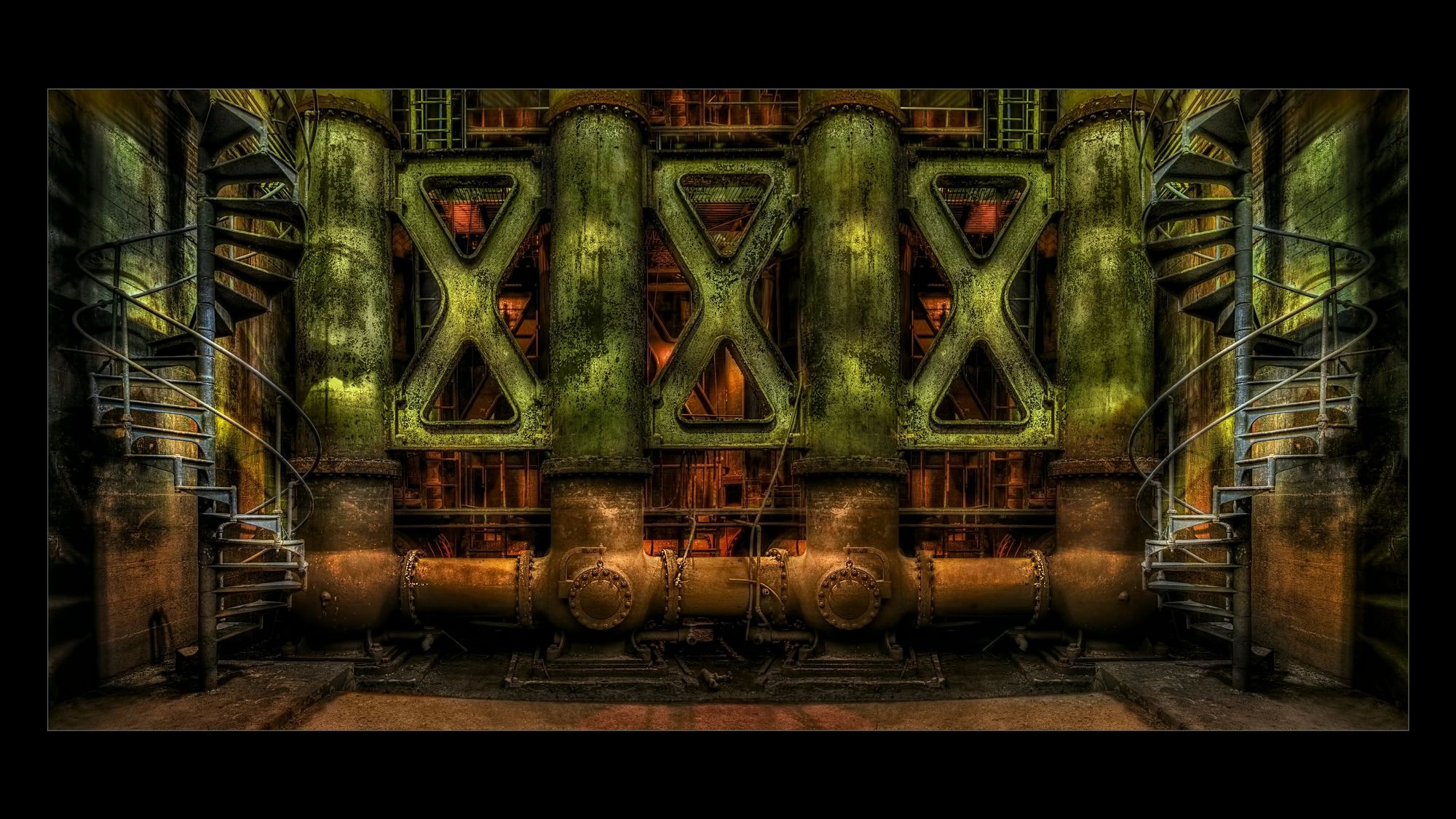
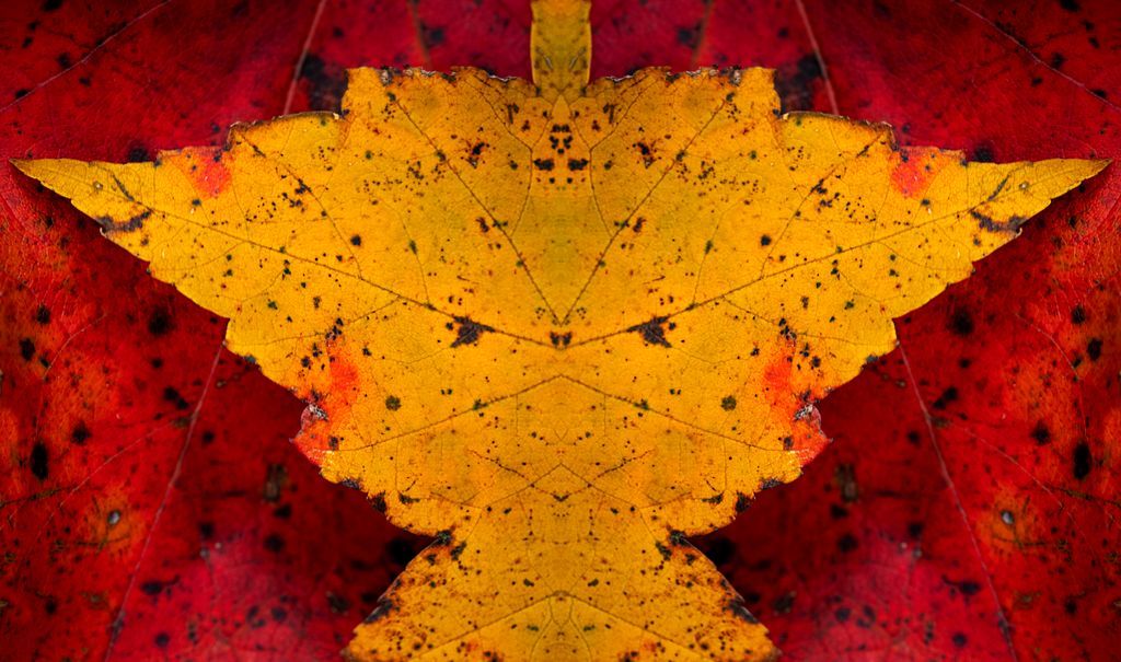
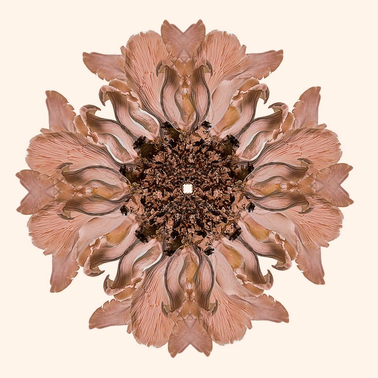
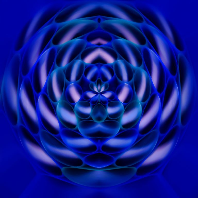
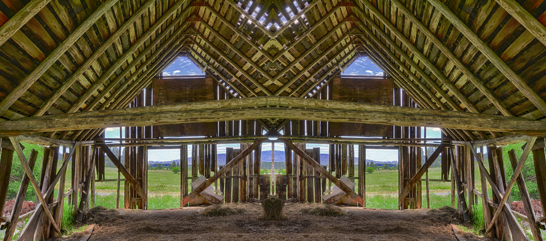
added canvas, 100% width
duplicated layer
transform, flip
added canvas again, 100% height
duplicated layer
transform, flip
Filter - Distort - Polar Coordinates
Polar to Rectangular
Topaz Glow; Graphic |
Jun 21st |
| 41 |
Jun 18 |
Reply |
good reminder
thanks |
Jun 21st |
| 41 |
Jun 18 |
Comment |
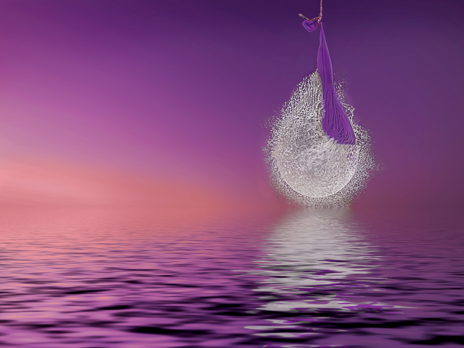
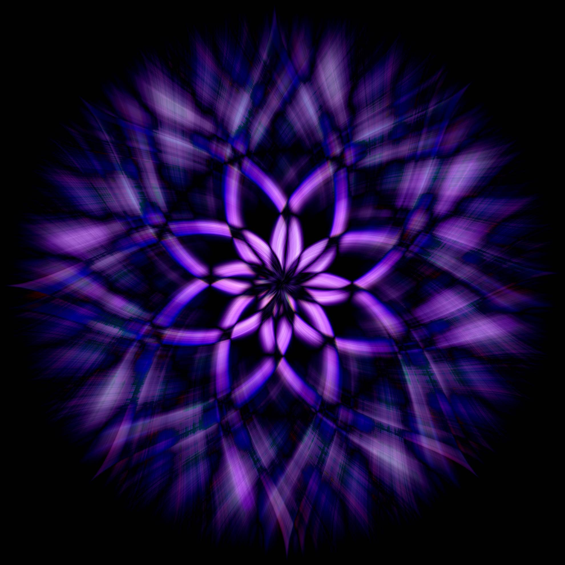
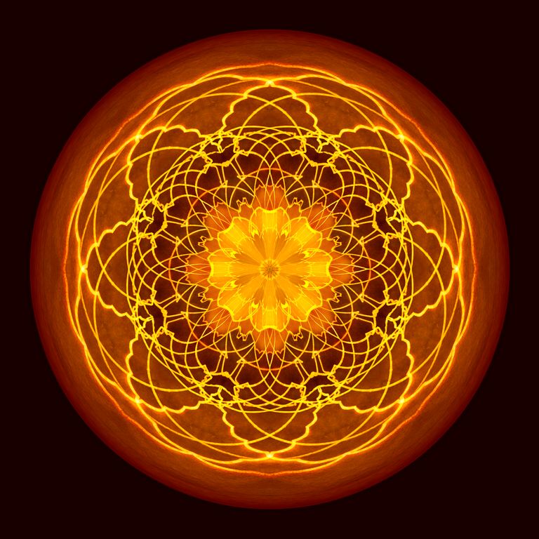
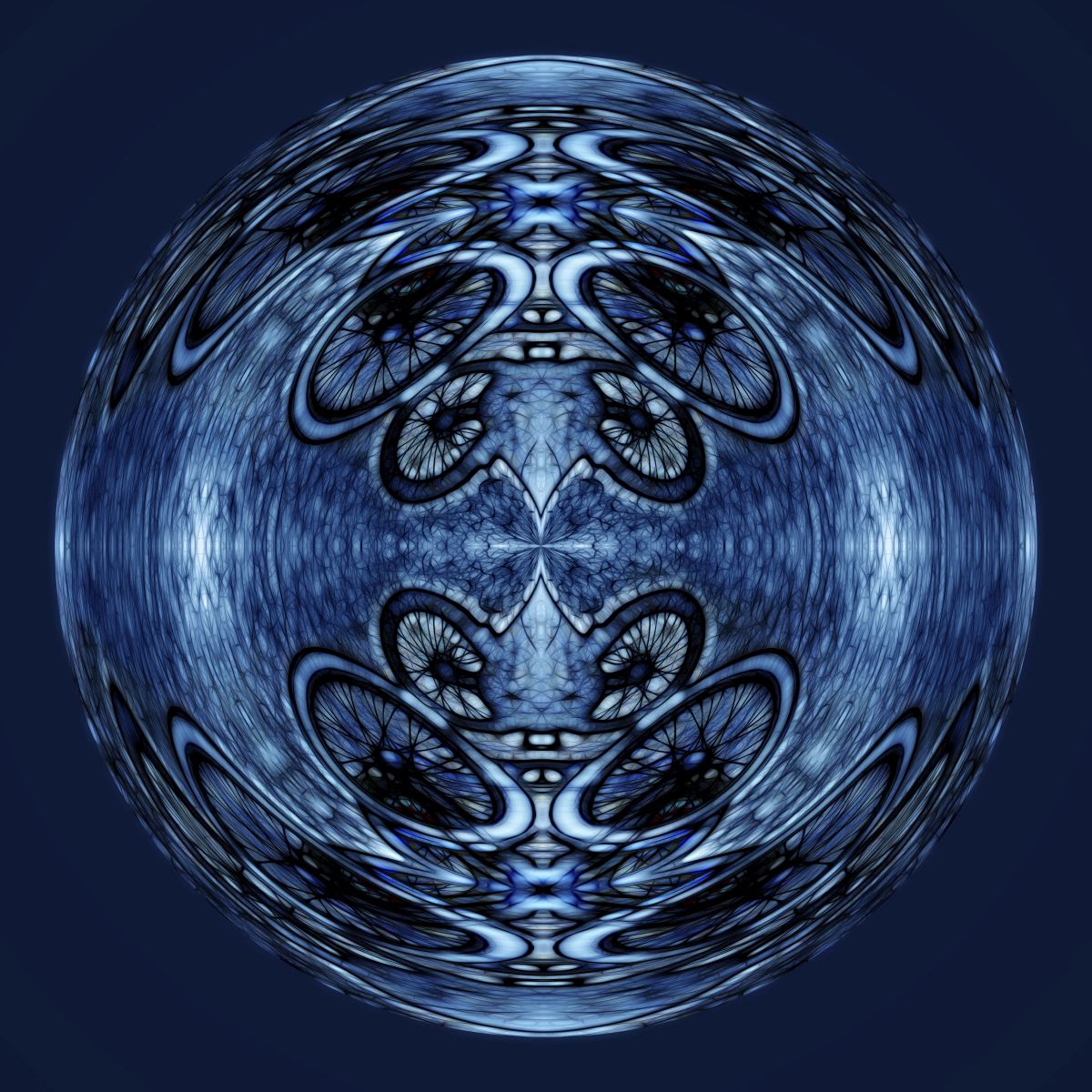
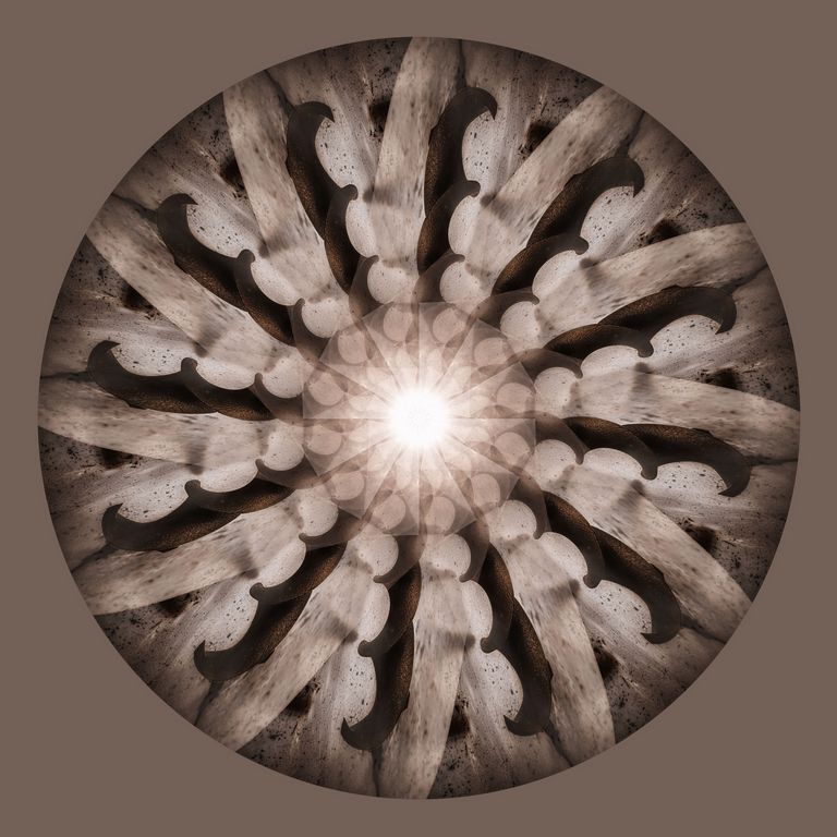
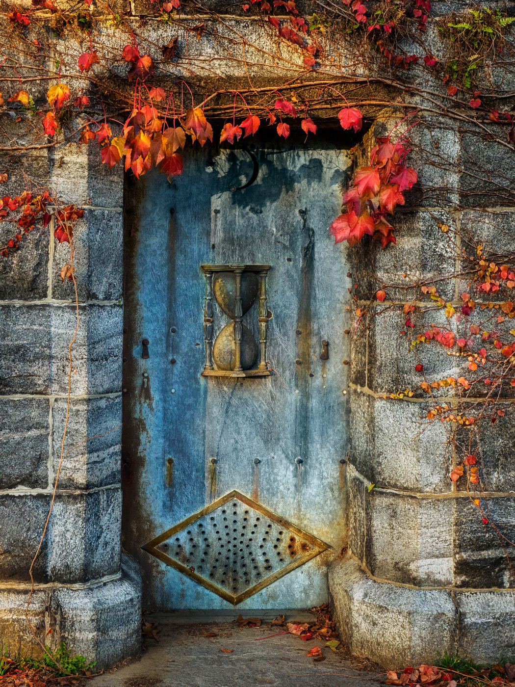
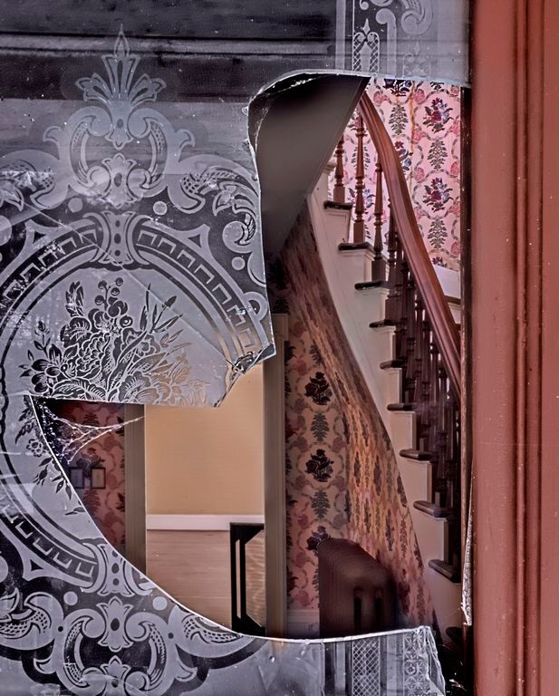
Carolyn, this is wonderful! Looks like a Tiffany stained glass window! A very effective use of Glow!!! This looks like it should be hanging in a museum.
I like the purpler version a tad more than the blue version.
I just love this, for me personally the only thing I would do is lose the red stroke, replace it with dark grey or something neutral, I find the red draws your eye away from the amazing image. |
Jun 11th |
| 41 |
Jun 18 |
Reply |
Brad...
We just love, love, love the Topaz products. We use Clarity or Adjust on the majority of our images. I use glow a lot too, sometimes dramatic like Carolyn did, but other times subtle.
Enter the discount use code breaphotos for 15% off Topaz products http://tinyurl.com/topaz-cuchara
For Topaz Studio plugins (I like their plugins better than their Studio but that is because I am an avid photoshop user) use this link: https://web.topazlabs.com/ref/130/ |
Jun 11th |
| 41 |
Jun 18 |
Reply |
let us know what you decide. |
Jun 11th |
| 41 |
Jun 18 |
Comment |
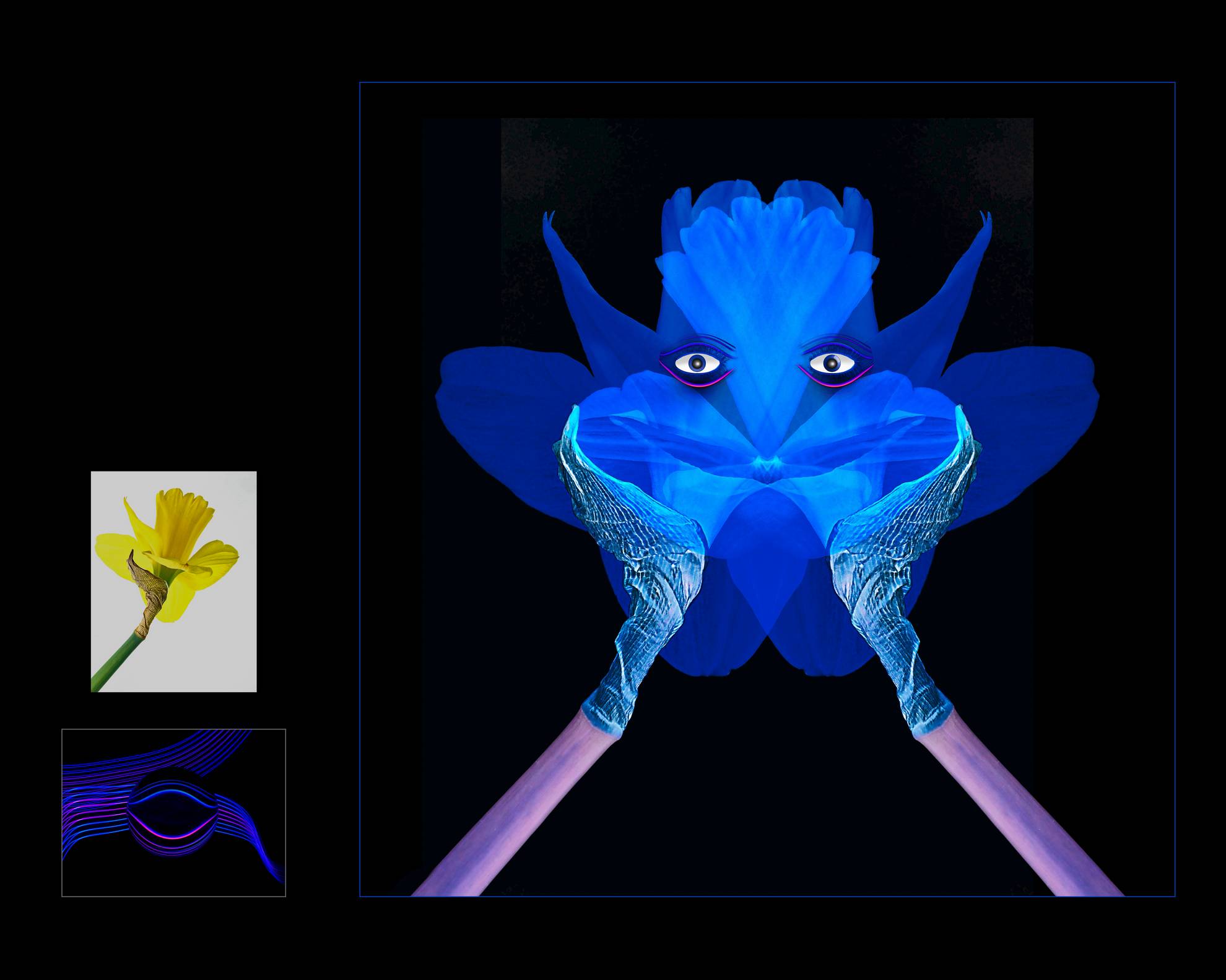
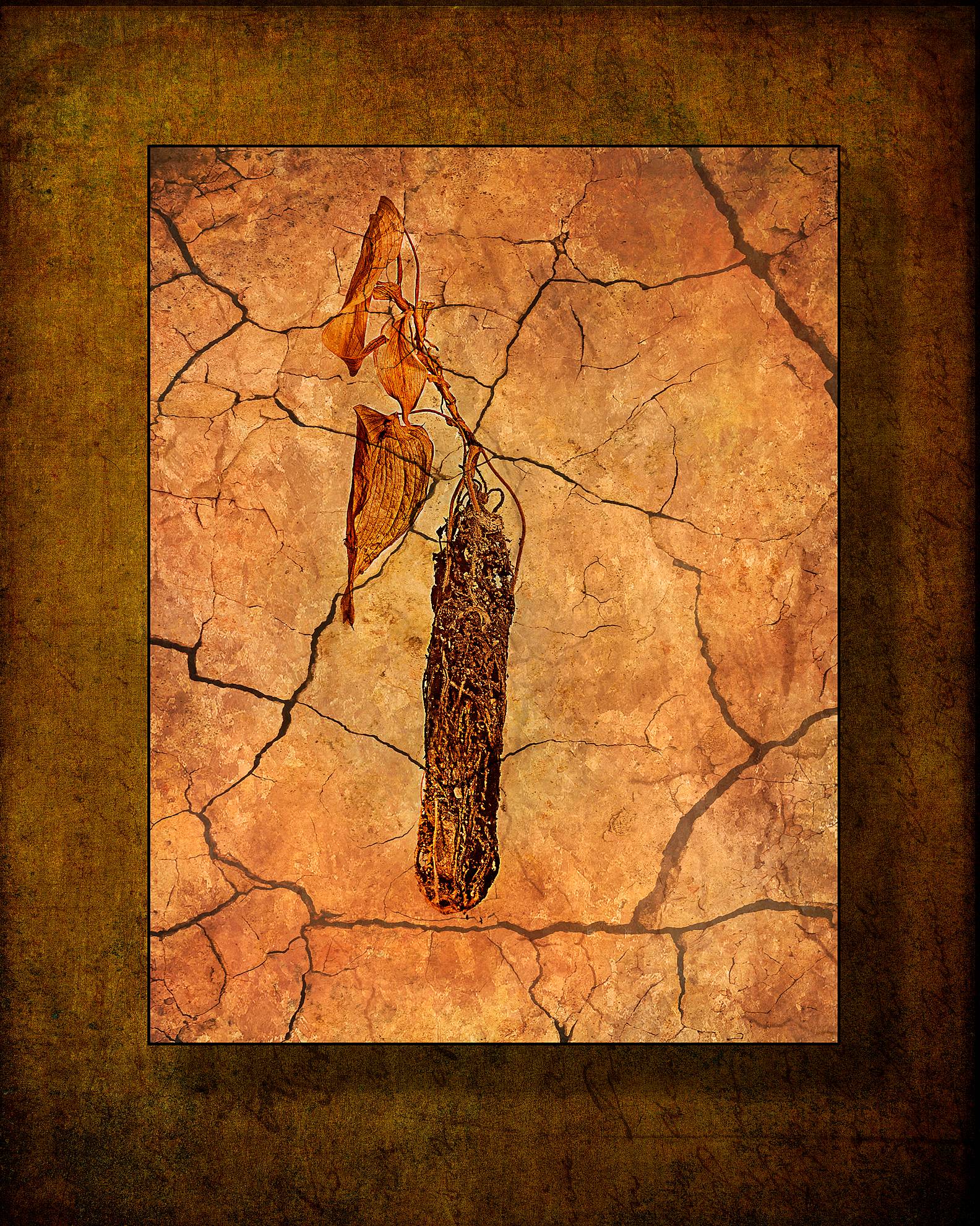
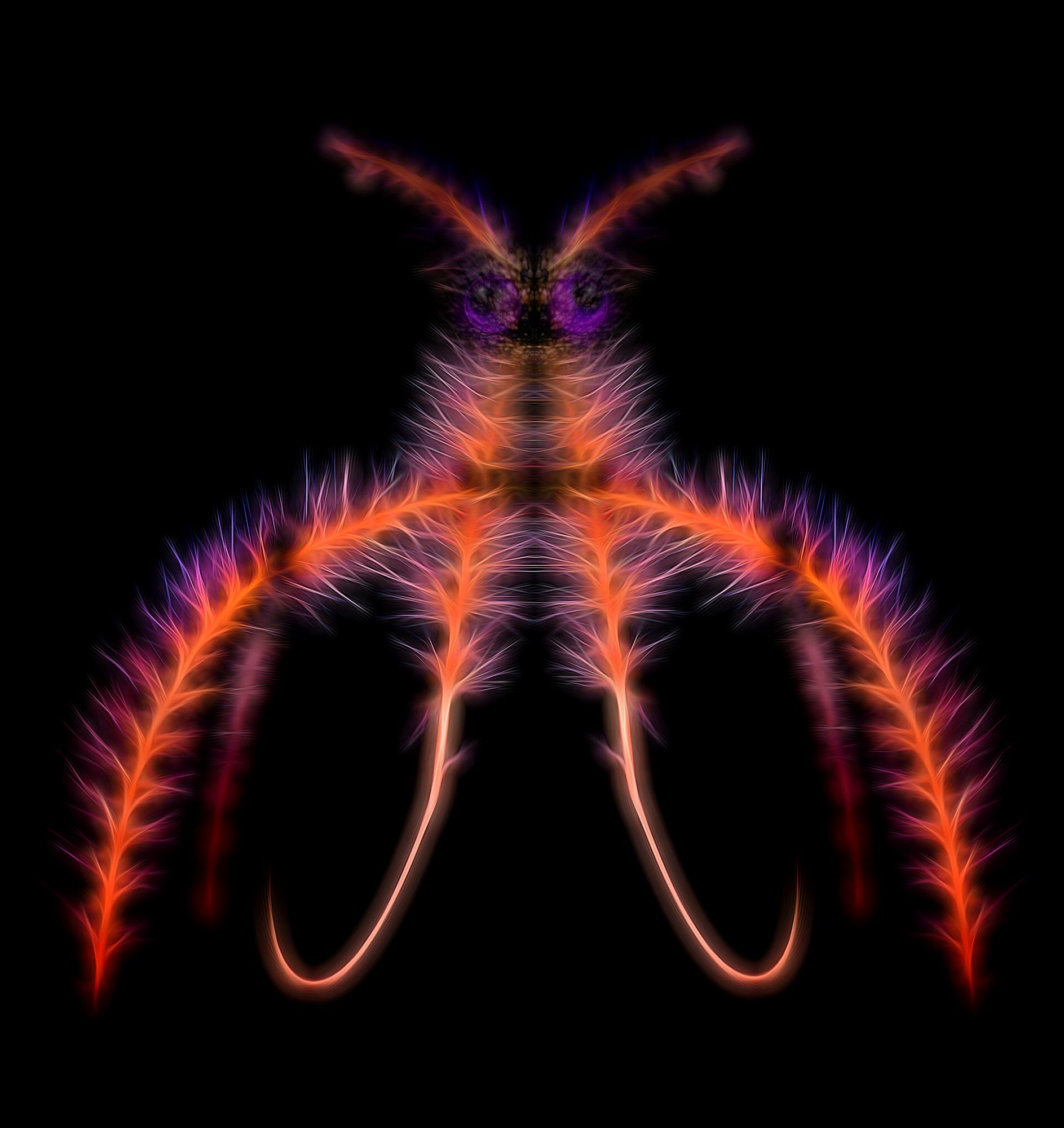
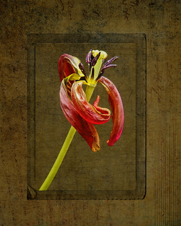
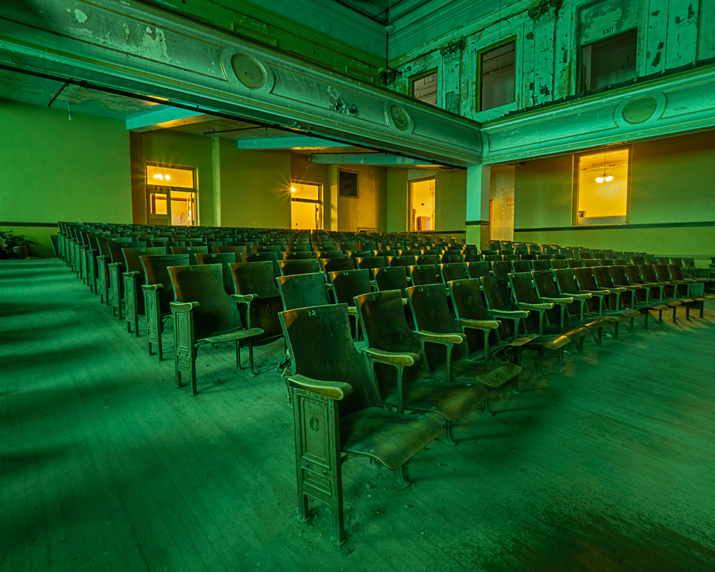
I like the imagination and the jeweled effect. The edges and fog are effective. The top left/middle vignette bothers me as it makes it look muddy as compared to the jewels and the rest of the image. Impressed that you started with that fungus and yielded that end result! |
Jun 1st |
| 41 |
Jun 18 |
Comment |
I like it! Always fun to play...
The main waterfall is blended nicely! Although perhaps a tad muddy, could use a little contrast.
Not sure if the waterfall on the right (from the top photo) is believable but it adds to the scene. The top hills could use a tad more contrast as well, but I love, love, love the sky.
Very interesting -- makes me think about some of my images that I could play with. |
Jun 1st |
| 41 |
Jun 18 |
Reply |
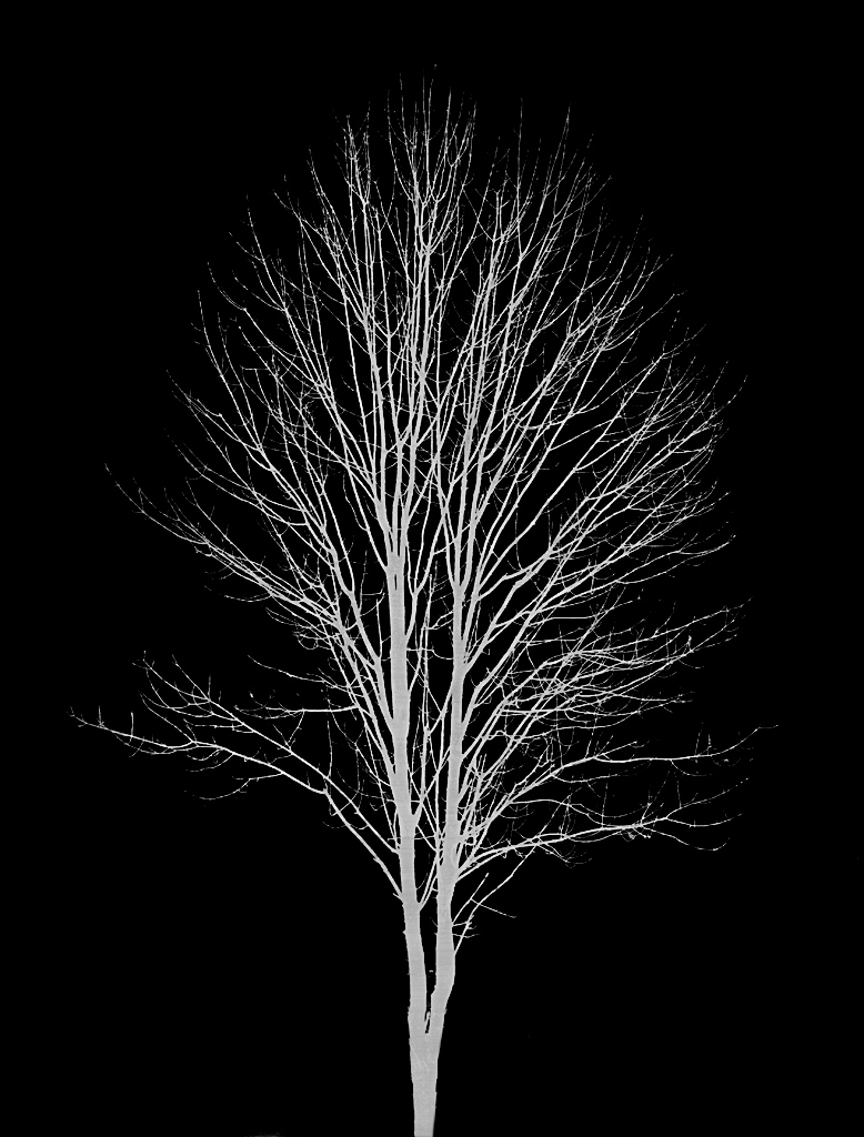
I will play, but I liked it as a monochrome... |
Jun 1st |
4 comments - 4 replies for Group 41
|
| 44 |
Jun 18 |
Reply |
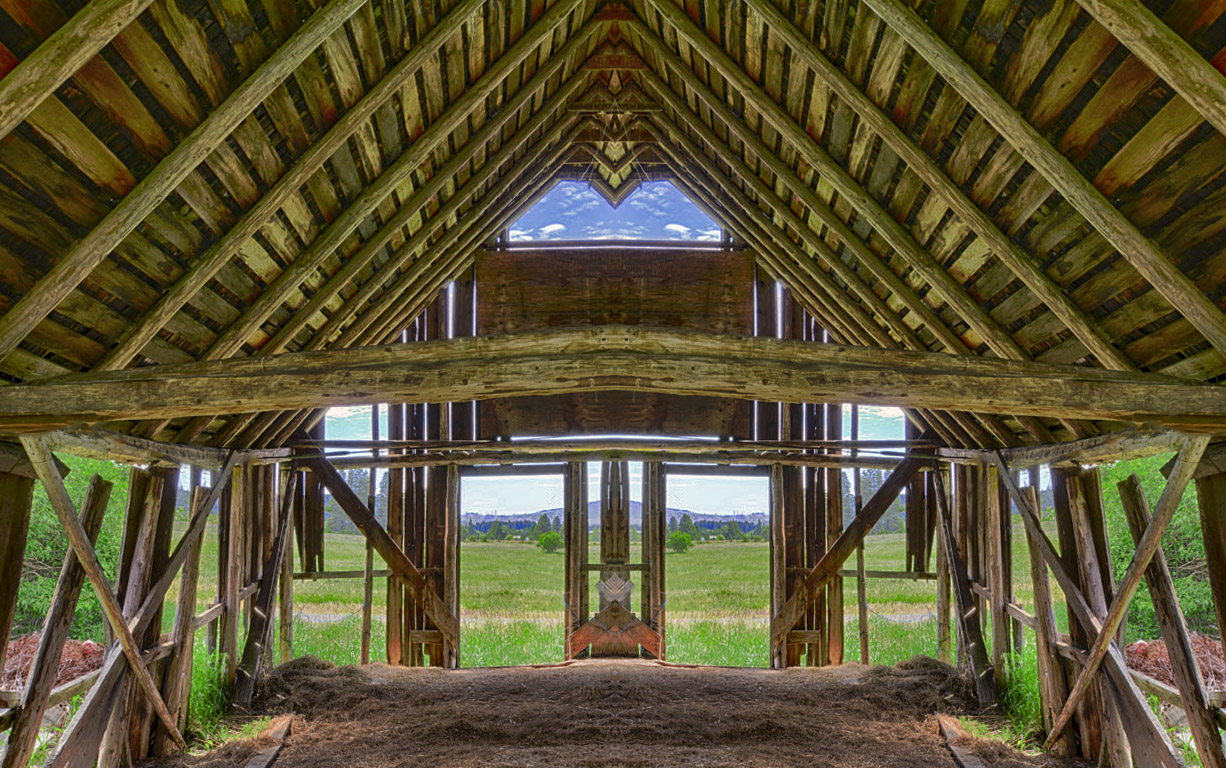
yes, the green on the left can definitely go
wish I had the whole window on the right |
Jun 21st |
| 44 |
Jun 18 |
Reply |
I agree, content aware fill and they would be gone in an instant |
Jun 21st |
| 44 |
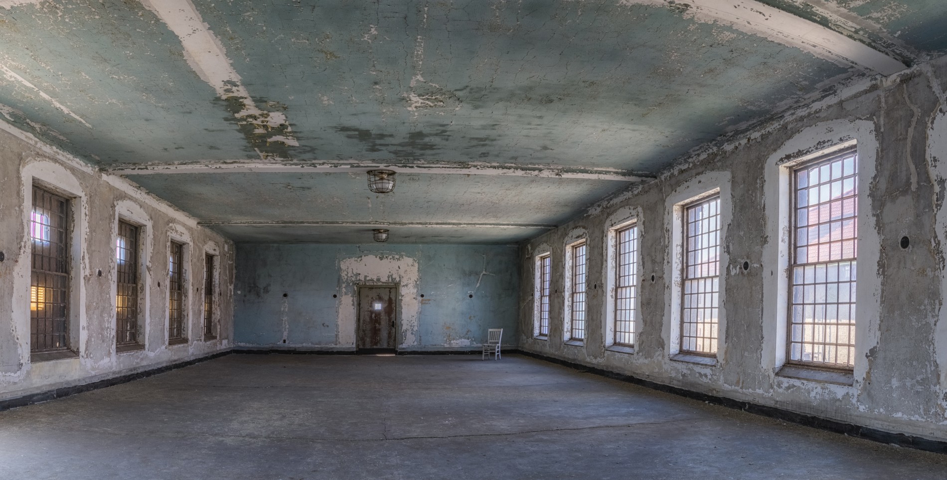
Jun 18 |
Comment |
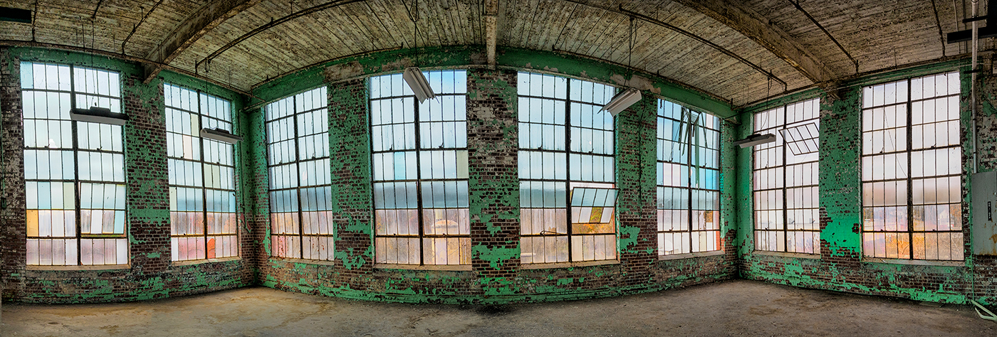
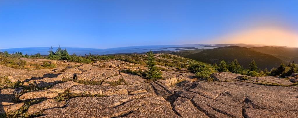
I love this -- the pano and aperture and HDR are great.
nit pick, wish it was even on the left and on the right |
Jun 21st |
| 44 |
Jun 18 |
Comment |
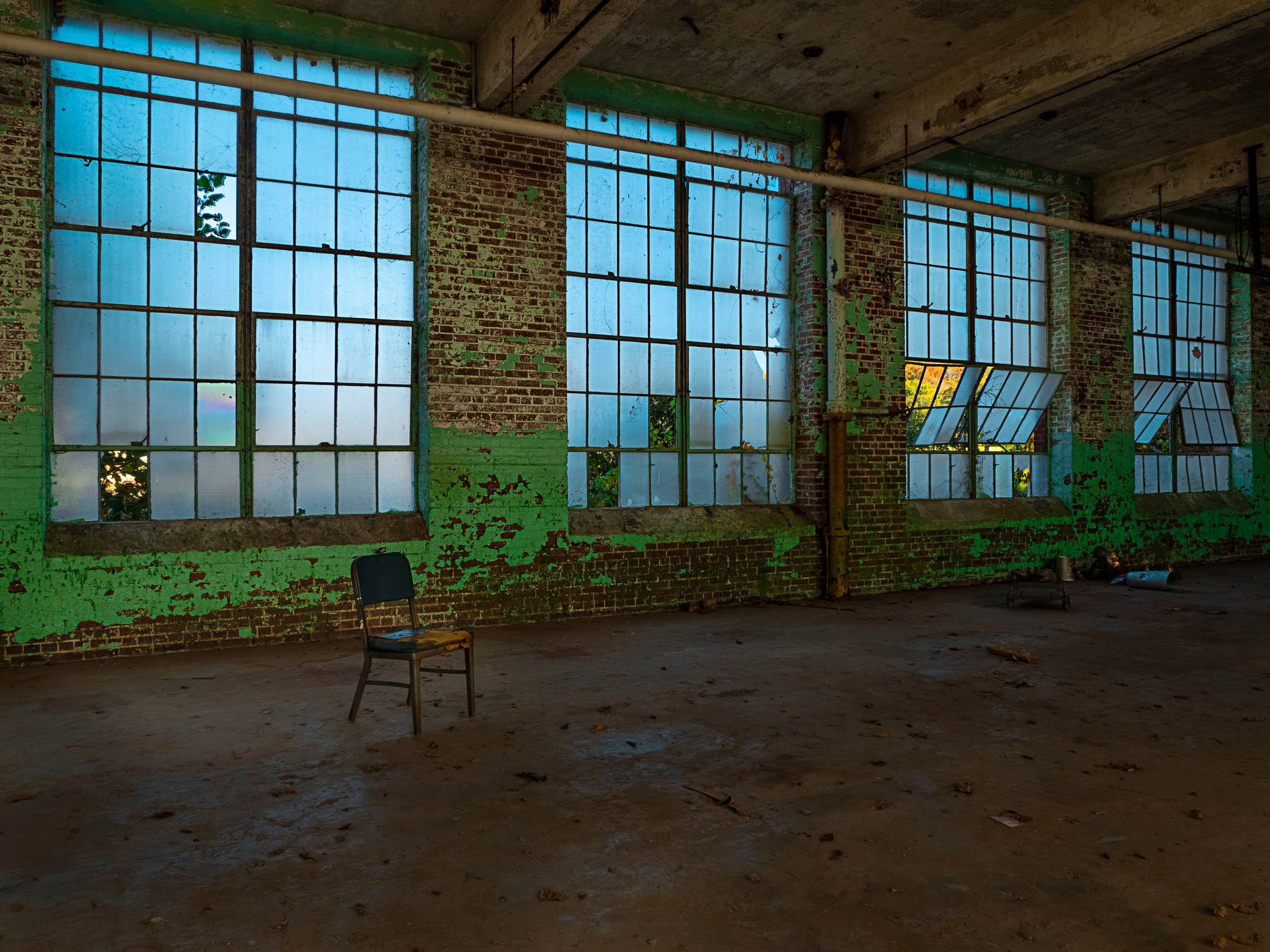
Good tone mapping, colors and highlights (except one piece of curtain) and shadows look good. There is a slite HDR slight muddiest to the candle. |
Jun 21st |
 |
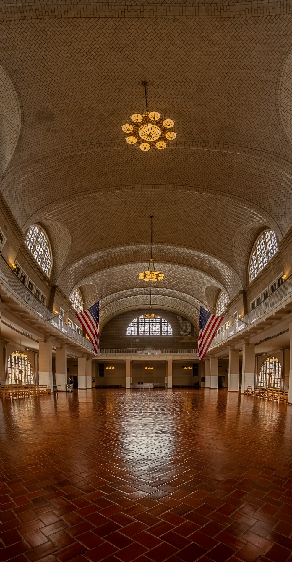
| 44 |
Jun 18 |
Comment |
the water is especially interesting! the highlights are handled quite well! love the aperture starbursts on the lights too. overall very well done! wish that I was standing next to you :-)
the sky is nicely blue but perhaps a pano?
perhaps a longer exposure to make the water smooth? |
Jun 21st |
 |
| 44 |
Jun 18 |
Comment |
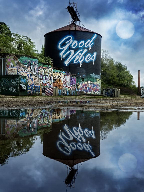
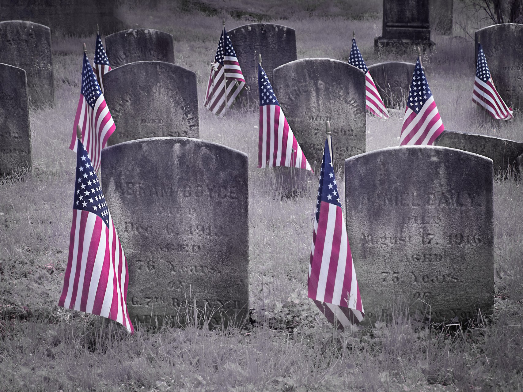
or this one
sorry, I know this is HDR, but they were just calling out to be a mirror
|
Jun 21st |
 |
| 44 |
Jun 18 |
Comment |
images like this also cry for some creative mirroring... |
Jun 21st |
 |
| 44 |
Jun 18 |
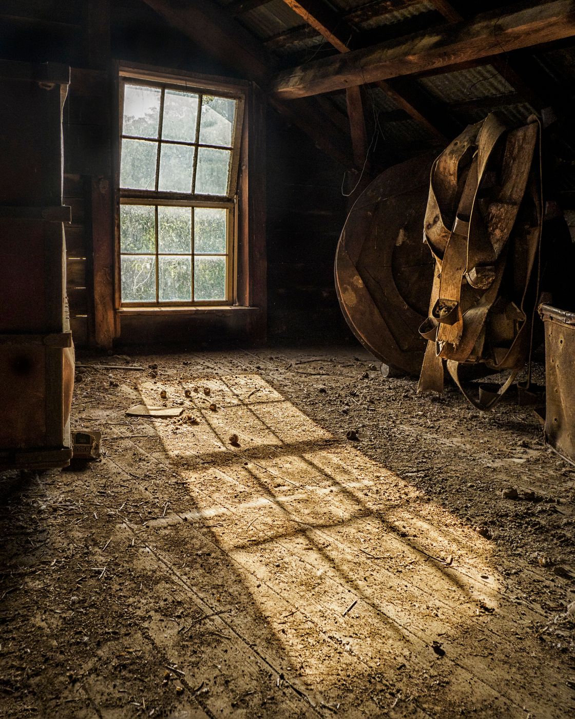
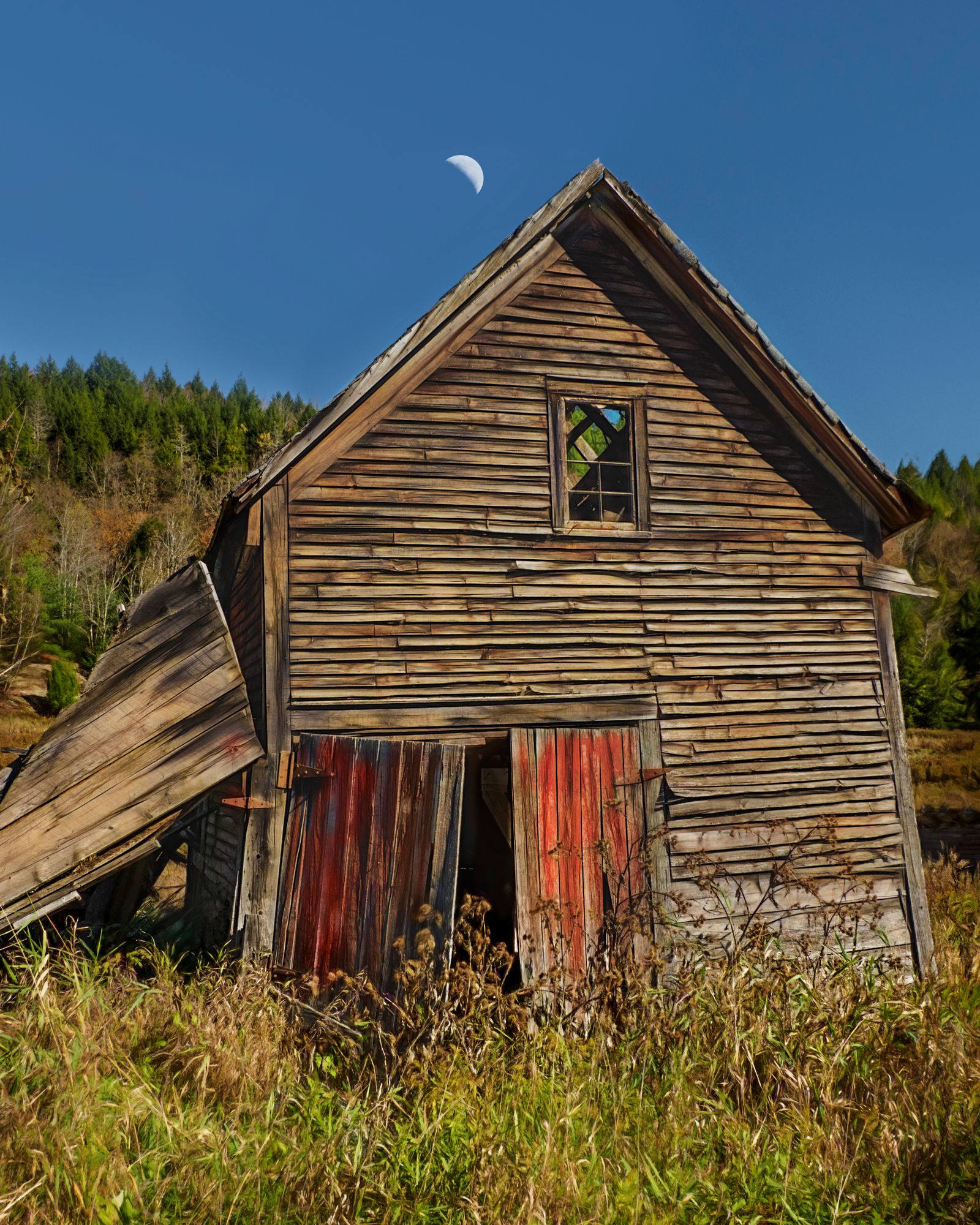
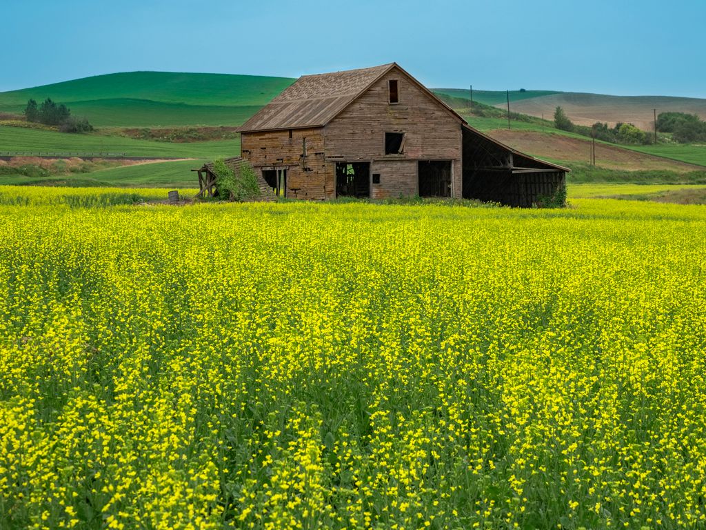
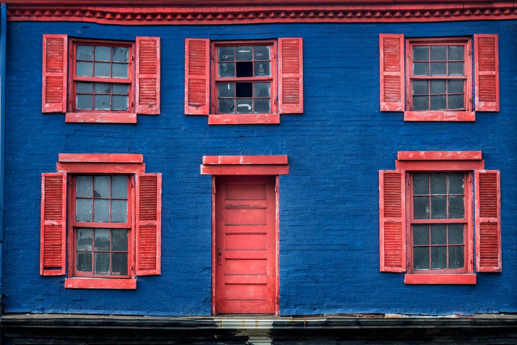
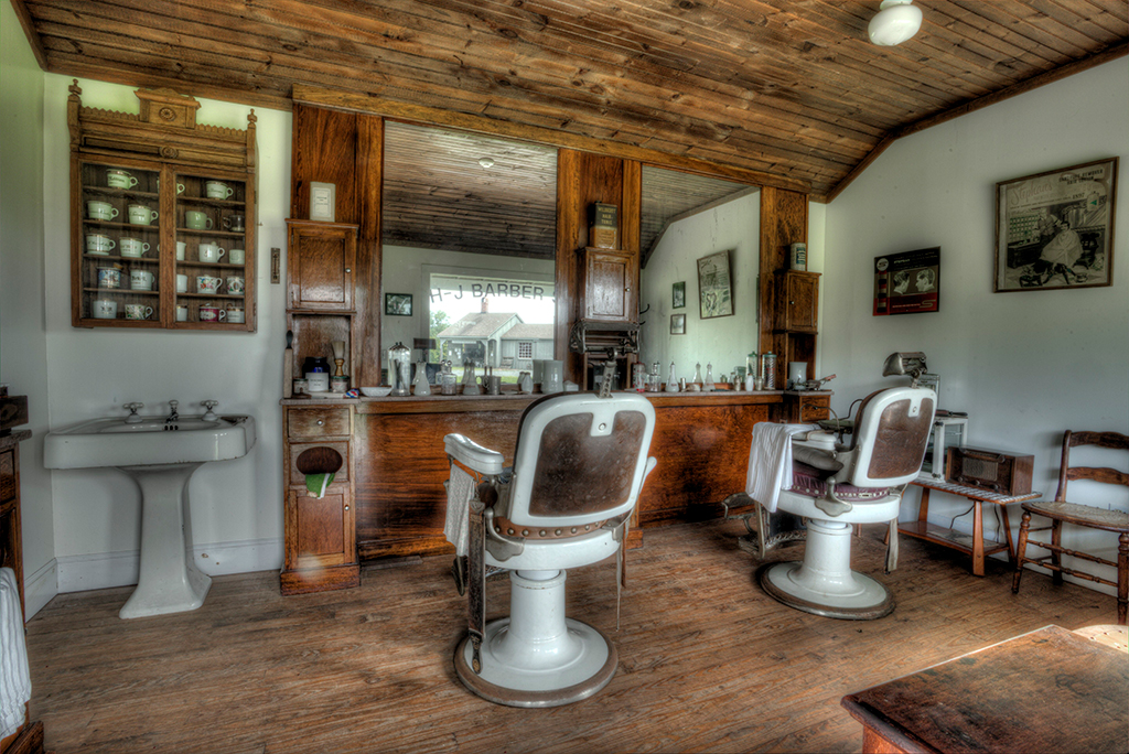
Comment |
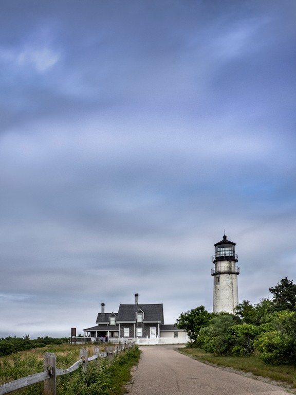
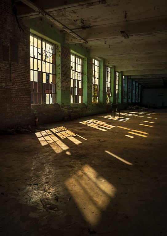
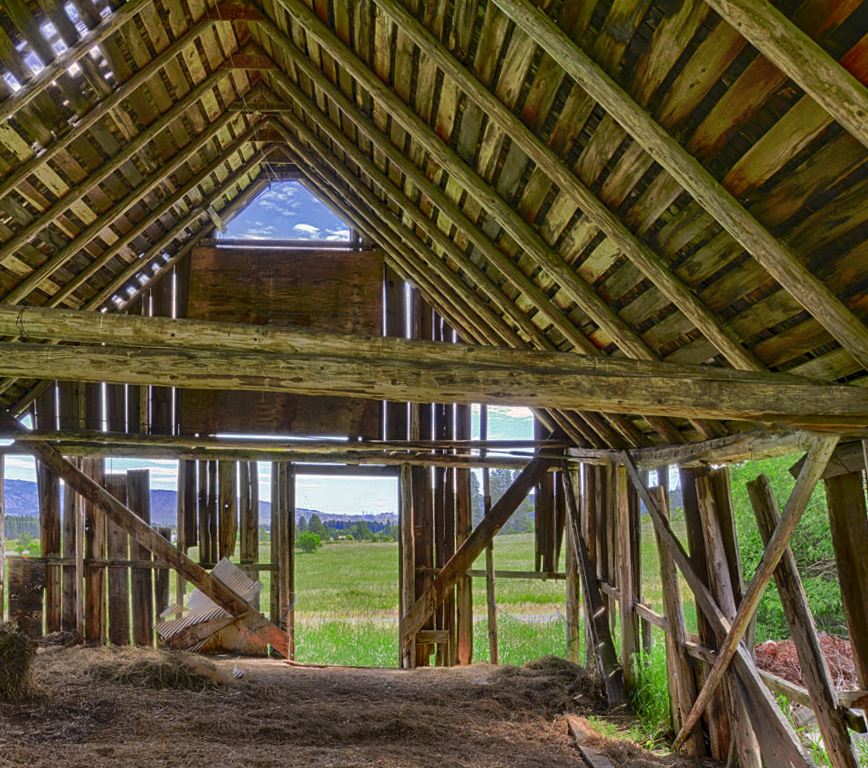
like the inside outside
coolr barn
I agree about getting rid of the wires
seems like some dehaze and some clarity and contrast would make it pop more |
Jun 21st |
 |
| 44 |
Jun 18 |
Comment |
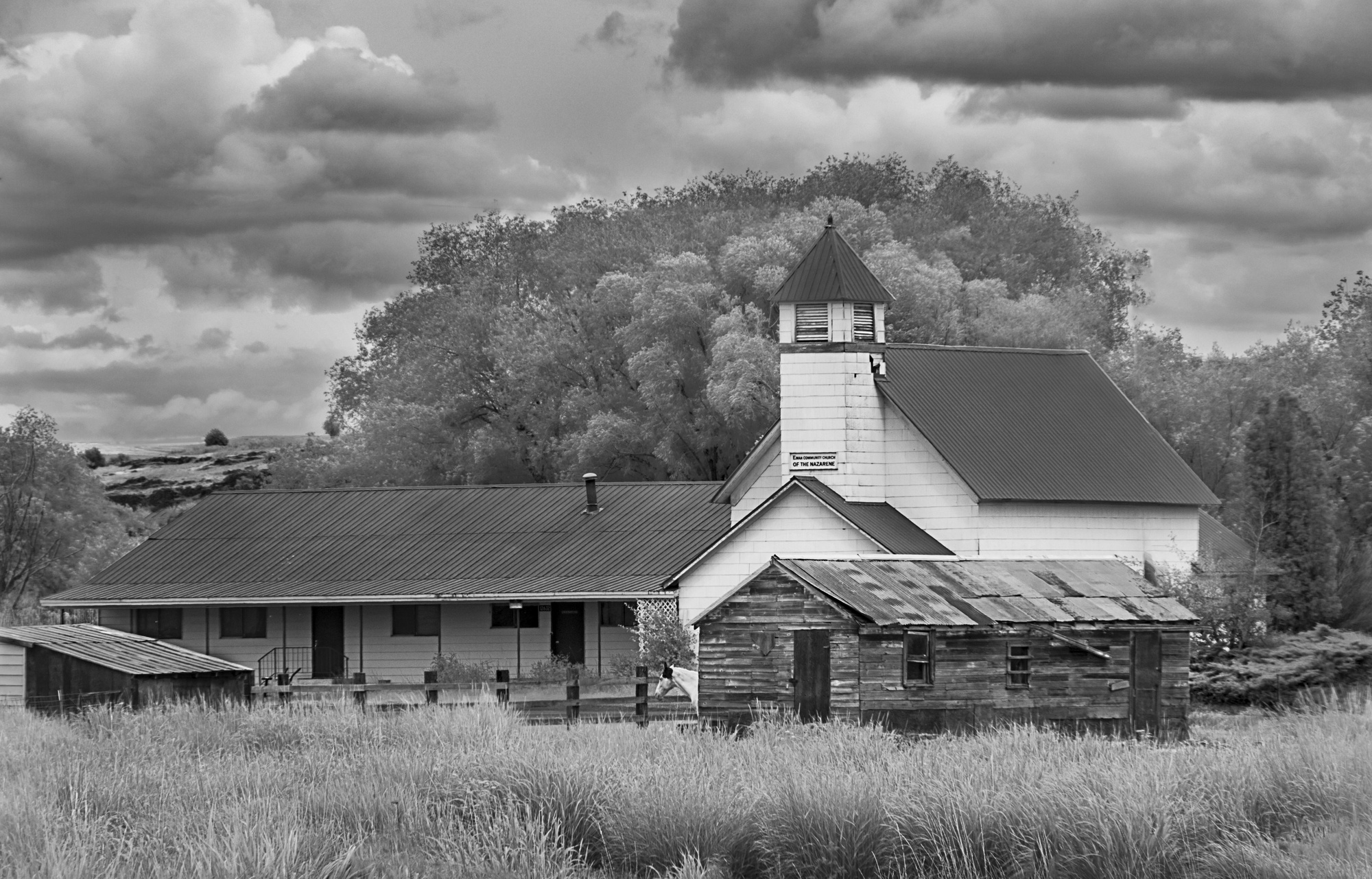
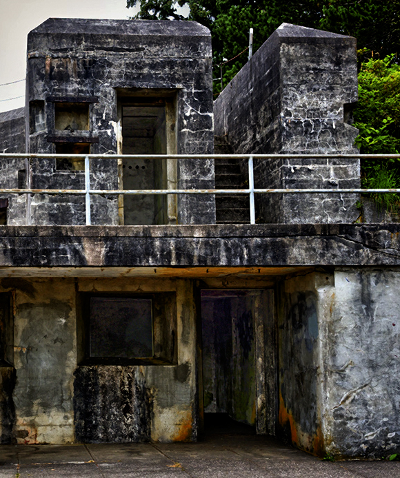
pano? |
Jun 21st |
 |
| 44 |
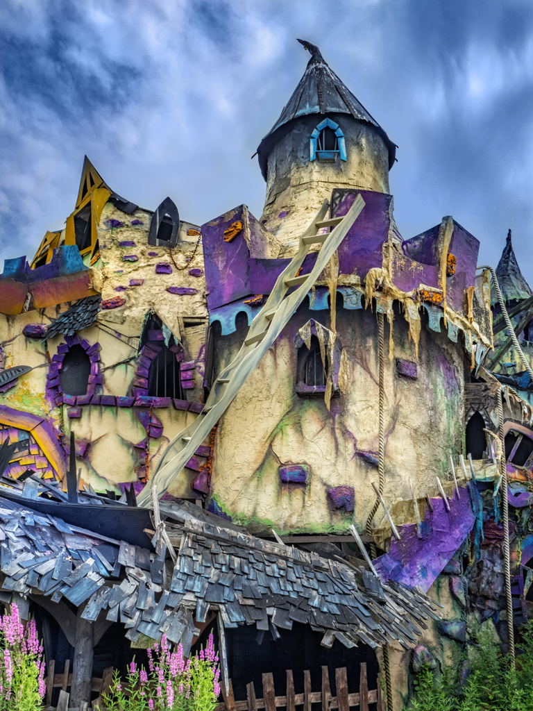
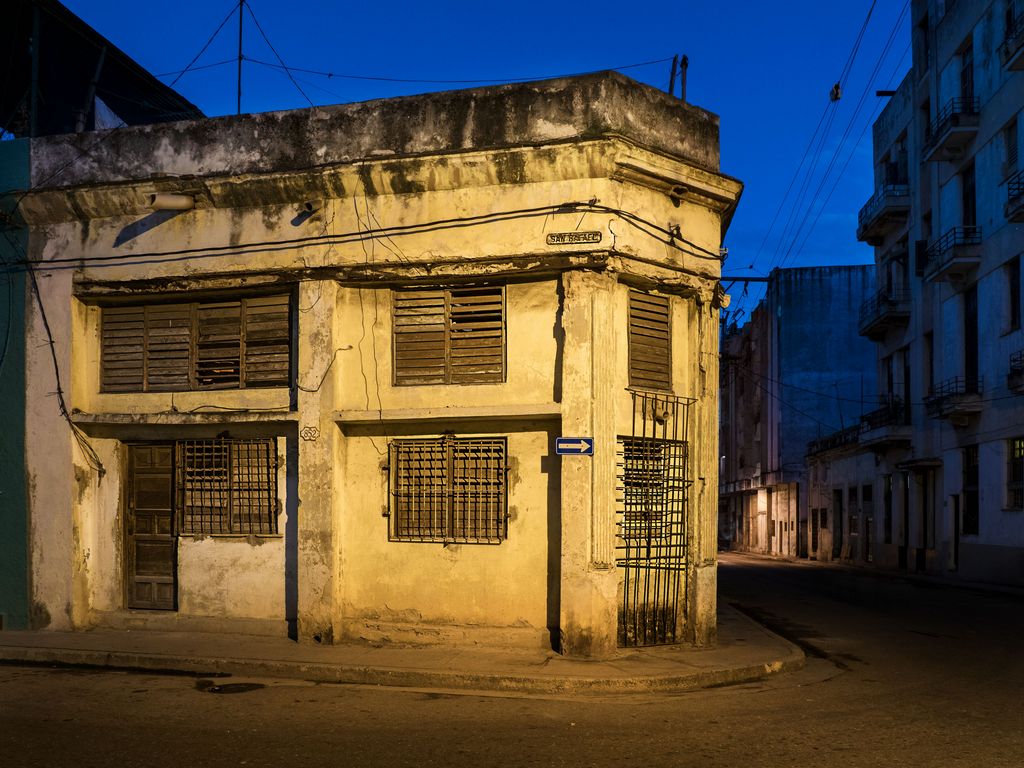
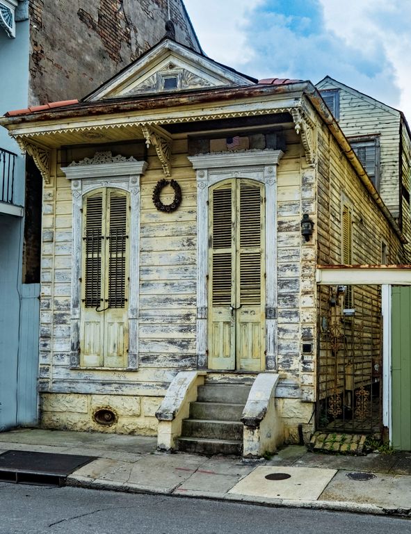
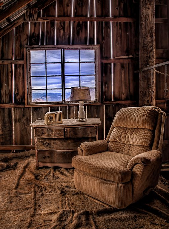
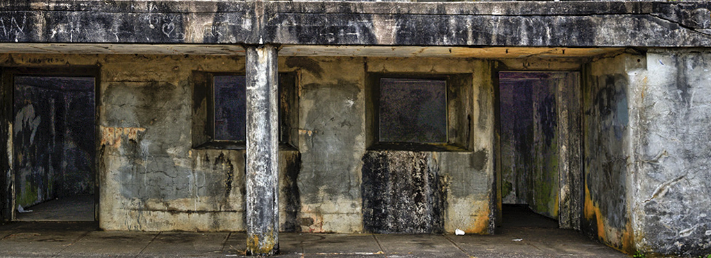
Jun 18 |
Comment |
cool fort!
Three stops work, although a tag more detail in the shadows MAY help.
The image seems a little blue cast to me?
sky works, although other variations without the sky could work too.
I would pick up or clone out the human trash (three white things, one is a cup) -- I will often kick them out of the way or move them to a trashcan, train your eye to notice small icky things like that. |
Jun 21st |
 |
8 comments - 2 replies for Group 44
|
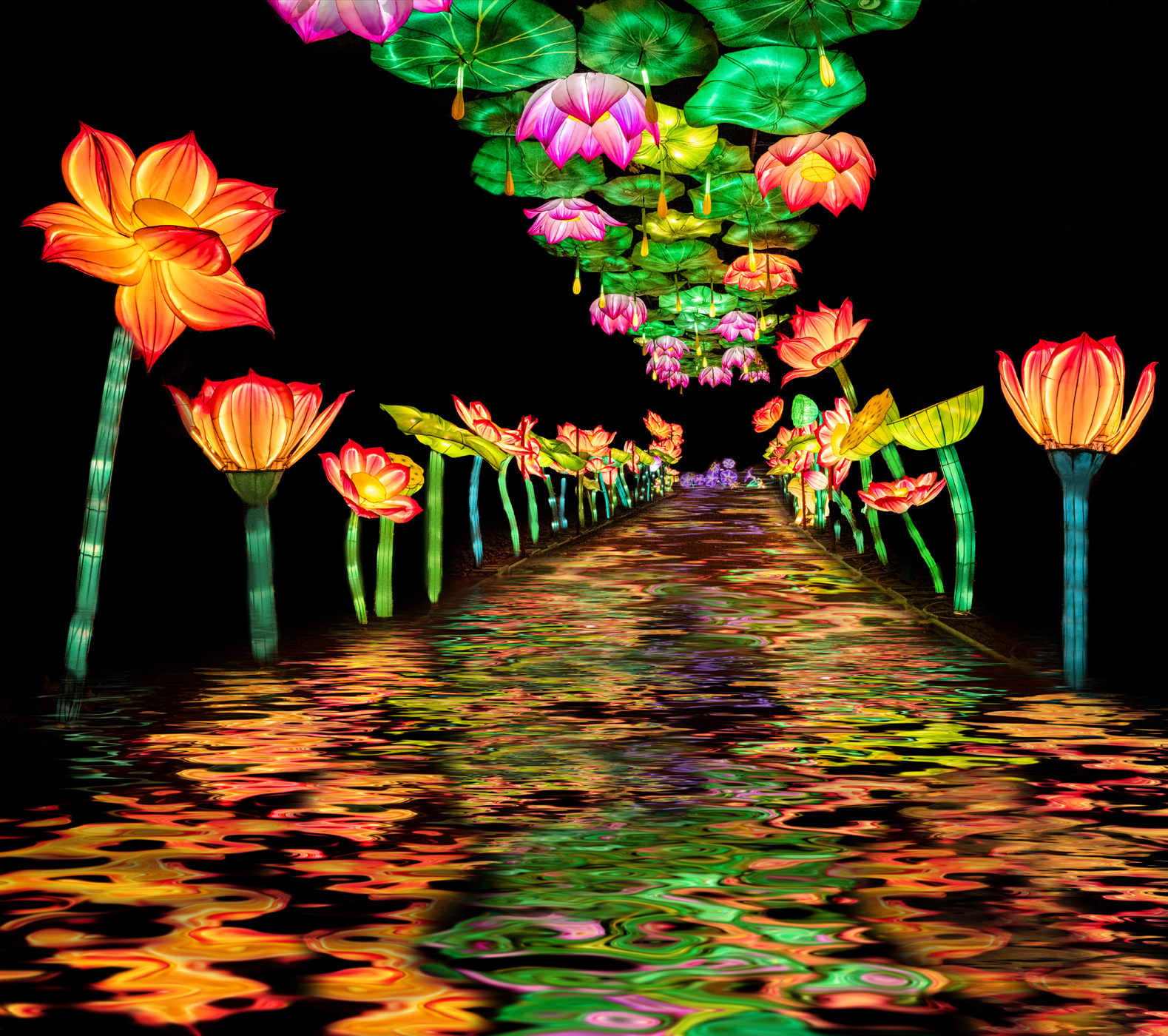
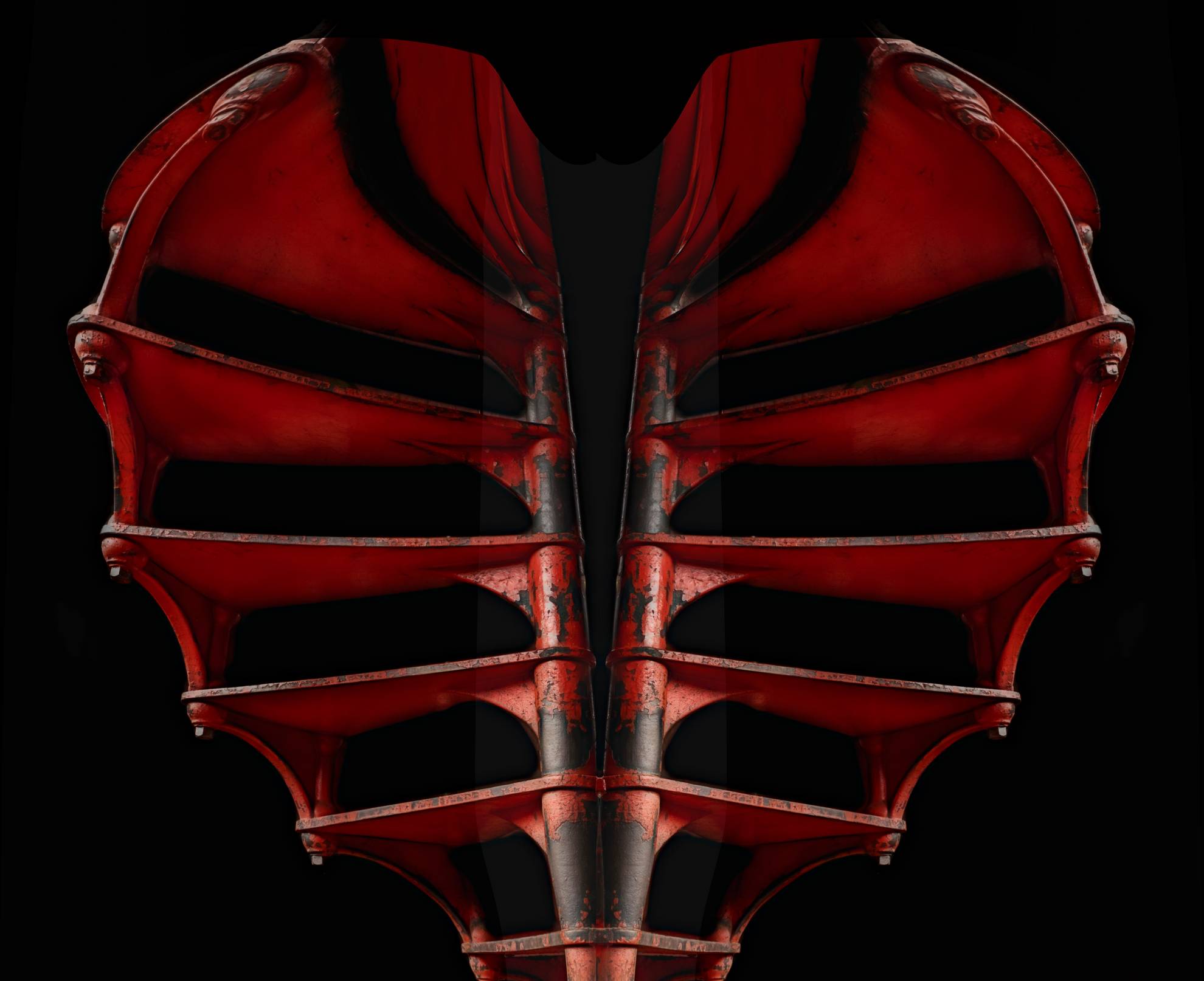
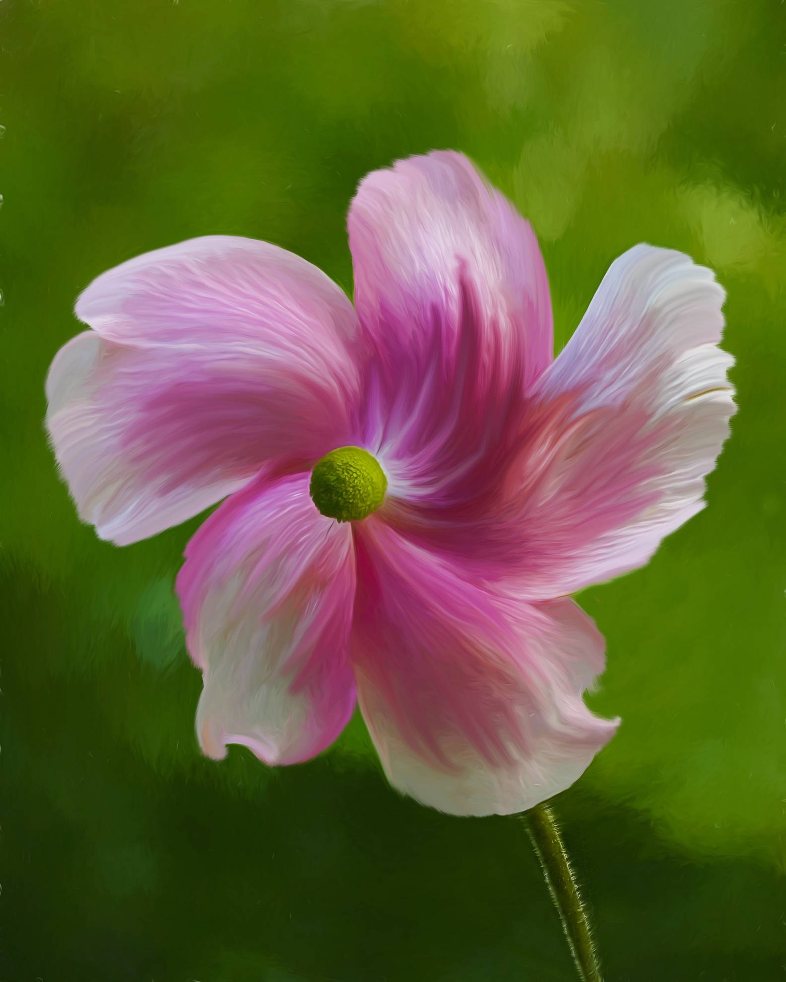
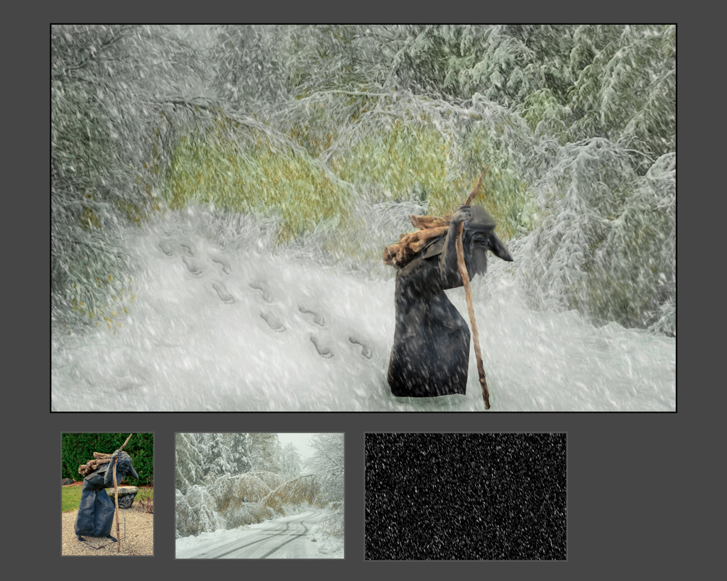
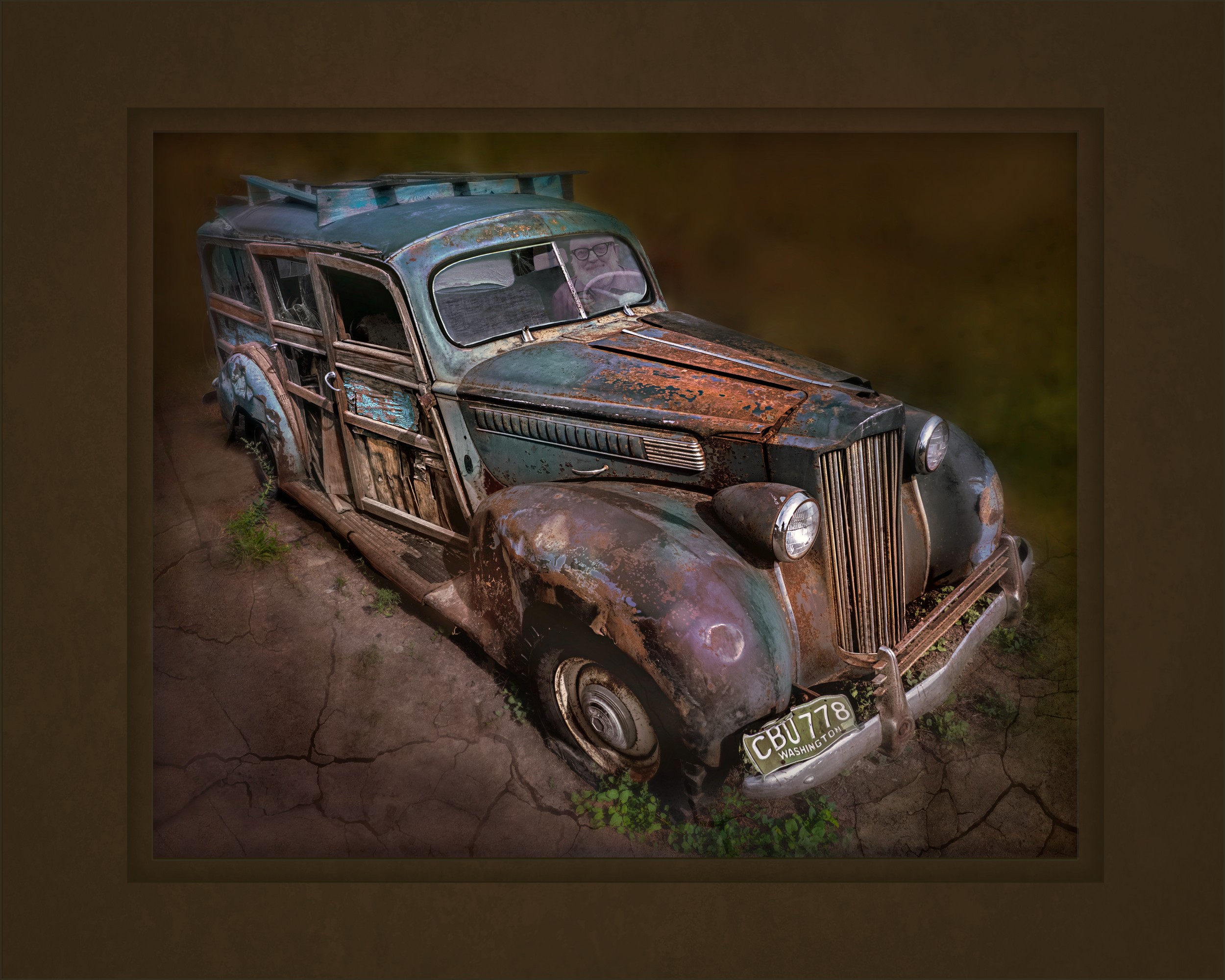
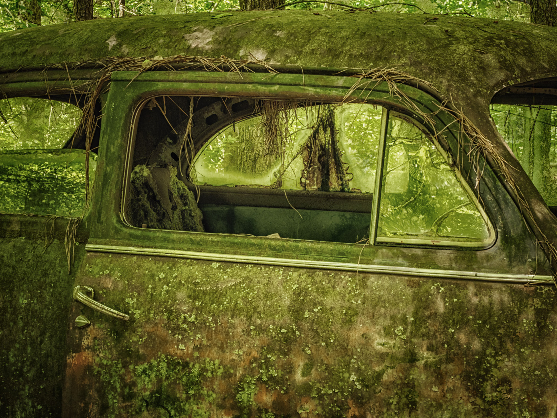
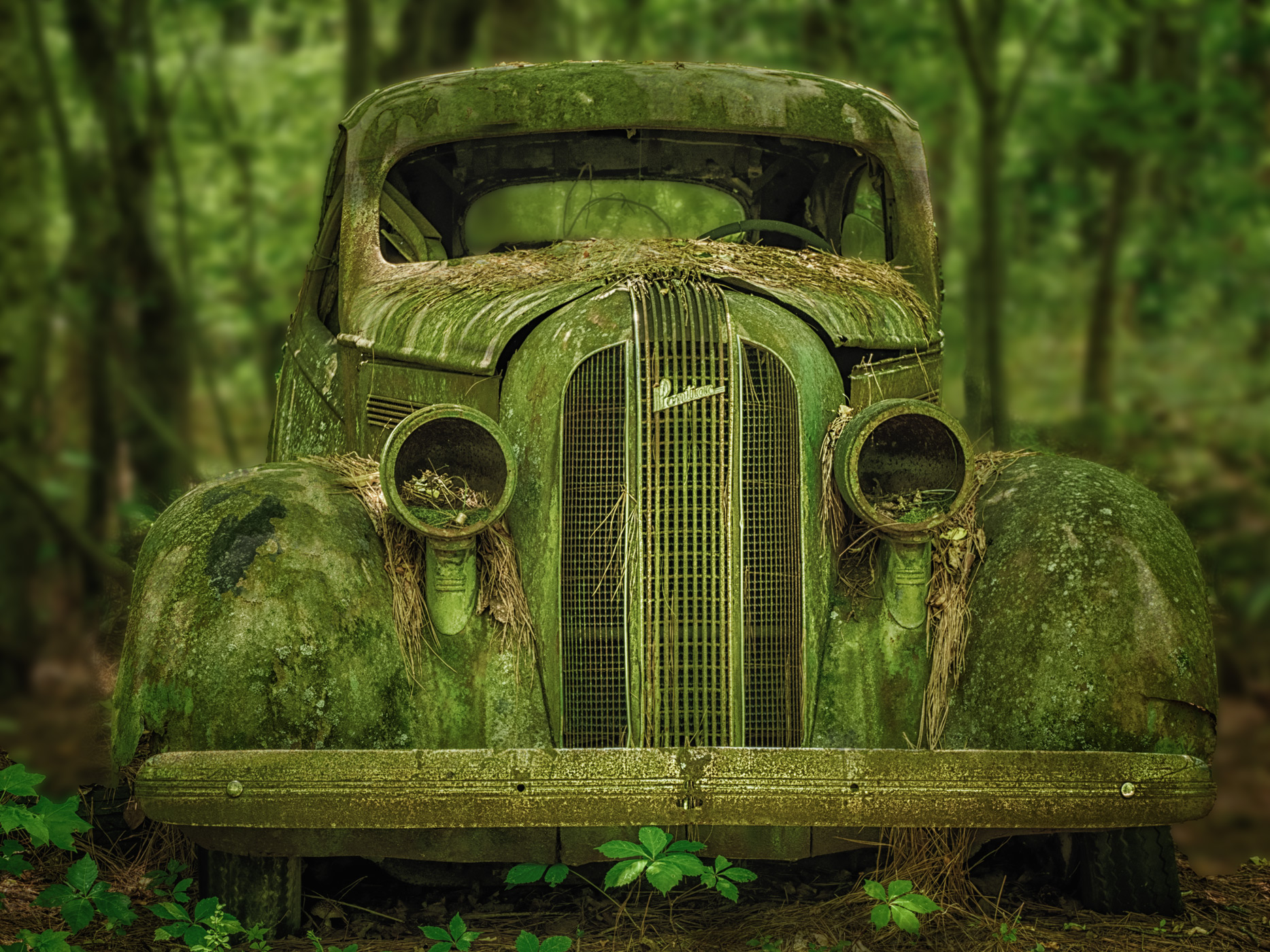
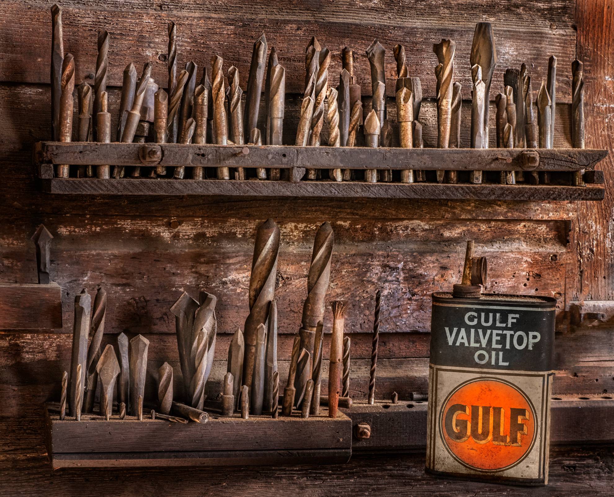
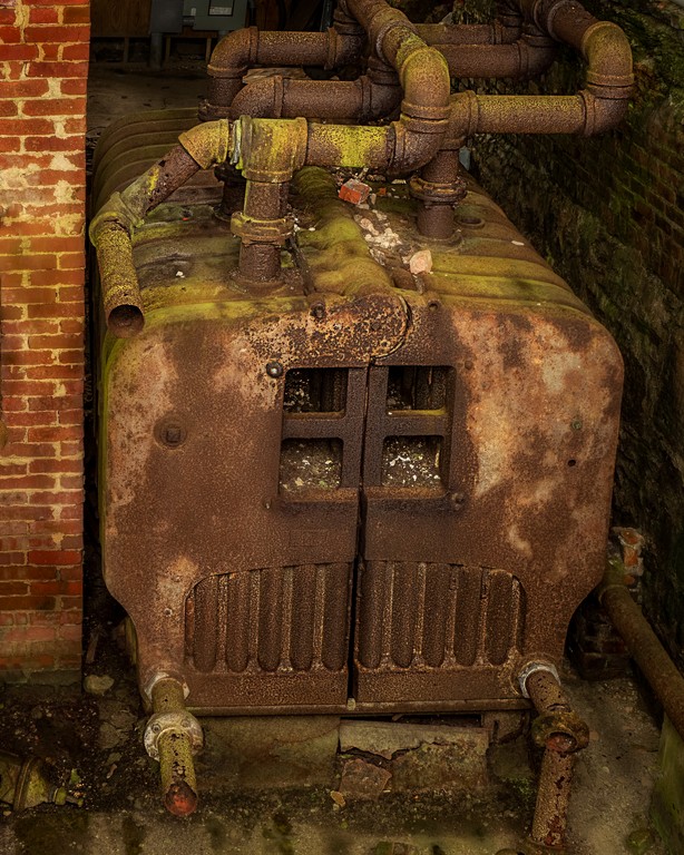
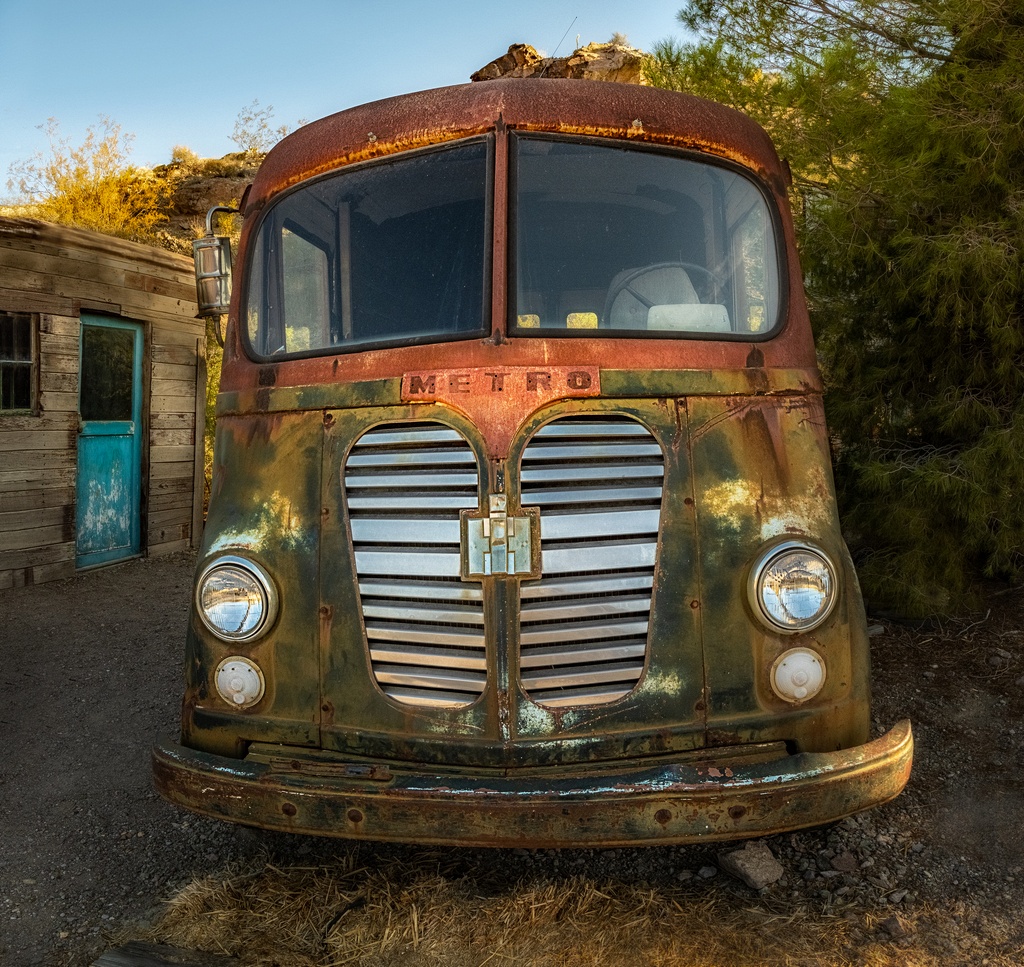
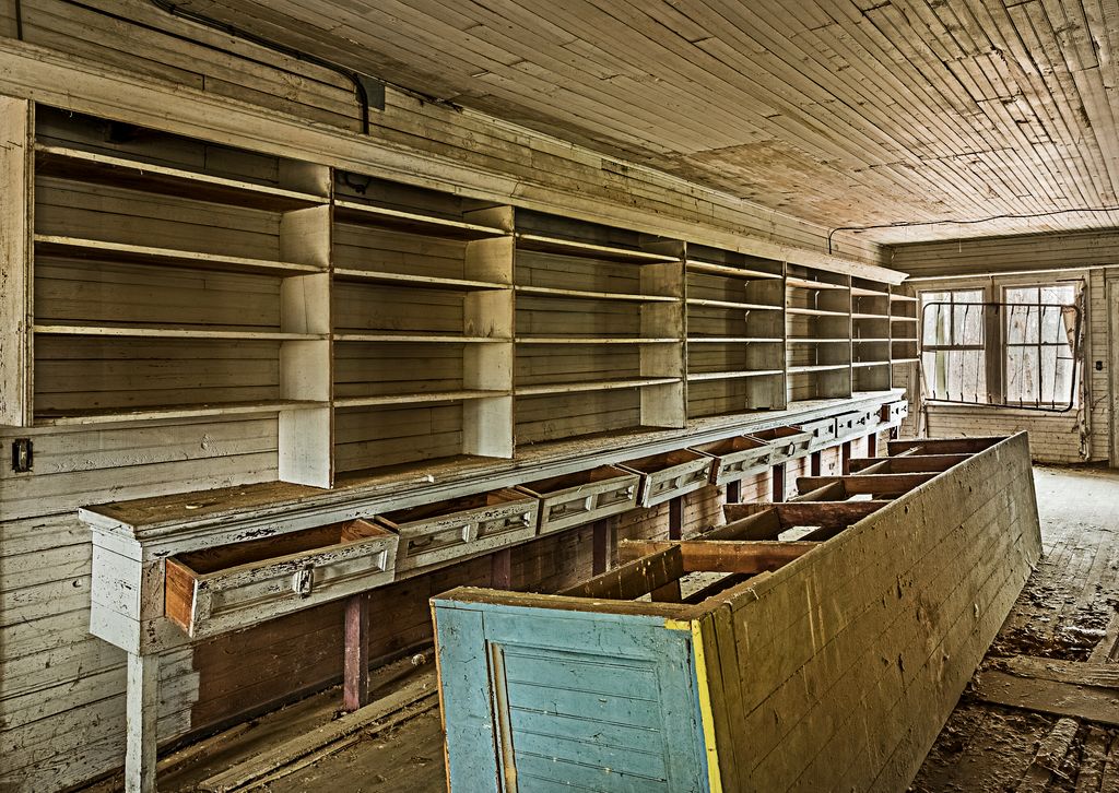
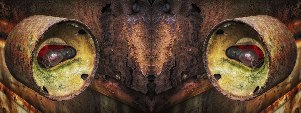
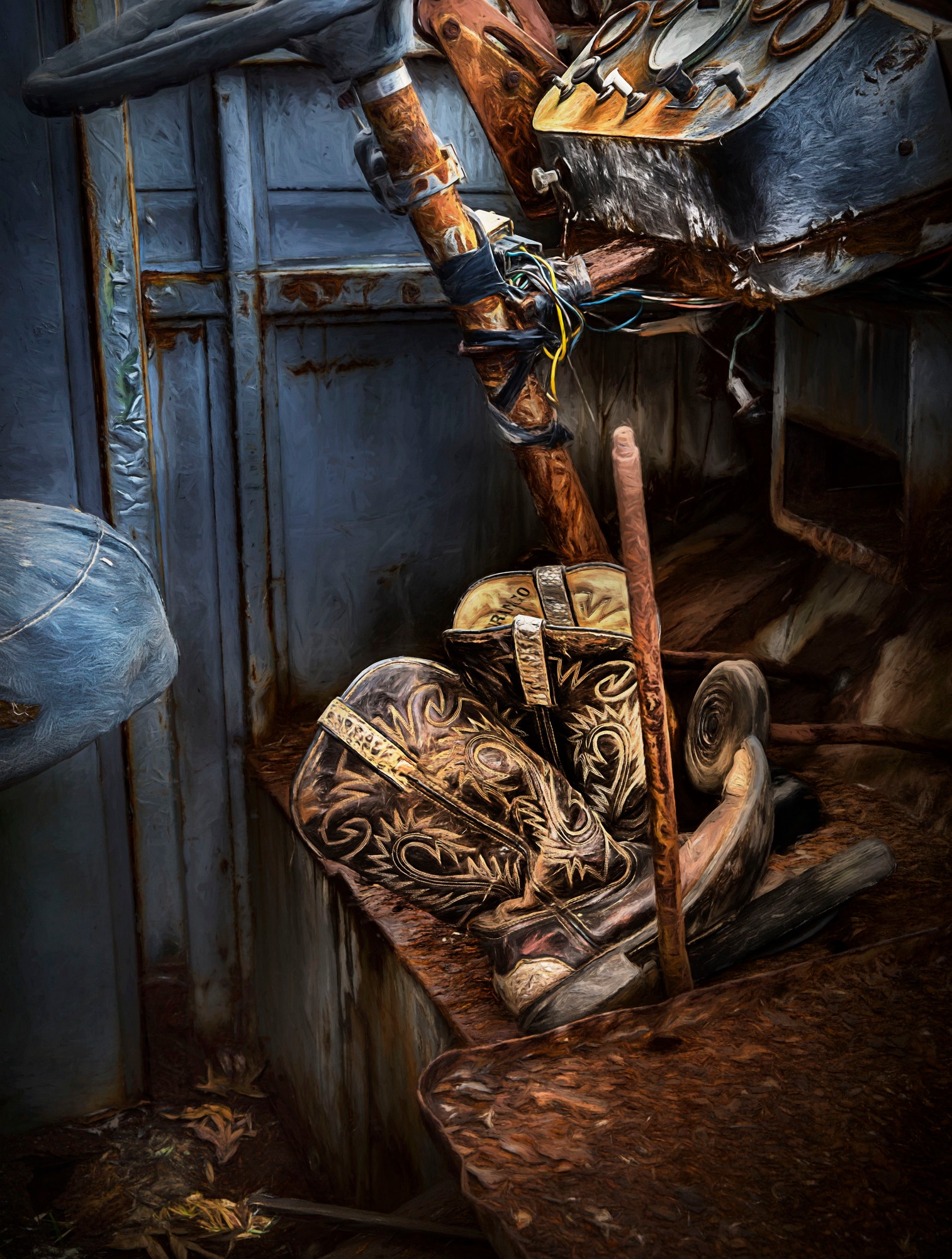
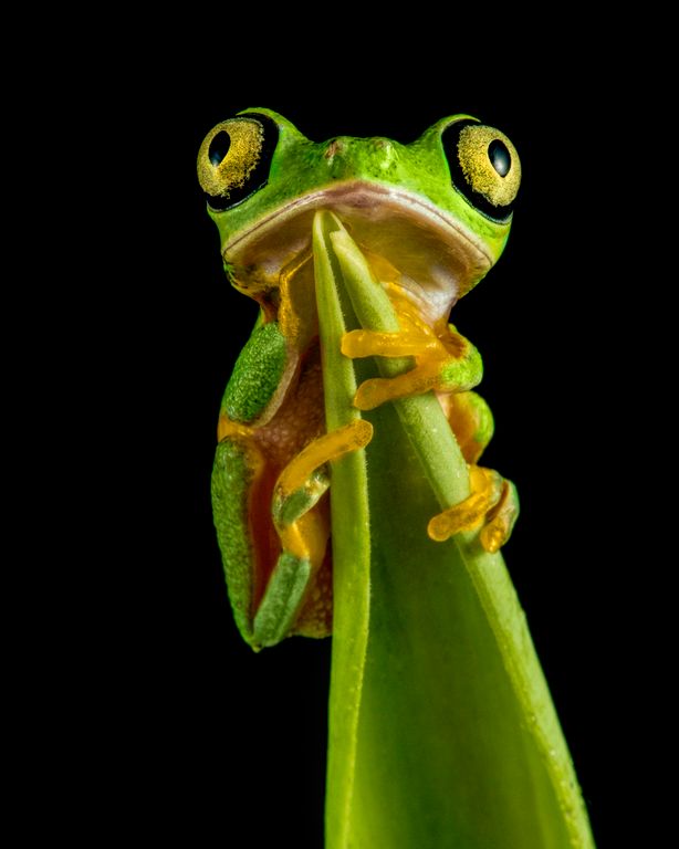
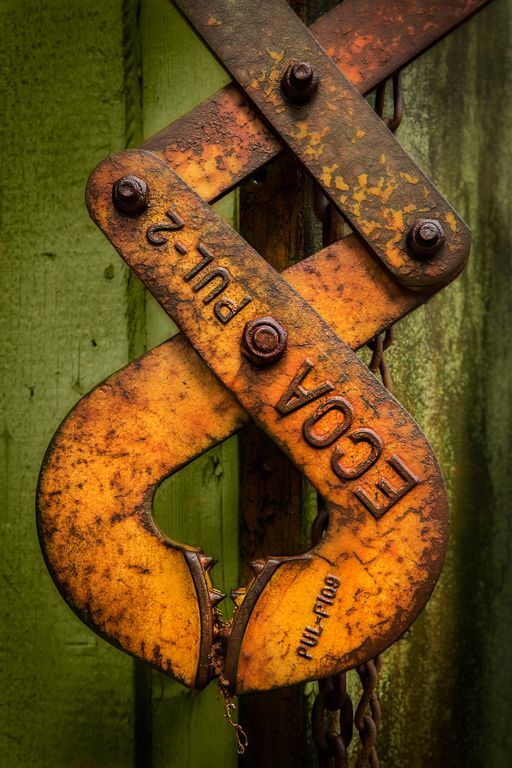
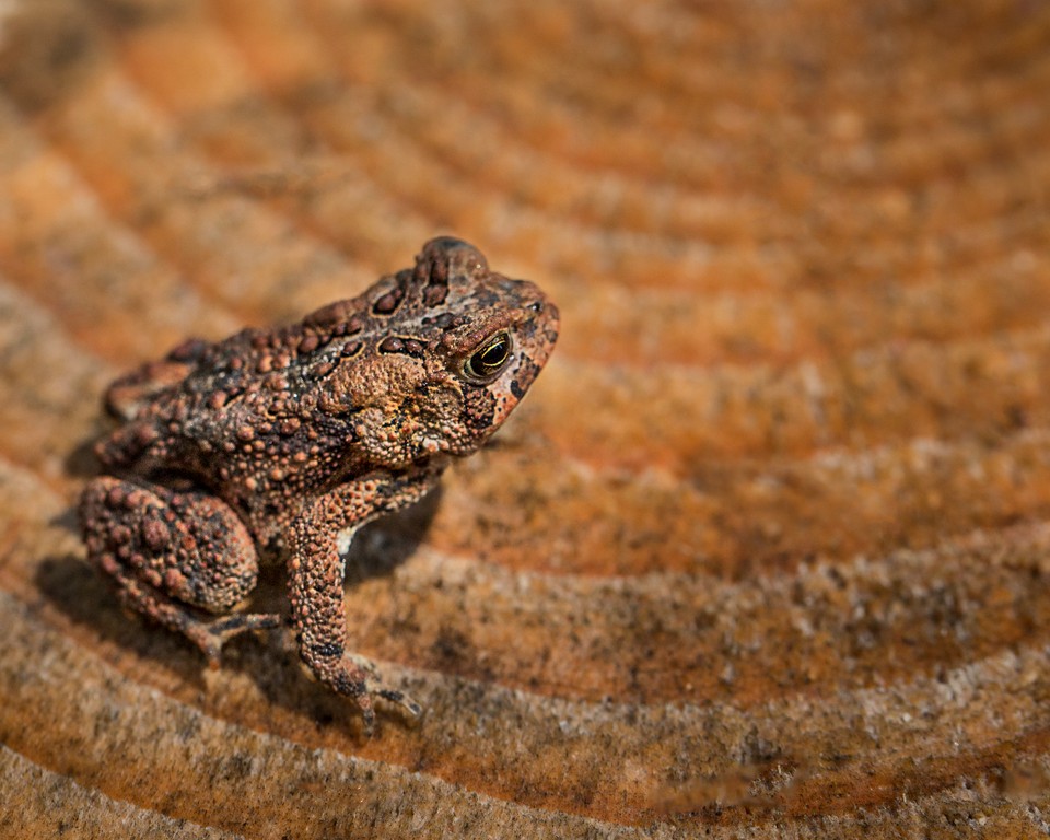
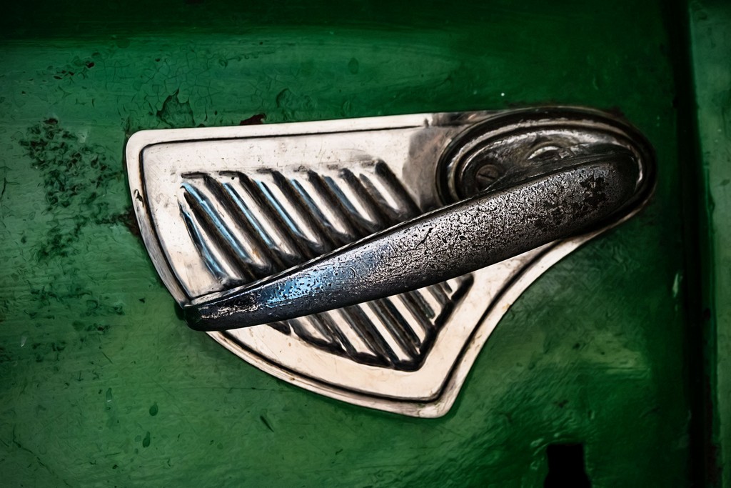
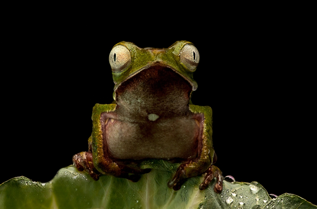
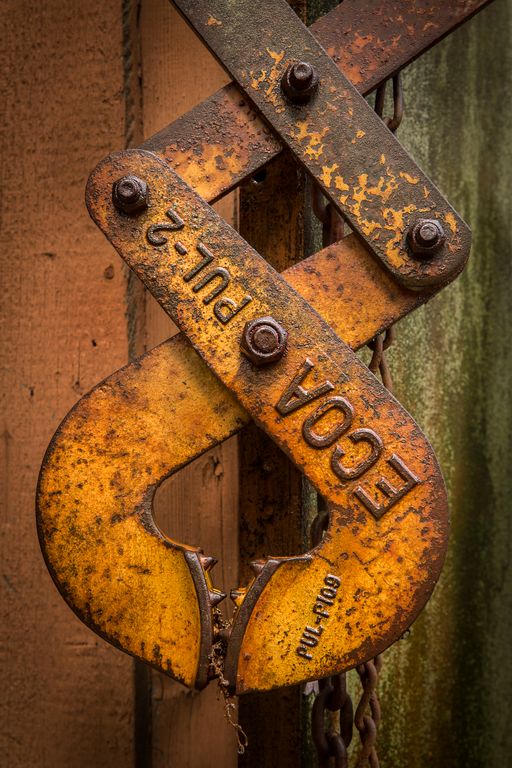
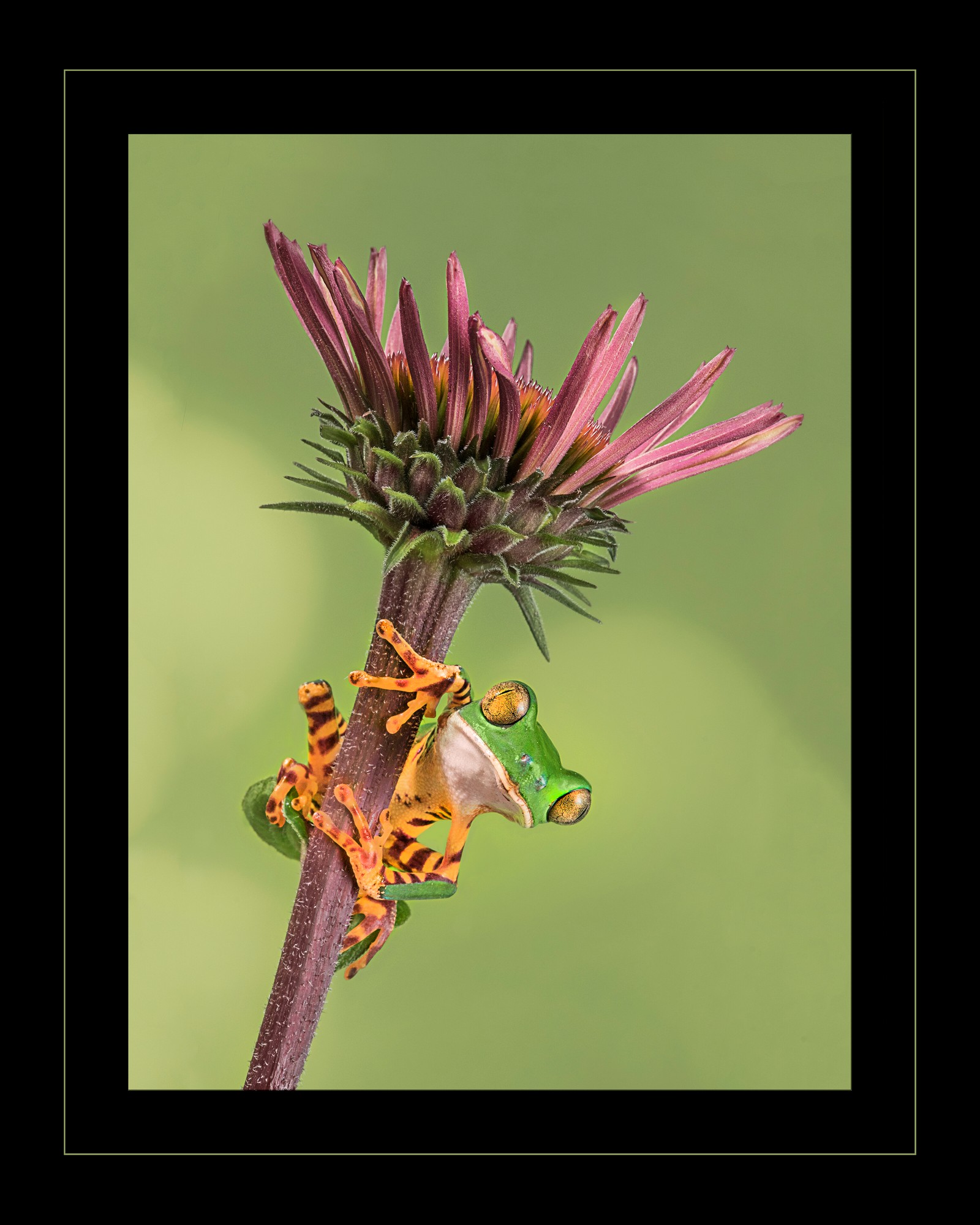
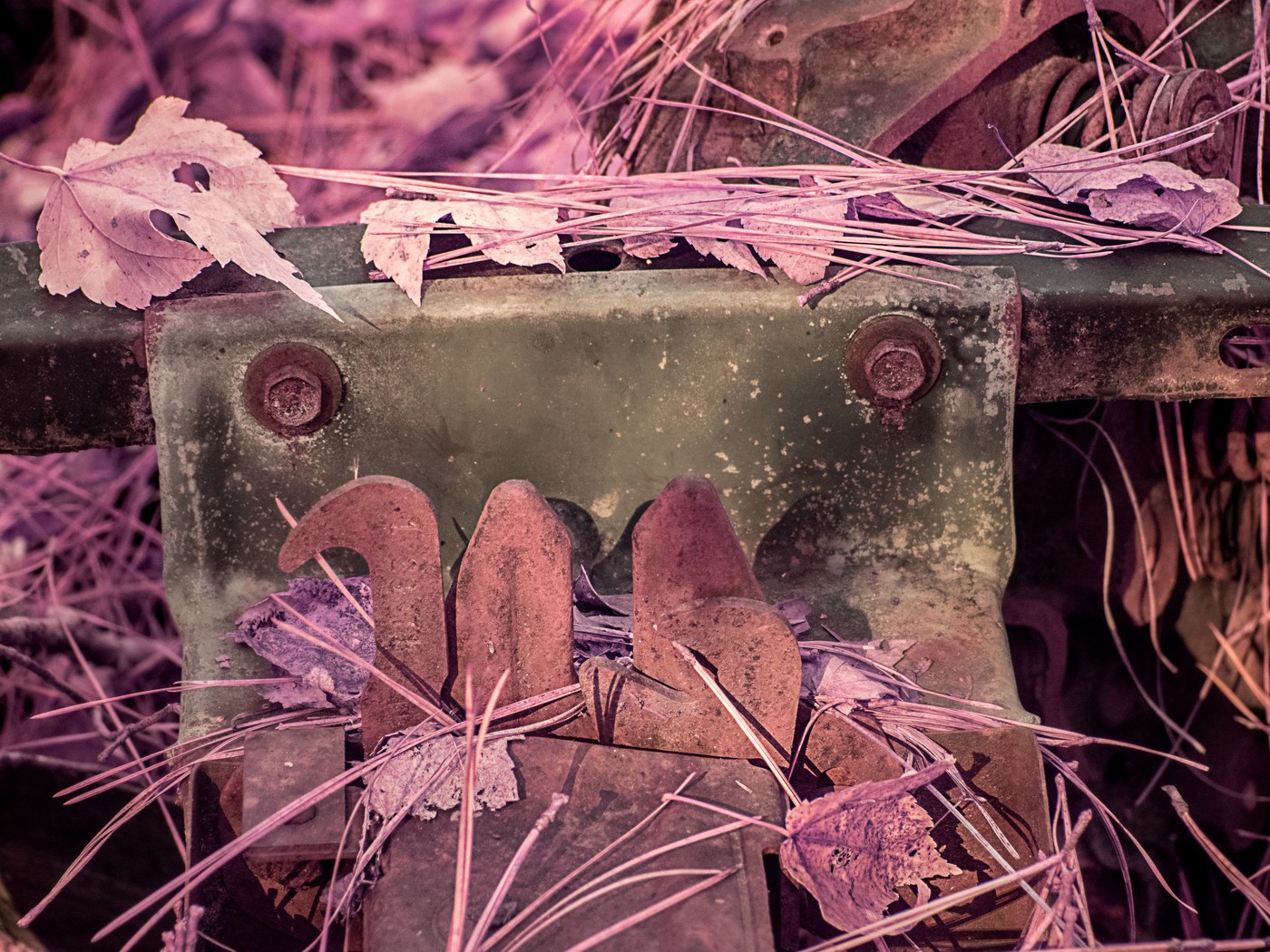
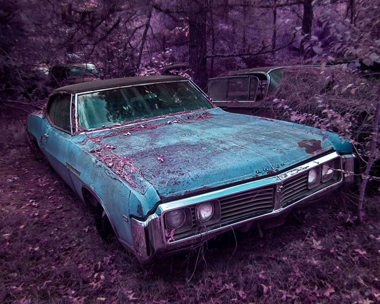
| 63 |
Jun 18 |
Comment |
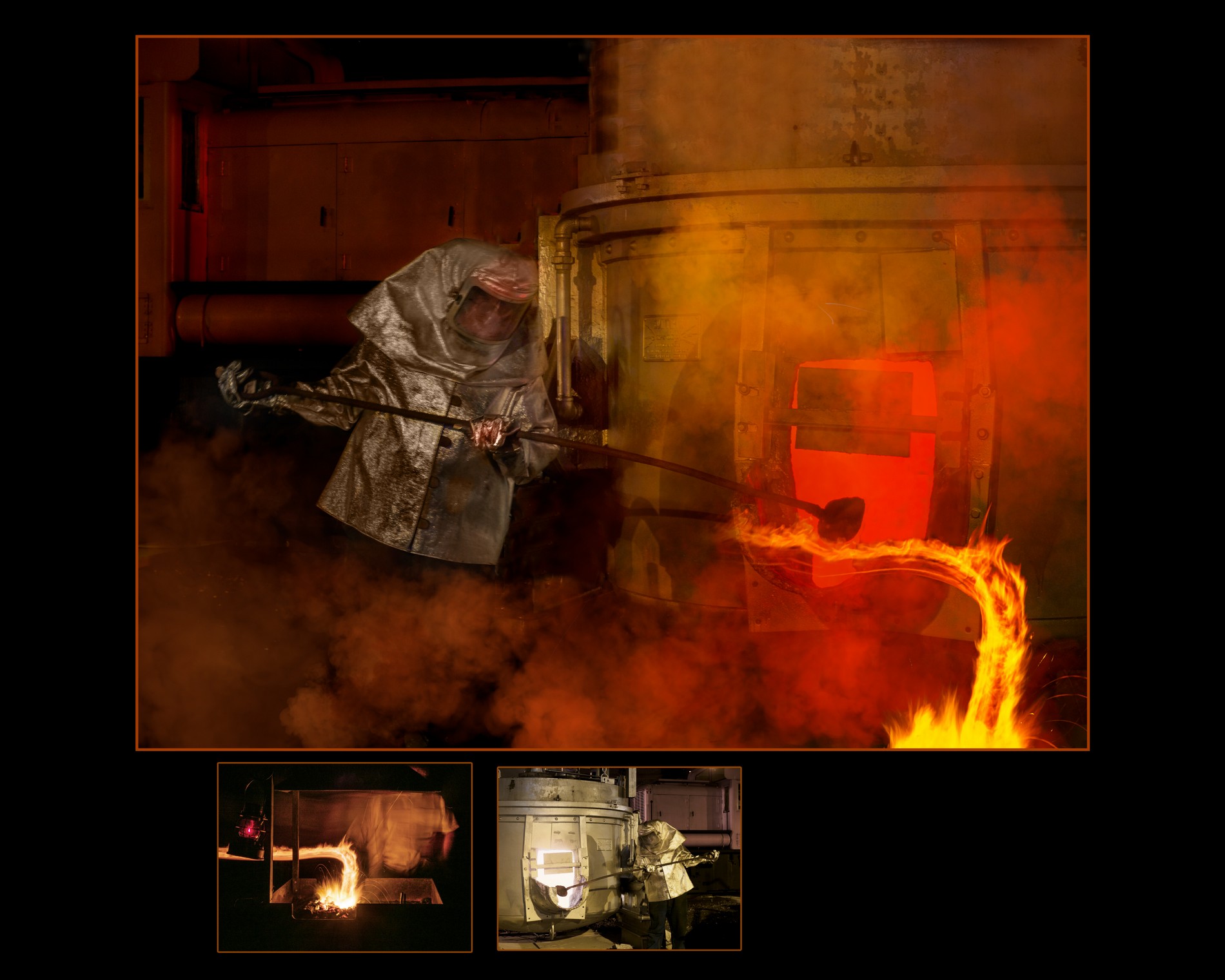
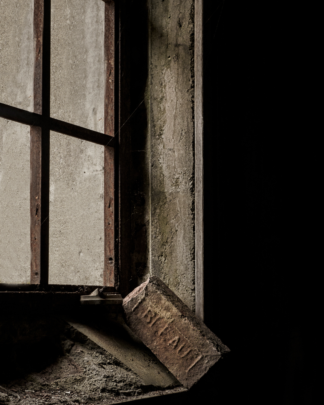
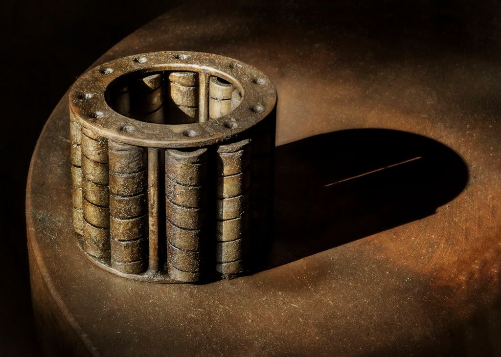
I just love rusty things! Just published a book about RUST! https://amzn.to/2lm01iP
I think that this is a good subject, needs to be sharper, practice your depth of field, your camera angle was not parallel camera sensor to subject. Also a polarizer would have helped with the glare.
Your time of day was tough, I often carry a diffuser for days and subjects like this, fold up small in your pocket and pops open to diffuse the sun.
Try Topaz Glow autoshine -- works well with rusty things...
|
Jun 21st |
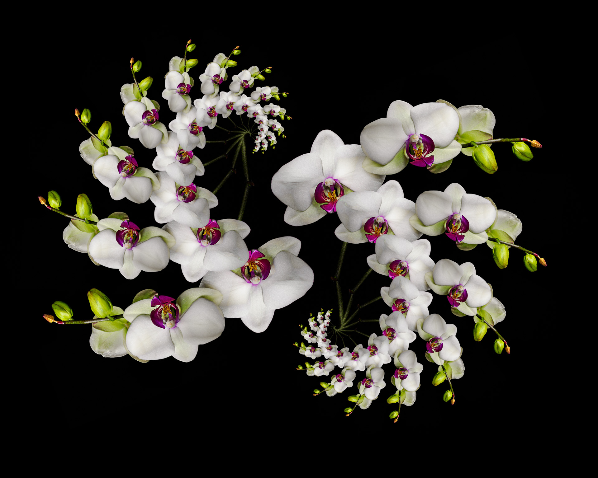
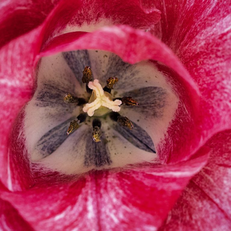
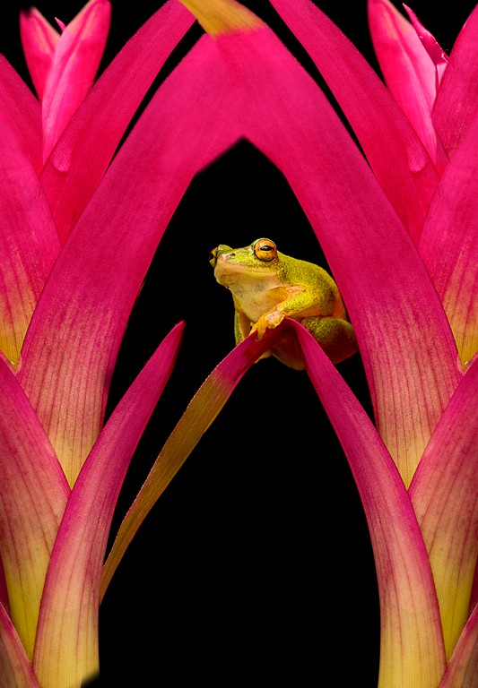
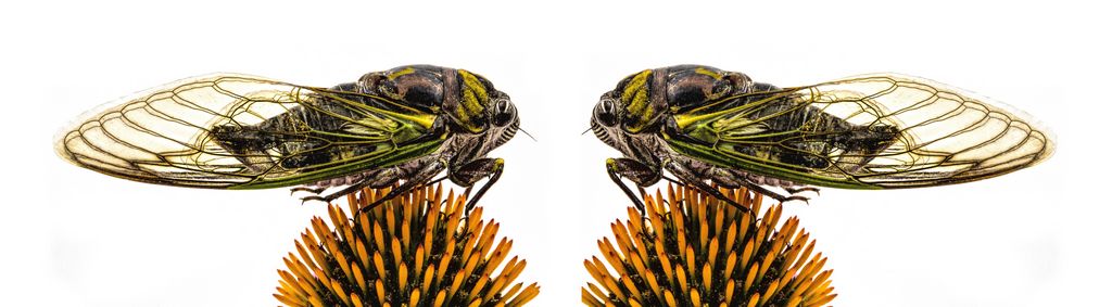
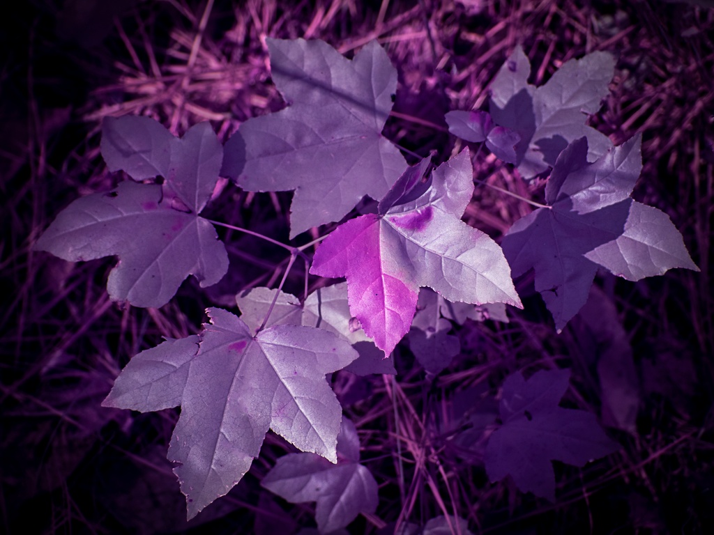
| 63 |
Jun 18 |
Comment |
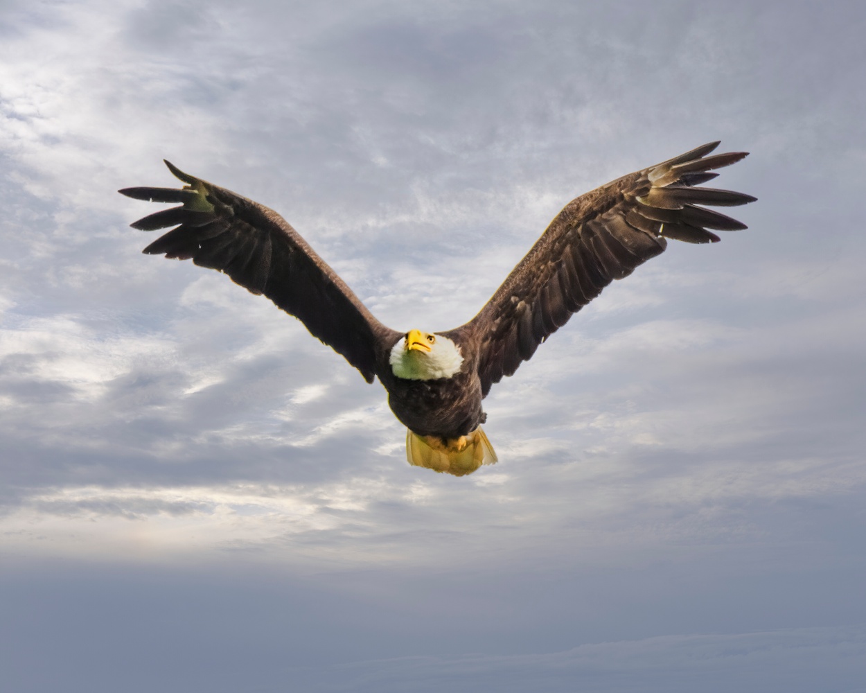
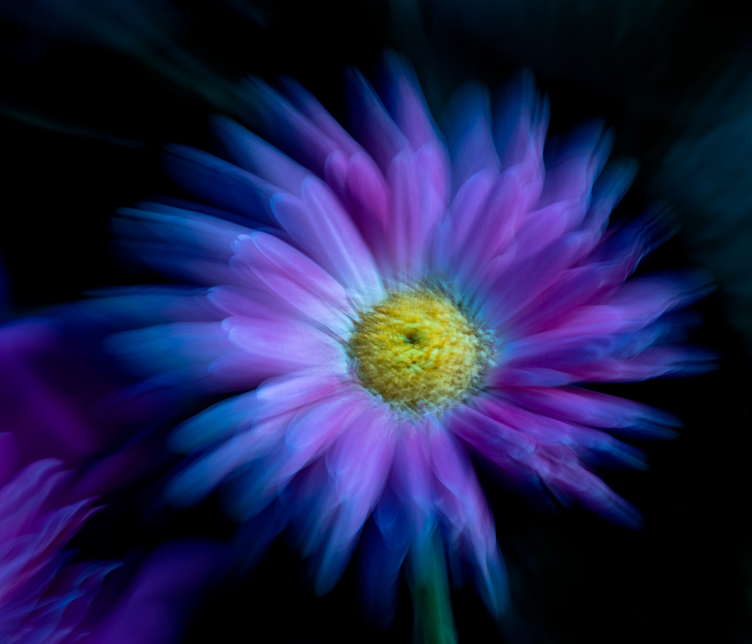
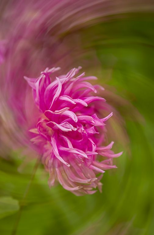
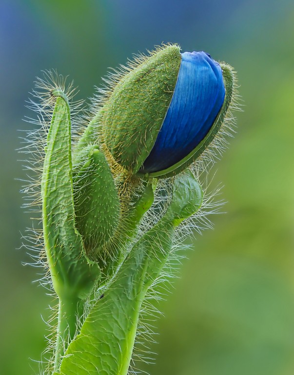
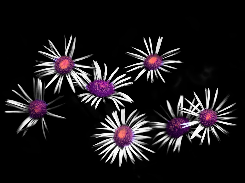
wow, stunning! Love the angle and the sharpness in the center and the colors. the selective focus is great.
The only thing that I can think to improve it would be to have placed another flower lower bottom left to get rid of the green -- or flip photo and do that in post... |
Jun 21st |
 |
| 63 |
Jun 18 |
Comment |
This one, opened file in ACR set white point, increased contrast |
Jun 21st |
 |
| 63 |
Jun 18 |
Comment |
This one, opened file, duplicated layer, changed blend mode to soft light, reduced opacity to 50% |
Jun 21st |
 |
| 63 |
Jun 18 |
Comment |
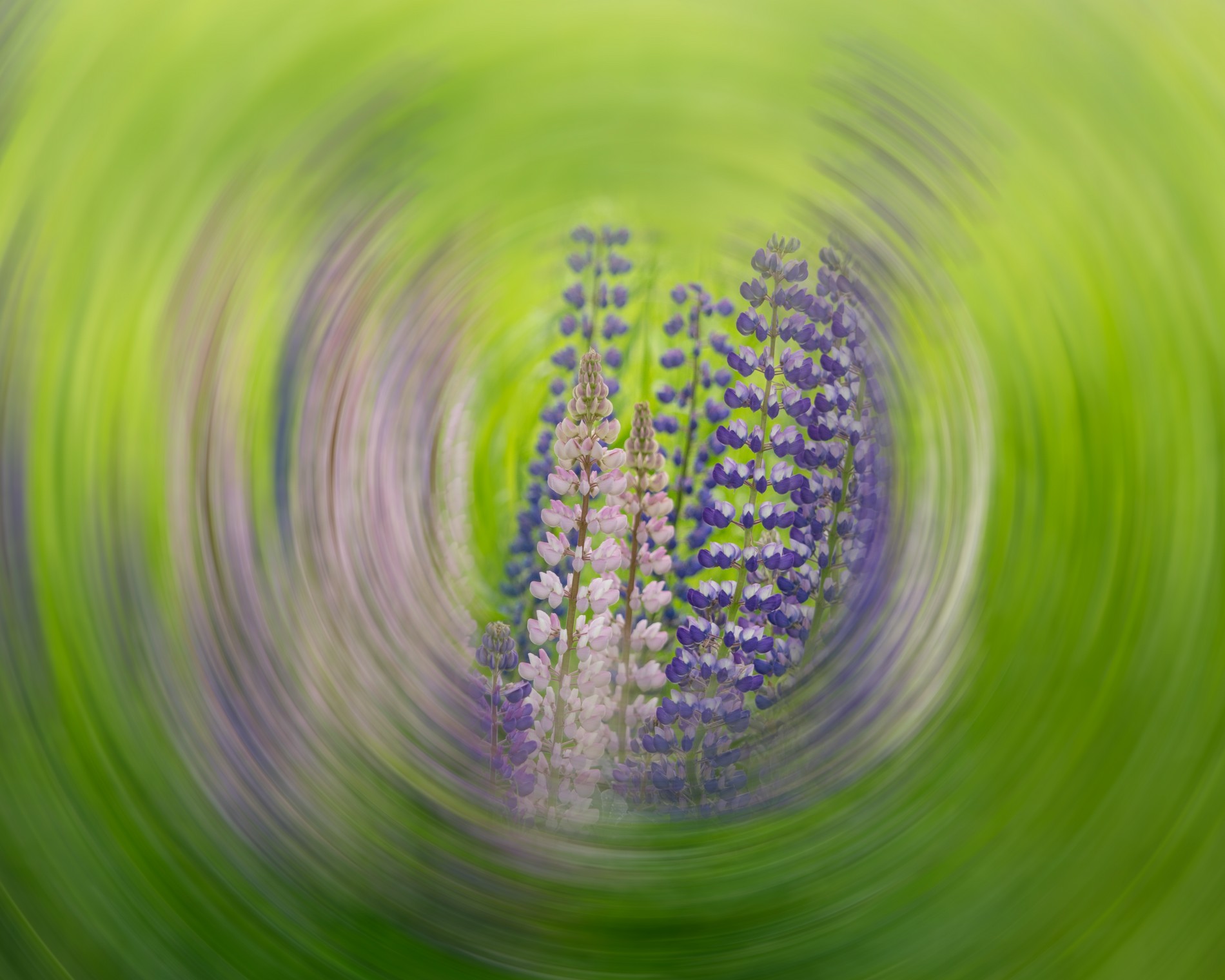
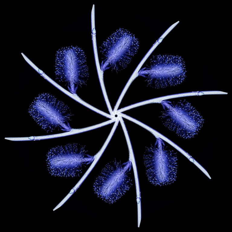
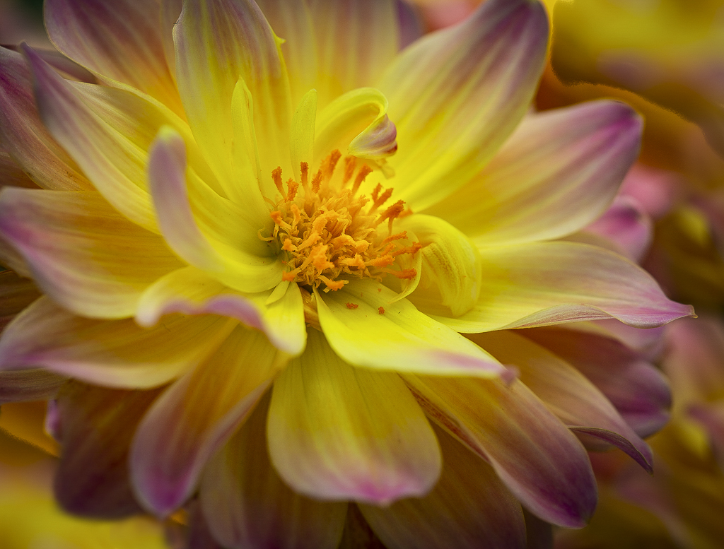
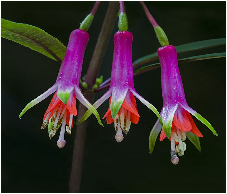
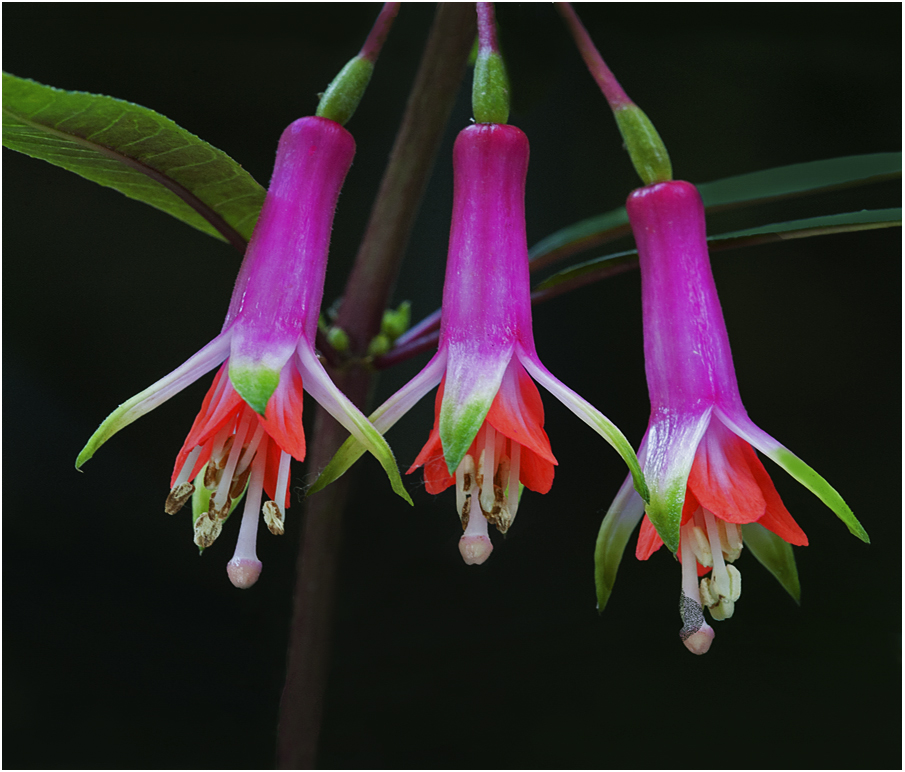
Love the composition, the choice of three, the colors, the sharpness (even the little hairs inside the flower)
I would add some contrast, appears a little flat on my screen. |
Jun 21st |
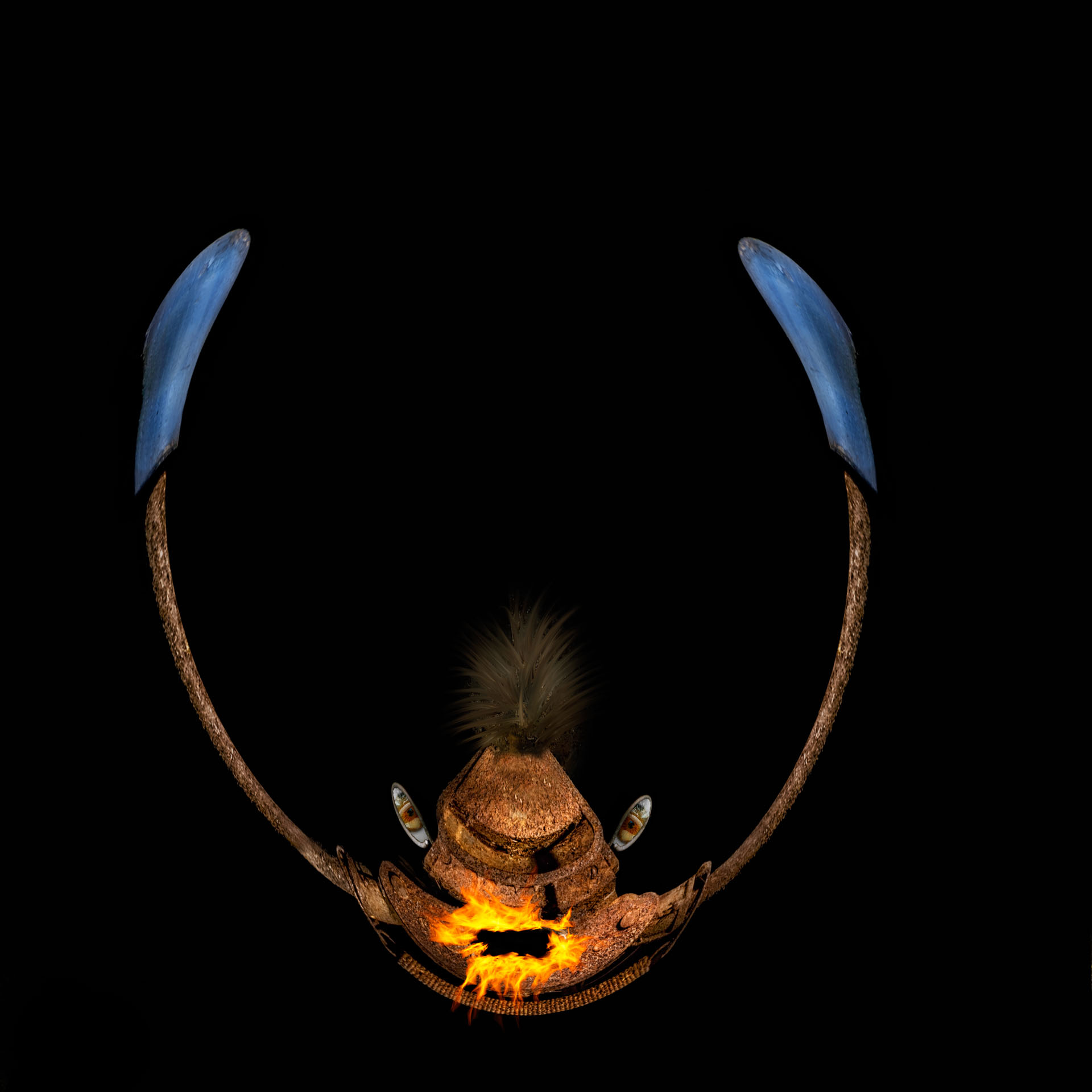
| 63 |
Jun 18 |
Reply |
LOL, gotta agree, I would not wear that color combo, lol |
Jun 21st |
| 63 |
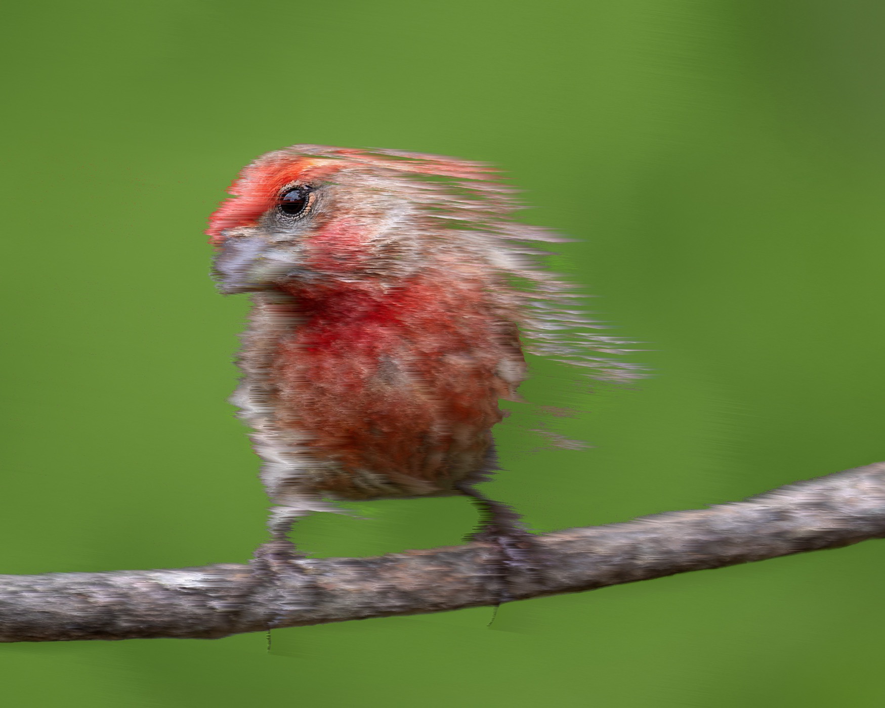
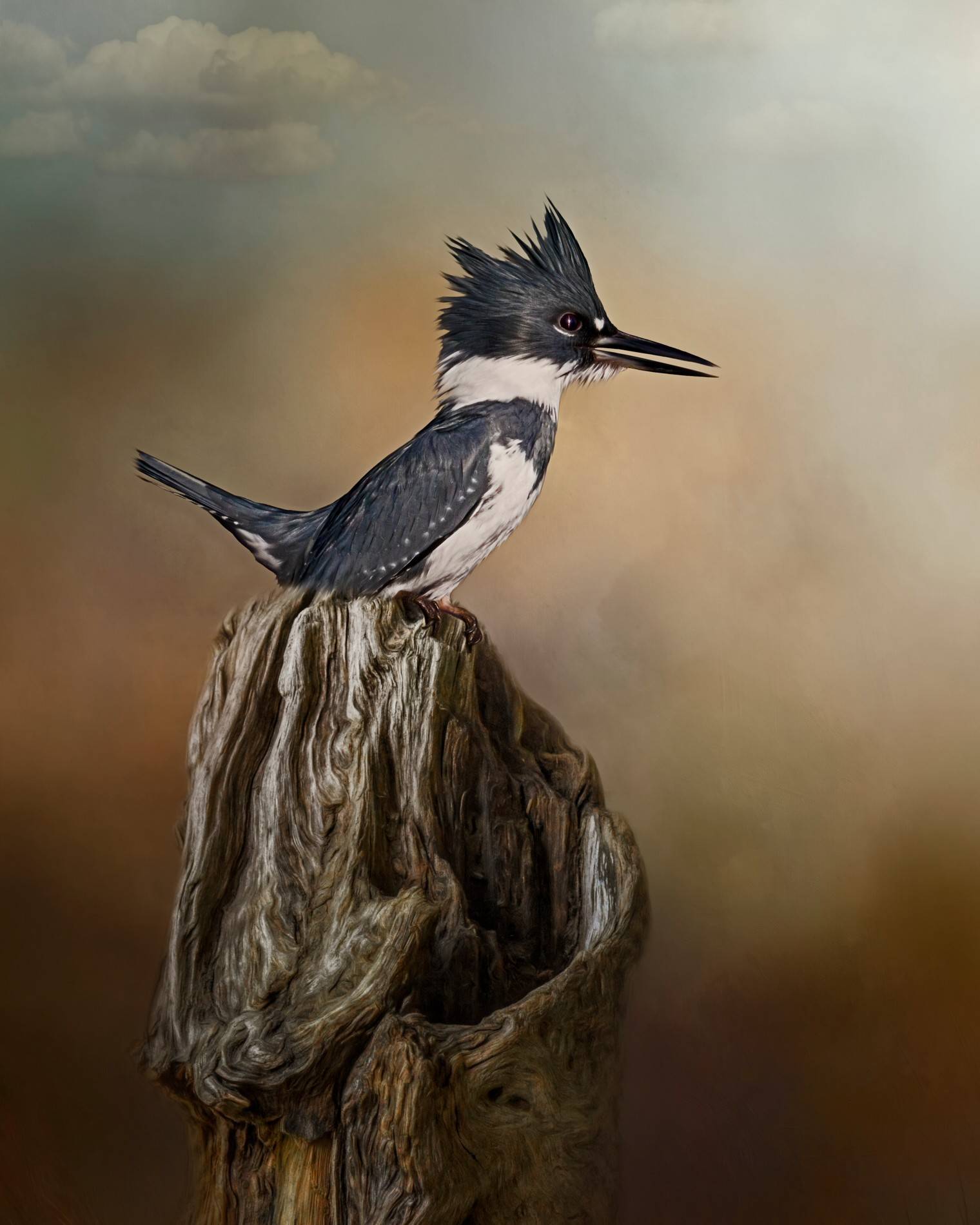
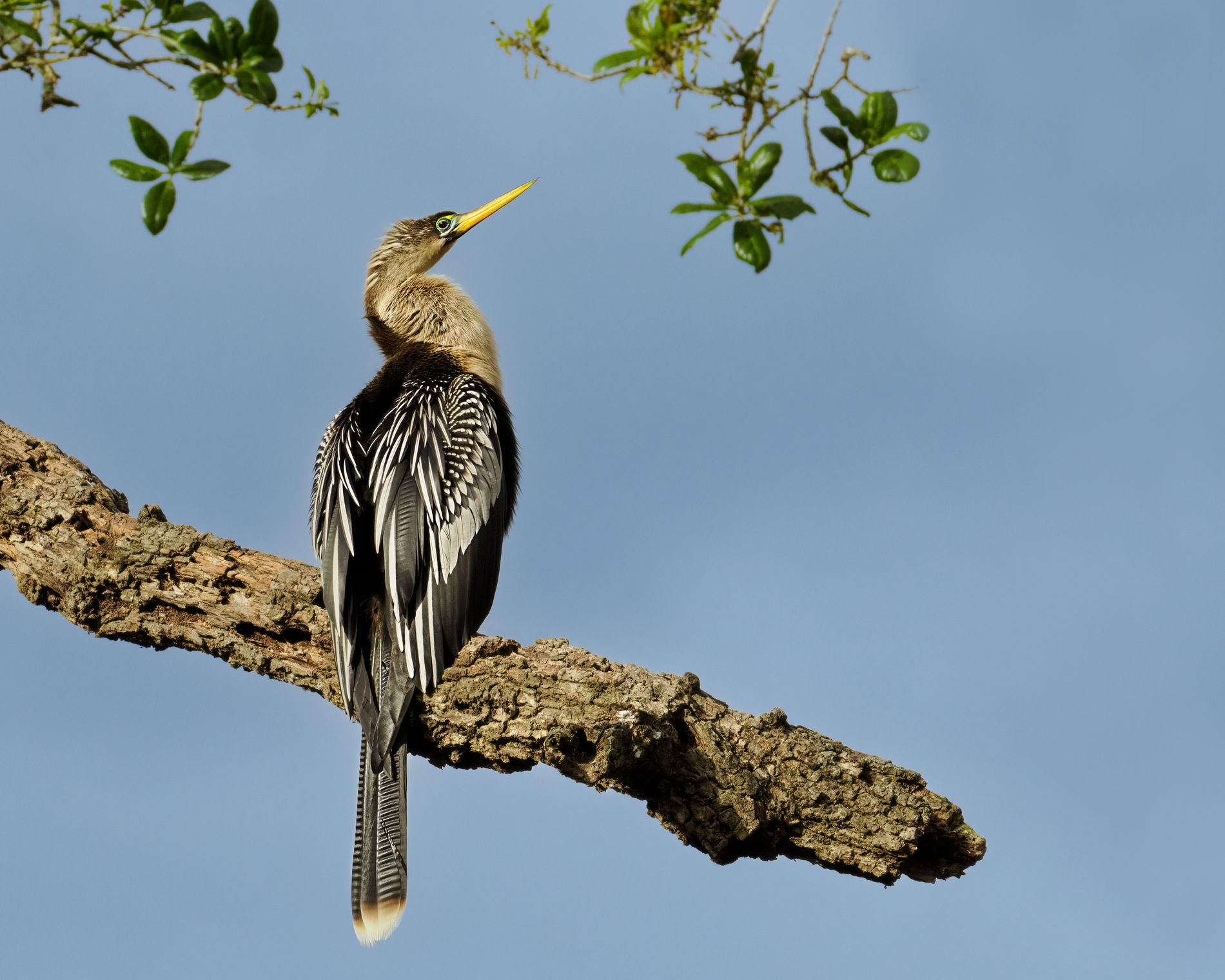
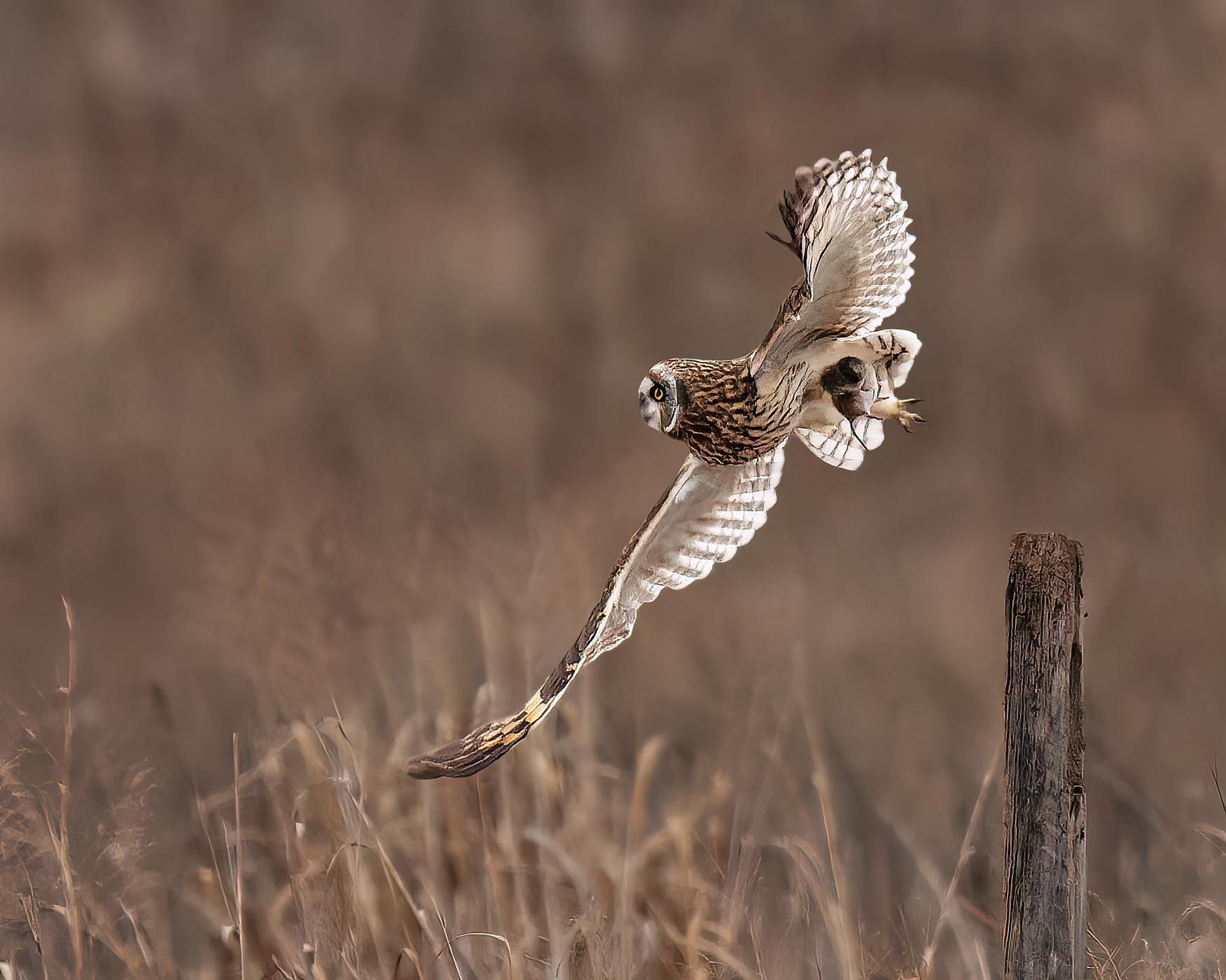
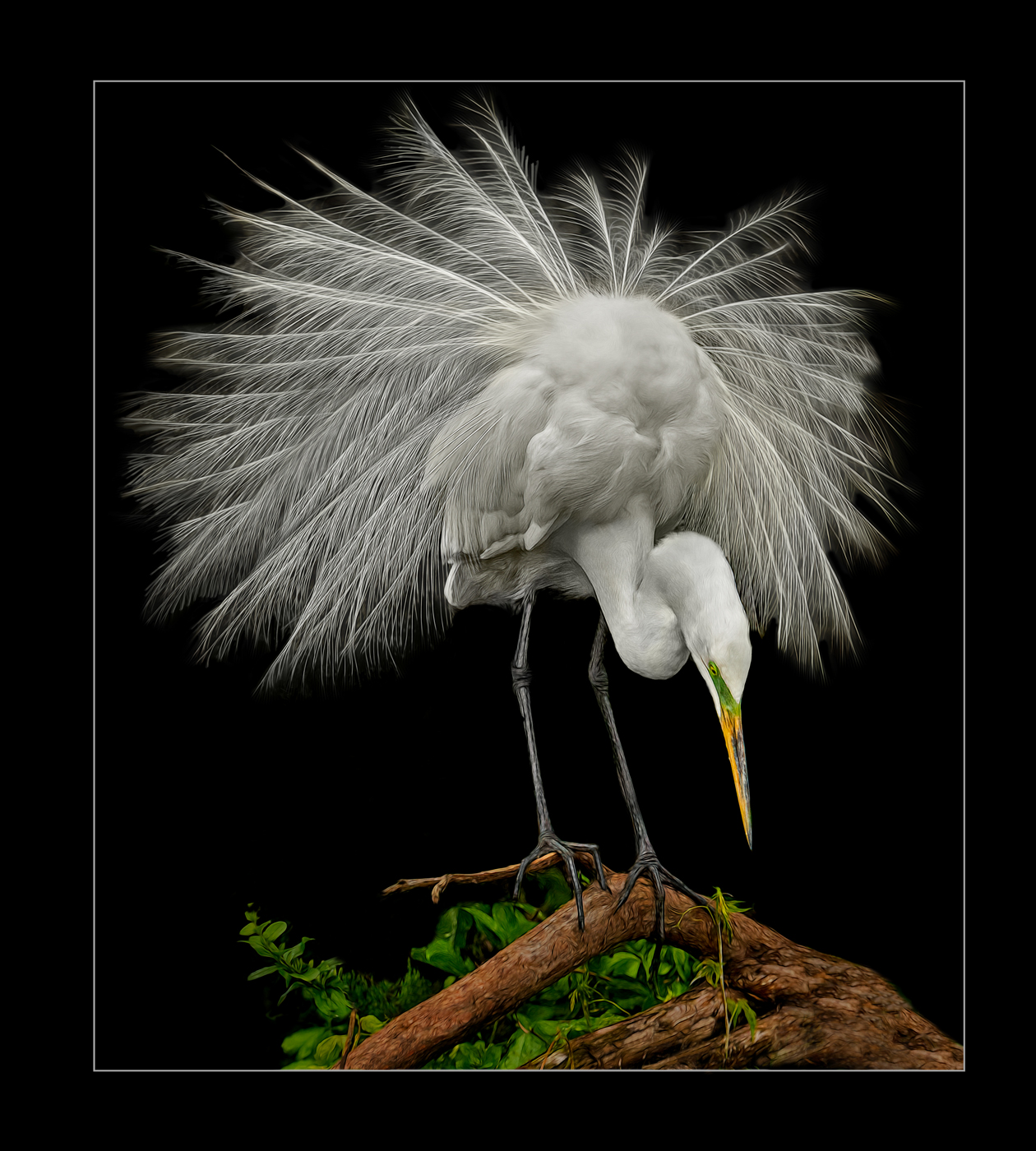
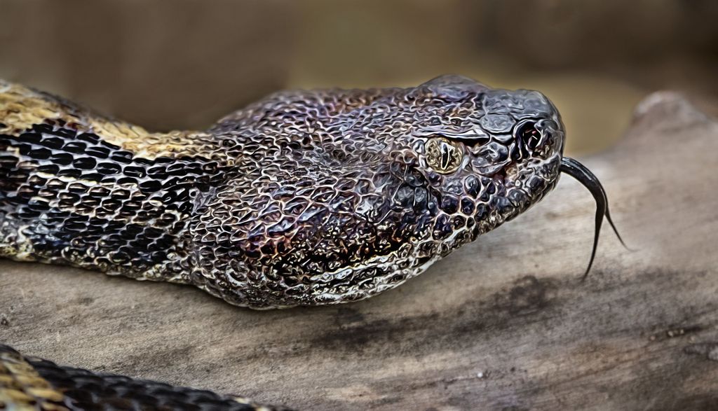
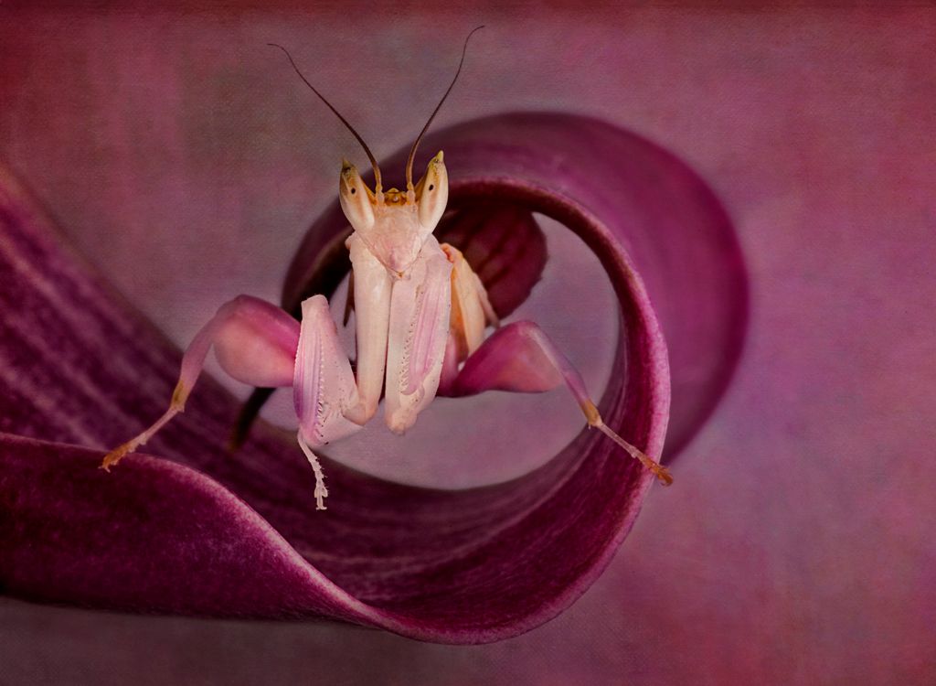
Jun 18 |
Comment |
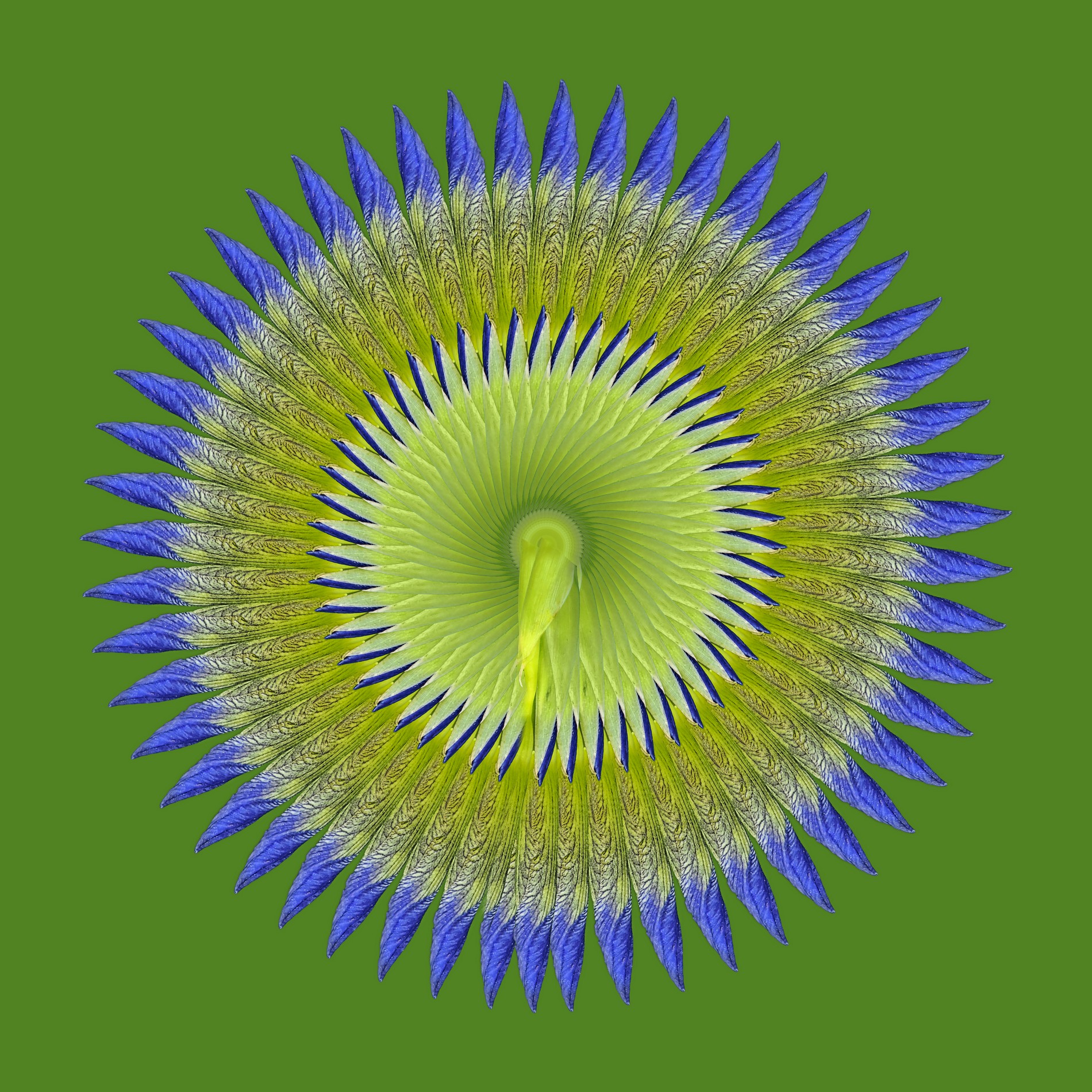
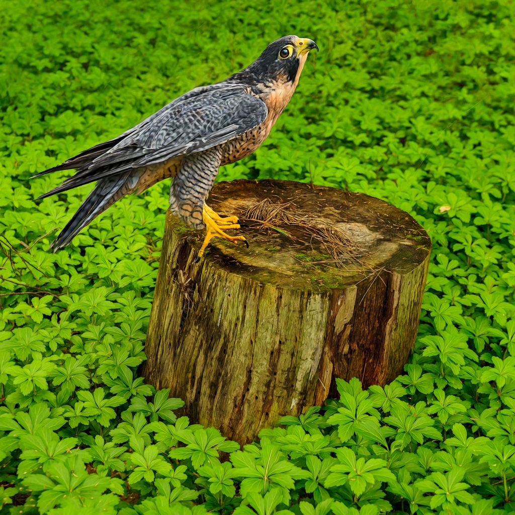
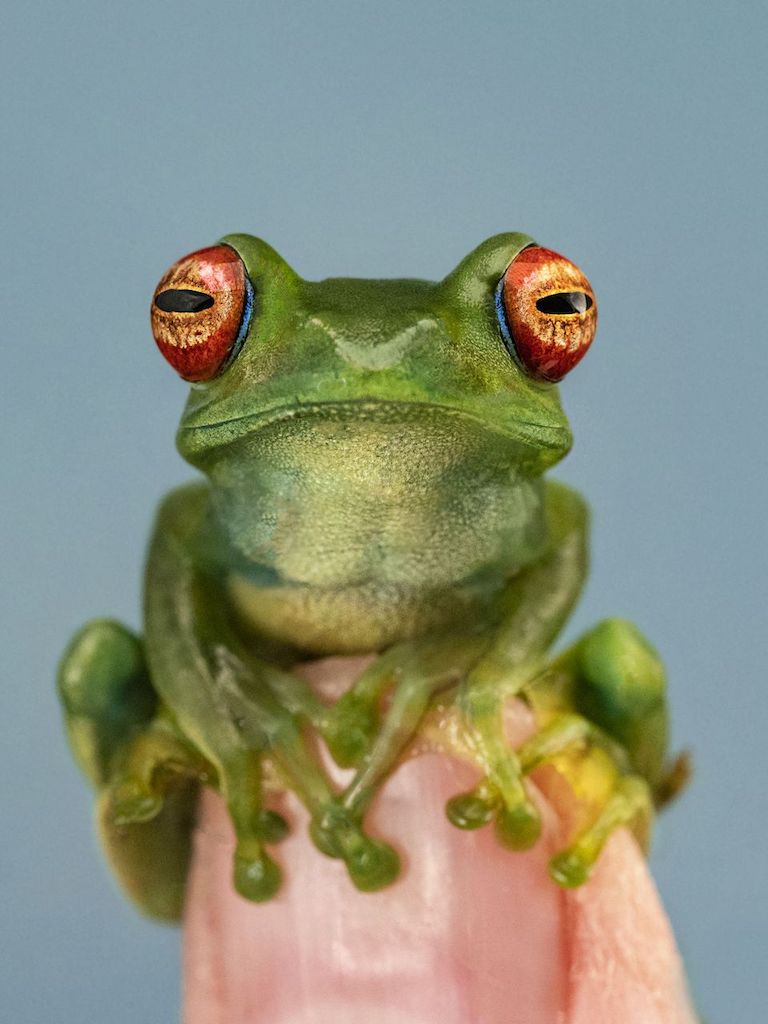
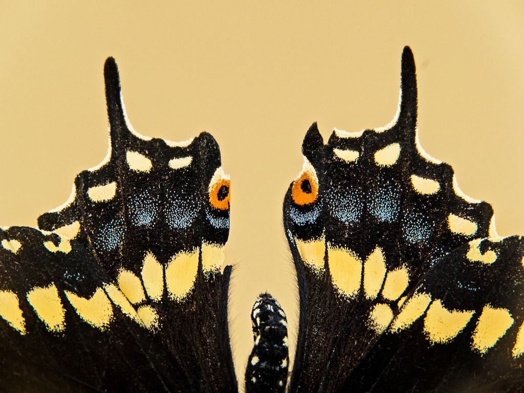
I love the bird; great detail in the feathers and eyes! Wow!
You could paint on a color blend mode and make those distracting white spots on the background go away.
But this is not macro ;-) not the lens or the subject
|
Jun 21st |
| 63 |
Jun 18 |
Reply |
black posterboard; I carry two pieces, black and blue on the other side and then white and green on the other side. The black and white sides were purchased that wah; the colors sides are blurry photos that I took intentionally and printed on matte paper and used double-sided tape.
|
Jun 21st |
| 63 |
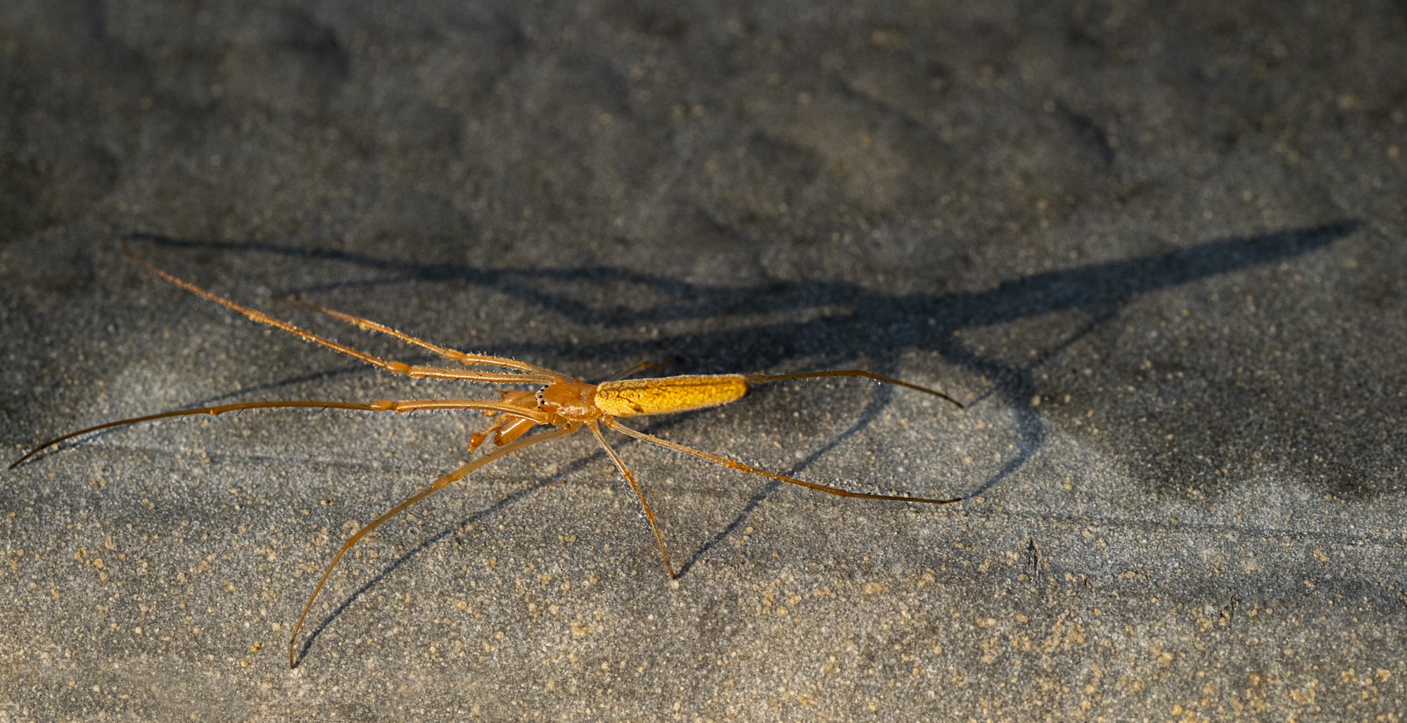
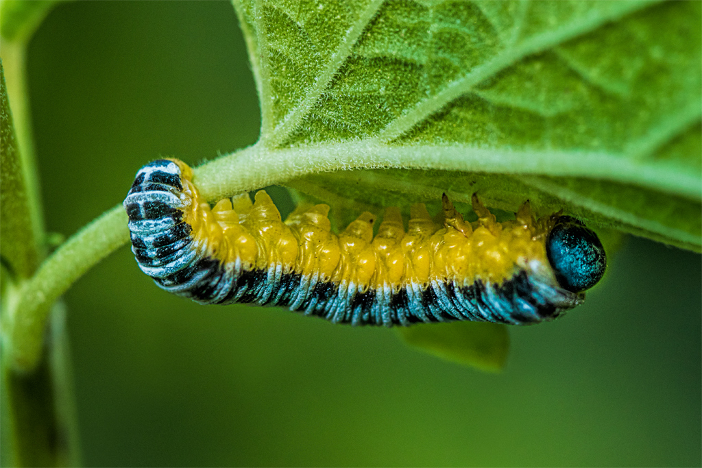
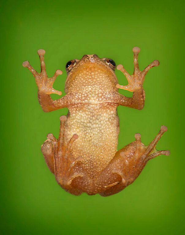
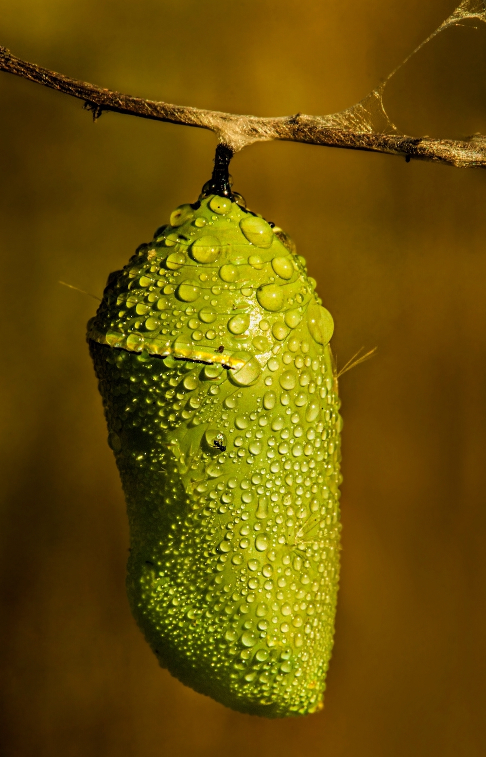
Jun 18 |
Comment |
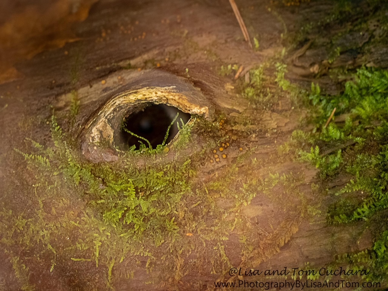
I thought that monarch caterpillars they only ate milkweed
As has been previously said macro is tough and you want the head/eyes to be sharp and as much of the subject to be on the same plane as the camera sensor as possible. The "original" is berter because there is too much blurry body on the other one.
Take a box of cereal, rice, etc. and practice this on your kitchen table. Keep the bok parallel to your camera sensor and observe the depth of field, then turn the box on a diagonal and see how fast the letters get blurry and at what aperture.
You have a good eye and an obvious love of nature, so practice, practice, practice. |
Jun 21st |
7 comments - 2 replies for Group 63
|
20 comments - 9 replies Total
|