|
| Group |
Round |
C/R |
Comment |
Date |
Image |
| 41 |
Mar 18 |
Reply |
bubbles in the water |
Mar 13th |
| 41 |
Mar 18 |
Comment |
I love the overall effect! I especially love what it did to her hair -- very cool! Her shirt looks very interesting with this effect as well. I will have to investigate this, thanks for sharing.
The subject is pretty and has a great smile and a good affect.
However, I do not like what it did to her arms, giving her a bigfoot appearance, lol, most women prefer smoother arms :-)
There is a lot of red on her left side of her face, that could be easily toned down, as well as her forehead and the lines in the forehead and right eye.
Lastly, be careful with eyes and hands -- hands are VERY hard to pose. I love her left hand and the way it is positioned by her head and the fact that we see the end and not the palm -- kudos on the left hands and arm! But her right hand disappears, almost making her an amputee, and then we see little nubs of fingers at the end. This gets better with more practice (practice on both the part of the model and the photog!)
and watch eyes that merge with I moved her eye just a tad to show that you want a little white showing. We usually give the subject a "mark" something to look at to get the eyes positions pleasingly. |
Mar 13th |
 |
| 41 |
Mar 18 |
Comment |
whoa, I have not played with this yet, we lost power for a few days and I was just behind before than and worse after that.
My impression of the program was it would have limited overall applicability (like Fractalius) but produce some cool results! Your image shows a cool effect for sure! I would darken the lower bottom right as it is the brightest in the scene and the least interesting in the scene.
very cool! Thanks! |
Mar 13th |
| 41 |
Mar 18 |
Comment |
I love the concept immensely! The sepia tones and the elements work well. The man looks like he is reminiscing which adds a lot of emotion to the instrument and music and to the house. Love those elements!
I would add some increased transparency to his beard as it disappears into the music, so just that area.
I did not know what the top noisy shape was in the upper right until I read that it was a top hat. That is the weak link in the image. It is not enough of the top hat to know what it is (I thought that it was a plate) and it is too noisy. |
Mar 13th |
3 comments - 1 reply for Group 41
|
| 44 |
Mar 18 |
Reply |
colors good, perhaps a tad bright |
Mar 14th |
| 44 |
Mar 18 |
Reply |
love it!!! |
Mar 13th |
| 44 |
Mar 18 |
Comment |
I like the colors and blend and the beach and composition and the birds in the foreground
but the images seems soft to me... |
Mar 13th |
| 44 |
Mar 18 |
Comment |
Hmm, I see stars, no barn, no tractor
? |
Mar 13th |
| 44 |
Mar 18 |
Comment |
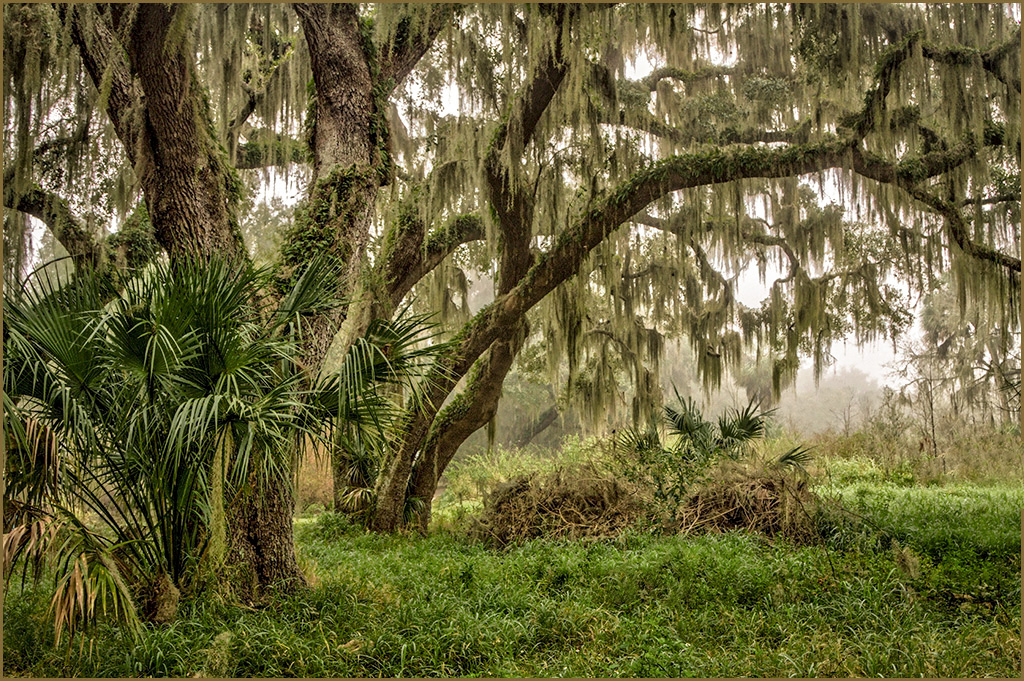
I love this, the subject, the tones, the composition, the bow of the branch going to the right and the moss.
Rick mentioned the greens were muted, I assumed that this was intentional.
I would clone out the vertical stick in the middle and the fronds at the far right. |
Mar 13th |
 |
| 44 |
Mar 18 |
Reply |
I agree about the dinosaur walking thru, I had the same thought!
|
Mar 13th |
| 44 |
Mar 18 |
Comment |
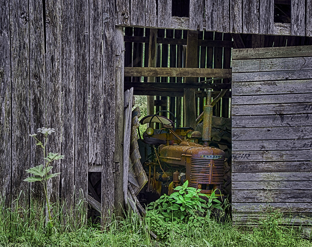
I love your choice of subject matter. The HDr has no halos and appears natural, but as some HDR does makes it kind of flat and lacking of contrast.
I treid a little dehaze and setting the back (and white) point
|
Mar 13th |
 |
| 44 |
Mar 18 |
Comment |
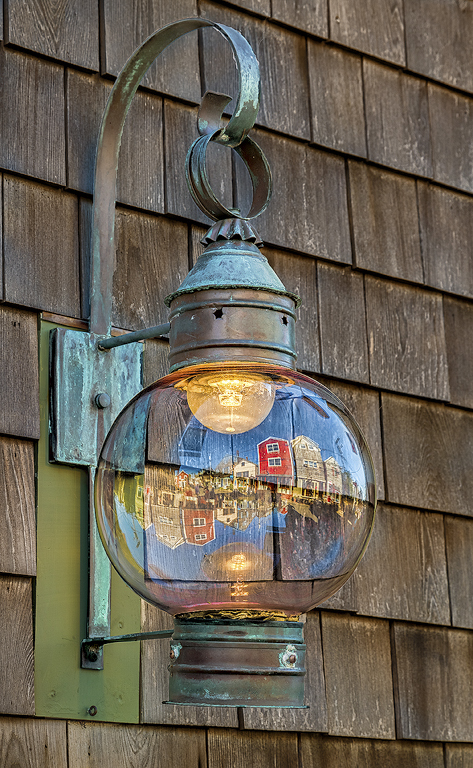
I love the lantern and the holder themselves but the reflection in it really adds a lot! The triple passes thru clarity worked very wekll - kudos for spending that much attention to detail and masking (I agree, not liking to have to use Studio to get to the new clarity, I am using the older clarity too)
The shingles have a blue color cast, seems like warming them up would add to the image and allow some yellow - blue/green color wheel pop.
Personally, I like it flipped as my eye comes in from the left and then follows the curve down to the lantern |
Mar 13th |
 |
| 44 |
Mar 18 |
Comment |
I like the wood patterns and all the brown ones, HDR at its best. I like the window reflections on the floor too. The angle leads your eye right down the bridge which is pleasing.
I wish that the green at the end had similar green colors to the first window, they are very blue greens at the end. |
Mar 13th |
6 comments - 3 replies for Group 44
|
| 63 |
Mar 18 |
Comment |
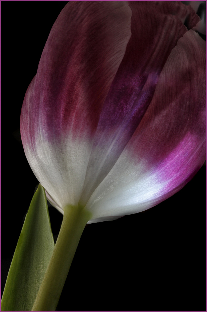
love the window light!
and you picked a good flower
the diagonal prevent the composition from being static
I would make sure that the black are black (they look muddy to me)
|
Mar 13th |
 |
| 63 |
Mar 18 |
Comment |
or even change the black to green with a new layer |
Mar 13th |
 |
| 63 |
Mar 18 |
Comment |
The position of the lily and the lily itself are done very well. Sharp, especially for handheld.
A polarizer would have helped a lot with all that glare and such on the green leaves.
The bright leaves in the background sticking almost out of the main lily are distracting.
I added a color blend mode layer and spiced up the leaves, took away the distracting leaf and applied Topaz clarity to the lily and then changed the blend mode to soft light. |
Mar 13th |
 |
| 63 |
Mar 18 |
Comment |
cool! more rust! I mentioned to Karen that we recently published a book on rust! http://amzn.to/2tJSVeZ
I love the textures and the bolts and main knocker. Sounds like you were able to have a vision for a somewhat ordinary object and make it into something special
The orange is a little too saturated for my taste (but like spices it is hard to tell someone how much garlic or curry or ginger to put into their meal)
I also wish the lower right bolt was not clipped. |
Mar 13th |
| 63 |
Mar 18 |
Comment |
I love this! bolts and cool things are right up my alley! We have a book on this very topic! http://amzn.to/2tJSVeZ
I love the blue and yellow tones and would bring that out more. Colors at opposite ends of the color wheel like this have a lot of impact!
The image is a tad noisy in the background, Topaz denoise 6 would do wonders with this! -- or just make a new layer and use the gaussian blur filter in PS.
The flat positioning of the bolt makes it a little static, a slight angle would add more pop to the image... |
Mar 13th |
 |
| 63 |
Mar 18 |
Comment |
Welcome!
Cool!
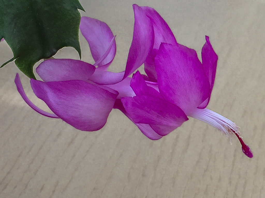
What app did you use for the capture, obviously it allowed for you to choose the shutter speed and the aperture, not all apps have that capability.
Was this an app for macro photography or did you have a macro lens attachment on the phone? I am not sure how the actual macro portion was captured. Please give us more details, inquiring minds want to know :-)
I like the placement and composition with the green coming out of one corner and the angle. The magenta colors pop!
We read left to right so the image would be stronger flipped. That way your eye starts at the green and flows towards pistel/stamen |
Mar 13th |
 |
| 63 |
Mar 18 |
Reply |
yes, I have a piece of acrylic that the frogs will climb up inside of the light tent... |
Mar 13th |
6 comments - 1 reply for Group 63
|
15 comments - 5 replies Total
|