|
| Group |
Round |
C/R |
Comment |
Date |
Image |
| 41 |
Feb 18 |
Comment |
The artistic effects enhance this image. The image was interesting to begin with and your choices to artistically render it were successful.
The knots in the wood detract from the main subject
The light areas and reflections at the top pull your eye away from the main subject.
The red keystroke bring my eye to the edge rather than the subject matter
I cropped to remove the keystroke and the top bright aware and content aware filled the knots |
Feb 24th |
 |
| 41 |
Feb 18 |
Comment |
I love using smoke and creating mirror images and faces from it, it is a lot of fun!
Your result is very interesting -- and what you see depends upon where you look and what your subconscious sees.
I like your use of Topaz adjust vibrance to add and enhance color to the image. The entire image is well done
The idea of these as harmony is interesting, as they have no beginning and no end. perhaps use the circle tool and eliminate the frayed knobs as they seems perhaps incongruous with the harmony theme. |
Feb 24th |
| 41 |
Feb 18 |
Comment |
wow, what an emotional image, such impact. The determination is so evident in this image. You have captured a powerful "superhero" image of this young man.
I like the space fx action, I collect a lot of actions but do not remember this one.
There is a halo on the bottom of the prosthetic shoe and around his hair (mask the hair halo with a 40% or so opacity and you should be able to bring in more space and lessen the halo drastically.Since this is creative I would also add a little canvas on top of his head and fill in with some space content aware fill should do it.
|
Feb 23rd |
3 comments - 0 replies for Group 41
|
| 44 |
Feb 18 |
Comment |
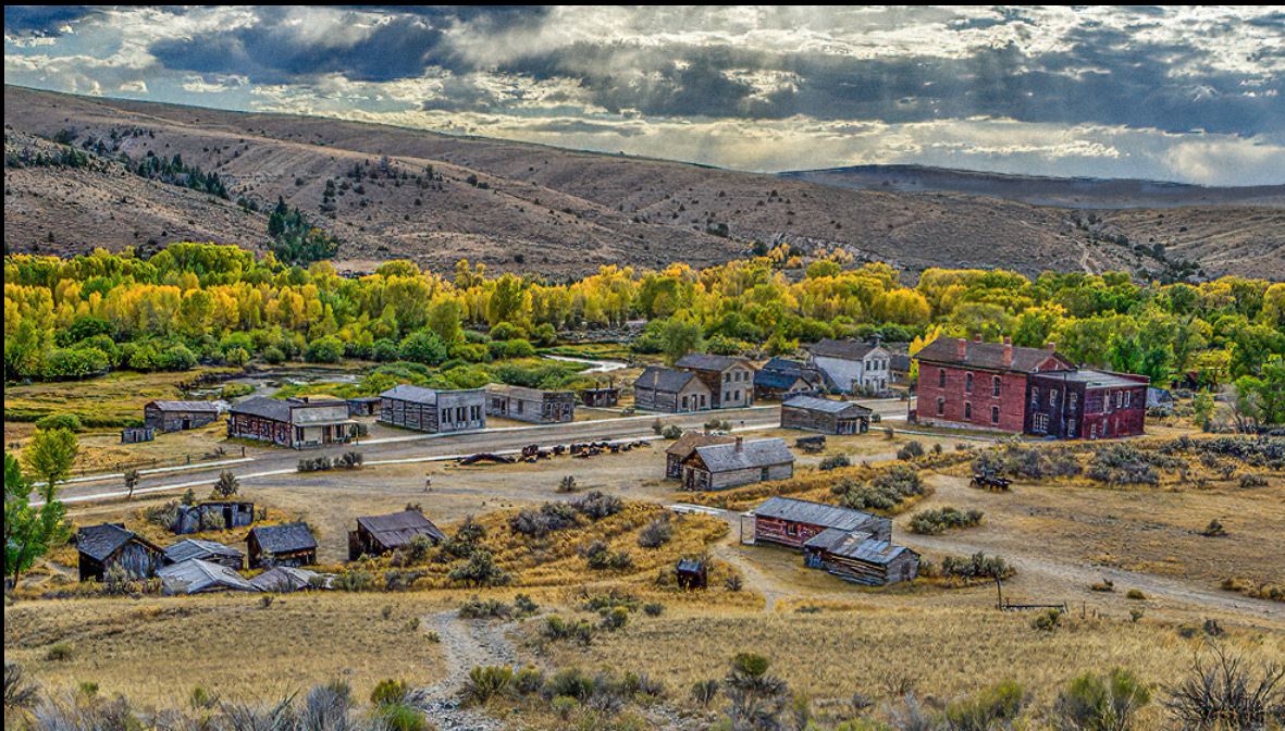
and I am not sure why the guidepost is not connected, is this a PP mishap or an optical illusion? |
Feb 24th |
 |
| 44 |
Feb 18 |
Comment |
there are a few orphaned pixels, not sure where they came from... |
Feb 24th |
 |
| 44 |
Feb 18 |
Comment |
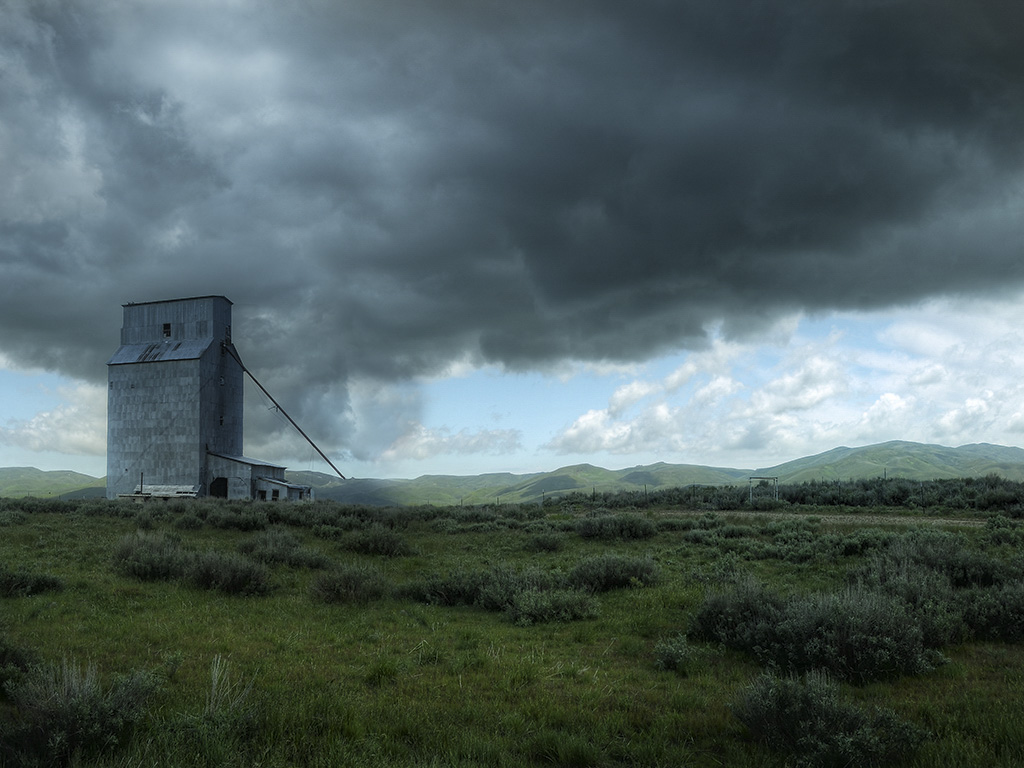
I love the subject matter and the dramatic clouds and blue skies help set a wonderful mood.
A little more contrast would help...
I see what you mean about the position of the silo and why you could not compose more to the right. You could flip the mage (and remove the sign content aware fill) |
Feb 24th |
 |
| 44 |
Feb 18 |
Comment |
I love the moodiness and the choice of BW/color. The clouds help set the mood. The makers and flags add interest to the left side and make it more than just a picture of a statue.
I like the BW and selective red/blue of the flags but I would keep the fucshia colors of the flowers in BW. I would also lose the color in the left church.
I would definitely suggest shooting more exposures than you think you will need, you can always choose not to use one or more exposures, combining this many stops from two exposures is hard. |
Feb 24th |
| 44 |
Feb 18 |
Comment |
love the composition and angle and lighting. The reds and clipped reds/yellow were already mentioned.
The top right has some alignment issues, in Photomatix you had aligned images checked?
You might consider content aware fill in that one patch of sunlight lower left, the rest of the image is so strong that it pulls my eye away from the arch
This image deserves to be reworked, it is beautiful. |
Feb 24th |
| 44 |
Feb 18 |
Reply |
good suggestion |
Feb 24th |
| 44 |
Feb 18 |
Comment |
I love OCC and I love old trucks/cars
Kudos for getting down low, too many people shoot at 60 inches because that is what they set their tripod to at the start of the shoot. Just like people you need to get down to "eye level" with cars as your subject.
I love the character and colors
I wish that there was a little more contrast in the car |
Feb 24th |
 |
| 44 |
Feb 18 |
Comment |
I love the crispness of the scene and colors. The yellow and yellow reflections are, to me, the center of interest, hence I would clone out the log.
I like the two clouds on the left side and no clouds on the right the negative space in the right sky side allows your eye to really concentrate on the yellow. |
Feb 24th |
| 44 |
Feb 18 |
Comment |
of course, you are the artistic, you could add clouds (rules depending of course) |
Feb 24th |
 |
| 44 |
Feb 18 |
Comment |
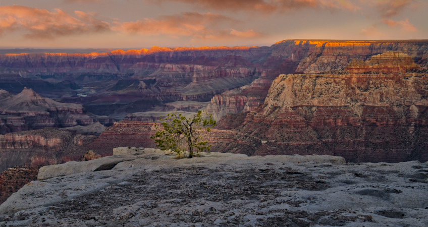
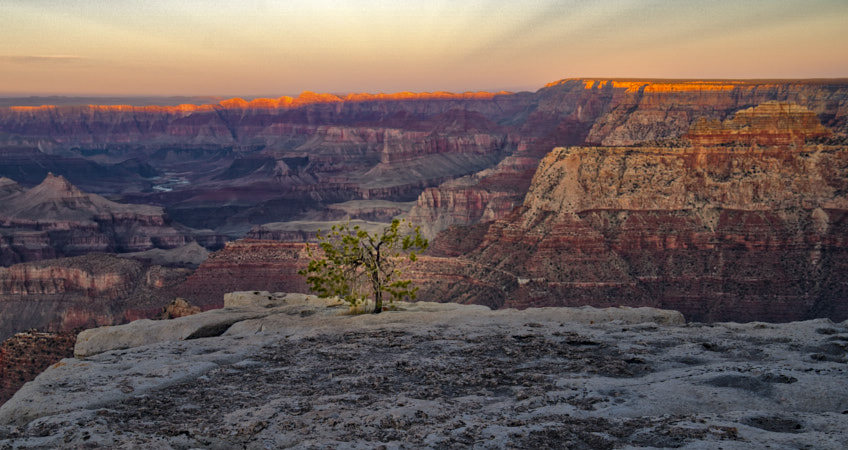
I love the scene and composition! The lit area at the top adds interest.
A little dehaze for the Canyon would add to the scene. as would a little light (radial filter in ACR)
I like some of the ridges and such on the left side but would sacrifice them for a less centered tree |
Feb 24th |
 |
9 comments - 1 reply for Group 44
|
| 63 |
Feb 18 |
Comment |
beautiful capture and choice of specimen
I would add a new layer, change the blend mode to colors and change those blue green lines to green
I agree with the above" The top of the flower went a bit too light in your processing and has lost some detail, the original shows good detail in the top of the flower." |
Feb 24th |
| 63 |
Feb 18 |
Comment |
unusual! Hard to create a new flower composition.
The colors and texture are great.
It is more traditional to have the darker color or top, my first reaction was flip it vertically, but when I did it loses some of its impactful unusualness |
Feb 24th |
 |
| 63 |
Feb 18 |
Comment |
white flowers are hard and you did a good job with exposure and the added water drops add interest. The background is pleasingly soft and blurred and the flower is interesting and keeps the viewer's eyes going around the flower.
A little more contrast would make it pop
or if you like layers, duplicate layer and change blend more to soft light and lower opacity to taste. |
Feb 24th |
| 63 |
Feb 18 |
Reply |
good assessment and I like the phrase
"I especially like the little renegade in the lower left." |
Feb 24th |
| 63 |
Feb 18 |
Comment |
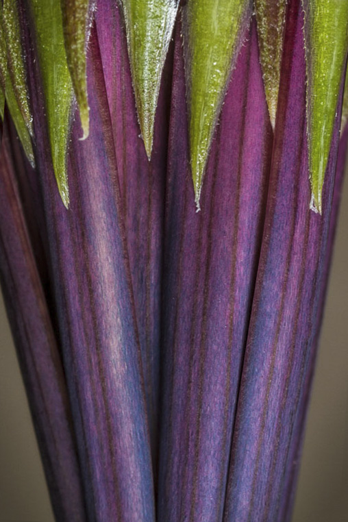
You achieved your goal of a good clean background, kudos. I like the colors at near opposite ends of the color wheel, the purple/blue against the greens is pleasing.
perhaps clone out that right side leafy stem in the lower right? |
Feb 24th |
| 63 |
Feb 18 |
Comment |
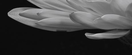
you do have what appears to be one small editing holiday left left petal |
Feb 24th |
 |
| 63 |
Feb 18 |
Comment |
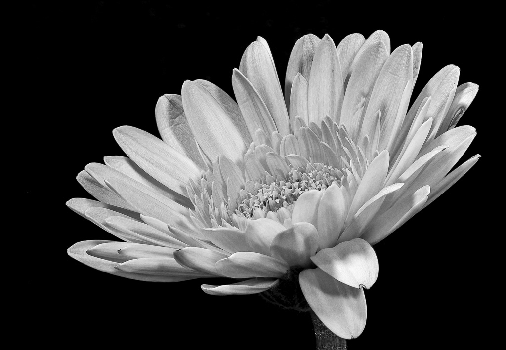
I love the choice of flower and your choice to make this BW. This image has so much detail and texture and shapes of the petals it really keeps your eye on the subject.
Perhaps you were trying for a low contrast scene, but I always set my blacks black and my whites white in ACR (hold down alt and move the slider until the blacks black and the whites white). I ended up with +51 white and -41 black on this.
on my calibrated monitor the blacks were grey |
Feb 24th |
 |
| 63 |
Feb 18 |
Comment |
I love this, the muted colors against the snow, really sets a tone of the circle of life. The brown tone are wonderful and the flower has lots of cool texture and detail.
I would try to paint a little white over the gray snowy areas and there might be a halo or PP artifact in one petal on the left
|
Feb 24th |
 |
7 comments - 1 reply for Group 63
|
19 comments - 2 replies Total
|