|
| Group |
Round |
C/R |
Comment |
Date |
Image |
| 41 |
Sep 17 |
Comment |
perhaps a tad less red? |
Sep 22nd |
 |
| 41 |
Sep 17 |
Comment |
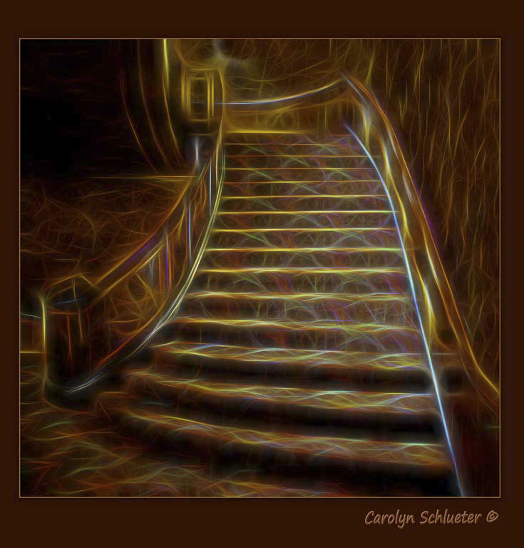
i love staircases and you have captured this very well, and I loved the edited version too. The effect is wild, but yey it complements the original carpet too
I like the leading lines and the doorway at the top
The already mentioned black stroke would be good |
Sep 22nd |
| 41 |
Sep 17 |
Comment |
I like the sketch effect! the BW works very well here.
I would darken the background so that it does not draw your eye away |
Sep 21st |
| 41 |
Sep 17 |
Comment |
has great impact and adds to her character!
cool!
you do lose a little of the fact that it is a lip ring so I would either mask out the effect on that area or clone it out
I agree about the neck "as it kinda makes her neck look crinkley and wrinkly" makes her look old and wrinkly, I would edit that area. |
Sep 21st |
| 41 |
Sep 17 |
Comment |
I love this as a subject for a mandala, the colors and patterns work well. I also like including the popouts of the subject used, very well done.
I would darken the blurred background so that it does not compete |
Sep 21st |
5 comments - 0 replies for Group 41
|
| 44 |
Sep 17 |
Comment |
I love trolley museums and have shot at this one a few times. Yes, there are lots of tripod ops here too.
five shots handheld, whew. And in bright light. You did really well with the conditions. and I like the saturation
The colors and composition work, although I would be tempted to change the trolley in the right to yellow, lol
texture would tone down the ground in front
|
Sep 22nd |
 |
| 44 |
Sep 17 |
Comment |
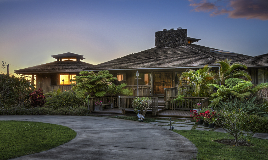
wow, what an awesome place to stay, I can see why you wanted to capture the memory.
The toning is natural and the sunset and windows give your eye add to the mood.
The chimney is a tad dark
This might be where luminosity would excel over tone mapping (?)
I brought this into ACR and added a gradient to the sky, a tad bluer and a tad darker and then added a color blend mode for windows |
Sep 22nd |
 |
| 44 |
Sep 17 |
Comment |
love the wood tones
The HDR works very well here
I would tone down the right with the bright cabinet.
I would also tone down the map on the left, just a tad, to keep the viewer's eye in the center |
Sep 22nd |
| 44 |
Sep 17 |
Comment |
The clock leads you right into the scene and then all of the elements bring the viewer right around counter
very good toned blend for only three exposures, tough with a window and you did it well.
Good use of the transform tool too.
It needs a little pop, HDR and tone mapping and all that are great, but they often leave you with too much midtone and not enough contrast. |
Sep 22nd |
| 44 |
Sep 17 |
Reply |
I did fix the cyan in the flat part of the roof, but missed that section, thanks! |
Sep 22nd |
| 44 |
Sep 17 |
Comment |
Thanks everyone!
There was purple in the clouds, this was that belt of venus alpenglow that occurs opposite of the sunset |
Sep 22nd |
| 44 |
Sep 17 |
Comment |
I like the archway and its off center position but it needs more pop. You also have a slight nit of keystoning.
I opened it in ACR and used contrast, vignette, and distortion control... |
Sep 22nd |
6 comments - 1 reply for Group 44
|
| 63 |
Sep 17 |
Comment |
I enjoy abstracts, both as stand alone like this and as overlays in other images. a tad more contrast might make this pop more but I like the patterns and the color saturation makes it apprear like it was wet when photographed |
Sep 21st |
| 63 |
Sep 17 |
Comment |
I do like patterns and abstracts so kudos on finding one that catches your eye! a little more contrast would make this pop |
Sep 21st |
| 63 |
Sep 17 |
Comment |
did you consider just including the buds? |
Sep 8th |
 |
| 63 |
Sep 17 |
Comment |
love the use o f the reflector. The flower and background are handled very well. You even have five buds and I love how saturated and colorful they are! |
Sep 8th |
| 63 |
Sep 17 |
Comment |
I love the colors and mutedness of the background!
The bird and leaf seem oversharpened to me.
I am not sure how this is macro? or even closeup? most of the images that people call macro are not technically macro, but closeup.
http://www.slrphotographyguide.com/macro-micro-closeup-difference/
https://digital-photography-school.com/getting-started-guide-to-macro-or-close-up-photography/ |
Sep 8th |
| 63 |
Sep 17 |
Comment |
I like the diagonal line leading your eye from left to right.The root hairs add interest. I do wish that the white was toned down quite a lot.
Hope that it was not poison ivy. I was taught "Vines that are hairy be very scary" as a child
love the title too, lol |
Sep 8th |
| 63 |
Sep 17 |
Reply |
I tried one image and the nose is not sharp/in focus, and the feet were not in focus either. A macro lens has very little DOF, when photographing frogs I typically have to stack at least two one for the nose and another for the eyes, often I need 3-10 in order to get everything in focus. |
Sep 8th |
6 comments - 1 reply for Group 63
|
17 comments - 2 replies Total
|