|
| Group |
Round |
C/R |
Comment |
Date |
Image |
| 41 |
May 17 |
Comment |
I like how something captured your eye and then you took the image and then created something artistic out of it, cropping in tightly.
Very creative, from capture to completion.
Your title is mirrored image, if that is the desire then I would brighten the left side, or edit transform and flip it and mask the right side into the left which would add some body detail on the left too. Otherwise I would call it reflection rather than mirrored. |
May 16th |
| 41 |
May 17 |
Comment |
how interesting. Thank you for providing detailed steps!!
I have never used Filter/Stylize/Extrude before. Gotta try it! It looks like you photographed a cityscape from a drone.
The end image is different and unsettling (in a good way)
The only thing I can suggest that might enhance is to straighten (or eliminate ??) the red brick on the bottom. Not sure, but worth a try since you like to play.
|
May 16th |
| 41 |
May 17 |
Comment |
I do not like my background version or my stretched strawberry much, your is much better, but at least you can see the shadow and the alternative burning and color layer. |
May 16th |
 |
| 41 |
May 17 |
Comment |
Drop shadow, then layer, layer style, create layer -- now you have your shadow on its |
May 16th |
 |
| 41 |
May 17 |
Comment |
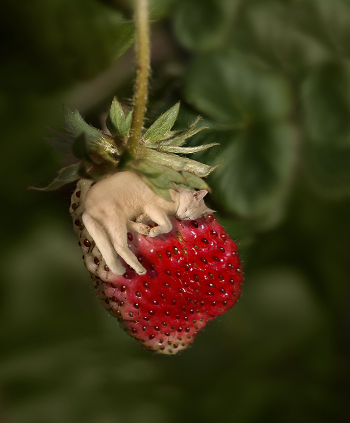
I like the concept!!
Some of your technique is great, but the burning makes the cat feel place there
I like how you blurred the background and then stretched the strawberry. I tried to do this and did not come up with anything as good as yours.
The color casts need to be blended better, for composite work people often put a color blend mode overtop at a lower opacity to blend them together.
Drop shadow, then layer, layer style, create layer -- now you have your shadow on its own layer
also add a soft light blend mode layer under the cat, between the cat and strawberry and paint some shadows in.
I dodge and burn (never use the D B tools in PS) by new layer, change blend mode to overlay, duplicate layer and paint with black at low opacity to burn and paint with white on the second layer to doged |
May 16th |
| 41 |
May 17 |
Comment |
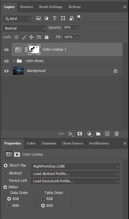
Thank you for the screen shots and detailed how you did it!
lots of action, love the PJ style crop
and this 8 bar effect works very well here!!
The only cc is that you need to go in 100% and mask the hand
|
May 16th |
 |
| 41 |
May 17 |
Comment |
topaz glow? |
May 6th |
| 41 |
May 17 |
Comment |
great sepia, love the framing, and the smoke and the angle of the body/composition. you brought out the eyes nicely too |
May 6th |
8 comments - 0 replies for Group 41
|
| 44 |
May 17 |
Reply |
good catch Rick, thanks! |
May 17th |
| 44 |
May 17 |
Comment |
I love the colors and the layers, wow! The greens and yellows and purples and blues, wow! and the Rain made the saturation just pop!
My thought, before reading what Tom wrote, was also to flip the image for a stronger composition with leading lines.
If you kept it unflipped I would crop some off the bottom |
May 17th |
| 44 |
May 17 |
Comment |
love this scene, postcard indeed!
I agree with Max about cloning out the sign.
and you have a slight halo at the pole on the right.
I am surprised by the quality of HDR and tone mapping. I have never gotten anything good from "Photoshop HDR Pro".
(I like the CC ACR HDR and use that a lot).
|
May 17th |
| 44 |
May 17 |
Comment |
This is a great subject and composition. My Topaz simplify crashes everytime I use it and seeing this makes me realize that I miss it.
I love the saturated artistic effect.
the only nit-pick is that the steering wheel merges with the window. |
May 17th |
| 44 |
May 17 |
Comment |
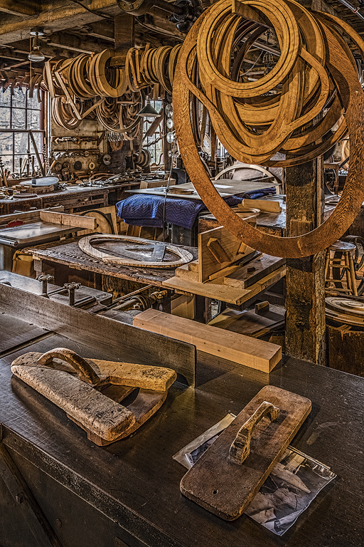
Love the circles!!
I am going to have to hang out with you more Rick, love these types of places!
Good perspective correction. Strong composition especially for a busy scene to have those circles in that placement.
The yellow is a little too saturated on my computer.
I am not sure about the blue tones cast on the left |
May 17th |
 |
| 44 |
May 17 |
Comment |
getting a good foreground is tough. Without the cacti, this image doesn't have the same impact. HDR done nicely. The sky, especially the moving clouds on the right are cool, although personally I could remove the contrails (gotta love content aware fill). Red rocks contrast nicely with the subtle green and the blue sky. |
May 17th |
5 comments - 1 reply for Group 44
|
| 63 |
May 17 |
Comment |
At f4.5 the background is nicely soft and dreamy which contrasts nicely with the wonderful green tones and beautiful sunlight.
The photo could be sharper, a difficult balance between DOF and background |
May 17th |
| 63 |
May 17 |
Comment |
I love the lighting in this, the windowlight really makes this POP.
Your analogy to a tribal headdress fits
I am impressed with the focus stacking!
The back poster board behind it doesn't look black on my monitor, it looks brown. And there are some background lines along the bottom that I would fix. It is worth the effort because this image rocks! It would look great printed on metal too, so much detail! |
May 17th |
| 63 |
May 17 |
Comment |
I love this! OCC is an awesome place!!
I love the texture and the colors.
and am impressed that you added grain in such an artistic manner, I like it here but abhor grain in my images and have always wondered why there was a slider to add grain, lol. Now I know why.
I would either crop or clone some of the very top. |
May 17th |
| 63 |
May 17 |
Comment |
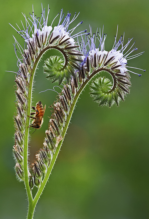
flipped - the leading lines lead to the bee and downward and out |
May 6th |
| 63 |
May 17 |
Comment |
tried a Nik plugin edit |
May 6th |
 |
| 63 |
May 17 |
Comment |
when flipped, |
May 6th |
| 63 |
May 17 |
Comment |
sorry for the choppiness, website issues |
May 6th |
| 63 |
May 17 |
Comment |
perhaps flip the canvas horizontally to allow you eye to come up the stem; |
May 6th |
| 63 |
May 17 |
Comment |
getting many website errors. 3/4 attempts to upload words or a file I get errors; seems like it will handle only short amount of text |
May 6th |
 |
| 63 |
May 17 |
Comment |
The background is nicely OOF, the cloudy day really helps both the background and the subjects. The placement of the bee as you snapped this puts it into a nice zone as well. The choice of the reflector really adds a lot to this image. |
May 6th |
| 63 |
May 17 |
Comment |
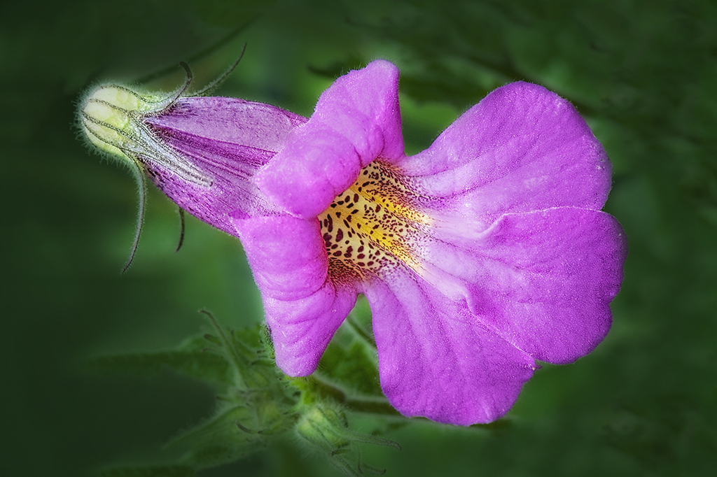
A Lacy Pacelia, gotta look that one up -- amazing! |
May 6th |
| 63 |
May 17 |
Comment |
I like the composition with the leading lines; more contrast would make this POP more.
|
May 6th |
| 63 |
May 17 |
Comment |
i love the colors and the unusual angle. Background is pleasing and nicely OOF for f8, great color saturation
.
on my screen it appears oversharpened and the lower right has some "chatter" perhaps from cloning?
|
May 6th |
13 comments - 0 replies for Group 63
|
26 comments - 1 reply Total
|