|
| Group |
Round |
C/R |
Comment |
Date |
Image |
| 41 |
Apr 17 |
Reply |
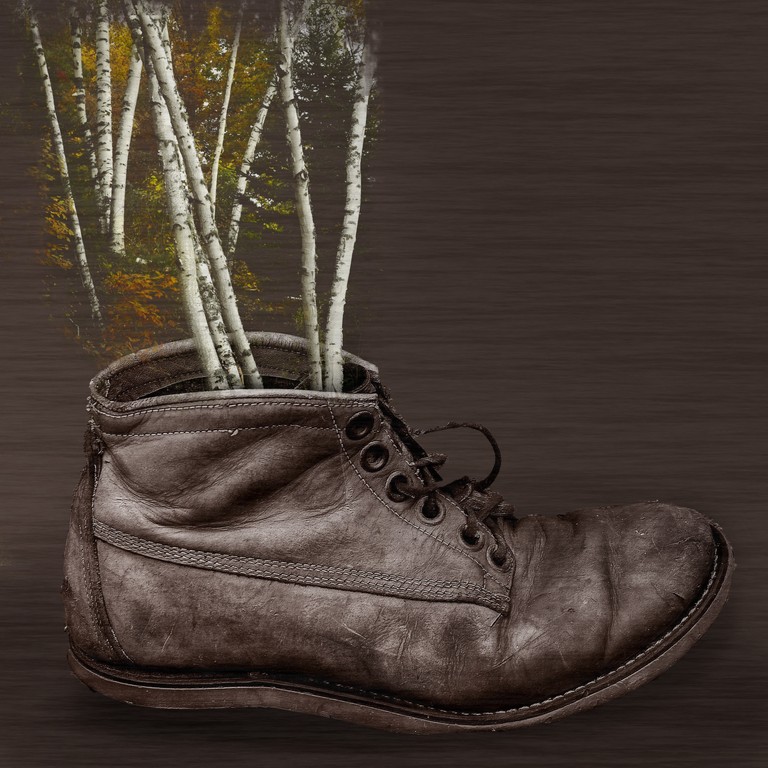
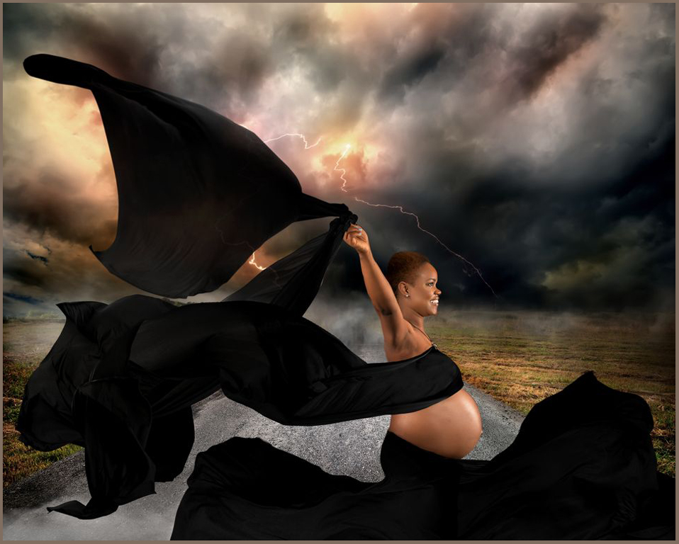
<< I would darken/change the tone/blur a bit the cement on the lower section to the left of her tummy.>>
good suggestion!
and easy to do since the pavement is on its own layer
Thanks! |
Apr 25th |
| 41 |
Apr 17 |
Reply |
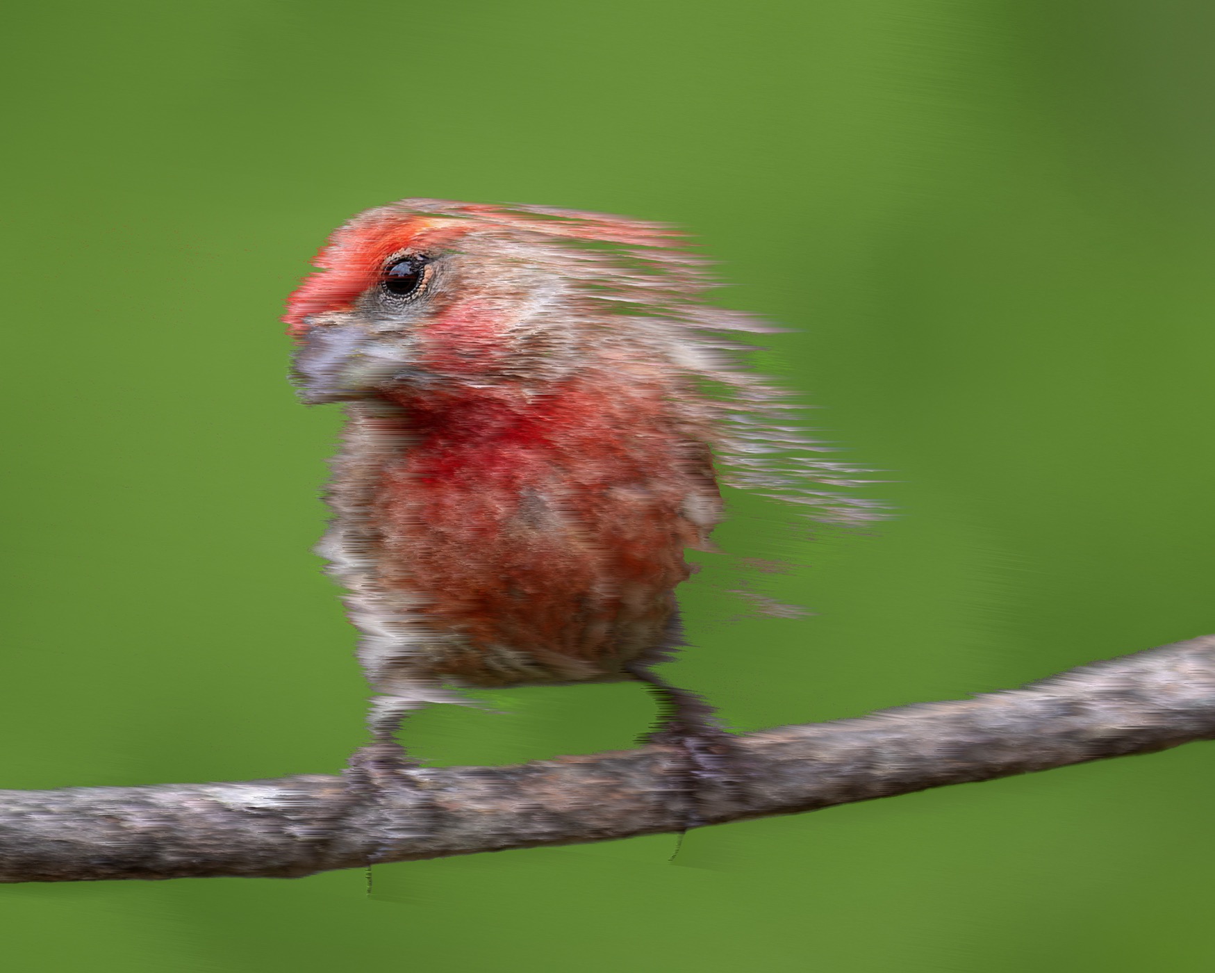
I have a studio fan, but people now just purchase a leaf blower. |
Apr 25th |
| 41 |
Apr 17 |
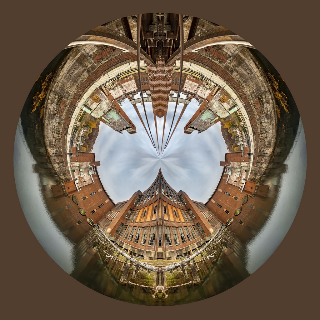
Comment |
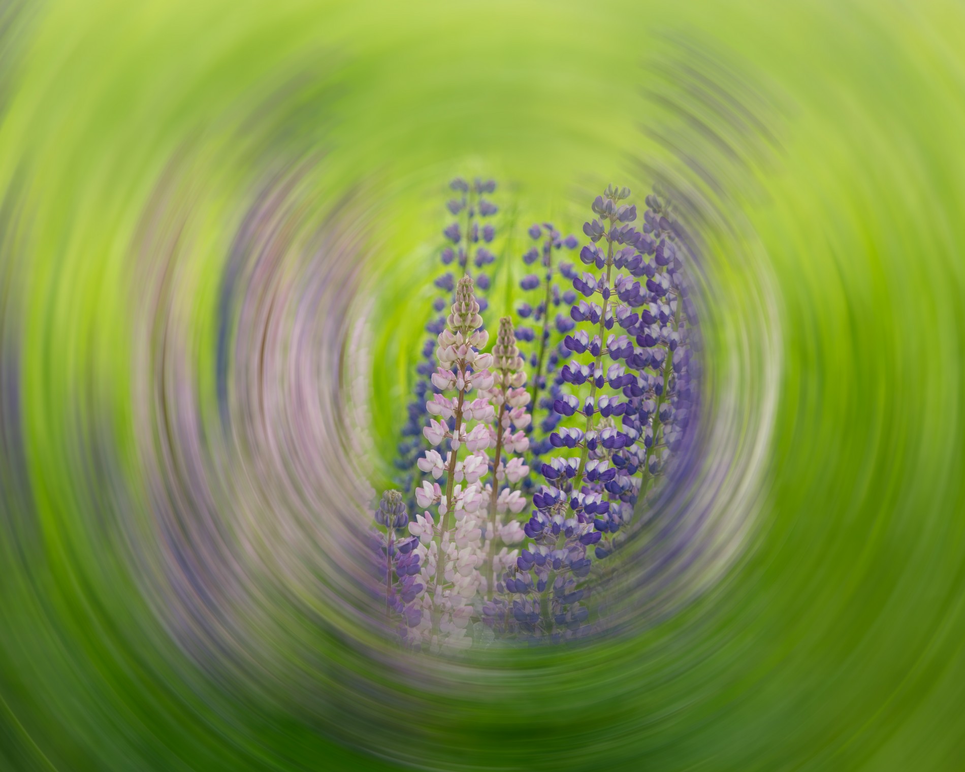
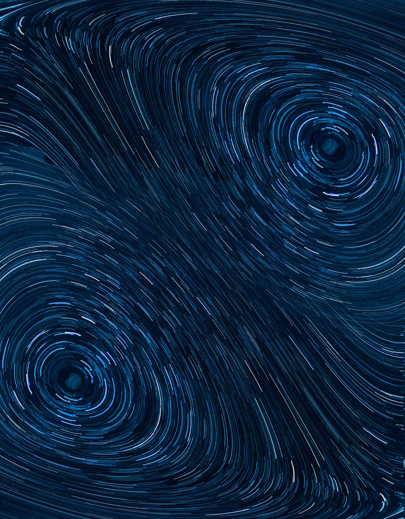
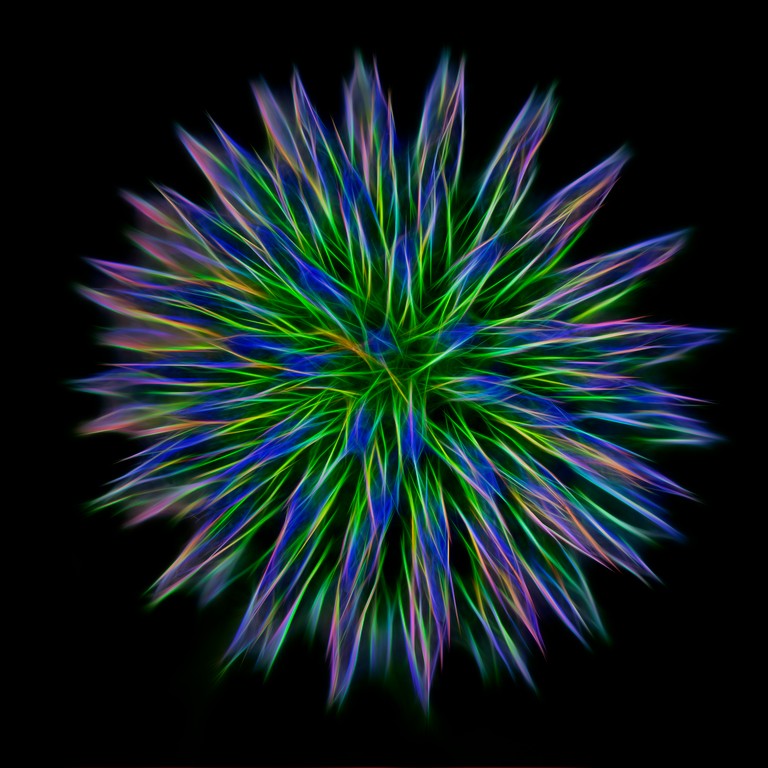
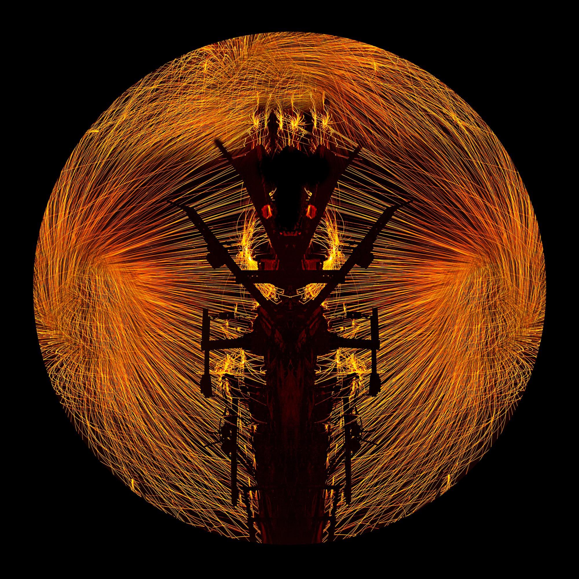
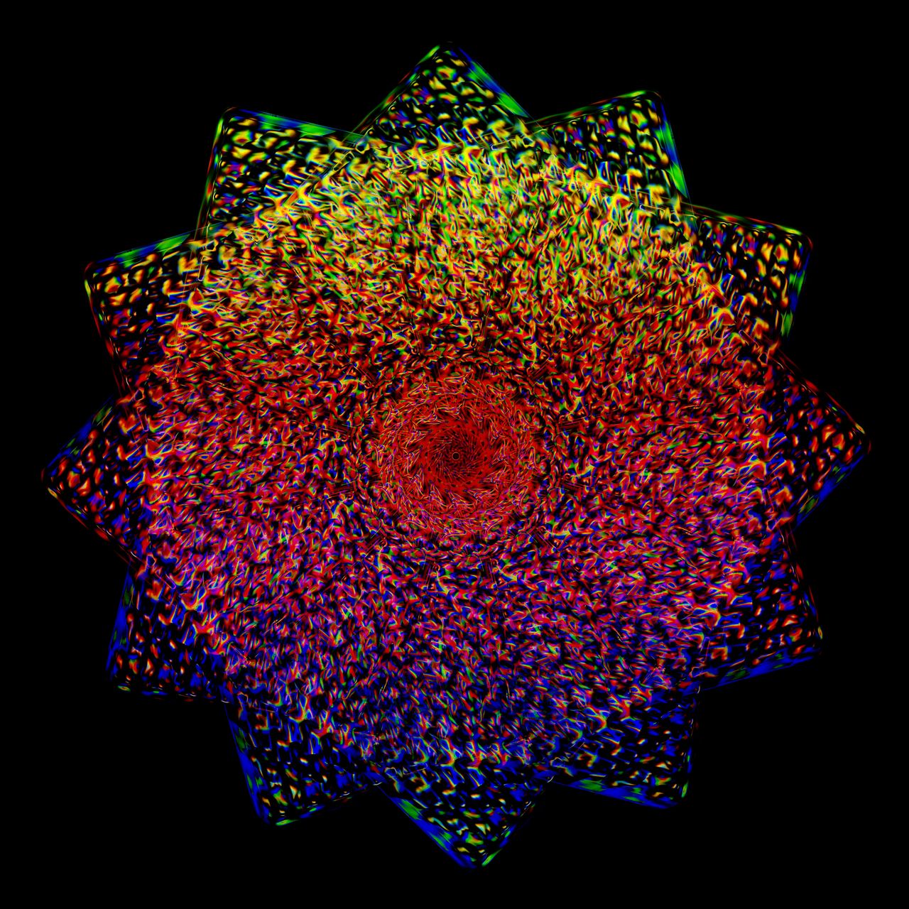
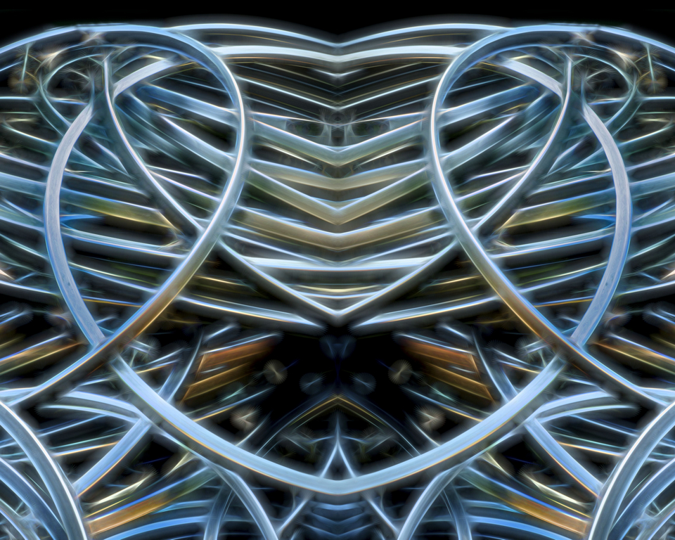
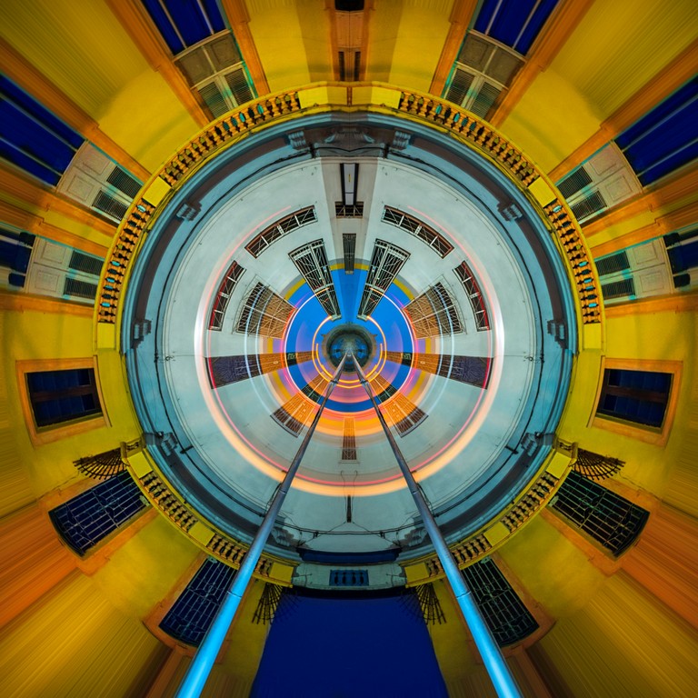
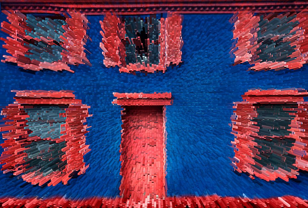
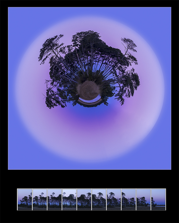
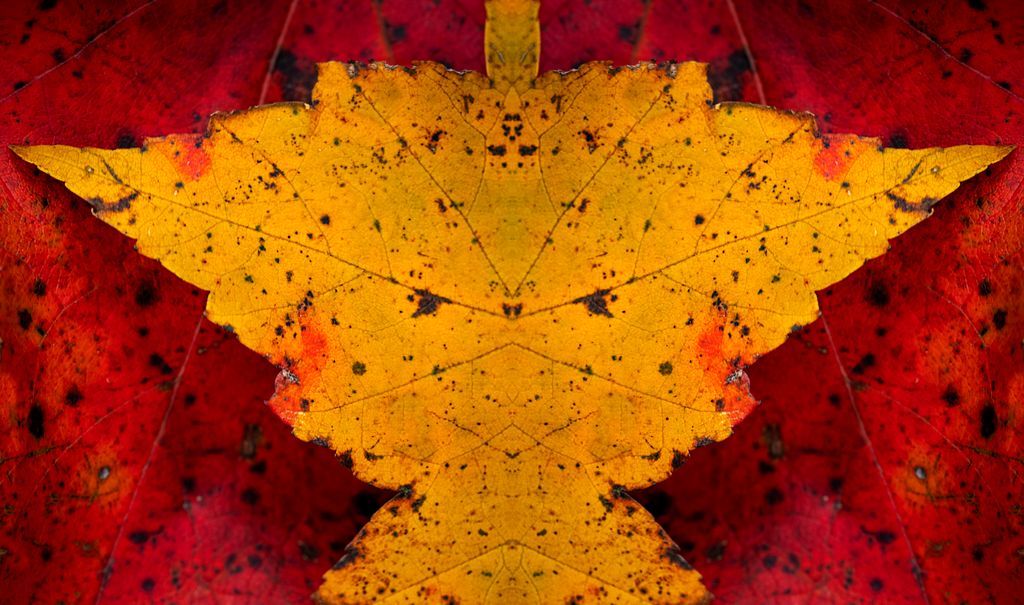
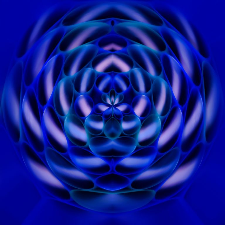
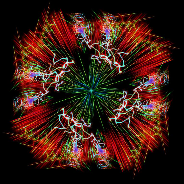
distort --> polar coordinates of the last version |
Apr 25th |
 |
| 41 |
Apr 17 |
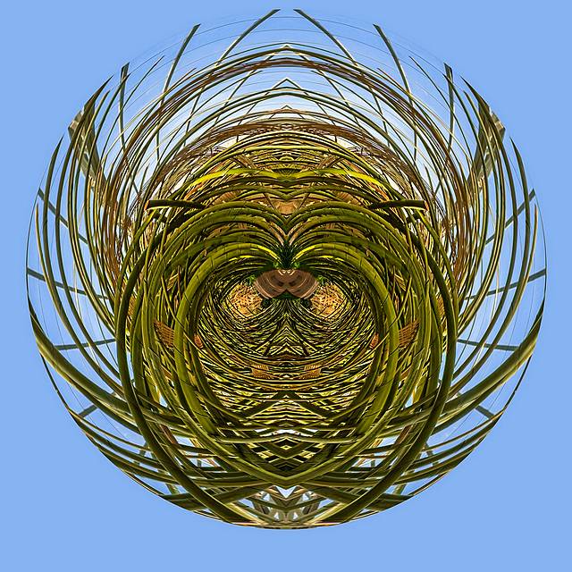
Comment |
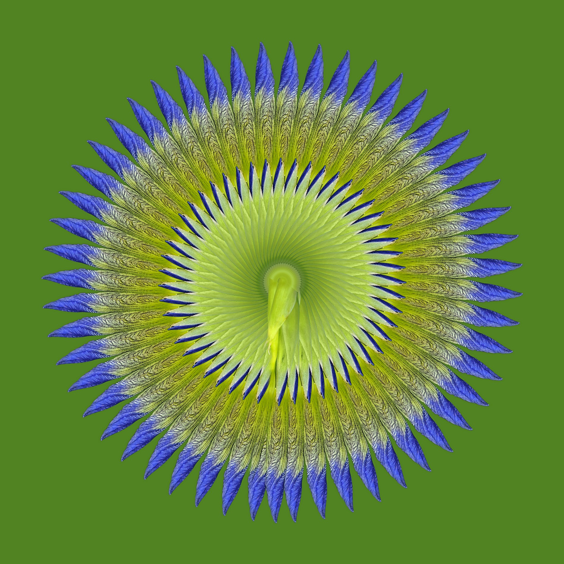
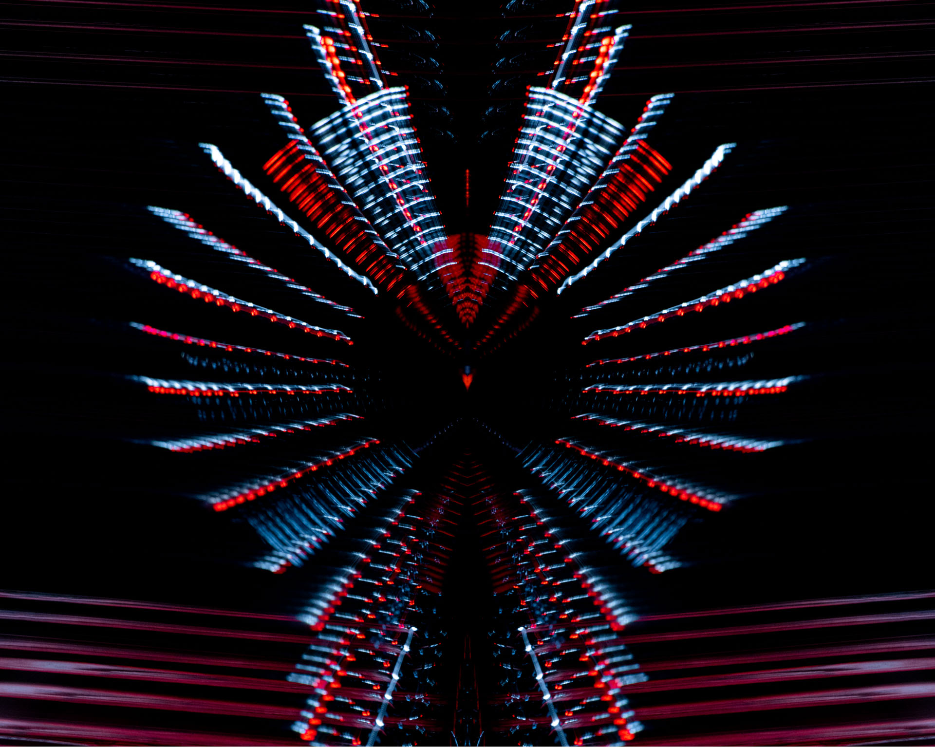
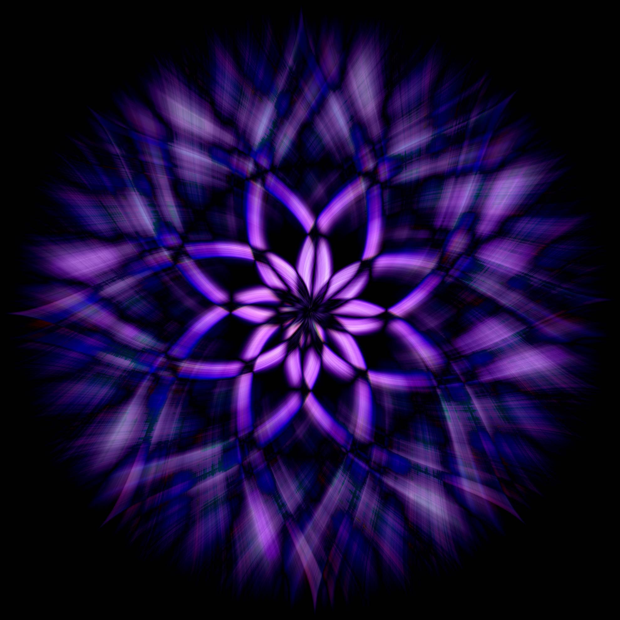
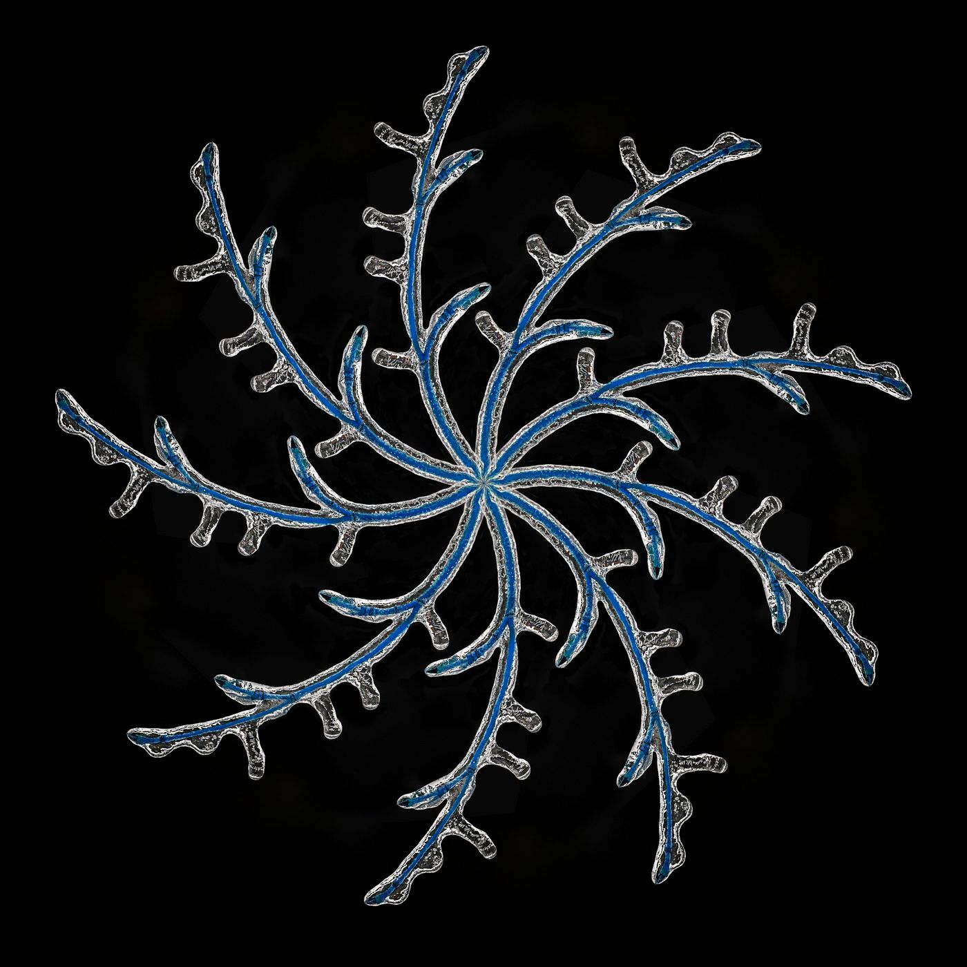
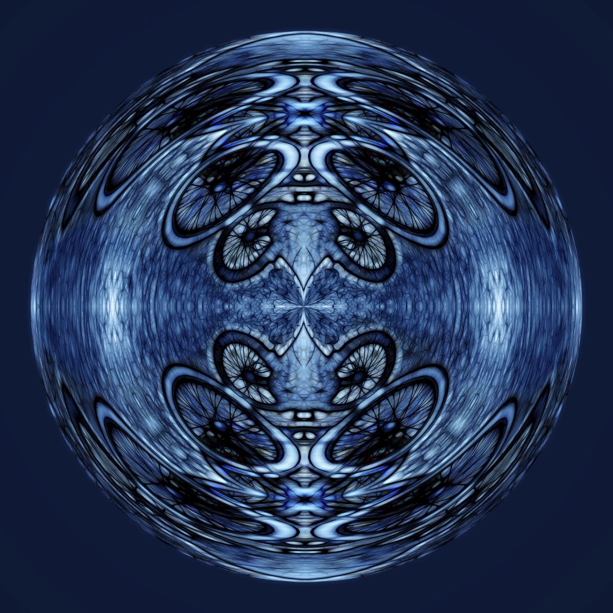
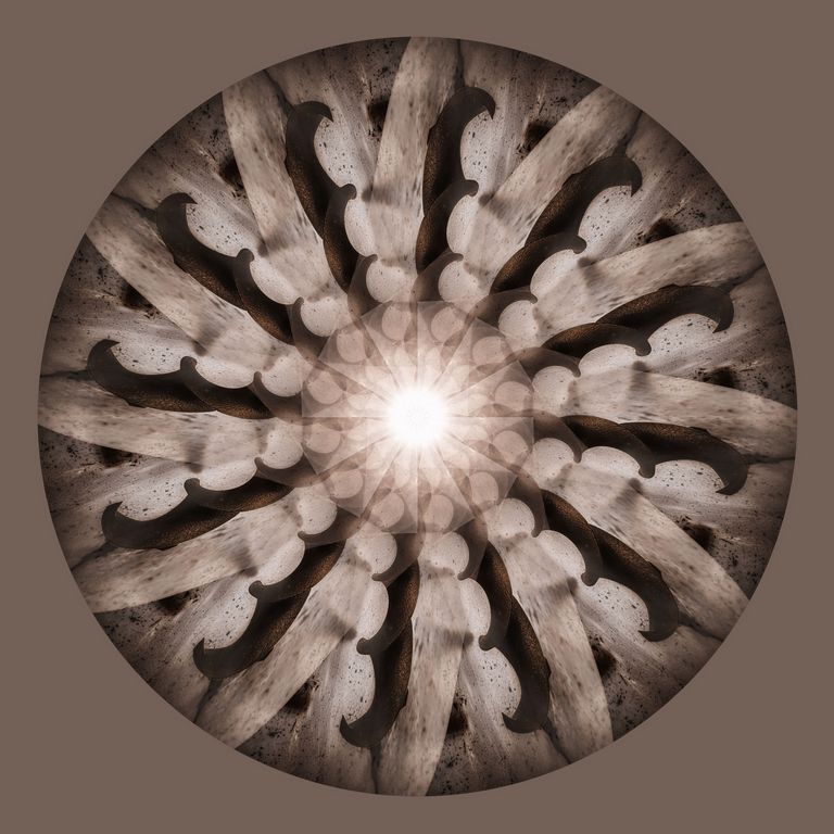
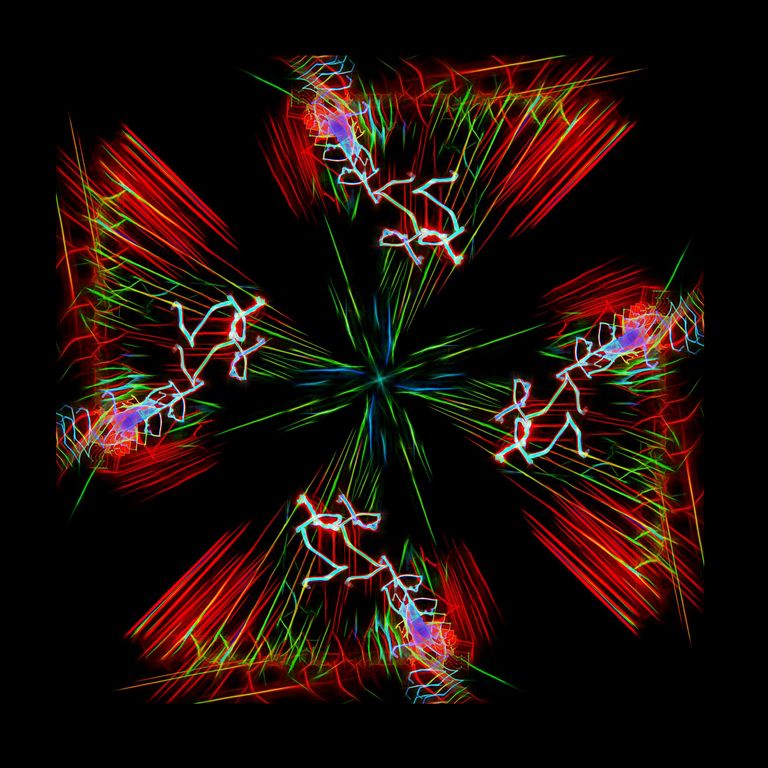
i did a duplicate of the above image and rotated it on lighten mode |
Apr 25th |
 |
| 41 |
Apr 17 |
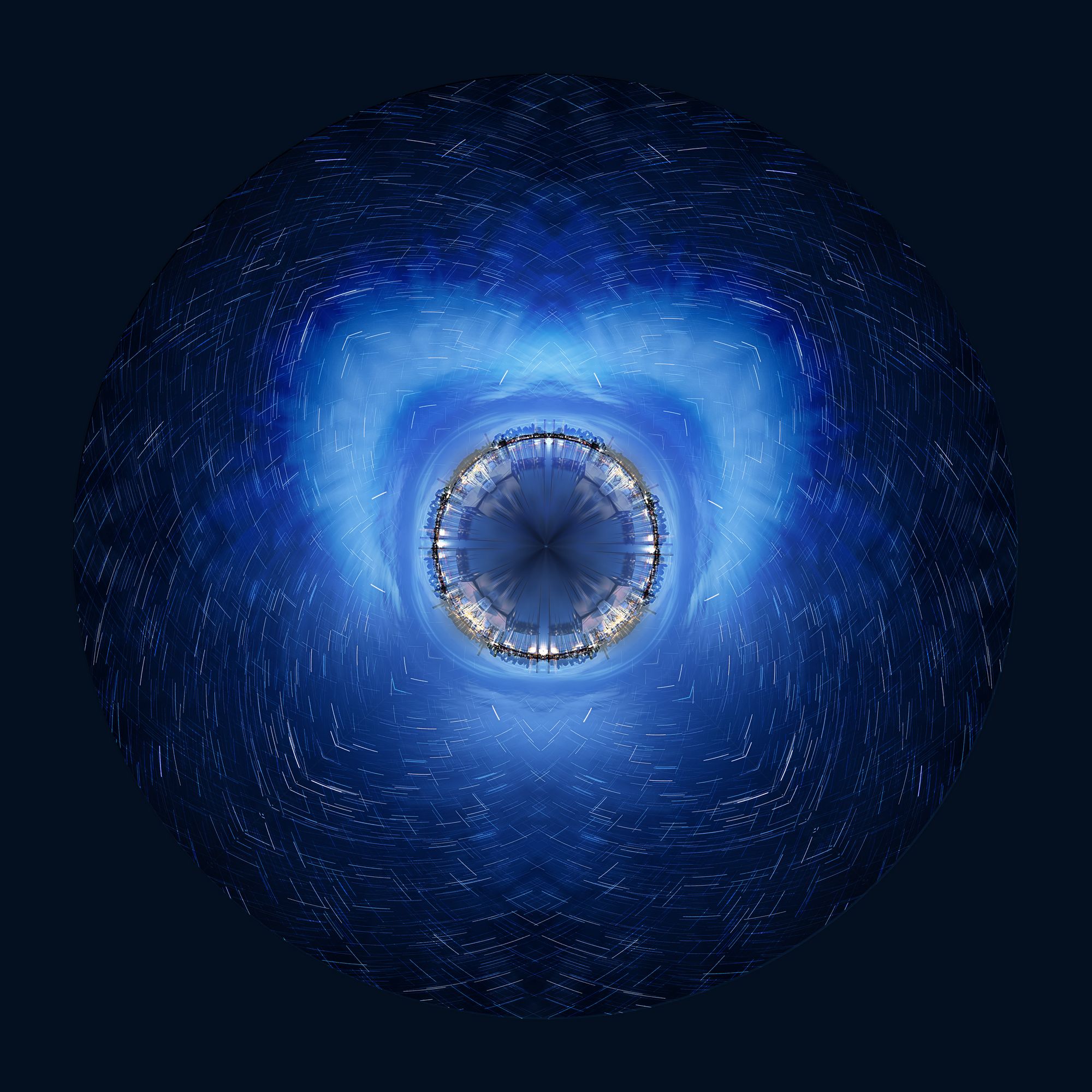
Comment |
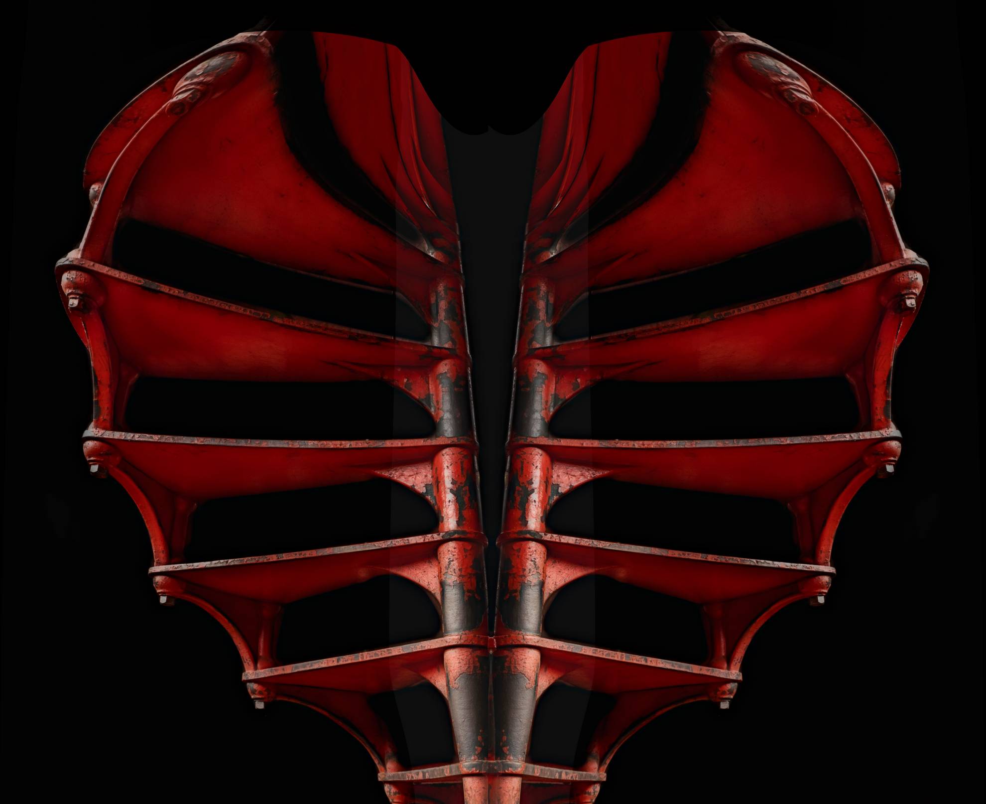
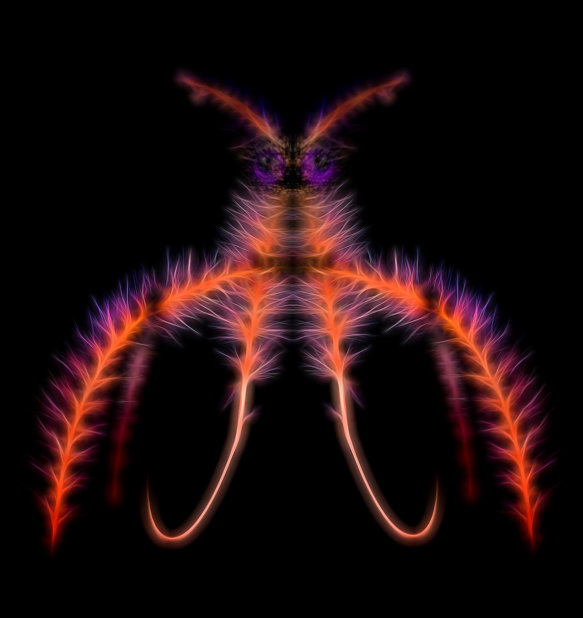
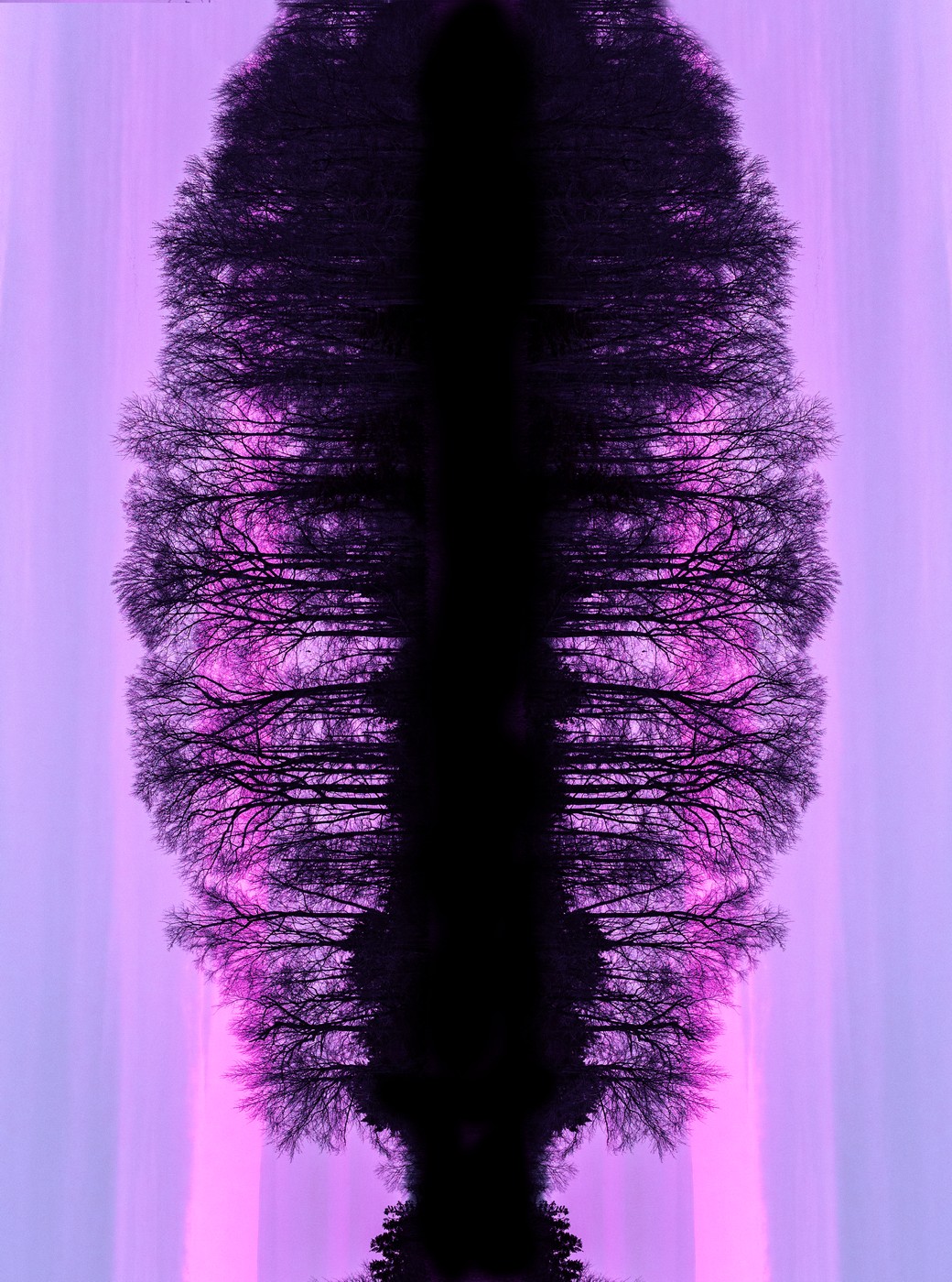
3 duplicate layers and the I flipped them |
Apr 25th |
 |
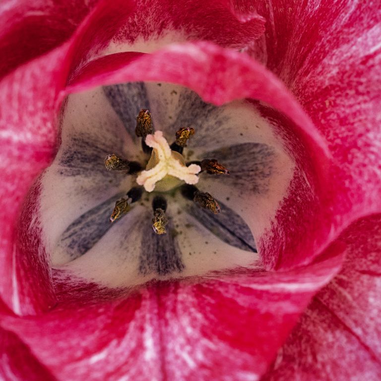
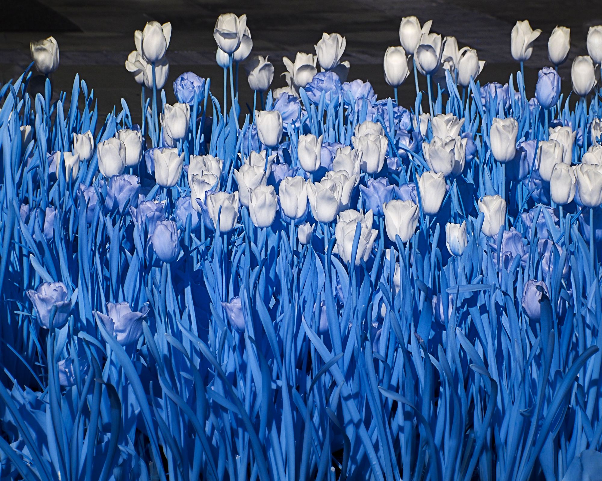
| 41 |
Apr 17 |
Comment |
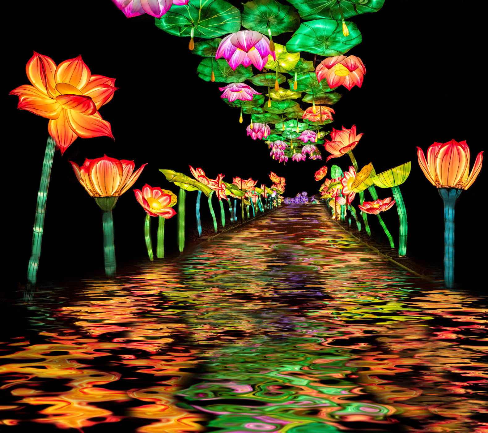
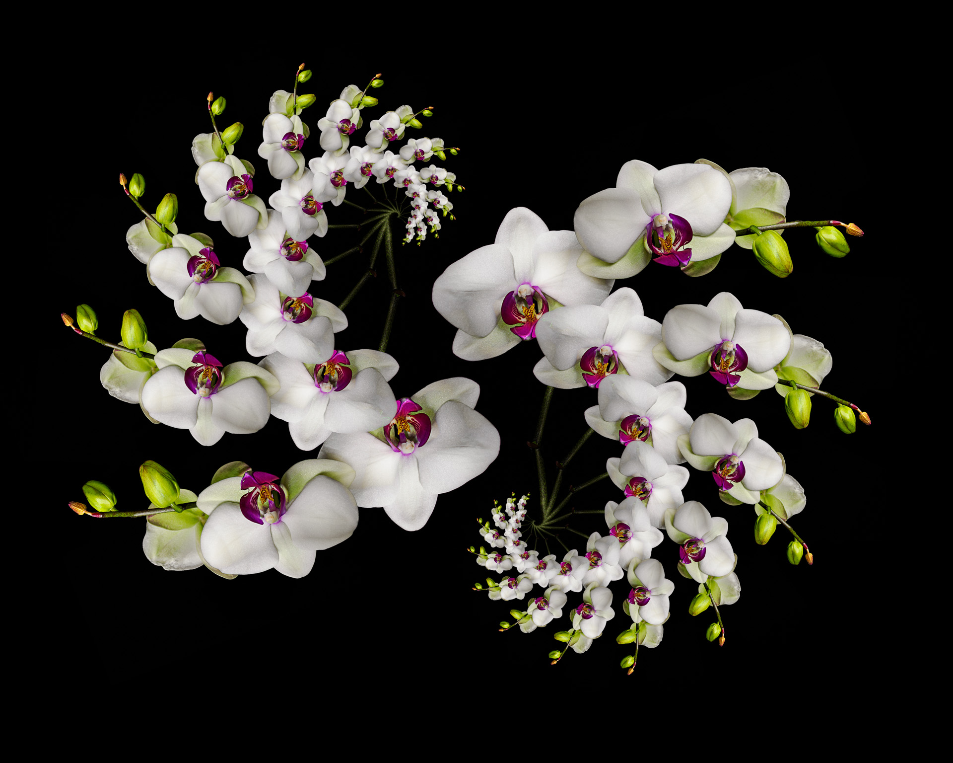
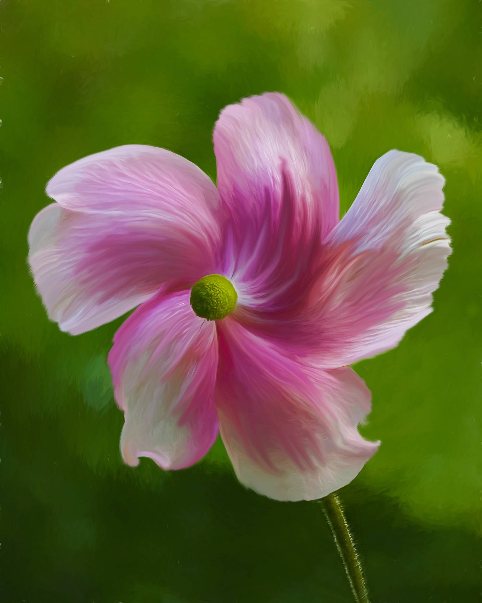
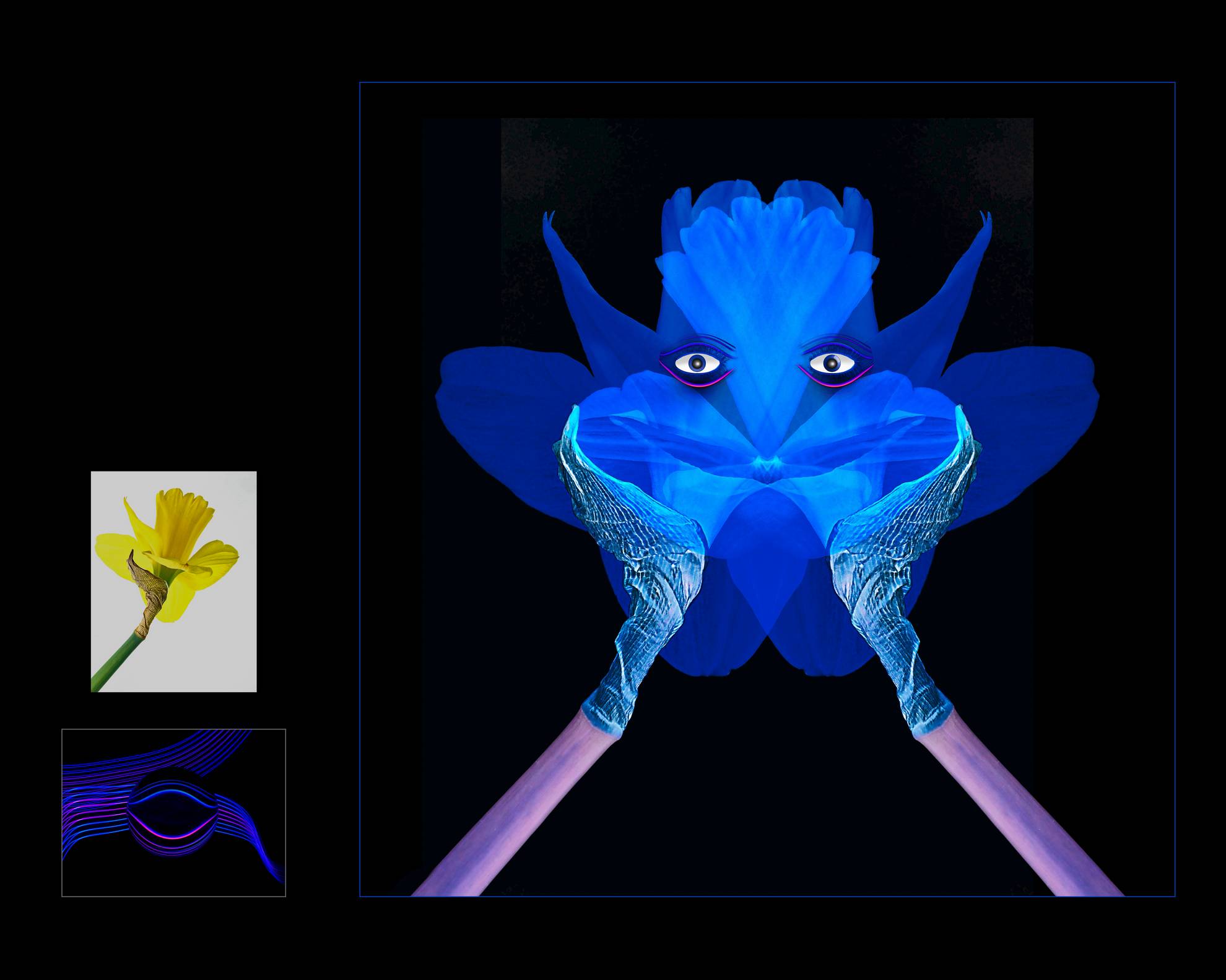
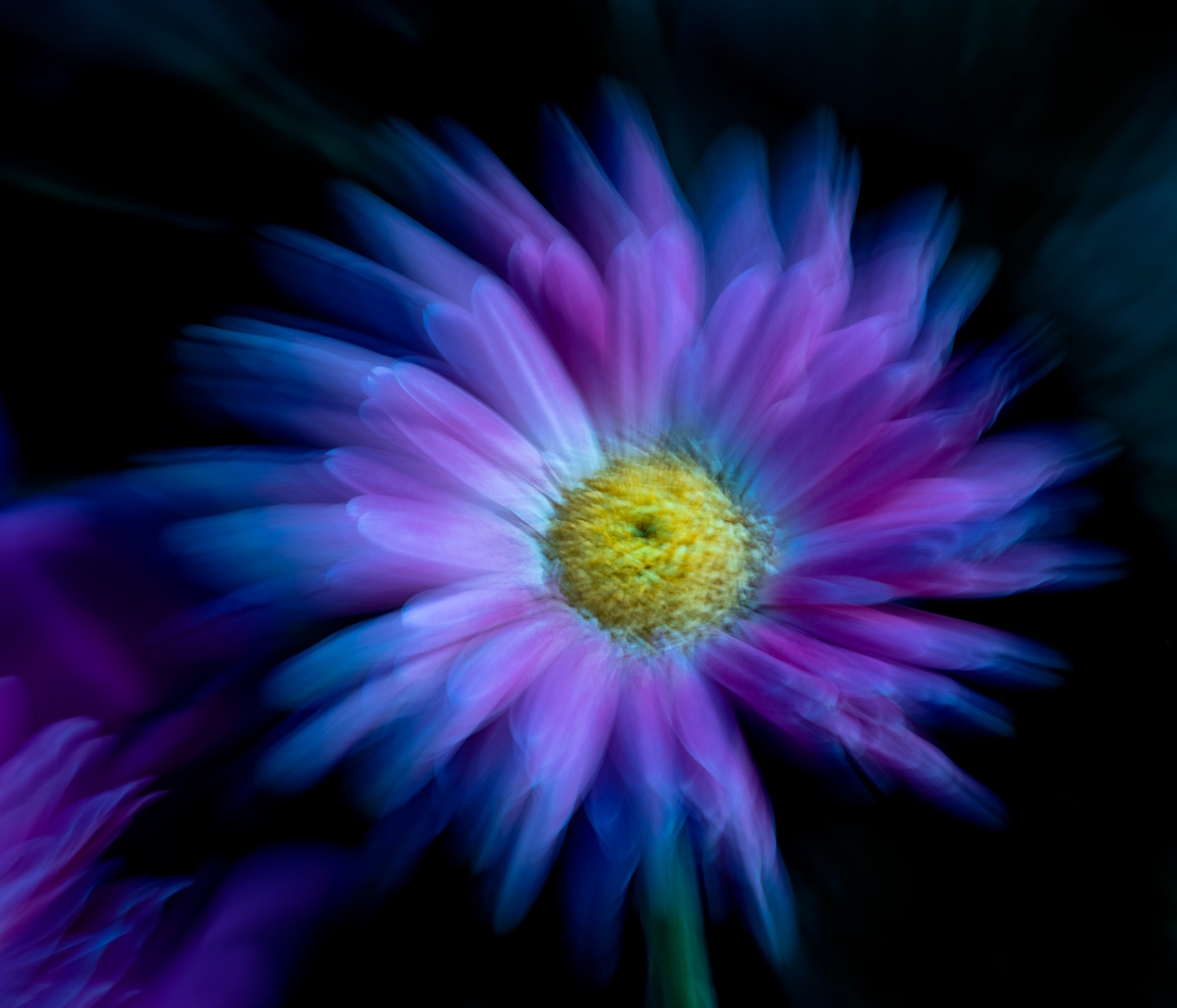
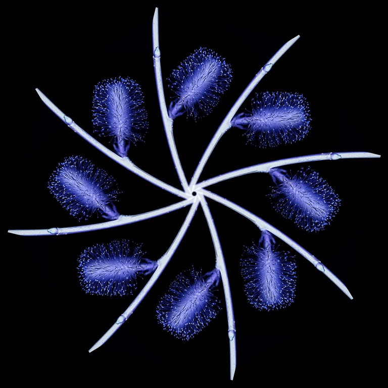
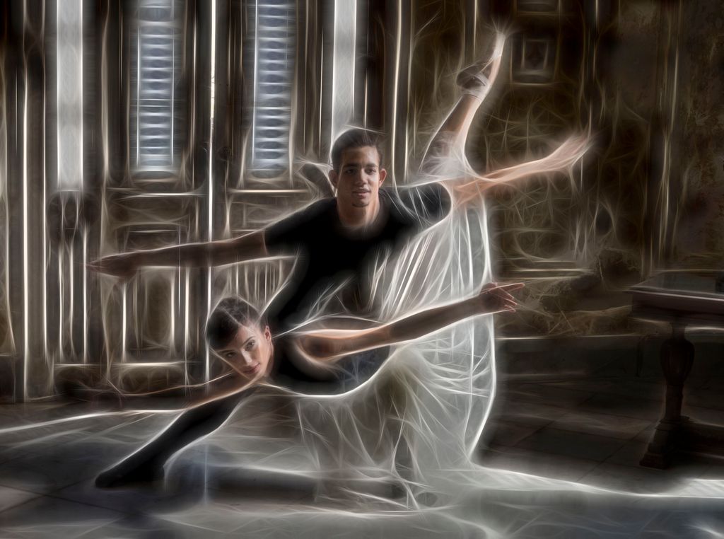
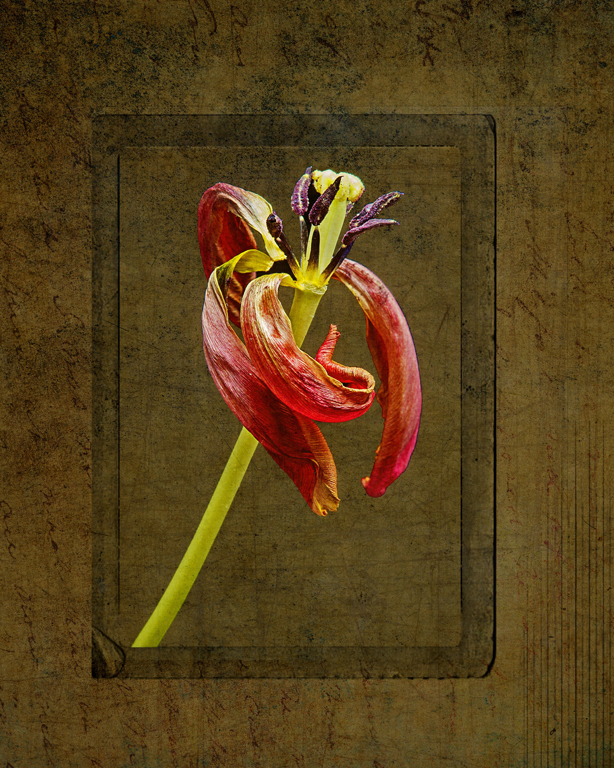
I love this plugin!
This flood does work very well on flowers and still lifes too.
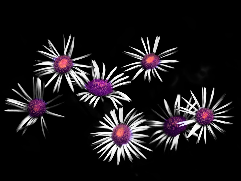
I love your tulip arrangement and the colors pop against the black. the flood reflection really works well here! love it!
I would get rid of the stray green leaves and reflection |
Apr 25th |
| 41 |
Apr 17 |
Comment |
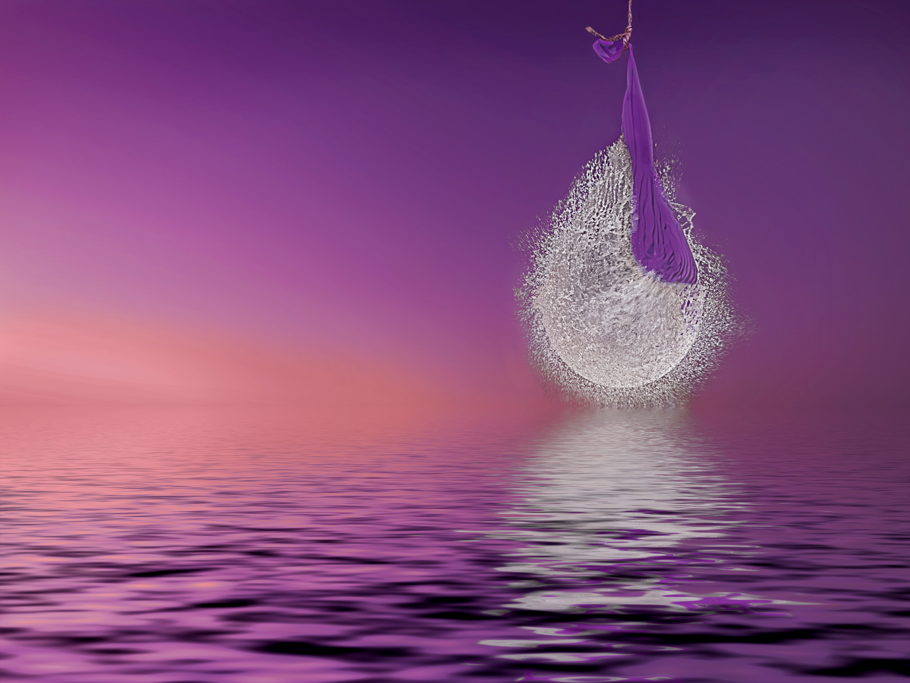
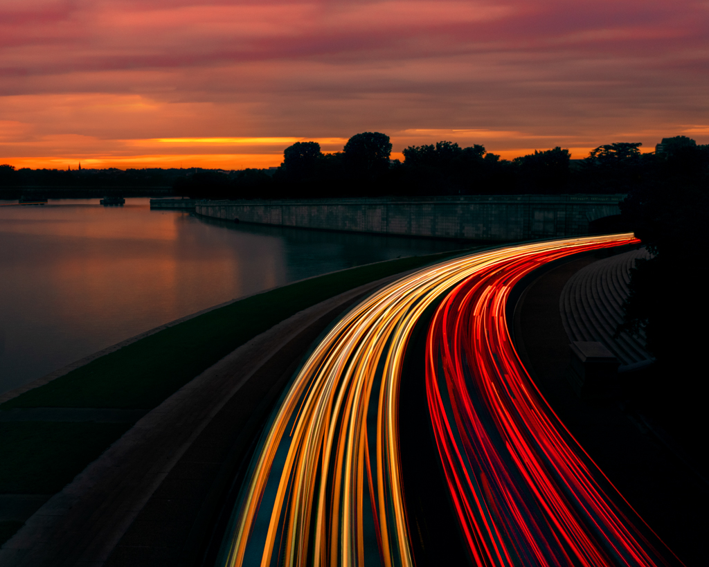
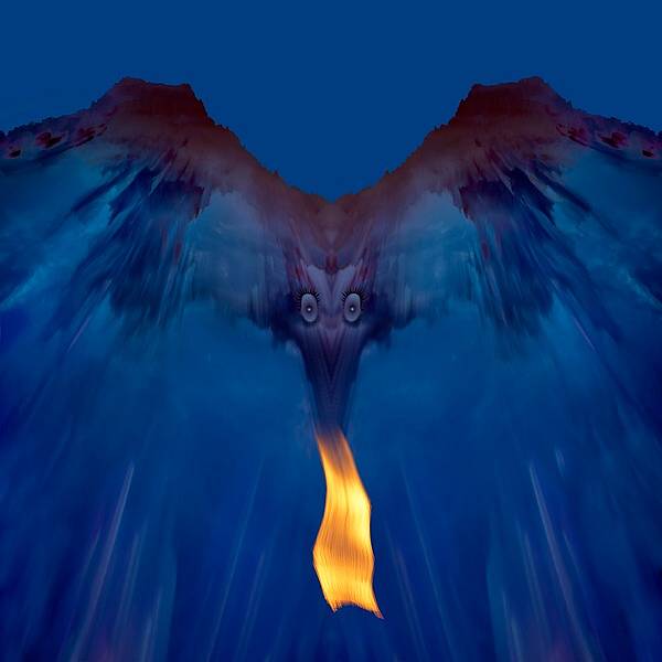
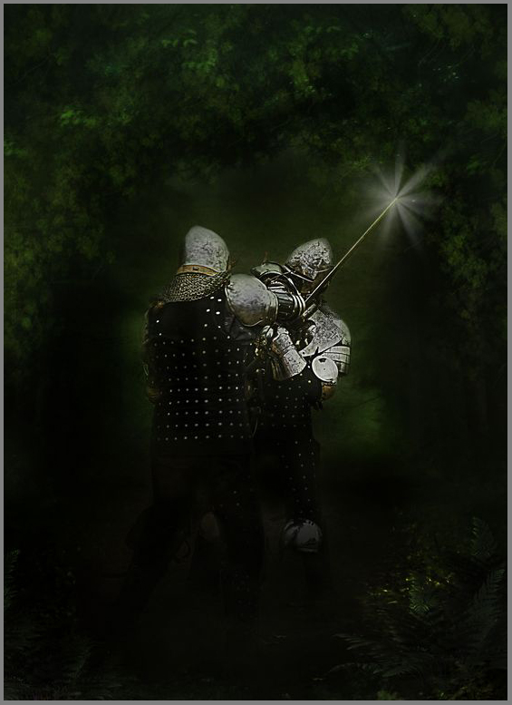
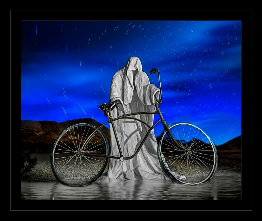
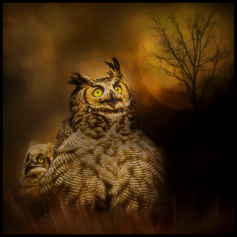
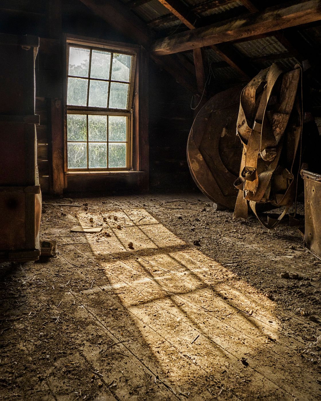
The original does have a ghostly feel to it. I love the triangle of light coming down! I am not sure that the main bright zigzag lights are, perhaps tone them down some.
I thought that I had all of the Topaz plugins, gotta go look for Topaz HDR, missed that one.
Glow is a fun plugin! I love the abstract feel that you created.
The purple canvas is distracting to me though...
|
Apr 25th |
| 41 |
Apr 17 |
Comment |
I love the emotion behind the image. The description helps set the mood a lot. I was not sure what the main subject was at first, I thought a shell on the beach, now I see the rose, but I agree with Tony that, that the stem would help identify it.
I would try flipping the image horizontally so that it reads stronger left to right (we read this way so images tend to be strong this way)
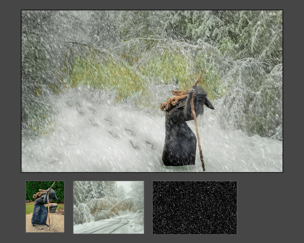
rain stamp? please explain. I have used brushes and patterns, but not stamps in PS. and did you make it, download it or purchase this stamp? Thanks! |
Apr 25th |
| 41 |
Apr 17 |
Comment |
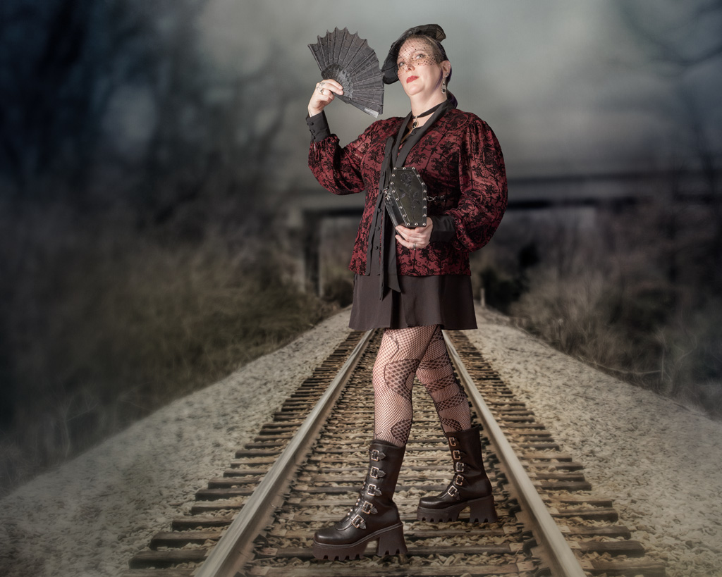
I like this effect, and thank you for the email about it! I gotta try this! Very cool!
The weave works well here! The texture and the placement of the edges.
I like the square crop and the close crop, but her hand cut off does bother me a bit.
The photo itself (before the effect) could use a couple of things...
I would clone out (content aware fill the hairband on her arm. I end up cloning out so hair bands, I just do not see them on their arms during the shoot.
Her left eye is merging with the socket. I try to give them something to look at so that their pupils are looking at me, but the eye doesn't creep into the far edge too much
The hair on the right side of the photo sticks out under her chin. I try to watch for things like this during the shoot itself and also during post-processing and extraction. I would just clone that area. |
Apr 25th |
7 comments - 2 replies for Group 41
|
| 44 |
Apr 17 |
Reply |
on my list of things to do, practice some old masters that is
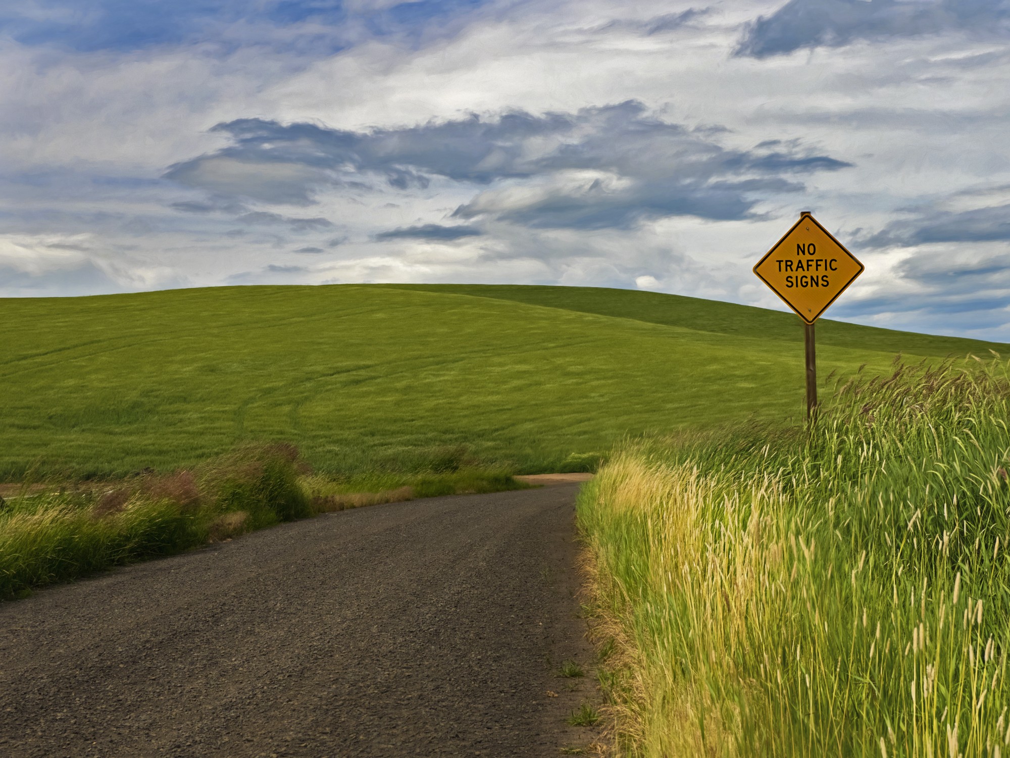
no, red or yellow to me anyway, would be distracting. However, if it was mine i would edit the line in the backpack, at first I thought that their shirt had ridden up, zooming in it is a line in the backpack., |
Apr 25th |
| 44 |
Apr 17 |
Comment |
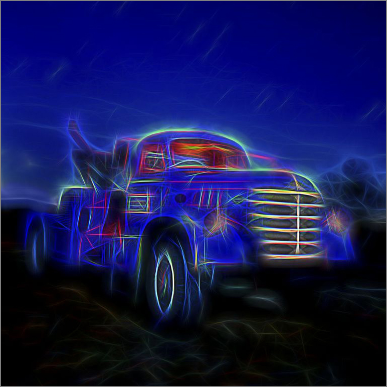
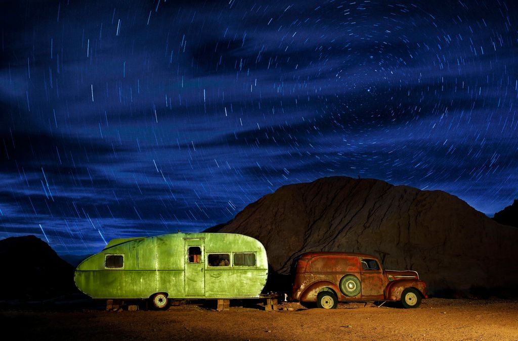
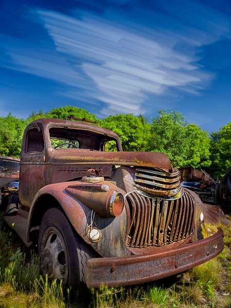
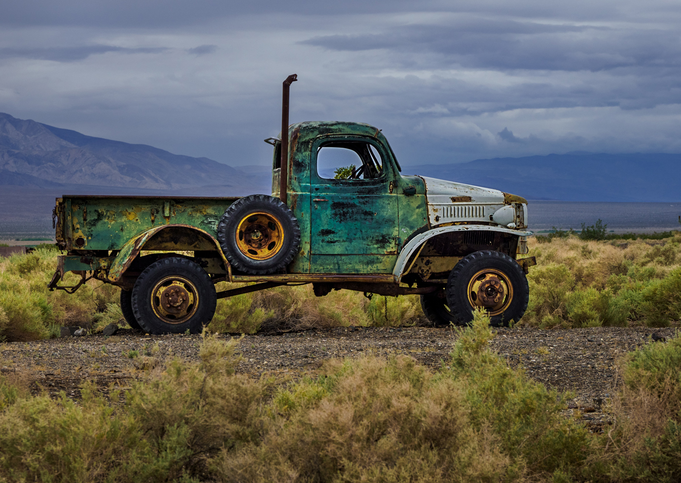
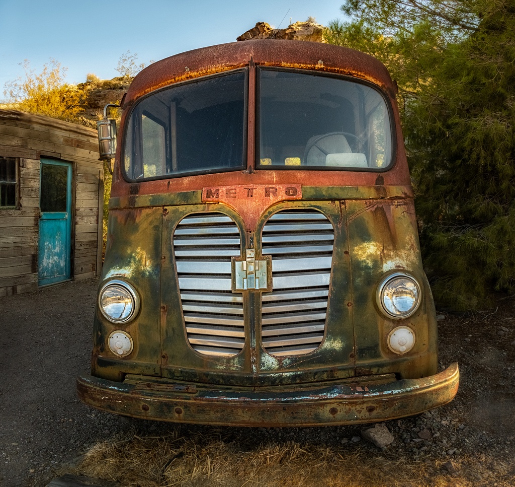
Great old truck. Good for you for stopping. post-processing on the truck and foliage very natural looking but the sky is surprisingly bland for HDR.
I like the composition with the other vehicle, field and trees, but too much sky of my taste, it is whispering to me to cut off a lot of sky and make it a pano.
perhaps some more clarity in RAW or Topax Clarity would make the mid-tones pop more. |
Apr 25th |
| 44 |
Apr 17 |
Comment |
love the scene, the lighting and the mood are awesome. Your post-processing and final image are good, nothing I would change.
funny about the person, I love having her in there because it gives us scale and perspective. But I would wait ten minutes (or use the median to make people go away), while my husband Tom would wait ten minutes for a person to enter the scene. |
Apr 25th |
| 44 |
Apr 17 |
Comment |
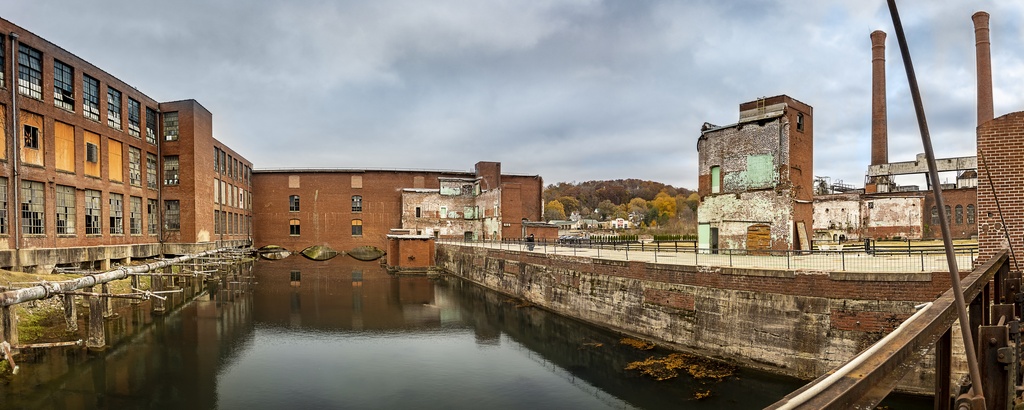
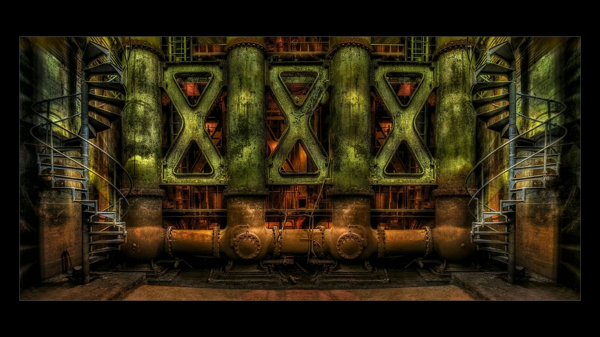
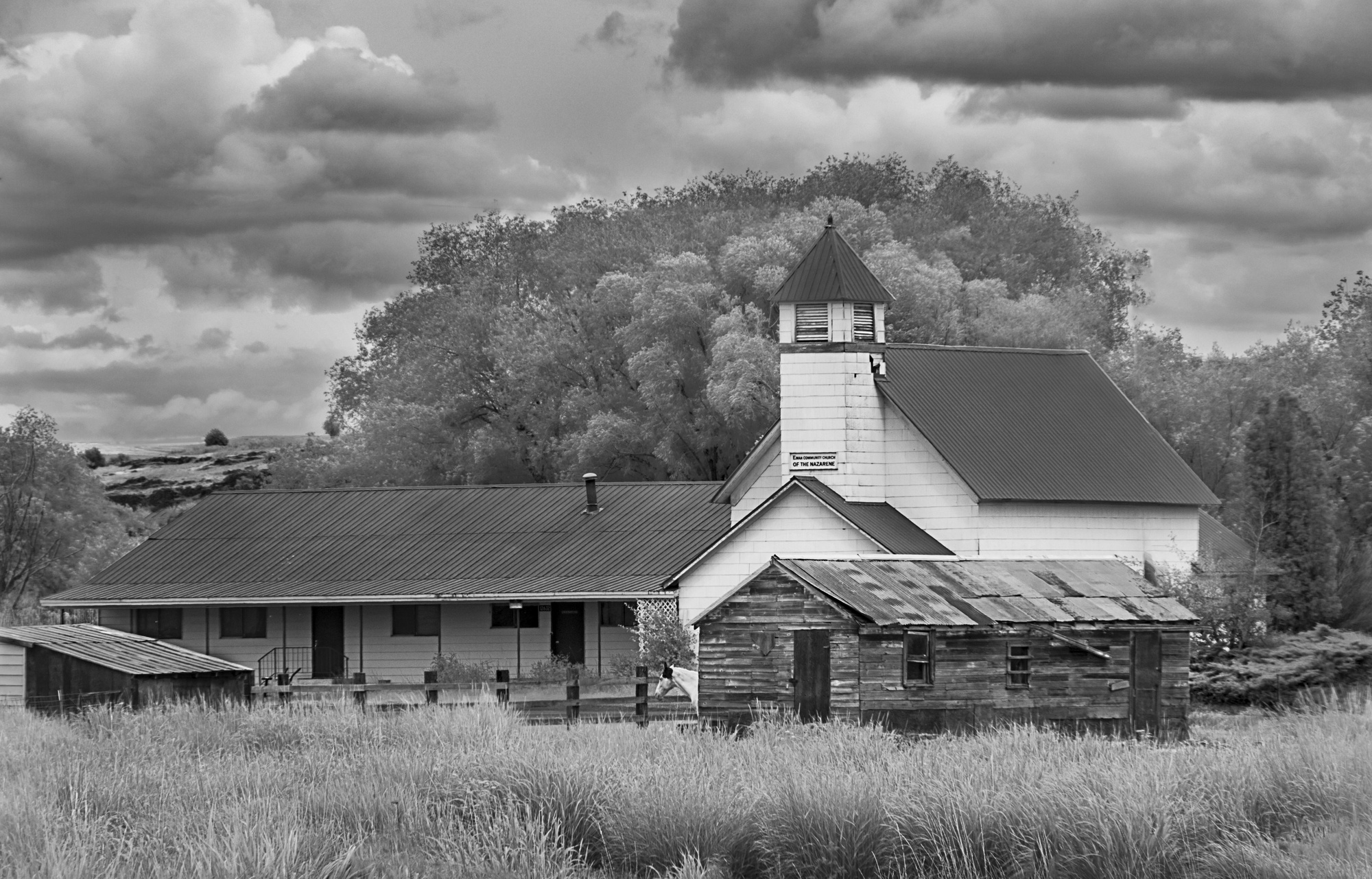
I love old mills like this. I like the framing of the other structure in this one.
<<Topaz color blast filter>> in adjust?
I love ACR RAW and the fact that you have all of thar RAW data in the resulting dng file to do perspective control and such.
Did you try dehaze, that would have made the fog in the grasses and background less. |
Apr 25th |
| 44 |
Apr 17 |
Comment |
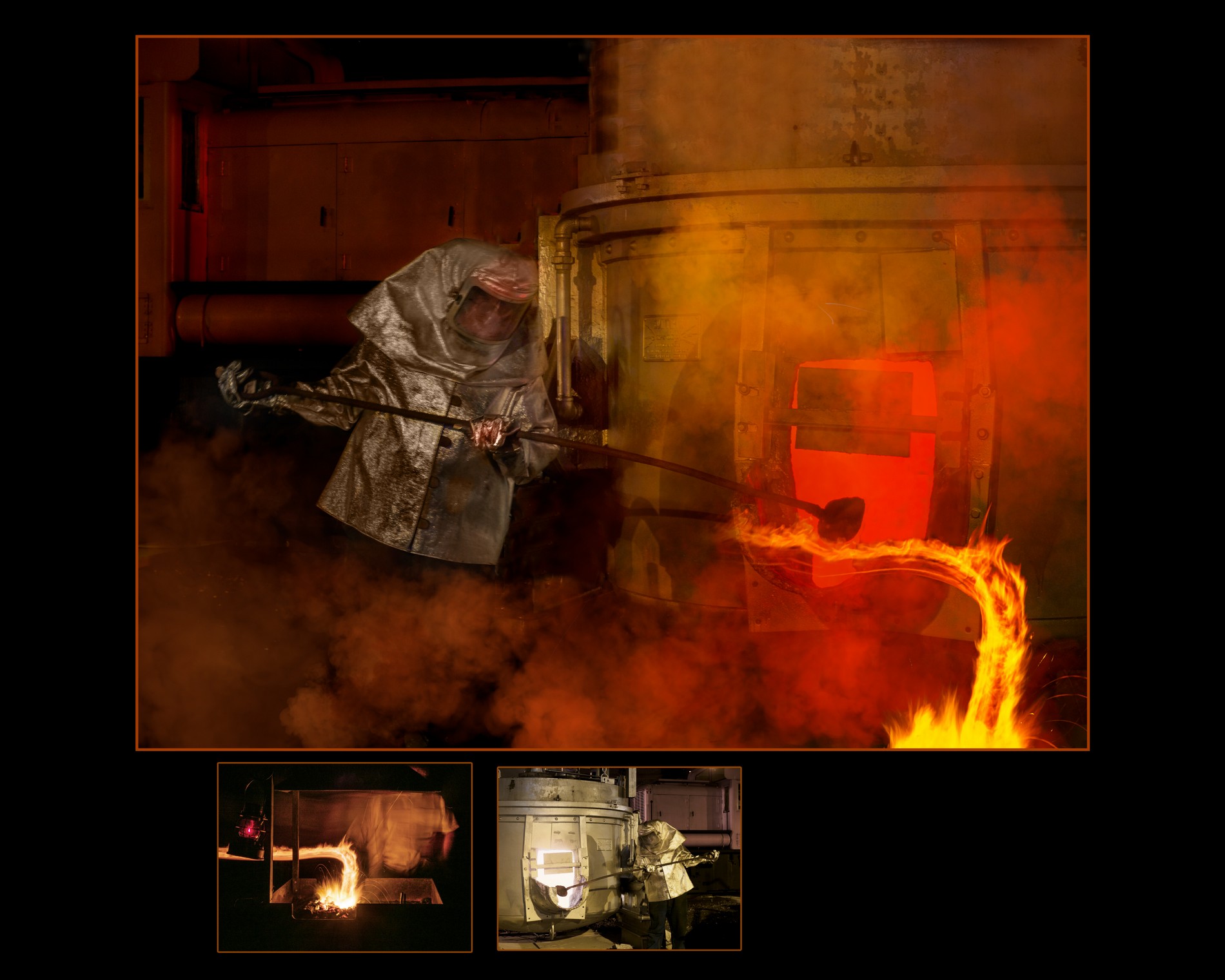
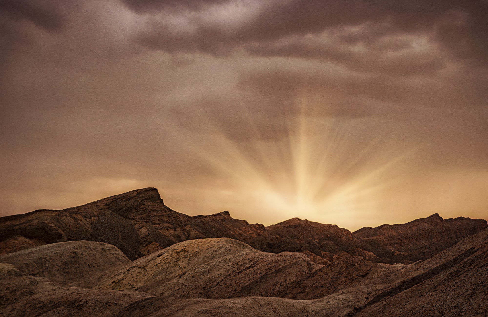
lots of tonal range to tone-map. Scenes like this sometimes can suffer from muddiness, but your tone mapping and post doesn't.
<< 16-35, obviously at 16mm>>
perhaps try a HDR panoramic next time. When I find myself using the wide end of the zoom lens I ask myself if the distortion helps the creative image, often I think no and do a stitched image. I call the end image a pano because I use the HDR ACR pano feature even though the resulting image is not twice as wide as long. I find myself doing more and more of these stitched images. In this case 6 exposures vertical at ~24 mm and then five series across might have given a different look. |
Apr 25th |
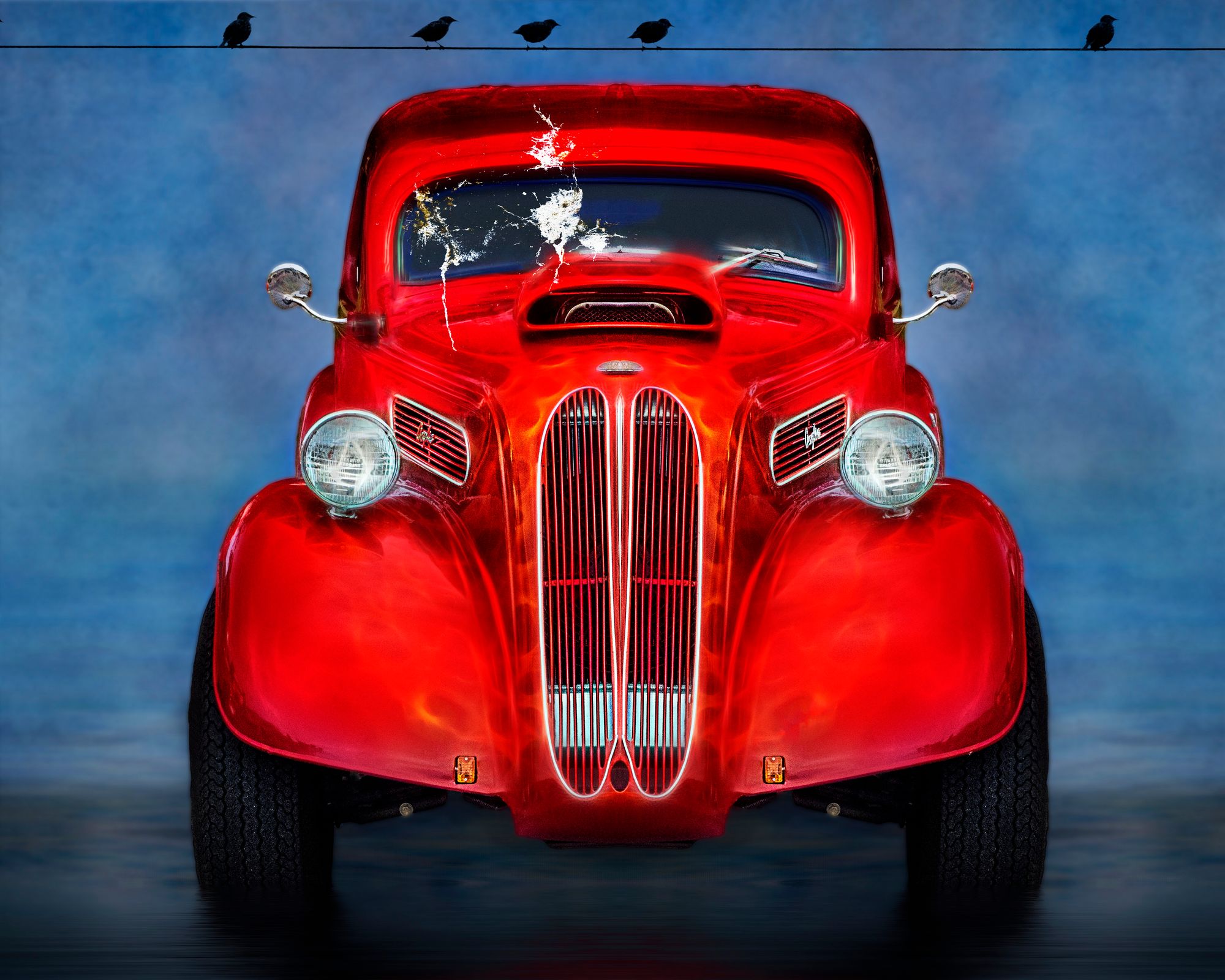
| 44 |
Apr 17 |
Comment |
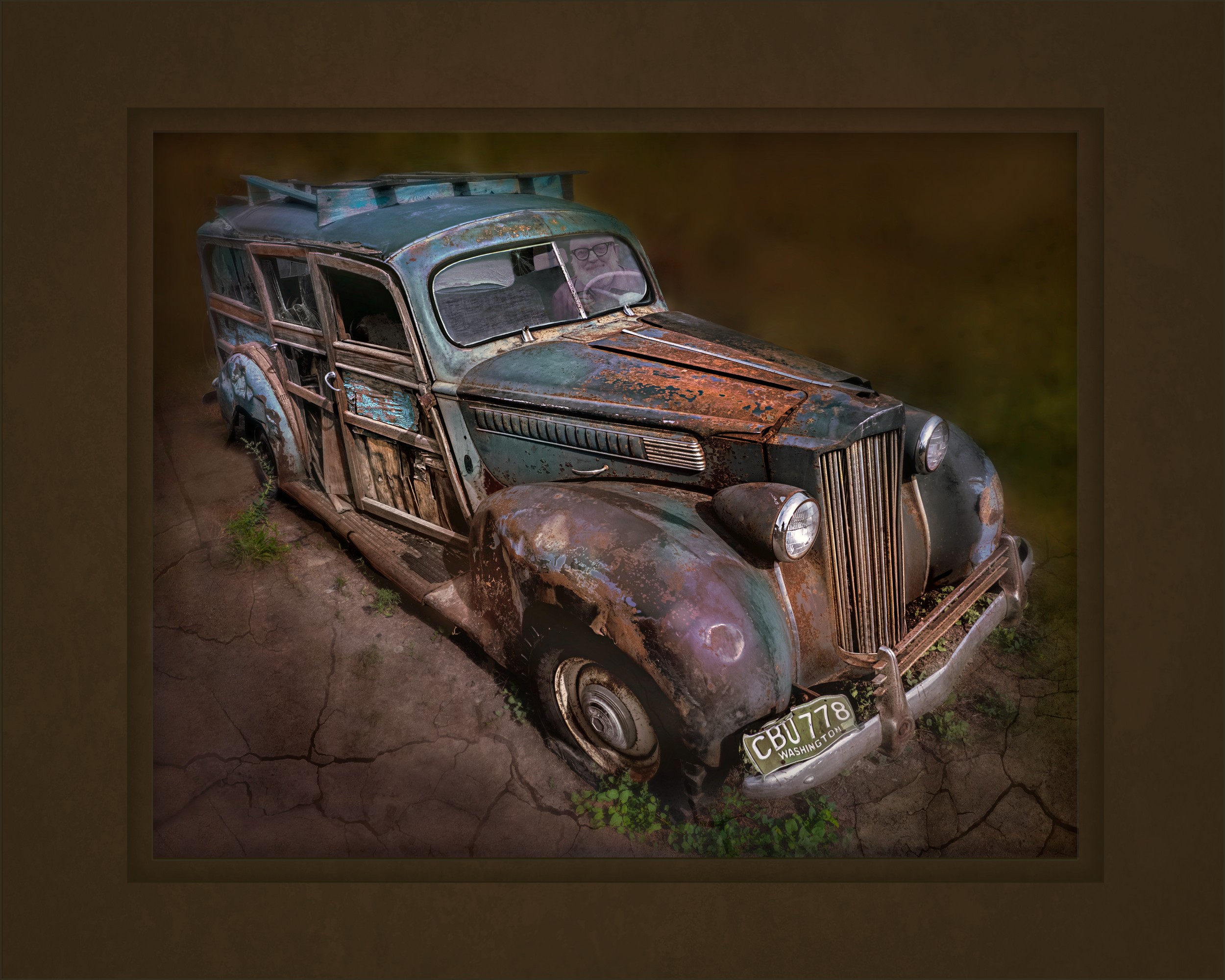
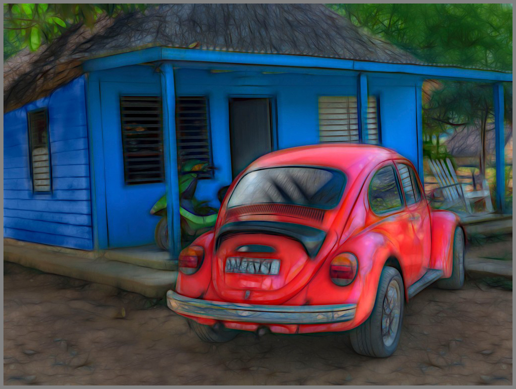
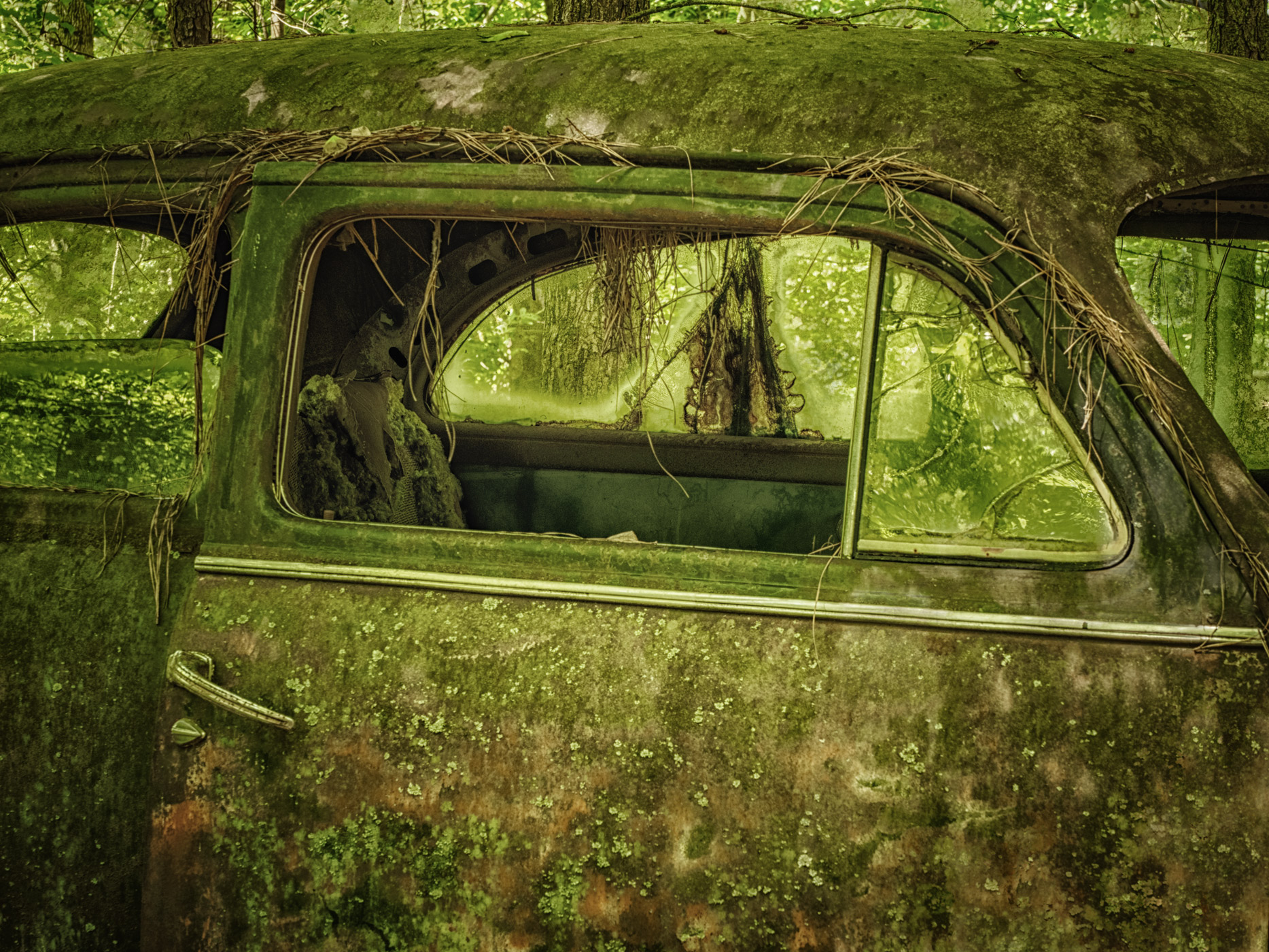
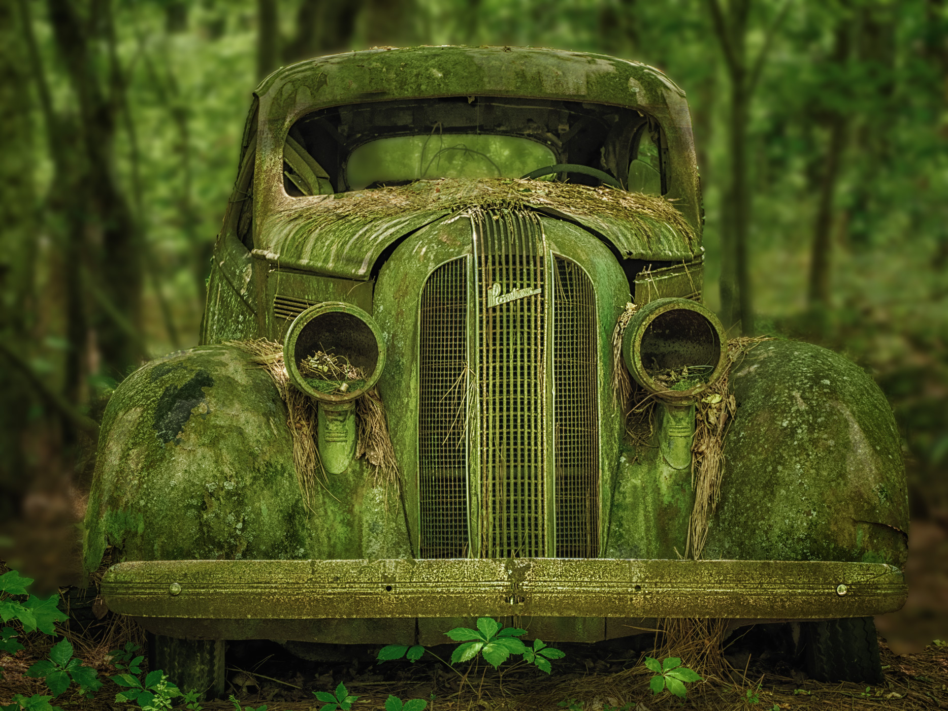
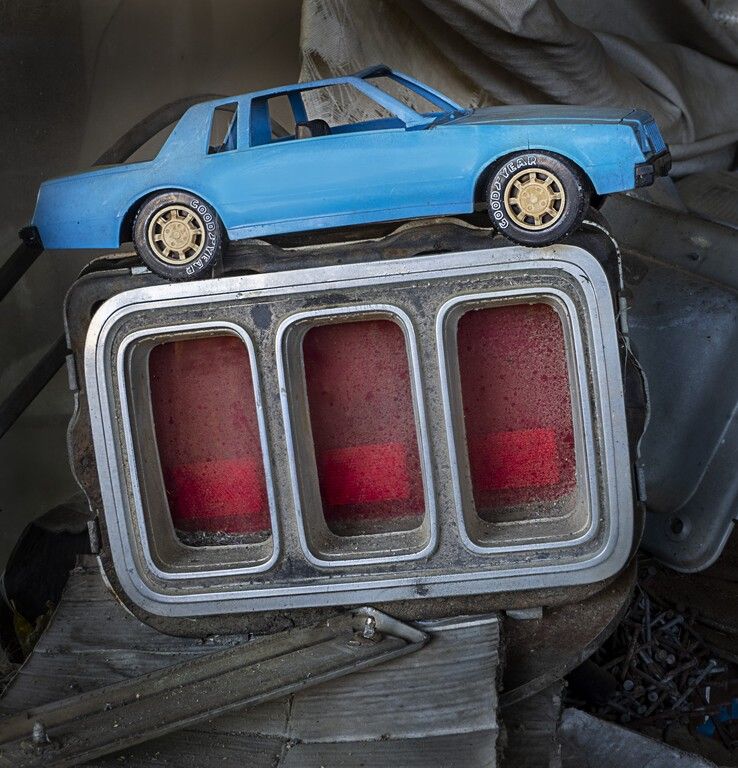
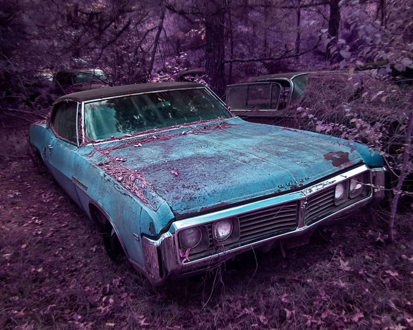
I love the car closeup, the textures and details! I like the composition but wish that there was more contrast in the final image.
|
Apr 25th |
5 comments - 1 reply for Group 44
|
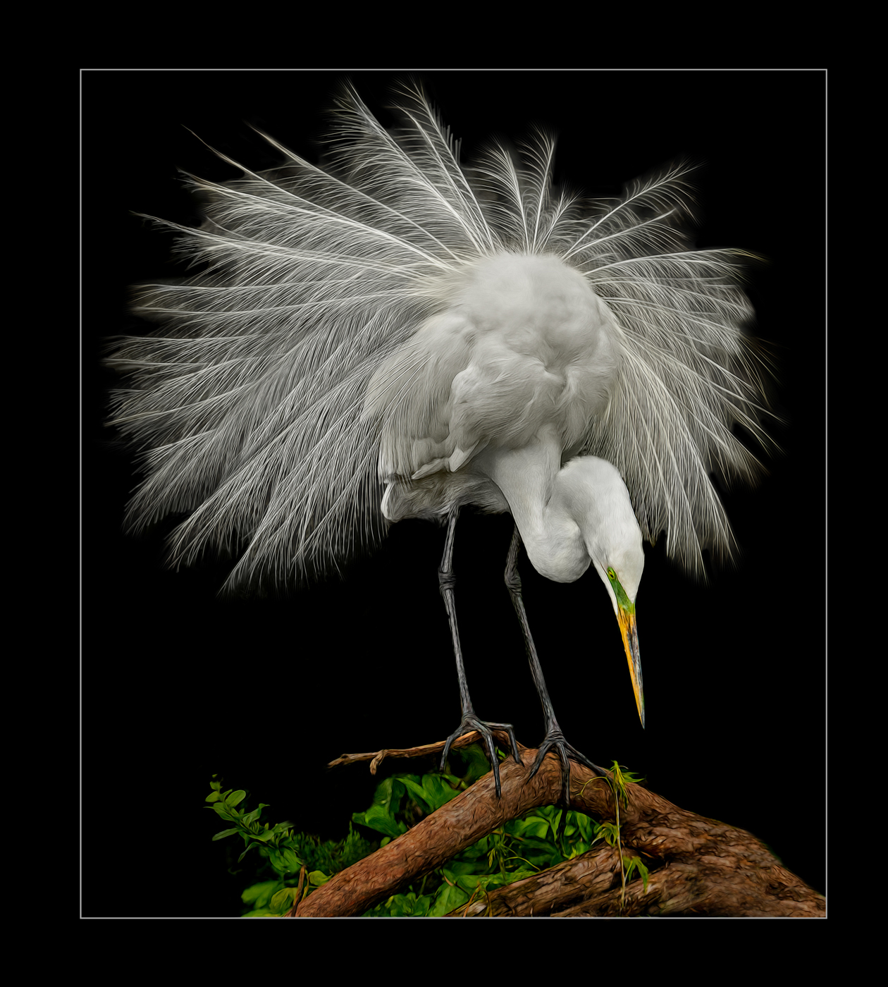
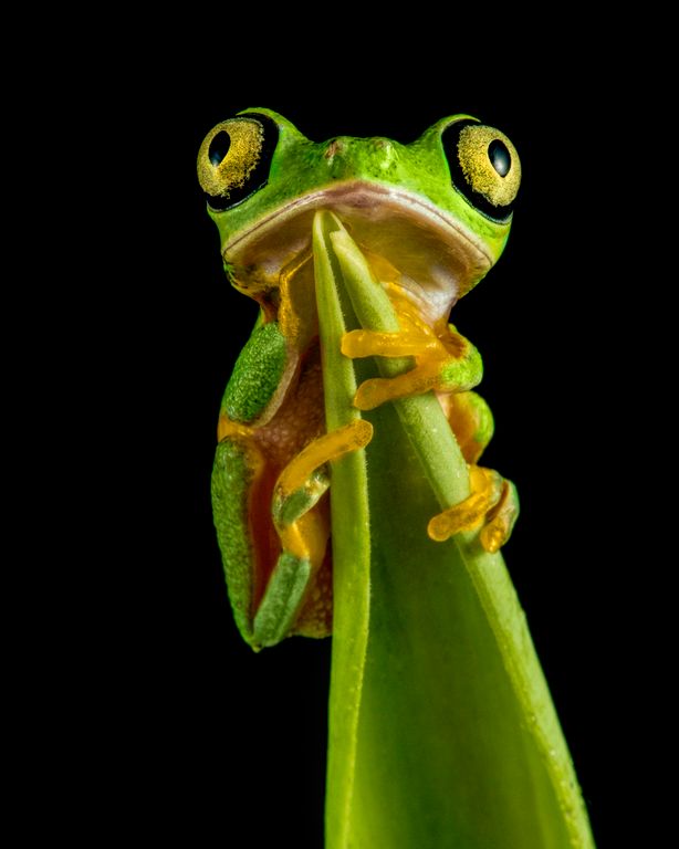
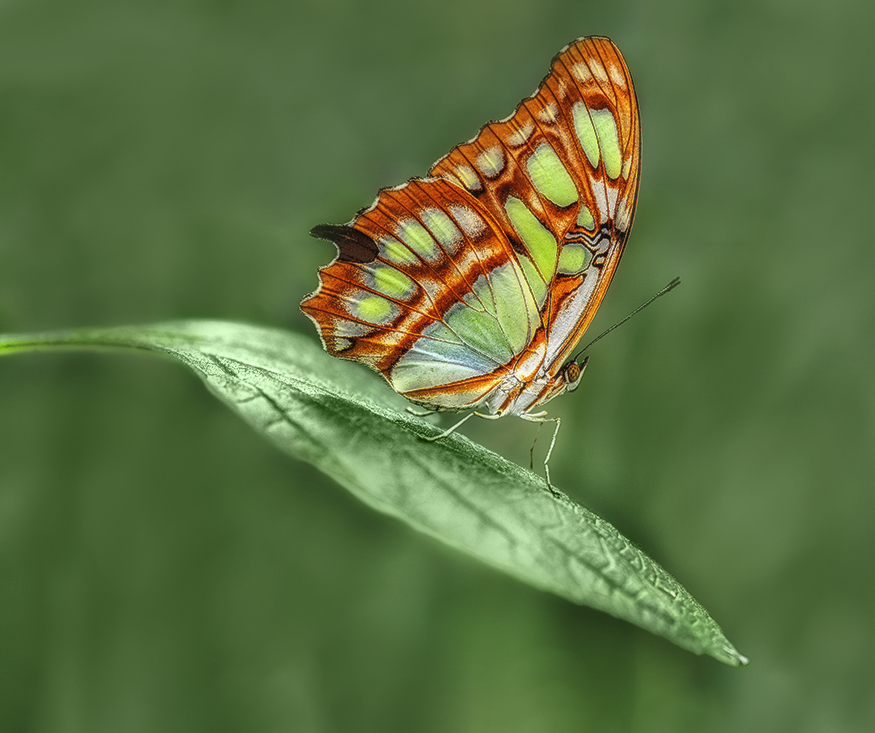
| 63 |
Apr 17 |
Comment |
I was hoping that you would point out something to fix, lol. from all of your comments this seems like a good photo, but did so-so in open comp and only scored in mid-70s in the PPA comp. It seems to be lacking "something" |
Apr 25th |
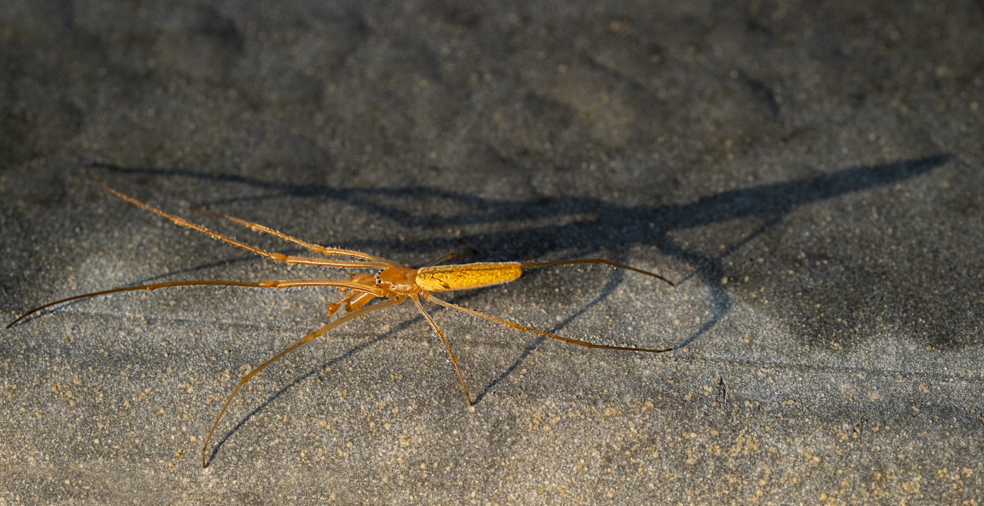
| 63 |
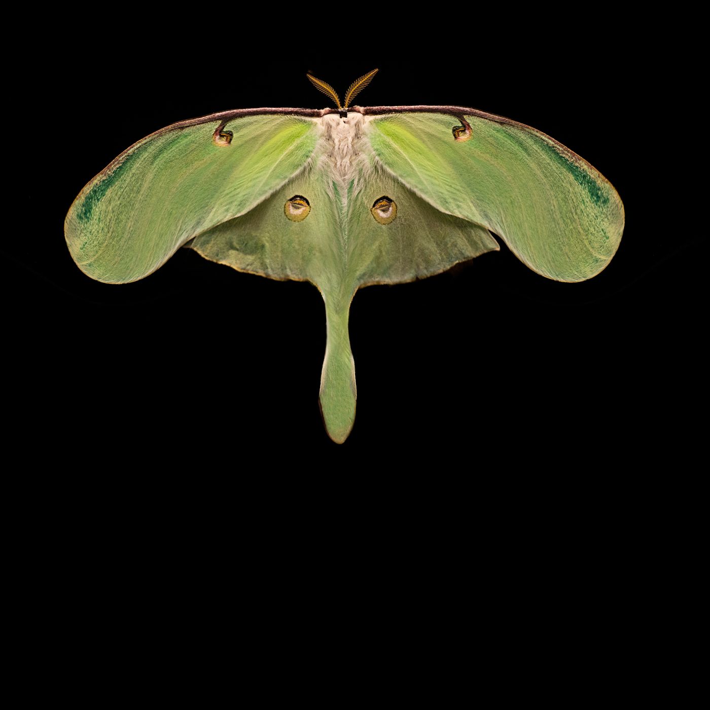
Apr 17 |
Comment |
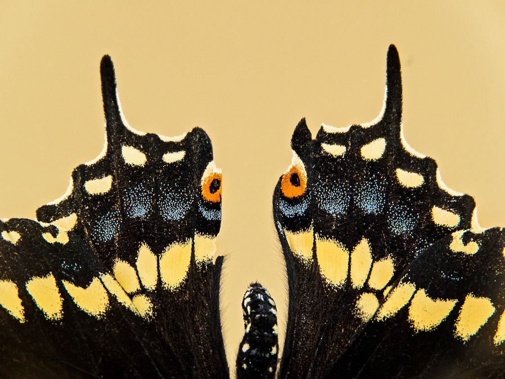
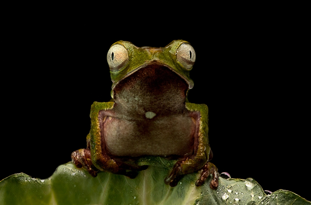
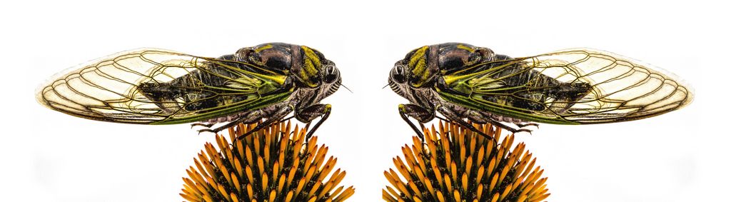
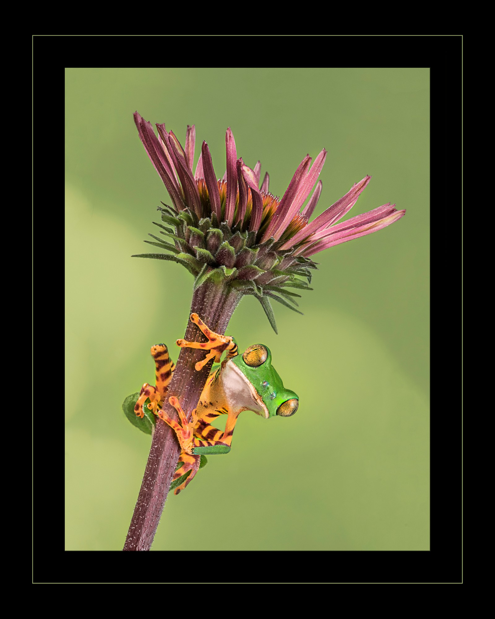
my comments got deleted, had major psa dd website issues last night. Love the choice of 5.6 to blur the background and it works because your camera sensor was intentionally placed parallel to the butterfly so that it is sharp.
I would flip it to read better left to right
I added some canvas on the bottom, cropped some from the wise and took it into Nik (polarization, sunlight and midnight) |
Apr 25th |
 |
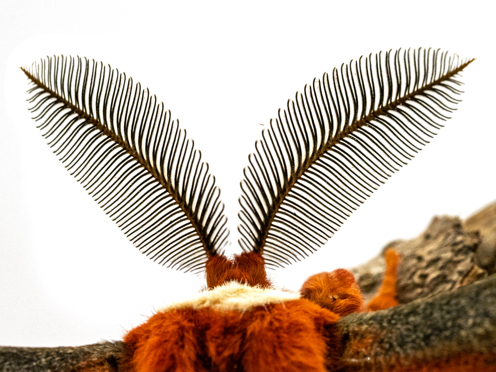
| 63 |
Apr 17 |
Comment |
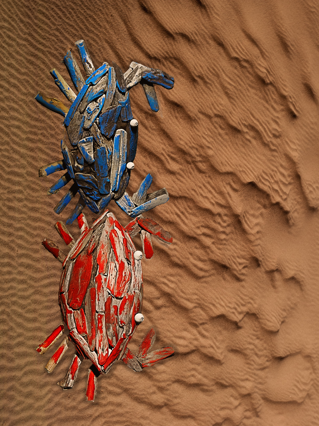
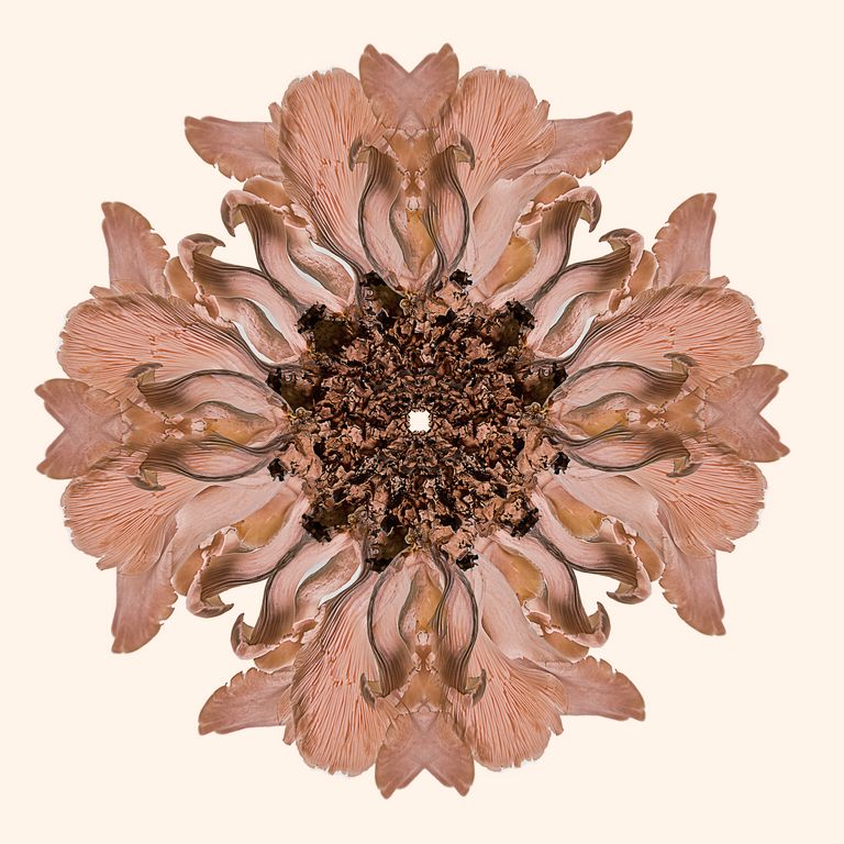
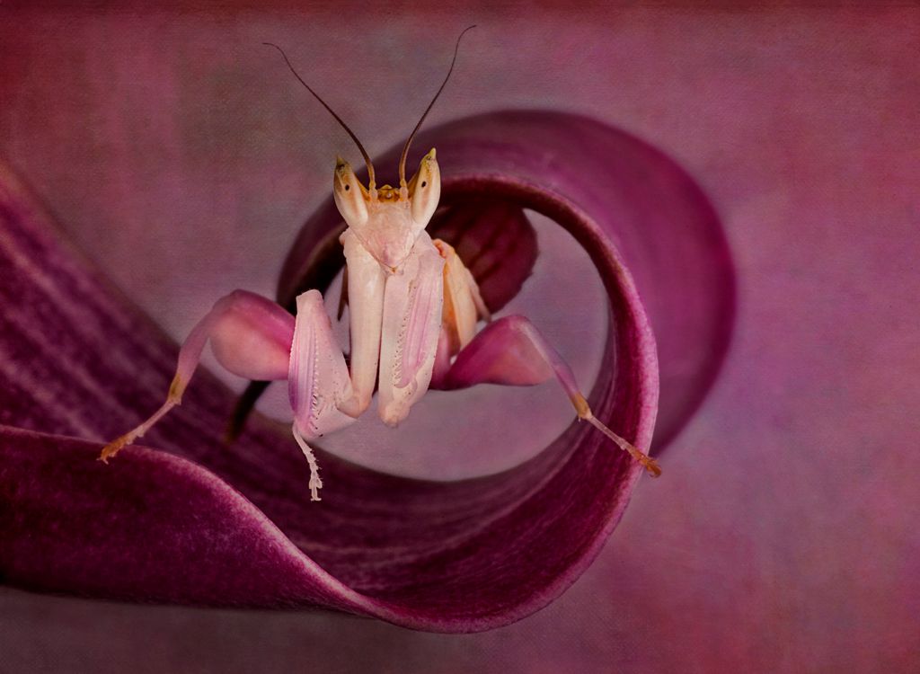
interesting to have two, one on top of the other. White is hard to photograph and still show detail, well done.
it could be sharper, but for handheld and f8 not bad! Try topaz clarity |
Apr 25th |
| 63 |
Apr 17 |
Comment |
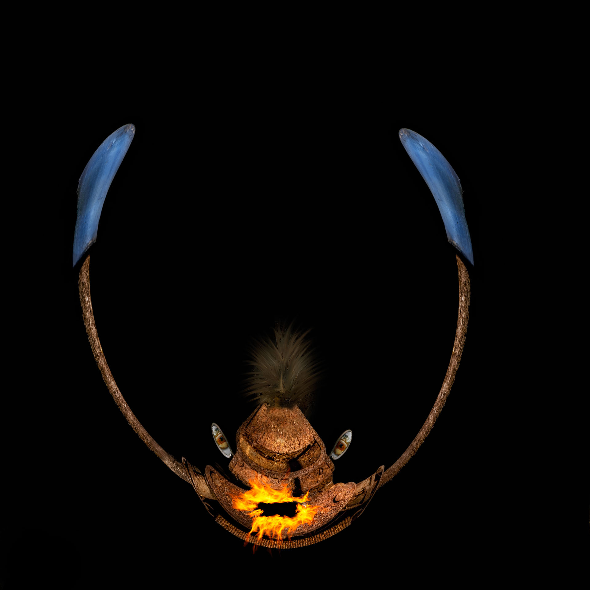
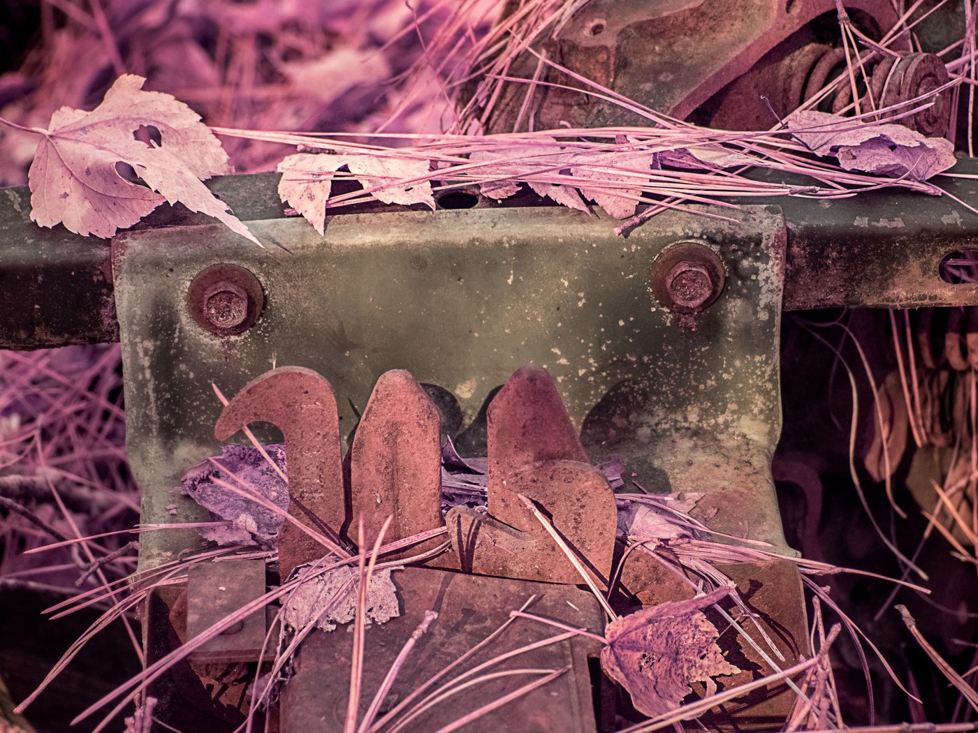
I love this, the simplicity of the ruler and the texture.
I would like more red pencil, and preferably coming from the right to act as a leading line to the "14" |
Apr 25th |
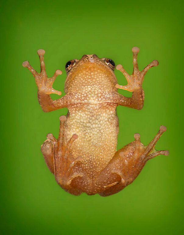
| 63 |
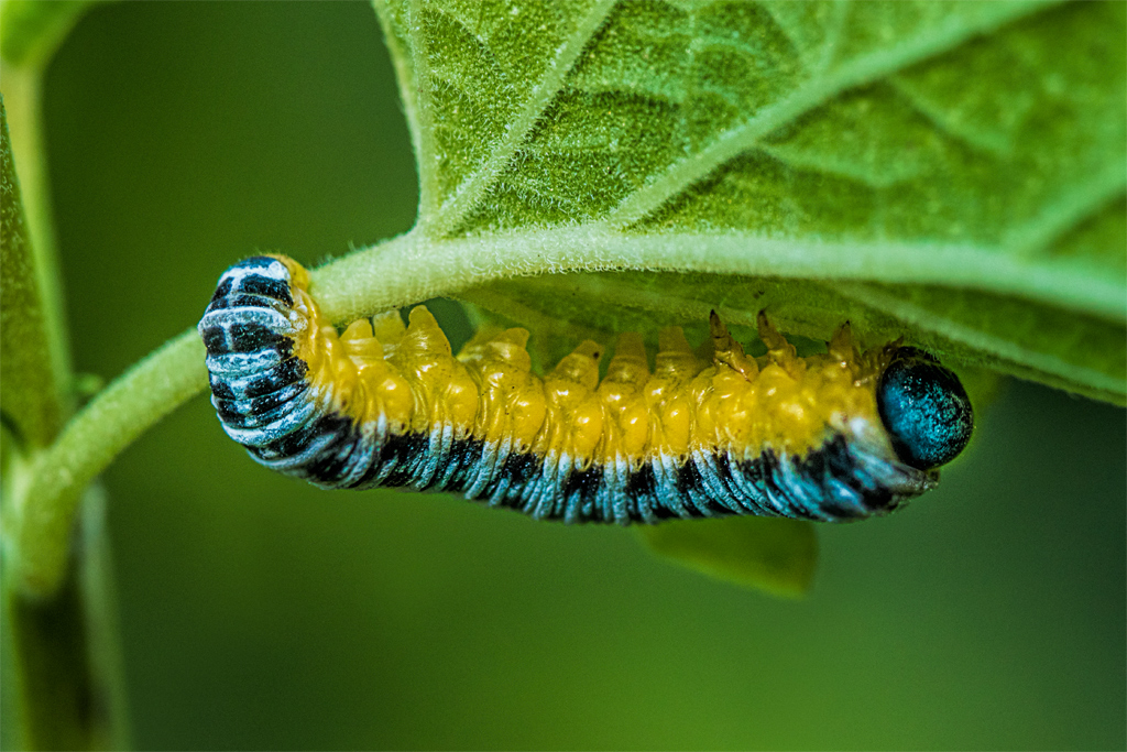
Apr 17 |
Comment |
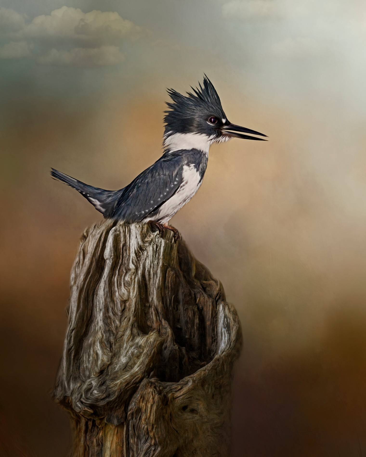
love the details, and colors and sharpness.
your details are great, are your parallel to the camera sensor with the subject?
Composition very good but I would have liked more or less of the cutoff words on the bottom. |
Apr 25th |
| 63 |
Apr 17 |
Comment |
love the details, and colors and sharpness.
your details are great, are your parallel to the camera sensor with the subject?
Composition very good but I would have liked more or less of the cutoff words on the bottom. |
Apr 25th |
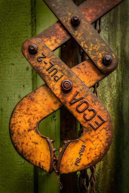
| 63 |
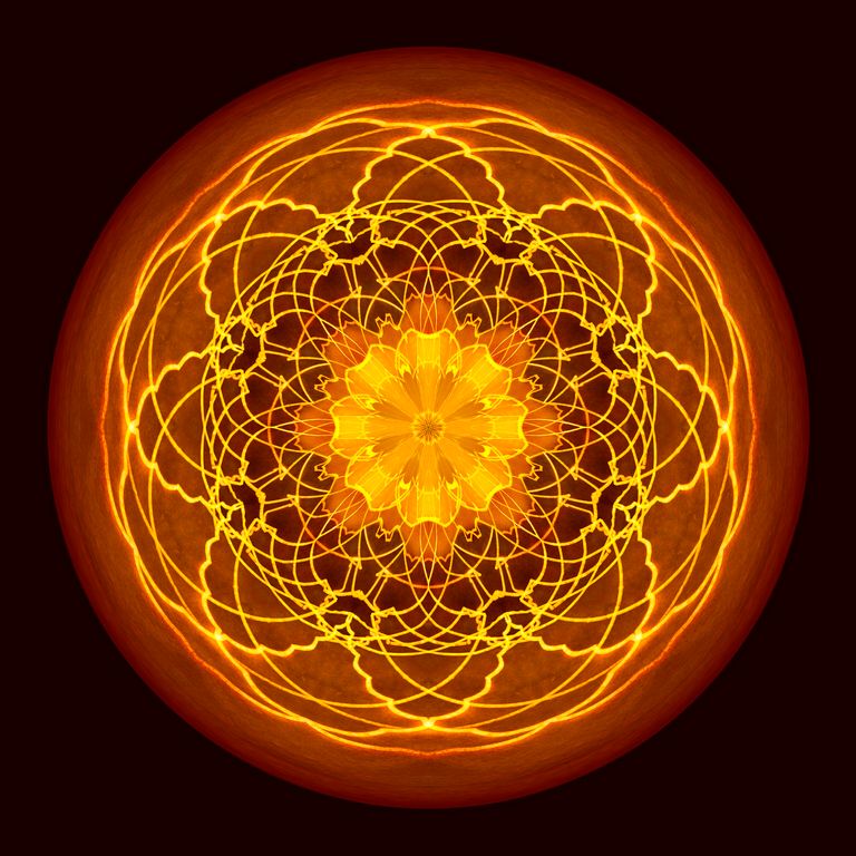
Apr 17 |
Comment |
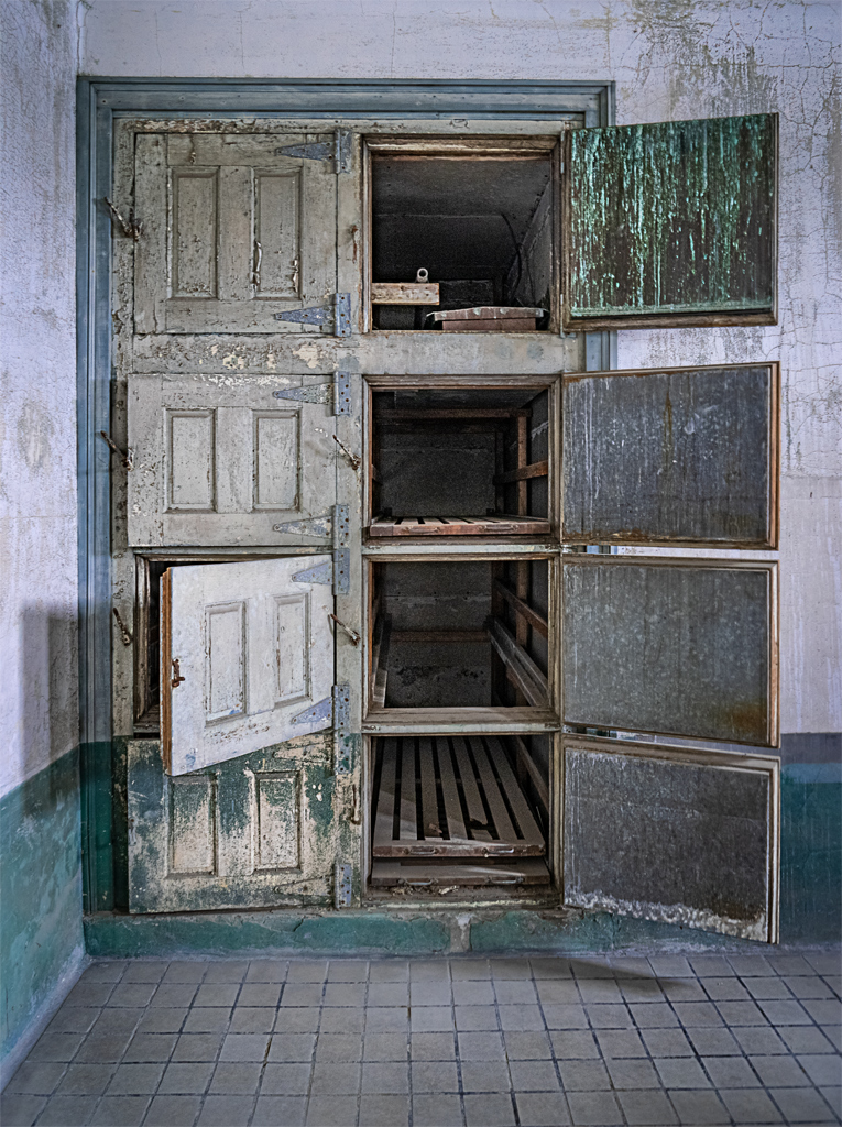
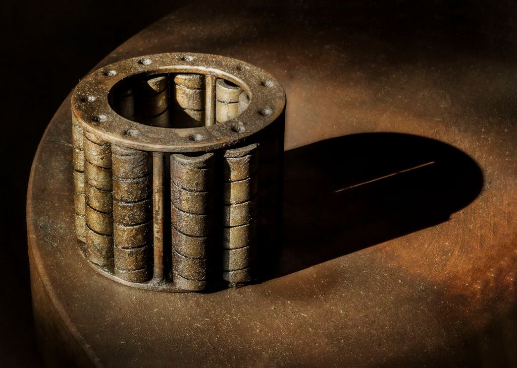
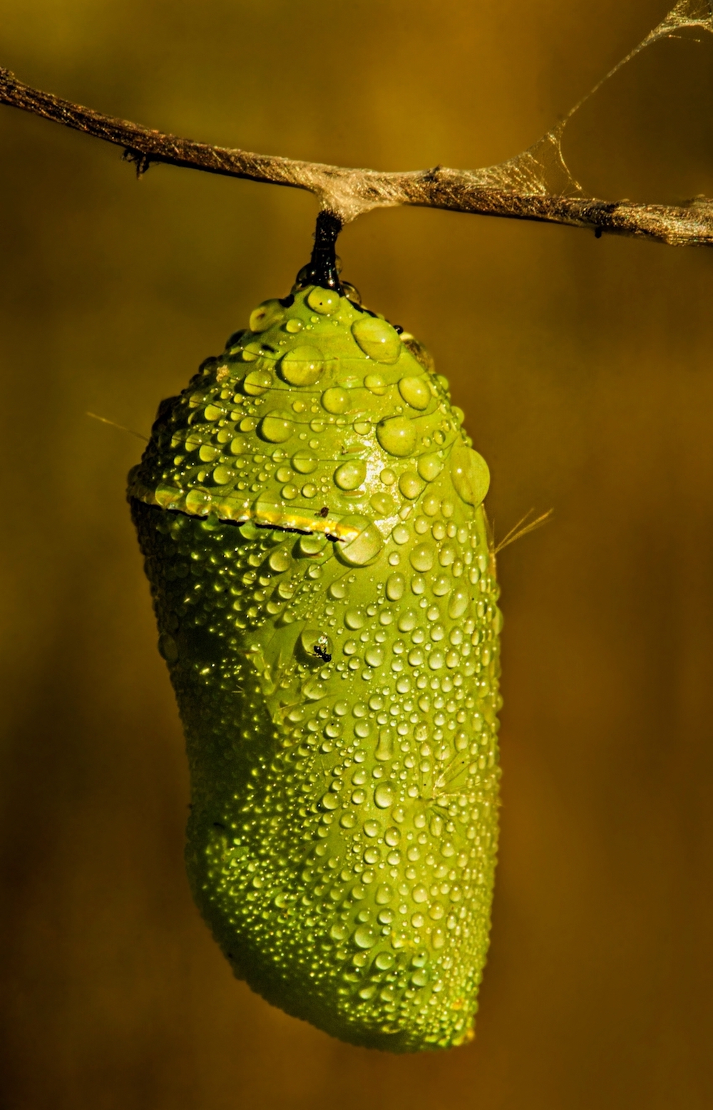
I assumed it was something rusty, very cool to find out that it was ice (no pun intended, lol). I like the main circle off center in your composition. I love the colors, except the top right where it goes blue and almost milky, perhaps dehaze in raw, or use the adjustment brush in ACR and warm it up some.
What aperture? tripod? |
Apr 25th |
| 63 |
Apr 17 |
Comment |
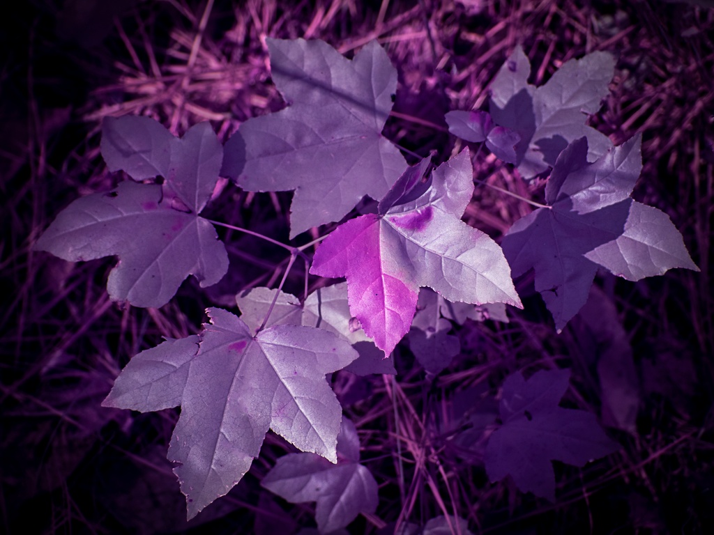
I like these leaves, becomes a strong abstract with the diagonal lines and all those green colors make it pop. Well captured. And kudos for making some awesome lemonade with the blossoms not appealing to you.
The very top left bothers me a tad, almost seems posterized or oversat |
Apr 25th |
8 comments - 0 replies for Group 63
|
20 comments - 3 replies Total
|