|
| Group |
Round |
C/R |
Comment |
Date |
Image |
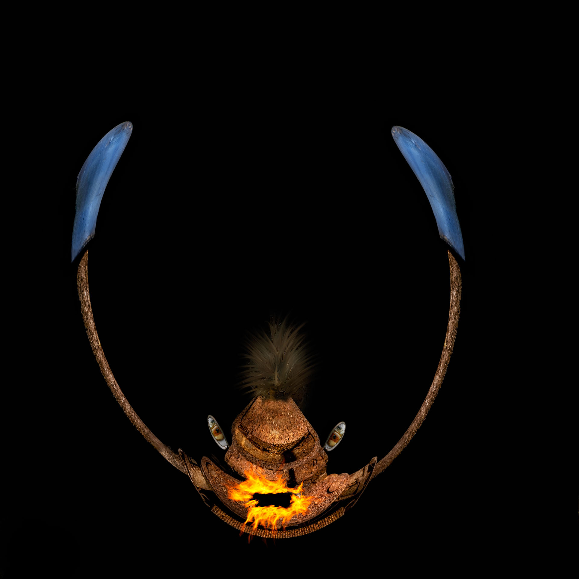
| 41 |
Mar 17 |
Reply |
thanks, I did not notice that bright part, I believe that it is part of the hitch; removed it, thanks!
cool idea of the campfire, not sure that I can put a campfire in or that I even have one, but it is an idea to try. Where would you place the fire? and you don't think that it would distract from the stars? |
Mar 17th |
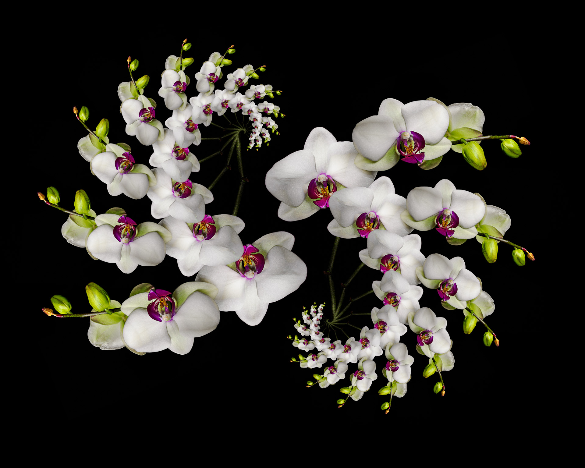
| 41 |
Mar 17 |
Comment |
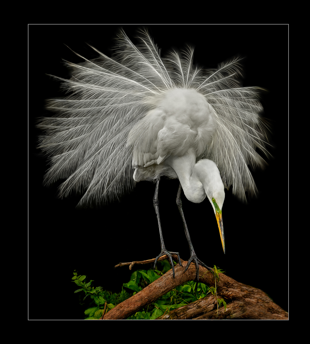
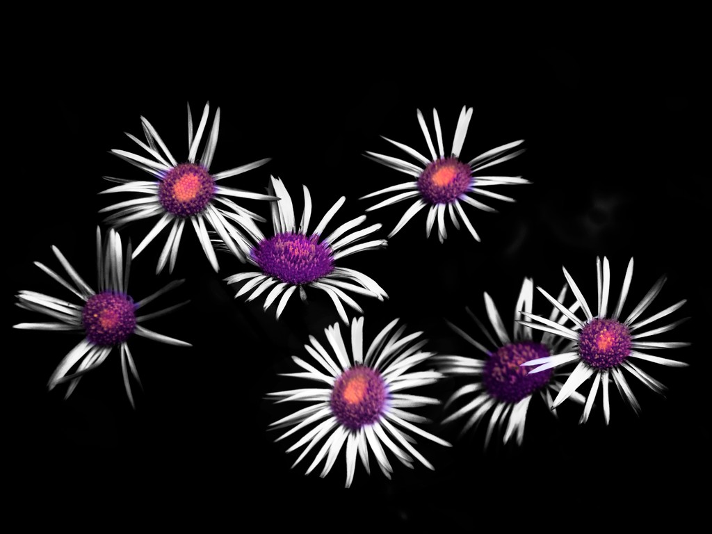
I love the composite and the impressions on top of it, has real POP. Your final arrangement of the 7 works well too. love it!
my only comment is that the bottom most ibis, feet look funny, like they were not masked all the way in or something
well done! |
Mar 15th |
| 41 |
Mar 17 |
Comment |
wow, that must have taken a long time! impressed with your patience!
The cloning is done very well, but I do see some tell-tale repeating patterns. I will change the angle of the clone tool (and even flip some) |
Mar 15th |
 |
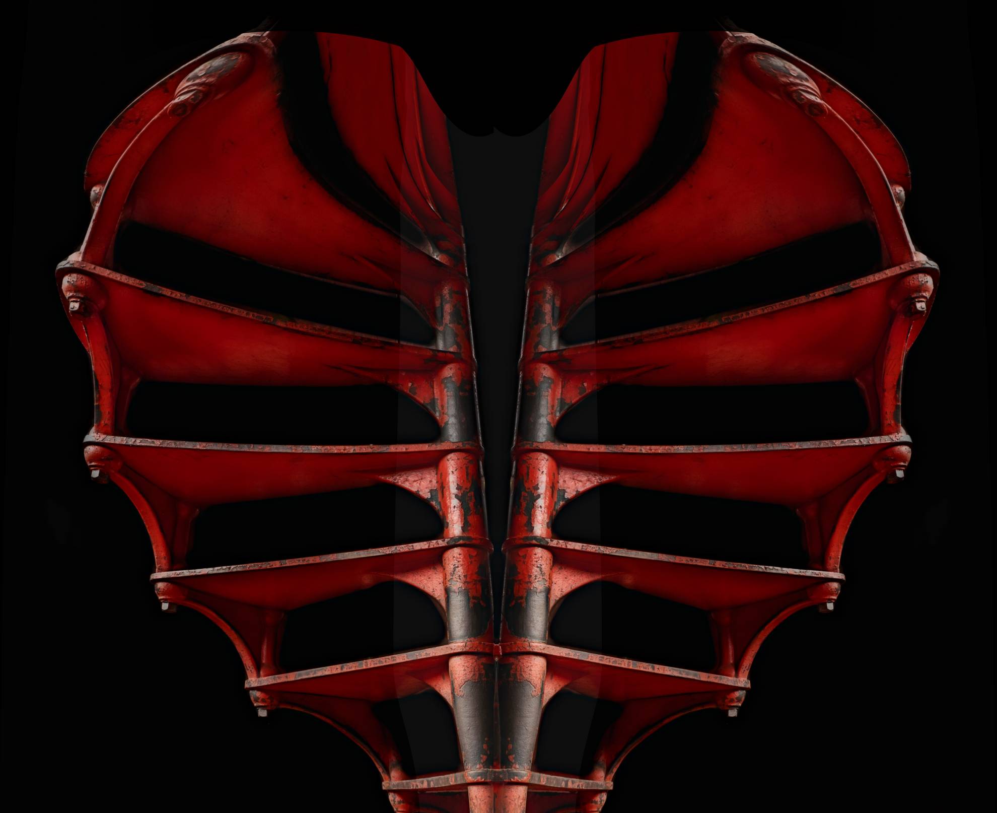
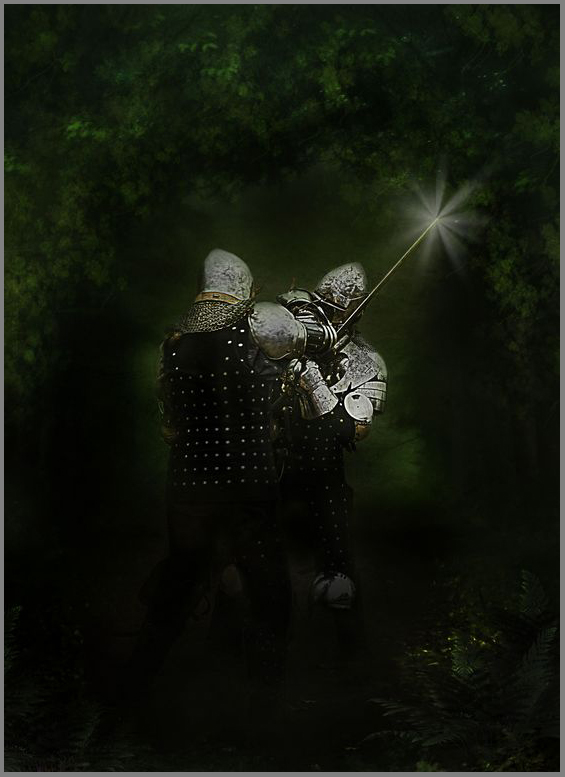
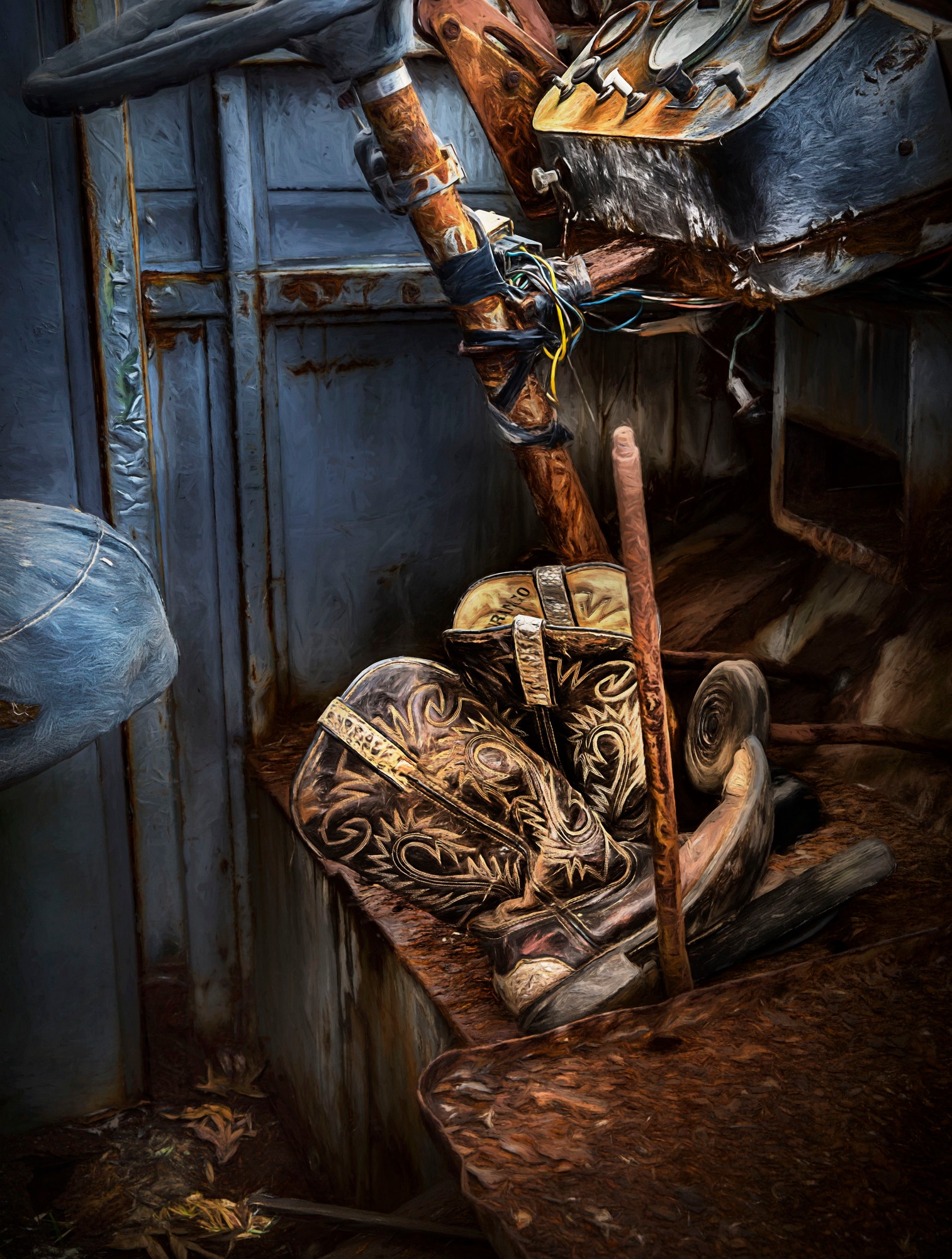
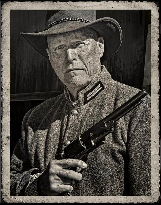
| 41 |
Mar 17 |
Comment |
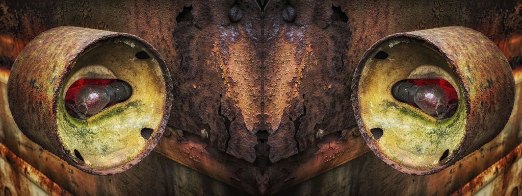
or make the gun barrel intentionally go out of the frame... |
Mar 15th |
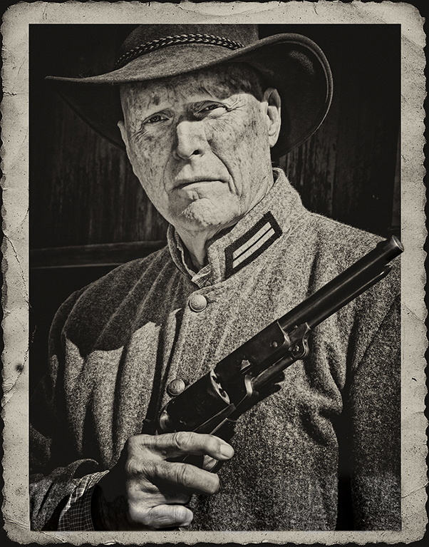 |
| 41 |
Mar 17 |
Comment |
The end effect is quite well done, the tones are great and I love the weathered border. I have not seen this preset in Silver Effects, this really works well here.
The two things that bother me are the clipped gun barrel and the clipped fingers. I would reduce the size of the photo inside the frame so that there are not clipped off?
|
Mar 15th |
 |
| 41 |
Mar 17 |
Comment |
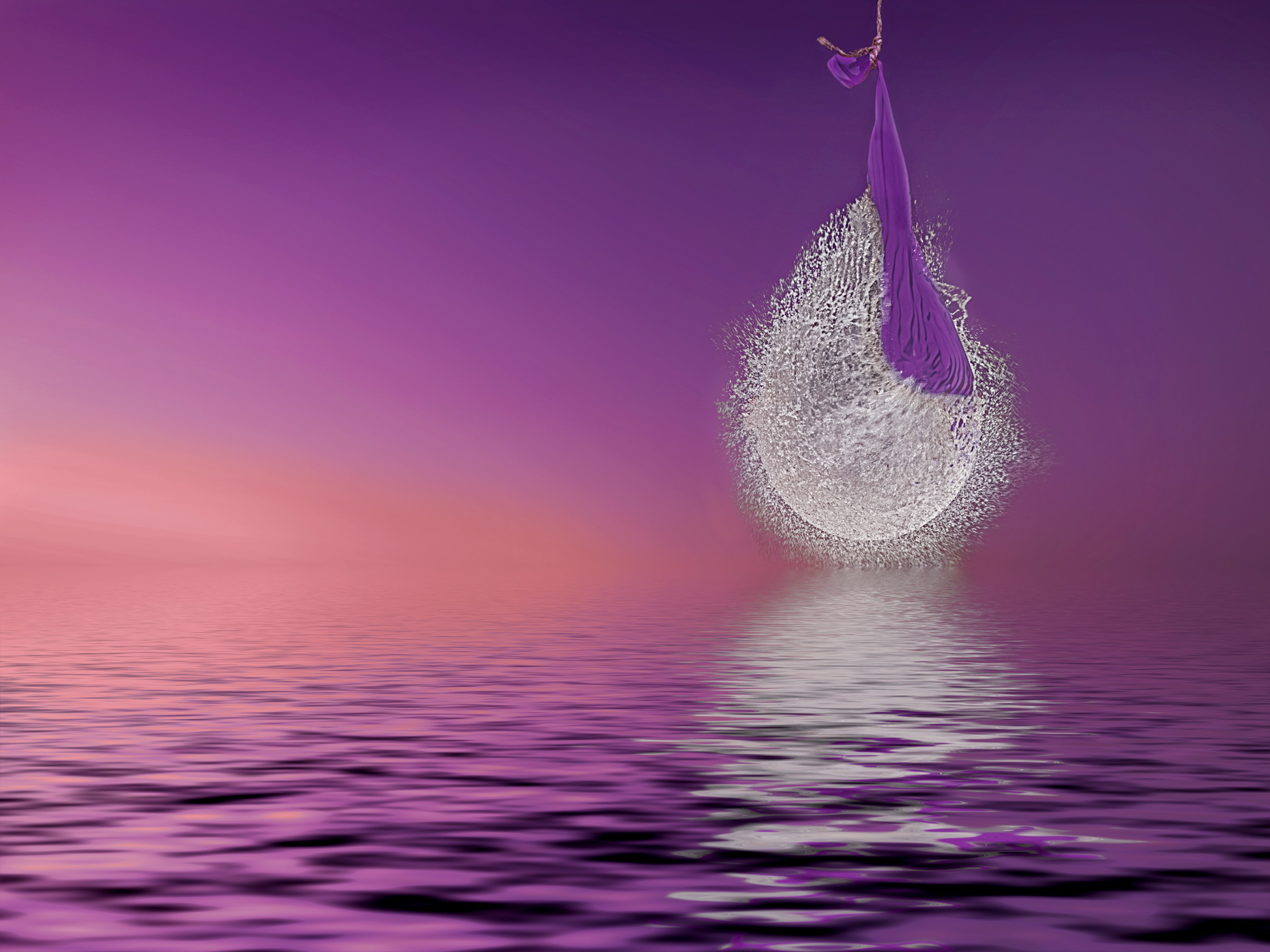
I love the textured mat and the bicolor effect and artistic effect.
Personally, I would clone out those water bubbles, turn the image upside down and they are the brightest parts and cause your eye to leave the darker duck
Tone down the white tail feathers for the same reason. |
Mar 15th |
| 41 |
Mar 17 |
Comment |
First glance the impact was huge and I love it, very graphic!
Very creative, and what a great way to simplify and get rid of the distractions, most impressive! definitely good artistic sports image!
I agree about the net
I shoe cut off in the lower bottom bothers me, I would crop it up some from the bottom
Was the shadow part of the action? I like the "tan" part of the background more
|
Mar 15th |
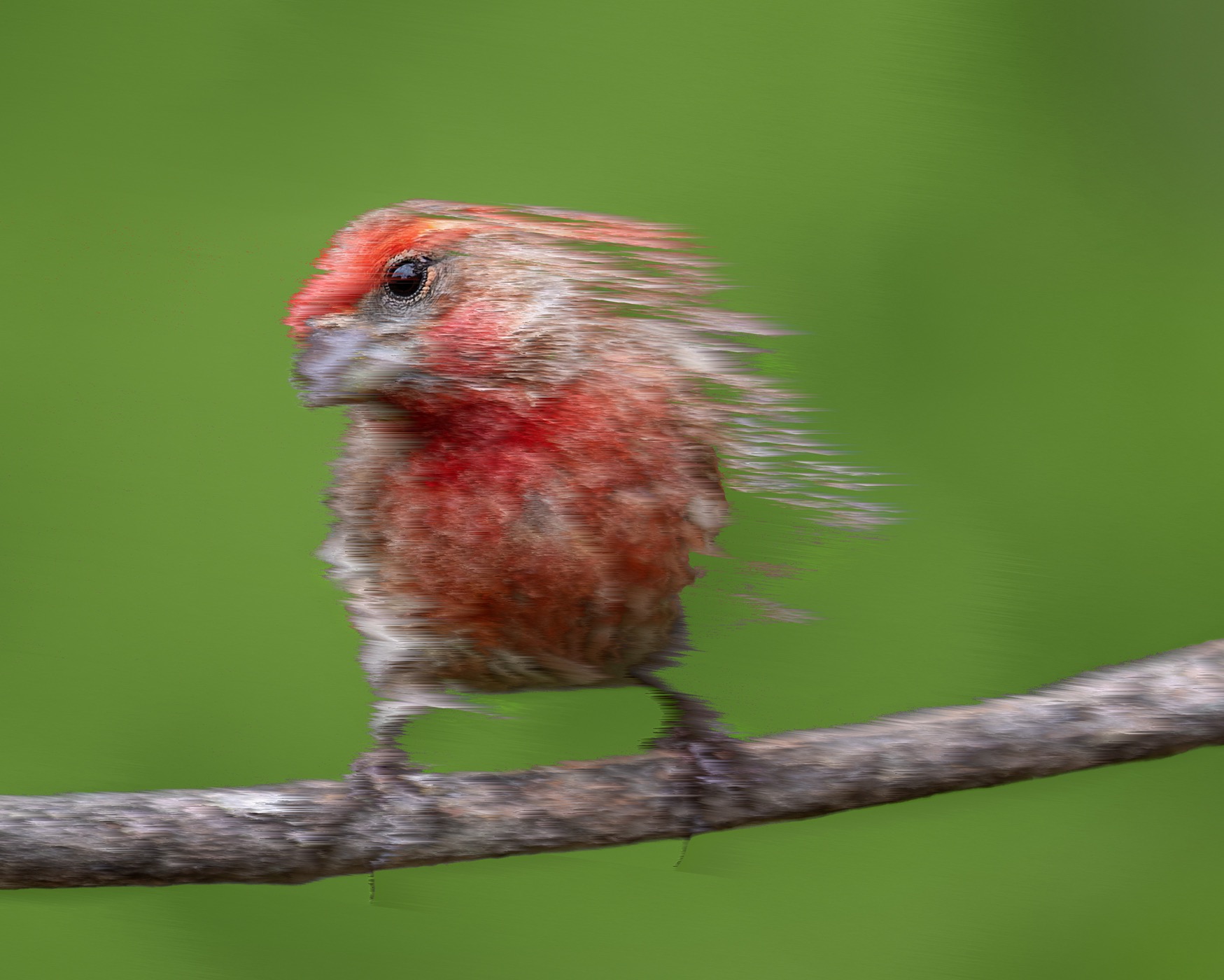
| 41 |
Mar 17 |
Reply |
yes, inquiring minds want to know
what new art action you bought
HPden layer |
Mar 15th |
6 comments - 2 replies for Group 41
|
| 44 |
Mar 17 |
Comment |
blurred the image, masked the truck back in |
Mar 15th |
 |
| 44 |
Mar 17 |
Comment |
add some more texture |
Mar 15th |
 |
| 44 |
Mar 17 |
Comment |
add some texture and clone more |
Mar 15th |
 |
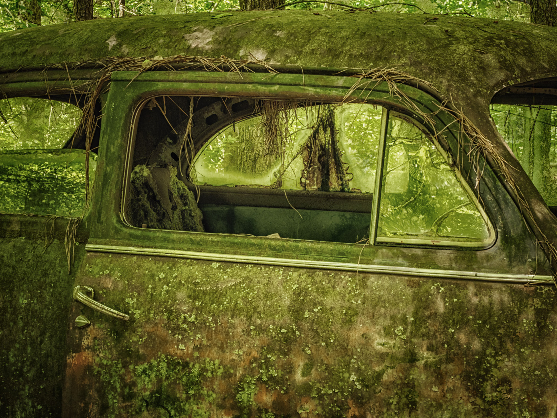
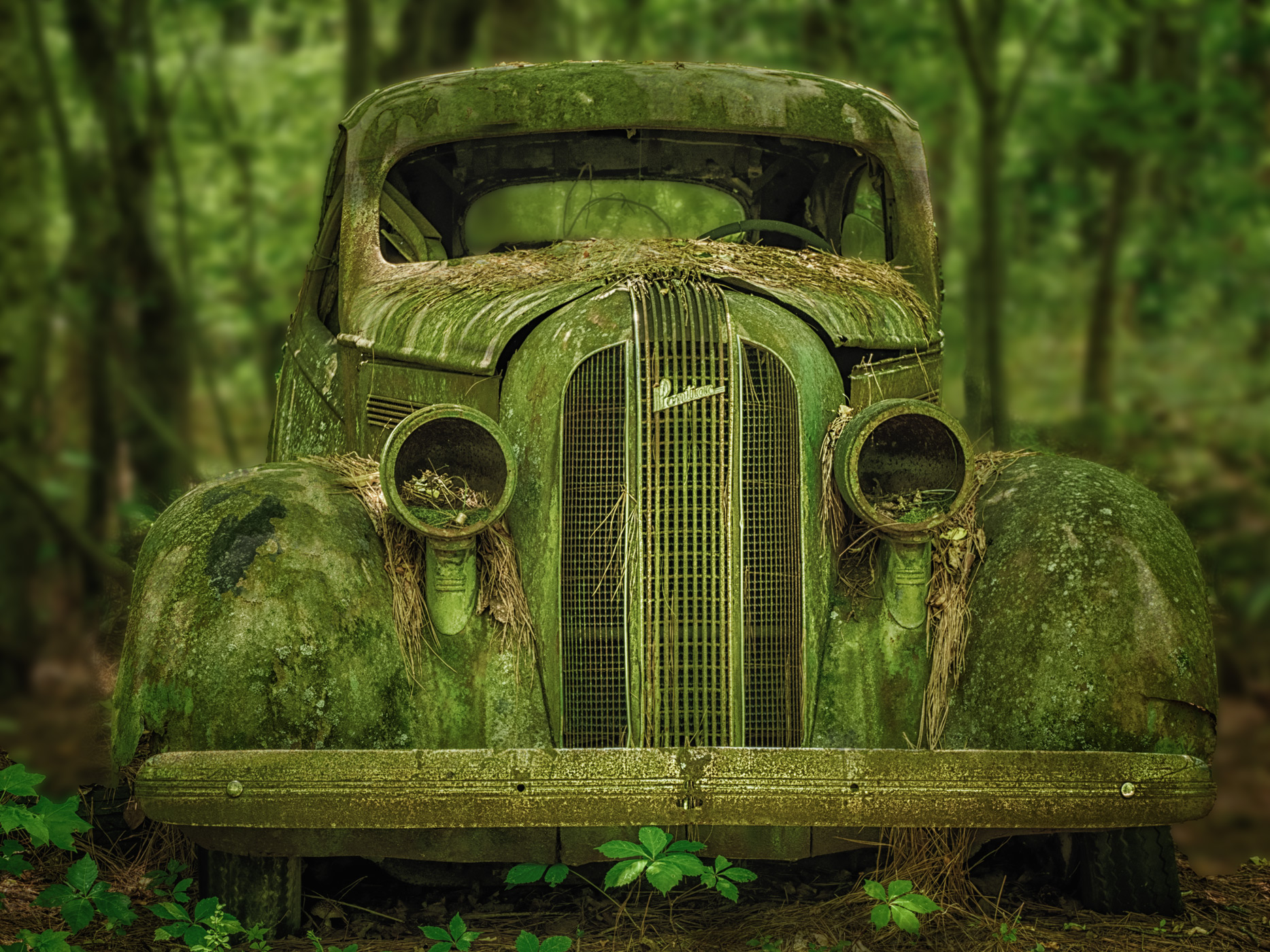
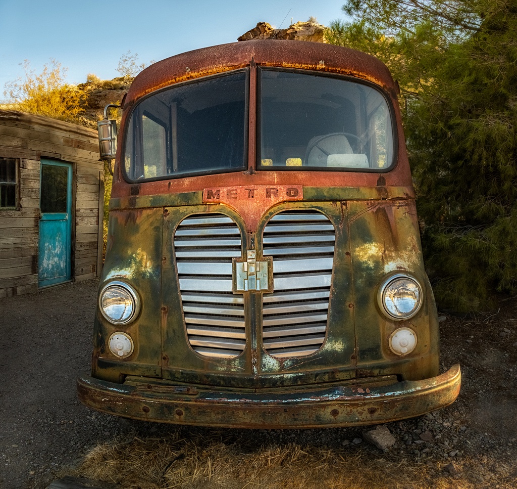
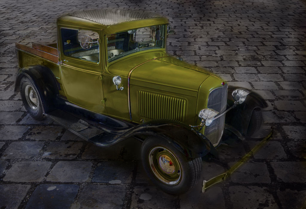
| 44 |
Mar 17 |
Comment |
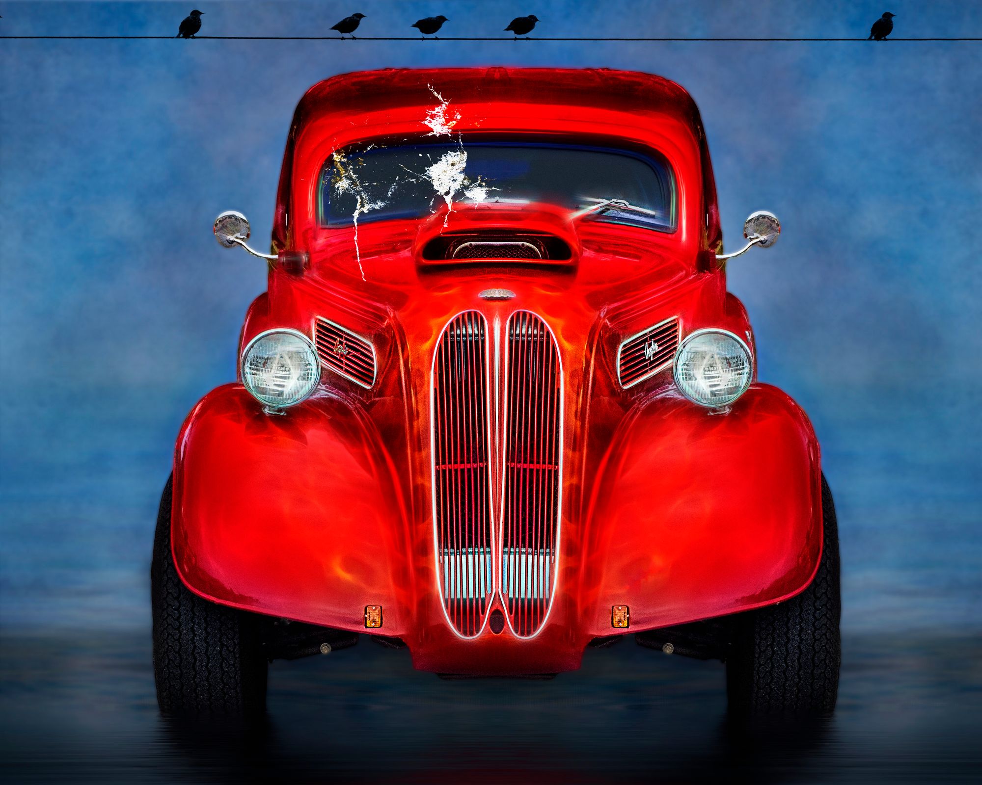
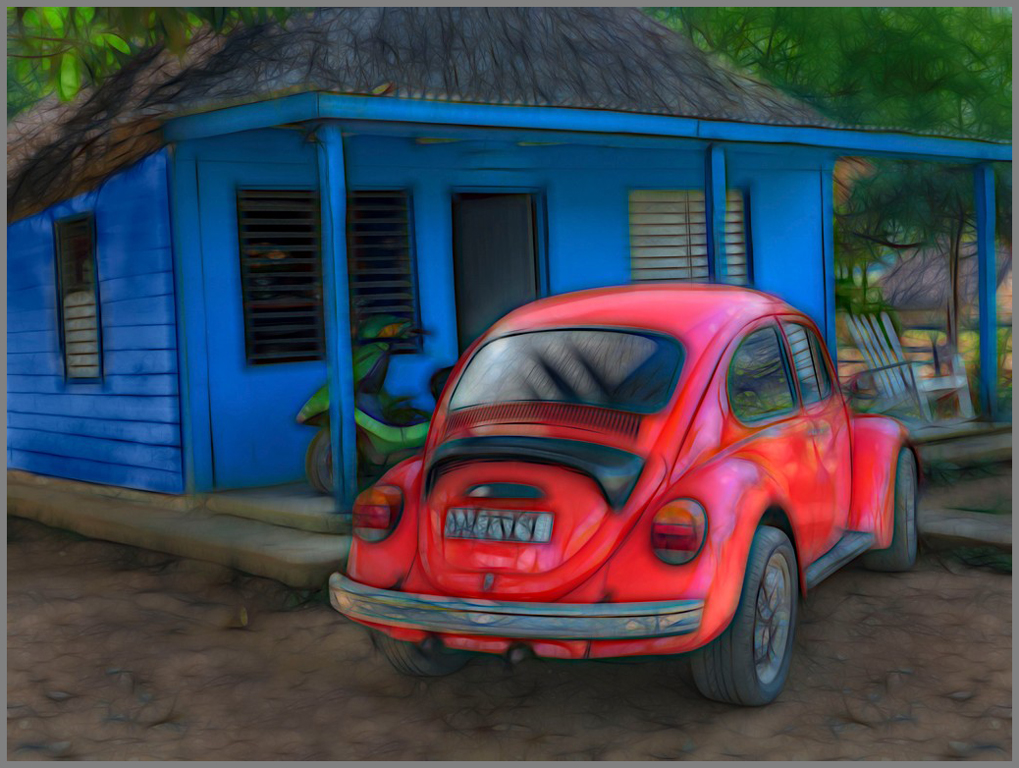
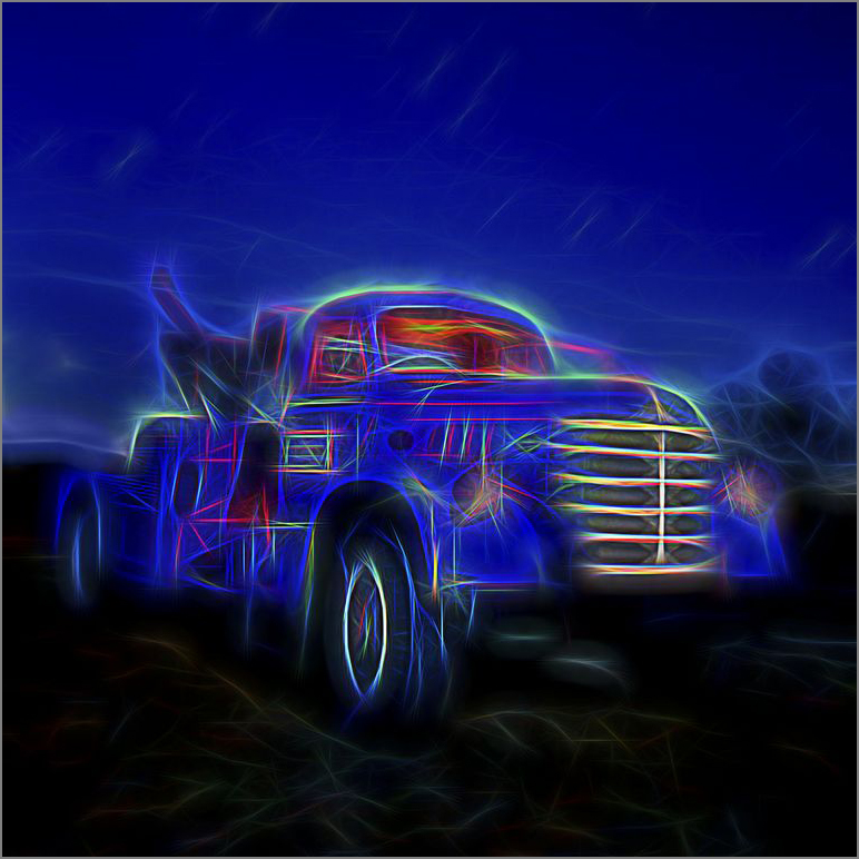
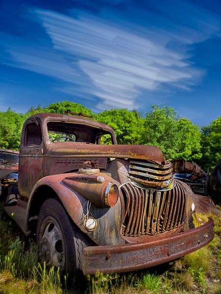
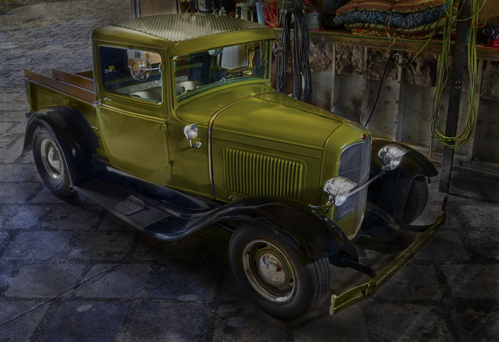
cool truck! great tones. I love old cars and you have captured it well, except for the small area behind the truck rear tire the tones are great!
The clutter is, of course, unfortunate. Depending upon how much editing you want to do this has unlimited potential. I would clone out some of the big or obvious distractions.
I added a hue/sat layer, cloned some... |
Mar 15th |
 |
| 44 |
Mar 17 |
Reply |
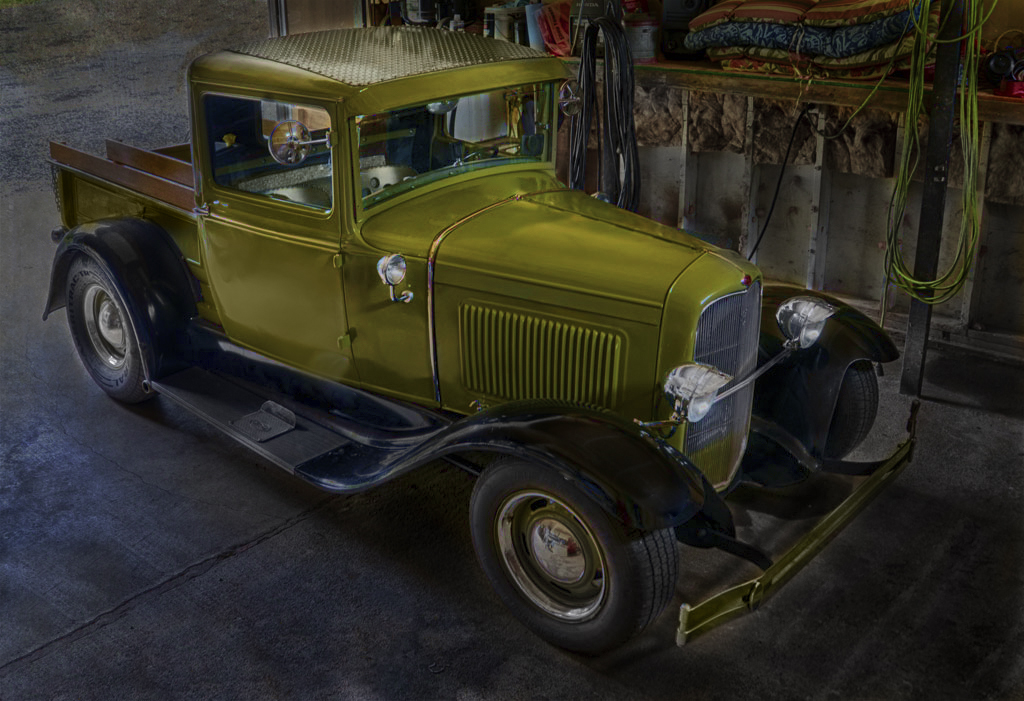
I like this crop! |
Mar 15th |
| 44 |
Mar 17 |
Comment |
love the bison and the backlighting and the BW conversion! I would not have thought to process (HDR/BW for bison) this like this yet I love it!
not sure about the log in front or bison almost in center. |
Mar 15th |
| 44 |
Mar 17 |
Comment |
green roof? |
Mar 15th |
 |
| 44 |
Mar 17 |
Comment |
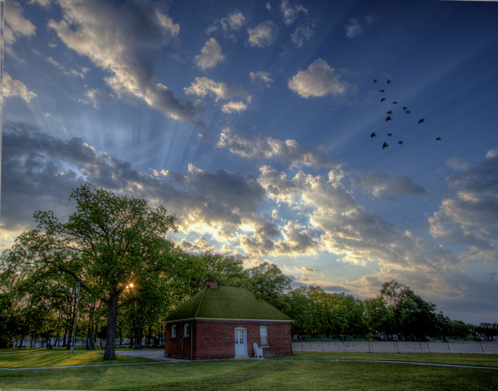
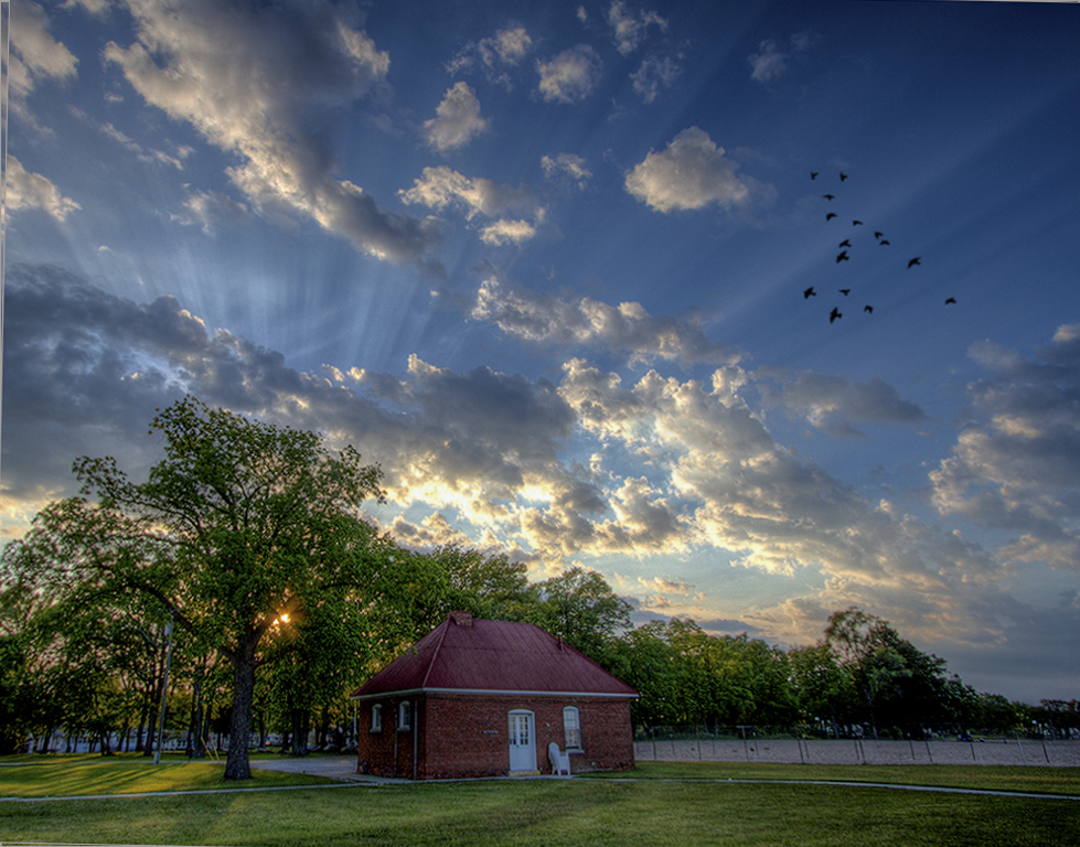
I love the rays of sun and the birds are perfectly placed. Has impact because of the ray. The clouds are great. What a sunset! Good placement of the sun behind the trees.
Image is slanted and could use a little straightening. Perhaps clone out house on far right.Tone down roof.
|
Mar 15th |
 |
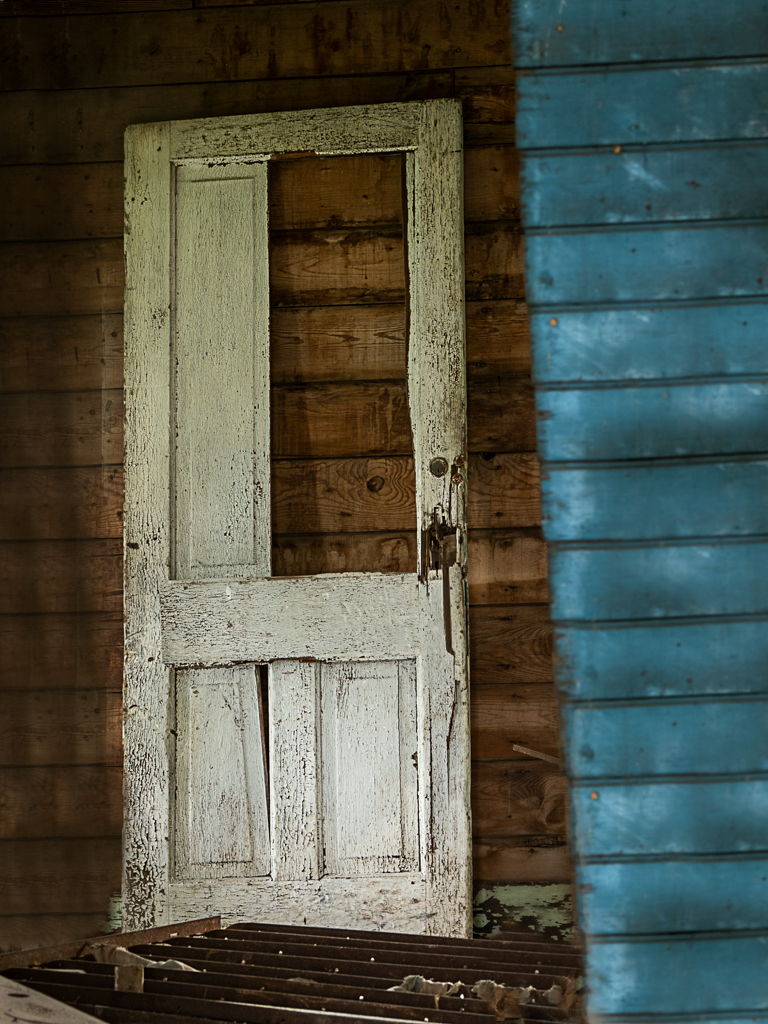
| 44 |
Mar 17 |
Reply |
"There is a small bit of one of the lattice uprights that pokes in along the left edge near the solid wood section."
Yes, I would clone or crop that out |
Mar 15th |
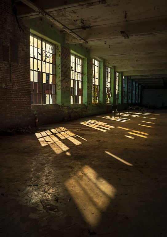
| 44 |
Mar 17 |
Comment |
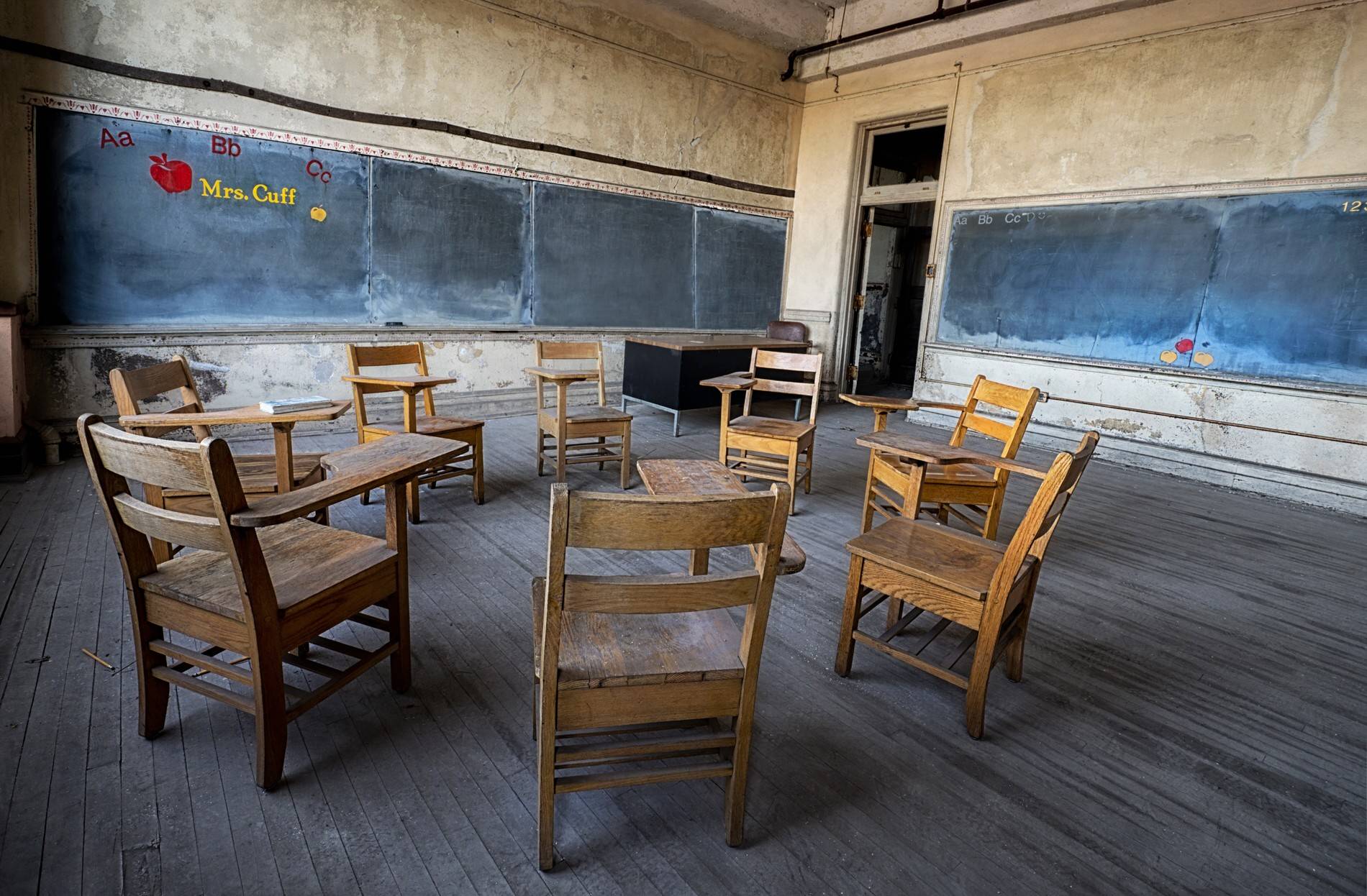
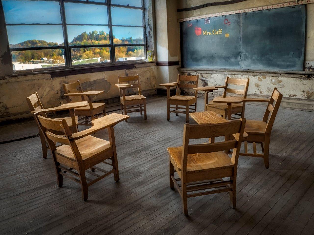
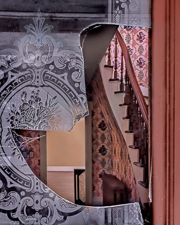
nice feel to the image, tones are balanced well. The blue sky looks natural and the inside and outside are both featured. Has a pleasant feel. Nicely done. |
Mar 15th |
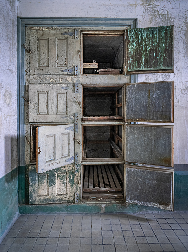
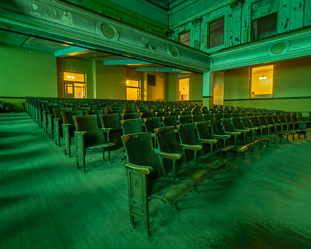
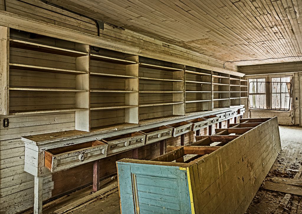
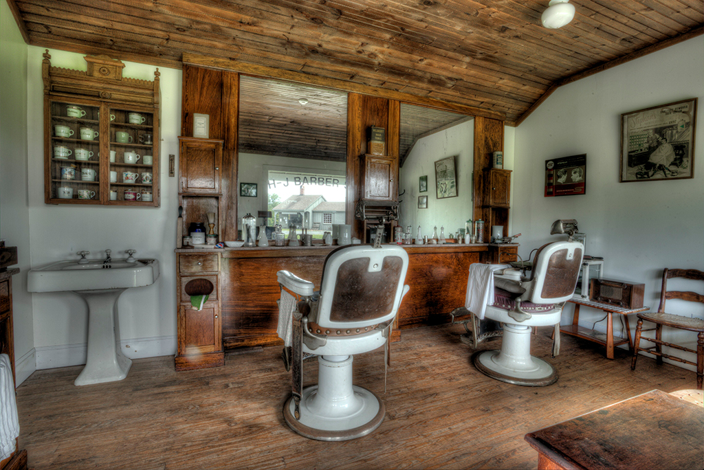
| 44 |
Mar 17 |
Comment |
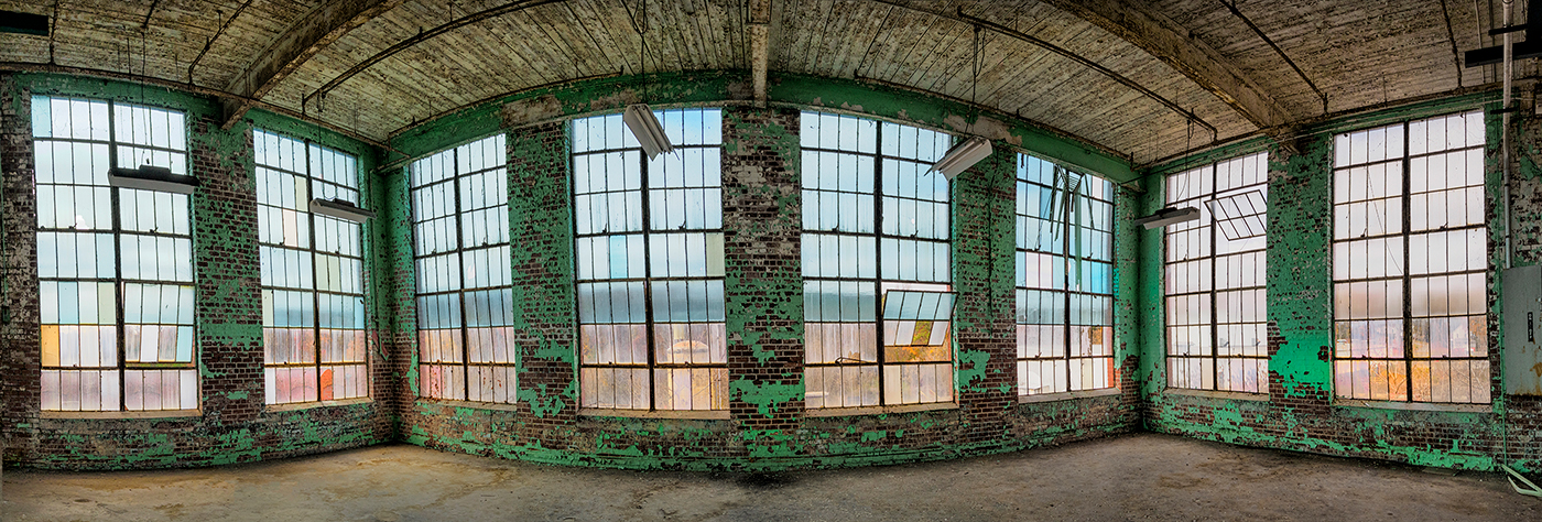
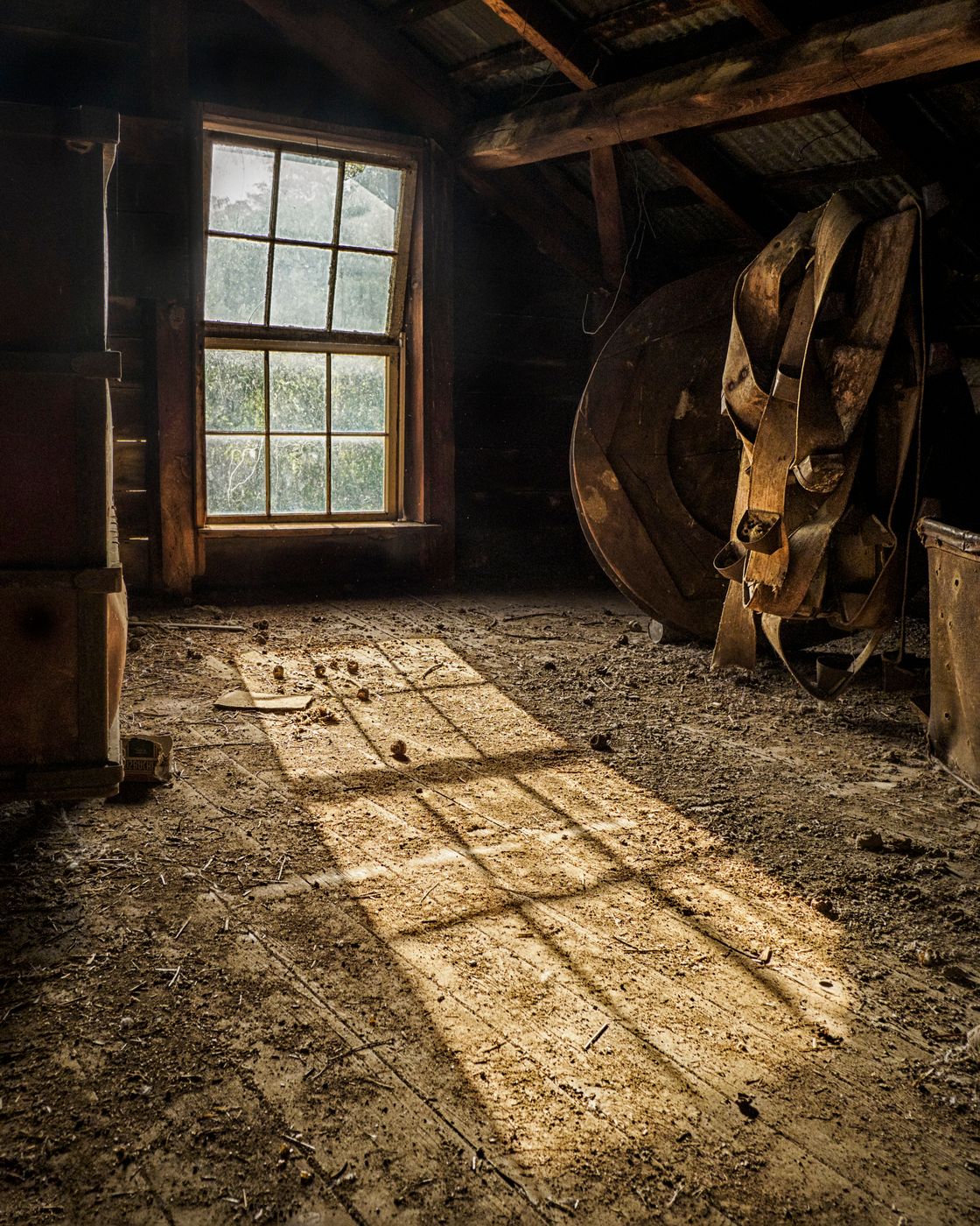
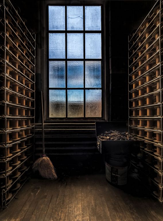
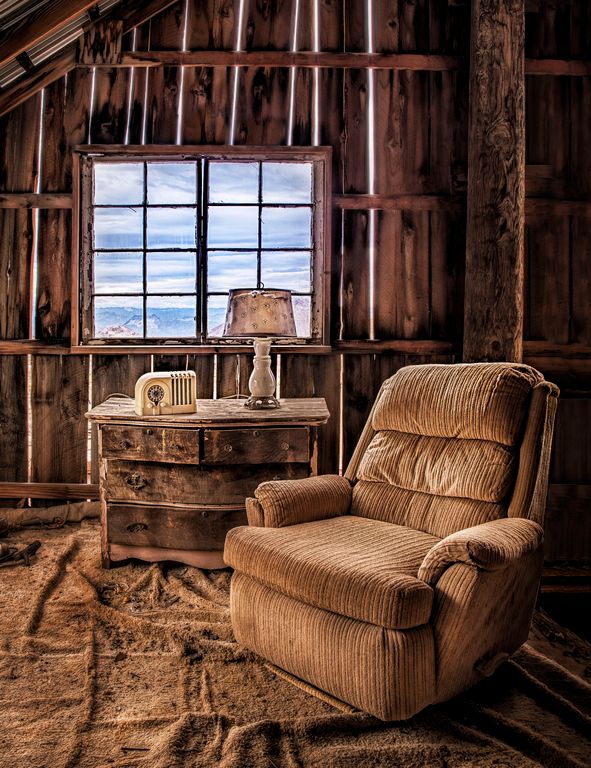
great place! I just love stepping into places like this. The composition and tone mapping are well done, love the tones and the light vignette adds without being noticable. I love the tones, the browns against the bluish floor and greens of the safe and file cabinet
I too agree with Tom, clone out the thermo, seems to be a bit out of place. I would probably tone down the desk, far right bottom, and also the reflection, right wall since you cannot see the map making it. |
Mar 15th |
| 44 |
Mar 17 |
Comment |
wow, dramatic! love the light rays! love the composition!
I do agree with Rick, that one flare does bother me. I would also either darken or unsaturate the rocks in the foreground. |
Mar 15th |
| 44 |
Mar 17 |
Comment |
brought image back into ACR for perspective to correct for the tilt, hue/sat layer to adjust the sky and then added some canvas to the right, cloned and darkeneed as per Rick's great suggestions |
Mar 15th |
 |
| 44 |
Mar 17 |
Reply |
Thanks! yes, I have no qualms cloning those out and taking care of the behind the chair area. I swear that the sky did not look like that when I processed it, but indeed here it looks too much, perhaps during the downsize and sRGB? hmmm... |
Mar 14th |
| 44 |
Mar 17 |
Reply |
never noticed the tilt towards the right, thanks, want to fix that, and yes, the sky does seem a bit too purple. Thanks!
|
Mar 14th |
11 comments - 4 replies for Group 44
|
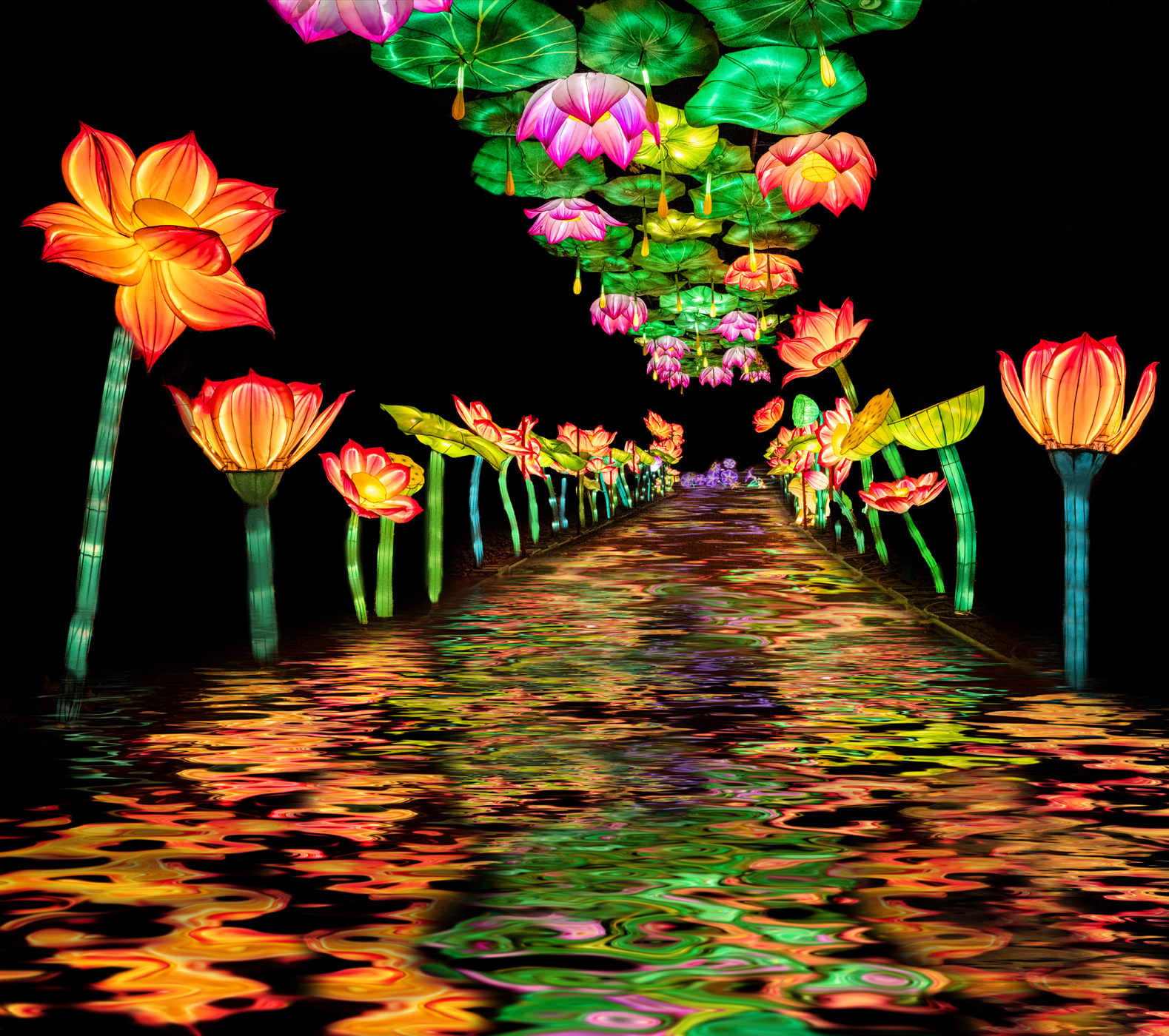
| 63 |
Mar 17 |
Comment |
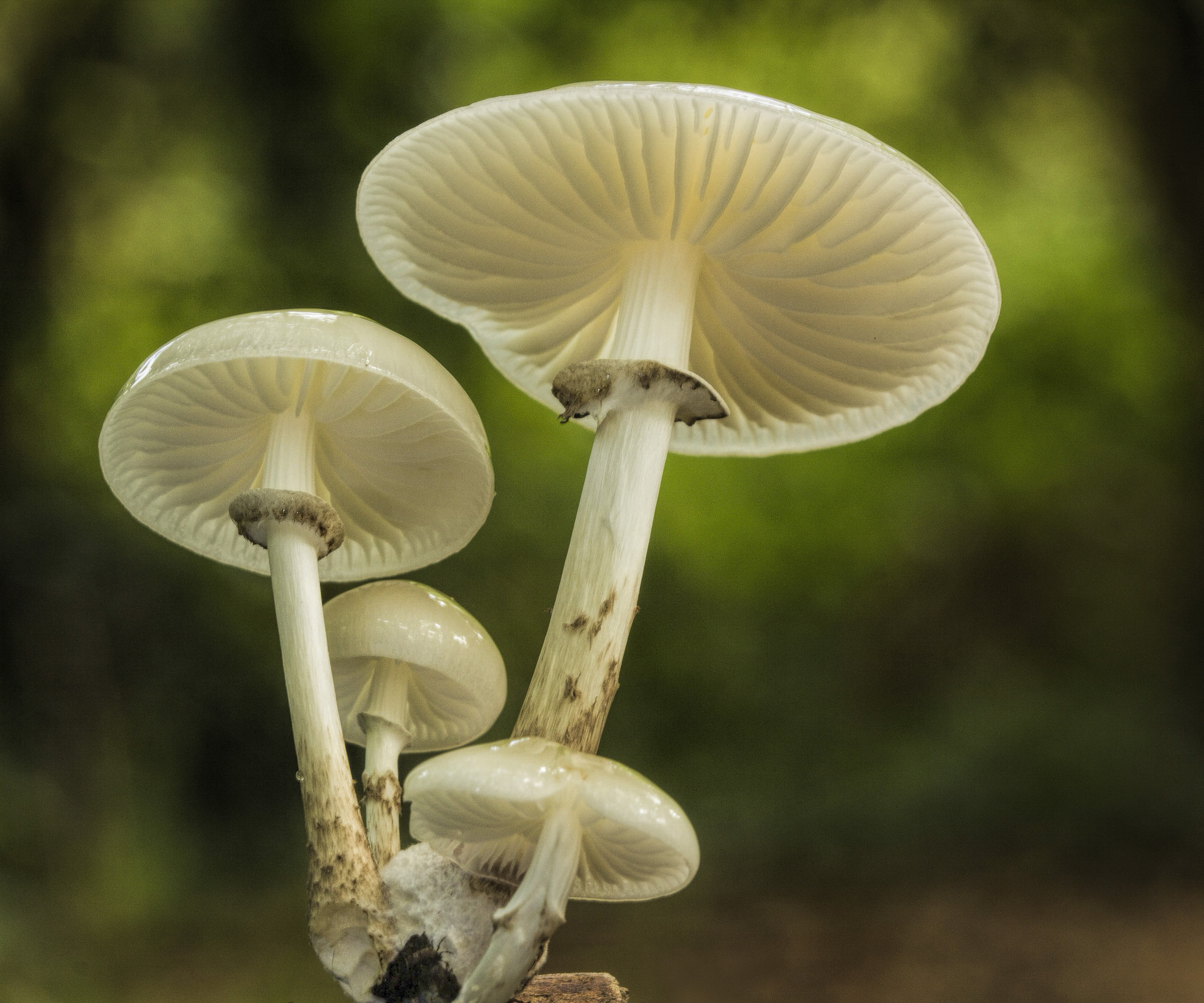
I love the texture and the angle, very well captured.
lots of detail but your background is still so nicely OOF
good choice of aperture
I would tone down or clone the black part. I did that and I ran it thru Topaz Clarity. |
Mar 23rd |
 |
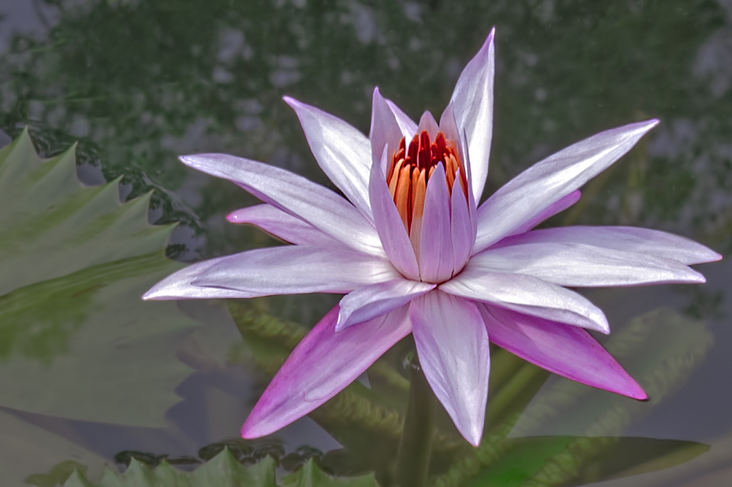
| 63 |
Mar 17 |
Comment |
the place that I photograph water lilies adds a black dye to the water for anti-fungal reasons, but it is great for photographing and contrast. so you would od a low key version of your image for added artistic impact.
|
Mar 23rd |
 |
| 63 |
Mar 17 |
Comment |
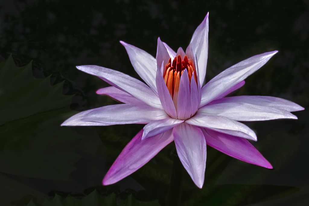
I love water lilies, your placement in the frame works well. The colors in the lily are becoming and bright and appealing.
A polarizer would have helped with the water glare.
The highlights in the water are distracting and I would heal those away. |
Mar 23rd |
 |
| 63 |
Mar 17 |
Comment |
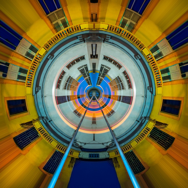
i like the colors and the abstract quality, with the leading lines drawing you into the scene. the "bullseye" ends up in a nice power point. perhaps slightly vignette the left top and right top and bottom to keep the viewers eye going along the leading lines from bottom left inward |
Mar 23rd |
| 63 |
Mar 17 |
Comment |
i love the creativity and the distortion. the twisting really makes your eye stay on the queen
I like the black border and the framing with the tons of cards, but perhaps less bright on those because the main twisted queen is so interesting they kind of distract... |
Mar 23rd |
| 63 |
Mar 17 |
Comment |
love the colors and the detail!
I agree about the winder being up, but then the words are upside down so I prefer it as posted.
my opinion on the background: The mottled background bothers me, there is not enough or too much, that is it just looks kind of dirty to me. |
Mar 23rd |
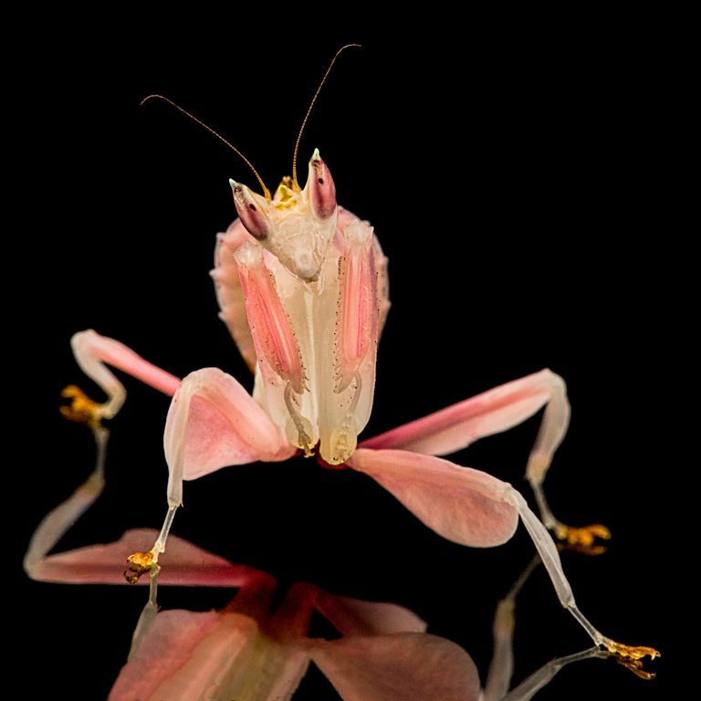
| 63 |
Mar 17 |
Comment |
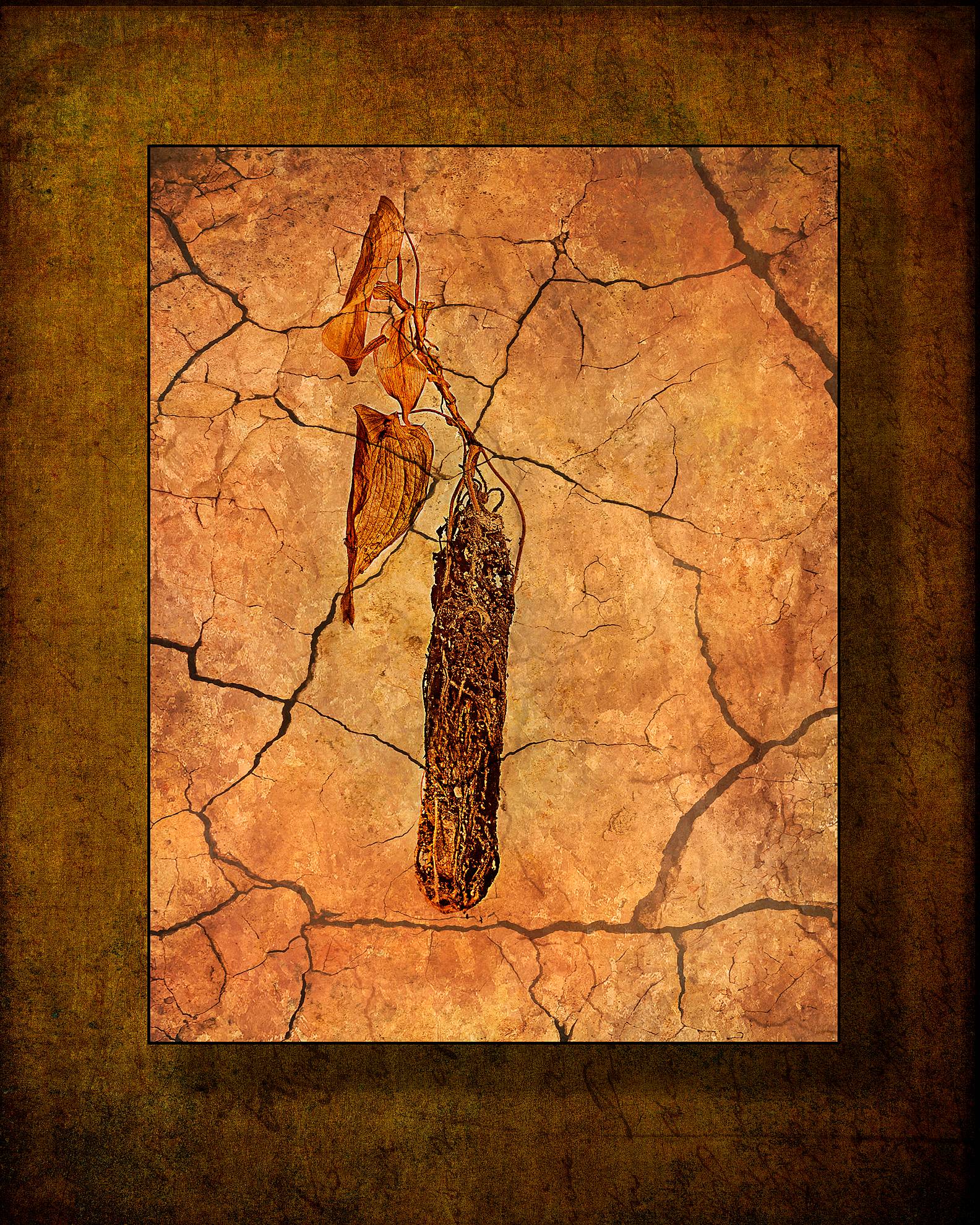
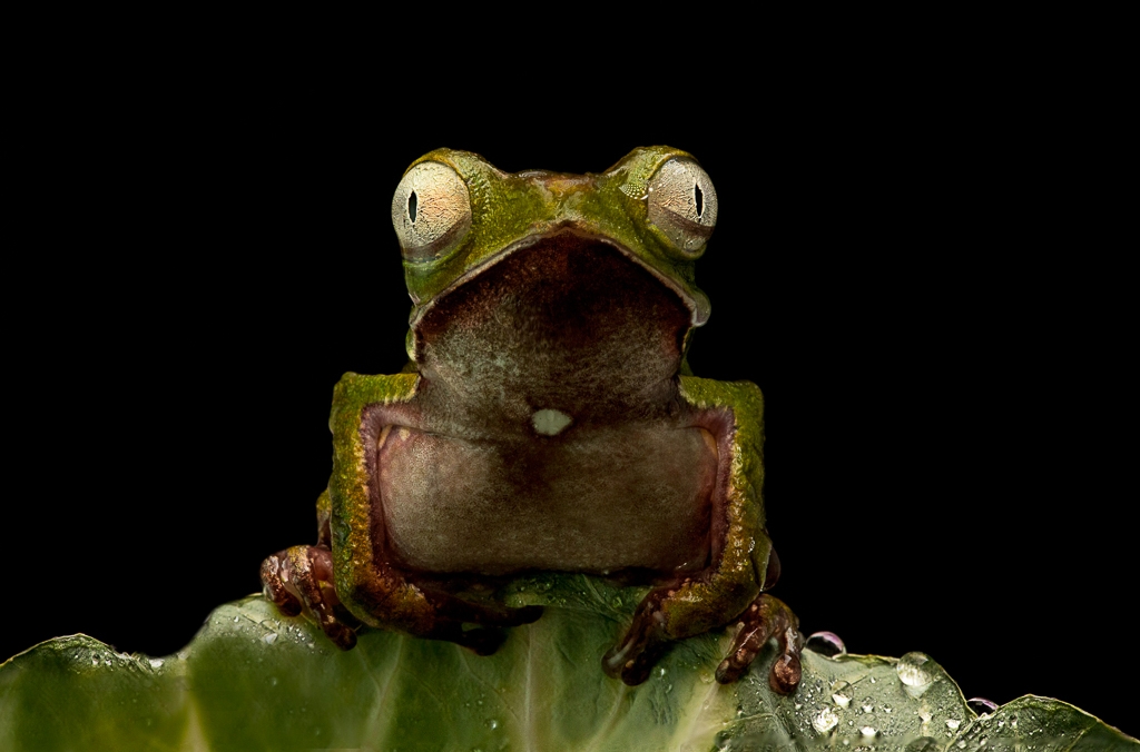
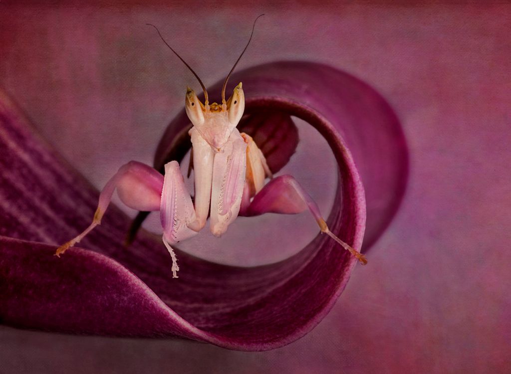
lol, thanks Cindy. Photography is subjective so maybe the judges just did not like "bugs" but I thought that it had impact with the praying mantis inside the of the flower petal. I was so excited just to see and photograph such a beautiful creature.
I figured that since you could not see the other back leg and since it was such a diminished view that it was OK to remove the leg.
I had this image of the orchid mantis too, I focus stacked it with a bunch of layers, but it seemed too simple and plain in contrast the impactfulness of the insect in the petal. |
Mar 2nd |
 |
7 comments - 0 replies for Group 63
|
24 comments - 6 replies Total
|