|
| Group |
Round |
C/R |
Comment |
Date |
Image |
| 41 |
Feb 17 |
Comment |
good extraction and more pleasing than last month's version because the tones work better.
I love how she is poised on the great curve and how her shadow appears on the orchid.
I would add a color blend mode at low opacity to blend it all together, many people who composite do that last to prevent the stuck on look. |
Feb 17th |
| 41 |
Feb 17 |
Comment |
definitely a lot of work. Interesting scene going on. I would (temporarily) flip the photo upside down and tone down the people and the white border pieces. Flipping it allows you to see the image as an abstract and tone down those areas that distract from your great interactive subject. |
Feb 17th |
| 41 |
Feb 17 |
Comment |
I love the tones and textures and how you accentuated just some of the pots and how you made the distracting background disappear. Your before and after makes me want to go back and edit some of my images. Love this! Wish I was there with you!
I would flip it to lead your eye right in
and clone/heal the top orange pot and the lip of the board at the top |
Feb 17th |
 |
| 41 |
Feb 17 |
Comment |
very creative! to put those three elements together! I just love the way that the petals wrap around too
The only thing I would change is that the left side goes out of the frame (the petals)
|
Feb 17th |
| 41 |
Feb 17 |
Comment |
I love the window scene itself and the brush mask really adds a cool dimension to it. wow!
I love the brush and the drops and effects in all areas except the very top, see snip, I would change just that area.
"I have provided two subjects for your to compare this effect. I like the windowsill for competition a little more than the portrait. What do you think? "
I like the window scene better, the girl is interesting and I do like the effect on a portrait, but it is too tight on the portrait for my taste, larger brush size or reduce the opacity a little |
Feb 17th |
 |
5 comments - 0 replies for Group 41
|
| 44 |
Feb 17 |
Reply |
aha the limitations imposed by humans. How many times they thwart our creativity. |
Feb 17th |
| 44 |
Feb 17 |
Reply |
wow, I missed that floor area, thanks! |
Feb 17th |
| 44 |
Feb 17 |
Reply |
correct, but I could clone that out and leave the sink. |
Feb 17th |
| 44 |
Feb 17 |
Comment |
cool old saloon and its placement and every the flowering bush all come together.
I do agree about it being too tight. And I would like to see the rest of the saloon letters with a slightly different camera height. |
Feb 17th |
| 44 |
Feb 17 |
Comment |
I can see what you stopped and got the camera out, great sky and good looking church and no power lines, I wish that they would all bury their power lines.
I would crop some off to put the church it a stronger composition so that it is not centered and either clone or crop the car out on the far right. |
Feb 17th |
| 44 |
Feb 17 |
Comment |
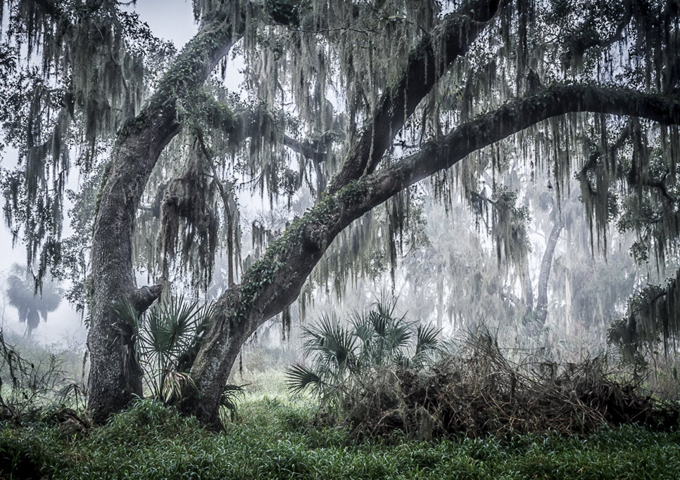
wow, what a great feeling to this image! The fog and the Spanish moss - wow! Yes, you were lucky to have fog that day, it really adds to the mood.
perhaps a slight crop off of the left side and a slight straighten.. |
Feb 17th |
 |
| 44 |
Feb 17 |
Comment |
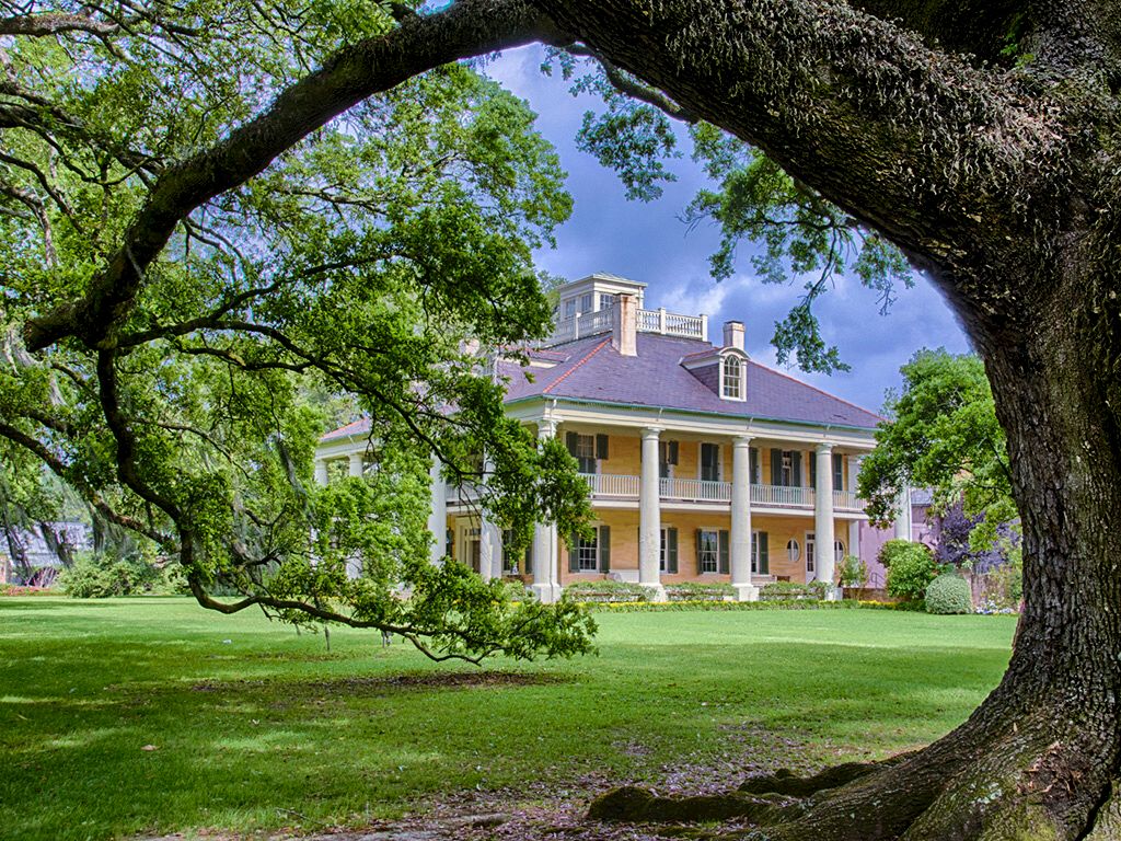
I love the framing of the tree; great placement and composition.
The house itself looks muddy to me, those great columns should pop more and the contrast of the grand house needs to be increased in my opinion.
"I tried Photoshop CC 2017" did you use ACR in CC? or the HDR feature within CC which is not as good? If you used ACR for the tone mapping did you check autotone or did you tone it yourself by adjusting the highlights, shadows, white point, black point clarity and contrast?
I would love to give this a try in ACR if you would like to send em the RAW files I can see what I come up with |
Feb 17th |
 |
| 44 |
Feb 17 |
Reply |
awe, thank you Brad |
Feb 17th |
| 44 |
Feb 17 |
Comment |
oh I just love places like this!! How every interesting, leaves you looking and looking. The light over the desk is really amazing and I love the golden colors of the wood molds. The aged signs on the wall are perfect and add interest and are not muddy. I also like the blue and golden tones mixed throughout the image.
I would suggest cloning out the electrical box on the far left and the green thing at the top right. |
Feb 17th |
| 44 |
Feb 17 |
Comment |
I love the sky but I want more light and detail in the bottom. The composition works with the framing on the left and the placement of the sun and the sharp prickles of the cacti and Joshua trees. Perhaps another exposure, going to 6 or 7 exposures. Perhaps getting lower to let some of the needles go against the sky would improve. |
Feb 17th |
6 comments - 4 replies for Group 44
|
| 63 |
Feb 17 |
Comment |
I also like it flipped, the leading line seems stronger to me and the bubbles almost like a mt landscape... |
Feb 23rd |
 |
| 63 |
Feb 17 |
Comment |
I love the ice that you captured, the swirls and the patterns. I wish that I liked the cold, lol, because I love these types of images.
posterization is like spices, everyone likes a different amount of curry and salt and garlic. I tried the opposite on it, using clarity and dehaze to simplify it. |
Feb 23rd |
 |
| 63 |
Feb 17 |
Comment |
I love this idea, the textures and the shapes, very cool!
perhaps try darkening the edges and other coins (besides the top five) to give it some depth... |
Feb 23rd |
 |
| 63 |
Feb 17 |
Comment |
or take the polar coordinates version and mirror that with a soft light blend mode |
Feb 23rd |
 |
| 63 |
Feb 17 |
Comment |
or filter distort polar coordinates |
Feb 23rd |
 |
| 63 |
Feb 17 |
Comment |
or duplicate and mirror vertically and wave |
Feb 23rd |
 |
| 63 |
Feb 17 |
Comment |
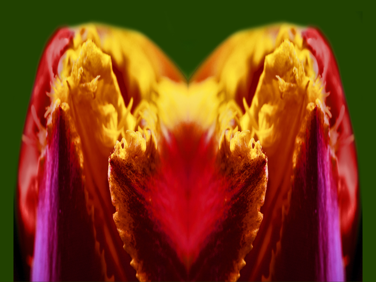
since you are going for abstract you also have some other options...
duplicate, mirror -- looks like a heart to me |
Feb 23rd |
 |
| 63 |
Feb 17 |
Comment |
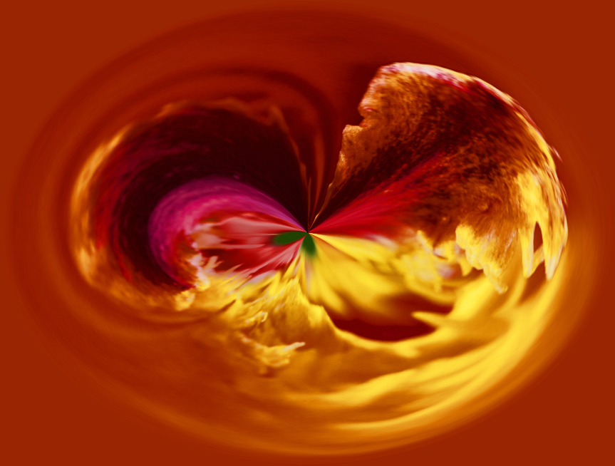
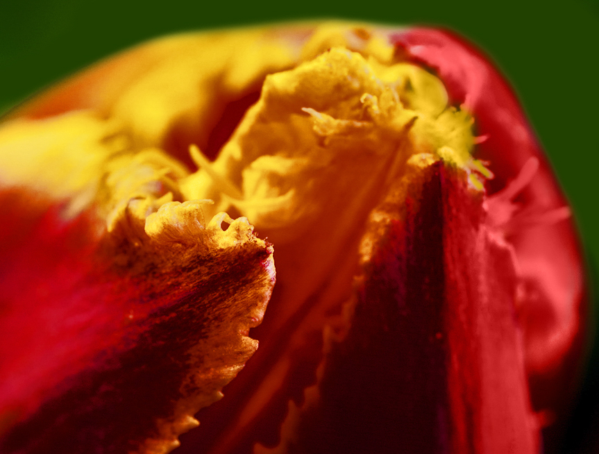
The petals coming from the left are interesting and I like the yellows and reds and green. The pink seems out of place and I would add a color blend mode layer and change the magenta to reddish. The top seems almost solarized so I would drop or brush that area. |
Feb 23rd |
 |
| 63 |
Feb 17 |
Comment |
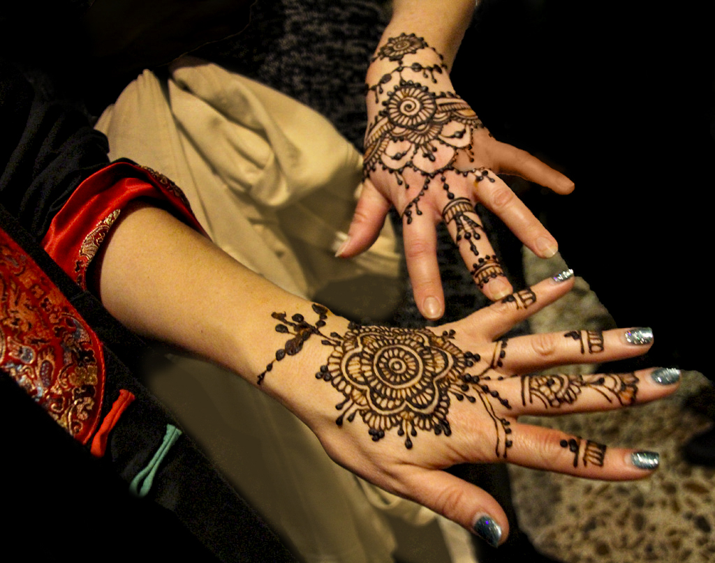
I love the design and the red
The cream colored fabric could have been used "as a background" we often will use a bride's dress and have someone hold the back up behind her as a more pleasing background
impressive steadiness of for 1/15 of a second, hard to do!
use levels and darken the "gray areas" selectively, and even teh cream colors areas.
Lastly, since we read left to right flipping this allows up to have a leading line with the arm and red on the left and then leads us to the Henna and the finger tips and keeps us there |
Feb 23rd |
 |
9 comments - 0 replies for Group 63
|
20 comments - 4 replies Total
|