|
| Group |
Round |
C/R |
Comment |
Date |
Image |
| 25 |
Feb 19 |
Reply |
Thanks for the comments.
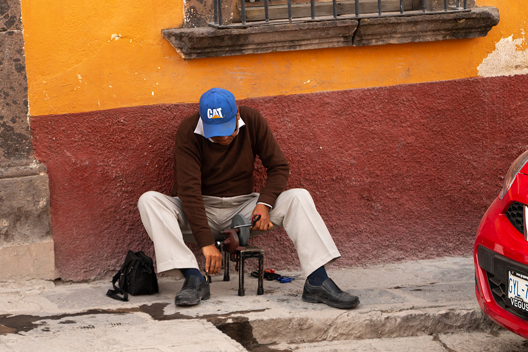
Since this a World Heritage Site the colors of buildings and there exterior maintenance is mandated. Thus, there always is a nice color palate which looks fresh.
The attachment shows the original uncropped version. |
Feb 26th |
 |
| 25 |
Feb 19 |
Comment |
Great subject and separating it from the background enhances the composition. The side lighting is wonderful and does not overwhelm the delicacy of the feather. (I would never have thought of using a TV as a light source). The soft colors of the feather are complimented be the background. There is nothing to draw the eye away from the feather.
A real small nit is the bright spot on the stem of the feather which attracts my eye. An easy fix with a brush. |
Feb 21st |
| 25 |
Feb 19 |
Comment |
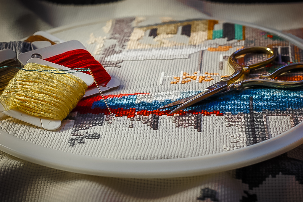
I like the subject and the arrangement of the yarn and the scissors. The side lighting works well and the colors complement one another. In my opinion the increasing the depth of field to get the back of the cross stitch sharper, and increasing the saturation of the colors would make it pop more. In Lightroom I add sharpening and saturated the colors. You an decide if you like it. |
Feb 21st |
 |
| 25 |
Feb 19 |
Comment |
Wonderful subject and lighting. The framing of the sunset makes for a great composition. The color is the story of the image and the sun does not look to be blown out. You are lucky to have this gorgeous sunset every evening. |
Feb 21st |
| 25 |
Feb 19 |
Comment |
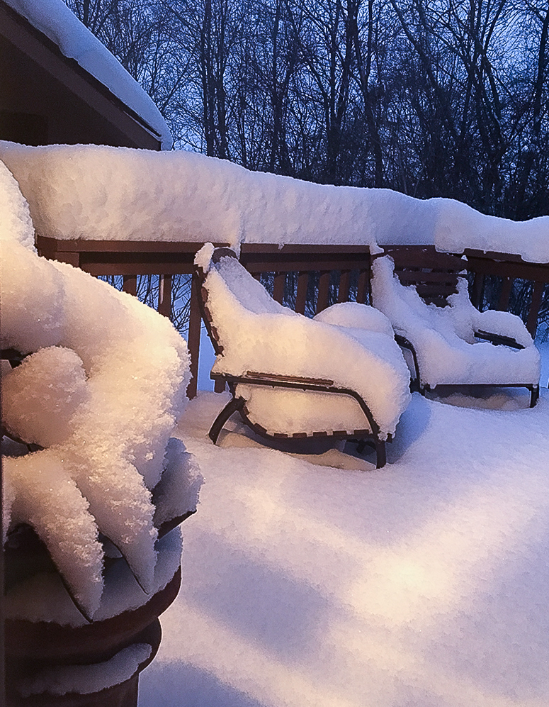
The image is sharp from front to back. I like the composition of the plant and the chairs, with the parallel line of the railing pulling it all together. I think the composition could be stronger if the chair on the right was not cut off. The lighting in the black and white handles the bright spots and shadows from the porch lights. I thought about how I would do it differently. In Lightroom I cropped the original to include the chair on the right and rather than black and white I adjusted the white balance to reduce but not eliminate the yellow in the lights and added some contrast and sharpened. You decide if you like it. |
Feb 21st |
 |
4 comments - 1 reply for Group 25
|
4 comments - 1 reply Total
|