|
| Group |
Round |
C/R |
Comment |
Date |
Image |
| 25 |
Nov 18 |
Reply |
Thanks for the catch. I remember a tractor parked back there. Its got to go. |
Nov 22nd |
| 25 |
Nov 18 |
Reply |
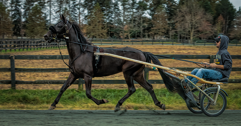
Thanks for the comments. You pointed out what was bothering me about the image, the background is to light for the dark horse. I will submit this for competition in January and will work to blur and tone down the trees. |
Nov 22nd |
| 25 |
Nov 18 |
Reply |
I really do know the difference between a house and a horse. |
Nov 22nd |
| 25 |
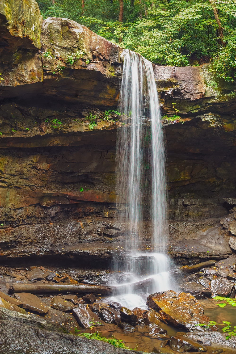
Nov 18 |
Comment |
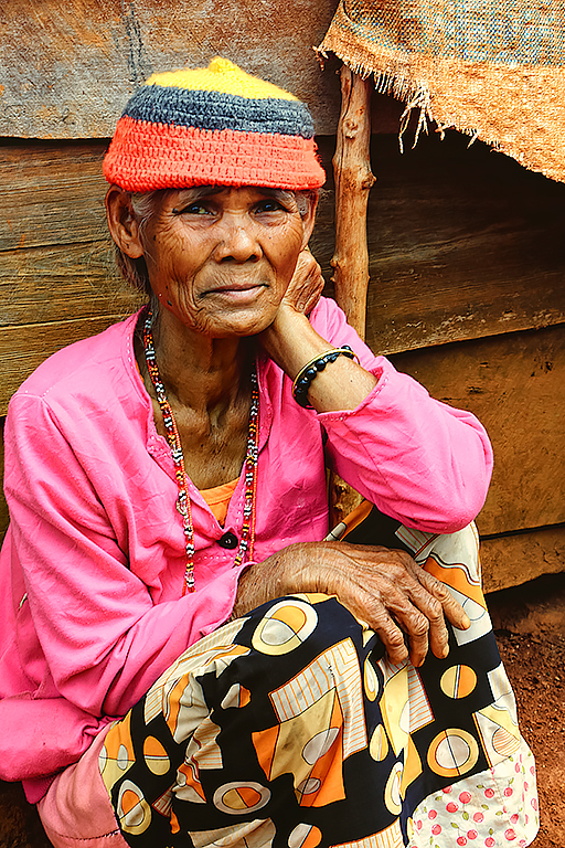
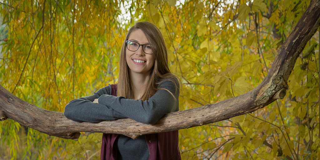
The composition and colors and good. The lighting has been discussed in other comments and I have nothing to add. My first reaction was she does not pop out of the image. I imported to Lightroom where I decreased the luminance of the background and added a vignette. The result is in the thumbnail. Also, when shooting portraits, which I only do occasionally, try for the full body shot like you did and then some close-ups. I noticed in Lightroom that the current image is close to being pixileted. |
Nov 22nd |
 |
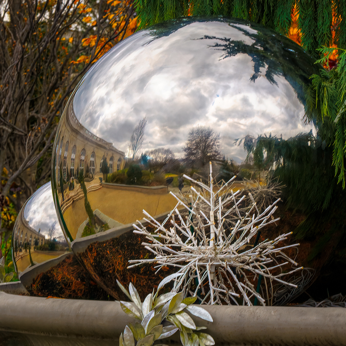
| 25 |
Nov 18 |
Comment |
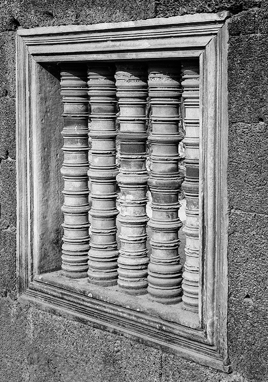
A great black and white. The composition and lighting are spot on. Since I enter competitions each month I know judges can be picky. So I put on my picky mask and looked real hard. There seem to be some dust spots, one on the left most part of the sculpture, 2 along the top, and one in the bottom center. Try opening it in Photoshop and change the view to 200%. Then search for imperfections/spots and correct with content aware. Let us know the results of the competition. |
Nov 22nd |
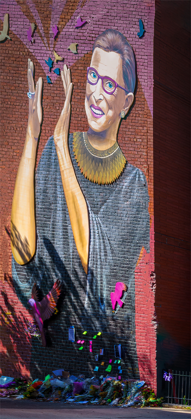
| 25 |
Nov 18 |
Comment |
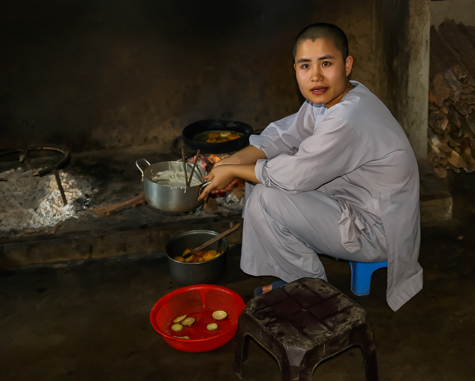
Great job on capturing this image. Her joy really comes through. The composition and color are well done, and the lighting is a bit dark for my tastes. The one distraction for me is her hand is the sharpest thing in the image and draws the eye away from her face. You may want to try toning it down while brightening her face to reduce the impact. Also I would put a stroke around the edges. |
Nov 22nd |
| 25 |
Nov 18 |
Comment |
The Monarch died for a good image. The composition, lighting and colors are well done. I like the original because it highlights the butterfly which is the subject. The HDR creates a competition between the background and butterfly which leaves me wondering what is the subject. |
Nov 22nd |
| 25 |
Nov 18 |
Comment |
Wow, you really found a great scene and created a great image. I like the whimsical feel of the original, but Marla has suggested a different way to look at it. I agree the cropping out the spot of sky on the top would remove a distraction. While cropping you might try to crop a bit of the grass in the foreground. These 2 changes would move it a bit more toward a pano which could be an interesting look. |
Nov 22nd |
| 25 |
Nov 18 |
Comment |
Very well seen. I also would have walked by and not seen it. I like Vincent's change. I also agree with Darin that the background is a distraction, but think making it all white or black takes it out of context. I would try brushing in a blur, especially the white fence, to reduce the impact. |
Nov 22nd |
| 25 |
Nov 18 |
Reply |
Thanks for the critique. This workshop was a pre-tour to the Horizon Summit in Newark DE. At the Summit, I went to a session by John Barclay who, along with being a fine photographer, is a advocate of Topaz Studio. The work flow I described is the one he presented. He thinks these 3 plugins are superior to their counterparts in Lightroom and so far my experience shows this to be correct. |
Nov 11th |
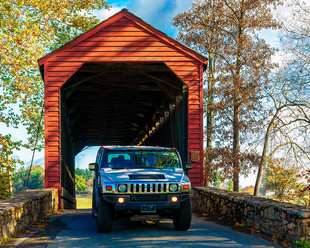
| 25 |
Nov 18 |
Reply |
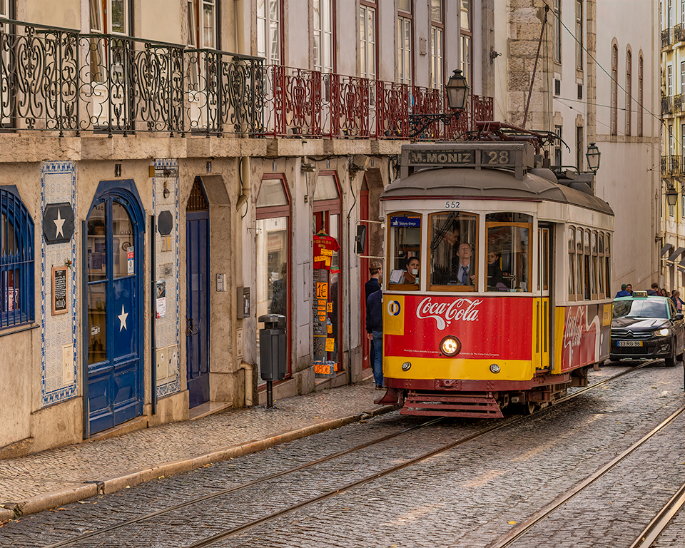
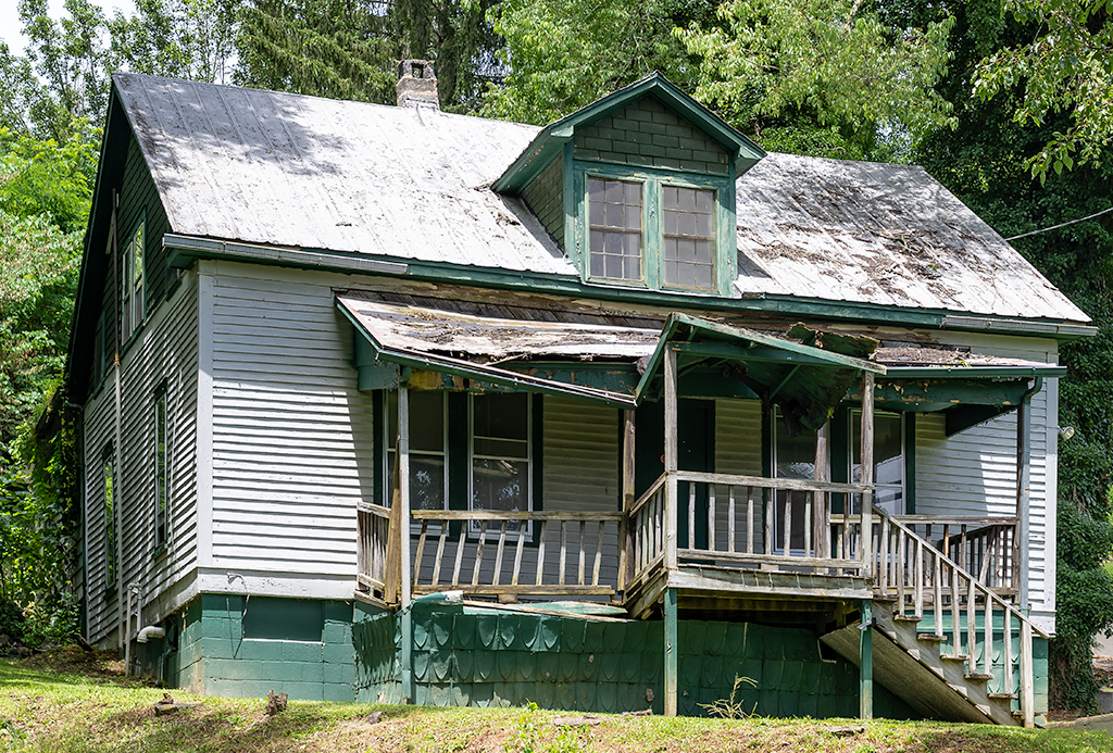
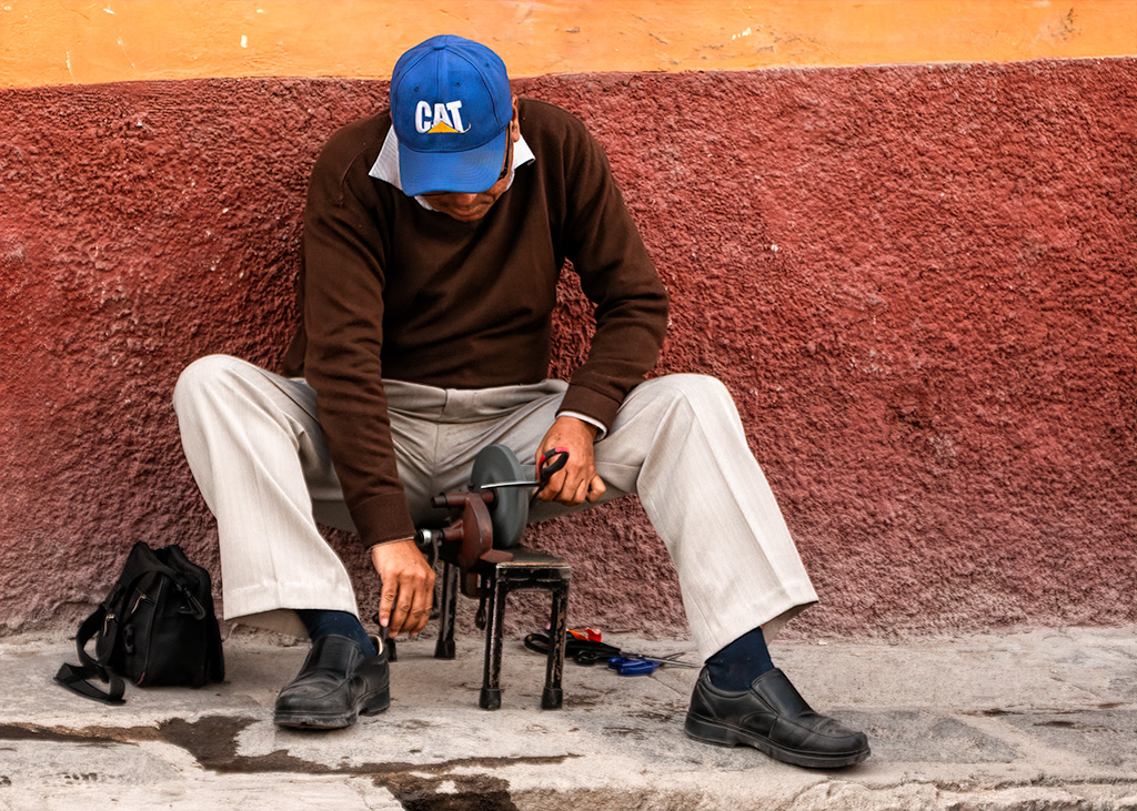
Thanks for the critique. Yes I was panning which caused the background blur. Each pass of the house resulted in 8 to 10 images. I experimented with different shutter speeds and liked the shots at 1/80 or 1/100 better for the blur, but this is the only shot with all 4 feet off the ground which I thought was more important. |
Nov 11th |
6 comments - 5 replies for Group 25
|
6 comments - 5 replies Total
|