|
| Group |
Round |
C/R |
Comment |
Date |
Image |
| 25 |
Oct 18 |
Reply |
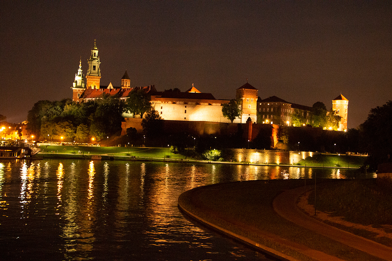
I agree this is a challenging shot, and I do not do much of it so the images do not turn out the way I had hoped. I have no idea why some of the lights look like starbursts, they were a surprise to me. I do not think there is much that can be done with the sky. It was cloudy enough so you could not see the stars but the moon was out but further off to the right. I am attaching the original for you info. |
Oct 24th |
 |
| 25 |
Oct 18 |
Comment |
A interesting subject with the composition attracting the eye. The light is spot on and brings out the warm colors. The stroke adds a nice touch, keeping the eye focused on the subject. The only adjustment I would make is to have a little more room on the top and left side, they seem a bit tight. |
Oct 24th |
| 25 |
Oct 18 |
Comment |
Great subject and composition. The lighting is a little confusing. The top and right of her head look like they are lit by a light in the upper right. However, her face has a shadow from her arm with the light source from the left, and the pumpkin has a shadow from a light source on the lower right. Not sure this is a problem, just odd. There is one adjustment I would try to make the next time you are shooting this type of image, move the camera a bit to the left and up so there is a little separation between the pumpkin and her face, |
Oct 23rd |
| 25 |
Oct 18 |
Comment |
Great subject, who does not like little boys, and the black and white really makes the image pop. The light is coming from the correct angle and is not harsh. I like the changes Audrey made but would also clone out the toothbrush and cup that looks like it is coming out of his ear. I do not mind the chin at the bottom of the mirror. It allows you to have another day in the life and repeat the pose to see the differences. Just understand when he starts to care about his neat hair he may kick you out. |
Oct 23rd |
| 25 |
Oct 18 |
Comment |
Good subject with great color. The composition is good but I wonder if you moved a little to the right, to get a little more head on the the flower on the right, it would be improved. As the others noticed the lighting is harsh and I think Audrey's adjustment works well. I would also experiment with a vignette to darken the edges. |
Oct 23rd |
| 25 |
Oct 18 |
Comment |
A great subject with an important message. I agree with Marla that a higher angle would clarify the message. The lighting on the bracelet is spot on, but the brightness at the top of the image draws the eye. |
Oct 23rd |
| 25 |
Oct 18 |
Comment |
A great subject and well composed with beautiful colors. The lighting is bit different, darker in the middle, but works well for this image. The only change I would suggest is to make it a bit wider so the tips of top leaves are away from the edge. |
Oct 23rd |
6 comments - 1 reply for Group 25
|
6 comments - 1 reply Total
|